Your EARL tickets are now live to purchasehere. Offering you every possible EARL ticket combination, here is a quick summary of what you can expect. You can simply choose a 3-day jam-packed conference pass or a 1 or 2-day option to customise an itinerary that works for you.
Grab your EARLy bird tickets right away – limited for a period of 2 weeks and 2 weeks only, we are delighted to be offering an unlimited amount of tickets ranging from 15-25% discount on all ticket options, depending if you are NHS, not for profit or an academic.
Team networking.
Why not bring your colleagues along for a much needed team social at the largest commercial R event in the UK? Offering lots of networking opportunities from brands in similar markets – there will be plenty of time to swap market experiences, over coffee, at lunch or at our evening reception. We are certainly proud to be a part of such an enthusiastic community.
Full or half day workshop on day 1.
We are running a 1-day series of workshops to kick offEARLon 6th September, covering all areas of R from explainable machine learning, to time series visualisation, functional programming with purr, an introduction to plumber APIs to having some fun and making games in Shiny. There is plenty of choice with morning and afternoon sessions agenda.
Full conference pass.
Our all-access pass to EARL gives you full access to a 1-day workshop, full 2-day conference pass and access to the evening reception at the unforgettable Drapers Hall on day 2 – the former home of Henry VIII. We have got an impressive line-up of keynotes including mathematician, science presenter and all-round badass – Hannah Fry, Top 100 Global Innovator in Data & Analytics – Harry Powell and the unmissable Financial Times columnist John Burn-Murdock. To add to this excitement, we have approved used cases from Bumble, Samaritans, BBC, Meta, Bank of England, Dogs Trust, NHS, and partners RStudio alongside many more.
1 or 2-day conference pass.
If you would like access to the keynotes, session talks and abundance of networking opportunities, you can choose from a 1 or 2-day pass aligned to your areas of interest. The 2-day conference pass gives you access to the main evening reception.
Evening reception.
This year we have opted for an unforgettable experience at Drapers Hall (the former home of Henry VIII), where you will get the ability to network with colleagues, delegates and speakers over drinks, canapes, and dinner in unforgettable surroundings. Transport is provided in a provide London red bus transfer.
This year promises an unforgettable experience, with a heavy weight line up, use cases from leading brands and the opportunity at last to share and network to your heart’s content. We look forward to meeting you.
Book your ticketsnow.
When are two variablestoorelated to one another to be used together in a linear regression model? Should the maximum acceptable correlation be 0.7? Or should the rule of thumb be 0.8? There is actually no single, ‘one-size-fits-all’ answer to this question.
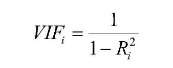
As an alternative to using pairwise correlations, an analyst can examine the variance inflation factor, or VIF, associated with each of the numeric input variables. Sometimes, however, pairwise correlations, and even VIF scores, do not tell the entire picture.
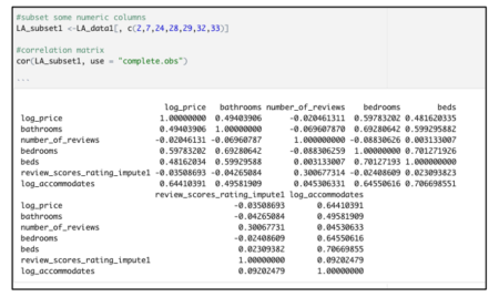
Consider this correlation matrix created from a Los Angeles Airbnb dataset.
Two item pairs identified in the correlation matrix above have a strong correlation value:
· Beds + log_accommodates (r= 0.701)
· Beds + bedrooms (r= 0.706)
Based on one school of thought, these correlation values are cause for concern; meanwhile, other sources suggest that such values are nothing to be worried about.
The variance inflation factor, which is used to detect the severity of multicollinearity, does not suggest anything unusual either.
library(car)
vif(model_test)
The VIF for each potential input variable is found by making a separate linear regression model, in which the variable being scored serves as the outcome, and the other numeric variables are the predictors. The VIF score for each variable is found by applying this formula:
When the other numeric inputs explain a large percentage of the variability in some other variable, then that variable will have a high VIF. Some sources will tell you that any VIF above 5 means that a variable should not be used in a model, whereas other sources will say that VIF values below 10 are acceptable. None of the vif() results here appear to be problematic, based on standard cutoff thresholds.
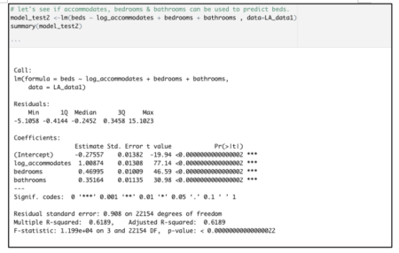
Based on the vif() results shown above, plus some algebraic manipulation of the VIF formula, we can know that a model that predictsbedsas the outcome variable, usinglog_accommodates,bedrooms, andbathroomsas the inputs, has an r-squared of just a little higher than 0.61. That is verified with the model shown below:
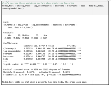
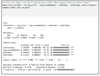
But look at what happens when we build a multi-linear regression model predicting the price of an Airbnb property listing.
The model summary hints at a problem because the coefficient for beds is negative. The proper interpretation for each coefficient in this linear model is the way thatlog_pricewill be impacted by a one-unit increase in that input, with all other inputs held constant.
Literally, then, this output indicates that having more beds within a house or apartment will make its rental value go down, when all else is held constant. That not only defies our common sense, but it also contradicts something that we already know to be the case — that bed number andlog_priceare positively associated. Indeed, the correlation matrix shown above indicates a moderately-strong linear relationship between these values, of 0.4816.
After dropping‘beds’from the original model, the adjusted R-squared declines only marginally, from 0.4878 to 0.4782.
This tiny decline in adjusted r-squared is not worrisome at all. The very low p-value associated with this model’s F-statistic indicates a highly significant overall model. Moreover, the signs of the coefficients for each of these inputs are consistent with the directionality that we see in the original correlation matrix.
Moreover, we still need to include other important variables that determine real estate pricing e.g. location and property type. After factoring in these categories along with other considerations such as pool availability, cleaning fee, and pet-friendly options, the model’s adjusted R-squared value is pushed to 0.6694. In addition, the residual standard error declines from 0.5276 in the original model to 0.4239.
Long story short: we cannot be completely reliant on rules of thumb, or even cutoff thresholds from textbooks, when evaluating the multicollinearity risk associated with specific numeric inputs. We must also examine model coefficients’ signs. When a coefficient’s sign “flips” from the direction that we should expect, based on that variable’s correlation with the response variable, that can also indicate that our model coefficients are impacted by multicollinearity.
Learn Data Science with R is for learning the R language and data science. The book is beginner-friendly and easy to follow. It is available for download as pay what you want. The minimum price is 0 and the suggested contribution is rs 1300 ($18). Please review the book at Goodreads.
Have a look at the FREE attached pdf of Chapter 2 on Logic and R from my recently published textbook, Mathematics and Programming for Machine Learning with R: From the Ground Up,by William B. Claster (Author) ~430 pages, over 400 exercises.Mathematics and Programming for Machine Learning with R -Chapter 2 Logic We discuss how to code machine learning algorithms in R but start from scratch. The first 4 chapters cover Logic, Sets, Probability, Functions. I am sharing Chapter 2 here on Logic and R here and will also probably release chapters 9 and 10 on Math for Neural Networks shortly. The text is on sale at Amazon here:
https://www.amazon.com/Mathematics-Programming-Machine-Learning-R-dp-0367507854/dp/0367507854/ref=mt_other?_encoding=UTF8&me=&qid=1623663440
I will try to add an errata page as well.
As many Qualtrics surveys produce really similar output datasets, I created a tutorial with the most common steps to clean and filter data from datasets directly downloaded from Qualtrics.
You will also find some useful codes to handle data such as creating new variables in the dataframe from existing variables with functions and logical operators.
The tutorial is presented in the format of a downloadable R code with explanations and annotations of each step. You will also find a raw Qualtrics dataset to work with.
This dataset comes from a Qualtrics survey with an experiment format (control and treatment conditions), but the codes can be applicable to non-experimental datasets as well, as many cleaning steps are the same.
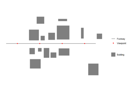
Isovists are polygons of visible areas from a point. They remove views that are blocked by objects, typically buildings. They can be used to understanding the existing impact of, or where to place urban design features that can change people’s behaviour (e.g. advertising boards, security cameras or trees). Here I present a custom function that creates a visibility polygon (isovist) using a uniform ray casting “physical” algorithm in R.
First we load the required packages (use install.packages() first if these are not already installed in R):
library(sf)
library(dplyr)
library(ggplot2)
Data generation
First we create and plot an example footway with viewpoints and set of buildings which block views. All data used should be in the same Coordinate Reference System (CRS). We generate one viewpoint every 50 m (note density here is a function of the st_crs() units, in this case meters)
Buildings should be cast to "POLYGON" if they are not already
buildings <- st_cast(buildings,"POLYGON")
Creating the function
A few parameters can be set before running the function. rayno is the number of observer view angles from the viewpoint. More rays are more precise, but decrease processing speed.raydist is the maximum view distance. The function takessfc_POLYGON type and sfc_POINT objects as inputs for buildings abd the viewpoint respectively.
If points have a variable view distance the function can be modified by creating a vector of view distance of length(viewpoints) here and then selecting raydist[x] in st_buffer below.
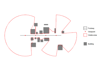
Each ray is intersected with building data within its raycast distance, creating one or more ray line segments. The ray line segment closest to the viewpoint is then extracted, and the furthest away vertex of this line segement is taken as a boundary vertex for the isovist. The boundary vertices are joined in a clockwise direction to create an isovist.
st_isovist <- function(
  buildings,
  viewpoint,

  # Defaults
  rayno = 20,
  raydist = 100) {

  # Warning messages
  if(!class(buildings)[1]=="sfc_POLYGON")     stop('Buildings must be sfc_POLYGON')
  if(!class(viewpoint)[1]=="sfc_POINT") stop('Viewpoint must be sf object')

  rayends     <- st_buffer(viewpoint,dist = raydist,nQuadSegs = (rayno-1)/4)
  rayvertices <- st_cast(rayends,"POINT")

  # Buildings in raydist
  buildintersections <- st_intersects(buildings,rayends,sparse = FALSE)

  # If no buildings block max view, return view
  if (!TRUE %in% buildintersections){
    isovist <- rayends
  }

  # Calculate isovist if buildings block view from viewpoint
  if (TRUE %in% buildintersections){

    rays <- lapply(X = 1:length(rayvertices), FUN = function(x) {
      pair      <- st_combine(c(rayvertices[x],viewpoint))
      line      <- st_cast(pair, "LINESTRING")
      return(line)
    })

    rays <- do.call(c,rays)
    rays <- st_sf(geometry = rays,
                  id = 1:length(rays))

    buildsinmaxview <- buildings[buildintersections]
    buildsinmaxview <- st_union(buildsinmaxview)
    raysioutsidebuilding <- st_difference(rays,buildsinmaxview)

    # Getting each ray segement closest to viewpoint
    multilines  <- dplyr::filter(raysioutsidebuilding, st_is(geometry, c("MULTILINESTRING")))
    singlelines <- dplyr::filter(raysioutsidebuilding, st_is(geometry, c("LINESTRING")))
    multilines  <- st_cast(multilines,"MULTIPOINT")
    multilines  <- st_cast(multilines,"POINT")
    singlelines <- st_cast(singlelines,"POINT")

    # Getting furthest vertex of ray segement closest to view point
    singlelines <- singlelines %>%
      group_by(id) %>%
      dplyr::slice_tail(n = 2) %>%
      dplyr::slice_head(n = 1) %>%
      summarise(do_union = FALSE,.groups = 'drop') %>%
      st_cast("POINT")

    multilines  <- multilines %>%
      group_by(id) %>%
      dplyr::slice_tail(n = 2) %>%
      dplyr::slice_head(n = 1) %>%
      summarise(do_union = FALSE,.groups = 'drop') %>%
      st_cast("POINT")

    # Combining vertices, ordering clockwise by ray angle and casting to polygon
    alllines <- rbind(singlelines,multilines)
    alllines <- alllines[order(alllines$id),]
    isovist  <- st_cast(st_combine(alllines),"POLYGON")
  }
  isovist
}
Running the function in a loop
It is possible to wrap the function in a loop to get multiple isovists for a multirow sfc_POINT object. There is no need to heed the repeating attributes for all sub-geometries warning as we want that to happen in this case.
Here is an open source desktop text editor that integrates both externally defined variable definitions and R. In the following demo video, R is used shortly after the 5-minute mark:
As the post on “hello world” functions has been quite appreciated by the R community, here follows the second round of functions for wannabe R programmer.
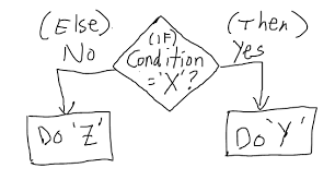
# If else statement:
# See the code syntax below for if else statement
x=10
if(x>1){
print(“x is greater than 1”)
}else{
print(“x is less than 1”)
}

# See the code below for nested if else statement

x=10
if(x>1 & x<7){
print(“x is between 1 and 7”)} else if(x>8 & x< 15){
print(“x is between 8 and 15”)
}


# For loops:
# Below code shows for loop implementation
x = c(1,2,3,4,5)
for(i in 1:5){
print(x[i])
}


# While loop :
# Below code shows while loop in R
x = 2.987
while(x <= 4.987) {
x = x + 0.987
print(c(x,x-2,x-1))
}


# Repeat Loop:
# The repeat loop is an infinite loop and used in association with a break statement.

# Below code shows repeat loop:
a = 1
repeat{
print(a)
a = a+1
if (a > 4) {
break
}
}

# Break statement:
# A break statement is used in a loop to stop the iterations and flow the control outside of the loop.

#Below code shows break statement:
x = 1:10
for (i in x){
if (i == 6){
break
}
print(i)
}

# Next statement:
# Next statement enables to skip the current iteration of a loop without terminating it.

#Below code shows next statement
x = 1: 4
for (i in x) {
if (i == 2){
next
}
print(i)
}


# function

words = c(“R”, “datascience”, “machinelearning”,”algorithms”,”AI”)
words.names = function(x) {
for(name in x){
print(name)
}
}

words.names(words) # Calling the function


# extract the elements above the main diagonal of a (square) matrix
# example of a correlation matrix

cor_matrix <- matrix(c(1, -0.25, 0.89, -0.25, 1, -0.54, 0.89, -0.54, 1), 3,3)
rownames(cor_matrix) <- c(“A”,”B”,”C”)
colnames(cor_matrix) <- c(“A”,”B”,”C”)
cor_matrix

rho <- list()
name <- colnames(cor_matrix)
var1 <- list()
var2 <- list()
for (i in 1:ncol(cor_matrix)){
for (j in 1:ncol(cor_matrix)){
if (i != j & i<j){
rho <- c(rho,cor_matrix[i,j])
var1 <- c(var1, name[i])
var2 <- c(var2, name[j])
}
}
}

d <- data.frame(var1=as.character(var1), var2=as.character(var2), rho=as.numeric(rho))
d

var1 var2 rho
1 A B -0.25
2 A C 0.89
3 B C -0.54
As programming is the best way to learn and think, have fun programming awesome functions!
This post is also shared in R-bloggers and LinkedIn
[This article was first published on the Azure Medium channel, and kindly contributed to R-bloggers]. (You can report issue about the content on this page here)
As probably you already know, Microsoft provided its Azure Machine Learning SDK for Python to build and run machine learning workflows, helping organizations to use massive data sets and bring all the benefits of the Azure cloud to machine learning.
Although Microsoft initially invested in R as the Advanced Analytics preferred language introducing the SQL Server R server and R services in the 2016 version, they abruptly shifted their attention to Python, investing exclusively on it. This basically happened for the following reasons:
Python’s simple syntax and readability make the language accessible to non-programmers
The most popular machine learning and deep learning open source libraries (such as Pandas, scikit-learn, TensorFlow, PyTorch, etc.) are deeply used by the Python community
Python is a better choice for productionalization: it’s relatively very fast; it implements OOPs concepts in a better way; it is scalable (Hadoop/Spark); it has better functionality to interact with other systems; etc.
Azure ML Python SDK Main Key Points
One of the most valuable aspects of the Python SDK is its ease to use and flexibility. You can simply use just few classes, injecting them into your existing code or simply referring to your script files into method calls, in order to accomplish the following tasks:
Explore your datasets and manage their lifecycle
Keep track of what’s going on into your machine learning experiments using the Python SDK tracking and logging features
Transform your data or train your models locally or using the best cloud computation resources needed by your workloads
Register your trained models on the cloud, package them into container image and deploy them on web services hosted in Azure Container Instances or Azure Kubernetes Services
Use Pipelines to automate workflows of machine learning tasks (data transformation, training, batch scoring, etc.)
Use automated machine learning (AutoML) to iterate over many combinations of defined data transformation pipelines, machine learning algorithms and hyperparameter settings. It then finds the best-fit model based on your chosen performance metric.
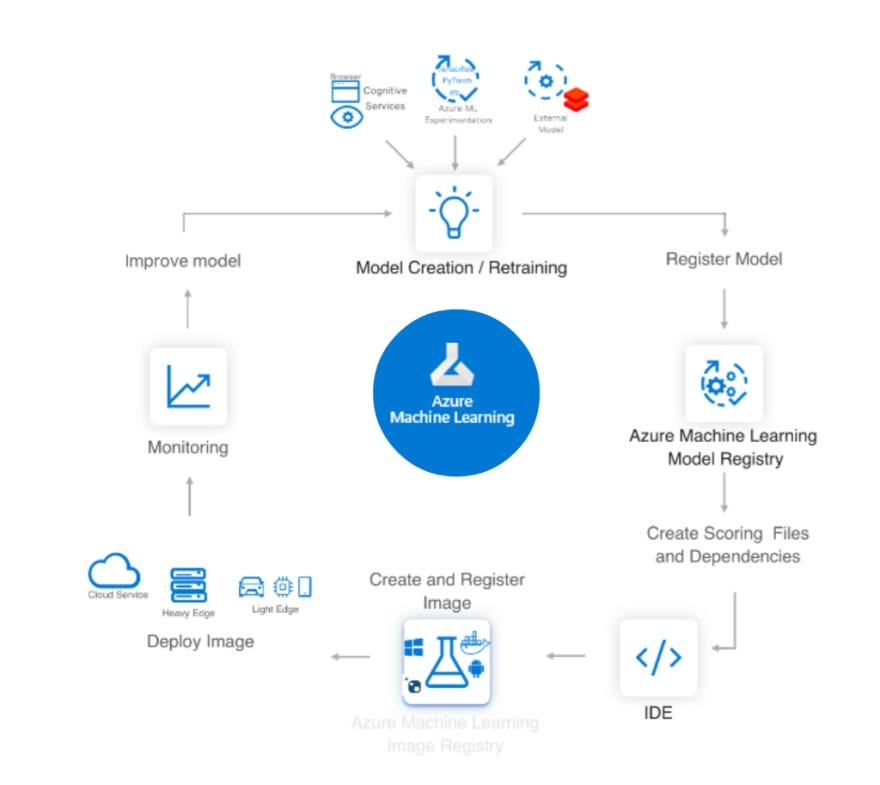
In summary, the scenario is the following one:
fig. 1 — AI/ML lifecycle using Azure ML
What About The R Community Engagement?
In the last 3 years Microsoft pushed a lot over the Azure ML Python SDK, making it a stable product and a first class citizen of the Azure cloud. But they seem to have forgotten all the R professionals who developed a huge amount of data science project all around the world.
We must not forget that in Analytics and Data Science the key of success of a project is to quickly try out a large number of analytical tools and find what’s the best one for the case in analysis. R was born for this reason. It has a lot of flexibility when you want to work with data and build some model, because it has tons of packages and easy of use visualization functionality. That’s why a lot of Analytics projects are developed using R by many statisticians and data scientists.
Fortunately in the last months Microsoft extended a hand to the R community, releasing a new project called Azure Machine Learning R SDK.
Can I Use R To Spin The Azure ML Wheels?
Starting from October 2019 Microsoft released a R interface for Azure Machine Learning SDK on GitHub. The idea behind this project is really straightforward. The Azure ML Python SDK is a way to simplify the access and the use of the Azure cloud storage and computation for machine learning purposes keeping the main code as the one a data scientist developed on its laptop.
Why not allow the Azure ML infrastructure to run also R code (using proper “cooked” Docker images) and let R data scientists call the Azure ML Python SDK methods using R functions?
The interoperability between Python and R is obtained thanks to reticulate. So, once the Python SDK module azureml is imported into any R environment using the import function, functions and other data within the azureml module can be accessed via the $ operator, like an R list.
Obviously, the machine hosting your R environment must have Python installed too in order to make the R SDK work properly.
Let’s start to configure your preferred environment.
Set Up A Development Environment For The R SDK
There are two option to start developing with the R SDK:
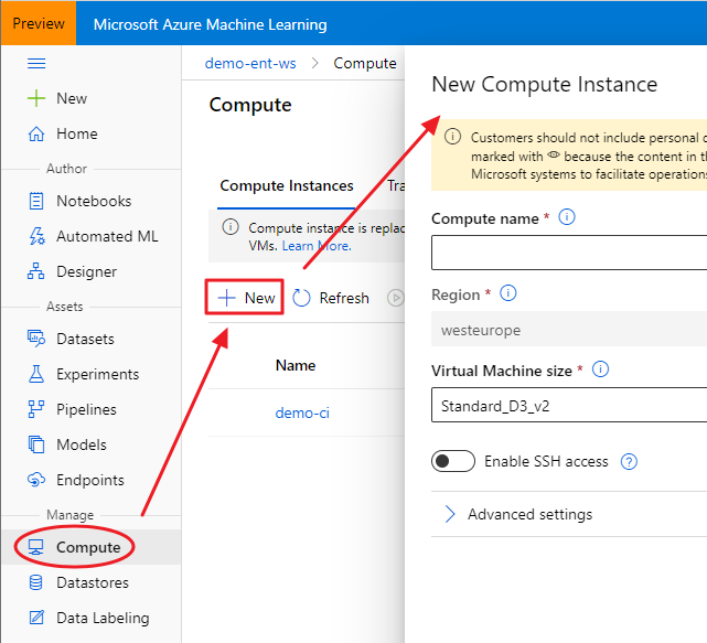
Using an Azure ML Compute Instance (the fastest way, but not the cheaper one!)
The advantage of using a Compute Instance is that the most used software and libraries by data scientists are already installed, including the Azure ML Python SDK and RStudio Server Open Source Edition. That said, once your Compute Instance is started, you can connect to RStudio using the proper link:
fig. 3 — Launch RStudio from a started Compute Intstance
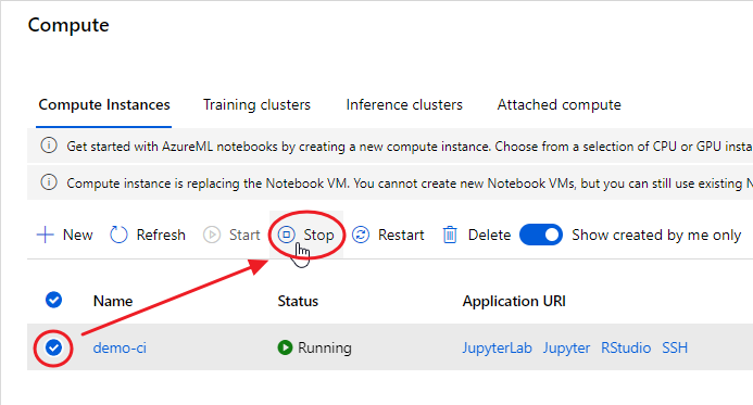
At the end of your experimentation, remember to shut down your Compute Instance, otherwise you’ll be charged according to the chosen plan:
fig. 4 — Remember to shut down your Compute Instance
Set Up Your Machine From Scratch
First of all you need to install the R engine from CRAN or MRAN. Then you could also install RStudio Desktop, the preferred IDE of R professionals.
The next step is to install Conda, because the R SDK needs to bind to the Python SDK through reticulate. If you really don’t need Anaconda for specific purposes, it’s recommended to install a lightweight version of it, Miniconda. During its installation, let the installer add the conda installation of Python to your PATH environment variable.
Install The R SDK
Open your RStudio, simply create a new R script (File → New File → R Script) and install the last stable version of Azure ML R SDK package (azuremlsdk) available on CRAN in the following way:
If you want to install the latest committed version of the package from GitHub (maybe because the product team has fixed an annoying bug), you can instead use the following function:
In this case, you just need to set the TZ environment variable with your preferred timezone:
Sys.setenv(TZ="GMT")
Then simply re-install the R SDK.
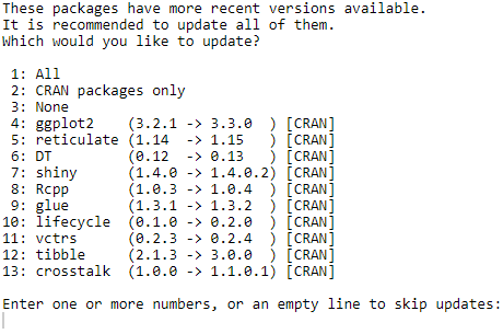
You may also be asked to update some dependent packages:
fig. 6 — Dependent packages to be updated
If you don’t have any requirement about dependencies in your project, it’s always better to update them all (put focus on the prompt in the console; press 1; press enter).
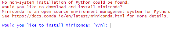
If you are on your Compute Instance and you get a warning like the following one:
fig. 7 — Warning about non-system installation of Python
just put the focus on the console and press “n”, since the Compute Instance environment already has a Conda installation. Microsoft engineers are already investigating on this issue.
You need then to install the Azure ML Python SDK, otherwise your azuremlsdk R package won’t work. You can do that directly from RStudio thanks to an azuremlsdk function:
The remove_existing_env parameter set to TRUE will remove the default Azure ML SDK environment r-reticulate if previously installed (it’s a way to clean up a Python SDK installation).
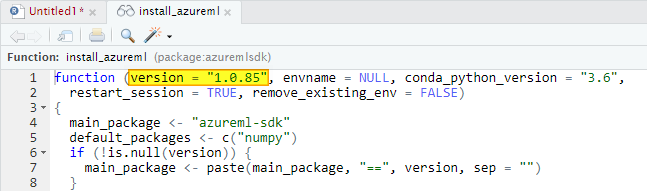
Just keep in mind that in this way you’ll install the version of the Azure ML Python SDK expected by your installed version of the azuremlsdk package. You can check what version you will install putting the cursor over the install_azureml function and visualizing the code definition clicking F2:
fig. 8 — install_azureml code definition
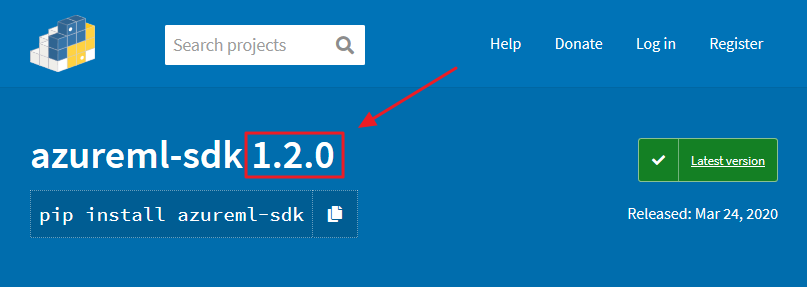
Sometimes there are new feature and fixes on the latest version of the Python SDK. If you need to install it, first check what version is available on this link:
fig. 9 — Azure ML Python SDK latest version
Then use that version number in the following code:
Sometimes you may need to install an updated version of a single component of the Azure ML Python SDK to test, for example new features. Supposing you want to update the Azure ML Data Prep SDK, here the code you could use:
In order to check if the installation is working correctly, try this:
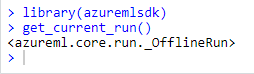
library(azuremlsdk)
get_current_run()
It should return something like this:
fig. 10 — Checking that azuremlsdk is correctly installed
Great! You’re now ready to spin the Azure ML wheels using your preferred programming language: R!
Conclusions
After a long period during which Microsoft focused exclusively on Python SDK to enable data scientists to benefit from Azure computing and storage services, they recently released the R SDK too. This article focuses on the steps needed to install the Azure Machine Learning R SDK on your preferred environment.
Next articles will deal with the R SDK main capabilities.
This tutorial illustrates how to use the bwimge R package (Biagolini-Jr 2019) to describe patterns in images of natural structures. Digital images are basically two-dimensional objects composed by cells (pixels) that hold information of the intensity of three color channels (red, green and blue). For some file formats (such as png) another channel (the alpha channel) represents the degree of transparency (or opacity) of a pixel. If the alpha channel is equal to 0 the pixel will be fully transparent, if the alpha channel is equal to 1 the pixel will be fully opaque. Bwimage’s images analysis is based on transforming color intensity data to pure black-white data, and transporting the information to a matrix where it is possible to obtain a series of statistics data. Thus, the general routine of bwimage image analysis is initially to transform an image into a binary matrix, and secondly to apply a function to extract the desired information. Here, I provide examples and call attention to the following key aspects: i) transform an image to a binary matrix; ii) introduce distort images function; iii) demonstrate examples of bwimage application to estimate canopy openness; and iv) describe vertical vegetation complexity. The theoretical background of the available methods is presented in Biagolini & Macedo (2019) and in references cited along this tutorial. You can reproduce all examples of this tutorial by typing the given commands at the R prompt. All images used to illustrate the example presented here are in public domain. To download images, check out links in the Data availability section of this tutorial. Before starting this tutorial, make sure that you have installed and loaded bwimage, and all images are stored in your working directory.
install.packages("bwimage") # Download and install bwimage
library("bwimage") # Load bwimage package
setwd(choose.dir()) # Choose your directory. Remember to stores images to be analyzed in this folder.
Transform an image to a binary matrix
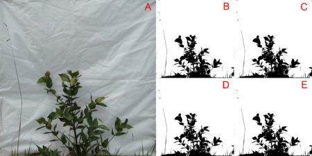
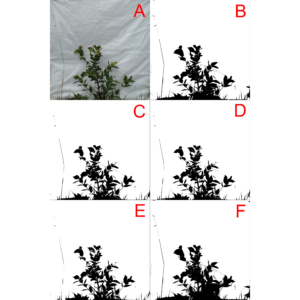
Transporting your image information to a matrix is the first step in any bwimage analysis. This step is critical for high quality analysis. The function threshold_color can be used to execute the thresholding process; with this function the averaged intensity of red, green and blue (or only just one channel if desired) is compared to a threshold (argument threshold_value). If the average intensity is less than the threshold (default is 50%) the pixel will be set as black, otherwise it will be white. In the output matrix, the value one represents black pixels, zero represents white pixels and NA represents transparent pixels. Figure 1 shows a comparison of threshold output when using all three channels in contrast to using just one channel (i.e. the effect of change argument channel).
Figure 1. The effect of using different color channels for thresholding a bush image. Figure A represents the original image. Figures B, C, D, and E, represent the output using all three channels, and just red, green and blue channels, respectively.
You can reproduce the threshold image by following the code:
In this first example, the overall variations in thresholding are hard to detect with a simple visual inspection. This is because the way images were produced create a high contrast between the vegetation and the white background. Later in this tutorial, more information about this image will be presented. For a clear visual difference in the effect of change argument channel, let us repeat the thresholding process with two new images with more extreme color channel contrasts: sunflower (Figure 2), and Brazilian flag (Figure 3).
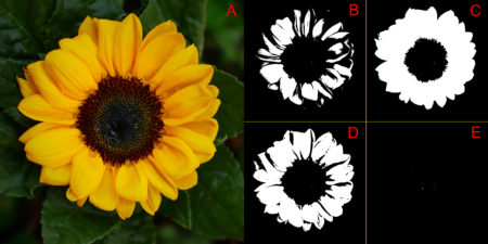
Figure 2. The effect of using different color channels for thresholding a sunflower image. Figure A represents the original image. Figures B, C, D, and E, represent the output using all three channels, and just red, green and blue, respectively.Figure 3. The effect of using different color channels for thresholding a Brazilian flag image. Figure A represents the original image. Figures B, C, D, and E, represent the output using all three channels, and just red, green and blue, respectively.
You can reproduce the thresholding output of images 2 and 3, by changing the first line of the previous code for the following codes, and just follow the remaining code lines.
file_name="sunflower.JPG" # for figure 2
file_name="brazilian_flag.JPG" # for figure 03
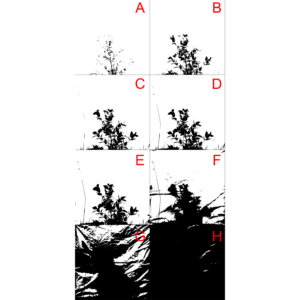
Another important parameter that can affect output quality is the threshold value used to define if the pixel must be converted to black or white (i.e. the argument threshold_value in function threshold_color). Figure 4 compares the effect of using different threshold limits in the threshold output of the same bush image processed above.
Figure 4 Comparison of different threshold values (i.e. threshold_value argument) to threshold a bush image. In this example, all color channels were considered, and thresholding values selected for images A to H, were 0.1,0.2,0.3,0.4,0.5,0.6,0.7,0.8 and 0.9, respectively.
You can reproduce the threshold image with the following code:
The bwimage package s threshold algorithm (described above) provides a simple, powerful and easy to understand process to convert colored images to a pure black and white scale. However, this algorithm was not designed to meet specific demands that may arise according to user applicability. Users interested in specific algorithms can use others R packages, such as auto_thresh_mask (Nolan 2019), to create a binary matrix to apply bwimage function. Below, we provide examples of how to apply four algorithms (IJDefault, Intermodes, Minimum, and RenyiEntropy) from the auto_thresh_mask function (auto_thresh_mask package – Nolan 2019), and use it to calculate vegetation density of the bush image (i.e. proportion of black pixels in relation to all pixels). I repeated the same analysis using bwimage algorithm to compare results. Figure 5 illustrates differences between image output from algorithms.
The calculated vegetation density for each algorithm was:
Algorithm
Vegetation density
IJDefault
0.1334882
Intermodes
0.1199355
Minimum
0.1136603
RenyiEntropy
0.1599628
Bwimage
0.1397852
For a description of each algorithms, check out the documentation of function auto_thresh_mask and its references.
?auto_thresh_mask
Figure 5 Comparison of thresholding output from the bush image using five algorithms. Image A represents the original image, and images from letters B to F, represent the output from thresholding of bwimage, IJDefault, Intermodes, Minimum, and RenyiEntropy algorithms, respectively.
You can reproduce the threshold image with the following code:
par(mar = c(0,0,0,0)) ## Remove the plot margin
image(t(bw_matrix)[,nrow(bw_matrix):1], col = c("white","black"), xaxt = "n", yaxt = "n")
image(t(bw_matrix)[,nrow(bw_matrix):1], col = c("white","black"), xaxt = "n", yaxt = "n")
image(t(IJDefault_matrix)[,nrow(IJDefault_matrix):1], col = c("white","black"), xaxt = "n", yaxt = "n")
image(t(Intermodes_matrix)[,nrow(Intermodes_matrix):1], col = c("white","black"), xaxt = "n", yaxt = "n")
image(t(Minimum_matrix)[,nrow(Minimum_matrix):1], col = c("white","black"), xaxt = "n", yaxt = "n")
image(t(RenyiEntropy_matrix)[,nrow(RenyiEntropy_matrix):1], col = c("white","black"), xaxt = "n", yaxt = "n")
dev.off()
If you applied the above functions, you may have noticed that high resolution images imply in large R objects that can be computationally heavy (depending on your GPU setup). The argument compress_method from threshold_color and threshold_image_list functions can be used to reduce the output matrix. It reduces GPU usage and time necessary to run analyses. But it is necessary to keep in mind that by reducing resolution the accuracy of data description will be lowered. To compare different resamplings, from a figure of 2500×2500 pixels, check out figure 2 from Biagolini-Jr and Macedo (2019) .
The available methods for image reduction are: i) frame_fixed, which resamples images to a desired target width and height; ii) proportional, which resamples the image by a given ratio provided in the argument “proportion”; iii) width_fixed, which resamples images to a target width, and also reduces the image height by the same factor. For instance, if the original file had 1000 pixels in width, and the new width_was set to 100, height will be reduced by a factor of 0.1 (100/1000); and iv) height_fixed, analogous to width_fixed, but assumes height as reference.
Distort images function
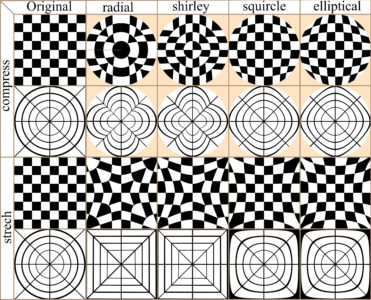
In many cases image distortion is intrinsic to image development, for instance global maps face a trade-off between distortion and the total amount of information that can be presented in the image. The bwimage package has two functions for distorting images (stretch and compress functions) which allow allow application of four different algorithms for mapping images, from circle to square and vice versa. Algorithms were adapted from Lambers (2016). Figure 6 compares image distortion of two images using stretch and compress functions, and all available algorithms.
Figure 6. Overview differences in the application of two distortion functions (stretch and compress) and all available algorithms.
You can reproduce distortion images with the following the code:
Canopy openness is one of the most common vegetation parameters of interest in field ecology surveys. Canopy openness can be calculated based on pictures on the ground or by an aerial system e.g. (Díaz and Lencinas 2018). Next, we demonstrate how to estimate canopy openness, using a picture taken on the ground. The photo setup is described in Biagolini-Jr and Macedo (2019). Canopy closure can be calculated by estimating the total amount of vegetation in the canopy. Canopy openness is equal to one minus the canopy closure. You can calculate canopy openness for the canopy image example (provide by bwimage package) using the following code:
For users interested in deeper analyses of canopy images, I also recommend the caiman package.
Describe vertical vegetation complexity
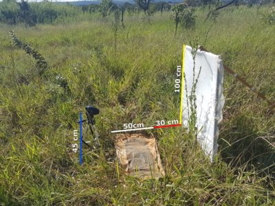
There are several metrics to describe vertical vegetation complexity that can be performed using a picture of a vegetation section against a white background, as described by Zehm et al. (2003). Part of the metrics presented by these authors were implemented in bwimage, and the following code shows how to systematically extract information for a set of 12 vegetation pictures. A description of how to obtain a digital image for the following methods is presented in Figure 7.
Figure 7. Illustration of setup to obtain a digital image for vertical vegetation complexity analysis. A vegetation section from a plot of 30 x 100 cm (red line), is photographed against a white cloth panel of 100 x 100 cm (yellow line) placed perpendicularly to the ground on the 100 cm side of the plot. A plastic canvas of 50x100cm (white line) was used to lower the vegetation along a narrow strip in front of a camera positioned on a tripod at a height of 45 cm (blue line).
As illustrated above, the first step to analyze images is to convert them into a binary matrix. You can use the function threshold_image_list to create a list for holding all binary matrices.
Once you obtain the list of matrices, you can use a loop or apply family functions to extract information from all images and save them into objects or a matrix. I recommend storing all image information in a matrix, and exporting this matrix as a csv file. It is easier to transfer information to another database software, such as an excel sheet. Below, I illustrate how to apply functions denseness_total, heigh_propotion_test, and altitudinal_profile, to obtain information on vegetation density, a logical test to calculate the height below which 75% of vegetation denseness occurs, and the average height of 10 vertical image sections and its SD (note: sizes expressed in cm).
answer_matrix=matrix(NA,ncol=4,nrow=length(image_matrix_list))
row.names(answer_matrix)=files_names
colnames(answer_matrix)=c("denseness", "heigh 0.75", "altitudinal mean", "altitudinal SD")
# Loop to analyze all images and store values in the matrix
for(i in 1:length(image_matrix_list)){
  answer_matrix[i,1]=denseness_total(image_matrix_list[[i]])
  answer_matrix[i,2]=heigh_propotion_test(image_matrix_list[[i]],proportion=0.75, height_size= 100)
  answer_matrix[i,3]=altitudinal_profile(image_matrix_list[[i]],n_sections=10, height_size= 100)[[1]]
  answer_matrix[i,4]=altitudinal_profile(image_matrix_list[[i]],n_sections=10, height_size= 100)[[2]]
}
Finally, we analyze information of holes data (i.e. vegetation gaps), in 10 image lines equally distributed among image (Zehm et al. 2003). For this purpose, we use function altitudinal_profile. Sizes are expressed in number of pixels.
# set a number of samples
nsamples=10
# create a matrix to receive calculated values
answer_matrix2=matrix(NA,ncol=7,nrow=length(image_matrix_list)*nsamples)
colnames(answer_matrix2)=c("Image name", "heigh", "N of holes", "Mean size", "SD","Min","Max")

# Loop to analyze all images and store values in the matrix
for(i in 1:length(image_matrix_list)){
  for(k in 1:nsamples){
  line_heigh= k* length(image_matrix_list[[i]][,1])/nsamples
  aux=hole_section_data(image_matrix_list[[i]][line_heigh,] )
  answer_matrix2[((i-1)*nsamples)+k ,1]=files_names[i]
  answer_matrix2[((i-1)*nsamples)+k ,2]=line_heigh
  answer_matrix2[((i-1)*nsamples)+k ,3:7]=aux
}}

write.table(answer_matrix2, file = "Image_data2.csv", sep = ",", col.names = NA, qmethod = "double")
Zehm A, Nobis M, Schwabe A (2003) Multiparameter analysis of vertical vegetation structure based on digital image processing. Flora-Morphology, Distribution, Functional Ecology of Plants 198:142-160 https://doi.org/10.1078/0367-2530-00086