After some years as a Stata user, I found myself in a new position where the tools available were SQL and SPSS. I was impressed by the power of SQL, but I was unhappy with going back to SPSS after five years with Stata.
Luckily, I got the go-ahead from my leaders at the department to start testing out R as a tool to supplement SQL in data handling.
This was in the beginning of 2020, and by March we were having a social gathering at our workplace. A Bingo night! Which turned out to be the last social event before the pandemic lockdown.
What better opportunity to learn a new programming language than to program some bingo cards! I learnt a lot from this little project.
It uses the packages grid and gridExtra to prepare and embellish the cards.
The function BingoCard draws the cards and is called from the function Bingo3. When Bingo3 is called it runs BingoCard the number of times necessary to create the requested number of sheets and stores the result as a pdf inside a folder defined at the beginning of the script.
All steps could have been added together in a single function. For instance, a more complete function could have included input for the color scheme of the cards, the number of cards on each sheet and more advanced features for where to store the results.
Still, this worked quite well, and was an excellent way of learning since it was both so much fun and gave me the opportunity to talk enthusiastically about R during Bingo Night.
library(gridExtra)
library(grid)
##################################################################
# Be sure to have a folder where results are stored
##################################################################
CardFolder <- "BingoCards"
if (!dir.exists(CardFolder)) {dir.create(CardFolder)}
##################################################################
# Create a theme to use for the cards
##################################################################
thema <- ttheme_minimal(
base_size = 24, padding = unit(c(6, 6), "mm"),
core=list(bg_params = list(fill = rainbow(5),
alpha = 0.5,
col="black"),
fg_params=list(fontface="plain",col="darkblue")),
colhead=list(fg_params=list(col="darkblue")),
rowhead=list(fg_params=list(col="white")))
##################################################################
## Define the function BingoCard
##################################################################
BingoCard <- function() {
B <- sample(1:15, 5, replace=FALSE)
I <- sample(16:30, 5, replace=FALSE)
N <- sample(31:45, 5, replace=FALSE)
G <- sample(46:60, 5, replace=FALSE)
O <- sample(61:75, 5, replace=FALSE)
BingoCard <- as.data.frame(cbind(B,I,N,G,O))
BingoCard[3,"N"]<-"X"
a <- tableGrob(BingoCard, theme = thema)
return(a)
}
##################################################################
## Define the function Bingo3
## The function has two arguments
## By default, 1 sheet with 3 cards is stored in the CardFolder
## The default name is "bingocards.pdf"
## This function calls the BingoCard function
##################################################################
Bingo3 <- function(NumberOfSheets=1, SaveFileName="bingocards") {
myplots <- list()
N <- NumberOfSheets*3
for (i in 1 : N ) {
a1 <- BingoCard()
myplots[[i]] <- a1
}
ml <- marrangeGrob(myplots, nrow=3, ncol=1,top="")
save_here <- paste0(CardFolder,"/",SaveFileName,".pdf")
ggplot2::ggsave(save_here, ml, device = "pdf", width = 210,
height = 297, units = "mm")
}
##################################################################
## Run Bingo3 with default values
##################################################################
Bingo3()
##################################################################
## Run Bingo3 with custom values
##################################################################
Bingo3(NumberOfSheets = 30, SaveFileName = "30_BingoCards")
WhatsApp is one of the most heavily used mobile instant messaging applications around the world. It is especially popular for everyday communication with friends and family and most users communicate on a daily or a weekly basis through the app. Interestingly, it is possible for WhatsApp users to extract a log file from each of their chats. This log file contains all textual communication in the chat that was not manually deleted or is not too far in the past.
This logging of digital communication is on the one hand interesting for researchers seeking to investigate interpersonal communication, social relationships, and linguistics, and can on the other hand also be interesting for individuals seeking to learn more about their own chatting behavior (or their social relationships).
The WhatsR R-package enables users to transform exported WhatsApp chat logs into a usable data frame object with one row per sent message and multiple variables of interest. In this blog post, I will demonstrate how the package can be used to process and visualize chat log files.
Installing the Package The package can either be installed via CRAN or via GitHub for the most up-to-date version. I recommend to install the GitHub version for the most recent features and bugfixes.
# from CRAN
# install.packages("WhatsR")

# from GitHub
devtools::install_github("gesiscss/WhatsR")
The package also needs to be attached before it can be used. For creating nicer plots, I recommend to also install and attach the patchwork package.
Obtaining a Chat Log You can export one of your own chat logs from your phone to your email address as explained in this tutorial. If you do this, I recommend to use the “without media” export option as this allows you to export more messages.
If you don’t want to use one of your own chat logs, you can create an artificial chat log with the same structure as a real one but with made up text using the WhatsR package!
## creating chat log for demonstration purposes

# setting seed for reproducibility
set.seed(1234)

# simulating chat log
# (and saving it automatically as a .txt file in the working directory)
create_chatlog(n_messages = 20000,
               n_chatters = 5,
               n_emoji = 5000,
               n_diff_emoji = 50,
               n_links = 999,
               n_locations = 500,
               n_smilies = 2500,
               n_diff_smilies = 10,
               n_media = 999,
               n_sdp = 300,
               startdate = "01.01.2019",
               enddate = "31.12.2023",
               language = "english",
               time_format = "24h",
               os = "android",
               path = getwd(),
               chatname = "Simulated_WhatsR_chatlog")
Parsing Chat Log File Once you have a chat log on your device, you can use the WhatsR package to import the chat log and parse it into a usable data frame structure.
data <- parse_chat("Simulated_WhatsR_chatlog.txt", verbose = TRUE)
Checking the parsed Chat Log You should now have a data frame object with one row per sent message and 19 variables with information extracted from the individual messages. For a detailed overview what each column contains and how it is computed, you can check the related open source publication for the package. We also add a tabular overview here.
## Checking the chat log
dim(data)
colnames(data)
Column Name
Description
DateTime
Timestamp for date and time the message was sent. Formatted as yyyy-mm-dd hh:mm:ss
Sender
Name of the sender of the message as saved in the contact list of the exporting phone or telephone number. Messages inserted by WhatsApp into the chat are coded with “WhatsApp System Message”
Message
Text of user-generated messages with all information contained in the exported chat log
Flat
Simplified version of the message with emojis, numbers, punctuation, and URLs removed. Better suited for some text mining or machine learning tasks
TokVec
Tokenized version of the Flat column. Instead of one text string, each cell contains a list of individual words. Better suited for some text mining or machine learning tasks
URL
A list of all URLs or domains contained in the message body
Media
A list of all media attachment filenames contained in the message body
Location
A list of all shared location URLs or indicators in the message body, or indicators for shared live locations
Emoji
A list of all emoji glyphs contained in the message body
EmojiDescriptions
A list of all emojis as textual representations contained in the message body
Smilies
A list of all smileys contained in the message body
SystemMessage
Messages that are inserted by WhatsApp into the conversation and not generated by users
TokCount
Amount of user-generated tokens per message
TimeOrder
Order of messages as per the timestamps on the exporting phone
DisplayOrder
Order of messages as they appear in the exported chat log
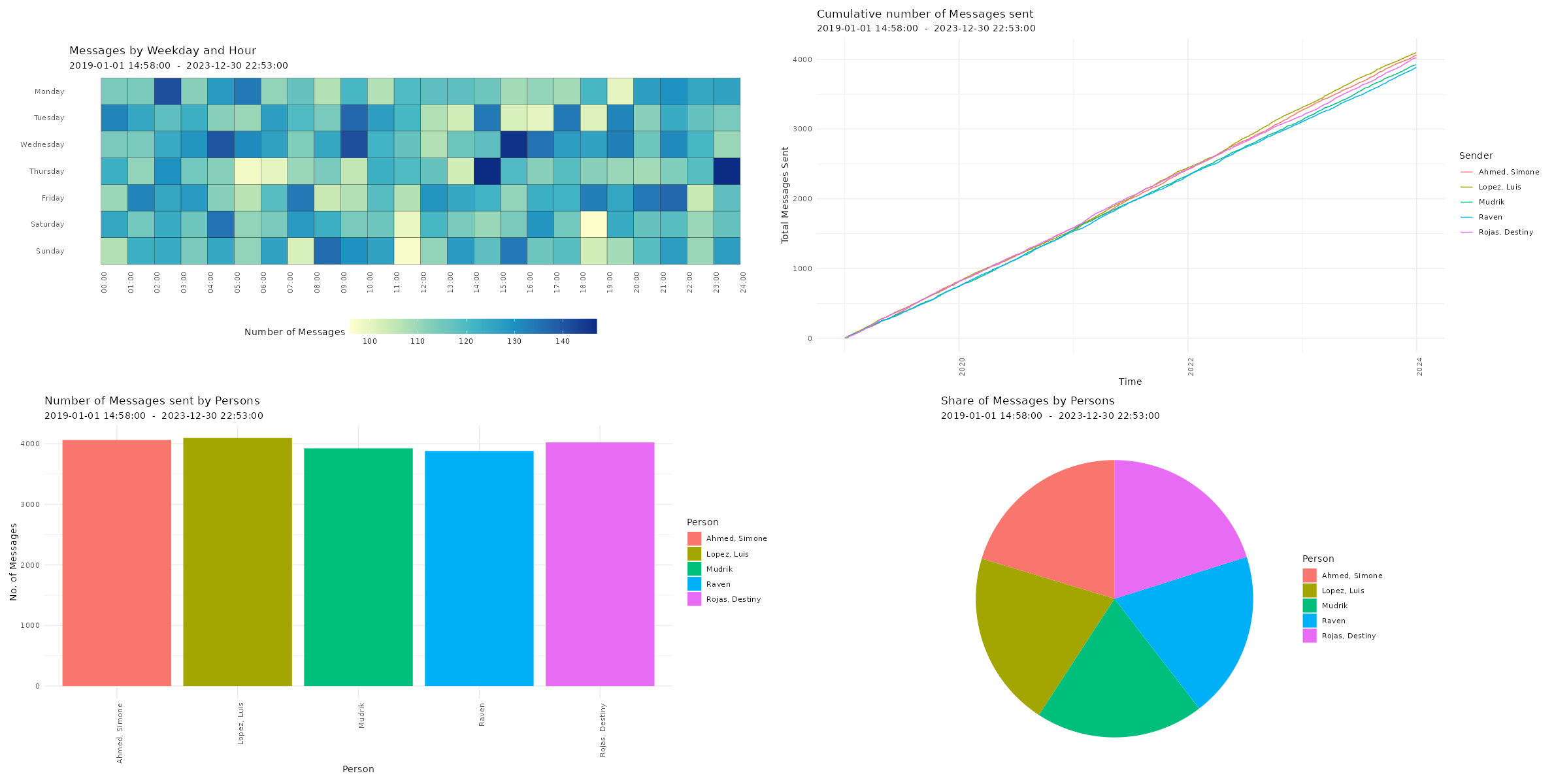
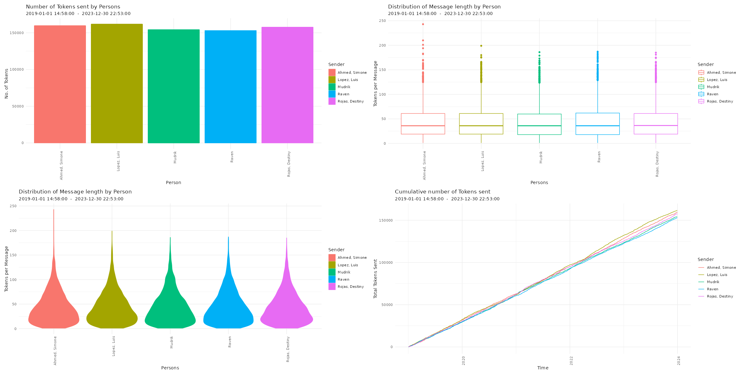
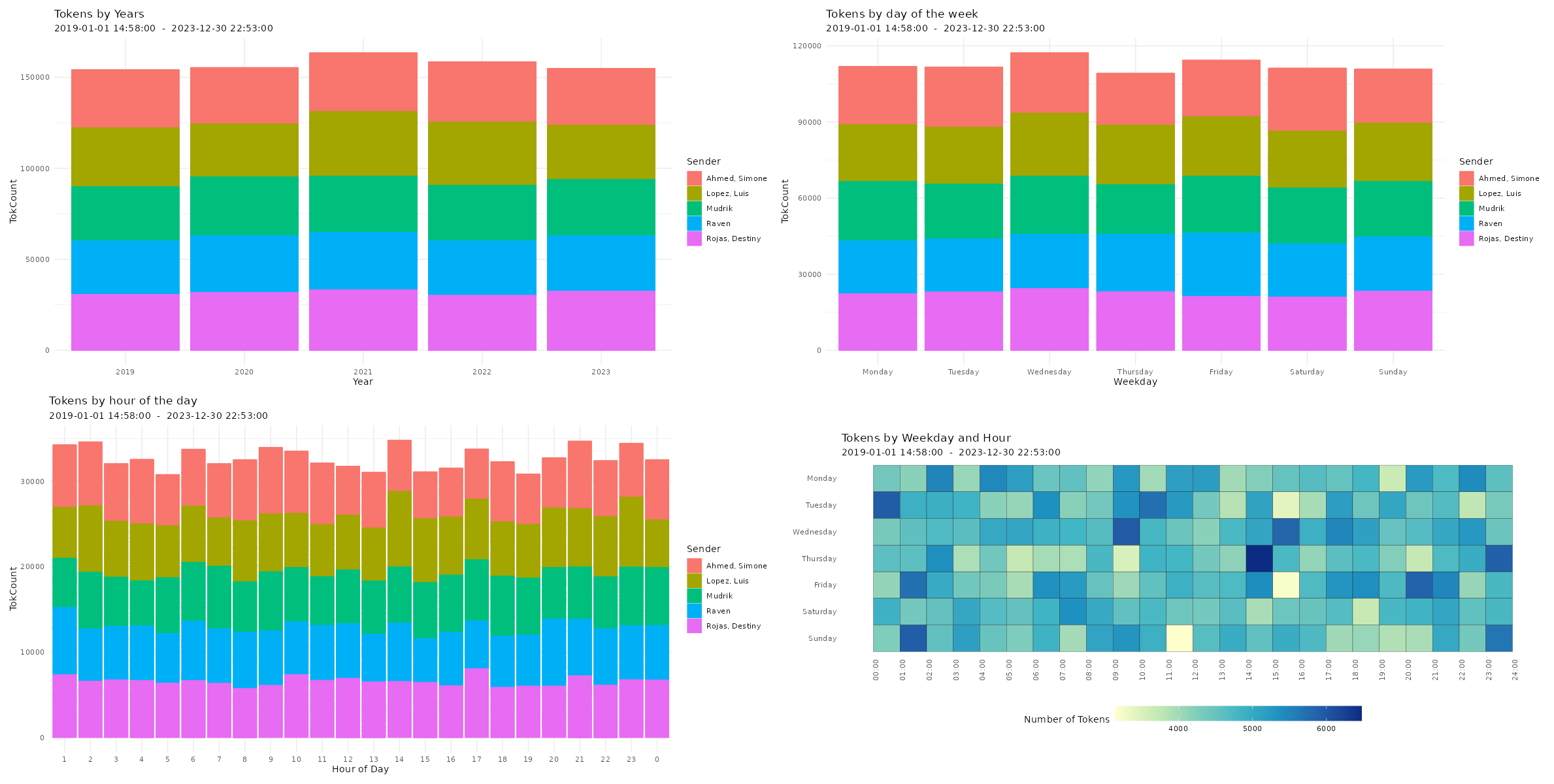
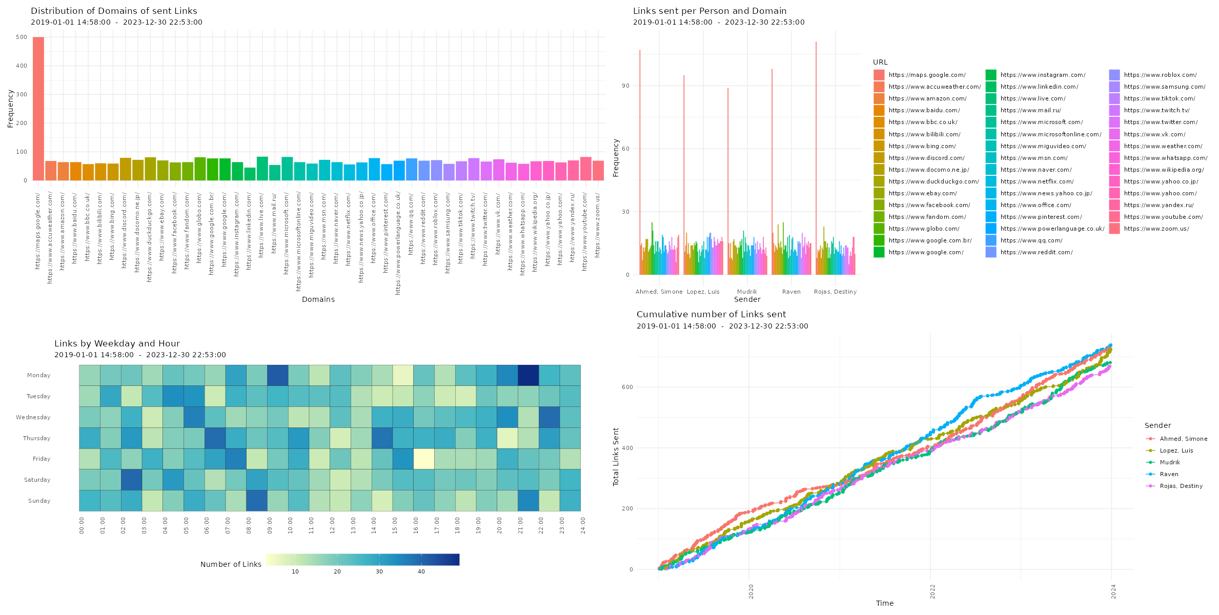
Checking Descriptives of Chat Logs Now, you can have a first look at the overall statistics of the chat log. You can check the number of messages, sent tokens, number of chat participants, date of first message, date of last message, the timespan of the chat, and the number of emoji, smilies, links, media files, as well as locations in the chat log.
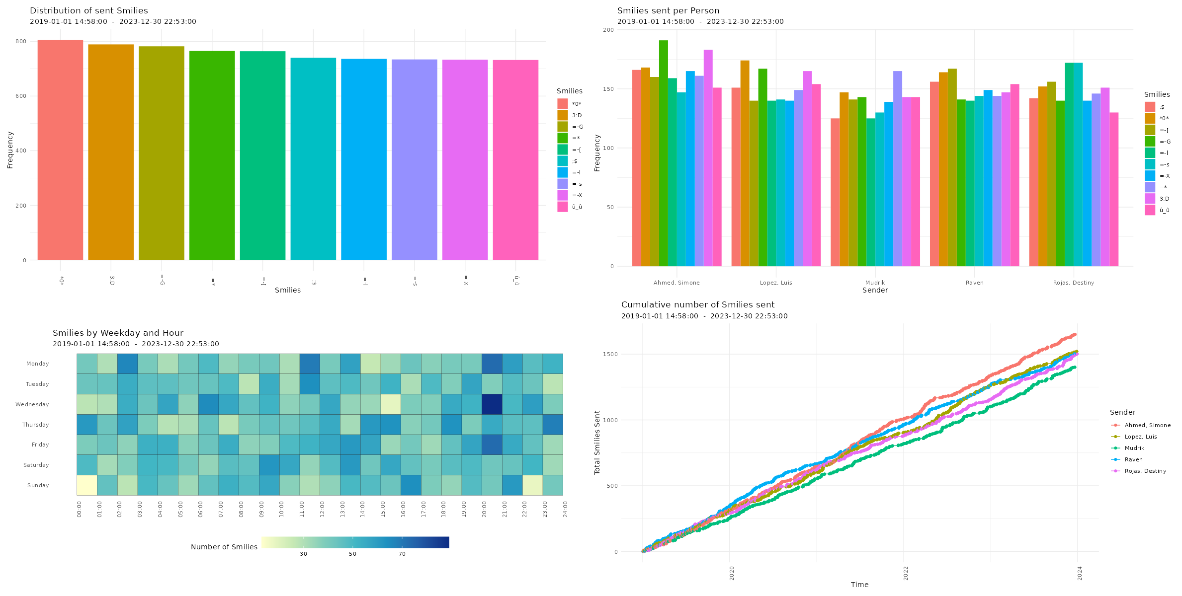
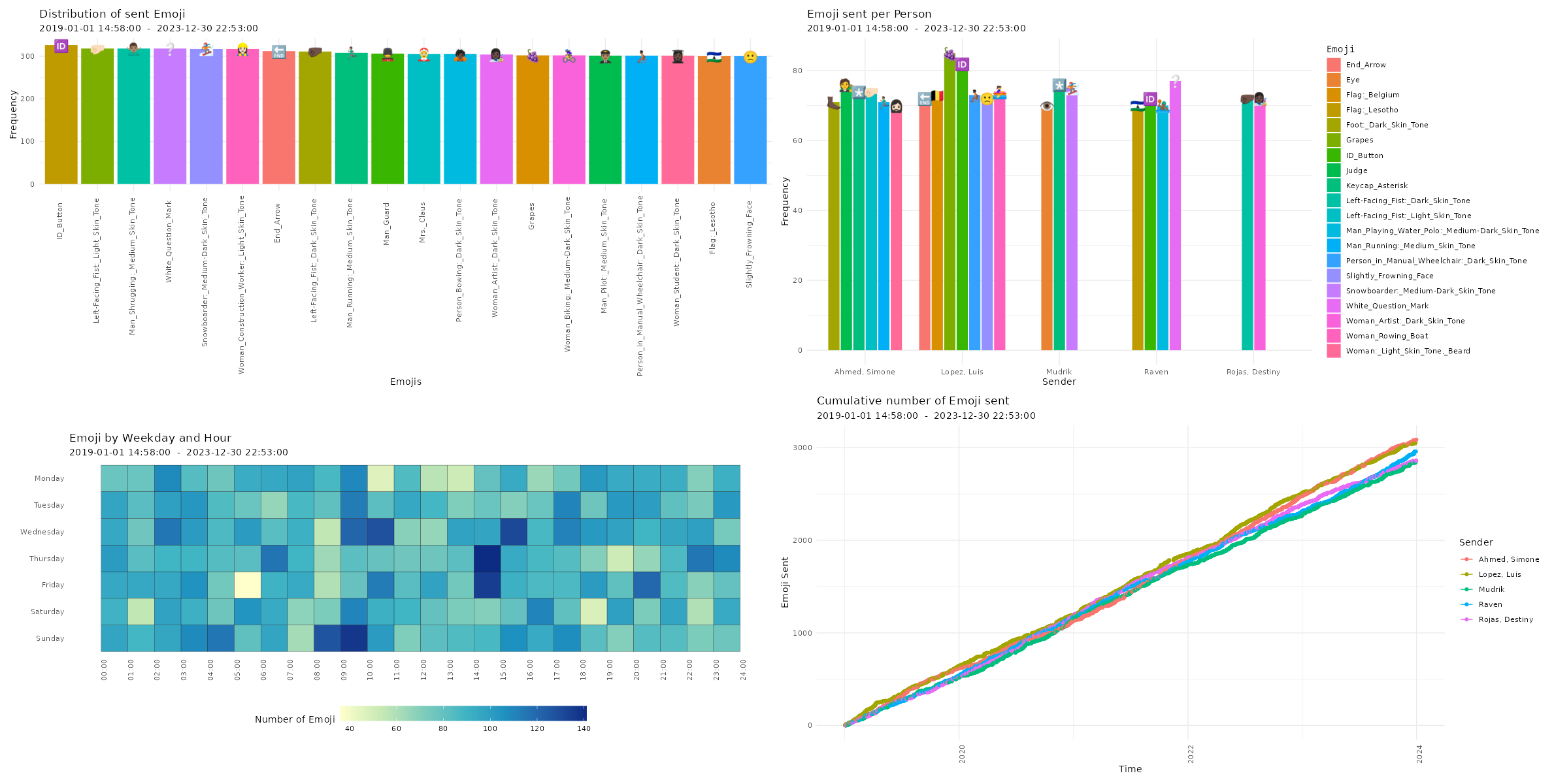
Visualizing Chat Logs The chat characteristics can now be visualized using the custom functions from the WhatsR package. These functions are basically wrappers to ggplot2 with some options for customizing the plots. Most plots have multiple ways of visualizing the data. For the visualizations, we can exclude the WhatsApp System Messages using ‘exclude_sm= TRUE’. Lets try it out:
Four different ways of visualizing the amount of sent emoji in a WhatsApp chat log. Click image to zoom in. Distribution of reaction times
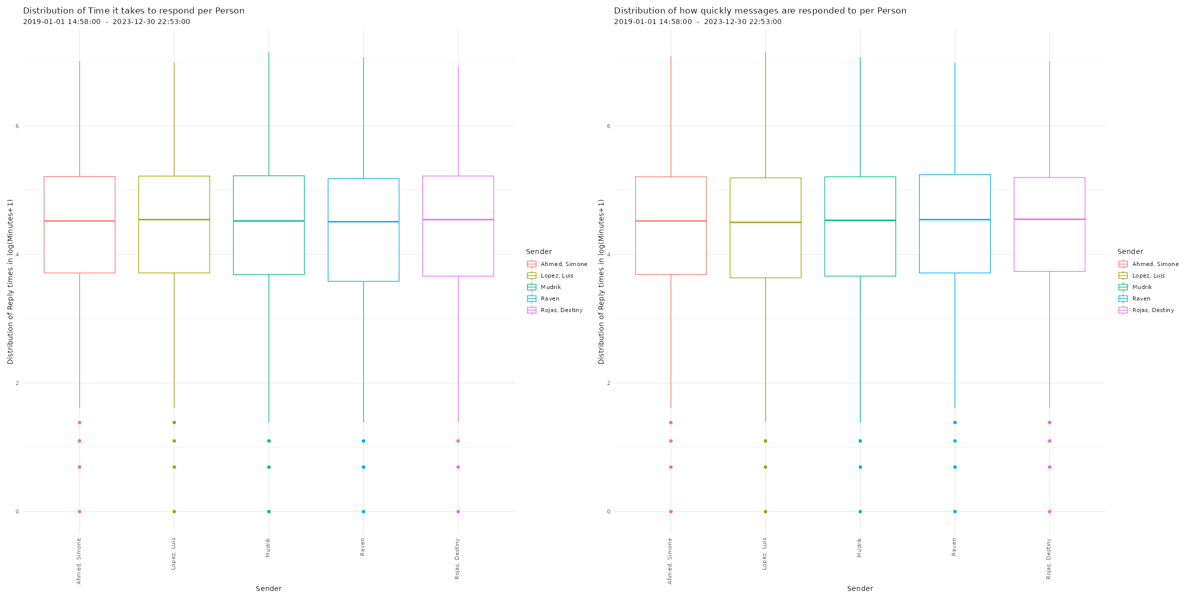
# Plotting distribution of reaction times
p26 <- plot_replytimes(data,
                       type = "replytime",
                       exclude_sm = TRUE)
p27 <- plot_replytimes(data,
                       type = "reactiontime",
                       exclude_sm = TRUE)

# Printing plots with patchwork package
free(p26) | free(p27)
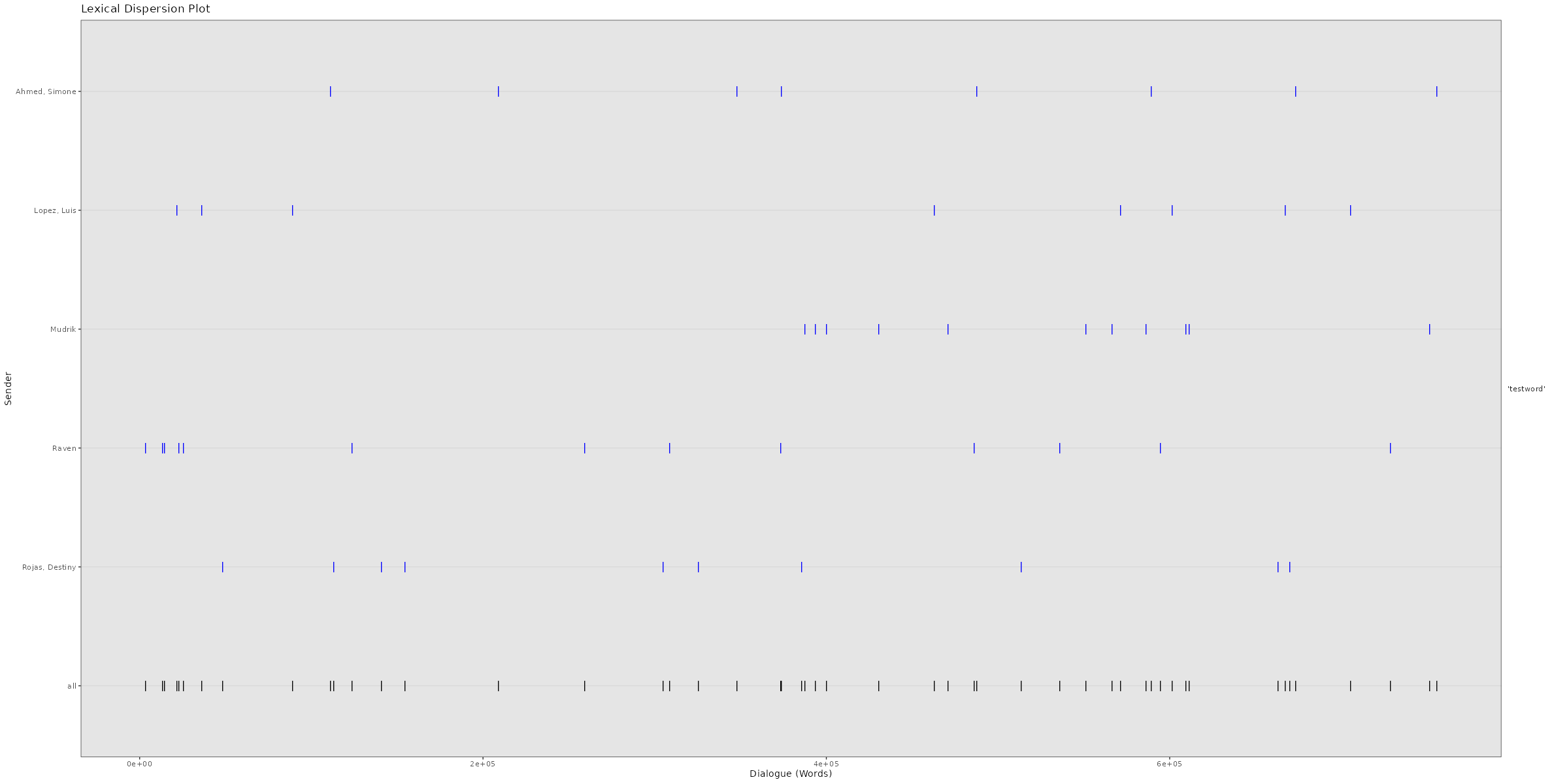
Average response times and times it takes to answer to messages for each individual chat participant in a WhatsApp chat log. Click image to zoom in. Lexical Dispersion A lexical dispersion plot is a visualization of where specific words occur within a text corpus. Because the simulated chat log in this example is using lorem ipsum text where all words occur similarly often, we add the string “testword” to a random subsample of messages. For visualizing real chat logs, this would of course not be necessary.
# Adding "testword" to random subset of messages for demonstration         # purposes
set.seed(12345)
word_additions <- sample(dim(data)[1],50)
data$TokVec[word_additions]
sapply(data$TokVec[word_additions],function(x){c(x,"testword")})
data$Flat[word_additions] <- sapply(data$Flat[word_additions],
  function(x){x <- paste(x,"testword");return(x)})
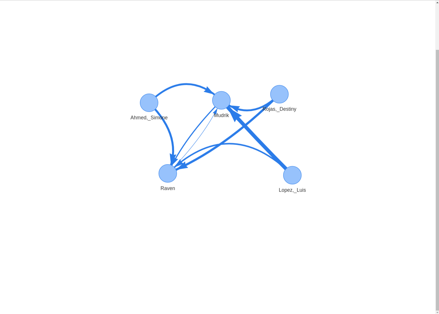
Network graph showing how often each chat participant directly responded to the previous messages (a subsequent message is counted as a “response” here). Click image to zoom in.
Issues and long-term availability.
Unfortunately, WhatsApp chat logs are a moving target when it comes to plotting and visualization. The structure of exported WhatsApp chat logs keeps changing from time to time. On top of that, the structure of chat logs is different for chats exported from different operating systems (Android & iOS) and for different time (am/pm vs. 24h format) and language (e.g. English & German) settings on the exporting phone. When the structure changes, the WhatsR package can be limited in its functionality or become completely dysfunctional until it is updated and tested. Should you encounter any issues, all reports on the GitHub issues page are welcome. Should you want to contribute to improving on or maintaining the package, pull requests and collaborations are also welcome!
As many Qualtrics surveys produce really similar output datasets, I created a tutorial with the most common steps to clean and filter data from datasets directly downloaded from Qualtrics.
You will also find some useful codes to handle data such as creating new variables in the dataframe from existing variables with functions and logical operators.
The tutorial is presented in the format of a downloadable R code with explanations and annotations of each step. You will also find a raw Qualtrics dataset to work with.
This dataset comes from a Qualtrics survey with an experiment format (control and treatment conditions), but the codes can be applicable to non-experimental datasets as well, as many cleaning steps are the same.
This is Part One of a three part tutorial series originally published on the DataCamp online learning platform in which you will use R to perform a variety of analytic tasks on a case study of musical lyrics by the legendary artist, Prince. The three tutorials cover the following:
Part Three: Predictive Analytics using Machine Learning (intermediate -advanced)
Musical lyrics may represent an artist’s perspective, but popular songs reveal what society wants to hear. Lyric analysis is no easy task. Because it is often structured so differently than prose, it requires caution with assumptions and a uniquely discriminant choice of analytic techniques. Musical lyrics permeate our lives and influence our thoughts with subtle ubiquity. The concept ofPredictive Lyricsis beginning to buzz and is more prevalent as a subject of research papers and graduate theses. This case study will just touch on a few pieces of this emerging subject.
Prince: The Artist
To celebrate the inspiring and diverse body of work left behind by Prince, you will explore the sometimes obvious, but often hidden, messages in his lyrics. However, you don’t have to like Prince’s music to appreciate the influence he had on the development of many genres globally. Rolling Stone magazinelistedPrince as the 18th best songwriter of all time, just behind the likes of Bob Dylan, John Lennon, Paul Simon, Joni Mitchell and Stevie Wonder. Lyric analysis is slowly finding its way into data science communities as the possibility of predicting “Hit Songs” approaches reality.
Prince was a man bursting with music – a wildly prolific songwriter, a virtuoso on guitars, keyboards and drums and a master architect of funk, rock, R&B and pop, even as his music defied genres. – Jon Pareles (NY Times)
In this tutorial, Part One of the series, you’ll utilize text mining techniques on a set of lyrics using the tidy text framework. Tidy datasets have a specific structure in which each variable is a column, each observation is a row, and each type of observational unit is a table. After cleaning and conditioning the dataset, you will create descriptive statistics and exploratory visualizations while looking at different aspects of Prince’s lyrics.
Data visualization and charting are actively evolving as a more and more important field of web development. In fact, people perceive information much better when it is represented graphically rather than numerically as raw data. As a result, various business intelligence apps, reports, and so on widely implement graphs and charts to visualize and clarify data and, consequently, to speed up and facilitate its analysis for further decision making.
While there are many ways you can follow to handle data visualization in R, today let’s see how to create interactive charts with the help of popular JavaScript (HTML5) charting library AnyChart. It has recently got an official R, Shiny and MySQL template that makes the whole process pretty straightforward and easy. (Disclaimer: I am the CTO at the AnyChart team. The template I am talking about here is released under the Apache 2.0 license; the library itself can be used for free in any personal, educational and other non-profit projects and is open on GitHub, but for commercial purposes it requires a commercial license though is fully functional when taken on a free trial.)
In this step-by-step tutorial, we will take a closer look at the template and the basic pie chart example it includes, and then I will show you how to quickly modify it to get some different data visualization, e.g. a 3D column (vertical bar) chart.
Briefly about AnyChart
AnyChart is a flexible, cross-browser JS charting library for adding interactive charts to websites and web apps in quite a simple way. Basically, it does not require any installations and work with any platform and database. Some more of AnyChart’s features include (but are not limited to):
a plenty of ready-to-use chart samples, making first steps with this library easy;
the appearance of all the graphics and of a variety of additional elements is greatly customizable.
Templates for popular technology stacks, like R, Shiny and MySQL in the present case, can further facilitate AnyChart’s integration.
Getting started
First of all, let’s make sure the R language is installed. If not, you can visit the official R website and follow the instructions.
If you have worked with R before, most likely you already have RStudio. Then you are welcome to create a project in it now, because the part devoted to R can be done there. If currently you do not have RStudio, you are welcome to install it from the official RStudio website. But, actually, using RStudio is not mandatory, and the pad will be enough in our case.
After that, we should check if MySQL is properly installed. To do that, you can open a terminal window and enter the next command:
$ mysql –version
mysql Ver 14.14 Distrib 5.7.16, for Linux (x86_64) using EditLine wrapper
You should receive the above written response (or a similar one) to be sure all is well. Please follow these instructions to install MySQL, if you do not have it at the moment.
Now that all the required components have been installed, we are ready to write some code for our example.
Basic template
First, to download the R, Shiny and MySQL template for AnyChart, type the next command in the terminal:
$ git clone https://github.com/anychart-integrations/r-shiny-mysql-template.git
The folder you are getting here features the following structure:
r-shiny-mysql-template/
www/
css/
style.css # css style
app.R # main application code
database_backup.sql # MySQL database dump
LICENSE
README.md
index.html # html template
Let’s take a look at the project files and examine how this sample works. We’ll run the example first.
Open the terminal and go to the repository folder:
$ cd r-shiny-mysql-template
Set up the MySQL database. To specify your username and password, make use of -u and -p flags:
$ mysql < database_backup.sql
Then run the R command line, using the command below:
$ R
And install the Shiny and RMySQL packages as well as initialize the Shiny library at the end:
> install.packages("shiny")
> install.packages("RMySQL")
> library(shiny)
If you face any problems during the installation of these dependencies, carefully read error messages, e.g. you might need sudo apt-get install libmysqlclient-dev for installing RMySQL.
Finally, run the application:
> runApp("{PATH_TO_TEMPLATE}") # e.g. runApp("/workspace/r-shiny-mysql-template")
And the new tab that should have just opened in your browser shows you the example included in the template:
Basic template: code
Now, let’s go back to the folder with our template to see how it works.
Files LICENSE and README.md contain information about the license and the template (how to run it, technologies, structure, etc.) respectively. They are not functionally important to our project, and therefore we will not explore them here. Please check these files by yourself for a general understanding.
The style.css file is responsible for the styles of the page.
The database_backup.sql file contains a code for the MySQL table and user creation and for writing data to the table. You can use your own table or change the data in this one.
Let’s move on to the code. First, open the app.R file. This file ensures the connection to the MySQL database, reads data, and passes it to the index.html file, which contains the main code of using AnyChart. The following is a part of the app.R code, which contains the htmlTemplate function; here we specify the name of the file where the data will be transmitted to, the names of our page and chart, and the JSON encoded chart data from MySQL database.
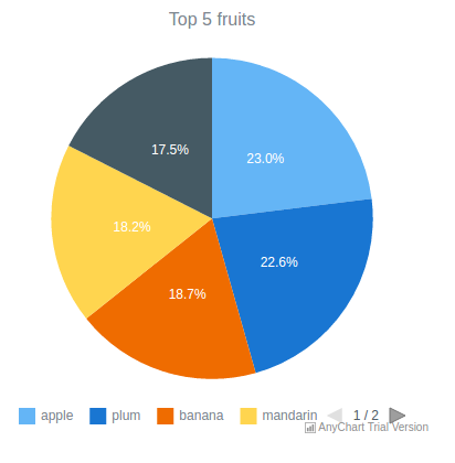
htmlTemplate("index.html",
title = "Anychart R Shiny template",
chartTitle = shQuote("Top 5 fruits"),
chartData = toJSON(loadData())
The main thing here is the index.html file, which is actually where the template for creating charts is. As you see, the first part of this file simply connects all necessary files to the code, including the AnyChart library, the CSS file with styles, and so on. I’ll skip this for now and proceed directly to the script tag and the anychart.onDocumentReady (function () {...}) function.
[code lang=”javascript”]
anychart.onDocumentReady(function() {
var chart = anychart.pie({{ chartData }});
chart.title({{ chartTitle }});
chart.container("container");
chart.draw();
});
This pattern works as follows. We create a pie chart by using the function pie() and get the data that have already been read and prepared using the R code. Please note that the names of the variables containing data are the same in the app.R and index.html files. Then we display the chart title via (chart.title({{ chartTitle }})) and specify the ID of the element that will contain a chart, which is a div with id = container in this case. To show all that was coded, we use сhart.draw().
Modifying the template to create a custom chart
Now that we’ve explored the basic example included in the template, we can move forward and create our own, custom interactive chart. To do that, we simply need to change the template a little bit and add some features if needed. Let’s see how it works.
First, we create all the necessary files by ourselves or make a new project using RStudio.
Second, we add a project folder named anychart. Its structure should look like illustrated below. Please note that some difference is possible (and acceptable) if you are using a new project in RStudio.
anychart/
www/
css/
style.css # css style
ui.R # main application code
server.R # sub code
database_backup.sql # data set
index.html # html template
Now you know what files you need. If you’ve made a project with the studio, the ui.R and server.R files are created automatically. If you’ve made a project by yourself, just create empty files with the same names and extensions as specified above.
The main difference from the original example included in the template is that we should change the file index.html and divide app.R into parts. You can copy the rest of the files or create new ones for your own chart.
Please take a look at the file server.R. If you’ve made a project using the studio, it was created automatically and you don’t need to change anything in it. However, if you’ve made it by yourself, open it in the Notepad and add the code below, which is standard for the Shiny framework. You can read more about that here.
The file structure of ui.R is similar to the one of app.R, so you can copy app.R from the template and change/add the following lines:
loadData = dbGetQuery(db, "SELECT name, value FROM fruits")
data1 <- character()
#data preparation
for(var in 1:nrow(loadData)){
c = c(as.character(loadData[var, 1]), loadData[var, 2])
data1 <- c(data1, c)
}
data = matrix(data1, nrow=nrow(loadData), ncol=2, byrow=TRUE)
ui = function(){
htmlTemplate("index.html",
title = "Anychart R Shiny template",
chartTitle = shQuote("Fruits"),
chartData = toJSON(data)
)}
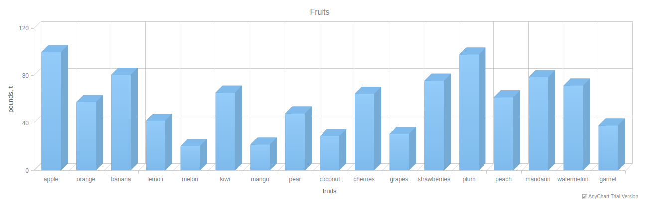
Since we are going to change the chart type, from pie to 3D vertical bar (column), the data needs some preparation before being passed to index.html. The main difference is that we will use the entire data from the database, not simply the top 5 positions.
We will slightly modify and expand the basic template. Let’s see the resulting code of the index.html first (the script tag) and then explore it.
[code lang=”javascript”]
anychart.onDocumentReady(function() {
var chart = anychart.column3d({{ chartData }});
chart.title({{ chartTitle }});
chart.animation(true);
var xAxis = chart.xAxis();
xAxis.title("fruits");
var yAxis = chart.yAxis();
yAxis.title("pounds, t");
var yScale = chart.yScale();
yScale.minimum(0);
yScale.maximum(120);
chart.container("container");
chart.draw();
});
With the help of var chart = anychart.column3d({{chartData}}), we are creating a 3D column chart by using the function column3d(). Here you can choose any other chart type you need; consider getting help from Chartopedia if you are unsure which one works best in your situation.
Next, we are adding animation to the column chart via chart.animation (true) to make it appear on page load gradually.
In the following section, we are creating two variables, xAxis and yAxis. Including these is required if you want to provide the coordinate axes of the chart with captions. So, you should create variables that will match the captions for the X and Y axes, and then use the function, transmit the values that you want to see.
The next unit is basically optional. We are explicitly specifying the maximum and minimum values for the Y axis, or else AnyChart will independently calculate these values. You can do that the same way for the X axis.
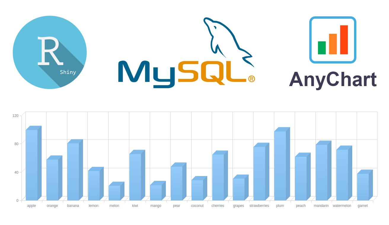
And that’s it! Our 3D column chart is ready, and all seems to be fine for successfully running the code. The only thing left to do before that is to change the MySQL table to make it look as follows:
(‘apple’,100),
(‘orange’,58),
(‘banana’,81),
(‘lemon’,42),
(‘melon’,21),
(‘kiwi’,66),
(‘mango’,22),
(‘pear’,48),
(‘coconut’,29),
(‘cherries’,65),
(‘grapes’,31),
(‘strawberries’,76),
To see what you’ve got, follow the same steps as for running the R, Shiny and MySQL template example, but do not forget to change the path to the folder and the folder name to anychart. So, let’s open the terminal and command the following:
$ cd anychart
$ mysql < database_backup.sql
$ R
> install.packages("shiny")
> install.packages("RMySQL")
> library(shiny)
> runApp("{PATH_TO_TEMPLATE}") # e.g. runApp("/workspace/anychart")
For consistency purposes, I am including the code of ui.R and server.R below. The full source code of this example can be found on GitHub.
ui.R:
library(shiny)
library(RMySQL)
library(jsonlite)
data1 <- character()
db = dbConnect(MySQL(),
dbname = "anychart_db",
host = "localhost",
port = 3306,
user = "anychart_user",
password = "anychart_pass")
loadData = dbGetQuery(db, "SELECT name, value FROM fruits")
#data preparation
for(var in 1:nrow(loadData)){
c = c(as.character(loadData[var, 1]), loadData[var, 2])
data1 <- c(data1, c)
}
data = matrix(data1, nrow=nrow(loadData), ncol=2, byrow=TRUE)
server = function(input, output){}
ui = function(){
htmlTemplate("index.html",
title = "Anychart R Shiny template",
chartTitle = shQuote("Fruits"),
chartData = toJSON(data)
)}
shinyApp(ui = ui, server = server)
server.R:
library(shiny)
shinyServer(function(input, output) {
output$distPlot <- renderPlot({
# generate bins based on input$bins from ui.R
x <- faithful[, 2]
bins <- seq(min(x), max(x), length.out = input$bins + 1)
# draw the chart with the specified number of bins
hist(x, breaks = bins, col = ‘darkgray’, border = ‘white’)
})
})
Conclusion
When your technology stack includes R, Shiny and MySQL, using AnyChart JS with the integration template we were talking about in this tutorial requires no big effort and allows you to add beautiful interactive JavaScript-based charts to your web apps quite quickly. It is also worth mentioning that you can customize the look and feel of charts created this way as deeply as needed by using some of the library’s numerous out-of-the-box features: add or remove axis labels, change the background color and how the axis is positioned, leverage interactivity, and so on.
The scope of this tutorial is likely to be actually even broader, because the process I described here not only applies to the AnyChart JS charting library, but also is mostly the same for its sister libraries AnyMap (geovisualization in maps), AnyStock (date/time graphs), and AnyGantt (charts for project management). All of them are free for non-profit projects but – I must put it clearly here again just in case – require a special license for commercial use.
I hope you find this article helpful in your activities when it comes to interactive data visualization in R. Now ask your questions, please, if any.

 Data visualization and charting are actively evolving as a more and more important field of web development. In fact, people perceive information much better when it is represented graphically rather than numerically as raw data. As a result, various business intelligence apps, reports, and so on widely implement graphs and charts to visualize and clarify data and, consequently, to speed up and facilitate its analysis for further decision making.
While there are many ways you can follow to handle data visualization in R, today let’s see how to create interactive charts with the help of popular JavaScript (HTML5) charting library AnyChart. It has recently got an official R, Shiny and MySQL template that makes the whole process pretty straightforward and easy. (Disclaimer: I am the CTO at the AnyChart team. The template I am talking about here is released under the Apache 2.0 license; the library itself can be used for free in any personal, educational and other non-profit projects and is open on GitHub, but for commercial purposes it requires a commercial license though is fully functional when taken on a free trial.)
In this step-by-step tutorial, we will take a closer look at the template and the basic pie chart example it includes, and then I will show you how to quickly modify it to get some different data visualization, e.g. a 3D column (vertical bar) chart.
Data visualization and charting are actively evolving as a more and more important field of web development. In fact, people perceive information much better when it is represented graphically rather than numerically as raw data. As a result, various business intelligence apps, reports, and so on widely implement graphs and charts to visualize and clarify data and, consequently, to speed up and facilitate its analysis for further decision making.
While there are many ways you can follow to handle data visualization in R, today let’s see how to create interactive charts with the help of popular JavaScript (HTML5) charting library AnyChart. It has recently got an official R, Shiny and MySQL template that makes the whole process pretty straightforward and easy. (Disclaimer: I am the CTO at the AnyChart team. The template I am talking about here is released under the Apache 2.0 license; the library itself can be used for free in any personal, educational and other non-profit projects and is open on GitHub, but for commercial purposes it requires a commercial license though is fully functional when taken on a free trial.)
In this step-by-step tutorial, we will take a closer look at the template and the basic pie chart example it includes, and then I will show you how to quickly modify it to get some different data visualization, e.g. a 3D column (vertical bar) chart.
 For consistency purposes, I am including the code of