How to Perform Ordinal Logistic Regression in R

In this article, we discuss the basics of ordinal logistic regression and its implementation in R. Ordinal logistic regression is a widely used classification method, with applications in variety of domains. This method is the go-to tool when there is a natural ordering in the dependent variable. For example, dependent variable with levels low, medium, high is a perfect context for application of logistic ordinal regression.

Having wide range of applicability, ordinal logistic regression is considered as one of the most admired methods in the field of data analytics. The method is also known as proportional odds model because of the transformations used during estimation and the log odds interpretation of the output. We hope that this article helps our readers to understand the basics and implement the model in R.

The article is organized as follows: focusing on the theoretical aspects of the technique, section 1 provides a quick review of ordinal logistic regression. Section 2 discusses the steps to perform ordinal logistic regression in R and shares R script. In addition, section 2 also covers the basics of interpretation and evaluation of the model on R. In section 3, we learn a more intuitive way to interpret the model. Section 4 concludes the article.

Basics of ordinal logistic regression
Ordinal logistic regression is an extension of simple logistic regression model. In simple logistic regression, the dependent variable is categorical and follows a Bernoulli distribution. (for a quick reference check out this article by perceptive analytics – https://www.kdnuggets.com/2017/10/learn-generalized-linear-models-glm-r.html). Whereas, in ordinal logistic regression the dependent variable is ordinal i.e. there is an explicit ordering in the categories. For example, during preliminary testing of a pain relief drug, the participants are asked to express the amount of relief they feel on a five point Likert scale. Another common example of an ordinal variable is app ratings. On google play, customers are asked to rate apps on a scale ranging from 1 to 5. Ordinal logistic regression becomes handy in the aforementioned examples as there is a clear order in the categorical dependent variable.

In simple logistic regression, log of odds that an event occurs is modeled as a linear combination of the independent variables. But, the above approach of modeling ignores the ordering of the categorical dependent variable. Ordinal logistic regression model overcomes this limitation by using cumulative events for the log of the odds computation. It means that unlike simple logistic regression, ordinal logistic models consider the probability of an event and all the events that are below the focal event in the ordered hierarchy. For example, the event of interest in ordinal logistic regression would be to obtain an app rating equal to X or less than X.  For example, the log of odds for the app rating less than or equal to 1 would be computed as follows:

LogOdds rating<1 = Log (p(rating=1)/p(rating>1)  [Eq. 1]
Likewise, the log of odds can be computed for other values of app ratings.  The computations for other ratings are below: LogOdds rating<2 = Log (p(rating<=2)/p(rating>2)  [Eq. 2] LogOdds rating<3 = Log (p(rating<=3)/p(rating>3)  [Eq. 3] LogOdds rating<4 = Log (p(rating=4)/p(rating>4)  [Eq. 4]

Because all the ratings below the focal score are considered in computation, the highest app rating of 5 will include all the ratings below it and does not have a log of odds associated with it. In general, the ordinal regression model can be represented using the LogOdds computation.

LogoddsYαi+ β1X12X2 +….. +βnXn

where,
Y is the ordinal dependent variable
i is the number of categories minus 1
X1, X2,…. Xn  are independent variables. They can be measured on nominal, ordinal or continuous measurement scale.
β1, β2,… βare estimated parameters For i ordered categories, we obtain i – 1 equations. The proportional odds assumption implies that the effect of independent variables is identical for each log of odds computation. But, this is not the case for intercept  as the intercept takes different values for each computation. Besides the proportional odds assumption, the ordinal logistic regression model assumes an ordinal dependent variable and absence of multicollinearity. Absence of multicollinearity means that the independent variables are not significantly correlated. These assumptions are important as their violation makes the computed parameters unacceptable.

Model building in R
In this section, we describe the dataset and implement ordinal logistic regression in R. We use a simulated dataset for analysis. The details of the variables are as follows. The objective of the analysis is to predict the likelihood of each level of customer purchase. The dependent variable is the likelihood of repeated purchase by customers. The variable is measured in an ordinal scale and can be equal to one of the three levels – low probability, medium probability, and high probability. The independent variables are measures of possession of coupon by the focal customer, recommendation received by the peers and quality of the product. Possession of coupon and peer recommendation are categorical variables, while quality is measured on a scale of 1 to 5. We discuss the steps for implementation of ordinal logistic regression and share the commented R script for better understanding of the reader. The data is in .csv format and can be downloaded by clicking here. Before starting the analysis, I will describe the preliminary steps in short. The first step is to keep the data file in the working directory. The next step is to explicitly define the ordering of the levels in  the dependent variable and the relevant independent variables. This step is crucial and ignoring it can lead to meaningless analysis.

#Read data file from working directory
setwd("C:/Users/You/Desktop")
data <- read.table("data.txt")
#Ordering the dependent variable
data$rpurchase = factor(data$rpurchase, levels = c("low probability", "medium probability", "high probability"), ordered = TRUE) 
data$peers = factor(data$peers, levels = c("0", "1"), ordered = TRUE) 
data$coupon = factor(data$coupon, levels = c("0", "1"), ordered = TRUE)
  Next, it is essential to perform the exploratory data analysis. Exploratory data analysis deals with outliers and missing values, which can induce bias in our model.  In this article we do basic exploration by looking at summary statistics and frequency table. Figure 1. shows the summary statistics. We observe the count of data for ordinal variables and distribution characteristics for other variables.  We compute the count of rpurchase with different values of coupon in Table 1. Note that the median value for rpurchase changes with change in coupon. The median level of rpurchase increases, indicating that coupon positively affects the likelihood of repeated purchase. The R script for summary statistics and the frequency table is as follows:

#Exploratory data analysis 
#Summarizing the data
summary(data)
#Making frequency table
table(data$rpurchase, data$coupon)
Figure 1. Summary statistics    
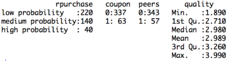
Table 1. Count of rpurchase by coupon
Rpurchase/Coupon With coupon Without coupon
Low probability 200 20
Medium probability 110 30
High proabability 27 13
After defining the order of the levels in the dependent variable and performing exploratory data analysis, the data is ready to be partitioned into training and testing set. We will build the model using the training set and validate the computed model using the data in test set. The partitioning of the data into training and test set is random. The random sample is generated using sample ( ) function along with set.seed ( ) function. The R script for explicitly stating the order of levels in the dependent variable and creating training and test data set is follows:

#Dividing data into training and test set
#Random sampling 
samplesize = 0.60*nrow(data)
set.seed(100)
index = sample(seq_len(nrow(data)), size = samplesize)
#Creating training and test set 
datatrain = data[index,]
datatest = data[-index,]

 Now, we will build the model using the data in training set. As discussed in the above section the dependent variable in the model is in the form of log odds.  Because of the log odds transformation, it is difficult to interpret the coefficients of the model. Note that in this case the coefficients of the regression cannot be interpreted in terms of marginal effects.  The coefficients are called as proportional odds and interpreted in terms of increase in log odds. The interpretation changes not only for the coefficients but also for the intercept. Unlike simple linear regression, in ordinal logistic regression we obtain n-1 intercepts, where n is the number of categories in the dependent variable. The intercept can be interpreted as the expected odds of identifying in the listed categories. Before interpreting the model, we share the relevant R script and the results. In the R code, we set Hess equal to true which the logical operator to return hessian matrix. Returning the hessian matrix is essential to use summary function or calculate variance-covariance matrix of the fitted model.

#Build ordinal logistic regression model
model= polr(rpurchase ~ coupon + peers + quality , data = datatrain, Hess = TRUE)
summary(model)
  Figure 2. Ordinal logistic regression model on training set

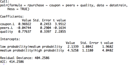
The table displays the value of coefficients and intercepts, and corresponding standard errors and t values.  The interpretation for the coefficients is as follows. For example, holding everything else constant, an increase in value of coupon by one unit increase the expected value of rpurchase in log odds by 0.96. Likewise, the coefficients of peers and quality can be interpreted.
Note that the ordinal logistic regression outputs multiple values of intercepts depending on the levels of intercept. The intercepts can be interpreted as the expected odds when others variables assume a value of zero. For example, the low probability | medium probability intercept takes value of 2.13, indicating that the expected odds of identifying in low probability category, when other variables assume a value of zero, is 2.13. Using the logit inverse transformation, the intercepts can be interpreted in terms of expected probabilities. The inverse logit transformation, <to be inserted> . The expected probability of identifying low probability category, when other variables assume a value of zero, is 0.89. After building the model and interpreting the model, the next step is to evaluate it. The evaluation of the model is conducted on the test dataset. A basic evaluation approach is to compute the confusion matrix and the misclassification error. The R code and the results are as follows:

#Compute confusion table and misclassification error
predictrpurchase = predict(model,datatest)
table(datatest$rpurchase, predictrpurchase)
mean(as.character(datatest$rpurchase) != as.character(predictrpurchase))
Figure 3. Confusion matrix
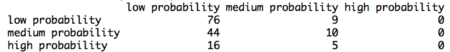
The confusion matrix shows the performance of the ordinal logistic regression model. For example, it shows that, in the test dataset, 76 times low probability category is identified correctly. Similarly, 10 times medium category and 0 times high category is identified correctly. We observe that the model identifies high probability category poorly. This happens because of inadequate representation of high probability category in the training dataset. Using the confusion matrix, we find that the misclassification error for our model is 46%.

Interpretation using plots

The interpretation of the logistic ordinal regression in terms of log odds ratio is not easy to understand. We offer an alternative approach to interpretation using plots. The R code for plotting the effects of the independent variables is as follows:

#Plotting the effects 
library("effects")
Effect(focal.predictors = "quality",model)
plot(Effect(focal.predictors = "coupon",model))
plot(Effect(focal.predictors = c("quality", "coupon"),model))
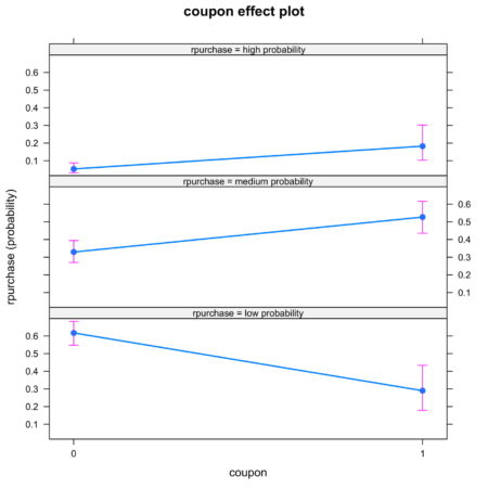
The plots are intuitive and easy to understand. For example, figure 4 shows that coupon increases the likelihood of classification into high probability and medium probability classes, while decreasing the likelihood of classification in low probability class.

Figure 4. Effect of coupon on identification
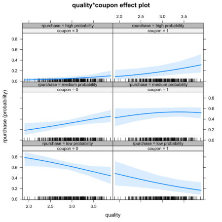
It is also possible to look at joint effect of two independent variable. Figure 5. shows the joint effect of quality and coupon on identification of category of independent variable. Observing the top row of figure 5., we notice that the interaction of coupon and quality increases the likelihood of identification in high probability category.

Figure 5. Joint effect of quality and coupon on identification

Conclusion The article discusses the fundamentals of ordinal logistic regression, builds and the model in R, and ends with interpretation and evaluation.  Ordinal logistic regression extends the simple logistic regression model to the situations where the dependent variable is ordinal, i.e. can be ordered. Ordinal logistic regression has variety of applications, for example, it is often used in marketing to increase customer life time value. For example, consumers can be categorized into different classes based on their tendency to make repeated purchase decision. In order to discuss the model in an applied manner, we develop this article around the case of consumer categorization. The independent variables of interest are – coupon held by consumers from previous purchase, influence of peers, quality of the product. The article has two key takeaways. First, ordinal logistic regression come handy while dealing with a dependent variable that can be ordered. If one uses multinomial logistic regression then the user is ignoring the information related to ordering of the dependent variable. Second, the coefficients of the ordinal linear regression cannot be interpreted in a similar manner to the coefficients of ordinary linear regression. Interpreting the coefficents in terms of marginal effects is one of the common mistakes that users make while implementing the ordinal regression model. We again emphasize the use of graphical method to interpret the coefficients. Using the graphical method, it is easy to understand the individual and joint effects of independent variables on the likelihood of classification. This article can be a go to reference for understanding the basics of ordinal logistic regression and its implementation in R. We have provided commented R code throughout the article.

Download R-code
Credits: Chaitanya Sagar and Aman Asija of Perceptive Analytics. Perceptive Analytics is a marketing analytics and Tableau consulting company. 


Simple Steps to Create Treemap in R

The following document details how to create a treemap in R using the treemap package. What are they & when do we use them In the most basic terms a treemap is generally used when we want to visualize proportions. It can be thought of a pie map where the slices are replaced by rectangles. Using pie charts to visualize proportion is an excellent way, however if the categories keep on increasing the pie charts tends to become more and more unreadable. This issue of pie charts is overcomed in a Treemap which uses nested structure. These are ideal for displaying large amount of hierarchical data. We can use a treemap when space is a constraint and we have a large amount of hierarchical data to get an overview.
A treemap is a diagram representing hierarchical data in the form of nested rectangles, the area of each corresponding to its numerical value

When not to use a treemap

A treemap should not be used when there is a big difference between the measure values or the values are not comparable. Also, negative values cannot be displayed on a treemap. Building a Treemap in R To create a treemap we use one or more dimension and a maximum of 2 measures. We will be using the treemap package in R. For this article we will use the Super Store data which is provided along with the article. Step 1: Importing Data and installing treemap package in R
## Set the working directory location to the file location##
>setwd("H:/R Treemap")

## Import the datafile in R and view the data sample)
>data= read.csv("data.csv", header = TRUE, sep =",")
>View(data)
Once we get the data in R we need to load the package treemap so that we can go ahead creating our required plot.
## Installing the package and calling the package in R##
>install.packages("treemap")
>library(treemap)
The data that we are using is already reshaped data and so we can go ahead with creating our basic treemap and move step by step from it. Step 2: Creating a Treemap The treemap function is used to create a treemap.
## Creating the most basic treemap##
>treemap(data,index = c("Category"),vSize ="Sales")
The first argument in the above formula is the data file name which is “data” in our case. The arguments within the index specify the hierarchy that we are looking into and the argument vSize tell R to pick up a values on which the proportion of the boxes are to be decided. In our case since we have only index in our formula the command just splits the entire tree in three parts ( each representing the proportion of Sales for these part) A first look into the above figures shows that the Proportion of Technology, Furniture and Office Supplies is almost within the same range , the highest being technology. We can check our hunch right away, Type in the following :
>aggregate(Sales ~ Category, data, sum)
And you will get the following result :

      Category               Sales
1     Furniture              741999.8
2     Office Supplies        719047.0
3     Technology             836154.0
We see how close these Sales are to other (proportionately) Now as we have created our most basic treemap lets go a bit further and see what happens when we list multiple values in the index ( create a hierarchy )
## Creating a treemap with Category and Subcategory as a hierarchy.
>treemap(data,index = c("Category","Sub.Category"),vSize = "Sales")
Here is what happened, the tree is first splits at the category level and then each category further splits under a subcategory. We can see from the treemap that the Technology Category accounted for maximum sales and within the Technology category, Phones accounted for most of the sales. (the size of the boxes are still by Sales) Let’s go a step further and color the boxes by another measure let’s say profit.
 
##Coloring the boxes by a measure##
>treemap(data,index = c("Category","Sub.Category"),vSize ="Sales",vColor = "Profit",type="value")
The treemap that we get here is similar to the previous one except for the fact that now the box color represents the Profit instead. So we can see here that the most profitable subcategory was Copiers while on the other hand Tables were the most unprofitable. The argument vColor tells R to pick up a variable that we want to be used as a color. Type Defines if it is a value, index or categorical.
##Using a categorical variable as color##
>treemap(data,index = c("Category","Region"),vSize ="Sales",vColor = "Region",type="categorical")
Here we see that the tree is split into Categories first and under each category we have all the four region that are distinguished by individual color. Step 3: Enhancing our treemap Let’s move ahead and make our treemap more readable. To do this we will add a title to our treemap and change to font size of the Labels for category and Subcategories. We will try to keep the labels for Categories bigger and sub categories a bit smaller. Here’s how to do it:
## Titles and font size of the labels##
>treemap(data,index = c("Category","Sub.Category"),vSize ="Sales",vColor = "Profit",type="value",title = "Sales Treemap For categories",fontsize.labels = c(15,10))
Notice how we have added a custom title to treemap and change the label size for Categories and Sub categories. The argument title allows us to add title to our visual while the argument fontsize.labels helps in adjusting the size of the labels. How about positioning the labels ?? How about keeping the Categories labels centered and keeping that of Sub Categories in top left. This can be achieved by the argument align.labels as under:
## Aligning the labels##
>treemap(data,index = c("Category","Sub.Category"),vSize ="Sales",vColor = "Profit",type="value",title = "Sales Treemap For categories",fontsize.labels = c(15,10),align.labels = list(c("centre","centre"),c("left","top")))
There it is, our labels are now aligned beautifully. We can also choose our custom palette for treemaps using the palette argument as under:
>treemap(data,index = c("Category","Sub.Category"),vSize ="Sales",vColor = "Profit",type="value",palette="RdYlGn",range=c(-20000,60000),mapping=c(-20000,10000,60000),title = "Sales Treemap For categories",fontsize.labels = c(15,10),align.labels = list(c("centre","centre"),c("left","top")))
Here we have used the custom Red Yellow Green palette to see the profit more clearly. Red being the most unprofitable and Green being the most profitable. In this article we looked upon how to create a treemap in R and adding aesthetic to our plot. There’s much more that can be done using the arguments under a treemap. For a complete list of argument and functionality refer the package documents. “Area-based visualizations have existed for decades. This idea was invented by professor Ben Shneiderman at the University of Maryland, Human – Computer Interaction Lab in the early 1990s. Shneiderman and his collaborators then deepened the idea by introducing a variety of interactive techniques for filtering and adjusting treemaps. These early treemaps all used the simple “slice-and-dice” tiling algorithm”. Treemaps are the most efficient option to display hierarchy that gives a quick overview of structure. They are also great at comparing the proportion between categories via their area sizes.

Author Bio:

This article was contributed by Perceptive Analytics. Rahul Singh, Chaitanya Sagar, Jyothirmayee Thondamallu and Saneesh Veetil contributed to this article. Perceptive Analytics provides data analytics, data visualization, business intelligence and reporting services to e-commerce, retail, healthcare and pharmaceutical industries. Our client roster includes Fortune 500 and NYSE listed companies in the USA and India.

Using Control Charts in R

I am sure you must have heard of Six Sigma quality standard or Six Sigma experts. But, what is Six Sigma?

Six Sigma is a set of techniques used by organizations to improve their processes and optimize operations. Six Sigma was popularized by manufacturing organizations and Jack Welch, former CEO of GE, was one of advocators of Six Sigma. At the heart of Six Sigma lies the core strategies to improve the quality of processes by identifying and removing the causes leading to defects and variability in product quality and business processes. Six Sigma uses empirical and statistical quality management methods to carry out operational improvement and excellence projects in organizations.

Six Sigma projects follow methodologies which are called as DMAIC and DMADV. DMAIC methodology is used for projects aimed at improving existing business processes; while, DMADV is used for projects which aims at creating new processes. Since this article talks about control charts, we will focus on DMAIC project methodology of which control charts is a part of. DMAIC methodology has five phases:

  1. Define
  2. Measure
  3. Analyze
  4. Improve
  5. Control

Define

Defining the goals that you wish to achieve – basically, identifying the problem statement you are trying to solve. In this stage, everyone involved in the project understands his/her role and responsibilities. There should be clarity on ‘Why is the project being undertaken?’

Measure

Understanding the ‘As-Is’ state of the process. Based on the goal defined in the ‘Define’ phase, you understand the process in detail and collect relevant data which is to be used in subsequent phases.

Analyze

By this phase, you know the goal that are you trying to achieve and also, you understand the entire process and have the relevant data to diagnose and analyze the problem. In this phase, make sure that your biases don’t lead you to results. Instead, it should be a complete fact-based and data-driven exercise to identify the root cause.

Improve

Now, you are aware about the entire process and cause behind the problems. In this phase, you need to find out ways or methodologies to work on the problem and improve the current processes. You have to think of new ways using techniques such as design of experiments and set up pilot projects to test the idea.

Control

You have implemented new processes and now, you have to ensure that any deviations in the optimized processes are corrected before they result in any defects. One of the techniques that can be used in control phase is statistical process control. Statistical process control can be used to monitor the processes and ensure that the desired quality level is maintained.

Control chart is the primary statistical process control tool used to monitor the performance of processes and ensure that they are operating within the permissible limits. Let’s understand what are control charts and how are they used in process improvement.

According to Wikipedia, “The data from measurements of variations at points on the process map is monitored using control charts. Control charts attempt to differentiate “assignable” (“special”) sources of variation from “common” sources. “Common” sources, because they are an expected part of the process, are of much less concern to the manufacturer than “assignable” sources. Using control charts is a continuous activity, ongoing over time.”

Let’s take an example and understand it step by step using above definition. You leave for office from your home every day at 9:00 AM. The average time it takes you to reach office is 35 minutes; while in most of the cases it takes 30 to 40 minutes for you to reach office. There is a variation of 5 minutes less or more because of slight traffic or you get all the traffic signals red on your way. However, on one fine day you leave from your home and you reach office in 60 minutes because there was an accident on the way and the entire traffic was diverted which caused additional delay of around 20 minutes. Now, relating our example with the definition above:

Measurements: Time to reach office – the time taken on daily basis to reach office from home is measured to monitor the system/process.

Variations: Deviations from the average time of 35 minutes – these variations are due to inherent attributes in the system such as traffic or traffic signals on the route.

Common sources: Slight traffic or traffic signals on the route – these are usually part of the processes and are of much less concern while driving to office.

Excessive Variation: Accident – these are events which leads to variations in the processes, leading to defects in the outputs or delayed processes.

Summing up everything, control charts are graphical techniques to monitor the performance of a process over time. In the control chart, the performance of these processes is monitored visually to identify any anomalies or variations from the usual behavior. For every control chart, there are control limits or decision limits set which define the normal behavior of the process. Any movement outside those limits indicate variation in the process and needs to be corrected to prevent further damage.

In any control chart, there are three main attributes – Average Line, UCL and LCL. Average line is the mean of all the observations taken in the process. UCL and LCL are upper control limit and lower control limit, respectively. These limits define the control or decision limits within which a process should always fall for efficient and optimized operations. These three values are determined by the process. For a process where all the values lie within the control limits and there is no specific pattern in the values, the process is said to be “in-control.”

X-axis can have either time or sample sequence; while, the Y-axis can have individual values or deviations. There are different control charts based on the data you have, continuous or variable (height, weight, density, cost, temperature, age) and attribute (number of defective parts produced). Accordingly, you choose the control chart and control objective.

Following steps present the step-by-step approach to implement a control chart:

  • What process needs to be controlled?

Answer to this question will come from the DMAIC process while implementing the entire project methodology.

  • Which system will provide the data to monitor?

Identifying the systems that will provide the data based on which control charts will be prepared and monitored.

  • Develop and monitor control charts

Develop the control charts by specifying the X-axis and Y-axis.

  • What actions to take based on control charts?

Once you have developed control charts, you need to monitor the processes and check for any special or excessive variations which may lead to defects in the processes.

By now, we have understood what control charts are and what information do they provide. Let us understand further uses of control charts and what more information can be extracted from these charts. Apart from manufacturing, control charts find their applications in healthcare industry and a host of other industries.

  • Control charts provide a very simple and easy to understand methodology to understand the performance of processes.
  • It reduces the need for inspection – the need for inspection arises only when the process behavior is significantly different from the usual behavior.
  • If changes have been made to the process, control charts can help in understanding the impact of those changes on desired results.
  • The data collected in the process can be used for improvement in the subsequent of follow-up projects

Control Chart Rules

For a process ‘in-control’, most of the points should lie near the average line i.e. Zone A, followed by Zone B and Zone C. Very few points should lie close to control limits and none of the points should fall beyond the control limits. There are eight rules which are helpful in identifying if there are certain patterns or special causes of variation in the observations.

Rule 1: One or more points beyond the control limits

Rule 2: 8 out of 9 points on the same side of the center line (Average line)

Rule 3: 6 consecutive points increasing or decreasing (monotonic)

Rule 4: 14 consecutive points are alternating up and down

Rule 5: 2 out of 3 consecutive points in Zone C or beyond

Rule 6: 4 out of 5 consecutive points in Zone B or beyond

Rule 7: 15 consecutive points are in Zone A

Rule 8: 8 consecutive points on either side of the Average line but not in Zone A

Now, we have understood the control charts, attributes, applications and associated rules, let’s try to implement a small example in R.

Let’s assume that there is a company which manufactures cylindrical piston rings. For each of the rings manufactured, measurement of the diameter is taken 5 times and captured to examine the within piece variability. These five measurements for one-piece forms one sample or one sub-group. Similarly, measurements for 25 pieces is taken. Using rnorm function in R, let’s create the measurement values.

> obs
         V1       V2       V3       V4       V5
1  1.448786 1.555614 1.400382 1.451316 1.328760
2  1.748518 1.525284 1.552703 1.417736 1.420078
3  1.600783 1.409819 1.350917 1.521953 1.358915
4  1.529281 1.582439 1.544136 1.712162 1.553276
5  1.479104 1.343972 1.642736 1.589858 1.460230
6  1.685809 1.553799 1.493372 1.609255 1.471565
7  1.493397 1.373165 1.660502 1.535789 1.512498
8  1.483724 1.564052 1.415218 1.436863 1.578013
9  1.480014 1.446424 1.604218 1.565367 1.412440
10 1.530056 1.398036 1.469385 1.667835 1.384063
11 1.423609 1.419212 1.420791 1.347140 1.485413
12 1.508196 1.505683 1.642166 1.559233 1.332157
13 1.574303 1.595021 1.484574 1.375992 1.367742
14 1.491598 1.387324 1.486832 1.372965 1.444112
15 1.420711 1.479883 1.411519 1.377991 1.251022
16 1.407785 1.477150 1.671345 1.562293 1.617919
17 1.586156 1.555872 1.515936 1.498874 1.579370
18 1.700294 1.574875 1.710501 1.544640 1.660743
19 1.593655 1.691820 1.470600 1.479399 1.506595
20 1.338427 1.600721 1.434118 1.541265 1.602901
21 1.442494 1.825335 1.450115 1.493083 1.433342
22 1.499603 1.483825 1.479840 1.466675 1.465325
23 1.432389 1.533376 1.456744 1.460206 1.456417
24 1.395037 1.382133 1.460687 1.449885 1.305300
25 1.445672 1.607760 1.534657 1.422726 1.416209
> qq = qcc(obs, type = “R”, nsigmas = 3)  

In R chart, we look for all rules that we have mentioned above. If any of the above rules is violated, then R chart is out of control and we don’t need to evaluate further. This indicates the presence of special cause variation. If the R chart appears to be in control, then we check the run rules against the X-Bar chart. In the above chart, R chart appears to be in control; hence, we move to check run rules against the X-Bar chart.

> summary(qq) 
Call:
qcc(data = obs, type = “R”, nsigmas = 3) 

R chart for obs  

Summary of group statistics:    
Min.   1st Qu.    Median      Mean   3rd Qu.      Max.
0.0342775 0.1627947 0.2212205 0.2131489 0.2644740 0.3919933  

Group sample size:  5
Number of groups:  25
Center of group statistics:  0.2131489
Standard deviation:  0.09163753  
Control limits: 
LCL       UCL  
0 0.4506969 
> qq = qcc(obs, type = “xbar”, nsigmas = 3)  

In the above chart, one of the points lie outside the UCL which implies that the process is out of control. The standard deviation in the above chart is the standard deviation of means of each of the samples. If we were to look at the sample 18, we see that the values in sample 18 are usually higher than values in other samples.

> obs[18,]         V1       V2       V3      V4       V5
18 1.700294 1.574875 1.710501 1.54464 1.660743 

Now, let’s check process capability. By process capability, we can check if control limits and specification limits are in sync with each other. For instance, in the case we have taken, our client wanted piston rings with target diameter of 1.5 cm with a variation of +/- 0.1 cm. Process capability will help us in identifying whether our system is capable to meeting the specified requirements. It is measured by process capability index Cpk.

> process.capability(qq, spec.limits = c(1.4,1.6))
 
Process Capability Analysis
 
Call:
process.capability(object = qq, spec.limits = c(1.4, 1.6))
 
Number of obs = 125          Target = 1.5
       Center = 1.498           LSL = 1.4
       StdDev = 0.09164         USL = 1.6
 
Capability indices:
 
       Value    2.5%   97.5%
Cp    0.3638  0.3185  0.4089
Cp_l  0.3562  0.2947  0.4178
Cp_u  0.3713  0.3088  0.4338
Cp_k  0.3562  0.2829  0.4296
Cpm   0.3637  0.3186  0.4087
 
Exp<LSL 14%           Obs<LSL 15%
Exp>USL 13%          Obs>USL 16%

In the above plot, red lines indicate the target value, the lower and upper specified range. It can easily be inferred that the system is not capable to manufacture products within the specified range. Also, for a capable process, value of Cpk should be greater than or equal to 1.33. In the above chart, the value is 0.356 which is less than the required value. This shows that the above process is neither stable nor capable.

I am sure after going through this article, you will be able to use and create control charts in multiple other cases in your work. We would love to hear your experience with creating control charts in different settings.

Author Bio:

This article was contributed by Perceptive Analytics. Jyothirmayee Thondamallu, Chaitanya Sagar and Saneesh Veetil contributed to this article.

Perceptive Analytics is a marketing analytics company and it also provides Tableau Consulting, data analytics, business intelligence and reporting services to e-commerce, retail, healthcare and pharmaceutical industries. Our client roster includes Fortune 500 and NYSE listed companies in the USA and India.

Dealing with The Problem of Multicollinearity in R

Imagine a situation where you are asked to predict the tourism revenue for a country, let’s say India. In this case, your output or dependent or response variable will be total revenue earned (in USD) in a given year. But, what about independent or predictor variables?

You have been provided with two sets of predictor variables and you have to choose one of the sets to predict your output. The first set consists of three variables:

  • X1 = Total number of tourists visiting the country
  • X2 = Government spending on tourism marketing
  • X3 = a*X1 + b*X2 + c, where a, b and c are some constants

The second set also consists of three variables:

  • X1 = Total number of tourists visiting the country
  • X2 = Government spending on tourism marketing
  • X3 = Average currency exchange rate

Which of the two sets do you think provides us more information in predicting our output?

I am sure, you will agree with me that the second set provides us more information in predicting the output because the second set has three variables which are different from each other and each of the variables provides different information (we can infer this intuitively at this moment). Moreover, none of the three variables is directly derived from the other variables in the system. Alternatively, we can also say that none of the variables is a linear combination of other variables in the system.

In the first set of variables, only two variables provide us relevant information; while, the third variable is nothing but a linear combination of other two variables. If we were to directly develop a model without including this variable, our model would have considered this combination and estimated coefficients accordingly.

Now, this effect in the first set of variables is called multicollinearity. Variables in the first set are strongly correlated to each other (if not all, at least some variables are correlated with other variables). Model developed using the first set of variables may not provide as accurate results as the second one because we are missing out on relevant variables/information in the first set. Therefore, it becomes important to study multicollinearity and the techniques to detect and tackle its effect in regression models.

According to Wikipedia, “Collinearity is a linear association between two explanatory variables. Two variables are perfectly collinear if there is an exact linear relationship between them. For example, X1 and X2 are perfectly collinear if there exist parameters λ0 and λ1 such that, for all observations i, we have

X2i = λ0 + λ1 * X1i

Multicollinearity refers to a situation in which two or more explanatory variables in a multiple regression model are highly linearly related.”

We saw an example of exactly what the Wikipedia definition is describing.

Perfect multicollinearity occurs when one independent variable is an exact linear combination of other variables. For example, you already have X and Y as independent variables and you add another variable, Z = a*X + b*Y, to the set of independent variables. Now, this new variable, Z, does not add any significant or different value than provided by X or Y. The model can adjust itself to set the parameters that this combination is taken care of while determining the coefficients.

Multicollinearity may arise from several factors. Inclusion or incorrect use of dummy variables in the system may lead to multicollinearity. The other reason could be the usage of derived variables, i.e., one variable is computed from other variables in the system. This is similar to the example we took at the beginning of the article. The other reason could be taking variables which are similar in nature or which provide similar information or the variables which have very high correlation among each other.

Multicollinearity may not possess problem at an overall level, but it strongly impacts the individual variables and their predictive power. You may not be able to identify which are statistically significant variables in your model. Moreover, you will be working with a set of variables which provide you similar output or variables which are redundant with respect to other variables.

  • It becomes difficult to identify statistically significant variables. Since your model will become very sensitive to the sample you choose to run the model, different samples may show different statistically significant variables.
  • Because of multicollinearity, regression coefficients cannot be estimated precisely because the standard errors tend to be very high. Value and even sign of regression coefficients may change when different samples are chosen from the data.
  • Model becomes very sensitive to addition or deletion of any independent variable. If you add a variable which is orthogonal to the existing variable, your variable may throw completely different results. Deletion of a variable may also significantly impact the overall results.
  • Confidence intervals tend to become wider because of which we may not be able to reject the NULL hypothesis. The NULL hypothesis states that the true population coefficient is zero.

Now, moving on to how to detect the presence of multicollinearity in the system.

There are multiple ways to detect the presence of multicollinearity among the independent or explanatory variables.

  • The first and most rudimentary way is to create a pair-wise correlation plot among different variables. In most of the cases, variables will have some bit of correlation among each other, but high correlation coefficient may be a point of concern for us. It may indicate the presence of multicollinearity among variables.
  • Large variations in regression coefficients on addition or deletion of new explanatory or independent variables can indicate the presence of multicollinearity. The other thing could be significant change in the regression coefficients from sample to sample. With different samples, different statistically significant variables may come out.
  • The other method can be to use tolerance or variance inflation factor (VIF).

VIF = 1 / Tolerance

VIF = 1/ (1 – R square)

VIF of over 10 indicates that the variables have high correlation among each other. Usually, VIF value of less than 4 is considered good for a model.

  • The model may have very high R-square value but most of the coefficients are not statistically significant. This kind of a scenario may reflect multicollinearity in the system.
  • Farrar-Glauber test is one of the statistical test used to detect multicollinearity. This comprises of three further tests. The first, Chi-square test, examines whether multicollinearity is present in the system. The second test, F-test, determines which regressors or explanatory variables are collinear. The third test, t-test, determines the type or pattern of multicollinearity.

We will now use some of these techniques and try their implementation in R.

We will use CPS_85_Wages data which consists of a random sample of 534 persons from the CPS (Current Population Survey). The data provides information on wages and other characteristics of the workers. (Linkhttp://lib.stat.cmu.edu/datasets/CPS_85_Wages). You can go through the data details on the link provided.

In this data, we will predict wages from other variables in the data.

> data1 = read.csv(file.choose(), header = T)> head(data1)  Education South Sex Experience Union  Wage Age Race Occupation Sector Marr1         8 0 1         21 0 5.10 35  2 6 1 12         9 0 1         42 0 4.95 57  3 6 1 13        12 0  0 1     0 6.67 19 3         6 1 04        12 0  0 4     0 4.00 22 3         6 0 05        12 0  0 17     0 7.50 35 3         6 0 16        13 0  0 9     1 13.07 28 3         6 0 0> str(data1)’data.frame’: 534 obs. of  11 variables: $ Education : int  8 9 12 12 12 13 10 12 16 12 … $ South     : int 0 0 0 0 0 0 1 0 0 0 … $ Sex       : int 1 1 0 0 0 0 0 0 0 0 … $ Experience: int  21 42 1 4 17 9 27 9 11 9 … $ Union     : int 0 0 0 0 0 1 0 0 0 0 … $ Wage      : num 5.1 4.95 6.67 4 7.5 … $ Age       : int 35 57 19 22 35 28 43 27 33 27 … $ Race      : int 2 3 3 3 3 3 3 3 3 3 … $ Occupation: int  6 6 6 6 6 6 6 6 6 6 … $ Sector    : int 1 1 1 0 0 0 0 0 1 0 … $ Marr      : int 1 1 0 0 1 0 0 0 1 0 …

The above results show the sample view of data and the variables present in the data. Now, let’s fit the linear regression model and analyze the results.

> fit_model1 = lm(log(data1$Wage) ~., data = data1)> summary(fit_model1) Call:lm(formula = log(data1$Wage) ~ ., data = data1) Residuals:     Min     1Q Median       3Q Max -2.16246 -0.29163 -0.00469  0.29981 1.98248  Coefficients:             Estimate Std. Error t value Pr(>|t|)    (Intercept)  1.078596 0.687514   1.569 0.117291 Education    0.179366 0.110756   1.619 0.105949 South       -0.102360 0.042823  -2.390 0.017187 * Sex         -0.221997 0.039907  -5.563 4.24e-08 ***Experience   0.095822 0.110799   0.865 0.387531 Union        0.200483 0.052475   3.821 0.000149 ***Age         -0.085444 0.110730  -0.772 0.440671 Race         0.050406 0.028531   1.767 0.077865 . Occupation  -0.007417 0.013109  -0.566 0.571761 Sector       0.091458 0.038736   2.361 0.018589 * Marr         0.076611 0.041931   1.827 0.068259 . —Signif. codes:  0 ‘***’ 0.001 ‘**’ 0.01 ‘*’ 0.05 ‘.’ 0.1 ‘ ’ 1 Residual standard error: 0.4398 on 523 degrees of freedomMultiple R-squared:  0.3185, Adjusted R-squared:  0.3054 F-statistic: 24.44 on 10 and 523 DF,  p-value: < 2.2e-16

The linear regression results show that the model is statistically significant as the F-statistic has high value and p-value for model is less than 0.05. However, on closer examination we observe that four variables – Education, Experience, Age and Occupation are not statistically significant; while, two variables Race and Marr (martial status) are significant at 10% level. Now, let’s plot the model diagnostics to validate the assumptions of the model.


> plot(fit_model1)
Hit <Return> to see next plot:

Hit to see next plot:

Hit to see next plot:

Hit to see next plot:

The diagnostic plots also look fine. Let’s investigate further and look at pair-wise correlation among variables.

library(corrplot)
> cor1 = cor(data1)
> corrplot.mixed(cor1, lower.col = “black”, number.cex = .7)

The above correlation plot shows that there is high correlation between experience and age variables. This might be resulting in multicollinearity in the model.

Now, let’s move a step further and try Farrar-Glauber test to further investigate this. The ‘mctest’ package in R provides the Farrar-Glauber test in R.

install.packages(‘mctest’)library(mctest)

We will first use omcdiag function in mctest package. According to the package description, omcdiag (Overall Multicollinearity Diagnostics Measures) computes different overall measures of multicollinearity diagnostics for matrix of regressors.

> omcdiag(data1[,c(1:5,7:11)],data1$Wage) Call:omcdiag(x = data1[, c(1:5, 7:11)], y = data1$Wage)  Overall Multicollinearity Diagnostics                        MC Results detectionDeterminant |X’X|:         0.0001 1Farrar Chi-Square:      4833.5751 1Red Indicator:             0.1983 0Sum of Lambda Inverse: 10068.8439         1Theil’s Method:            1.2263 1Condition Number:        739.7337 1 1 –> COLLINEARITY is detected by the test 0 –> COLLINEARITY is not detected by the test

The above output shows that multicollinearity is present in the model. Now, let’s go a step further and check for F-test in in Farrar-Glauber test.

> imcdiag(data1[,c(1:5,7:11)],data1$Wage) Call:imcdiag(x = data1[, c(1:5, 7:11)], y = data1$Wage)  All Individual Multicollinearity Diagnostics Result                  VIF TOL   Wi Fi Leamer      CVIF KleinEducation   231.1956 0.0043  13402.4982 15106.5849 0.0658  236.4725 1South         1.0468 0.9553     2.7264 3.0731 0.9774    1.0707 0Sex           1.0916 0.9161     5.3351 6.0135 0.9571    1.1165 0Experience 5184.0939 0.0002 301771.2445 340140.5368 0.0139 5302.4188     1Union         1.1209 0.8922     7.0368 7.9315 0.9445    1.1464 0Age        4645.6650 0.0002 270422.7164 304806.1391 0.0147 4751.7005     1Race          1.0371 0.9642     2.1622 2.4372 0.9819    1.0608 0Occupation    1.2982 0.7703    17.3637 19.5715 0.8777    1.3279 0Sector        1.1987 0.8343    11.5670 13.0378 0.9134    1.2260 0Marr          1.0961 0.9123     5.5969 6.3085 0.9551    1.1211 0 1 –> COLLINEARITY is detected by the test 0 –> COLLINEARITY is not detected by the test Education , South , Experience , Age , Race , Occupation , Sector , Marr , coefficient(s) are non-significant may be due to multicollinearity R-square of y on all x: 0.2805  * use method argument to check which regressors may be the reason of collinearity===================================

The above output shows that Education, Experience and Age have multicollinearity. Also, the VIF value is very high for these variables. Finally, let’s move to examine the pattern of multicollinearity and conduct t-test for correlation coefficients.

> pcor(data1[,c(1:5,7:11)],method = “pearson”)$estimate              Education   South Sex  Experience Union         Age Race OccupationEducation   1.000000000 -0.031750193  0.051510483 -0.99756187 -0.007479144  0.99726160 0.017230877 0.029436911South      -0.031750193  1.000000000 -0.030152499 -0.02231360 -0.097548621  0.02152507 -0.111197596 0.008430595Sex         0.051510483 -0.030152499  1.000000000 0.05497703 -0.120087577 -0.05369785  0.020017315 -0.142750864Experience -0.997561873 -0.022313605  0.054977034 1.00000000 -0.010244447 0.99987574  0.010888486 0.042058560Union      -0.007479144 -0.097548621 -0.120087577 -0.01024445  1.000000000 0.01223890 -0.107706183 0.212996388Age         0.997261601 0.021525073 -0.053697851  0.99987574 0.012238897 1.00000000 -0.010803310 -0.044140293Race        0.017230877 -0.111197596  0.020017315 0.01088849 -0.107706183 -0.01080331  1.000000000 0.057539374Occupation  0.029436911 0.008430595 -0.142750864  0.04205856 0.212996388 -0.04414029 0.057539374  1.000000000Sector     -0.021253493 -0.021518760 -0.112146760 -0.01326166 -0.013531482  0.01456575 0.006412099 0.314746868Marr       -0.040302967  0.030418218 0.004163264 -0.04097664  0.068918496 0.04509033 0.055645964 -0.018580965                 Sector MarrEducation  -0.021253493 -0.040302967South      -0.021518760  0.030418218Sex        -0.112146760  0.004163264Experience -0.013261665 -0.040976643Union      -0.013531482  0.068918496Age         0.014565751 0.045090327Race        0.006412099 0.055645964Occupation  0.314746868 -0.018580965Sector      1.000000000 0.036495494Marr        0.036495494 1.000000000 $p.value           Education    South Sex Experience        Union Age Race Occupation       SectorEducation  0.0000000 0.46745162 0.238259049  0.0000000 8.641246e-01 0.0000000 0.69337880 5.005235e-01 6.267278e-01South      0.4674516 0.00000000 0.490162786  0.6096300 2.526916e-02 0.6223281 0.01070652 8.470400e-01 6.224302e-01Sex        0.2382590 0.49016279 0.000000000  0.2080904 5.822656e-03 0.2188841 0.64692038 1.027137e-03 1.005138e-02Experience 0.0000000 0.60962999 0.208090393  0.0000000 8.146741e-01 0.0000000 0.80325456 3.356824e-01 7.615531e-01Union      0.8641246 0.02526916 0.005822656  0.8146741 0.000000e+00 0.7794483 0.01345383 8.220095e-07 7.568528e-01Age        0.0000000 0.62232811 0.218884070  0.0000000 7.794483e-01 0.0000000 0.80476248 3.122902e-01 7.389200e-01Race       0.6933788 0.01070652 0.646920379  0.8032546 1.345383e-02 0.8047625 0.00000000 1.876376e-01 8.833600e-01Occupation 0.5005235 0.84704000 0.001027137  0.3356824 8.220095e-07 0.3122902 0.18763758 0.000000e+00 1.467261e-13Sector     0.6267278 0.62243025 0.010051378  0.7615531 7.568528e-01 0.7389200 0.88336002 1.467261e-13 0.000000e+00Marr       0.3562616 0.48634504 0.924111163  0.3482728 1.143954e-01 0.3019796 0.20260170 6.707116e-01 4.035489e-01                MarrEducation  0.3562616South      0.4863450Sex        0.9241112Experience 0.3482728Union      0.1143954Age        0.3019796Race       0.2026017Occupation 0.6707116Sector     0.4035489Marr       0.0000000 $statistic              Education South         Sex Experience Union        Age Race Occupation SectorEducation     0.0000000 -0.7271618  1.18069629 -327.2105031 -0.1712102  308.6803174 0.3944914 0.6741338 -0.4866246South        -0.7271618 0.0000000 -0.69053623   -0.5109090 -2.2436907 0.4928456 -2.5613138  0.1929920 -0.4927010Sex           1.1806963 -0.6905362  0.00000000 1.2603880 -2.7689685   -1.2309760 0.4583091 -3.3015287 -2.5834540Experience -327.2105031 -0.5109090  1.26038801 0.0000000 -0.2345184 1451.9092015  0.2492636 0.9636171 -0.3036001Union        -0.1712102 -2.2436907 -2.76896848   -0.2345184 0.0000000 0.2801822 -2.4799336  4.9902208 -0.3097781Age         308.6803174 0.4928456 -1.23097601 1451.9092015  0.2801822 0.0000000 -0.2473135 -1.0114033 0.3334607Race          0.3944914 -2.5613138  0.45830912 0.2492636 -2.4799336   -0.2473135 0.0000000 1.3193223 0.1467827Occupation    0.6741338 0.1929920 -3.30152873    0.9636171 4.9902208 -1.0114033 1.3193223  0.0000000 7.5906763Sector       -0.4866246 -0.4927010 -2.58345399   -0.3036001 -0.3097781 0.3334607 0.1467827  7.5906763 0.0000000Marr         -0.9233273 0.6966272  0.09530228 -0.9387867  1.5813765 1.0332156 1.2757711 -0.4254112  0.8359769                  MarrEducation  -0.92332727South       0.69662719Sex         0.09530228Experience -0.93878671Union       1.58137652Age         1.03321563Race        1.27577106Occupation -0.42541117Sector      0.83597695Marr        0.00000000 $n[1] 534 $gp[1] 8 $method[1] “pearson”

As we saw earlier in the correlation plot, partial correlation between age-experience, age-education and education-experience is statistically significant. There are other pairs also which are statistically significant. Thus, Farrar-Glauber test helps us in identifying the variables which are causing multicollinearity in the model.

There are multiple ways to overcome the problem of multicollinearity. You may use ridge regression or principal component regression or partial least squares regression. The alternate way could be to drop off variables which are resulting in multicollinearity. You may drop of variables which have VIF more than 10. In our case, since age and experience are highly correlated, you may drop one of these variables and build the model again. Try building the model again by removing experience or age and check if you are getting better results. Share your experiences in the comments section below.

Author Bio:

This article was contributed by Perceptive Analytics. Jyothirmayee Thondamallu, Chaitanya Sagar and Saneesh Veetil contributed to this article.

Perceptive Analytics is a marketing analytics company and it also provides Tableau Consulting, data analytics, business intelligence and reporting services to e-commerce, retail, healthcare and pharmaceutical industries. Our client roster includes Fortune 500 and NYSE listed companies in the USA and India.

Anomaly Detection in R

The World of Anomalies

Imagine you are a credit card selling company and you know about a particular customer who makes a purchase of 25$ every week. You guessed this purchase is his fixed weekly rations but one day, this customer makes a different purchase of 700$. This development will not just startle you but also compel you to talk to the customer and find out the reason so you can approve the transaction. This is because, the behavior of the customer had become fixed and the change was so different that it was not expected. Hence we call this event as an anomaly.

Anomalies are hard to detect because they can also be real phenomenon. Let’s say that the customer in the example above made the usual purchases while he was living alone and will be starting his family this week. This will mean that this should be the first of his future purchases of similar magnitude or he is throwing a party this week and this was a one-time large purchase. In all these cases, the customer will be classified as making an ‘abnormal’ choice. We as the credit card seller need to know which of these cases are genuine and which are mistakes which can be corrected if they reconfirm the same with the customer. The usefulness of detecting such anomalies are very useful especially in BFSI industry with the primary use in credit card transactions. Such anomalies can be signs of fraud or theft. Someone making multiple transactions of small amounts from the same credit card, making one very large transaction which is a few order of magnitudes larger than the average, making transactions from an unfamiliar location are such examples that can caused by fraudsters and must be caught. With the popularity of adoption, let’s study the ways we can detect anomalies.

Detecting The Pattern To Find Anomalies

Anomalies are essentially the outliers in our data. If something happens regularly, it is not an anomaly but a trend. Things which happen once or twice and are deviant from the usual behavior, whether continuously or with lags are all anomalies. So it all boils down to the definition of outliers for our data. R provides a lot of packages with different approaches to anomaly detection. We will use the AnomalyDetection package in R to understand the concept of anomalies using one such method. However, the package needs to be installed specially from github. This requires the install_github() function in devtools package. We will also use the Rcpp package which helps us to integrate R with C++ functions. Another github package to be used in this article is the wikipedia trend package which contains the API to access wikipedia and create data for anomaly detection analysis.

The package is capable of identifying outliers in the presence of seasonality and trend in the data. The package uses an algorithm known as Seasonal Hybrid ESD algorithm which finds outliers globally as well as locally in time series or a vector of data. The package has a lot of features, some of which include visualization graphs, type of anomalies (positive or negative) and specifying the window of interest.
#Install the devtools package then github packages
install.packages("devtools")
install.packages("Rcpp")
library(devtools)
install_github("petermeissner/wikipediatrend")
install_github("twitter/AnomalyDetection")

#Loading the libraries
library(Rcpp)
library(wikipediatrend)
library(AnomalyDetection)
The first step is data preparation. We will use the page views on wikipedia page marked on fifa data starting from date 18th March 2013. (link: https://en.wikipedia.org/wiki/FIFA). The wp_trend function gives us the access statistics for the page with the ability to filter data from within the function. We will use this data to model day wise page views and understand anomalies in the pattern of those view numbers
#Download wikipedia webpage "fifa" 
fifa_data_wikipedia = wp_trend("fifa", from="2013-03-18", lang = "en")
This gives us a dataset of about 1022 observations and 8 columns. Looking at the data reveals some redundant information captured
#First_look
fifa_data_wikipedia
   project   language article access     agent      granularity date       views
197 wikipedia en       Fifa    all-access all-agents daily       2016-01-13 116  
546 wikipedia en       Fifa    all-access all-agents daily       2016-12-27  64  
660 wikipedia en       Fifa    all-access all-agents daily       2017-04-20 100  
395 wikipedia en       Fifa    all-access all-agents daily       2016-07-29  70  
257 wikipedia en       Fifa    all-access all-agents daily       2016-03-13  75  
831 wikipedia en       Fifa    all-access all-agents daily       2017-10-08 194  
229 wikipedia en       Fifa    all-access all-agents daily       2016-02-14  84  
393 wikipedia en       Fifa    all-access all-agents daily       2016-07-27 140  
293 wikipedia en       Fifa    all-access all-agents daily       2016-04-18 105  
420 wikipedia en       Fifa    all-access all-agents daily       2016-08-23 757
We see that project, language, article, access, agent and granularity appear to be same for all rows and are irrelevant for us. We are only concerned with date and views as the features to work on. Let’s plot the views against date
#Plotting data
library(ggplot2)
ggplot(fifa_data_wikipedia, aes(x=date, y=views, color=views)) + geom_line()
Anomaly detection
We see some huge spikes at different intervals. There are a lot of anomalies in this data. Before we process them further, let’s keep only the relevant columns.
# Keep only date & page views and discard all other variables
columns_to_keep=c("date","views")
fifa_data_wikipedia=fifa_data_wikipedia[,columns_to_keep]
We will now perform anomaly detection using Seasonal Hybrid ESD Test. The technique maps data as a series and captures seasonality while pointing out data which does not follow the seasonality pattern. The AnomalyDetectionTs() function finds the anomalies in the data. It will basically narrow down all the peaks keeping in mind that not more than 10% of data can be anomalies (by default). We can also reduce this number by changing the max_anoms parameter in the data. We can also specify which kind of anomalies are to be identified using the direction parameter. Here, we are going to specify only positive direction anomalies to be identified. That means that sudden dips in the data are not considered.
#Apply anomaly detection and plot the results
anomalies = AnomalyDetectionTs(fifa_data_wikipedia, direction="pos", plot=TRUE)
anomalies$plot
Anomaly Detection 2

Our data has 5.68% anomalies in positive direction if we take a level of significance (alpha) to be 95%. Since we had a total of 1022 observations, 5.68% of the number is about 58 observations. We can look at the specific dates which are pointed out by the algorithm.
# Look at the anomaly dates
anomalies$anoms
   timestamp anoms
1  2015-07-01   269
2  2015-07-02   233
3  2015-07-04   198
4  2015-07-05   330
5  2015-07-06   582
6  2015-07-07   276
7  2015-07-08   211
8  2015-07-09   250
9  2015-07-10   198
10 2015-07-20   315
11 2015-07-21   209
12 2015-07-25   202
13 2015-07-26   217
14 2015-09-18   278
15 2015-09-25   234
16 2015-09-26   199
17 2015-10-03   196
18 2015-10-07   242
19 2015-10-08   419
20 2015-10-09   240
21 2015-10-11   204
22 2015-10-12   223
23 2015-10-13   237
24 2015-10-18   204
25 2015-10-28   213
26 2015-12-03   225
27 2015-12-21   376
28 2015-12-22   212
29 2016-02-24   240
30 2016-02-26   826
31 2016-02-27   516
32 2016-02-29   199
33 2016-04-04   330
34 2016-05-13   217
35 2016-05-14   186
36 2016-06-10   196
37 2016-06-11   200
38 2016-06-12   258
39 2016-06-13   245
40 2016-06-14   204
41 2016-06-22   232
42 2016-06-27   273
43 2016-06-28   212
44 2016-07-10   221
45 2016-07-11   233
46 2016-08-22   214
47 2016-08-23   757
48 2016-08-24   244
49 2016-09-18   250
50 2016-09-19   346
51 2017-01-10   237
52 2017-03-29   392
53 2017-06-03   333
54 2017-06-21   365
55 2017-10-08   194
56 2017-10-09   208
57 2017-10-11   251
58 2017-10-14   373
We have the exact dates and the anomaly values for each date. In a typical anomaly detection process, each of these dates are looked case by case and the reason for anomalies is identified. For instance, the page views can be higher on these dates if there had been fifa matches or page updates on these particular days. Another reason could be big news about fifa players. However, if page views on any of the dates does not correspond to any special event, then those days are true anomalies and should be flagged. In other situations such as credit card transactions, such anomalies can indicate fraud and quick action must be taken on identification.

The ‘Anomaly Way’

Anomalies are a kind of outlier so SH-ESD (Seasonal Hybrid ESD) is not the only way to detect anomalies. Moreover, ‘AnomalyDetection’ is not the only package we will look upon. Let’s try the anomalize package which is available in CRAN. However, it is always recommended to update the package using github as the owners keep the most recent package versions there and it takes time and testing for the changes to move into standard repositories such as CRAN. We will first install the package from CRAN so that the dependencies are also installed then update the package using devtools
#Installing anomalize
install.packages('anomalize')
#Update from github
library(devtools)
install_github("business-science/anomalize")
#Load the package
library(anomalize)
# We will also use tidyverse package for processing and coindeskr to get bitcoin data
library(tidyverse)
library(coindeskr)
I am also using the tidyverse package (Link) and coindeskr package (Link). The coindeskr package is used to download the bitcoin data and tidyverse is used for speedy data processing. We will now download bitcoin data from 1st January 2017
#Get bitcoin data from 1st January 2017
bitcoin_data <- get_historic_price(start = "2017-01-01")
This data indicates the price per date. Let’s convert it into a time series
#Convert bitcoin data to a time series
bitcoin_data_ts = bitcoin_data %>% rownames_to_column() %>% as.tibble() %>% mutate(date = as.Date(rowname)) %>% select(-one_of('rowname'))
In the time series conversion, we are actually converting the data to a tibble_df which the package requires. We could have alternatively converted the data into tibbletime object. Since it is a time series now, we should also see the seasonality and trend patterns in the data. It is important to remove them so that anomaly detection is not affected. We will now decompose the series. We will also plot the series

#Decompose data using time_decompose() function in anomalize package. We will use stl method which extracts seasonality
bitcoin_data_ts %>% time_decompose(Price, method = "stl", frequency = "auto", trend = "auto") %>%  anomalize(remainder, method = "gesd", alpha = 0.05, max_anoms = 0.1) %>% plot_anomaly_decomposition()
Converting from tbl_df to tbl_time.
Auto-index message: index = date
frequency = 7 days
trend = 90.5 days
Anomaly Detection 2
We have some beautiful plots with the first plot being overall observed data, second being season, third being trend and the final plot analyzed for anomalies. The red points indicate anomalies according to the anomalize function. However, we are not looking for this plot. We only want the anomalies plot with trend and seasonality removed. Let’s plot the data again with recomposed data. This can be done by setting the time_recomposed() function

#Plot the data again by recomposing data
bitcoin_data_ts %>% time_decompose(Price) %>% anomalize(remainder) %>% time_recompose() %>%  plot_anomalies(time_recomposed = TRUE, ncol = 3, alpha_dots = 0.5)
Converting from tbl_df to tbl_time.
Auto-index message: index = date
frequency = 7 days
trend = 90.5 days
Anomaly Detection 3
This is a better plot and shows the anomalies. We all know how bitcoin prices shot up in 2018. The grey portion explains the expected trend. Let’s see what these red points are.
#Extract the anomalies
anomalies=bitcoin_data_ts %>% time_decompose(Price) %>%  anomalize(remainder) %>%  time_recompose() %>%  filter(anomaly == 'Yes')
Now the anomalies dataset consists of the data points which were identified as anomalies by the algorithm

Conclusion: Are You An Anomaly?

We have twitter’s anomaly detection package based on Seasonal Hybrid ESD (SH-ESD) as well as CRAN’s anomaly detection package based on factor analysis, Mahalanobis distance, Horn’s parallel analysis or Principal component analysis. We also have TsOutliers package and anomalize packages in R. There are a lot more packages than one could find in R. They all have the same concept but differ in the underlying algorithm which they use to detect anomaly. Hence, one can get a general idea from all such packages: anomalies are data points which do not follow the general trend or do not lie under the expected behavior of the rest of the data. The next question which is raised is the criteria for a data point to be following expected behavior. The rest of the data points are all anomalies. One can also have varying types of anomalies such as direction based anomalies as described by the anomaly detection package (positive or negative) or anomalies not following events such as matches in fifa data. One can similarly pitch in another logic for anomaly classification and treat them accordingly.

Here is the entire code used in this article

#Install the devtools package then github packages
install.packages("devtools")
install.packages("Rcpp")
library(devtools)
install_github("petermeissner/wikipediatrend")
install_github("twitter/AnomalyDetection")

#Loading the libraries
library(Rcpp)
library(wikipediatrend)
library(AnomalyDetection)

# Download wikipedia webpage "fifa"
fifa_data_wikipedia = wp_trend("fifa", from="2013-03-18", lang = "en")
#First_look
fifa_data_wikipedia

# Plotting data
library(ggplot2)
ggplot(fifa_data_wikipedia, aes(x=date, y=views, color=views)) + geom_line()

# Keep only date & page views and discard all other variables
columns_to_keep=c("date","views")
fifa_data_wikipedia=fifa_data_wikipedia[,columns_to_keep]

#Apply anomaly detection and plot the results
anomalies = AnomalyDetectionTs(fifa_data_wikipedia, direction="pos", plot=TRUE)
anomalies$plot

# Look at the anomaly dates
anomalies$anoms

#Installing anomalize
install.packages('anomalize')
#Update from github
library(devtools)
install_github("business-science/anomalize")
#Load the package
library(anomalize)
# We will also use tidyverse package for processing and coindeskr to get bitcoin data
library(tidyverse)
library(coindeskr)

#Get bitcoin data from 1st January 2017
bitcoin_data = get_historic_price(start = "2017-01-01")

#Convert bitcoin data to a time series
bitcoin_data_ts = bitcoin_data %>% rownames_to_column() %>% as.tibble() %>% mutate(date = as.Date(rowname)) %>% select(-one_of('rowname'))

#Decompose data using time_decompose() function in anomalize package. We will use stl method which extracts seasonality
bitcoin_data_ts %>% time_decompose(Price, method = "stl", frequency = "auto", trend = "auto") %>%  anomalize(remainder, method = "gesd", alpha = 0.05, max_anoms = 0.1) %>% plot_anomaly_decomposition()

#Plot the data again by recomposing data
bitcoin_data_ts %>% time_decompose(Price) %>% anomalize(remainder) %>% time_recompose() %>%  plot_anomalies(time_recomposed = TRUE, ncol = 3, alpha_dots = 0.5)

#Extract the anomalies
anomalies=bitcoin_data_ts %>% time_decompose(Price) %>%  anomalize(remainder) %>%  time_recompose() %>%  filter(anomaly == 'Yes')

Author Bio:

This article was contributed by Perceptive Analytics. Madhur Modi, Prudhvi Potuganti, Saneesh Veetil and Chaitanya Sagar contributed to this article. Perceptive Analytics provides Tableau Consulting, data analytics, business intelligence and reporting services to e-commerce, retail, healthcare and pharmaceutical industries. Our client roster includes Fortune 500 and NYSE listed companies in the USA and India.


Exploratory Factor Analysis in R

Changing Your Viewpoint for Factors

In real life, data tends to follow some patterns but the reasons are not apparent right from the start of the data analysis. Taking a common example of a demographics based survey, many people will answer questions in a particular ‘way’. For example, all married men will have higher expenses than single men but lower than married men with children. In this case, the driving factor which makes them answer following a pattern is the economic status but these answers may also depend on other factors such as level of education, salary and locality or area. It becomes complicated to assign answers related to multiple factors. One option is to map variables or answers to one of the factors. This process has a lot of drawbacks such as the requirement to ‘guess’ the number of factors, heuristic based or biased manual assignment and non-consideration of influence of other factors to the variable. We have variables and answers in the data defined in a way such that we can understand them and interpret. What if we change our view lens in an alternate reality where all variables are automatically mapped into different new categories with customized weight based on their influence on that category. This is the idea behind factor analysis.

Creating Meaningful Factors

Factor analysis starts with the assumption of hidden latent variables which cannot be observed directly but are reflected in the answers or variables of the data. It also makes the assumption that there are as many factors as there are variables. We then transform our current set of variables into an equal number of variables such that each new variable is a combination of the current ones in some weightage. Hence, we are not essentially adding or removing information in this step but only transforming it. A typical way to make this transformation is to use eigenvalues and eigenvectors. We transform our data in the direction of each eigenvector and represent all the new variables or ‘factors’ using the eigenvalues. An eigenvalue more than 1 will mean that the new factor explains more variance than one original variable. We then sort the factors in decreasing order of the variances they explain. Thus, the first factor will be the most influential factor followed by the second factor and so on. This also helps us think of variable reduction by removing the last few factors. Typically we take factors which collectively explain 90-99% of the variance depending upon the dataset and problem. Thus, there is no need to guess the number of factors required for the data. However, we need to read into each of the factors and the combination of original features out of which they are made of to understand what they represent.

Loading Factors With Factor Loadings

As I mentioned, even after transformation, we retain the weight of each original feature that were combined to obtain the factor. These weights are known as ‘factor loadings’ and help understand what the factors represent. Let’s take a cooked up example of factor loadings for an airlines survey. Let’s say the table looks like this:

Perceptive Analytics

I took 10 features originally so it should generate 10 factors. Let’s say our first three factors are as shown in the table. Looking at the values of the factors, the first factor may represent customer experience post on-boarding. The second factor reflects the airline booking experience and related perks. The third factor shows the flight competitive advantage of the airline compared to its competition. We also have a 10th feature which is negatively affecting the second factor (which seems to make sense as a loyal customer will book flights even if they are no longer economic or don’t have as great frequent flyer programs). Thus, we can now understand that the top most important factors for customers filling the survey are customer experience, booking experience and competitive advantage. However, this understanding needs to be developed manually by looking at the loadings. It is the factor loadings and their understanding which are the prime reason which makes factor analysis of such importance followed by the ability to scale down to a few factors without losing much information.

Exploration – How Many Factors?

Factor analysis can be driven by different motivations. One objective of factor analysis can be verifying with the data with what you already know and think about it. This requires a prior intuition on the number of important factors after which the loadings will be low overall as well as an idea of the loadings of each original variable in those factors. This is the confirmatory way of factor analysis where the process is run to confirm with understanding of the data. A more common approach is to understand the data using factor analysis. In this case, you perform factor analysis first and then develop a general idea of what you get out of the results. How do we stop at a specific number of factor in factor analysis when we are exploring? We use the scree plot in this case. The scree plot maps the factors with their eigenvalues and a cut-off point is determined wherever there is a sudden change in the slope of the line.

Going Practical – The BFI Dataset in R

Let’s start with a practical demonstration of factor analysis. We will use the Psych package in R which is a package for personality, psychometric, and psychological research. It consists a dataset – the bfi dataset which represents 25 personality items with 3 additional demographics for 2800 data points. The columns are already classified into 5 factors thus their names start with letters A (Agreeableness), C (Conscientiousness), E (Extraversion), N (Neuroticism) and O (Openness). Let’s perform factor analysis to see if we really have the same association of the variables with each factor.
#Installing the Psych package and loading it
install.packages("psych")
library(psych)
#Loading the dataset
bfi_data=bfi
Though we have NA values in our data which need to be handled but we will not perform much processing on the data. To make things simple, we will only take those data points where there are no missing values.
#Remove rows with missing values and keep only complete cases
bfi_data=bfi_data[complete.cases(bfi_data),]
This leaves us with 2236 data points down from 2800 which means a reduction of 564 data points. Since 2236 is still a plausible number of data points, we can proceed further. We will use the fa() function for factor analysis and need to calculate the correlation matrix for the function
#Create the correlation matrix from bfi_data
bfi_cor <- cor(bfi_data)
The fa() function needs correlation matrix as r and number of factors. The default value is 1 which is undesired so we will specify the factors to be 6 for this exercise.
#Factor analysis of the data
factors_data <- fa(r = bfi_cor, nfactors = 6)
#Getting the factor loadings and model analysis
factors_data
Factor Analysis using method =  minres
Call: fa(r = bfi_cor, nfactors = 6)
Standardized loadings (pattern matrix) based upon correlation matrix
            MR2   MR3   MR1   MR5   MR4   MR6    h2   u2 com
A1         0.11  0.07 -0.07 -0.56 -0.01  0.35 0.379 0.62 1.8
A2         0.03  0.09 -0.08  0.64  0.01 -0.06 0.467 0.53 1.1
A3        -0.04  0.04 -0.10  0.60  0.07  0.16 0.506 0.49 1.3
A4        -0.07  0.19 -0.07  0.41 -0.13  0.13 0.294 0.71 2.0
A5        -0.17  0.01 -0.16  0.47  0.10  0.22 0.470 0.53 2.1
C1         0.05  0.54  0.08 -0.02  0.19  0.05 0.344 0.66 1.3
C2         0.09  0.66  0.17  0.06  0.08  0.16 0.475 0.53 1.4
C3         0.00  0.56  0.07  0.07 -0.04  0.05 0.317 0.68 1.1
C4         0.07 -0.67  0.10 -0.01  0.02  0.25 0.555 0.45 1.3
C5         0.15 -0.56  0.17  0.02  0.10  0.01 0.433 0.57 1.4
E1        -0.14  0.09  0.61 -0.14 -0.08  0.09 0.414 0.59 1.3
E2         0.06 -0.03  0.68 -0.07 -0.08 -0.01 0.559 0.44 1.1
E3         0.02  0.01 -0.32  0.17  0.38  0.28 0.507 0.49 3.3
E4        -0.07  0.03 -0.49  0.25  0.00  0.31 0.565 0.44 2.3
E5         0.16  0.27 -0.39  0.07  0.24  0.04 0.410 0.59 3.0
N1         0.82 -0.01 -0.09 -0.09 -0.03  0.02 0.666 0.33 1.1
N2         0.83  0.02 -0.07 -0.07  0.01 -0.07 0.654 0.35 1.0
N3         0.69 -0.03  0.13  0.09  0.02  0.06 0.549 0.45 1.1
N4         0.44 -0.14  0.43  0.09  0.10  0.01 0.506 0.49 2.4
N5         0.47 -0.01  0.21  0.21 -0.17  0.09 0.376 0.62 2.2
O1        -0.05  0.07 -0.01 -0.04  0.57  0.09 0.357 0.64 1.1
O2         0.12 -0.09  0.01  0.12 -0.43  0.28 0.295 0.70 2.2
O3         0.01  0.00 -0.10  0.05  0.65  0.04 0.485 0.52 1.1
O4         0.10 -0.05  0.34  0.15  0.37 -0.04 0.241 0.76 2.6
O5         0.04 -0.04 -0.02 -0.01 -0.50  0.30 0.330 0.67 1.7
gender     0.20  0.09 -0.12  0.33 -0.21 -0.15 0.184 0.82 3.6
education -0.03  0.01  0.05  0.11  0.12 -0.22 0.072 0.93 2.2
age       -0.06  0.07 -0.02  0.16  0.03 -0.26 0.098 0.90 2.0

                       MR2  MR3  MR1  MR5  MR4  MR6
SS loadings           2.55 2.13 2.14 2.03 1.79 0.87
Proportion Var        0.09 0.08 0.08 0.07 0.06 0.03
Cumulative Var        0.09 0.17 0.24 0.32 0.38 0.41
Proportion Explained  0.22 0.18 0.19 0.18 0.16 0.08
Cumulative Proportion 0.22 0.41 0.59 0.77 0.92 1.00

 With factor correlations of 
      MR2   MR3   MR1   MR5   MR4   MR6
MR2  1.00 -0.18  0.24 -0.05 -0.01  0.10
MR3 -0.18  1.00 -0.23  0.16  0.19  0.04
MR1  0.24 -0.23  1.00 -0.28 -0.19 -0.15
MR5 -0.05  0.16 -0.28  1.00  0.18  0.17
MR4 -0.01  0.19 -0.19  0.18  1.00  0.05
MR6  0.10  0.04 -0.15  0.17  0.05  1.00

Mean item complexity =  1.8
Test of the hypothesis that 6 factors are sufficient.

The degrees of freedom for the null model are  378  and the objective function was  7.79
The degrees of freedom for the model are 225  and the objective function was  0.57 

The root mean square of the residuals (RMSR) is  0.02 
The df corrected root mean square of the residuals is  0.03 

Fit based upon off diagonal values = 0.98
Measures of factor score adequacy             
                                                   MR2  MR3  MR1  MR5  MR4  MR6
Correlation of (regression) scores with factors   0.93 0.89 0.89 0.88 0.86 0.77
Multiple R square of scores with factors          0.86 0.79 0.79 0.77 0.74 0.59
Minimum correlation of possible factor scores     0.72 0.57 0.58 0.54 0.49 0.18
The factor loadings show that the first factor represents N followed by C,E,A and O. This means most of the members in the data have Neuroticism in the data. We also notice that the first five factors adequately represent the factor categories as the data is meant for.

Conclusion: A Deeper Insight

As apparent from the bfi survey example, factor analysis is helpful in classifying our current features into factors which represent hidden features not measured directly. It also has an additional advantage of helping reduce our data into a smaller set of features without losing much information. There are a few things to keep in mind before putting factor analysis into action. The first is about the values of factor loadings. We may have datasets where the factor loadings for all factors are low – lower than 0.5 or 0.3. While a factor loading lower than 0.3 means that you are using too many factors and need to re-run the analysis with lesser factors. A range of loadings around 0.5 is satisfactory but indicates poor predicting ability. You should later keep thresholds and discard factors which have a loading lower than the threshold for all features. Factor analysis on dynamic data can also be helpful in tracking changes in the nature of data. In case the data changes significantly, the number of factors in exploratory factor analysis will also change and indicate you to look into the data and check what changes have occurred. The final one of importance is the interpretability of factors. In case you are unable to understand or explain the factor loadings, you are either using a very granular or very generalized set of factors. In this case, you need to find the right number of factors and obtain loadings to features which are both interpretable and beneficial for analysis. There can be a variety of other situations that may occur with factor analysis and are all subject to interpretation.

Keep learning and here is the entire code used in this article.

#Installing the Psych package and loading it
install.packages("psych")
library(psych)
#Loading the dataset
bfi_data=bfi

#Remove rows with missing values and keep only complete cases
bfi_data=bfi_data[complete.cases(bfi_data),]

#Create the correlation matrix from bfi_data
bfi_cor <- cor(bfi_data)

#Factor analysis of the data
factors_data <- fa(r = bfi_cor, nfactors = 6)
#Getting the factor loadings and model analysis
factors_data

Author Bio:

This article was contributed by Perceptive Analytics. Madhur Modi, Prudhvi Sai Ram, Saneesh Veetil and Chaitanya Sagar contributed to this article.

Perceptive Analytics provides Tableau Consulting, data analytics, business intelligence and reporting services to e-commerce, retail, healthcare and pharmaceutical industries. Our client roster includes Fortune 500 and NYSE listed companies in the USA and India.

Discriminant Analysis: Statistics All The Way

Discriminant analysis is used when the variable to be predicted is categorical in nature. This analysis requires that the way to define data points to the respective categories is known which makes it different from cluster analysis where the classification criteria is not know. It works by calculating a score based on all the predictor variables and based on the values of the score, a corresponding class is selected. Hence, the name discriminant analysis which, in simple terms, discriminates data points and classifies them into classes or categories based on analysis of the predictor variables. This article delves into the linear discriminant analysis function in R and delivers in-depth explanation of the process and concepts. Before we move further, let us look at the assumptions of discriminant analysis which are quite similar to MANOVA.

  • Since we are dealing with multiple features, one of the first assumptions that the technique makes is the assumption of multivariate normality that means the features are normally distributed when separated for each class. This also implies that the technique is susceptible to possible outliers and is also sensitive to the group sizes. If there is an imbalance between the group sizes and one of the groups is too small or too large, the technique suffers when classifying data points into that ‘outlier’ class
  • The second assumption is about homoscedasticity. This states that the variance of the features is same across all the classes of the predictor feature
  • We also assume that the features are sampled randomly
  • The final assumption is about the absence of multicollinearity. If the variables are correlated with each other, the predictive ability will decrease.
Though the discriminant analysis can discriminate features non-linearly as well, linear discriminant analysis is a simpler and more popular methodology. We have normally distributed conditional probability functions for each class. If y is the class to be predicted with two values, 1 and 2 and x is the combined set of all the predictor features, we can assume a threshold value T such that the value which comes as a result of linear combination of features of x belongs to class 1 if it is less than T and belongs to class 2 otherwise. Mathematically,

(x−μ1)TΣ1−1(x−μ1)+ln|Σ1|−(x−μ2)TΣ2−1(x−μ2)−ln|Σ2|T

Where (μ1,Σ1) and(μ2, Σ2) are the respective means and variances of x for class 1 and class 2. We sometimes simplify our calculations by assuming equal variances of the two classes to get a simplified version w.x>c where c is the threshold and w is the weight combined with x.

Let’s understand Fisher’s LDA which is one of the most popular variants of LDA

Fisher’s Linear Discriminant analysis – How and when to use it?

Fisher’s linear discriminant finds out a linear combination of features that can be used to discriminate between the target variable classes. In Fisher’s LDA, we take the separation by the ratio of the variance between the classes to the variance within the classes. To understand it in a different way, it is the interclass variance to intraclass variance ratio
S= 𝛔2between/𝛔2within = (w⋅(μ2−μ1))2/ wT(Σ1+Σ2)w
Fisher’s LDA maximizes this ratio and has a lot of applications. One of the recent applications involve classification of speech and audio. Other past usages include face recognition where Fisher’s LDA is used to create Fisher’s Faces and combined with PCA technique to get eigenfaces. Fisher’s LDA also finds usages in earth science, biomedical science, bankruptcy problems and finance along with in marketing. That’s all on the theoretical aspect of LDA. Let’s understand using an example in R.

LDA Classification example in R

R has a MASS package which has the lda() function. For dataset, we will use the iris dataset and try to classify the classes.
#Load the library containing lda() function
library(MASS)
#Store the dataset
dataset=iris

Before running the lda() function, let’s start with the help documentation of lda()
#Help Documentation
?lda
The description for lda() is minimalistic and simple. We are interested in the details section of the documentation which describes the process which the function uses. As the documentation mentions – the lda() function also tries to detect if the within-class covariance matrix is singular. We can also define a tolerance such that if any variable has within-group variance less than tol^2 it will stop and report the variable as a constant. Another possible adjustment is the prior probabilities. The prior parameter in lda() function is used to specify the prior probabilities. If not specified, the function calculates the prior probabilities to be the same as the distribution of classes in the data. These prior probabilities also affect the rotation of the linear discriminants. Let us proceed with performing linear discriminant analysis over the iris dataset.
#Perform LDA over the data
lda_iris=lda(Species~.,data=dataset)
#Prior Probabilities and coefficients of Linear discriminants
lda_iris

Call:
lda(Species ~ ., data = dataset)

Prior probabilities of groups:
        setosa      versicolor      virginica 
    0.3333333   0.3333333   0.3333333 

Group means:
                Sepal.Length        Sepal.Width         Petal.Length        Petal.Width
setosa              5.006               3.428               1.462               0.246
versicolor          5.936               2.770               4.260               1.326
virginica           6.588               2.974               5.552               2.026

Coefficients of linear discriminants:
                            LD1             LD2
Sepal.Length        0.8293776   0.02410215
Sepal.Width         1.5344731   2.16452123
Petal.Length        -2.2012117  -0.93192121
Petal.Width         -2.8104603      2.83918785

Proportion of trace:
        LD1         LD2 
0.9912  0.0088 


#Check the accuracy of our analysis
Predictions=predict(lda_iris,dataset)
table(Predictions$class, dataset$Species)
                setosa      versicolor  virginica
  setosa            50              0           0
  versicolor        0           48          1
  virginica         0           2           49
With LDA, we are able to classify all but 3 data points correctly in iris dataset. This is probably because the iris data is linearly separable. How do we know whether a data is linearly separable or not? We use the pairs function to see the scatter plots of data and see if they are separable
#Check how easily we can linearly separate the iris dataset
pairs(dataset)

As we can see, one of the classes is completely separate while the other two are somewhat overlapping. However, LDA is still able to distinguish between the two. A better version of using lda is lda() with CV. This can be done by passing the CV=TRUE in the lda function.
#LDA with CV
lda_cv_iris=lda(Species~.,data=dataset,CV=TRUE)

#The predictions are already generated in lda_cv_iris
table(lda_cv_iris$class, dataset$Species)
I didn’t generate the summary for the model as it will also produce all the predictions. As we already know from the summary of lda_iris, the function first calculates the prior probabilities of the classes in the dataset unless provided specifically. The iris dataset had 50 data points for each class hence the prior probabilities are calculated to be 0.33 each. It then makes the necessary calculations which involves means of each class and overall variance and gets the linear discriminant. The function also scales the value of the linear discriminants so that the mean is zero and variance is one. The final value, proportion of trace that we get is the percentage separation that each of the discriminant achieves. Thus, the first linear discriminant is enough and achieves about 99% of the separation. As a final step, we will plot the linear discriminants and visually see the difference in distinguishing ability. The ldahist() function helps make the separator plot. For the data into the ldahist() function, we can use the x[,1] for the first linear discriminant and x[,2] for the second linear discriminant and so on
#Plot the predictions - first linear discriminant
ldahist(data = Predictions$x[,1], g=Species)

The data points are almost completely separated by the first linear discriminant and that is why we see the three classes in different ranges of values. To further our understanding, we also see the second linear discriminant.
#Plot the predictions - second linear discriminant
ldahist(data = Predictions$x[,2], g=Species)

From the plot of the second linear discriminant, we see that we can hardly differentiate between the three groups hence the proportion of trace values.

Everything is not linear – quadratic discriminant analysis

MASS package also contains the qda() function which stands for quadratic discriminant analysis. The idea is simple – if the data can be discriminated using a quadratic function, we can use qda() instead of lda(). The rest of the nuances are the same for qda() as were in lda()
#QDA
qda_iris=qda(Species~.,data=dataset)
qda_iris


Call:
qda(Species ~ ., data = dataset)

Prior probabilities of groups:
            setosa      versicolor      virginica 
        0.3333333   0.3333333   0.3333333 

Group means:
                Sepal.Length        Sepal.Width         Petal.Length        Petal.Width
setosa              5.006               3.428               1.462               0.246
versicolor          5.936               2.770               4.260               1.326
virginica           6.588               2.974               5.552               2.026

#Check the accuracy of our analysis of qda
Predictions_qda=predict(qda_iris,dataset)
table(Predictions_qda$class, dataset$Species)
                setosa      versicolor  virginica
  setosa            50              0           0
  versicolor        0           48          1
  virginica         0           2           49
Since the data has a linear relation, the qda function also applies the same statistics and returns similar results.

Conclusion: Evaluating LDA and QDA

Even though LDA is a tough problem to understand, its implementation in R is simple. As a final step, we will look into another package- the klaR package which helps to create an exploratory graph for LDA or QDA. The package contains the partimat() function which takes a similar input as the lda() function but returns a plot instead of the model. The function stands for partition matrix and plots the ability of the features to partition the target class taking combinations of two at a time.
#Using the klarR package
# install.packages("klaR")
library(klaR)
partimat(Species~.,data=dataset,method="lda")

Our data has four features so we have 4C2 =6 combinations to classify our data. The plot show how different classes are defined based on the two features on x-axis and y-axis. As a summary, it is important to know that one should look at the data first to know whether the data seems to be linearly separable (or quadratically separable in case of qda) before selecting the technique. Since LDA makes some assumptions about the data, we also need to preprocess the data and perform univariate analysis to see if the normality assumption holds for each class of the data. In the absence of normality, that is, in case there is a violation of the normality condition, one can still proceed with LDA or QDA but the results will not be appropriate and will lack in accuracy. We also need to analyze whether the features are related to each other and some of them need to be omitted from our analysis. The rest is up to the lda() function to calculate and make predictions on. Here is the entire code used in this article:
#Load the library containing lda() function
library(MASS)
#Store the dataset
dataset=iris

#Help Documentation
?lda

#Perform LDA over the data
lda_iris=lda(Species~.,data=dataset)
#Prior Probabilities and coefficients of Linear discriminants
lda_iris

#Check the accuracy of our analysis
Predictions=predict(lda_iris,dataset)
table(Predictions$class, dataset$Species)

#Check how easily we can linearly separate the iris dataset
pairs(dataset)

#LDA with CV
lda_cv_iris=lda(Species~.,data=dataset,CV=TRUE)

#The predictions are already generated in lda_cv_iris
table(lda_cv_iris$class, dataset$Species)

#Plot the predictions - first linear discriminant
ldahist(data = Predictions$x[,1], g=Species)

#Plot the predictions - second linear discriminant
ldahist(data = Predictions$x[,2], g=Species)

#QDA
qda_iris=qda(Species~.,data=dataset)
qda_iris

#Check the accuracy of our analysis of qda
Predictions_qda=predict(qda_iris,dataset)
table(Predictions_qda$class, dataset$Species)

#Using the klarR packagew
# install.packages("klaR")
library(klaR)
partimat(Species~.,data=dataset,method="lda")

Author Bio:

This article was contributed by Perceptive Analytics. Madhur Modi, Chaitanya Sagar, Jyothirmayee Thondamallu and Saneesh Veetil contributed to this article.
Perceptive Analytics provides data analytics, data visualization, business intelligence and reporting services to e-commerce, retail, healthcare and pharmaceutical industries. Our client roster includes Fortune 500 and NYSE listed companies in the USA and India.

Steps to Perform Survival Analysis in R

Another way of analysis?

When there are so many tools and techniques of prediction modelling, why do we have another field known as survival analysis? As one of the most popular branch of statistics, Survival analysis is a way of prediction at various points in time. This is to say, while other prediction models make predictions of whether an event will occur, survival analysis predicts whether the event will occur at a specified time. Thus, it requires a time component for prediction and correspondingly, predicts the time when an event will happen. This helps one in understanding the expected duration of time when events occur and provide much more useful information. One can think of natural areas of application of survival analysis which include biological sciences where one can predict the time for bacteria or other cellular organisms to multiple to a particular size or expected time of decay of atoms. Some interesting applications include prediction of the expected time when a machine will break down and maintenance will be required

How hard does it get..

It is not easy to apply the concepts of survival analysis right off the bat. One needs to understand the ways it can be used first. This includes Kaplan-Meier Curves, creating the survival function through tools such as survival trees or survival forests and log-rank test. Let’s go through each of them one by one in R. We will use the survival package in R as a starting example. The survival package has the surv() function that is the center of survival analysis.
# install.packages("survival")
# Loading the package
library("survival")
The package contains a sample dataset for demonstration purposes. The dataset is pbc which contains a 10 year study of 424 patients having Primary Biliary Cirrhosis (pbc) when treated in Mayo clinic. A point to note here from the dataset description is that out of 424 patients, 312 participated in the trial of drug D-penicillamine and the rest 112 consented to have their basic measurements recorded and followed for survival but did not participate in the trial. 6 of these 112 cases were lost. We are particularly interested in ‘time’ and ‘status’ features in the dataset. Time represents the number of days after registration and final status (which can be censored, liver transplant or dead). Since it is survival, we will consider the status as dead or not-dead (transplant or censored). Further details about the dataset can be read from the command:
#Dataset description
?pbc
We start with a direct application of the Surv() function and pass it to the survfit() function. The Surv() function will take the time and status parameters and create a survival object out of it. The survfit() function takes a survival object (the one which Surv() produces) and creates the survival curves.
#Fitting the survival model
survival_func=survfit(Surv(pbc$time,pbc$status == 2)~1)
survival_func

Call: survfit(formula = Surv(pbc$time, pbc$status == 2) ~ 1)

        n   events      median  0.95LCL     0.95UCL 
        418         161         3395        3090        3853
The function gives us the number of values, the number of positives in status, the median time and 95% confidence interval values. The model can also be plotted.
#Plot the survival model
plot(survival_func)

As expected, the plot shows us the decreasing probabilities for survival as time passes. The dashed lines are the upper and lower confidence intervals. In the survfit() function here, we passed the formula as ~ 1 which indicates that we are asking the function to fit the model solely on the basis of survival object and thus have an intercept. The output along with the confidence intervals are actually Kaplan-Meier estimates. This estimate is prominent in medical research survival analysis. The Kaplan – Meier estimates are based on the number of patients (each patient as a row of data) from the total number who survive for a certain time after treatment. (which is the event). We can represent the Kaplan – Meier function by the formula:
Ŝ(t)=∏(1-di/ni) for all i where ti≤t
Here, di the number of events and ni is the total number of people at risk at time ti

What to make of the graph?

Unlike other machine learning techniques where one uses test samples and makes predictions over them, the survival analysis curve is a self – explanatory curve. From the curve, we see that the possibility of surviving about 1000 days after treatment is roughly 0.8 or 80%. We can similarly define probability of survival for different number of days after treatment. At the same time, we also have the confidence interval ranges which show the margin of expected error. For example, in case of surviving 1000 days example, the upper confidence interval reaches about 0.85 or 85% and goes down to about 0.75 or 75%. Post the data range, which is 10 years or about 3500 days, the probability calculations are very erratic and vague and should not be taken up. For example, if one wants to know the probability of surviving 4500 days after treatment, then though the Kaplan – Meier graph above shows a range between 0.25 to 0.55 which is itself a large value to accommodate the lack of data, the data is still not sufficient enough and a better data should be used to make such an estimate.

Alternative models: Cox Proportional Hazard model

The survival package also contains a cox proportional hazard function coxph() and use other features in the data to make a better survival model. Though the data has untreated missing values, I am skipping the data processing and fitting the model directly. In practice, however, one needs to study the data and look at ways to process the data appropriately so that the best possible models are fitted. As the intention of this article is to get the readers acquainted with the function rather than processing, applying the function is the shortcut step which I am taking.
# Fit Cox Model
Cox_model = coxph(Surv(pbc$time,pbc$status==2) ~.,data=pbc)
summary(Cox_model)

Call:
coxph(formula = Surv(pbc$time, pbc$status == 2) ~ ., data = pbc)

  n= 276, number of events= 111 
   (142 observations deleted due to missingness)

                coef    exp(coef)       se(coef)        z   Pr(>|z|)   
id              -2.729e-03      9.973e-01   1.462e-03   -1.866  0.06203 . 
trt             -1.116e-01      8.944e-01   2.156e-01   -0.518  0.60476   
age         3.191e-02   1.032e+00   1.200e-02   2.659   0.00784 **
sexf            -3.822e-01      6.824e-01   3.074e-01   -1.243  0.21378   
ascites     6.321e-02   1.065e+00   3.874e-01   0.163   0.87038   
hepato      6.257e-02   1.065e+00   2.521e-01   0.248   0.80397   
spiders     7.594e-02   1.079e+00   2.448e-01   0.310   0.75635   
edema       8.860e-01   2.425e+00   4.078e-01   2.173   0.02980 * 
bili            8.038e-02   1.084e+00   2.539e-02   3.166   0.00155 **
chol        5.151e-04   1.001e+00   4.409e-04   1.168   0.24272   
albumin     -8.511e-01      4.270e-01   3.114e-01   -2.733  0.00627 **
copper      2.612e-03   1.003e+00   1.148e-03   2.275   0.02290 * 
alk.phos    -2.623e-05      1.000e+00   4.206e-05   -0.624  0.53288   
ast         4.239e-03   1.004e+00   1.941e-03   2.184   0.02894 * 
trig            -1.228e-03      9.988e-01   1.334e-03   -0.920  0.35741   
platelet    7.272e-04   1.001e+00   1.177e-03   0.618   0.53660   
protime     1.895e-01   1.209e+00   1.128e-01   1.680   0.09289 . 
stage       4.468e-01   1.563e+00   1.784e-01   2.504   0.01226 * 
---
Signif. codes:  0 ‘***’ 0.001 ‘**’ 0.01 ‘*’ 0.05 ‘.’ 0.1 ‘ ’ 1

                exp(coef)   exp(-coef)  lower .95   upper .95
id              0.9973      1.0027      0.9944      1.000
trt             0.8944      1.1181      0.5862      1.365
age             1.0324      0.9686      1.0084      1.057
sexf            0.6824      1.4655      0.3736      1.246
ascites         1.0653      0.9387      0.4985      2.276
hepato          1.0646      0.9393      0.6495      1.745
spiders         1.0789      0.9269      0.6678      1.743
edema           2.4253      0.4123      1.0907      5.393
bili            1.0837      0.9228      1.0311      1.139
chol            1.0005      0.9995      0.9997      1.001
albumin     0.4270      2.3422      0.2319      0.786
copper          1.0026      0.9974      1.0004      1.005
alk.phos        1.0000      1.0000      0.9999      1.000
ast             1.0042      0.9958      1.0004      1.008
trig            0.9988      1.0012      0.9962      1.001
platelet        1.0007      0.9993      0.9984      1.003
protime         1.2086      0.8274      0.9690      1.508
stage           1.5634      0.6397      1.1020      2.218

Concordance= 0.849  (se = 0.031 )
Rsquare= 0.462   (max possible= 0.981 )
Likelihood ratio test= 171.3  on 18 df,   p=0
Wald test            = 172.5  on 18 df,   p=0
Score (logrank) test = 286.1  on 18 df,   p=0
The Cox model output is similar to how a linear regression output comes up. The R2 is only 46% which is not high and we don’t have any feature which is highly significant. The top important features appear to be age, bilirubin (bili) and albumin. Let’s see how the plot looks like.
#Create a survival curve from the cox model
Cox_curve <- survfit(Cox_model)
plot(Cox_curve)

With more data, we get a different plot and this one is more volatile. Compared to the Kaplan – Meier curve, the cox-plot curve is higher for the initial values and lower for the higher values. The major reason for this difference is the inclusion of variables in cox-model. The plots are made by similar functions and can be interpreted the same way as the Kaplan – Meier curve.

Going traditional : Using survival forests

Random forests can also be used for survival analysis and the ranger package in R provides the functionality. However, the ranger function cannot handle the missing values so I will use a smaller data with all rows having NA values dropped. This will reduce my data to only 276 observations.
#Using the Ranger package for survival analysis
Install.packages("ranger")
library(ranger)

#Drop rows with NA values
pbc_nadrop=pbc[complete.cases(pbc), ]
#Fitting the random forest
ranger_model <- ranger(Surv(pbc_nadrop$time,pbc_nadrop$status==2) ~.,data=pbc_nadrop,num.trees = 500, importance = "permutation",seed = 1)

#Plot the death times
plot(ranger_model$unique.death.times,ranger_model$survival[1,], type = "l", ylim = c(0,1),)

Let’s look at the variable importance plot which the random forest model calculates.
#Get the variable importance
data.frame(sort(ranger_model$variable.importance,decreasing = TRUE))
sort.ranger_model.variable.importance..decreasing...TRUE.

bili                                                    0.0762338981
copper                                                  0.0202733989
albumin                                                 0.0165070226
age                                                     0.0130134413
edema                                                   0.0122113704
ascites                                                 0.0115315711
chol                                                    0.0092889960
protime                                                 0.0060215073
id                                                      0.0055867915
ast                                                     0.0049932803
stage                                                   0.0030225398
hepato                                                  0.0029290675
trig                                                    0.0028869184
platelet                                                0.0012958105
sex                                                     0.0010639806
spiders                                                 0.0005210531
alk.phos                                                0.0003291581
trt                                                     -0.0002020952
These numbers may be different for different runs. In my example, we see that bilirubin is the most important feature.

Lessons learned: Conclusion

Though the input data for Survival package’s Kaplan – Meier estimate, Cox Model and ranger model are all different, we will compare the methodologies by plotting them on the same graph using ggplot.
#Comparing models
library(ggplot2)

#Kaplan-Meier curve dataframe
#Add a row of model name
km <- rep("Kaplan Meier", length(survival_func$time))
#Create a dataframe
km_df <- data.frame(survival_func$time,survival_func$surv,km)
#Rename the columns so they are same for all dataframes
names(km_df) <- c("Time","Surv","Model")

#Cox model curve dataframe
#Add a row of model name
cox <- rep("Cox",length(Cox_curve$time))
#Create a dataframe
cox_df <- data.frame(Cox_curve$time,Cox_curve$surv,cox)
#Rename the columns so they are same for all dataframes
names(cox_df) <- c("Time","Surv","Model")

#Dataframe for ranger
#Add a row of model name
rf <- rep("Survival Forest",length(ranger_model$unique.death.times))
#Create a dataframe
rf_df <- data.frame(ranger_model$unique.death.times,sapply(data.frame(ranger_model$survival),mean),rf)
#Rename the columns so they are same for all dataframes
names(rf_df) <- c("Time","Surv","Model")

#Combine the results
plot_combo <- rbind(km_df,cox_df,rf_df)

#Make a ggplot
plot_gg <- ggplot(plot_combo, aes(x = Time, y = Surv, color = Model))
plot_gg + geom_line() + ggtitle("Comparison of Survival Curves")

We see here that the Cox model is the most volatile with the most data and features. It is higher for lower values and drops down sharply when the time increases. The survival forest is of the lowest range and resembles Kaplan-Meier curve. The difference might be because of Survival forest having less rows. The essence of the plots is that there can be different approaches to the same concept of survival analysis and one may choose the technique based on one’s comfort and situation. A better data with processed data points and treated missing values might fetch us a better R2 and more stable curves. At the same time, they will help better in finding time to event cases such as knowing the time when a promotion’s effect dies down, knowing when tumors will develop and become significant and lots of other applications with a significant chunk of them being from medical science. Survival, as the name suggests, relates to surviving objects and is thus related to event occurrence in a completely different way than machine learning. It is important to know this technique to know more and more ways data can help us in solving problems, with time involved in this particular case. Hope this article serves the purpose of giving a glimpse of survival analysis and the feature rich packages available in R.

Here is the complete code for the article:

# install.packages("survival")
# Loading the package
library("survival")

#Dataset description
?pbc

#Fitting the survival model
survival_func=survfit(Surv(pbc$time,pbc$status == 2)~1)
survival_func

#Plot the survival model
plot(survival_func)

# Fit Cox Model
Cox_model = coxph(Surv(pbc$time,pbc$status==2) ~.,data=pbc)
summary(Cox_model)

#Create a survival curve from the cox model
Cox_curve <- survfit(Cox_model)
plot(Cox_curve)

#Using the Ranger package for survival analysis
#install.packages("ranger")
library(ranger)

#Drop rows with NA values
pbc_nadrop=pbc[complete.cases(pbc), ]
#Fitting the random forest
ranger_model <- ranger(Surv(pbc_nadrop$time,pbc_nadrop$status==2) ~.,data=pbc_nadrop,num.trees = 500, importance = "permutation",seed = 1)

#Plot the death times
plot(ranger_model$unique.death.times,ranger_model$survival[1,], type = "l", ylim = c(0,1),)

#Get the variable importance
data.frame(sort(ranger_model$variable.importance,decreasing = TRUE))

#Comparing models
library(ggplot2)

#Kaplan-Meier curve dataframe
#Add a row of model name
km <- rep("Kaplan Meier", length(survival_func$time))
#Create a dataframe
km_df <- data.frame(survival_func$time,survival_func$surv,km)
#Rename the columns so they are same for all dataframes
names(km_df) <- c("Time","Surv","Model")

#Cox model curve dataframe
#Add a row of model name
cox <- rep("Cox",length(Cox_curve$time))
#Create a dataframe
cox_df <- data.frame(Cox_curve$time,Cox_curve$surv,cox)
#Rename the columns so they are same for all dataframes
names(cox_df) <- c("Time","Surv","Model")

#Dataframe for ranger
#Add a row of model name
rf <- rep("Survival Forest",length(ranger_model$unique.death.times))
#Create a dataframe
rf_df <- data.frame(ranger_model$unique.death.times,sapply(data.frame(ranger_model$survival),mean),rf)
#Rename the columns so they are same for all dataframes
names(rf_df) <- c("Time","Surv","Model")

#Combine the results
plot_combo <- rbind(km_df,cox_df,rf_df)

#Make a ggplot
plot_gg <- ggplot(plot_combo, aes(x = Time, y = Surv, color = Model))
plot_gg + geom_line() + ggtitle("Comparison of Survival Curves")

Author Bio:

This article was contributed by Perceptive Analytics. Madhur Modi, Chaitanya Sagar, Vishnu Reddy and Saneesh Veetil contributed to this article.

Perceptive Analytics provides data analytics, data visualization, business intelligence and reporting services to e-commerce, retail, healthcare and pharmaceutical industries. Our client roster includes Fortune 500 and NYSE listed companies in the USA and India.

Whys and Hows of Apply Family of Functions in R

Introduction to Looping system

Imagine you were to perform a simple task, let’s say calculating sum of columns for 3X3 matrix, what do you think is the best way? Calculating it directly using traditional methods such as calculator or even pen and paper doesn’t sound like a bad approach. A lot of us may prefer to just calculate it manually instead of writing an entire piece of code for such a small dataset.

Now, if the dataset is 10X10 matrix, would you do the same? Not sure.

Now, if the dataset is further bigger, let’s say 100X100 matrix or 1000X1000 matrix or 5000X5000 matrix, would you even think of doing it manually? I won’t.

But, let’s not worry ourselves with this task because it is not as big a task as it may look at prima facie. There’s a concept called ‘looping’ which comes to our rescue in such situations. I’m sure whosoever has ever worked on any programming language, they must have encountered loops and looping system. It is one of the most useful concepts in any programming language. ‘Looping system’ is nothing but an iterative system that performs a specific task repeatedly until given conditions are met or it is forced to break. Looping system comes in handy when we have to carry a task iteratively; we may or may not know before-hand how many iterations to be carried out. Instead of writing the same piece of code tens or hundreds or thousands of times, we write a small piece of code using loops and it does the entire task for us.

There are majorly two loops which are used extensively in programming – for loop and while loop. In the case of ‘for loop’ we know before hand as to how many times we want the loop to run or we know before-hand the number of iterations that should be carried out. Let’s take a very simple example of printing number 1 to 10. One way could be we write the code of printing every number from 1 to 10; while, the other and smart way would be to write a two-line code that will do the work for us.
for (i in 1:10) {
  print(i) 
}
The above code should print values from 1 to 10 for us.
> for (i in 1:10) {
+   print(i) 
+ }
[1] 1
[1] 2
[1] 3
[1] 4
[1] 5
[1] 6
[1] 7
[1] 8
[1] 9
[1] 10
The other very powerful loop is ‘while’ loop. In while loop, we don’t know before-hand as to how many iterations should the loop perform. It works till a certain condition is being met, as soon as the condition is violated the loop breaks.
i = 1
while (i < 10) {
  print(i)
  i = i+1
}
In the above code, we don’t know how many iterations are there, we just know that the loop should work until the value of ‘i’ is less than 10 and it does the same.
> i = 1
> while (i < 10) {
+   print(i)
+   i = i+1
+ }
[1] 1
[1] 2
[1] 3
[1] 4
[1] 5
[1] 6
[1] 7
[1] 8
[1] 9
Using very basic examples, we have seen how powerful these loops can be. However, there is one disadvantage of using these loops in R language – they make our code run slow. The number of computations that needs to be carried increases and this increases the time that system takes to execute the code.

But we need not worry about this limitation as R offers a very good alternative, vectorization, to using these loops in lot of conditions. Vectorization, as the name suggests, is an operation of converting scalars or plain numbers in to single operation on vectors or matrices. A lot of functions that are performed by loops can be performed through vectorization. Moreover, vectorization makes calculation and running of processes faster because they convert the code into lower language such as C, C++ which further contains loops to execute the operation. User need not worry about these aspects of vectorization and can just do fine with direct functions.

Based on the concept of vectorization is a family of functions in R called ‘apply’ family function. It is a part of base R package. There are multiple functions in the apply family. We will go through them one by one and check their implementation, alongside, in R. The functions in apply family are apply, sapply, lapply, mapply, rapply, tapply and vapply. Their usage depends on the kind of input data we have, kind of output we want to see and the kind of operations we want to perform on data. Let’s go through some of these functions and implement toy examples using them.

Apply Function

Apply function is the most commonly used function in apply family. It works on arrays or matrices. The syntax of apply function is follows:
Apply(x, margin, function, ….)
Where,
  • X refers to an array or matrix on which operation is to be performed
  • Margin refers to how the function is to be applied; margin =1 means function is to be applied on rows, while margin = 2 means function is to be applied on columns. Margin = c(1,2) means function is to be applied on both row and column.
  • Function refers to the operation that is to be performed on the data. It could be predefined functions in R such as Sum, Stddev, ColMeans or it could be user defined function.
Let’s take an example and use the function to see how it can help us.
ApplyFun = matrix(c(1:16), 4,4)

ApplyFun

apply(ApplyFun,2,sum)

apply(ApplyFun,2,mean)

apply(ApplyFun,1,var)

apply(ApplyFun,1,sum)
In the above code, we have applied sum and mean function on columns of the matrix; while variance and sum function on the rows. Let’s see the output of the above code.
> ApplyFun = matrix(c(1:16), 4,4)

> ApplyFun
     [,1] [,2] [,3] [,4]
[1,]    1    5    9   13
[2,]    2    6   10   14
[3,]    3    7   11   15
[4,]    4    8   12   16
 
> apply(ApplyFun,2,sum)
[1] 10 26 42 58
 
> apply(ApplyFun,2,mean)
[1]  2.5  6.5 10.5 14.5
 
> apply(ApplyFun,1,var)
[1] 26.66667 26.66667 26.66667 26.66667
 
> apply(ApplyFun,1,sum)
[1] 28 32 36 40
Let’s understand the first statement that we executed; others are based on the same logic. We first generated a matrix as below:
> ApplyFun
     [,1] [,2] [,3] [,4]
[1,]    1    5    9   13
[2,]    2    6   10   14
[3,]    3    7   11   15
[4,]    4    8   12   16
Now, in the second line [apply(ApplyFun,2,sum)], we are trying to calculate the sum of all the columns of the matrix. Here, ‘2’ means that the operation should be performed on the columns and sum is the function that should be executed. The output generated here is a vector.

Lapply Function

Lapply function is similar to apply function but it takes list or data frame as an input and returns list as an output. It has a similar syntax to apply function. Let’s take a couple of examples and see how it can be used.
LapplyFun = list(a = 1:5, b = 10:15, c = 21:25)

LapplyFun

lapply(LapplyFun, FUN = mean)

lapply(LapplyFun, FUN = median)

> LapplyFun = list(a = 1:5, b = 10:15, c = 21:25)
> LapplyFun
$a
[1] 1 2 3 4 5

$b
[1] 10 11 12 13 14 15

$c
[1] 21 22 23 24 25

> lapply(LapplyFun, FUN = mean)
$a
[1] 3

$b
[1] 12.5

$c
[1] 23

> lapply(LapplyFun, FUN = median)
$a
[1] 3

$b
[1] 12.5

$c
[1] 23

Sapply Function

Sapply function is similar to lapply, but it returns a vector as an output instead of list.
set.seed(5)

SapplyFun = list(a = rnorm(5), b = rnorm(5), c = rnorm(5))

SapplyFun

sapply(SapplyFun, FUN = mean)

> set.seed(5)
> 
> SapplyFun = list(a = rnorm(5), b = rnorm(5), c = rnorm(5))
> 
> SapplyFun
$a
[1] -0.84085548  1.38435934 -1.25549186  0.07014277  1.71144087

$b
[1] -0.6029080 -0.4721664 -0.6353713 -0.2857736  0.1381082

$c
[1]  1.2276303 -0.8017795 -1.0803926 -0.1575344 -1.0717600

> 
> sapply(SapplyFun, FUN = mean)
         a          b          c 
 0.2139191 -0.3716222 -0.3767672 
Let’s take another example and see the difference between lapply and sapply in further detail.
X = matrix(1:9,3,3)
X

Y = matrix(11:19,3,3)
Y

Z = matrix(21:29,3,3)
Z

Comp.lapply.sapply = list(X,Y,Z)
Comp.lapply.sapply

> X = matrix(1:9,3,3)
> X
     [,1] [,2] [,3]
[1,]    1    4    7
[2,]    2    5    8
[3,]    3    6    9
> 
> Y = matrix(11:19,3,3)
> Y
     [,1] [,2] [,3]
[1,]   11   14   17
[2,]   12   15   18
[3,]   13   16   19
> 
> Z = matrix(21:29,3,3)
> Z
     [,1] [,2] [,3]
[1,]   21   24   27
[2,]   22   25   28
[3,]   23   26   29
> Comp.lapply.sapply = list(X,Y,Z)
> Comp.lapply.sapply
[[1]]
     [,1] [,2] [,3]
[1,]    1    4    7
[2,]    2    5    8
[3,]    3    6    9

[[2]]
     [,1] [,2] [,3]
[1,]   11   14   17
[2,]   12   15   18
[3,]   13   16   19

[[3]]
     [,1] [,2] [,3]
[1,]   21   24   27
[2,]   22   25   28
[3,]   23   26   29


lapply(Comp.lapply.sapply,"[", , 2)

lapply(Comp.lapply.sapply,"[", 1, )

lapply(Comp.lapply.sapply,"[", 1, 2)

> lapply(Comp.lapply.sapply,"[", , 2)
[[1]]
[1] 4 5 6

[[2]]
[1] 14 15 16

[[3]]
[1] 24 25 26

> lapply(Comp.lapply.sapply,"[", 1, )
[[1]]
[1] 1 4 7

[[2]]
[1] 11 14 17

[[3]]
[1] 21 24 27

> lapply(Comp.lapply.sapply,"[", 1, 2)
[[1]]
[1] 4

[[2]]
[1] 14

[[3]]
[1] 24

Now, getting the output of last statement using sapply function.
> sapply(Comp.lapply.sapply,"[", 1,2)
[1]  4 14 24
We can see the difference between lapply and sapply in the above example. Lapply returns the list as an output; while sapply returns vector as an output.

Mapply Function

Mapply function is similar to sapply function, which returns vector as an output and takes list as an input. Let’s take an example and understand how it works.
X = matrix(1:9,3,3)
X

Y = matrix(11:19,3,3)
Y

Z = matrix(21:29,3,3)
Z

mapply(sum,X,Y,Z)

> X = matrix(1:9,3,3)
> X
     [,1] [,2] [,3]
[1,]    1    4    7
[2,]    2    5    8
[3,]    3    6    9
> 
> Y = matrix(11:19,3,3)
> Y
     [,1] [,2] [,3]
[1,]   11   14   17
[2,]   12   15   18
[3,]   13   16   19
> 
> Z = matrix(21:29,3,3)
> Z
     [,1] [,2] [,3]
[1,]   21   24   27
[2,]   22   25   28
[3,]   23   26   29
> 
> mapply(sum,X,Y,Z)
[1] 33 36 39 42 45 48 51 54 57
The above function adds element by element of each of the matrix and returns a vector as an output.
For e.g., 33 = X[1,1] + Y[1,1] + Z[1,1]
36 = X[2,1] + Y[2,1] + Z[2,1} and so on.

How to decide which apply function to use

Now, comes the part of deciding which apply function should one use and how to decide which apply function will provide the desired results. This is mainly based on the following four parameters:
  1. Input
  2. Output
  3. Intention
  4. Section of Data
As we have discussed in the article above, all the apply family functions work on different types of datasets. Apply function works on arrays or matrices, lapply works on lists, sapply also works on lists and similar other functions. Based on kind of input that we are providing to the function provides us a first level of filter as to which all functions can be used.

Second filter comes from the output that we desire from the function. Lapply and sapply both work on lists; in that case, how to decide which function to use? As we saw above, lapply gives us list as an output while sapply outputs vector. This provides us another level of filter in deciding which function to choose.

Now, comes the intention which is making us use the apply family function. By intention, we mean the kind of functions that we are planning to pass through the apply family. Section of data refers to the subset or part of the data that we want our function to operate on – is it rows or columns or the entire dataset.

These four things can help us figure out which apply function should we choose for our tasks.

After going through the article, I’m sure you will agree with me that these functions are much easier to use than loops, and provides faster and efficient ways to execute codes. However, this doesn’t mean that we should not use loops at all. Loops have their own advantage when doing complex operations. Moreover, other programming languages do not provide any support for apply family function, so we don’t have an option but to use loops. We should keep ourselves open to both the ideas and decide what to use basis the requirements at hand.

Author Bio:

This article was contributed by Perceptive Analytics. Chaitanya Sagar, Jyothirmayee Thondamallu and Saneesh Veetil contributed to this article.

Perceptive Analytics provides data analytics, data visualization, business intelligence and reporting services to e-commerce, retail, healthcare and pharmaceutical industries. Our client roster includes Fortune 500 and NYSE listed companies in the USA and India.

Understanding Naïve Bayes Classifier Using R

The Best Algorithms are the Simplest

The field of data science has progressed from simple linear regression models to complex ensembling techniques but the most preferred models are still the simplest and most interpretable. Among them are regression, logistic, trees and naive bayes techniques. Naive Bayes algorithm, in particular is a logic based technique which is simple yet so powerful that it is often known to outperform complex algorithms for very large datasets. Naive bayes is a common technique used in the field of medical science and is especially used for cancer detection. This article explains the underlying logic behind naive bayes algorithm and example implementation.

How Probability defines Everything

We calculate probability as the proportion of cases where an event happens and call it the probability of the event. Just as there is probability for a single event, we have probability of a group of events as the proportion of cases where the group of events occur together. Another concept in probability is calculating the occurrence of events in a particular sequence, that is, if it is known that something has already happened, what will be the probability that another event happens after that. By logic, one can understand that we are narrowing down our scope to only the case when that something has already happened and then calculating the proportion of cases where our second event occurs. To represent it mathematically, If A is the first event and B is the second event, then P(B|A) is our desired probability of calculating probability of event A after occurrence of event B, P(A n B) is probability of the two events occurring together

P(B | A) = P(B) * P(A | B) / P(A)

This is the foundation pillar for Naive bayes algorithm. Owing to this, Naive Bayes can handle different kind of events which are differentiated by the probabilities of event separately, that is , P(B) and conditional probability P(B|A). If the two probabilities are same, then it means that the occurrence of event A had no effect on event B and the events are known as independent events. If the conditional probability becomes zero, then it means the occurrence of event A implies that event B cannot occur. If the reverse is also true, then the events are known as mutually exclusive events and the occurrence of only one of the events at a time is possible. All other cases are classified as dependent events where the conditional probability can be either lower or higher than the original. In real life, every coin toss is independent of all other coin tosses made previously and thus coin tosses are independent. The outcome of a single coin toss is composed of mutually exclusive events. We cannot have a head and the tails at the same time. When we consider runs of multiple coin tosses, we are talking about dependent events. For a combination of three coin tosses, the final outcome is dependent of the first, second as well as the third coin toss.

How do we Calculate these Probabilities?

It is easy to calculate the probability of a single event. It equates to the number of cases when the event occurs divided by the total number of possible cases. For instance, the probability of a 6 in a single six-faced die roll is ⅙ if all the sides have equal chance of coming. However, one needs to be careful when calculating probabilities of two or more events. Simply knowing the probability of each event separately is not enough to calculate the probability of multiple events happening. If we additionally know that the events are independent, then the probability of them occurring together is the multiplication of each event separately.

We denote this mathematically as follows: P(A and B)=P(A)*P(B) – For independent events

As I already described, each coin toss is independent of other coin tosses. So the probability of having a Heads and a Heads combination in two coin tosses is P(Heads-Heads Combo)=P(Heads in first throw)*P(Heads in second throw)=½ * ½ = ¼

If the events are not independent, we can use the probability of any one event multiplied by the probability of second event after the first has happened
P(A and B)=P(A)*P(B|A) – For dependent events

An example of dependent events can be drawing cards without replacement. If you want to know that the two cards drawn are King and Queen then we know that the probability of the first event is dependent of 52 cards whereas the probability of the second event is dependent on 51 cards.

Thus, P(King and Queen)=P(King)*P(Queen|King)

Here, P(King) is 4/52. After a King is drawn, there are 4 queens out of 51 cards. So, P(Queen|King) is 4/51 P(King and Queen)=4/52*4/51=~0.6%

This is known as general multiplication rule. It also applies to the independent events scenario but since the events are independent, P(B|A) becomes equal to P(B)

The third case is for mutually exclusive events. If the events are mutually exclusive, we know that only one of the events can occur at a time. So the probability of the two events occurring together is zero. We are sometimes interested in probability of one of the events occuring and it is the sum of the individual probabilities in this scenario.

P(A OR B)=P(A)+P(B) – for mutually exclusive events

If we’re talking about a single six faced fair die throw, the probability of any two numbers occurring together is zero. In this case the probability of any prime number occuring is the sum of occurrence of each prime number. In this case P(2)+P(3)+P(5)

Had the events not been mutually exclusive, the probability of one of the events would have counted the probability of both events coming together twice. Hence we subtract this probability. P(A OR B)=P(A)+P(B)-P(A AND B) – for events which are not mutually exclusive

In a single six faced fair dice throw, the probability of throwing a multiple of 2 or 3 describes a scenario of events which are not mutually exclusive since 6 is both a multiple of 2 and 3 and is counted twice.

Thus, P(multiple of 2 or 3)=P(Multiple of 2)+P(Multiple of 3)- P(Multiple of 2 AND 3) =P(2,4,6)+P(3,6)-P(6)=3/6 + 2/6 -1/6 = 4/6 =2/3

This is known as general addition rule and similar to the multiplication rule, it also applies to the mutually exclusive events scenario but in that case, P(A AND B) is zero.

This is all we need to understand how Naive Bayes algorithm works. It takes into account all such scenarios and learns accordingly. Let’s get our hands dirty with a sample dataset.

Naive Bayes – a Not so Naive Algorithm

The reason that Naive Bayes algorithm is called Naive is not because it is simple or stupid. It is because the algorithm makes a very strong assumption about the data having features independent of each other while in reality, they may be dependent in some way. In other words, it assumes that the presence of one feature in a class is completely unrelated to the presence of all other features. If this assumption of independence holds, Naive Bayes performs extremely well and often better than other models. Naive Bayes can also be used with continuous features but is more suited to categorical variables. If all the input features are categorical, Naive Bayes is recommended. However, in case of numeric features, it makes another strong assumption which is that the numerical variable is normally distributed.

R supports a package called ‘e1071’ which provides the naive bayes training function. For this demonstration, we will use the classic titanic dataset and find out the cases which naive bayes can identify as survived.

The Titanic dataset in R is a table for about 2200 passengers summarised according to four factors – economic status ranging from 1st class, 2nd class, 3rd class and crew; gender which is either male or female; Age category which is either Child or Adult and whether the type of passenger survived. For each combination of Age, Gender, Class and Survived status, the table gives the number of passengers who fall into the combination. We will use the Naive Bayes Technique to classify such passengers and check how well it performs. As we know, Bayes theorem is based on conditional probability and uses the formula

P(A | B) = P(A) * P(B | A) / P(B)

We now know how this conditional probability comes from multiplication of events so if we use the general multiplication rule, we get another variation of the theorem that is, using P(A AND B) = P(A) * P(B | A), we can obtain the value for conditional probability: P(B | A) = P(A AND B) / P(A) which is the variation of Bayes theorem.

Since P(A AND B) also equals P(B) * P(A | B), we can substitute it and get back the original formula P(B | A) = P(B) * P(A | B) / P(A) Using this for each of the features among Age, Gender and Economic status, Naive Bayes algorithm will calculate the conditional probability of survival of the combination
#Getting started with Naive Bayes
#Install the package
#install.packages(“e1071”)
#Loading the library
library(e1071)
?naiveBayes #The documentation also contains an example implementation of Titanic dataset
#Next load the Titanic dataset
data(“Titanic”)
#Save into a data frame and view it
Titanic_df=as.data.frame(Titanic)
We see that there are 32 observations which represent all possible combinations of Class, Sex, Age and Survived with their frequency. Since it is summarised, this table is not suitable for modelling purposes. We need to expand the table into individual rows. Let’s create a repeating sequence of rows based on the frequencies in the table
#Creating data from table
repeating_sequence=rep.int(seq_len(nrow(Titanic_df)), Titanic_df$Freq) #This will repeat each combination equal to the frequency of each combination
#Create the dataset by row repetition created
Titanic_dataset=Titanic_df[repeating_sequence,]
#We no longer need the frequency, drop the feature
Titanic_dataset$Freq=NULL
The data is now ready for Naive Bayes to process. Let’s fit the model
#Fitting the Naive Bayes model
Naive_Bayes_Model=naiveBayes(Survived ~., data=Titanic_dataset)
#What does the model say? Print the model summary
Naive_Bayes_Model
Naive Bayes Classifier for Discrete Predictors
Call:
naiveBayes.default(x = X, y = Y, laplace = laplace)

A-priori probabilities:
Y
      No      Yes 
0.676965 0.323035 

Conditional probabilities:
     Class
Y          1st          2nd         3rd         Crew
  No    0.08187919  0.11208054  0.35436242  0.45167785
  Yes   0.28551336  0.16596343  0.25035162  0.29817159

     Sex
Y          Male         Female
  No    0.91543624  0.08456376
  Yes   0.51617440  0.48382560

     Age
Y         Child         Adult
  No    0.03489933  0.96510067
  Yes   0.08016878  0.91983122
The model creates the conditional probability for each feature separately. We also have the a-priori probabilities which indicates the distribution of our data. Let’s calculate how we perform on the data.
#Prediction on the dataset
NB_Predictions=predict(Naive_Bayes_Model,Titanic_dataset)
#Confusion matrix to check accuracy
table(NB_Predictions,Titanic_dataset$Survived)
NB_Predictions      No      Yes
                No      1364    362
                Yes     126     349
We have the results! We are able to classify 1364 out of 1490 “No” cases correctly and 349 out of 711 “Yes” cases correctly. This means the ability of Naive Bayes algorithm to predict “No” cases is about 91.5% but it falls down to only 49% of the “Yes” cases resulting in an overall accuracy of 77.8%

Conclusion: Can we Do any Better?

Naive Bayes is a parametric algorithm which implies that you cannot perform differently in different runs as long as the data remains the same. We will, however, learn another implementation of Naive Bayes algorithm using the ‘mlr’ package. Assuming the same session is going on for the readers, I will install and load the package and start fitting a model
#Getting started with Naive Bayes in mlr
#Install the package
#install.packages(“mlr”)
#Loading the library
library(mlr)
The mlr package consists of a lot of models and works by creating tasks and learners which are then trained. Let’s create a classification task using the titanic dataset and fit a model with the naive bayes algorithm.
#Create a classification task for learning on Titanic Dataset and specify the target feature
task = makeClassifTask(data = Titanic_dataset, target = "Survived")
#Initialize the Naive Bayes classifier
selected_model = makeLearner("classif.naiveBayes")
#Train the model
NB_mlr = train(selected_model, task)
The summary of the model which was printed in e3071 package is stored in learner model. Let’s print it and compare
#Read the model learned  
NB_mlr$learner.model
Naive Bayes Classifier for Discrete Predictors

Call:
naiveBayes.default(x = X, y = Y, laplace = laplace)

A-priori probabilities:
Y
      No      Yes 
0.676965 0.323035 

Conditional probabilities:
     Class
Y               1st         2nd         3rd         Crew
    No      0.08187919  0.11208054  0.35436242  0.45167785
    Yes     0.28551336  0.16596343  0.25035162  0.29817159

     Sex
Y               Male        Female
     No     0.91543624  0.08456376
    Yes     0.51617440  0.48382560

     Age
Y           Child       Adult
    No      0.03489933  0.96510067
    Yes     0.08016878  0.91983122
The a-priori probabilities and the conditional probabilities for the model are similar to the one calculated by e3071 package as was expected. This means that our predictions will also be the same.
#Predict on the dataset without passing the target feature
predictions_mlr = as.data.frame(predict(NB_mlr, newdata = Titanic_dataset[,1:3]))

##Confusion matrix to check accuracy
table(predictions_mlr[,1],Titanic_dataset$Survived)
        No      Yes
  No    1364    362
  Yes   126     349
As we see, the predictions are exactly same. The only way to improve is to have more features or more data. Perhaps, if we have more features such as the exact age, size of family, number of parents in the ship and siblings then we may arrive at a better model using Naive Bayes. In essence, Naive Bayes has an advantage of a strong foundation build and is very robust. I know of the ‘caret’ package which also consists of Naive Bayes function but it will also give us the same predictions and probability.

Author Bio:

This article was contributed by Perceptive Analytics. Madhur Modi, Chaitanya Sagar, Vishnu Reddy and Saneesh Veetil contributed to this article.

Perceptive Analytics provides data analytics, data visualization, business intelligence and reporting services to e-commerce, retail, healthcare and pharmaceutical industries. Our client roster includes Fortune 500 and NYSE listed companies in the USA and India.

Here is the Complete Code (used in this article):

#Getting started with Naive Bayes
#Install the package
#install.packages(“e1071”)
#Loading the library
library(e1071)
?naiveBayes #The documentation also contains an example implementation of Titanic dataset
#Next load the Titanic dataset
data("Titanic")
#Save into a data frame and view it
Titanic_df=as.data.frame(Titanic)
#Creating data from table
repeating_sequence=rep.int(seq_len(nrow(Titanic_df)), Titanic_df$Freq) #This will repeat each combination equal to the frequency of each combination

#Create the dataset by row repetition created
Titanic_dataset=Titanic_df[repeating_sequence,]
#We no longer need the frequency, drop the feature
Titanic_dataset$Freq=NULL

#Fitting the Naive Bayes model
Naive_Bayes_Model=naiveBayes(Survived ~., data=Titanic_dataset)
#What does the model say? Print the model summary
Naive_Bayes_Model

#Prediction on the dataset
NB_Predictions=predict(Naive_Bayes_Model,Titanic_dataset)
#Confusion matrix to check accuracy
table(NB_Predictions,Titanic_dataset$Survived)

#Getting started with Naive Bayes in mlr
#Install the package
#install.packages(“mlr”)
#Loading the library
library(mlr)

#Create a classification task for learning on Titanic Dataset and specify the target feature
task = makeClassifTask(data = Titanic_dataset, target = "Survived")

#Initialize the Naive Bayes classifier
selected_model = makeLearner("classif.naiveBayes")

#Train the model
NB_mlr = train(selected_model, task)

#Read the model learned  
NB_mlr$learner.model

#Predict on the dataset without passing the target feature
predictions_mlr = as.data.frame(predict(NB_mlr, newdata = Titanic_dataset[,1:3]))

##Confusion matrix to check accuracy
table(predictions_mlr[,1],Titanic_dataset$Survived)