Hi fellow R users (and Qualtrics users),
As many Qualtrics surveys produce really similar output datasets, I created a tutorial with the most common steps to clean and filter data from datasets directly downloaded from Qualtrics.
You will also find some useful codes to handle data such as creating new variables in the dataframe from existing variables with functions and logical operators.
The tutorial is presented in the format of a downloadable R code with explanations and annotations of each step. You will also find a raw Qualtrics dataset to work with.
Link to the tutorial: https://github.com/angelajw/QualtricsDataCleaning
This dataset comes from a Qualtrics survey with an experiment format (control and treatment conditions), but the codes can be applicable to non-experimental datasets as well, as many cleaning steps are the same.
Tag: tidyverse
Tidy Visualization of Mixture Models in R
We are excited to announce the release of the plotmm R package (v0.1.0), which is a suite of tidy tools for visualizing mixture model output. plotmm is a substantially updated version of the plotGMM package (Waggoner and Chan). Whereas plotGMM only includes support for visualizing univariate Gaussian mixture models fit via the mixtools package, the new plotmm package supports numerous mixture model specifications from several packages (model objects).
This current stable release is available on CRAN, and was a collaborative effort among Fong Chan, Lu Zhang, and Philip Waggoner.
The package has five core functions:
Take a look at the Github repo for several demonstrations.
Note that though plotmm includes many updates and expanded functionality beyond plotGMM, it is under active development with support for more model objects and specifications forthcoming. Stay tuned for updates, and always feel free to open an issue ticket to share anything you’d like to see included in future versions of the package. Thanks and enjoy!
This current stable release is available on CRAN, and was a collaborative effort among Fong Chan, Lu Zhang, and Philip Waggoner.
The package has five core functions:
- plot_mm(): The main function of the package, plot_mm() allows the user to simply input the name of the fit mixture model, as well as an optional argument to pass the number of components k that were used in the original fit. Note: the function will automatically detect the number of components if k is not supplied. The result is a tidy ggplot of the density of the data with overlaid mixture weight component curves. Importantly, as the grammar of graphics is the basis of visualization in this package, all other tidy-friendly customization options work with any of the plotmm’s functions (e.g., customizing with ggplot2’s functions like labs() or theme_*(); or patchwork’s plot_annotation()).
- plot_cut_point(): Mixture models are often used to derive cut points of separation between groups in feature space. plot_cut_point() plots the data density with the overlaid cut point (point of greatest separation between component class means) from the fit mixture model.
- plot_mix_comps(): A helper function allowing for expanded customization of mixture model plots. The function superimposes the shape of the components over a ggplot2 object. plot_mix_comps() is used to render all plots in the main plot_mm() function, and is not bound by package-specific objects, allowing for greater flexibility in plotting models not currently supported by the main plot_mm() function.
- plot_gmm(): The original function upon which the package was expanded. It is included in plotmm for quicker access to a common mixture model form (univariate Gaussian), as well as to bridge between the original plotGMM package.
- plot_mix_comps_normal(): Similarly, this function is the original basis of plot_mix_comps(), but for Gaussian mixture models only. It is included in plotmm for bridging between the original plotGMM package.
- mixtools
- EMCluster
- flexmix
Supported specifications include mixtures of:- Univariate Gaussians
- Bivariate Gaussians
- Gammas
- Logistic regressions
- Linear regressions (also with repeated measures)
- Poisson regressions
Take a look at the Github repo for several demonstrations.
Note that though plotmm includes many updates and expanded functionality beyond plotGMM, it is under active development with support for more model objects and specifications forthcoming. Stay tuned for updates, and always feel free to open an issue ticket to share anything you’d like to see included in future versions of the package. Thanks and enjoy!
Lyric Analysis with NLP and Machine Learning using R: Part One – Text Mining
June 22
By Debbie Liske
This is Part One of a three part tutorial series originally published on the DataCamp online learning platform in which you will use R to perform a variety of analytic tasks on a case study of musical lyrics by the legendary artist, Prince. The three tutorials cover the following:
Musical lyrics may represent an artist’s perspective, but popular songs reveal what society wants to hear. Lyric analysis is no easy task. Because it is often structured so differently than prose, it requires caution with assumptions and a uniquely discriminant choice of analytic techniques. Musical lyrics permeate our lives and influence our thoughts with subtle ubiquity. The concept of Predictive Lyrics is beginning to buzz and is more prevalent as a subject of research papers and graduate theses. This case study will just touch on a few pieces of this emerging subject.
Prince: The Artist
To celebrate the inspiring and diverse body of work left behind by Prince, you will explore the sometimes obvious, but often hidden, messages in his lyrics. However, you don’t have to like Prince’s music to appreciate the influence he had on the development of many genres globally. Rolling Stone magazine listed Prince as the 18th best songwriter of all time, just behind the likes of Bob Dylan, John Lennon, Paul Simon, Joni Mitchell and Stevie Wonder. Lyric analysis is slowly finding its way into data science communities as the possibility of predicting “Hit Songs” approaches reality.
Check out the article here!
(reprint by permission of DataCamp online learning platform)
By Debbie Liske
This is Part One of a three part tutorial series originally published on the DataCamp online learning platform in which you will use R to perform a variety of analytic tasks on a case study of musical lyrics by the legendary artist, Prince. The three tutorials cover the following:
- Part One: Text Mining and Exploratory Analysis (beginner)
- Part Two: Sentiment Analysis and Topic Modeling with NLP (intermediate)
- Part Three: Predictive Analytics using Machine Learning (intermediate -advanced)
Musical lyrics may represent an artist’s perspective, but popular songs reveal what society wants to hear. Lyric analysis is no easy task. Because it is often structured so differently than prose, it requires caution with assumptions and a uniquely discriminant choice of analytic techniques. Musical lyrics permeate our lives and influence our thoughts with subtle ubiquity. The concept of Predictive Lyrics is beginning to buzz and is more prevalent as a subject of research papers and graduate theses. This case study will just touch on a few pieces of this emerging subject.
Prince: The Artist
To celebrate the inspiring and diverse body of work left behind by Prince, you will explore the sometimes obvious, but often hidden, messages in his lyrics. However, you don’t have to like Prince’s music to appreciate the influence he had on the development of many genres globally. Rolling Stone magazine listed Prince as the 18th best songwriter of all time, just behind the likes of Bob Dylan, John Lennon, Paul Simon, Joni Mitchell and Stevie Wonder. Lyric analysis is slowly finding its way into data science communities as the possibility of predicting “Hit Songs” approaches reality.
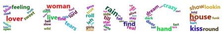
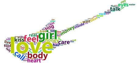
Prince was a man bursting with music – a wildly prolific songwriter, a virtuoso on guitars, keyboards and drums and a master architect of funk, rock, R&B and pop, even as his music defied genres. – Jon Pareles (NY Times)In this tutorial, Part One of the series, you’ll utilize text mining techniques on a set of lyrics using the tidy text framework. Tidy datasets have a specific structure in which each variable is a column, each observation is a row, and each type of observational unit is a table. After cleaning and conditioning the dataset, you will create descriptive statistics and exploratory visualizations while looking at different aspects of Prince’s lyrics.
Check out the article here!
(reprint by permission of DataCamp online learning platform)