I recently had the wonderful opportunity to chat with Hadley Wickham. He is an immensely prolific, yet humble guy who has not only contributed heavily to the advancement and development of R as a language and environment, but who also cares and has thought a lot about the process of doing data science the right way.
As a result, he has given many interviews on this “process” and his approach to data science and programming in R, mostly on the technical side of things. So, when I spoke with him, I wanted to frame the conversation for a broader audience, in large part due to the rapid expansion of people who are using R, most of whom engage very little with the programming wing of the community. Though this expansion of R users is a great thing on many dimensions, it has the potential to create a cohort of frustrated, self-taught programmers.
So, I am sharing Hadley’s responses to my questions in this blog for three main reasons: first and foremost, in an effort to offer a life-raft of sorts to people just getting started with (and frustrated by) R; second, to try and bridge the applied side of R users with the programming side of R users; and third, in the spirit of the open source foundation of R, to speak openly and plainly about the basics of approaching programming in R, and then how to keep going when you run into problems.
Importantly, though this conversation is intentionally non-technical and aimed at beginning programmers and R users, there are many great points and ideas for all programmers to consider, regardless of levels of proficiency and comfort with R. I have highlighted (via bold text) several of these particularly practical and valuable points throughout.
A final technical note: I edited a few places to make the conversation more amenable to reading and for the purpose of a blog post. I did not, however, change any of the substantive content of Hadley’s responses, as you will note from the conversational style of the responses, virtually all of which are verbatim. Enough of me. Here is some advice from Hadley Wickham to young (and old) programmers.
- First, what is your role at R-Studio?
I am the chief scientist at R-Studio. I don’t really know what that means, or what chief scientists do. But I basically lead the teams that look after the Tidyverse, which is a set of packages for doing data science in R. So, my teams have a mix of roles, but there is some research in thinking what we should be working on, a bunch of programming, and also a bunch of education, like helping people understand how things work, webinars, books, talks, and Tweets.
- Why R? How did you come to it and why should other people be convinced?
When I started learning R, the reason was simple: it was the only open source programming language for statistics. That’s obviously changed today, with programs and languages like Python, Java Script, and Scala.
So why R today? When you talk about choosing programming languages, I always say you shouldn’t pick them based on technical merits, but rather pick them based on the community. And I think the R community is like really, really strong, vibrant, free, welcoming, and embraces a wide range of domains. So, if there are like people like you using R, then your life is going to be much easier. That’s the first reason.
And the second reason, which is both a huge strength of R and a bit of a weakness, is that R is not just a programming language. It was designed from day 1 to be an environment that can do data analysis. So, compared to the other options like Python, you can get up and running in R doing data science, learning much, much less about programming to get started. And that generally makes it like easier to get up and running if you don’t have formal training in computer science or software engineering.
- Let’s transition to Tidyverse, as you just mentioned. First, could you explain a bit behind the approach of the Tidyverse, from processing and management, to analysis in R?
The Tidyverse is a collection of R packages with the goal being, once you’ve learned one package in the collection, learning the other packages should be much easier. And what that means is that there is a deep, underlying philosophy and unity where you can learn things in one package and apply the same ideas elsewhere. So, it just means that your naïve ideas about what a function is going to do or how to tackle a problem should be fairly good, because you can draw on your experiences. Things are designed consistently in such a way where your experiences with other functions apply to new functions. So, for example, one of the ideas that underlies many, many packages in the Tidyverse is this idea of “tidy data,” which is a really simple idea, where when you are dealing with data science-y kind of data, you want to make sure that every variable is in a column, and then naturally every observation or case becomes a row. And if you put your data in that format once when you are doing data tidying, then you don’t have to hassle with it multiple times throughout the process.
- In an interview in 2014 at UseR, you said one of your main goals was streamlining the process of getting from raw data to visualization quickly and efficiently, with “tidying” up the data being a key aspect of that. Presumably, you were talking about development of the Tidyverse. Do you think you’re there on that goal? Is there more to be expected? Did you meet it?
Yeah, we have made a lot of progress towards that goal. And 2014 was well before the idea of the Tidyverse existed. And the biggest change in my thinking since then is thinking of the Tidyverse as a thing and not just individual packages, and then being consistent across packages. That’s playing off one of the things my team has been focusing on this year, and that’s consistency within the Tidyverse; not adding a bunch of new features or creating new packages. But just thinking, “how can we make sure everything fits together as well as it possibly can?”
So, we are making good progress and there’s always more to do. And one of the things I find really rewarding is people sharing their experiences, like getting started with data and having the first really enjoyable experience when you go from a new dataset to some cool visualization with as little pain as possible. A neat illustration of that is the “TidyTuesday” hashtag [#tidytuesday] on Twitter. Every Tuesday they post a little data set and challenge, and then people tackle it with R and other tools and Tweet their results. Its really cool. [And anybody can do this, I guess?] Yeah exactly. Totally community run and driven.
- Let’s shift and talk a little more conceptually about R and programming. There seems to be a ton of resources out there for R programmers given that its open source. This is naturally a wonderful thing. But I am wondering about beginning R programmers. Given that there is so much out there, how would you counsel a beginning programmer to sift through the resources to distinguish the signal from the noise?
So, I’m obviously biased in this recommendation, but I would say start with my book, “R for Data Science,” just because this is what it was designed for. It’s not going to teach you everything about R, and it’s by no means perfect, but I think it’s a really good way to get started. And it focuses relentlessly on giving you useful tools to help you understand data. It seems to be pretty popular and people seem to like it. And it’s free. You can buy a book if you want, but it’s free online.
After that, the other thing I would say is to try and find an R learning community. It’s much easier to learn and stay motivated when you are working with other people. And I think there’s lots of ways of doing that: look for a local meet up, like an R meet up or an R Ladies meet up in your area. There’s also the R-Studio community site.
Just find some way to find people like you who also are learning, because you can share your successes and your trials and your failures. It makes it much more likely that you will stick it out to the point where you will do something really useful.
- I’ve noticed a theme in your work and how you approach package and resource development is addressing and fixing common problems in R. I’m curious how you hone in on these problems.
Yeah, I am curious too. I seem to be able to do it. I don’t really know exactly how. Part of it is I just talk to people and I travel a lot. I talk to people in different areas working on different problems, and I interact with a bunch of people on Twitter. And somehow that all feeds into my brain, and then ideas come out in a way I don’t fully understand. But it seems to work. I don’t want to break it. Also, I talk to people who are actually struggling with data analysis problems, and I also read a lot of other programming languages, computer science, and software engineering, because there’s basically nothing that I have done that’s not been done in some way, somewhere else before. So, it’s just finding a right idea that someone else has come up with and then applying it in a new domain; it’s tremendously valuable.
- The use of R has seemed to explode within the past decade or so, moving far beyond the smaller world of computer programmers, spilling into many applied fields such as medicine, engineering, and even my own, political science. Having learned mostly on my own, I feel like there are two conversations going on, with a big gap, leaving the beginners to try and sift through complex worlds and tradeoffs. Specifically, in applied data analysis, the debate or tradeoff seems to be over using R versus another package like Stata. But from what I have observed, in the programming world, the debate seems to be over R versus other languages, such as Python, like you mentioned. So how should an applied analyst, someone who is not a programmer by training, navigate this tradeoff?
I think the tradeoff between Stata and R is: do you want a point-and-click interface, or do you want a programming interface? Point-and-click interfaces are great, because they lay out all of your options in front of you, and you don’t have to remember anything. You can navigate through the set of pre-supplied options. And that’s also it’s greatest weakness, because first of all, you are constrained into what the developer thought you should be able to do. And secondly, because your primary interaction is with a mouse, it’s very difficult to record what you did. And I think that’s a problem for science, because ideally you want to say how you actually got these results. And then simply do that reliably and have other people critique you on that. But it’s also really hard when you are learning, because when you have a problem, how do you communicate that problem to someone else? You basically have to say, “I clicked here, then I clicked here, then I clicked here, and I did this.” Or you make a screen cast, and it’s just clunky.
So, the advantages of programming languages like R or Python, is that the primary mechanism for communicating with the computer is text. And that is scary because there’s nothing like this blinking cursory in front of you; it doesn’t tell you what to do next. But it means you are unconstrained, because you can do anything you can imagine. And you have all these advantages of text, where if you have a problem with your code, you can copy and paste it into an email, you can Google it, you can check it and put it on GitHub, or you can share it by Twitter. There’s just so many advantages to the fact that the primary way you relate with a programming language is through code, which is just text. And so, as long as you are doing data analysis fairly regularly, I think all the advantages outweigh a point and click interface like Stata.
For R and Python, Python is first and foremost a programming language. And that has a lot of good features, but it tends to mean, that if you are going to do data science in Python, you have to first learn how to program in Python. Whereas I think you are going to get up and running faster with R, than with Python because there’s just a bunch more stuff built in and you don’t have to learn as many programming concepts. You can focus on being a great political scientist or whatever you do and learning enough R that you don’t have to become an expert programmer as well to get stuff done.
- As people develop in programming, could you talk a little about the tradeoff between technical complexity and simplicity and usability?
That’s a big question. People naturally go through a few phases. When you start out, you don’t have many tips and techniques at your disposal. So, you are forced to do the simplest thing possible using the simplest ideas. And sometimes you face problems that are really hard to solve, because you don’t know quite the right techniques yet. So, the very earliest phase, you’ve got a few techniques that you understand really well, and you apply them everywhere because those are the techniques you know.
And the next stage that a lot of people go through, is that you learn more techniques, and more complex ways of solving problems, and then you get excited about them and start to apply them everywhere possible. So instead of using the simplest possible solution, you end up creating something that’s probably overly complex or uses some overly general formulation.
And then eventually you get past that and it’s about understanding, “what are the techniques at my disposal? Which techniques fit this problem most naturally? How can I express myself as clearly as possible, so I can understand what I am doing, and so other people can understand what I am doing?” I talk about this a lot but think explicitly about code as communication. You are obviously telling the computer what to do, but ideally you want to write code to express what it means or what it is trying to do as well, so when others read it and when you in the future reads it, you can understand some of the reasoning.
- Any parting words of wisdom for R programmers or the community?
It’s easy when you start out programming to get really frustrated and think, “Oh it’s me, I’m really stupid,” or, “I’m not made out to program.” But, that is absolutely not the case. Everyone gets frustrated. I still get frustrated occasionally when writing R code. It’s just a natural part of programming. So, it happens to everyone and gets less and less over time. Don’t blame yourself. Just take a break, do something fun, and then come back and try again later.

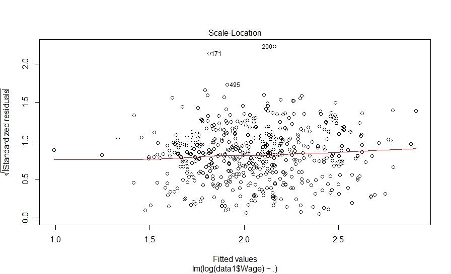
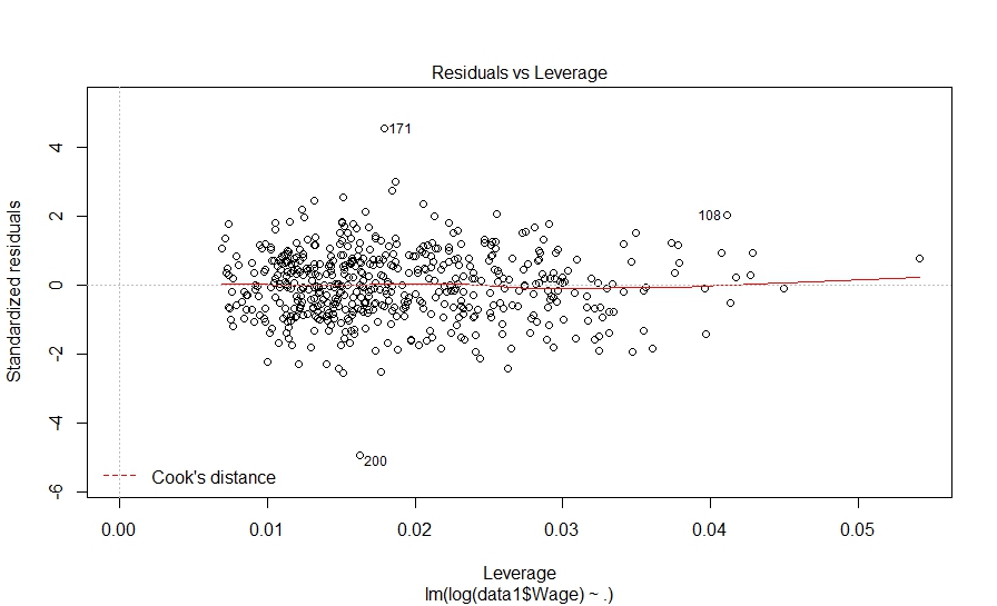
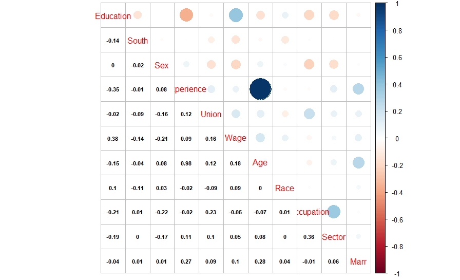
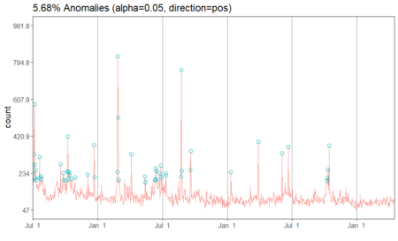
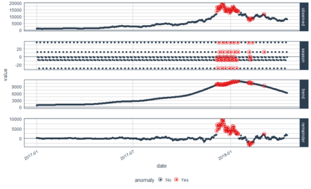
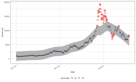
 And here is what we did in our study:

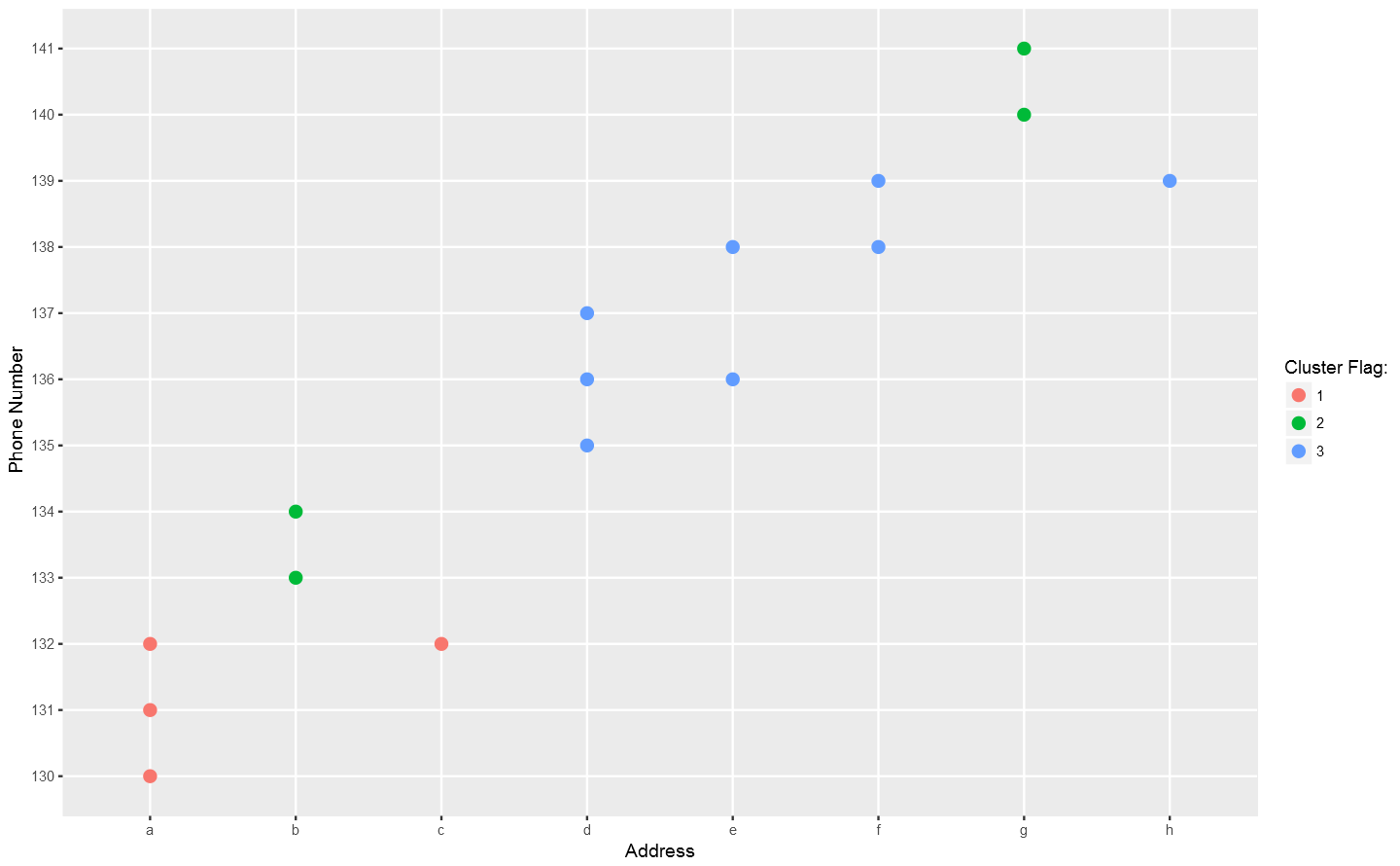
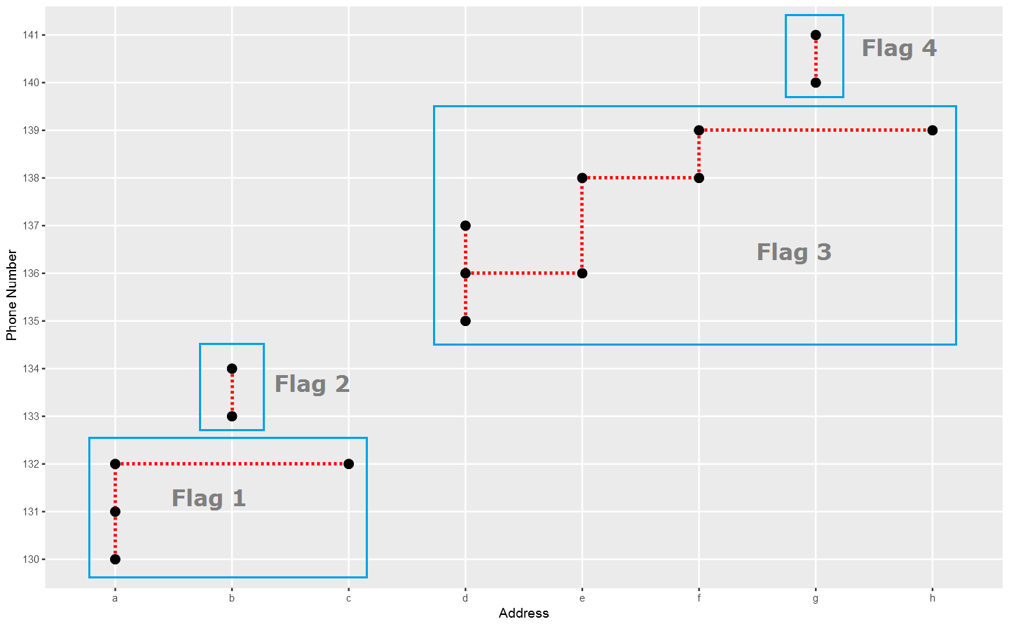 In the above plot, each point stand for a "identity" who has a address which you can tell according to horizontal axis , and a phone number which you can see in vertical axis. The red dotted line present the "connections" betweent identities, which actually means the same address or phone number. So the wanted result is the blue rectangels to circle out different flags which reprent really different persons.
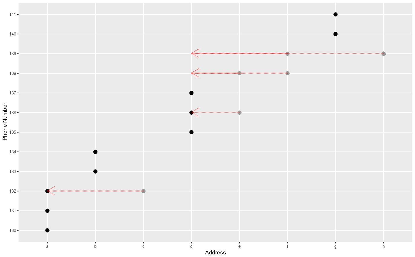
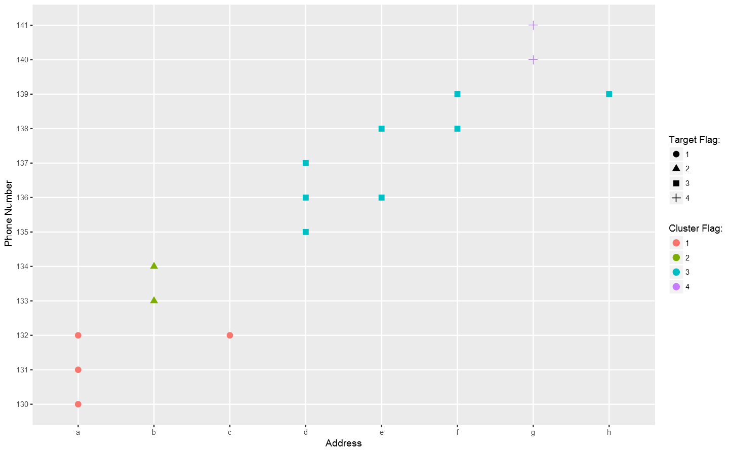 Not bad so far.