A single loop is not enough. A collection of hello world control structures


As the post on “hello world” functions has been quite appreciated by the R community, here follows the second round of functions for wannabe R programmer.

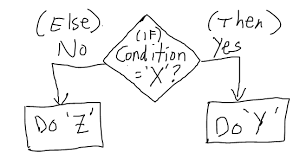
# If else statement:
# See the code syntax below for if else statement
x=10
if(x>1){
print(“x is greater than 1”)
}else{
print(“x is less than 1”)
}

# See the code below for nested if else statement

x=10
if(x>1 & x<7){
print(“x is between 1 and 7”)} else if(x>8 & x< 15){
print(“x is between 8 and 15”)
}


# For loops:
# Below code shows for loop implementation
x = c(1,2,3,4,5)
for(i in 1:5){
print(x[i])
}


# While loop :
# Below code shows while loop in R
x = 2.987
while(x <= 4.987) {
x = x + 0.987
print(c(x,x-2,x-1))
}


# Repeat Loop:
# The repeat loop is an infinite loop and used in association with a break statement.

# Below code shows repeat loop:
a = 1
repeat{
print(a)
a = a+1
if (a > 4) {
break
}
}

# Break statement:
# A break statement is used in a loop to stop the iterations and flow the control outside of the loop.

#Below code shows break statement:
x = 1:10
for (i in x){
if (i == 6){
break
}
print(i)
}

# Next statement:
# Next statement enables to skip the current iteration of a loop without terminating it.

#Below code shows next statement
x = 1: 4
for (i in x) {
if (i == 2){
next
}
print(i)
}


# function

words = c(“R”, “datascience”, “machinelearning”,”algorithms”,”AI”)
words.names = function(x) {
for(name in x){
print(name)
}
}

words.names(words) # Calling the function


# extract the elements above the main diagonal of a (square) matrix
# example of a correlation matrix

cor_matrix <- matrix(c(1, -0.25, 0.89, -0.25, 1, -0.54, 0.89, -0.54, 1), 3,3)
rownames(cor_matrix) <- c(“A”,”B”,”C”)
colnames(cor_matrix) <- c(“A”,”B”,”C”)
cor_matrix

rho <- list()
name <- colnames(cor_matrix)
var1 <- list()
var2 <- list()
for (i in 1:ncol(cor_matrix)){
for (j in 1:ncol(cor_matrix)){
if (i != j & i<j){
rho <- c(rho,cor_matrix[i,j])
var1 <- c(var1, name[i])
var2 <- c(var2, name[j])
}
}
}

d <- data.frame(var1=as.character(var1), var2=as.character(var2), rho=as.numeric(rho))
d

var1 var2 rho
1 A B -0.25
2 A C 0.89
3 B C -0.54


As programming is the best way to learn and think, have fun programming awesome functions!

This post is also shared in R-bloggers and LinkedIn

Introduction to mebootSpear() Function

In the latest version of meboot (v 1.4-8) on CRAN, the function mebootSpear was introduced.  Below is a gentle introduction to its capabilities and a link to a reference paper with further applications to improved Monte Carlo simulations.

The desired properties from the original maximum entropy bootstrap function meboot were retained, while incorporating the additional argument setSpearman.  The original function created bootstrap replicates with unit rank-correlations to the original time-series, setSpearman relaxes this condition.


AirPassengers
The following example will demonstrate the mebootSpear rank-correlation results from the average of 1,000 bootstrap replicates of the AirPassengers dataset.

library(meboot)
output <- mebootSpear(AirPassengers, setSpearman = 0, xmin = 0)$rowAvg

cor(output, AirPassengers, method = "spearman")
[1] 0.01695065


Reference
The following paper is available with additional examples and R-code:

Vinod, Hrishikesh D. and Viole, Fred, Arbitrary Spearman’s Rank Correlations in Maximum Entropy Bootstrap and Improved Monte Carlo Simulations (June 7, 2020). Available at SSRN: 
https://ssrn.com/abstract=3621614 


3D route visualisation – Kilimanjaro


I will show here how to create an interactive 3D visualisation of geospatial data, using rgl library, that allows export of the results into HTML.

The dataset to visualize, is a 7 day hike to Kilimajaro mountain (5895 metres) in Tanzania. 
Dataset contains latitude, longitude and elevation at sequence of timestamps.
route <- readr::read_delim("https://raw.githubusercontent.com/mvhurban/kilimanjaro/master/Kilimanjaro_ascent.csv", ";", escape_double = FALSE, trim_ws = TRUE)
The elevation gain of hiker in meters can be plotted simply:
plot(route$ele)
When visualizing small areas, such as cities, mountains or parts of countries, distortion due to Geoid projection on 2D surface is insignificant and it is sufficient to set the projection center to the visualized area. 
 Our dataset falls into this category and therefore can be bounded by:
max_lat = max(route$lat)
min_lat = min(route$lat)
max_lon = max(route$lon)
min_lon = min(route$lon)
To create a 3D surface, units must match altitude units (meters). This can be achieved by scaling coordinates by factor corresponding to the arclength of 
latitude or longitude degree:

We can use function distGeo (this calculates great circle distance between two points on Earth) to obtain conversion scales.
library(geosphere)
library(rgdal)
lon_scale = geosphere::distGeo(c(min_lon, (min_lat+max_lat)/2), c(max_lon,(min_lat+max_lat)/2))/(max_lon-min_lon) 
lat_scale = geosphere::distGeo(c(min_lon, min_lat), c(min_lon, max_lat))/(max_lat-min_lat)
By hving conversion scales for latitude and logitude, we can convert GPS coordinates to cartesian coordinates in the plane tangent to the Earth at the center of the dataset. One can see it as placing a sheet of paper on the scrutinized spot on Earth. 
route$lon_m <- route$lon * lon_scale
route$lat_m <- route$lat * lat_scale
To obtain the elevation data surrounding the track we define a polygon (rectangle) enclosing the track. Note, that the polygon ends and begins with same point.
y_coord <- c(min_lat, min_lat, max_lat, max_lat, min_lat) # latitude
x_coord <- c(min_lon, max_lon, max_lon, min_lon, min_lon) # longitude
Geospatial polygons can be handled by sp library. Such a polygon must contain a projection string prj_sps defining how to interpret coordinates:
library(sp)
polygon_border <- cbind(x_coord, y_coord)
p <- sp::Polygon(polygon_border)
ps <- sp::Polygons(list(p), 1)
sps <- sp::SpatialPolygons(list(ps))
prj_sps <- sp::CRS("+proj=longlat +datum=WGS84 +no_defs +ellps=WGS84 +towgs84=0,0,0")
sp::proj4string(sps) <- prj_sps
spdf = sp::SpatialPolygonsDataFrame(sps, data.frame(f=99.9))
#plot(spdf)
We define grid with points at which elevation data will be requested. Then we define projection string for a grid object:
grid_data <- sp::makegrid(spdf, cellsize = 0.001) # cellsize in map units (here meters)!
grid <- sp::SpatialPoints(grid_data, proj4string = prj_sps)
The Elevation data for raster object can be downloaded using elevatr library by to accessing the Terrain Tiles on AWS.
library(elevatr)
elevation_df <- elevatr::get_elev_raster(grid, prj = prj_sps, z = 12)
#plot(elevation_df)
Transforming raster object to dataframe:
library(raster)
kili_map <- as.data.frame(raster::rasterToPoints(elevation_df))
Since we have equidistant rectangular grid, we can rearrange points into matrix and project to the plane:
lenX = length(unique(kili_map$x))
lenY = length(unique(kili_map$y))
z_full = matrix(kili_map$layer, nrow=lenX, ncol =lenY, byrow = FALSE )
x_full = lon_scale * matrix(kili_map$x, nrow=lenX, ncol =lenY, byrow = FALSE ) # longitude
y_full = lat_scale * matrix(kili_map$y, nrow=lenX, ncol =lenY, byrow = FALSE ) # latitude
At this stage, it is possible to generate 3D model of route, but depending on the dataset, additional problems may occur. 
Here we address mismatch of Track altitudes and of the altitude dowloaded using elevatr library. 

I our case elevations do not match and some points of Kilimanjaro dataset are above and some below elevatr altitudes and this overlap makes the display ugly. 
We solve this problem by discarding provided elevations and projecting GPS coordinates to dowloaded grid. (Another option would be to use elevatr::get_elev_point(), which returns altitude for the dataframe.)

The projection is done by finding the closest point on a grid to the route point and assigning the elevation, the search of closest neighbour is done by a function provided in data.table library:
library(data.table)
dt_route = data.table::data.table(route)
N = nrow(dt_route)
data.table::setkeyv(dt_route, c('lon_m','lat_m'))
coor_x = data.table::data.table(ind_x=c(1:lenX), lon_m=x_full[ , 1])
coor_y = data.table::data.table(ind_y=c(1:lenY),lat_m=y_full[1, ])
dt_route$ind_y = coor_y[dt_route, on = 'lat_m', roll='nearest']$ind_y
dt_route$ind_x = coor_x[dt_route, on = 'lon_m', roll='nearest']$ind_x
for (i in c(1:N)){
dt_route$altitude[i]<-z_full[dt_route$ind_x[i], dt_route$ind_y[i]]}
For our purposes, the size of grid object is too big and we can skip few points:
Note that skipping every 5 grid points makes a reduction of the size by 96%!
skip_cell = 5
x = x_full[seq(1, lenX, by=skip_cell), seq(1, lenY, by=skip_cell)]
y = y_full[seq(1, lenX, by=skip_cell), seq(1, lenY, by=skip_cell)]
z = z_full[seq(1, lenX, by=skip_cell), seq(1, lenY, by=skip_cell)]
Colors can be assigned to a particular altitude by color pallet, for obvious reasons we have choosen terrain.colors. But since Kilimanjaro has snow above 5300 m, we added the snowline. 
snowline <- 5300 # above this line color will be white
colorlut <- terrain.colors(snowline-0, alpha = 0)
# maping altitude to color: minimum is 0 - green, maximum 5300 - white
z_col<-z
z_col[z_col>snowline] <- snowline
col <- colorlut[z_col]
Calculating relative time spent on the hike:
dt_route = dt_route[order(time), ]
time <- as.POSIXlt(dt_route$time, format='%Y-%m-%d-%H-%M-%S')
start_time = time[1]
end_time = time[N]
dt_route$relative_time <- as.numeric(difftime(time, start_time, units ='hours'))/as.numeric(difftime(end_time, start_time, units='hours'))
Here we add some additional perks to the map:
#### CAMPS
camp_index<-c(1, 2897, 4771, 7784, 9275, 10396,15485, 17822)
camp_lon <- dt_route[camp_index, lon_m]
camp_lat <- dt_route[camp_index, lat_m]
camp_alt <- dt_route[camp_index, altitude]
camp_names <- c('Machame gate','Machame camp', 'Shira cave', 'Baranco camp', 'Karanga camp', 'Barafu camp', 'Mweka camp', 'Mweka gate')
#### PEAKS
peak_lon <- lon_scale*c( 37.3536381, 37.4561200, 37.3273936, 37.2370328)
peak_lat <- lat_scale*c(-3.0765783, -3.0938911, -3.0679128, -3.0339558)
peak_alt <- c(5895, 5149, 4689, 2962)-50
peak_names<-c("Uhuru peak (5895)", "Mawenzi (5149)", "Lava Tower (4689)", "Shira (2962)")

#### Hike
skip_points <- 10
aux_index <- seq(1, N, by=skip_points)
time <- dt_route[aux_index, relative_time]
hike <- cbind(dt_route[aux_index, lon_m], dt_route[aux_index, lat_m], dt_route[aux_index, altitude])
Finally, plotting using rgl library. It is important, that rgl window initialized by rgl::open3d() is open while objects are created. Each object created is loaded to html element within rgl scene3d, and at any moment can be saved as scene object by command: kilimanjaro_scene3d <- scene3d() (which assigns current status of rgl window). Note, that the importance of parameter alpha, where alpha=1 corresponds to non-transparent objects, while for display of texts the transparency is allowed, which smoothes imaging of edges (alpha=0.9).
library(rmarkdown)
rgl::open3d()
hike_path <- rgl::plot3d(hike, type="l", alpha = 1, lwd = 4, col = "blue", xlab = "latitude", ylab='longitude', add = TRUE)["data"]
rgl::aspect3d("iso") # set equilateral spacing on axes
camp_shape <- rgl::spheres3d(camp_lon, camp_lat, camp_alt, col="green", radius = 150)
rgl::rgl.surface(x, z, y, color = col, alpha=1)
hiker <- rgl::spheres3d(hike[1, , drop=FALSE], radius = 200, col = "red")
camp_text<-rgl::rgl.texts(camp_lon, camp_lat, camp_alt+400,camp_names
, font = 2, cex=1, color='black', depth_mask = TRUE, depth_test = "always", alpha =0.7)
peak_shape <- rgl::spheres3d(peak_lon, peak_lat, peak_alt, col="black", radius = 150)
peak_text <- rgl::rgl.texts(peak_lon,peak_lat,peak_alt+400,peak_names
,font = 2, cex=1, color='black', depth_mask = TRUE, depth_test = "always", alpha =0.9)
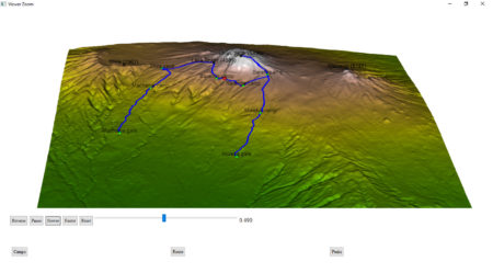
To generate an interactive HTML, rgl library provides the rglwidget function, that can be used to display the motion of a hiker in real time. It is worth to mention how agecontrol object works: it generates a set of objects with predefined life cycle, where birth defines the time of spawn, age defines the vector of time periods (in object age) at which value of object changes like the transparency (alpha).
library(rgl)
rgl::rglwidget() %>%
playwidget(
ageControl(births = 0, ages = time, vertices = hike, objids = hiker),step = 0.01, start = 0, stop=1, rate = 0.01, components = c("Reverse", "Play", "Slower", "Faster","Reset", "Slider", "Label"), loop = TRUE) %>%
toggleWidget(ids = c(camp_shape, camp_text), label="Camps") %>%
toggleWidget(ids = hike_path, label="Route") %>%
toggleWidget(ids = c(peak_shape, peak_text), label="Peaks") %>%
asRow(last = 3)
And that’s it!
Version modified to satisfy requirements of Shiny apps is posted here:
https://mvhurban.shinyapps.io/GPS_zobrazovanie/
R code for removing Bias in Covid-19 data Using Econometric Tools

A version of our detailed paper with all the theory is submitted to a journal called Econometrica. It is entitled “A Novel Solution to Biased Data in Covid-19 Incidence Studies” and is available at vinod/virus1.pdf and also at ssrn.com/abstract=3637682 The paper solves the bias in data arising from non-random testing of entire population for Covid-19. A two-equation model overcomes the bias by using the inverse Mills ratio and improves forecasts of new deaths in all nine out of nine weekly out-of-sample comparisons. We identify the political party of the governors of states with desirable negative and undesirable positive trends.
library(sampleSelection)
library(margins)
library(dplyr)
##Pull Data
Cumulative_Deaths=read.csv("Cumulative Deaths.csv")
Cumulative_Infections=read.csv("Cumulative Infections.csv")
Covid=read.csv("Covid_0615.csv")
##clean data
Covid$State.Abbreviation<-Covid$STA
Final_Dataset<-merge(Covid,Cumulative_Deaths,by="State.Abbreviation")
Data<-merge(Final_Dataset,Cumulative_Infections,by="State.Abbreviation")
2020/06/15: First Step Probit Model

myprobit<-glm(TI~HES+CPT+UI+HR+HI, family=binomial(link="probit"),data=Data)
##TI is Testing Indicator (i.e. 1 for tested and 0 for not tested)
##HES is Hospital Employee Share
##CPT is portion of population that Commutes on Public Transit
##UI in Uninsured Population
##HR is Hypertension Rate (one of the leading comorbidities)
#HI is Household Income

summary(myprobit)
## 
## Call:
## glm(formula = TI ~ HES + CPT + UI + HR + HI, family = binomial(link = "probit"), 
##     data = Data)
## 
## Deviance Residuals: 
##     Min       1Q   Median       3Q      Max  
## -0.7296  -0.3849  -0.3553  -0.3376   2.5180  
## 
## Coefficients:
##               Estimate Std. Error z value Pr(>|z|)    
## (Intercept) -2.4319390  0.0636110 -38.231  < 2e-16 ***
## HES          0.0663127  0.0081659   8.121 4.64e-16 ***
## CPT          0.0193450  0.0004345  44.523  < 2e-16 ***
## UI          -0.0070335  0.0009966  -7.058 1.69e-12 ***
## HR           0.0198518  0.0011021  18.012  < 2e-16 ***
## HI           0.0021614  0.0004608   4.690 2.73e-06 ***
## ---
## Signif. codes:  0 '***' 0.001 '**' 0.01 '*' 0.05 '.' 0.1 ' ' 1
## 
## (Dispersion parameter for binomial family taken to be 1)
## 
##     Null deviance: 254187  on 499999  degrees of freedom
## Residual deviance: 250590  on 499994  degrees of freedom
## AIC: 250602
## 
## Number of Fisher Scoring iterations: 5
2020/06/15: Probit Model Marginal Effects

#Marginal Effects of probit model
effects_pro=margins(myprobit) #print(effects_pro)
summary(effects_pro)
 

1   CPT 0.0025685341    5.801388e-05    44.274475   0.000000e+00    0.0024548290    0.0026822392
2   HES 0.0088046672    1.084429e-03    8.119170    4.693813e-16    0.0066792246    0.0109301098
3   HI  0.0002869787    6.119577e-05    4.689519    2.738481e-06    0.0001670372    0.0004069203
4   HR  0.0026358250    1.465264e-04    17.988742   2.387156e-72    0.0023486386    0.0029230114
5   UI  -0.0009338730   1.323531e-04    -7.055923   1.714593e-12    -0.0011932802   -0.0006744657
5 rows
2020/06/15: Extract inverse Mills ratio from probit model

##Compute inverse Mills ratio from probit model usine 'invMillsRatio' command from the 'sampleSelection' package.
IMR=invMillsRatio(myprobit,all=FALSE)
Data$IMR<-invMillsRatio(myprobit)$IMR1
##create table of IMR values by state
IMR.Index=cbind(as.character(Data$State.Abbreviation),Data$IMR)
IMR_table=distinct(data.frame(IMR.Index))
2020/06/15: Second Step Heckman Equation (i.e. with IMR)

##GLM with Poisson distribution to estimate cumulative deaths based on the log of cumulative infections from the previous week, as well as the IMR. 
##Use 'glm' command with 'family=poisson(link="log")'
##Only ran the model on individuals who were tested (i.e. TI = 1).
##CD is "Cumulative Deaths"
##CI is "Cumulative Infections"

glm_IMR_0615_CD<-glm(X20200615_CD~log(X20200608_CI)+IMR,family=poisson(link="log"),
                     data=subset(Data,TI==1))
fig-out-of-sample-all

#Compute fitted values for each state
Tested_Individuals<-subset(Data,TI==1)
Fitted_CD_IMR=fitted(glm_IMR_0615_CD)
Fitted_CD=fitted(glm_0615_CD)

Results_Table=cbind(as.character(Tested_Individuals$State.Abbreviation),Tested_Individuals$X20200622_CI,
               Tested_Individuals$X20200622_CD,Tested_Individuals$X20200615_CD,Fitted_CD_IMR,Fitted_CD,
               Tested_Individuals$IMR)

#Pull fitted value for each state
Final_Results=distinct(data.frame(Results_Table))

View(Final_Results)
Assessing Nation-wide Forecast

#Compare fitted values with in-sample (2020/06/15) and out-of-sample (2020/06/22) actual deaths

Actual_Infections_Out_Sample=sum(as.numeric(Final_Results[,2]))

Actual_Deaths_Out_Sample=sum(as.numeric(Final_Results[,3]))
Predict_Deaths_IMR=sum(as.numeric(Final_Results$Fitted_CD_IMR))
Predict_Deaths_no_IMR=sum(as.numeric(Final_Results$Fitted_CD))
Out_of_sample_per_diff_CD_IMR=(Predict_Deaths_IMR-Actual_Deaths_Out_Sample)/Actual_Deaths_Out_Sample
Out_of_sample_per_diff__CD_no_IMR=(Predict_Deaths_no_IMR-Actual_Deaths_Out_Sample)/Actual_Deaths_Out_Sample

Actual_Deaths_In_Sample=sum(as.numeric(Final_Results[,4]))
In_sample_per_diff_CD_IMR=(Predict_Deaths_IMR-Actual_Deaths_In_Sample)/Actual_Deaths_In_Sample
In_sample_per_diff_CD_no_IMR=(Predict_Deaths_no_IMR-Actual_Deaths_In_Sample)/Actual_Deaths_In_Sample

print(rbind(Actual_Deaths_In_Sample,In_sample_per_diff_CD_IMR,In_sample_per_diff_CD_no_IMR))
##                                       [,1]
## Actual_Deaths_In_Sample       1.098220e+05
## In_sample_per_diff_CD_IMR     4.064085e-03
## In_sample_per_diff_CD_no_IMR -4.705036e-02
print(rbind(Actual_Infections_Out_Sample,Actual_Deaths_Out_Sample,Predict_Deaths_no_IMR, Out_of_sample_per_diff_CD_IMR,Out_of_sample_per_diff__CD_no_IMR))
##                                            [,1]
## Actual_Infections_Out_Sample       2.290489e+06
## Actual_Deaths_Out_Sample           1.139440e+05
## Predict_Deaths_no_IMR              1.046548e+05
## Out_of_sample_per_diff_CD_IMR     -3.225860e-02
## Out_of_sample_per_diff__CD_no_IMR -8.152394e-02

In all nine cases using IMR bias correction improves out-of-sample forecasts of Covid-19 deaths in US as a whole

cbind(Week,IMR_Perc_Diff,Without_IMR_Perc_Diff)
##       Week IMR_Perc_Diff Without_IMR_Perc_Diff
##  [1,]    1        -25.27                -26.96
##  [2,]    2        -21.61                -22.50
##  [3,]    3        -17.66                -18.73
##  [4,]    4        -12.14                -13.78
##  [5,]    5         -9.38                -11.28
##  [6,]    6         -7.25                 -9.70
##  [7,]    7         -5.53                 -9.01
##  [8,]    8         -3.94                 -8.03

Tidy Visualization of Mixture Models in R

We are excited to announce the release of the plotmm R package (v0.1.0), which is a suite of tidy tools for visualizing mixture model output. plotmm is a substantially updated version of the plotGMM package (Waggoner and Chan). Whereas plotGMM only includes support for visualizing univariate Gaussian mixture models fit via the mixtools package, the new plotmm package supports numerous mixture model specifications from several packages (model objects).

This current stable release is available on CRAN, and was a collaborative effort among Fong Chan, Lu Zhang, and Philip Waggoner.

The package has five core functions:

  • plot_mm(): The main function of the package, plot_mm() allows the user to simply input the name of the fit mixture model, as well as an optional argument to pass the number of components k that were used in the original fit. Note: the function will automatically detect the number of components if k is not supplied. The result is a tidy ggplot of the density of the data with overlaid mixture weight component curves. Importantly, as the grammar of graphics is the basis of visualization in this package, all other tidy-friendly customization options work with any of the plotmm’s functions (e.g., customizing with ggplot2’s functions like labs() or theme_*(); or patchwork’s plot_annotation()).

  • plot_cut_point(): Mixture models are often used to derive cut points of separation between groups in feature space. plot_cut_point() plots the data density with the overlaid cut point (point of greatest separation between component class means) from the fit mixture model.

  • plot_mix_comps(): A helper function allowing for expanded customization of mixture model plots. The function superimposes the shape of the components over a ggplot2 object. plot_mix_comps() is used to render all plots in the main plot_mm() function, and is not bound by package-specific objects, allowing for greater flexibility in plotting models not currently supported by the main plot_mm() function.

  • plot_gmm(): The original function upon which the package was expanded. It is included in plotmm for quicker access to a common mixture model form (univariate Gaussian), as well as to bridge between the original plotGMM package.

  • plot_mix_comps_normal(): Similarly, this function is the original basis of plot_mix_comps(), but for Gaussian mixture models only. It is included in plotmm for bridging between the original plotGMM package.
Supported model objects/packages include:

  1. mixtools
  2. EMCluster
  3. flexmix
Supported specifications include mixtures of:

  1. Univariate Gaussians
  2. Bivariate Gaussians
  3. Gammas
  4. Logistic regressions
  5. Linear regressions (also with repeated measures)
  6. Poisson regressions

Take a look at the Github repo for several demonstrations.

Note that though plotmm includes many updates and expanded functionality beyond plotGMM, it is under active development with support for more model objects and specifications forthcoming. Stay tuned for updates, and always feel free to open an issue ticket to share anything you’d like to see included in future versions of the package. Thanks and enjoy!

Epidemiologists should consider GLM & IMR for better Covid death predictions and overcome testing bias

Social science research network (SSRN) reviewer has posted our “A Novel Solution to Biased Data in Covid-19 Incidence Studies” written by myself (H D Vinod) and K Theiss.  It uses a new two-equation generalized linear model (glm) with Poisson link for forecasting Covid-19 deaths in the US and individual states. The first equation explicitly models the probability of being tested. It helps build an estimate of the bias using inverse mills ratio (IMR) Detailed paper is available for free download at:

ssrn.com/abstract=3637682 It uses open-source R software.  A supplement to the paper entitled “State-by-state Forecasts of Covid-19 Deaths” is available for free download at http://www.fordham.edu/economics/vinod/WeeklyCovid.pdf Our bias-corrected out-of-sample death forecasts for future weeks should help state governors and mayors decide on limits to opening local economies.  One can compare the performance of democratic versus republican governors using the information tabulated.

Basic data analysis with palmerpenguins


Introduction

In June 17, nice article for introducing new trial dataset were uploaded via R-bloggers.

iris, one of commonly used dataset for simple data analysis. but there is a little issue for using it. 

Too good.

Every data has well-structured and most of analysis method works with iris very well.

In reality, most of dataset is not pretty and requires a lot of pre-process to just start. This can be possible works in pre-process

Remove NAs.
Select meaningful features
Handle duplicated or inconsistent values.
or even, just loading the dataset. if is not well-structured like Flipkart-products

However, in this penguin dataset, you can try for this work. also there’s pre-processed data too.

For more information, see the page of palmerpenguins

There is a routine for me with brief data analysis. and today, I want to share them with this lovely penguins. 


Contents

0. Load dataset and library on workspace.
library(palmerpenguins) # for data
library(dplyr) # for data-handling
library(corrplot) # for correlation plot
library(GGally) # for parallel coordinate plot
library(e1071) # for svm

data(penguins) # load pre-processed penguins 
palmerpenguins have 2 data penguins, penguins_raw , and as you can see from their name, penguins is pre-processed data.  

1. See the summary  and plot of Dataset
summary(penguins)
plot(penguins)


It seems speciesisland  and sex is categorical features.
and remaining for numerical features.

2. Set the format of feature
penguins$species <- as.factor(penguins$species)
penguins$island <- as.factor(penguins$island)
penguins$sex <- as.factor(penguins$sex)

summary(penguins)
plot(penguins)
and see summary and plot again. note that result of plot is same. 


There’s unwanted NA and . values in some features.

3. Remove not necessary datas ( in this tutorial, NA)
penguins <- penguins %>% filter(sex == 'MALE' | sex == 'FEMALE')
summary(penguins)
And here, I additionally defined color values for each penguins to see better plot result
# Green, Orange, Purple
pCol <- c('#057076', '#ff8301', '#bf5ccb')
names(pCol) <- c('Gentoo', 'Adelie', 'Chinstrap')
plot(penguins, col = pCol[penguins$species], pch = 19)

Now, plot results are much better to give insights.

Note that, other pre-process step may requires for different datasets.

4. See relation of categorical features

My first purpose of analysis this penguin is species
So, I will try to see relation between species and other categorical values

4-1. species, island
table(penguins$species, penguins$island)
chisq.test(table(penguins$species, penguins$island)) # meaningful difference

ggplot(penguins, aes(x = island, y = species, color = species)) +
  geom_jitter(size = 3) + 
  scale_color_manual(values = pCol) 


Wow, there’s strong relationship between species and island

Adelie lives in every island
Gentoo lives in only Biscoe
Chinstrap lives in only Dream

4-2 & 4.3.
However, species and sex or sex and island did not show any meaningful relation.
You can try following codes. 
# species vs sex
table(penguins$sex, penguins$species)
chisq.test(table(penguins$sex, penguins$species)[-1,]) # not meaningful difference 0.916

# sex vs island
table(penguins$sex, penguins$island) # 0.9716
chisq.test(table(penguins$sex, penguins$island)[-1,]) # not meaningful difference 0.9716
5. See with numerical features

I will select numerical features. 
and see correlation plot and parallel coordinate plots.
# Select numericals
penNumeric <- penguins %>% select(-species, -island, -sex)

# Cor-relation between numerics

corrplot(cor(penNumeric), type = 'lower', diag = FALSE)

# parallel coordinate plots

ggparcoord(penguins, columns = 3:6, groupColumn = 1, order = c(4,3,5,6)) + 
  scale_color_manual(values = pCol)

plot(penNumeric, col = pCol[penguins$species], pch = 19)

and below are result of them.


lucky, every numeric features (even only 4) have meaningful correlation and there is trend with  their combination for species (See parallel coordinate plot)

6. Give statistical work on dataset.

In this step, I usually do linear modeling or svm to predict

6.1 linear modeling

species is categorical value, so it needs to be change to numeric value
set.seed(1234)
idx <- sample(1:nrow(penguins), size = nrow(penguins)/2)

# as. numeric
speciesN <- as.numeric(penguins$species)
penguins$speciesN <- speciesN

train <- penguins[idx,]
test <- penguins[-idx,]


fm <- lm(speciesN ~ flipper_length_mm + culmen_length_mm + culmen_depth_mm + body_mass_g, train)

summary(fm) 


It shows that, body_mass_g is not meaningful feature as seen in plot above ( it may explain gentoo, but not other penguins )

To predict, I used this code. however, numeric predict generate not complete value (like 2.123 instead of 2) so I added rounding step.
predRes <- round(predict(fm, test))
predRes[which(predRes>3)] <- 3
predRes <- sort(names(pCol))[predRes]

test$predRes <- predRes
ggplot(test, aes(x = species, y = predRes, color = species))+ 
  geom_jitter(size = 3) +
  scale_color_manual(values = pCol)

table(test$predRes, test$species)


Accuracy of basic linear modeling is 94.6%

6-2 svm

using svm is also easy step.
m <- svm(species ~., train)

predRes2 <- predict(m, test)
test$predRes2 <- predRes2

ggplot(test, aes(x = species, y = predRes2, color = species)) +
  geom_jitter(size = 3) +
  scale_color_manual(values = pCol)

table(test$species, test$predRes2)
and below are result of this code.


Accuracy of svm is 100%. wow.


Conclusion

Today I introduced simple routine for EDA and statistical analysis with penguins.
That is not difficult that much, and shows good performances.

Of course, I skipped a lot of things like processing raw-dataset.
However I hope this trial gives inspiration for further data analysis.

Thanks.

Outliers and Domain Knowledge

by Jerry Tuttle
      I would like to share some thoughts about outliers and domain knowledge.
      One of the common steps during the data exploration stage is the search for outliers. Some analysis methods such as regression are very sensitive to outliers. As an example of sensitivity, in the following data (10,10) is an outlier. Including the outlier produces a regression line y = .26 + .91x, while excluding the outlier produces the very different regression line y = 2.

x <- c(1,1,1,2,2,2,3,3,3,10)
y <- c(1,2,3,1,2,3,1,2,3,10)
df <- data.frame(cbind(x,y))
lm(y ~ x, df)
plot(x,y, pch=16)
abline(lm(y ~ x, df)


      Statistics books sometimes define an outlier as being outside the range of Q1 ± 1.5IQR or Q1 ± 3IQR, where Q1 is the lower quartile (25th percentile value), Q3 is the upper quartile (75th percentile value), and the interquartle range IQR = Q3 – Q1.
      What does one do with an outlier? It could be bad data. It is pretty unlikely that there is a graduate student who is age 9, but we don’t know whether the value should be 19 (very rare, but possible), or 29 (likely), or 39 or more (not so rare). If we have the opportunity to ask the owner of the data, perhaps we can get the value corrected. More likely is we can not ask the owner. We can delete the entire observation, or we can pretend to correct the value with a mode or median value or a judgmental value.
      Perhaps the outlier is not bad data but rather just an unusual value. In a portfolio of property or liability insurance claims, the distribution is often positively skewed (mean greater than mode, a long tail to the positive side of the mode). Most claims are small, but occasionally there is that one enormous claim. What does one do with that outlier value? Some authors consider data science to be the Venn diagram intersection among math/statistics, computer science, and domain knowledge (see for example Drew Conway, in drewconway.com/zia/2013/3/26/the-data-science-venn-diagram). If the data scientist is not the domain expert, he or she should consult with one. With insurance claims there are several possibilities. One is that the enormous claim is one that is unlikely to reoccur for any number of reasons. Hopefully there will never be another September 11 type destruction of two World Trade Center buildings owned by a single owner. Another example is when the insurance policy terms are revised to literally prohibit a specific kind of claim in the future. Another possibility is that the specific claim is unlikely to reoccur (the insurance company stopped insuring wheelchairs, so there won’t be another wheelchair claim), but that claim is representative of another kind of claim that is likely to occur. In this case, the outlier should not be deleted. One author has said it takes Solomon-like wisdom to discern which possibility to believe.
      An interesting example of outliers occurs with sports data. For many reasons, US major league baseball player statistics have changed over the years. There are more great home run seasons nowadays than decades ago, but there are fewer great batting average seasons. Baseball fanatics know the last .400 hitter (40% ratio of hits divided by at bats over the entire season) was Ted Williams in 1941. If we have 80 years of baseball data and we are predicting the probability of another .400 hitter, we would predict close to zero. It’s possible, but extremely unlikely, right? Actually no. Assuming there will still be a shortened season in 2020, a decision that may change, this author is willing to forecast that there will be a .400 hitter in a shortened season. This is due to the theory that batters need less time in spring training practice to be at full ability than pitchers, and it is easier to achieve .400 in a small number of at bats earlier in the season when the pitchers are not at full ability. This is another example of domain expertise as a lifetime baseball fan.

Netflix vs Disney+. Who has more fresh titles?

“Let`s shift to Disney+”, said my wife desperately browsing Netflix on her phone. “Netflix has much more fresh content” I argued. And…I realized I need numbers to close these family debates…

I choose “2018 and later” criteria as “fresh” and “1999 and earlier” as “old”. Those criteria are not strict but I needed certainty to have completely quantified arguments to keep my Netflix on the family throne.

Since I did not find such numbers on both streaming services websites I decided to scrape full lists of movies and TV shows and calculate % of “fresh” / “old” movies in entire lists. Likely, there are different websites listing all movies and TV shows both on Disney+ and Netflix and updating them daily. I choose one based on popularity (I checked it both with Alexa and Similar Web) and its architecture making my scraping job easy and predictable.
library (tidyverse)
library (rvest)
disney0 <- read_html("https://www.finder.com/complete-list-disney-plus-movies-tv-shows-exclusives/")
Locate proper CSS element using Selector Gadget
disney_year_0 <- html_nodes(disney0, 'td:nth-child(2)')
disney_year <- html_text (disney_year_0, trim=TRUE)
# list of release years for every title
length (disney_year) #1029
Now, let`s create frequency table for each year of release
disney_year_table <- as.data.frame (sort (table (disney_year), decreasing = TRUE), stringsAsFactors = FALSE)
colnames (disney_year_table) <- c('years', 'count') 

glimpse (disney_year_table)
Rows: 89 Columns: 2 $ years  "2019", "2017", "2016", "2018", "2015", "2011", "2014", "2012", "2010", "200... $ count  71, 58, 48, 40, 36, 35, 35, 34, 31, 28, 28, 27, 27, 25, 24, 24, 23, 23, 21,
Finally, count ‘fresh’ and 'old' % in entire Disney+ offer

disney_year_table$years <- disney_year_table$years %>% as.numeric () 

fresh_disney_years <- disney_year_table$years %in% c(2018:2020) 
fresh_disney_num <- paste (round (sum (disney_year_table$count[fresh_disney_years]) / sum (disney_year_table$count)*100),'%') 

old_disney_years <- disney_year_table$years < 2000
old_disney_num <- paste (round (sum (disney_year_table$count[old_disney_years]) / sum (disney_year_table$count)*100),'%') 
So, I`ve got roughly 14% “fresh” and 33% “old” movie on Disney+. Let`s see the numbers for Netflix.
For Netflix content our source website does not have single page so I scraped movies and TV shows separately.
 

#movies
netflix_mov0 <- read_html("https://www.finder.com/netflix-movies/")
netflix_mov_year_0 <- html_nodes(netflix_mov0, 'td:nth-child(2)') 
netflix_mov_year <- tibble (html_text (netflix_mov_year_0, trim=TRUE))
colnames (netflix_mov_year) <- "year" 

#TV shows 
netflix_tv0 <- read_html("https://www.finder.com/netflix-tv-shows/")
netflix_tv_year_0 <- html_nodes(netflix_tv0, 'td:nth-child(2)')
netflix_tv_year <- tibble (html_text (netflix_tv_year_0, trim=TRUE))
colnames (netflix_tv_year) <- "year" 
Code for final count of the at Neflix ‘fresh’ and ‘old’ movies / TV shows portions is almost the same as for Disney
netflix_year <- rbind (netflix_mov_year, netflix_tv_year)
nrow (netflix_year)
netflix_year_table <- as.data.frame (sort (table (netflix_year), decreasing = TRUE), stringsAsFactors = FALSE) colnames (netflix_year_table) <- c('years', 'count')

glimpse (netflix_year_table)
Rows: 68
Columns: 2
$ years  2018, 2019, 2017, 2016, 2015, 2014, 2020, 2013, 2012, 2010,
$ count  971, 882, 821, 653, 423, 245, 198, 184, 163, 127, 121, 108, 
Count 'fresh' and 'old' % in entire offer
netflix_year_table$years <- netflix_year_table$years %>% as.numeric ()

fresh_netflix_years <- netflix_year_table$years %in% c(2018:2020)
fresh_netflix_num <- paste (round (sum (netflix_year_table$count[fresh_netflix_years]) / sum (netflix_year_table$count)*100),'%') 

old_netflix_years <- netflix_year_table$years < 2000
old_netflix_years <- na.omit (old_netflix_years)
old_netflix_num <- paste (round (sum (netflix_year_table$count[old_netflix_years]) / sum (netflix_year_table$count)*100),'%') 
So, finally, I can build my arguments based on numbers, freshly baked and bold


Version 0.1.4 of nnlib2Rcpp: a(nother) R package for Neural Networks

For anyone interested, a new version (v.0.1.4) of nnlib2Rcpp is available on GitHub. It can be installed the usual way for packages on GitHub:

library(devtools)
install_github("VNNikolaidis/nnlib2Rcpp")
nnlib2Rcpp is an R package containing a number of Neural Network (NN) implementations. The NNs are implemented in C++ (using nnlib2 C++ class library) and are interfaced with R via Rcpp package (which is required). The package currently includes versions of Back-Propagation, Autoencoder, Learning Vector Quantization (unsupervised and supervised) and simple Matrix-Associative-Memory neural networks. Functions and modules for directly using these models from R are provided.

Furthermore, a new “NN” module (NN-class) has been added to version 0.1.4, that allows the creation of custom NNs using predefined components, and manipulation of the network and its components from R. It also provides a fixed procedure for defining new NN component types (layers, nodes, sets of connections etc) which can then be used in the module (some familiarity with C++ is required).

The  “NN” (aka NN-class)   provides methods for handling the NN, such as: add_layer, add_connection_set, create_connections_in_sets, connect_layers_at, fully_connect_layers_at, add_single_connection, input_at, encode_at, encode_all, recall_at, recall_all, get_output_from, get_input_at, get_weights_at, print, outline.

A (rather useless and silly) example of using the “NN” module follows:
# (1.A) create new 'NN' object:
n <- new("NN")

# (1.B) Add topology components:
# 1. add a layer of 4 generic nodes:
n$add_layer("generic",4)
# 2. add (empty) set for connections that pass data unmodified:
n$add_connection_set("pass-through")
# 3. add another layer of 2 generic nodes:
n$add_layer("generic",2)
# 4. add (empty) set for connections that pass data * weight:
n$add_connection_set("wpass-through")
# 5. add a layer of 1 generic node:
n$add_layer("generic",1)
# Create actual connections in sets,w/random initial weights in [0,1]:
n$create_connections_in_sets(0,1)
# Optionally, show an outline of the topology:
n$outline()

# (1.C) use the network.
# input some data, and run create output for it:
n$input_at(1,c(10,20,30,40))
n$recall_all(TRUE)
# the final output:
n$get_output_from(5)

# (1.D) optionally, examine the network:
# the input at first layer at position 1:
n$get_input_at(1)
# Data is passed unmodified through connections at position 2,
# and (by default) summed together at each node of layer at 3.
# Final output from layer in position 3:
n$get_output_from(3)
# Data is then passed multiplied by the random weights through
# connections at position 4. The weights of these connections:
n$get_weights_at(4)
# Data is finally summed together at the node of layer at position 5,
# producing the final output, which (again) is:
n$get_output_from(5)
The next example, creates a simple MAM using the "NN" (NN-class) module: 
# (2.A) Create the NN and its components:

m <- new( "NN" )
m$add_layer( "generic" , 4 )
m$add_layer( "generic" , 3 )
m$fully_connect_layers_at(1, 2, "MAM", 0, 0)

# (2.B) Use it to store iris species:

iris_data    <- as.matrix( scale( iris[1:4] ) )
iris_species <- as.integer( iris$Species )
for(r in 1:nrow( iris_data ) )
{
    x <- iris_data[r,]
    z <- rep( -1, 3 )
    z [ iris_species[r] ] <- 1
    m$input_at( 1, x )
    m$input_at( 3, z )
    m$encode_all( TRUE )
}

# (2.C) Attempt to recall iris species:

recalled_ids <- NULL;
for(r in 1:nrow(iris_data))
{
    x <- iris_data[r,]
    m$input_at( 1, x )
    m$recall_all( TRUE )
    z <- m$get_output_from( 3 )
    recalled_ids <- c( recalled_ids, which.max ( z ) )
}

plot(iris_data, pch=recalled_ids)
Hopefully the collection of predefined components will expand (and any contribution of components is welcomed).