Zoom talk on “Building dashboards in R/shiny (and improve them with logs and user feedback)” from the Grenoble (FR) R user group

The next talk of Grenoble’s R user group will be on May 25, 2021 at 5PM (FR) and is free and open to all:

Building dashboards in R/shiny (and improve them with logs and user feedback)

        The main goal of this seminar is to demonstrate how R/Shiny app developers can collect data from the visitors of their app (such as logs or feedback) to improve it. We will use as example the CaDyCo project, a dynamic and collaborative cartography project hosted by USMB and UGA.


Hope to see you there!

Zoom talk on “Version control and git for beginners” from the Grenoble (FR) R user group

The next talk of Grenoble’s R user group will be on May 06, 2021 at 5PM (FR) and is free and open to all:

Version control and git for beginners

    Git is a version control system whose original purpose was to help groups of developers work collaboratively on big software projects. Git manages the evolution of a set of files – called a repository – in a sane, highly structured way. Git has been re-purposed by the data science community. In addition to using it for source code, we use it to manage the motley collection of files that make up typical data analytical projects, which often consist of data, figures, reports, and, yes, source code. In this presentation aimed at beginners we will try to give you an understanding on what git is, how it is integrated in Rstudio and how it can help you make your projects more reproducible, enable you to share your code with the world and collaborate in a seamless manner. (abstract strongly inspired by the intro from happygitwithr.com)


Hope to see you there!

Zoom talk on “Alternatives to Rstudio” from the Grenoble (FR) R user group

The next talk of Grenoble’s R user group will be on December 17th, 2020 at 5PM (FR) and is free and open to all:

Alternatives to Rstudio
RStudio is the most widely used IDE designed to optimize the workflow with R language. However, there exists many alternatives designed for more specific use cases. Among the most popular, there are VS-Code, Jupyter, Atom and many others. What are the advantages they offer? Can they be more useful than RStudio?
Hope to see you there!

Members of the R community: be part of the response to COVID-19 (and future epidemic outbreaks)

Dear R users,

We are enthralled to present to you a tool we have been developing with the R epidemics consortium (RECON) thanks to a grant from the R Consortium: the COVID-19 challenge.

It is an online platform whose general goal is to connect members of the R community, R package developers and field agents working on the response to COVID-19 who use R (such as epidemiologists, statisticians or mathematical modellers) to help them fill-in their R related needs. It provides a single place for field agents to give feedback in real time on their analytical needs (such as requesting specific analysis templates, new functions, new method implementation, etc), these requests are then compiled and organized by order of priority (here) for package developers and (hopefully many!) members of the R community to browse and help contribute to.


Many COVID-19 field agents use R to develop their analysis pipelines, but may lack specific knowledge or time to implement some of their needs. That’s why trying to involve the R community in providing them help could turn out to be very important.

For members of the R community it is not only a great opportunity to contribute to the worldwide response to COVID-19 and provide an application of their skills with direct benefit to the community, but it is also a chance to encourage free, open and citizen science through the development of free and open source professional tools who aim at becoming the new standards in epidemic outbreak response.

These packages have already been successfully used in outbreaks such as the Ebola outbreaks in West Africa (2014-2016) and Eastern Democratic Republic of the Congo (2018-2020), and are currently used by various public health institutions and academic modelling groups in the COVID-19 response.

Although this platform has been developed specifically to contribute to the response to COVID-19 we hope to create a dynamic community that will outlast this epidemic, and become a long term methodological contributor.

If you have any question or suggestion, feel free to write to me at [email protected], we welcome all helpful feedback. Also please communicate this to your local R user group, the more you help us get to circulate the word, the most successful the project will be 🙂

Useful links:


Zoom talk on “Organising exams in R” from the Grenoble R user group

Due to the current sanitary situation, the Grenoble (France) R user group has decided to switch 100% online. The advantage to this is that our talks will now open for anybody around the globe 🙂

The next talk will be on October 22nd, 2020 at 5PM (FR):

Organising exams in R
Package {exams} enables creating questionnaires that combine program output, graphs, etc in an automatised and dynamic fashion. They may be exported in many different formats: html, pdf, nops and most intresting xml. Xml is compatible with moodle which allows to reproducibly generate random questions in R and create a great number of different exams and make them an online moodle exam.

Link to the event: https://www.eventbrite.com/e/organising-exams-in-r-tickets-125308530187

Link to Zoom: https://us04web.zoom.us/j/76885441433?pwd=bUhvejdUb2sxa29saEk5M3NlMldBdz09

Link to the Grenoble R user group 2020/2021 calendar:  https://r-in-grenoble.github.io/sessions.html

Hope to see you there!

Longitudinal heat plots

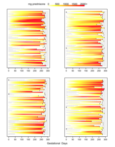
During our research on the effect of prednisone consumption during pregency on health outcomes of the baby (Palmsten K, Rolland M, Hebert MF, et al., Patterns of prednisone use during pregnancy in women with rheumatoid arthritis: Daily and cumulative dose. Pharmacoepidemiol Drug Saf. 2018 Apr;27(4):430-438. https://www.ncbi.nlm.nih.gov/pubmed/29488292) we developed a custom plot to visualize for each patient their daily and cumulative consumption of prednisone during pregenancy. Since the publication these plots have raised some interest so here is the code used to produce them. Data needs to be in the following format: 1 line per patient 1 column for the patient ID (named id) and then 1 column per unit of time (here days) reporting the measure for that day 
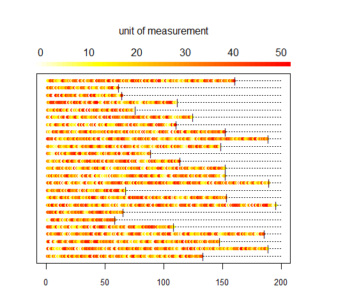
To illustrate the type of data we dealt with I first generate a random dataset containing 25 patients followed for n days (n different for each patient, randomly chosen between 50 and 200) with a daily consumption value randomly selected between 0 and a maximum dose (randomly determined for each patient between 10 and 50 ). 
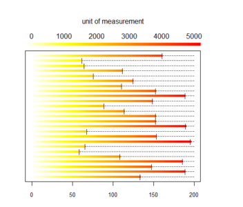
Then we compute the cumulated consumption ie sum of all previous days.
# initial parameters for simulating data
n_indiv <- 25
min_days <- 50
max_days <- 200
min_dose <- 10
max_dose <- 50

# list of ids
id_list <- str_c("i", 1:n_indiv)

# intializing empty table
my_data <- as.data.frame(matrix(NA, n_indiv, (max_days+1)))
colnames(my_data) <- c("id", str_c("d", 1:max_days))
my_data$id <- id_list

# daily simulated data
set.seed(113)
for(i in 1:nrow(my_data)){
# n days follow up
n_days <- round(runif(1, min_days, max_days))
# maximum dose
dose <- round(runif(1, min_dose, max_dose))
# random daily value
my_data[i,2:ncol(my_data)] <- c(runif(n_days, 0, max_dose), rep(NA,(max_days-n_days)))
}

# cumulative simulated data
my_cum_data <- my_data
for(i in 3:ncol(my_cum_data)){
my_cum_data[[i]] <- my_cum_data[[i]] + my_cum_data[[i-1]] 
}
Our plots use the legend.col function found here: https://aurelienmadouasse.wordpress.com/2012/01/13/legend-for-a-continuous-color-scale-in-r/ Here is the longitudinal heat plot function:
 # Color legend on the top
long_heat_plot <- function(my_data, cutoff, xmax) {
# my_data: longitudinal data with one line per individual, 1st column with id, and then one column per unit of time
# cutoff: cutoff value for color plot, all values above cutoff are same color
# xmax: x axis max value
n_lines <- nrow(my_data)
line_count <- 1
# color scale
COLS <- rev(heat.colors(cutoff))
# plotting area
par(oma=c(1,1,4,1), mar=c(2, 2, 2, 4), xpd=TRUE)
# plot init
plot(1,1,xlim=c(0,xmax), ylim=c(1, n_lines), pch='.', ylab='Individual',xlab='Time unit',yaxt='n', cex.axis = 0.8)
# plot line for each woman one at a time
for (i in 1 : n_lines) { 
# get id
id1 <- my_data$id[i]
# get trajectory data maxed at max_val
id_traj <- my_data[my_data$id == id1, 2:ncol(my_data)]
# get last day
END <- max(which(!is.na(id_traj)))
# plot dotted line
x1 <- 1:xmax
y1 <- rep(i,xmax)
lines(x1, y1, lty=3)
for (j in 1 : (ncol(my_data) - 1)) {
# trim traj to max val
val <- min(id_traj[j], cutoff)
# plot traj
points(j, i, col=COLS[val], pch=20, cex=1)
}
# add limit line
points((END+1), i, pch="|", cex=0.9)
}
# add legend
legend.col(col = COLS, lev = 1:cutoff)
mtext(side=3, line = 3, 'unit of measurement')
opar <- par()
text_size <- opar$cex.main
}
Then we generate the corresponding plots:
 long_heat_plot(my_data, 50, 200) 

 long_heat_plot(my_cum_data, 5000, 200) 
And here is what we did in our study: