Add shiny in quarto blog with shinylive

Shiny, without server

In previous article, I introduced method to share shiny application in static web page (github page)

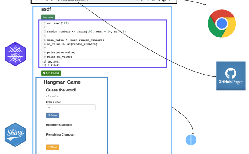
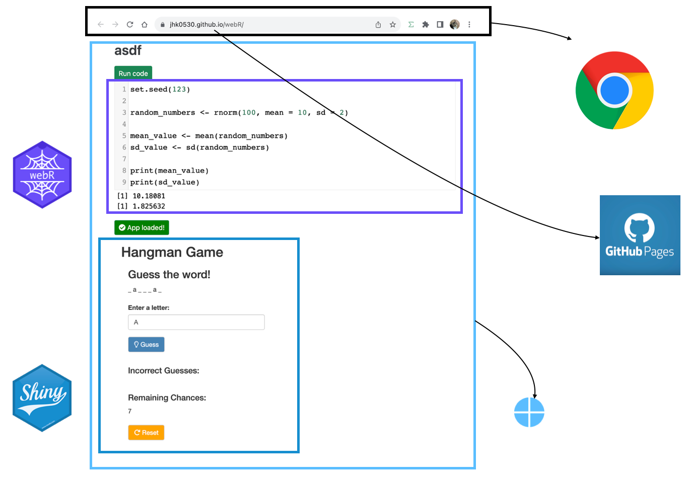
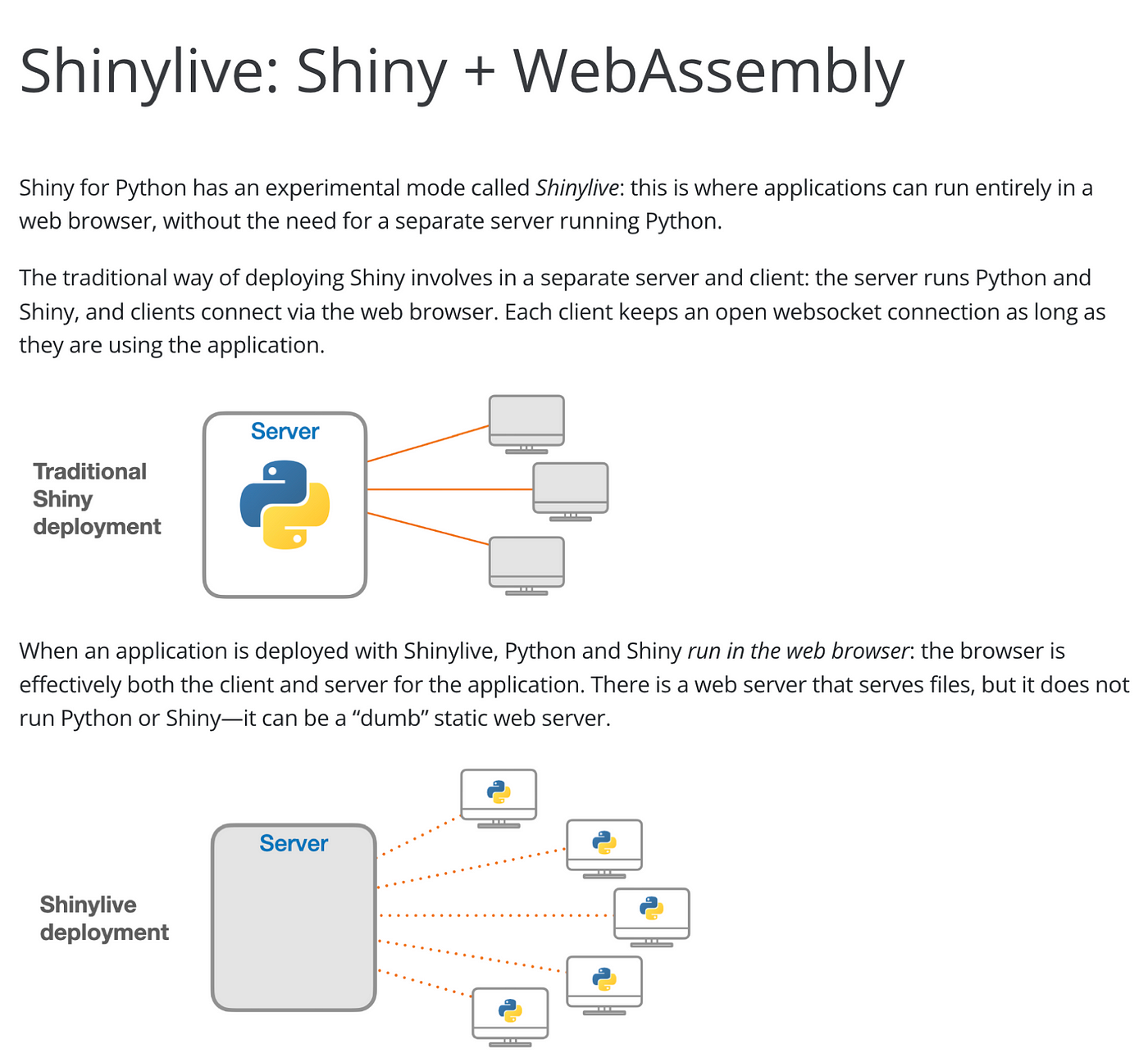
At the core of this method is a technology called WASM, which is a way to load and utilize R and Shiny-related libraries and files that have been converted for use in a web browser. The main problem with wasm is that it is difficult to configure, even for R developers.

Of course, there was a way called shinylive, but unfortunately it was only available in python at the time.

Fortunately, after a few months, there is an R package that solves this configuration problem, and I will introduce how to use it to add a shiny application to a static page.

shinylive

shinylive is R package to utilize wasm above shiny. and now it has both Python and R version, and in this article will be based on the R version.

shinylive is responsible for generating HTML, Javascript, CSS, and other elements needed to create web pages, as well as wasm-related files for using shiny.

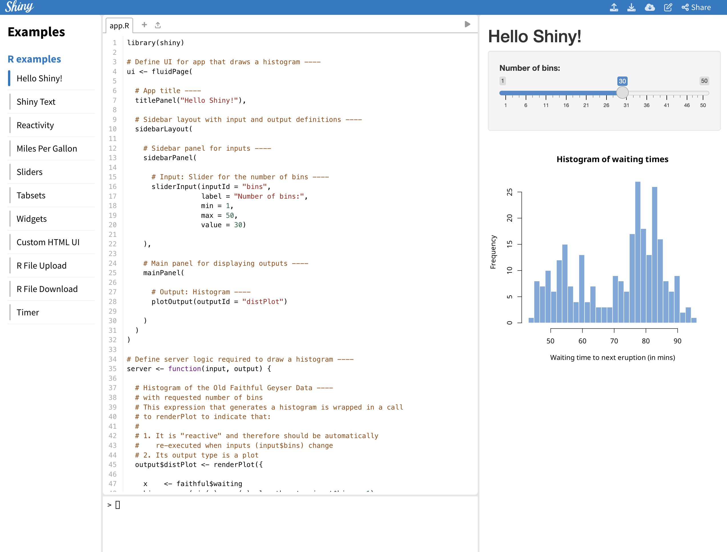
You can see examples created with shinylive at this link.


Install shinylive

While shinylive is available on CRAN, it is recommended to use the latest version from github as it may be updated from time to time, with the most recent release being 0.1.1. Additionally, pak is the recently recommended R package for installing R packages in posit, and can replace existing functions like install.packages() and remotes::install_github().

# install.packages("pak")

pak::pak("posit-dev/r-shinylive")


You can think of shinylive as adding a wasm to an existing shiny application, which means you need to create a shiny application first.

For the example, we’ll use the code provided by shiny package (which you can also see by typing shiny::runExample("01_hello") in the Rstudio console).
library(shiny)

ui <- fluidPage(

titlePanel("Hello Shiny!"),
  sidebarLayout(
  sidebarPanel(
    sliderInput(
      inputId = "bins",
      label = "Number of bins:",
      min = 1,
      max = 50,
      value = 30
    )
  ),
  mainPanel(
    plotOutput(outputId = "distPlot")
    )
  )
)

server <- function(input, output) {
  output$distPlot <- renderPlot({
  x <- faithful$waiting
  bins <- seq(min(x), max(x), length.out = input$bins + 1)
  hist(x,
    breaks = bins, col = "#75AADB", border = "white",
    xlab = "Waiting time to next eruption (in mins)",
    main = "Histogram of waiting times"
  )
  })
}

shinyApp(ui = ui, server = server)

This code creates a simple shiny application that creates a number of histograms in response to the user’s input, as shown below.
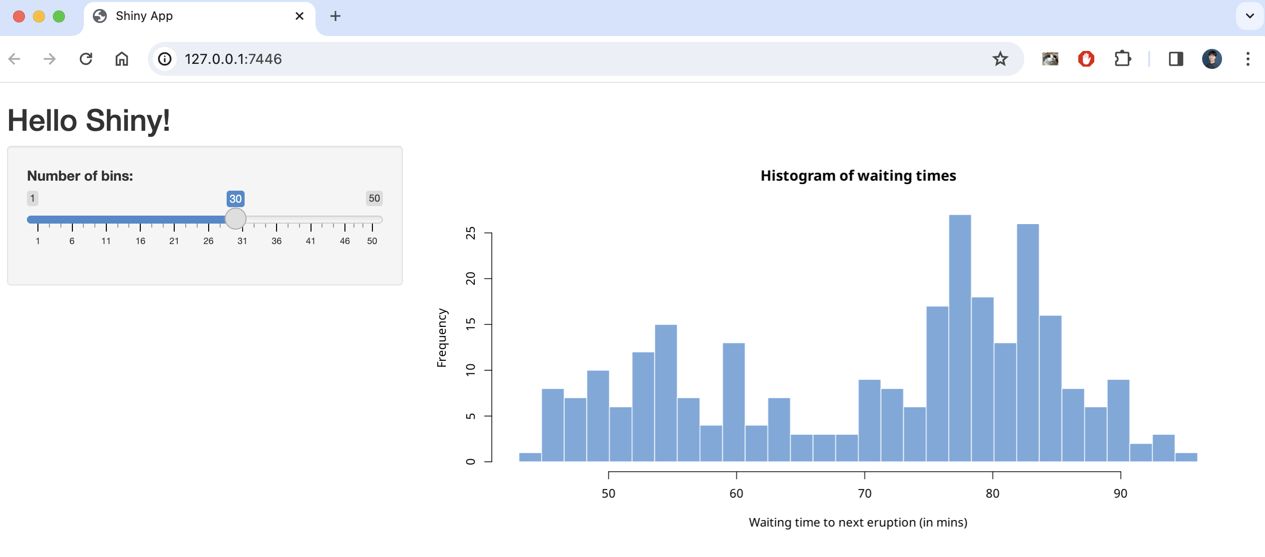

There are two ways to create a static page with this code using shinylive, one is to create it as a separate webpage (like previous article) and the other is to embed it as internal content on a quarto blog page .

First, here’s how to create a separate webpage.

shinylive via web page

To serve shiny on a separate static webpage, you’ll need to convert your app.R to a webpage using the shinylive package you installed earlier.

Based on creating a folder named shinylive in my Documents(~/Documents) and saving `app.R` inside it, here’s an example of how the export function would look like

shinylive::export('~/Documents/shinylive', '~/Documents/shinylive_out')


When you run this code, it will create a new folder called shinylive_out in the same location as shinylive, (i.e. in My Documents), and inside it, it will generate the converted wasm version of shiny code using the shinylive package.

If you check the contents of this shinylive_out folder, you can see that it contains the webr, service worker, etc. mentioned in the previous post.
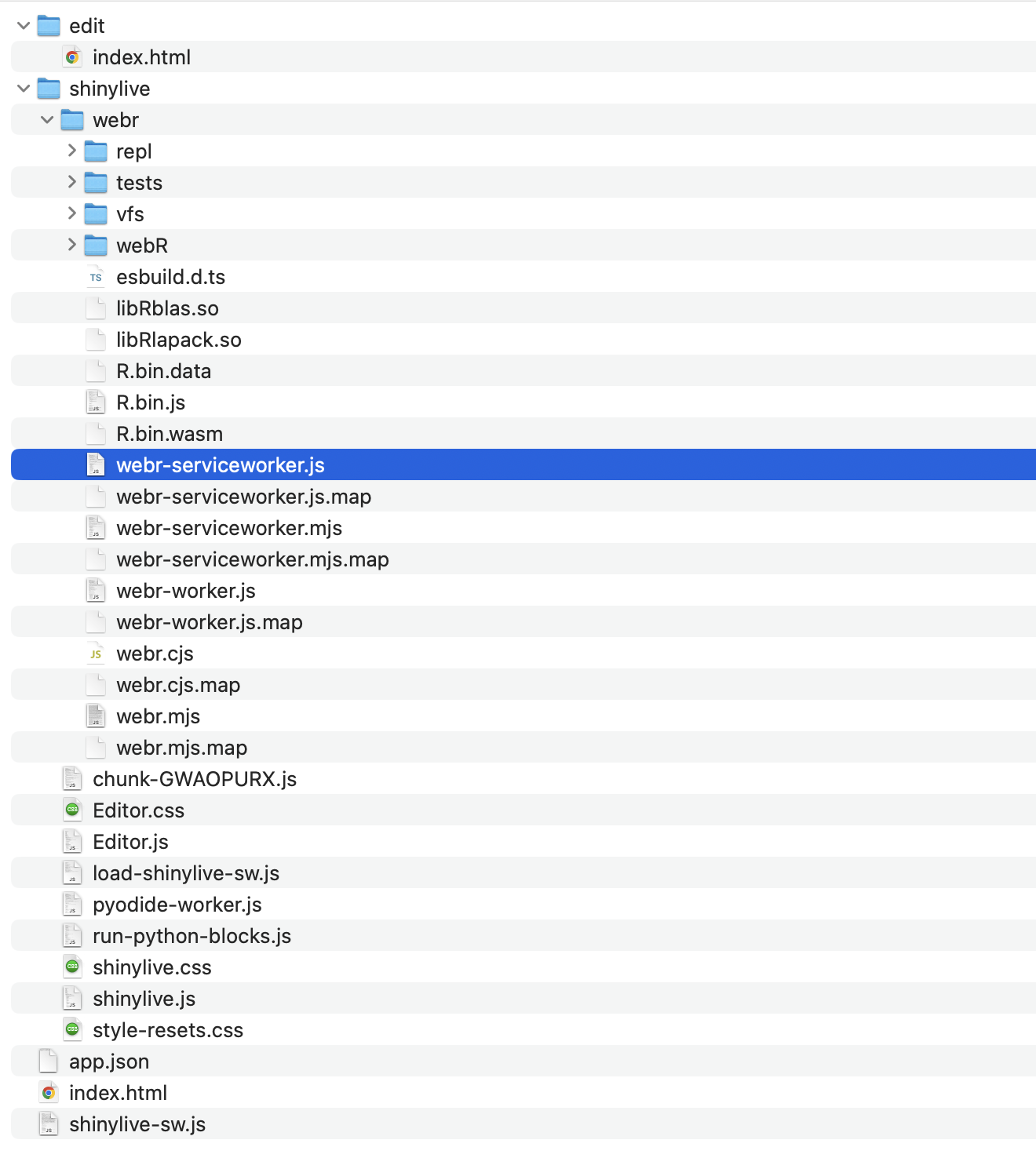

More specifically, the export function is responsible for adding the files from the local PC’s shinylive package assets, i.e. the library files related to shiny, to the out directory on the local PC currently running R studio.


Now, if you create a github page or something based on the contents of this folder, you can serve a static webpage that provides shiny, and you can preview the result with the command below.

httpuv::runStaticServer("~/Documents/shinylive_out")

shinylive in quarto blog


To add a shiny application to a quarto blog, you need to use a separate extension. The quarto extension is a separate package that extends the functionality of quarto, similar to using R packages to add functionality to basic R.

First, we need to add the quarto extension by running the following code in the terminal (not a console) of Rstudio.

quarto add quarto-ext/shinylive

You don’t need to create a separate file to plant shiny in your quarto blog, you can use a code block called {shinylive-r}. Additionally, you need to set shinylive in the yaml of your index.qmd.

filters: 
- shinylive

Then, in the {shinylive-r} block, write the contents of the app.R we created earlier. 

#| standalone: true
#| viewerHeight: 800
library(shiny)
ui <- fluidPage(
  titlePanel("Hello Shiny!"),
  sidebarLayout(
    sidebarPanel(
      sliderInput(
        inputId = "bins",
        label = "Number of bins:",
        min = 1,
        max = 50,
        value = 30
      )
    ),
    mainPanel(
      plotOutput(outputId = "distPlot")
    )
  )
)
server <- function(input, output) {
  output$distPlot <- renderPlot({
    x <- faithful$waiting
    bins <- seq(min(x), max(x), length.out = input$bins + 1)
    hist(x,
      breaks = bins, col = "#75AADB", border = "white",
      xlab = "Waiting time to next eruption (in mins)",
      main = "Histogram of waiting times"
    )
  })
}
shinyApp(ui = ui, server = server)

after add this in quarto blog, you may see working shiny application.

You can see working example in this link

Summary

shinylive is a feature that utilizes wasm to run shiny on static pages, such as GitHub pages or quarto blogs, and is available as an R package and quarto extension, respectively.

Of course, since it is less than a year old, not all features are available, and since it uses static pages, there are disadvantages compared to utilizing a separate shiny server.

However, it is very popular for introducing shiny usage and simple statistical analysis, and you can practice it right on the website without installing R, and more features are expected to be added in the future.

The code used in blog (previous example link) can be found at the link.

Author: jhk0530
Build serverless shiny application via Github page

Simple guide for simple shiny application 

TL;DR

I made shiny application in github page with quarto.

You can check code in my github repository and result, result2


How we use shiny

Shiny is R package to make user utilize R with web browser without install it.

So my company utilizes shiny to provide statistical analysis for doctors (who don’t know R but need statistics).


Behind shiny

As you know, shiny is consisted with 2 part. UI and Server

You may think just UI is channel to both get input (data) from user and return calculated output (result) to user.
and server is just calculator

It means, server requires dynamic calculation that may change, not fixed contents (it called as static web page)

To achieve dynamic calculation, there are several options.

We can use shinyapps.io, posit connect, or deploy own shiny server in other cloud like AWS / azure / GCP …

These options can be categorized into two main categories: free but with limited features, or feature-rich but paid.

There is no single right answer, but I use shinyapps.io in see toy level project or deploy using shiny server in company’s cloud server which is not just toy level.

An Introduction to Bayesian A/B Testing in Stan, R, and Python workshop

Join our workshop on Introduction to An Introduction to Bayesian A/B Testing in Stan, R, and Python, which is a part of our workshops for Ukraine series! 

Here’s some more info: 

Title: An Introduction to Bayesian A/B Testing in Stan, R, and Python

Date: Thursday, September 14th, 18:00 – 20:00 CEST (Rome, Berlin, Paris timezone)

Speaker: Jordan Nafa is a Data Scientist at Game Data Pros, Inc. where his work centers around Bayesian A/B Testing, stochastic optimization, and applied causal inference for revenue optimization, promotional pricing, and personalized targeting in video games. He is also a Ph.D. Candidate in Political Science at the University of North Texas where he previously taught undergraduate courses in causal inference, applied statistics, and American political behavior.

Description: This workshop will cover a basic introduction to Bayesian inference, A/B Testing, and decision theory for the analysis of large-scale field experiments in industry settings. After introducing the foundations of the Bayesian approach to A/B Testing, we will work through real-world examples using the probabilistic programming language Stan along with its R and Python interfaces.

Minimal registration fee: 20 euro (or 20 USD or 800 UAH)


How can I register?

  • Save your donation receipt (after the donation is processed, there is an option to enter your email address on the website to which the donation receipt is sent)
  • Fill in the registration form, attaching a screenshot of a donation receipt (please attach the screenshot of the donation receipt that was emailed to you rather than the page you see after donation).

If you are not personally interested in attending, you can also contribute by sponsoring a participation of a student, who will then be able to participate for free. If you choose to sponsor a student, all proceeds will also go directly to organisations working in Ukraine. You can either sponsor a particular student or you can leave it up to us so that we can allocate the sponsored place to students who have signed up for the waiting list.


How can I sponsor a student?


  • Save your donation receipt (after the donation is processed, there is an option to enter your email address on the website to which the donation receipt is sent)

  • Fill in the sponsorship form, attaching the screenshot of the donation receipt (please attach the screenshot of the donation receipt that was emailed to you rather than the page you see after the donation). You can indicate whether you want to sponsor a particular student or we can allocate this spot ourselves to the students from the waiting list. You can also indicate whether you prefer us to prioritize students from developing countries when assigning place(s) that you sponsored.

If you are a university student and cannot afford the registration fee, you can also sign up for the waiting list here. (Note that you are not guaranteed to participate by signing up for the waiting list).


You can also find more information about this workshop series,  a schedule of our future workshops as well as a list of our past workshops which you can get the recordings & materials here.


Looking forward to seeing you during the workshop!


REDCapDM: a package to access and manage REDCap data

Garcia-Lerma E, Carmezim J, Satorra P, Peñafiel J, Pallares N, Santos N, Tebé C.
Biostatistics Unit, Bellvitge Biomedical Research Institute (IDIBELL)

The REDCapDM package allows users to read data exported directly from REDCap or via an API connection. It also allows users to process the previously downloaded data, create reports of queries and track the identified issues.

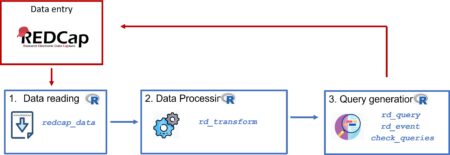
The diagram below shows the data management cycle: from data entry in REDCap to obtain data ready for the analysis.


The package structure can be divided into three main components: reading raw data, processing data and identifying queries. Typically, after collecting data in REDCap, we will have to follow these three components in order to have a final validated dataset for analysis. We will provide a user guide on how to perform each one of these steps using the package’s functions. For data processing and query identification, we will use the COVICAN data as an example (see the package vignette for more information about this built-in dataset).

Read data: redcap_data

The redcap_data function allows users to easily import data from a REDCap project into R for analysis.

To read exported data from REDCap, use the arguments data_path and dic_path to, respectively, describe the path of the R file and the REDCap project’s dictionary:

dataset <- redcap_data(data_path="C:/Users/username/example.r",
                       dic_path="C:/Users/username/example_dictionary.csv")

Note: The R and CSV files exported from REDCap must be located in the same directory.

If the REDCap project is longitudinal (contains more than one event) then a third element should be specified with the correspondence of each event with each form of the project. This csv file can be downloaded in the REDCap of the project following these steps: Project Setup < Designate Instruments for My Events < Download instrument-event mappings (CSV).

dataset <- redcap_data(data_path="C:/Users/username/example.r",
                       dic_path="C:/Users/username/example_dictionary.csv",
                       event_path="C:/Users/username/events.csv")

Note: if the project is longitudinal and the event-form file is not provided using the event_path argument, some steps of the processment can not be performed.

Another way to read data exported from a REDCap project is using an API connection. To do this, we can use the arguments uri and token which respectively refer to the uniform resource identifier of the REDCap project and the user-specific string that serves as the password:

dataset_api <- redcap_data(uri ="https://redcap.idibell.cat/api/",
                           token = "55E5C3D1E83213ADA2182A4BFDEA")

In this case, there is no need to specify the event-form file since the function will download it automatically using the API connection, if the project is longitudinal.

Remember that the token would give anyone access to all the project’s information. You should be careful about who you give this information to.

This function returns a list with 3 elements (imported data, dictionary and event-form mapping) which can then be used for further analysis or visualization.

Data process: rd_transform

The main function involved in the processing of the data is rd_transform. This function is used to process the REDCap data read into R using the redcap_data, as described above. Using the arguments of the function we can perform different type of transformations of our data.

As previously stated, we will use the built-in dataset covican as an example.

The only necessary elements that must be provided are the dataset to be transformed and the corresponding dictionary. If the project is longitudinal, as in the case of covican, also the event-form dataset should be specified. These elements can be specified directly using the output of the redcap_data function or separately in different arguments.

#Option A: list object 
covican_transformed <- rd_transform(covican)

#Option B: separately with different arguments
covican_transformed <- rd_transform(data = covican$data, 
                                    dic = covican$dictionary, 
                                    event_form = covican$event_form)

#Print the results of the transformation
covican_transformed$results
1. Recalculating calculated fields and saving them as '[field_name]_recalc'

| Total calculated fields | Non-transcribed fields | Recalculated different fields |
|:-----------------:|:----------------:|:-----------------------:|
|         2         |      0 (0%)      |         1 (50%)         |


|     field_name      | Transcribed? | Is equal? |
|:-------------------:|:------------:|:---------:|
|         age         |     Yes      |   FALSE   |
| screening_fail_crit |     Yes      |   TRUE    |

2. Transforming checkboxes: changing their values to No/Yes and changing their names to the names of its options. For checkboxes that have a branching logic, when the logic is missing their values will be set to missing

Table: Checkbox variables advisable to be reviewed

| Variables without any branching logic |
|:-------------------------------------:|
|        type_underlying_disease        |

3. Replacing original variables for their factor version

4. Deleting variables that contain some patterns

This function will return a list with the transformed dataset, dictionary and the output of the results of the transformation.

As we can see, there are 4 steps in the transformation and they are briefly explained in the output of the function. This four steps are:

        1. Recalculation of REDCap calculated fields

        2. Checkbox transformation

        3. Replacement of the original variable by its factor version

        4. Elimination of variables containing some pattern

In addition, we can change the final structure of the transformed dataset by specifying in the final_format argument whether we want our data to be split by event or by form.

For more examples and information on extra arguments, see the vignette.

Queries

Queries are very important to ensure the accuracy and reliability of a REDCap dataset. The collected data may contain missing values, inconsistencies, or other potential errors that need to be identified in order to correct them later.

For all the following examples we will use the raw transformed data: covican_transformed.

rd_query

The rd_query function allows users to generate queries by using a specific expression. It can be used to identify missing values, values that fall outside the lower and upper limit of a variable and other types of inconsistencies.

Missings

If we want to identify missing values in the variables copd and age in the raw transformed data, a list of required arguments needs to be supplied.

example <- rd_query(covican_transformed,
                    variables = c("copd", "age"),
                    expression = c("%in%NA", "%in%NA"),
                    event = "baseline_visit_arm_1")

# Printing results
example$results
Report of queries
Variables Description Event Query Total
copd Chronic obstructive pulmonary disease Baseline visit The value should not be missing 6
age Age Baseline visit The value should not be missing 5

Expressions

The rd_query function is also able to identify outliers or observations that fulfill a specific condition.

example <- rd_query(variables="age",
                    expression=">70",
                    event="baseline_visit_arm_1",
                    dic=covican_transformed$dictionary,
                    data=covican_transformed$data)

# Printing results
example$results
Report of queries
Variables Description Event Query Total
age Age Baseline visit The value should not be >70 76

More examples of both functions can be seen at the vignette.

Output

When the rd_query function is executed, it returns a list that includes a data frame with all the queries identified and a second element with a summary of the number of generated queries in each specified variable for each expression applied:

Identifier DAG Event Instrument Field Repetition Description Query Code
100-58 Hospital 11 Baseline visit Comorbidities copd · Chronic obstructive pulmonary disease The value is NA and it should not be missing 100-58-1
Report of queries
Variables Description Event Query Total
copd Chronic obstructive pulmonary disease Baseline visit The value should not be missing 6

The data frame is designed to aid users in locating each query in their REDCap project. It includes information such as the record identifier, the Data Access Group (DAG), the event in which each query can be found, along with the name and the description of the analyzed variable and a brief description of the query.

check_queries

Once the process of identifying queries is complete, the typical approach would be to adress them by modifying the original dataset in REDCap and re-run the query identification process generating a new query dataset.

The check_queries function compares the previous query dataset with the new one by using the arguments old and new, respectively. The output remains a list with 2 items, but the data frame containing the information for each query will now have an additional column (“Modification”) indicating which queries are new, which have been modified, which have been corrected, and which remain pending. Besides, the summary will show the number of queries in each one of these categories:

check <- check_queries(old = example$queries, 
                       new = new_example$queries)

# Print results
check$results
Comparison report
State Total
Pending 7
Solved 3
Miscorrected 1
New 1

There are 7 pending queries, 3 solved queries, 1 miscorrected query, and 1 new query between the previous and the new query dataset.

Note: The “Miscorrected” category includes queries that belong to the same combination of record identifier and variable in both the old and new reports, but with a different reason. For instance, if a variable had a missing value in the old report, but in the new report shows a value outside the established range, it would be classified as “Miscorrected”.

Query control output:

Identifier DAG Event Instrument Field Repetition Description Query Code Modification
100-58 Hospital 11 Baseline visit Comorbidities copd · Chronic obstructive pulmonary disease The value is NA and it should not be missing 100-58-1 Pending
100-79 Hospital 11 Baseline visit Comorbidities copd · Chronic obstructive pulmonary disease The value is NA and it should not be missing 100-79-1 New
102-113 Hospital 24 Baseline visit Demographics age · Age The value is NA and it should not be missing 102-113-1 Pending
105-11 Hospital 5 Baseline visit Comorbidities copd · Chronic obstructive pulmonary disease The value is NA and it should not be missing 105-11-1 Pending

Future improvements

In the short term, we would like to make some improvements to the query identification and tracking process to minimise errors and cover a wide range of possible structures. We would also like to extend the scope of the data processing to cover up specific transformations of the data that may be required in some specific scenarios. As a long-term plan, we would like to complement this package with the development of a shiny application to facilitate the use of the package and make it as user-friendly as possible.


How do I count thee? Let me count the ways?

How do I count thee? Let me count the ways? by Jerry Tuttle    In Major League Baseball, a player who hits 50 home runs in a single season has hit a lot of home runs. Suppose I want to count the number of 50 homer seasons by team, and also the number of 50 homer seasons by New York Yankees. (I will count Maris and Mantle in 1961 as two.) Here is the data including Aaron Judge’s 62 in 2022 :
You would think base R would have a count function such as count(df$Team) and count(df$Team == “NYY”) but this gives the error “could not find function ‘count'”. Base R does not have a count function. Base R has at last four ways to perform a count: 1. The table function will count items in a vector.    table(df$Team) presents results horizontally, and data.frame(table(df$Team)) presents results vertically.    table(df$Team == “NYY”) displays results 37 false and 10 true, while table(df$Team == “NYY”)[2] just displays the result 10 true. 2. The sum function can be used to count the number of rows meeting a condition.    sum(df$Team == “NYY”) displays the result 10. Here df$Team == “NYY” is creating a logical vector, and sum is summing the number of true = 1. 3. Similar to sum, nrow(df[df$Team == “NYY”, ]) counts the number of rows meeting the NYY condition. 4. The length function counts the number of elements in an R object.    length(which(df$Team == “NYY”)) , length(df$Team[df$Team == “NYY”]) , and length(grep(“NYY”, df[ , “Team”])) are all ways that will count the 10 Yankees. The more direct solution to counting uses the count function in the dplyr library. Note that dplyr’s count function applies to a data frame or tibble, but not to a vector. After loading library(dplyr) , 1. df %>% count(Team) lists the count for each team. 2. df %>% filter(Team = “NYY”) lists each Yankee, and you can see there are 10. 3. df %>% count(Team == “NYY”) displays 37 false and 10 true, while df %>% filter(Team == “NYY”) %>% count() just displays the 10 true. The following is a bar chart of the results by team for teams with at least 1 50 homer season:
Finally, “How do I count thee? Let me count the ways?” is of course adapted from Elizabeth Barrett Browning’s poem “How do I love thee? Let me count the ways?” But in her poem, just how would we count the number of times “love” is mentioned? The tidytext library makes counting words fairly easy, and the answer is ten, the same number of 50 homer Yankee seasons. Coincidence? The following is all the R code. Happy counting!

  library(dplyr) 
library(ggplot2)
library(tidytext)
df <- data.frame(
   Player=c('Ruth','Ruth','Ruth','Ruth','Wilson','Foxx','Greenberg','Foxx','Kiner','Mize','Kiner','Mays','Mantle','Maris', 'Mantle','Mays','Foster','Fielder','Belle','McGwire','Anderson','McGwire','Griffey','McGwire','Sosa','Griffey', 'Vaughn','McGwire','Sosa','Sosa','Bonds','Sosa','Gonzalez','Rodriguez','Rodriguez','Thome','Jones','Howard','Ortiz', 'Rodriguez','Fielder','Bautista','Davis','Stanton','Judge','Alonso','Judge'),
   Year=c(1920,1921,1927,1928,1930,1932,1938,1938,1947,1947,1949,1955,1956,1961,1961,1965,1977,1990,1995,1996,1996,1997,1997, 1998,1998,1998,1998,1999,1999,2000,2001,2001,2001,2001,2002,2002,2005,2006,2006,2007,2007,2010,2013,2017,2017,2019,2022),
   Homers=c(54,59,60,54,56,58,58,50,51,51,54,51,52,61,54,52,52,51,50,52,50,58,56,70,66,56,50,65,63,50,73,64,57,52,57,52,51, 58,54,54,50,54,53,59,52,53,62),
   Team=c('NYY','NYY','NYY','NYY','CHC','PHA','DET','BOS','PIT','NYG','PIT','NYG','NYY','NYY','NYY','SF','CIN','DET','CLE', 'OAK','BAL','OAK/SLC','SEA','SLC','CHC','SEA','SD','SLC','CHC','CHC','SF','CHC','ARI','TEX','TEX','CLE','ATL','PHP', 'BOR','NYY','MIL','TOR','BAL','MIA','NYY','NYM','NYY')) head(df) # base R ways to count: table(df$Team)    # shows results horizontally
data.frame(table(df$Team))    #shows results vertically
table(df$Team == "NYY")    # displays 37 false and 10 true
table(df$Team == "NYY")[2] sum(df$Team == "NYY")    # displays the result 10. nrow(df[df$Team == "NYY", ])    # counts the number of rows meeting the NYY condition. length(which(df$Team == "NYY"))     # which returns a vector of indices which are true
length(df$Team[df$Team == "NYY"])
length(grep("NYY", df[ , "Team"]))     # grep returns a vector of indices that match the pattern # dplyr R ways to count; remember to load library(dplyr): df %>% count(Team)    # lists the count for each team. df %>% filter(Team == "NYY")    # lists each Yankee, and you can see there are 10. df %>% count(Team == "NYY")    # displays 37 false and 10 true, while
df %>% filter(Team == "NYY") %>% count()    # just displays the 10 true. # barplot of all teams with at least 1 50 homer season; remember to load library(ggplot2) df %>%
    group_by(Team) %>%
    summarise(count = n()) %>%
    ggplot(aes(x=reorder(Team, count), y=count, fill=Team)) +
    geom_bar(stat = 'identity') +
    ggtitle("Count of 50 Homer Seasons") +
    xlab("Team") +
    scale_y_continuous(breaks=c(1,2,3,4,5,6,7,8,9,10)) +
    coord_flip() +
    theme(plot.title = element_text(face="bold", size=18)) +
    theme(axis.title.y = element_text(face="bold")) +
    theme(axis.title.x = element_blank()) +
    theme(axis.text.x = element_text(size=12, face="bold"),
    axis.text.y = element_text(size=12, face="bold")) +
    theme(legend.position="none")
# count number of times "love" is mentioned in Browning's poem; remember to load library(tidytext) textfile <- c("How do I love thee? Let me count the ways.",
"I love thee to the depth and breadth and height",
"My soul can reach, when feeling out of sight",
"For the ends of being and ideal grace.",
"I love thee to the level of every day's",
"Most quiet need, by sun and candle-light.",
"I love thee freely, as men strive for right.",
"I love thee purely, as they turn from praise.",
"I love thee with the passion put to use", <br
"In my old griefs, and with my childhood's faith.",
"I love thee with a love I seemed to lose",
"With my lost saints. I love thee with the breath,", <br
"Smiles, tears, of all my life; and, if God choose,",
"I shall but love thee better after death.")
df<-data.frame(line=1:length(textfile), text=textfile) <br <br
df_words % unnest_tokens(word, text) <br
cleaned_words % anti_join(get_stopwords())
cleaned_words %>% count(word, sort = TRUE) %>% head(6)
cleaned_words %>% filter(word == "love") %>% count()

Create a hyper-marketing model using Naïve Bayes

By Huey Fern Tay with Greg Page

Everyone loves an extra income stream – even the super-wealthy owners of luxurious properties that they only inhabit for just a few weeks each year.  Offering a property as a short-term rental through a platform like Airbnb can provide a wonderful side hustle.  For some owners, however, the associated hassles could be a powerful deterrent to using the service.  Text messages at 3 a.m. about Wi-Fi passwords, stopped-up toilets, and the lack of water pressure in the shower might be just enough to tip the scales against such an undertaking…especially when such messages are followed up by angry “Why isn’t this fixed yet?” queries just 30 minutes later.

So what if an all-in-one concierge service could take away ALL of those hassles?  If an intermediary service could handle all of the tenant interactions, the marketing, the logistics of the key hand-offs, etc. then suddenly the idle rich jetsetters might be a bit more willing to open up their pied-a-terres to the unbathed masses.  Such a service would benefit all stakeholders – travelers would have more options, the property owners would earn more income, and the platform would receive more commission fees from the extra transactions. In exchange for a fee paid to the service, willing property owners could have a side hustle that was “all side, no hustle.”  

Let’s imagine that such a service is looking to establish itself, with an initial marketing outreach effort to high-end property owners not already using Airbnb.  Let’s also imagine that this new service is operating on a shoestring budget, and therefore needs to. How can it identify the properties within a city that are most likely to command high values in the short-term rental market? 

The Naïve Bayes classifier is a good candidate for the task at hand because of its simplicity, computational efficiency, and ability to handle categorical variables.  Furthermore, its classification outcomes come with associated probability values – we can use those to identify records that are most likely to belong to some particular group. 

To illustrate how this method could be used to solve the business problem outlined above, I will utilize Airbnb data of San Francisco listings.

One of the first decisions the modeler must make is deciding how to bin the data. In this case, the question is which numerical variable would you use to separate the properties? Would you use price, review ratings, or number of reviews? Each of these variables has a different impact on the outcome and may not be equally effective at separating classes. If the classes are not well separated, then even a large dataset will not be helpful.

The next important decision is to determine the number of classification categories you would like to create. Also, what would the cut-off be for each group? In other words, should you create four groups and bin them equally? Or should you create three groups by dividing the data according to a 15-70-15 proportion, 20-40-20, or 30-40-30…etc? The decision made at this step has a big impact on the model.

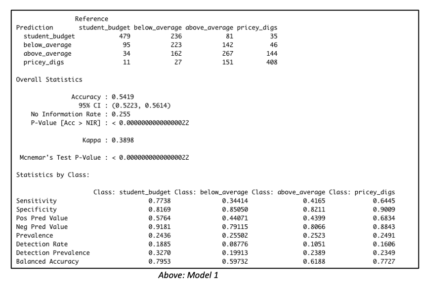
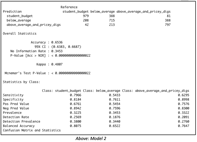
Consider both models below which were each created with 3811 rows of data representing 60% of the total dataset. Both models were created with the same predictor variables, such as the number of bedrooms, bathrooms, property type, location, etc. But in Model 1, the data was binned into 4 equal groups while in Model 2, the data was binned into 3 equal groups. The model summary for Model 1 showed the model has an accuracy of 54.19%, which is good considering that this performance is slightly more than double the No Information Rate (Naïve Rate). Model 2’s accuracy’s level is at 65.36%, a level which is nearly double its No Information Rate.

These are encouraging results but in our Airbnb example, we are more interested in knowing how well our model performs when it is asked to classify properties into any of the classes used in the model. For this reason, it is worth considering the true positive rate i.e. ‘sensitivity’. Model 1 is better at predicting the true positives (‘sensitivity’) for classes at opposite ends of the spectrum. This suggests Model 1 has difficulty reading nuances. On the other hand, Model 2’s performance in this regard is comparatively more balanced.


Naive Bayes model with four classification outcome


Naive Bayes output with three classification outcome


But wait – let’s get back to our original goal.  While overall accuracy is good to see, what we are most interested in here is identifying that high-end price group.  Owners of such units will be the best targets for our all-in-one concierge service.  Therefore, let’s dive a bit deeper to examine this model’s suitability for identifying such properties. 

By running the predict() function with the type=’raw’ parameter included, we can view the associated probabilities for each outcome class, and then rank records by probability of belonging to some particular outcome group. 

Taking this approach with the validation set, we find that among the 100 records identified by the model as most likely to land in the top tier group, 96 truly belonged to “Above Average and Pricey Digs.”   Among the 150 likeliest, 140 units, or 93.33%, actually belonged to that group, and among the 200 likeliest, 185 units, or 92.5%, were truly in that top tier. 

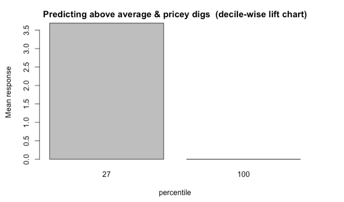
But that’s not all. It is worth going one step further by evaluating the model with lift charts or decile-wise lift charts because these charts determine how effectively our model ‘skims the cream’.

The decile-wise lift charts below illustrate how effectively the model can predict membership in the ‘above average and pricey digs’ group. When the model is used to classify the top 27% properties in this category, its performance is more than 3.5x better than a random guess.

Decile-wise lift chart shows the model is 3.5 times better at classifying the top 27 percent properties

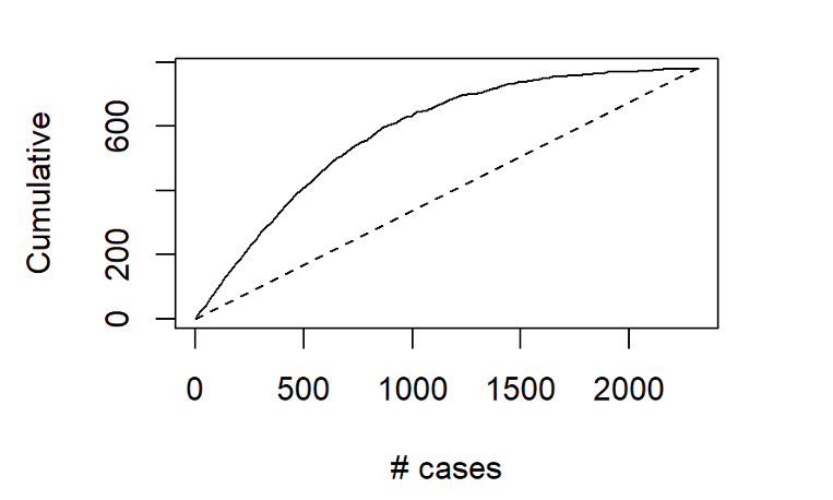
Another way to assess the model’s ability to identify top-tier rentals is with a two-dimensional lift chart.  Such a chart only works with two-outcome class scenarios, so we start here by collapsing the first and second tiers together, and then labelling that group as “other.”  

Gains chart shows among the 500 records that the model says are most likely to land in the Above Average & Pricey Digs Tier, just over 400 truly did belong to that group

In the entire validation set, there are 780 units that land in the highest price tier.  The values along the x-axis represent all the validation set records, ranked in order of their probability of belonging to the highest-tier class.  The y-axis shows the number of correct predictions.  The solid line represents the model’s performance – it shows us, for instance, that among the 500 records that the model says are most likely to land in the Above Average & Pricey Digs Tier, just over 400 truly did belong to that group.  The line flattens out at around x=1500, because by that point, the model has already identified nearly all of the records that truly belonged to this outcome class. 

The dotted line, by contrast, shows how effective a model would be if it simply labelled all the records as belonging to the top tier.  Since 33.6%, of the validation records belong to this group, each x-axis value here corresponds to a y-axis value that is exactly 33.6% as large.  The difference between the solid line and the dotted line represents the model’s improvement as the number of cases increases.

What do these results mean for the concierge service?  Let’s revisit our original assumptions: 


  • such a service would most likely appeal to the owners of properties in the highest pricing tier;
  • the initial outreach efforts should be made to owners of properties not already registered with Airbnb; and that
  • the new service has a limited budget, and therefore needs to carefully focus its outreach efforts only on that tier of properties whose owners would be likeliest to use it
Given these assumptions, our primary interest does not lie with overall model accuracy.  The model’s ability to distinguish between the bottom two pricing tiers is almost immaterial to us; however, we are keenly interested in the answer to this question:  When the model predicts that a property will belong to the highest pricing tier, how often is it correct? 

As demonstrated here, the model delivers quite effectively in this regard, especially when we maintain a relatively narrow focus on the properties that are most likely to be top tier.  Splashy magazine inserts, Super Bowl advertisements, and big-ticket endorsements from celebrities might be in the cards for this service down the road, after it spreads across the globe and prepares for its IPO roadshow.  For now, though, the hyper-specific focus that can come from “skimming the cream” off the top of those Naïve Bayes model probability predictions may be the surest next step for this service’s success. 

Data source: Inside Airbnb
 

Mapping iNaturalist Data in R

This post was originally published from IGIS as a Tech Note. Enjoy!

Introduction

iNaturalist logoiNaturalist is an enormously popular platform for recording and sharing observations of nature. Most people interact with iNaturalist through the Android or iOS phone app, but a little known fact is the platform also has an API (Application Programming Interface). That means that you can query observations using programming languages like R and Python. And if you can query observations, then you can map them!

The rest of this post demonstrates how you can download iNaturalist observations in R using the rinat package, and then map them using leaflet. We’ll also use functions from sf and dplyr. These are very common R packages in data science, and there are lot of online resources that teach you how to use them.

Our study area will be Placerita Canyon State Park in Los Angeles County, California. If you want to jump ahead to see the final product, click here.

Import the Park Boundary

First we load the packages we’re going use:
library(rinat)
library(sf)
library(dplyr)
library(tmap)
library(leaflet)

## Load the conflicted package and set preferences
library(conflicted)
conflict_prefer("filter", "dplyr", quiet = TRUE)
conflict_prefer("count", "dplyr", quiet = TRUE)
conflict_prefer("select", "dplyr", quiet = TRUE)
conflict_prefer("arrange", "dplyr", quiet = TRUE)
Now we can import the park boundary which is saved as a geojson file. We use the sf package to import and transform the boundary to geographic coordinates, and leaflet to plot it:
placertia_sf <- st_read("placertia_canyon_sp.geojson", quiet = TRUE) %>% 
  st_transform(4326)

leaflet(placertia_sf) %>% 
  addTiles() %>% 
  addPolygons()
Placerita Canyon State Park

Get the Bounding Box

Next, we get the bounding box of the study area, so we can pass it to the iNaturalist API to tell it which area we’re interested in:
placertia_bb <- placertia_sf %>% 
  st_bbox()

placertia_bb
##       xmin       ymin       xmax       ymax 
## -118.47216   34.36698 -118.43764   34.37820

Download data

Now we are ready to retrieve iNaturalist observations. rinat makes this easy with get_inat_obs().
Downloading Etiquette

The non-profit that supports iNaturalist doesn’t charge for downloading data, because they believe in open data and supporting citizen science initiatives. They also don’t require registration for simply downloading observations. That being said, downloading data consumes resources that can affect other users, and it’s bad form (and bad programming) to download data unnecessarily.

There are a few best practices for downloading data in ways that won’t cause problems for other users:

  1. Use the server-side filters the API provides to only return results for your area of interest and your taxon(s) of interest. See below for examples of sending spatial areas and a taxon name when calling the API from R.

  2. Always save your results to disk, and don’t download data more than once. Your code should check to see if you’ve already downloaded something before getting it again.

  3. Don’t download more than you need. The API will throttle you (reduce your download speed) if you exceed more than 100 calls per minute. Spread it out.

  4. The API is not designed for bulk downloads. For that, look at the Export tool.

We’ll use the bounds argument in get_inat_obs() to specify the extent of our search. bounds takes 4 coordinates. Our study area is not a pure rectangle, but we’ll start with the bounding box and then apply an additional mask to remove observations outside the park boundary.

For starters we’ll just download the most recent 100 iNaturalist observations within the bounding box. (There are actually over 3000, but that would make for a very crowded map!). The code below first checks if the data have already been downloaded, to prevent downloading data twice.
search_results_fn <- "placertia_bb_inat.Rdata"

if (file.exists(search_results_fn)) {
  load(search_results_fn)

} else {  
  # Note we have to rearrange the coordinates of the bounding box a 
  # little bit to give get_inat_obs() what it expects
  inat_obs_df <- get_inat_obs(bounds = placertia_bb[c(2,1,4,3)], 
                            taxon_name = NULL,
                            year = NULL,
                            month = NULL,
                            maxresults = 100)
  
  ## Save the data frame to disk
  save(inat_obs_df, file = search_results_fn)
}
See what we got back:
dim(inat_obs_df)
## [1] 100  36
glimpse(inat_obs_df)
## Rows: 100
## Columns: 36
## $ scientific_name                   "Sceloporus occidentalis", "Eriogonum~
## $ datetime                          "2021-09-04 14:01:55 -0700", "2021-08~
## $ description                       "", "", "", "", "", "", "", "", "", "~
## $ place_guess                       "Placerita Canyon State Park, Newhall~
## $ latitude                          34.37754, 34.37690, 34.37691, 34.3764~
## $ longitude                         -118.4571, -118.4598, -118.4597, -118~
## $ tag_list                          "", "", "", "", "", "", "", "", "", "~
## $ common_name                       "Western Fence Lizard", "California b~
## $ url                               "https://www.inaturalist.org/observat~
## $ image_url                         "https://inaturalist-open-data.s3.ama~
## $ user_login                        "bmelchiorre", "ericas3", "ericas3", ~
## $ id                                94526862, 92920757, 92920756, 9291801~
## $ species_guess                     "Western Fence Lizard", "", "", "", "~
## $ iconic_taxon_name                 "Reptilia", "Plantae", "Plantae", "Pl~
## $ taxon_id                          36204, 54999, 52854, 58014, 64121, 55~
## $ num_identification_agreements     2, 0, 0, 0, 0, 1, 0, 0, 0, 0, 1, 0, 1~
## $ num_identification_disagreements  0, 0, 0, 0, 0, 0, 0, 0, 0, 0, 0, 0, 0~
## $ observed_on_string                "Sat Sep 04 2021 14:01:55 GMT-0700 (P~
## $ observed_on                       "2021-09-04", "2021-08-29", "2021-08-~
## $ time_observed_at                  "2021-09-04 21:01:55 UTC", "2021-08-2~
## $ time_zone                         "Pacific Time (US & Canada)", "Pacifi~
## $ positional_accuracy               5, 3, 4, 4, 16, 4, 41, 41, 26, 9, NA,~
## $ public_positional_accuracy        5, 3, 4, 4, 16, 4, 41, 41, 26, 9, NA,~
## $ geoprivacy                        "", "", "", "", "", "", "", "", "", "~
## $ taxon_geoprivacy                  "open", "", "", "", "", "", "", "", "~
## $ coordinates_obscured              "false", "false", "false", "false", "~
## $ positioning_method                "", "", "", "", "", "", "", "", "", "~
## $ positioning_device                "", "", "", "", "", "", "", "", "", "~
## $ user_id                           4985856, 404893, 404893, 404893, 3214~
## $ created_at                        "2021-09-12 02:16:03 UTC", "2021-08-2~
## $ updated_at                        "2021-09-12 06:28:20 UTC", "2021-08-2~
## $ quality_grade                     "research", "needs_id", "needs_id", "~
## $ license                           "CC-BY-NC", "CC-BY-NC-SA", "CC-BY-NC-~
## $ sound_url                         NA, NA, NA, NA, NA, NA, NA, NA, NA, N~
## $ oauth_application_id              3, 333, 333, 333, 3, 3, 3, 3, 3, 3, N~
## $ captive_cultivated                "false", "false", "false", "false", "~
Next, in order to spatially filter the observations using the park boundary, we convert the data frame into a sf object. At the same time we’ll select just a few of the columns for our map:
inat_obs_sf <- inat_obs_df %>% 
select(longitude, latitude, datetime, common_name, 
      scientific_name, image_url, user_login) %>% 
  st_as_sf(coords=c("longitude", "latitude"), crs=4326)

dim(inat_obs_sf)
## [1] 100 6
Next, filter out observations that lie outside Placerita Canyon SP. How many are left?
inat_obs_pcsp_sf <- inat_obs_sf %>% st_intersection(placertia_sf)
nrow(inat_obs_pcsp_sf)
## [1] 90
Next, add a column to the attribute table containing HTML code that will appear in the popup windows:
inat_obs_pcsp_popup_sf <- inat_obs_pcsp_sf %>% 
  mutate(popup_html = paste0("<p><b>", common_name, "</b><br/>",
                        "<i>", scientific_name, "</i></p>",
                        "<p>Observed: ", datetime, "<br/>",
                        "User: ", user_login, "</p>",
                        "<p><img src='", image_url, "' style='width:100%;'/></p>")
)

Map the Results

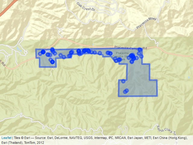
Finally, we have everything we need to map the results with leaflet. Zoom-in and click on an observation to see details about it.
htmltools::p("iNaturalist Observations in Placerita Canyon SP",
             htmltools::br(),
             inat_obs_pcsp_popup_sf$datetime %>% 
               as.Date() %>% 
               range(na.rm = TRUE) %>% 
               paste(collapse = " to "),
             style = "font-weight:bold; font-size:110%;")

leaflet(placertia_sf) %>% 
  addProviderTiles("Esri.WorldStreetMap") %>% 
  addPolygons() %>% 
  addCircleMarkers(data = inat_obs_pcsp_popup_sf,
                   popup = ~popup_html, 
                   radius = 5)

iNaturalist Observations in Placerita Canyon SP
2006-01-04 to 2021-09-04

Leaflet map of all species in Placerita Canyon Sin
Click on the map to open in a new tab

Map the Arachnids

The iNaturalist API supports taxon searching. If you pass it the name of a genus, for example, it will restrict results to only observations from that genus. Likewise for family, order, class, etc. Observations that don’t have a scientific name assigned will be left out.

You can do a taxon search from R by passing the taxon_name argument in get_inat_obs(). Below we’ll ask for the Arachnid class, which includes spiders, scorpions, ticks, and other arthropods. This code should all look familiar by now:
search_arachnid_fn <- "placertia_arachnid_obs.Rdata"
if (file.exists(search_arachnid_fn)) {
  load(search_arachnid_fn)
} else {  
  inat_arachnid_df <- get_inat_obs(bounds = placertia_bb[c(2,1,4,3)], 
                            taxon_name = "Arachnida",
                            year = NULL,
                            month = NULL,
                            maxresults = 100)
  save(inat_arachnid_df, file = search_arachnid_fn)
}

inat_arachnid_pcsp_popup_sf <- inat_arachnid_df %>% 
  select(longitude, latitude, datetime, common_name, scientific_name, image_url, user_login) %>%
  st_as_sf(coords=c("longitude", "latitude"), crs=4326) %>% 
  st_intersection(placertia_sf) %>% 
  mutate(popup_html = paste0("<p><b>", common_name, "</b><br/>",
                             "<i>", scientific_name, "</i></p>",
                             "<p>Observed: ", datetime, "<br/>",
                             "User: ", user_login, "</p>",
                             "<p><img src='", image_url, 
                             "' style='width:100%;'/></p>"))

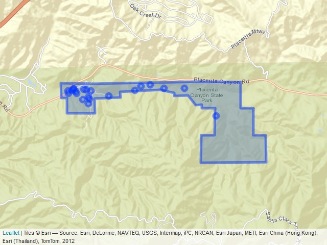
htmltools::p("Arachnids in Placerita Canyon SP", style = "font-weight:bold; font-size:110%;")

leaflet(placertia_sf) %>% 
  addProviderTiles("Esri.WorldStreetMap") %>% 
  addPolygons() %>% 
  addCircleMarkers(data = inat_arachnid_pcsp_popup_sf,
                   popup = ~popup_html, 
                   radius = 5)
Arachnids in Placerita Canyon SP

Leaflet map of Arachnids
Click on the map to open in a new tab

Summary

The iNaturalist API allows you to download observations from a global community of naturalists, which is pretty powerful. This Tech Note showed you how to create a map of iNaturalist observations within a specific area and for a specific taxon using the rinat and leaflet packages for R.

A couple caveats are worth noting. A limitation of this method is that the data are static. In other words, to get the latest data your have to re-query the API again. It isn’t ‘live’ like a feature service.

Also, although leaflet works well for small to medium sized datasets, you wouldn’t want to use this mapping tool for massive amounts of spatial data. With leaflet, all of the geographic information and popup content are saved in the HTML file, and rendering is done on the client. This generally makes it extremely fast because everything is in memory. But if the data overwhelm memory it can slow your browser to a crawl. If you have to map hundreds of thousands of points, for example, you would need a different approach for both downloading and visualizing the data.

NPL Markets and R Shiny

Our mission at NPL Markets is to enable smart decision-making through innovative trading technology, advanced data analytics and a new comprehensive trading ecosystem. We focus specifically on the illiquid asset market, a market that is partially characterized by its unstructured data.

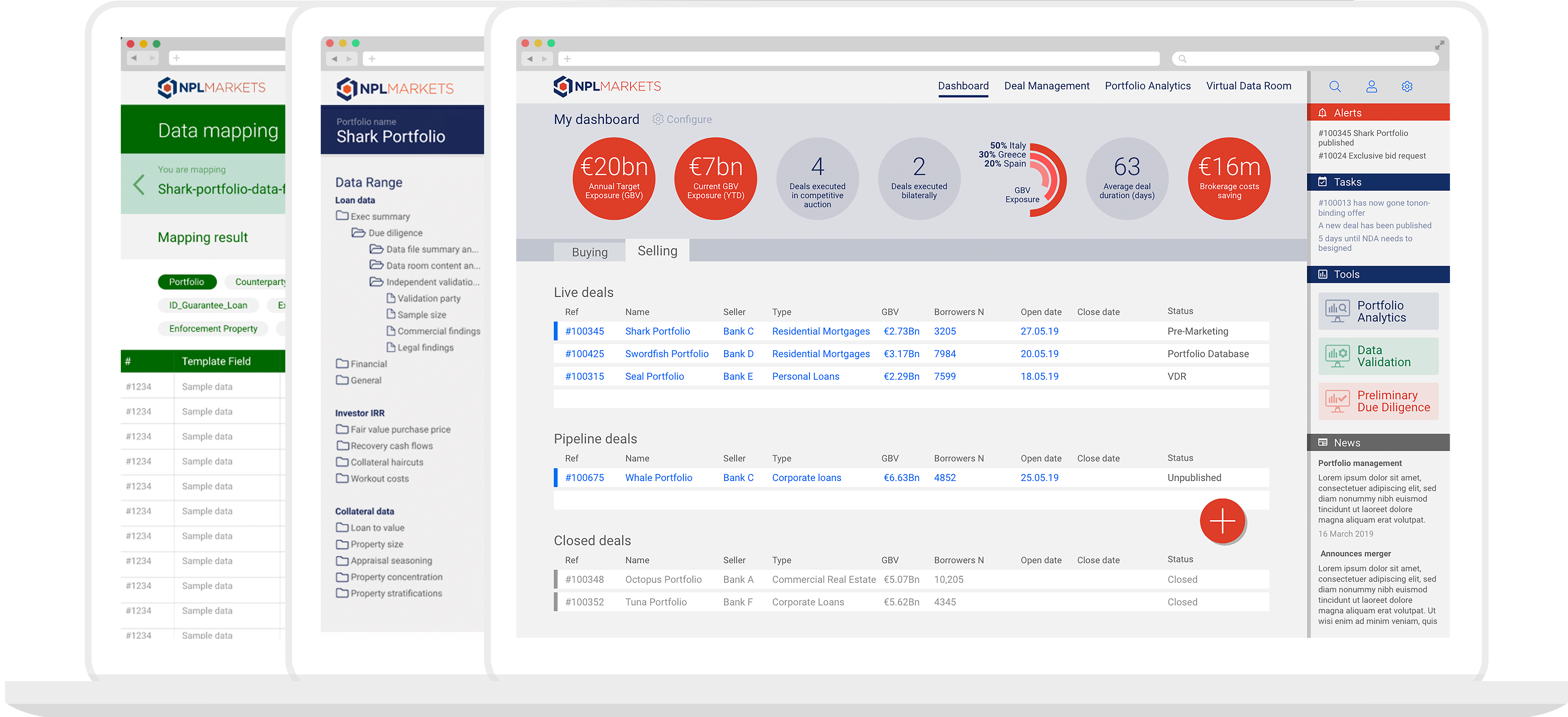
  Platform Overview


NPL Markets fully embraces R and Shiny to create an interactive platform where sellers and buyers of illiquid credit portfolios can interact with each other and use sophisticated tooling to structure and analyse credit data. 

Creating such a platform with R Shiny was a challenge, while R Shiny is extremely well suited to analyzing data, it is not entirely a generalist web framework. Perhaps it was not intended as such, but our team at NPL Markets has managed to create an extremely productive setup. 

Our development setup has a self-build ‘hot reload’ library, which we may release to a wider audience once it is sufficiently tested internally. This library allows us to update front-end and server code on the fly without restarting the entire application.

In addition to our development setup, our production environment uses robust error handling and reporting, preventing crashes that require an application to restart.

More generally, we use continuous integration and deployment and automatically create unit tests for any newly created R functions, allowing us to quickly iterate.

If you would like to know more about what we built with R and Shiny, reach out to us via our website www.nplmarkets.com

Tidy Visualization of Mixture Models in R

We are excited to announce the release of the plotmm R package (v0.1.0), which is a suite of tidy tools for visualizing mixture model output. plotmm is a substantially updated version of the plotGMM package (Waggoner and Chan). Whereas plotGMM only includes support for visualizing univariate Gaussian mixture models fit via the mixtools package, the new plotmm package supports numerous mixture model specifications from several packages (model objects).

This current stable release is available on CRAN, and was a collaborative effort among Fong Chan, Lu Zhang, and Philip Waggoner.

The package has five core functions:

  • plot_mm(): The main function of the package, plot_mm() allows the user to simply input the name of the fit mixture model, as well as an optional argument to pass the number of components k that were used in the original fit. Note: the function will automatically detect the number of components if k is not supplied. The result is a tidy ggplot of the density of the data with overlaid mixture weight component curves. Importantly, as the grammar of graphics is the basis of visualization in this package, all other tidy-friendly customization options work with any of the plotmm’s functions (e.g., customizing with ggplot2’s functions like labs() or theme_*(); or patchwork’s plot_annotation()).

  • plot_cut_point(): Mixture models are often used to derive cut points of separation between groups in feature space. plot_cut_point() plots the data density with the overlaid cut point (point of greatest separation between component class means) from the fit mixture model.

  • plot_mix_comps(): A helper function allowing for expanded customization of mixture model plots. The function superimposes the shape of the components over a ggplot2 object. plot_mix_comps() is used to render all plots in the main plot_mm() function, and is not bound by package-specific objects, allowing for greater flexibility in plotting models not currently supported by the main plot_mm() function.

  • plot_gmm(): The original function upon which the package was expanded. It is included in plotmm for quicker access to a common mixture model form (univariate Gaussian), as well as to bridge between the original plotGMM package.

  • plot_mix_comps_normal(): Similarly, this function is the original basis of plot_mix_comps(), but for Gaussian mixture models only. It is included in plotmm for bridging between the original plotGMM package.
Supported model objects/packages include:

  1. mixtools
  2. EMCluster
  3. flexmix
Supported specifications include mixtures of:

  1. Univariate Gaussians
  2. Bivariate Gaussians
  3. Gammas
  4. Logistic regressions
  5. Linear regressions (also with repeated measures)
  6. Poisson regressions

Take a look at the Github repo for several demonstrations.

Note that though plotmm includes many updates and expanded functionality beyond plotGMM, it is under active development with support for more model objects and specifications forthcoming. Stay tuned for updates, and always feel free to open an issue ticket to share anything you’d like to see included in future versions of the package. Thanks and enjoy!

Covid-19 interactive map (using R with shiny, leaflet and dplyr)

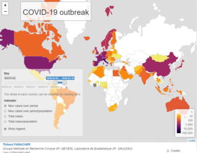
The departement of Public Health of the Strasbourg University Hospital (GMRC, Prof. Meyer) and the Laboratory of Biostatistics and Medical Informatics of the Strasbourg  Medicine Faculty (Prof. Sauleau), to the extent of their means and expertise, are contributing to the fight against Covid-19 infection. Doctor Fabacher has produced an interactive map for global monitoring of the infection, accessible at :

https://thibautfabacher.shinyapps.io/covid-19/


This map, which complements the Johns Hopkins University tool (Coronavirus COVID-19 Global Cases by Johns Hopkins CSSE), focuses on the evolution of the number of cases per country and for a given period, but in terms of incidence and prevalence. It is updated daily.
The period of interest can be defined by the user and it is possible to choose  :
  • The count of new cases over a period of time or the same count in relation to the population of the country (incidence).
  • The total case count over a period of time or the same count reported to the population (prevalence).

This map is made using R with shiny, leaflet and dplyr packages.

Code available here : https://github.com/DrFabach/Corona/blob/master/shiny.r

Reference
Dong E, Du H, Gardner L. An interactive web-based dashboard to track COVID-19 in real time. Lancet Infect Dis; published online Feb 19. https://doi.org/10.1016/S1473-3099(20)30120-1.