My primary goal was to research popular movies
vocabulary – words all those heroes actually saying to us and put well known movies onto the scale from the ones with the
widest lexicon down to below average range despite possible crowning by IMDB rating, Box Office revenue or number / lack of Academy Awards.
Main unit of analysis is Number of unique words per 1000 which says about how WIDE the vocabulary of each movie / TV show is. I saw and personally made similar analysis for literature, music or web content but never for real top movies texts, not scripts.
This post is the 2nd Part of the
Movies text analysis and covers analysis itself and displaying results in nice looking tables using
gt package. Part 1,
previously published on R-Bloggers, covers preparation stage and movie texts cleaning using
textclean package.
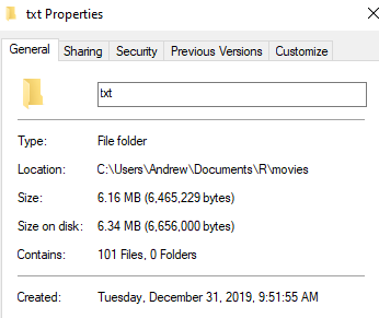
I created CSV file featuring movies:
Movies_prep <- read_csv("R/movies/Movies_prep.csv")
Movies_prep [1:5,]
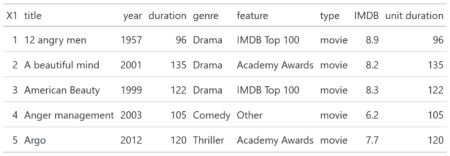
Resulting table will be plugged with three more parameters needed to be calculated.
- Number of words (for entire movie).
- Words per minute (Number of words / Movie length).
- Vocabulary (Number of unique words per 1000 words).
library (tidyverse)
library (tidytext)
library (textstem)
library (gt)
Bind clean text (described in Movies text analysis. Part 1) to the titles
movies_ <- select (Movies_prep, title = title)
movies_bind <- cbind (movies_, text)
Let`s use
tidytext package to Unnest text to words
movies_words <- unnest_tokens (movies_bind, word, text)
Simply calculate nwords and words per minute for each movie
title_ <- movies_bind$title
movies_nword <- function (i){movies_nwords1<- movies_words %>% filter (title==i) %>% nrow ()
movies_nwords1}
movies_nwords <- sapply (title_, movies_nword)

Movies_prep1 <-  Movies_prep %>% mutate (words = movies_nwords, wpminute = round (movies_nwords/duration))
Let`s look at the
Words per minute parameter first.
wpm_summary <- Movies_prep1$wpminute %>% summary ()
wpm_summary
Min. 1st Qu. Median Mean 3rd Qu. Max.
37.00 66.00 80.00 85.89 104.00 182.00
Let`s check ten most wordy movies in our dataset
Movies_prep1_GT <- Movies_prep1 %>% select (title, wpminute, genre, type)
Movies_preptop_GT <- Movies_prep1_GT %>% arrange (desc(wpminute)) %>% slice (1:10) %>% gt ()
I added tiny command gt () from
gt package and my slice became nice looking table:
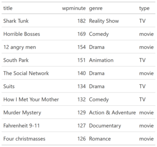
The same for ten least wordy movies
Movies_prepbot_GT <- Movies_prep1_GT %>% arrange (wpminute) %>% slice (1:10) %>% gt ()
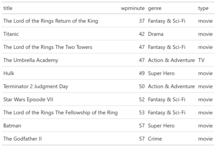
Only Reality Show I added as control value is obvious outlier. While the most silent are well known epic movies.
We will explore gt package more deep a later.
Now, let`s check the range for Total Number of words
words_summary <- Movies_prep1$words %>% summary ()
Min. 1st Qu. Median Mean 3rd Qu. Max.
5981 8619 10311 10815 12467 18710
I wish all of them were exact 10,000 words length. Or any other but equal length for all movies. Real life is not so round. Unlike music vocabulary, we cannot take "99.7 songs" to have the same length for every peer. Why we need that? We cannot properly compare Number of unique words within different pieces of text unless they all are the same length. Any one sentence has up to 100% words uniqueness, 100 sentences - up to 50%. Any entire movie – much less due to marginal saturation e.g. usage the words we already used.
Before we solve this problem we should lemmatize clean text.
movies_lem<- lemmatize_words (movies_words$word)
movies <- movies_words %>% mutate (word = movies_lem)
And, vocabulary unique words per 1000 for each movie (I use minimal length along the all movies in dataset with sampling all movies text the same size = length of the shortest (N of words) movie.
nwords_min <- min(movies_nwords)
vocab1 <- function (z) {vocab2<- movies_words %>% filter (title==z)
vocab3<- as.data.frame (replicate (5, sample (vocab2$word, nwords_min, replace = FALSE)), stringsAsFactors = FALSE)
vocab4 <- round (mean (sapply (sapply (vocab3, unique), length))/nwords_min *1000)
vocab4}
vocab <- sapply (title_, vocab1)

Summary (vocab)
Min. 1st Qu.  Median    Mean 3rd Qu.    Max.
152.0   176.0   188.0   188.7   200.0   251.0

Movies_final <-  Movies_prep1 %>% mutate (vocabulary = vocab)
I plan to compare and visualize how wide vocabulary is within iconic movies, different genres, Movies vs TV Shows, IMDB TOP 100 vs Box Office All Time Best etc. in my next post (Movies text analysis. Part 3.)
For this part I want to explore further
gt package and display movies ranking by its vocabulary:
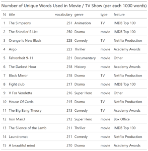
Movies_final_GT <- Movies_final %>% select (title, vocabulary, genre, type, feature) %>%
  top_n (20, vocabulary) %>% mutate (N = seq (20))
Movies_final_GT <- Movies_final_GT [,c(6,1,2,3,4,5)] %>% gt() %>%
  tab_header(
  title = "Number of Unique Words Used in Movie / TV Show (per each 1000 words)")
Using gt package we put top 15 movies by number of unique words in table. This time with header.
And we can easily save the table as graphical output.
gtsave(Movies_final_GT, filename = 'Movies_final_GT.png')
gtsave(Movies_final_GT, filename = 'Movies_final_GT.pdf')
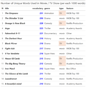
Let`s format the table a bit.
Movies_final_GTT <- Movies_final_GT %>%
    tab_style(
    style = list(
      cell_text(weight = "bold")),
    locations = cells_column_labels(
      columns = vars(N, title, vocabulary, genre, type, feature))) %>%
  tab_style(
  style = list(
      cell_text(weight = "bold")),
locations = cells_body(
  columns = vars(title, vocabulary))) %>%
  tab_style(
    style = list(
      cell_text(style = "italic")),
locations = cells_body(
        columns = vars(title, type)))
We can change cells and text colors and even make it conditional (for instance, only ‘type == TV’).
Movies_final_GTT <- Movies_final_GTT %>%
  tab_style(
    style = list(
      cell_text(color = "blue")),
locations = cells_body(
      columns = vars(vocabulary))) %>%
  tab_style(
    style = list(
      cell_fill(color = "#F9E3D6")),
locations = cells_body(
      columns = vars(type),
      rows = type == "TV"))
That`s it for tables and for Part 2 of my Movies text analysis. In Part 3 I plan to use
ggplot2 to visualize and compare how wide vocabulary is within iconic movies, different genres, Movies vs TV Shows, IMDB TOP 100 vs Box Office All Time Best etc. See ya.
 You can test RXSpreadsheet by installing the GitHub version with devtools::install_github(‘MichaelHogers/RXSpreadsheet’) and subsequently running RXSpreadsheet::runExample().
This wrapper was made by Jiawei Xu and Michael Hogers. We are aiming for a CRAN release over the coming weeks. Special thanks to NPL Markets for encouraging us to release open source software.
You can test RXSpreadsheet by installing the GitHub version with devtools::install_github(‘MichaelHogers/RXSpreadsheet’) and subsequently running RXSpreadsheet::runExample().
This wrapper was made by Jiawei Xu and Michael Hogers. We are aiming for a CRAN release over the coming weeks. Special thanks to NPL Markets for encouraging us to release open source software. 
 [contact-form][contact-field label=”Name” type=”name” required=”true” /][contact-field label=”Email” type=”email” required=”true” /][contact-field label=”Website” type=”url” /][contact-field label=”Message” type=”textarea” /][/contact-form]