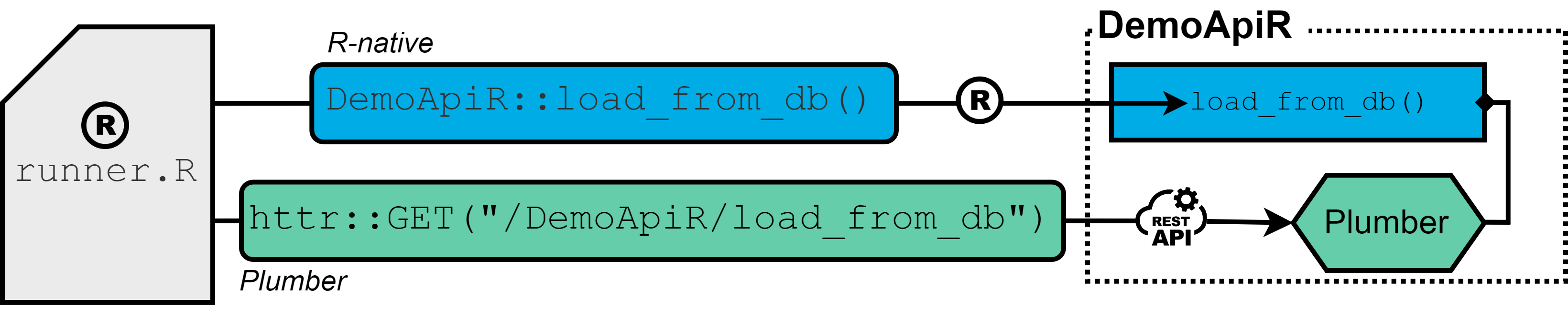
The R-native approach (blue): API interaction is available by functions of relevant R-packages that are directly installed into the R-session.
The Plumber approach (green): The Plumber package allows R code to be exposed as a RESTful web service through special decorator comments. As a results, API functionality is assesed by sending REST calls (GET, POST, …) rather than calling functions of R-packages directly.
#* This endpoint is a dummy for loading data
#* @get load_from_db
#* @serializer unboxedJSON
#* @param row_limit :int
#* @response 200 OK with result
#* @response 201 OK without result
#* @response 401 Client Error: Invalid Request - Class
#* @response 402 Client Error: Invalid Request - Type
#* @response 403 Client Error: Missing or invalid parameter
#* @response 500 Server Error: Unspecified Server error
#* @response 501 Server Error: Database writing failed
#* @response 502 Server Error: Database reading failed
#* @tag demo
function(res, row_limit = 10000) {
   # load data from db
   data <- dplyr::tibble()
   res$status <- 200
   res$body <- as.list(data)
   return(res$body)
}
Which approach to use?
Certainly, both approaches have their strengths and limitations. It should be no surprise, that in terms of execution time, CPU utilization and format consistency, the R-native approach is likely to be the first choice, as code and data is processed within one context. Furthermore, the approach offers flexibility for complex data manipulations, but can be challenging when it comes to maintenance, especially propagating new releases of packages to all relevant processes and credential management. To the best of my knowledge, there is no automated way of re-installing new releases directly into all related R-packages, even with using the POSIT package manager – so this easily becomes tedious.
In contrast, the Plumber API encourages modular design that enhances code organization and facilitates integration with a wide array of platforms and systems. It streamlines package updates while ensuring a consistent interface. This means that interacting with a Plumber API remains separate from the underlying code logic provided by the endpoint. This approach not only improves version management but also introduces a clear separation between the client and server. In general, decoupling functionality through a RESTful API offers the possibility of dividing tasks into separate development teams more easily and thus a higher degree of flexibility and external support. Additionally, I found distributing a Plumber API notably more straightforward than handing over a raw R package.
The primary goal of this blog post is to quantify the performance difference between the two approaches when it comes to getting data in and out of a database. Such benchmark can be particularly valuable for ETL (Extract, Transform, Load) processes, thereby shedding light on the threshold at which the advantages of the Plumber approach cease to justify its constraints. In doing so, we hope to provide information to developers who are faced with the decision of whether it makes sense to provide or access R functionalities via Plumber APIs.
Experimental Setup
The experimental setup encompassed a virtual machine instance equipped with 64GB RAM and an Intel(R) Xeon(R) Gold 6152 CPU clocked at 2.1GHz, incorporating 8 kernels, running Ubuntu 22.04 LTS, hosting the POSIT Workbench and Connect server (for hosting the Plumber API) and employing R version v4.2.1. Both POSIT services were granted identical access permissions to the virtual machine’s computational resources.
Both approaches are evaluated in terms of execution times, simply measured with system.time(), and maximal observed CPU load, the latter being expecially an important indicator on how how much data can be extracted and send at once. For each fixed number of data row, ranging from 10^4 to 10^7, 10 trials are being conducted and results beeing plotted by using a jittered beeswarm plot. For assessing the cpu load during the benchmark, I build a separate function that returns a new session object, within which every 10 seconds the output of NCmisc::top(CPU = FALSE) is appended to a file.
get_cpu_load <- function(interval = 10, root, name, nrow) {
  rs_cpu <- callr::r_session$new()
  rs_cpu$call(function(nrow, root, name, interval) {
    files <- list.files(root)
    n_files <- sum(stringr::str_detect(files, sprintf("%s_%s_", name, format(nrow, scientific = FALSE))))
    l <- c()
    while (TRUE) {
      ret <- NCmisc::top(CPU = FALSE)
      l <- c(l, ret$RAM$used * 1000000)
      save(l, file = sprintf("%s/%s_%s_%s.rda", root, name, format(nrow, scientific = FALSE), n_files + 1))
      Sys.sleep(interval)
    }
  }, args = list(nrow, root, name, interval))
  return(rs_cpu)
}
Result
Execution time: in the following figure A), the data extraction process is observed to be approximately 10 times slower, when utilizing the plumber API as compared to the R-native approach across all dataset sizes.
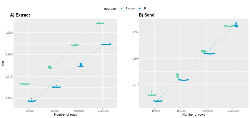
(y-axis in logarithmic scale)
Both approaches display a linear increase in execution time on a logarithmic time scale, indicating exponential growth in the original data domain. Specifically, the mean execution times for R-native and Plumber start at 0.00078 and 0.00456 minutes, respectively, and escalate to 0.286 and 2.61 minutes. It is reasonable to assume that this exponential trend persists for larger datasets, potentially resulting in execution times exceeding half an hour for very large tables (> 100 million rows) when using Plumber.
Conversely, subfigure B) shows the execution time for sending data and illustrates that both approaches provide rather comparable performance, particularly with larger numbers of rows. While for 10,000 rows, the R-native approach is still twice as fast (average of 0.0023 minutes) compared to Plumber (0.00418), the advantage of being in one context diminishes as the number of rows increases. At 10 million rows, the Plumber approach is even faster than the R-native approach (1.88 min), averaging 1.7 minutes. Once again, the execution time exhibits an exponential growth trend with an increasing number of rows.
CPU Load: In examining maximum observable CPU load during data receiving and sending, notable differences emerge between the Plumber API and the R-native approach.
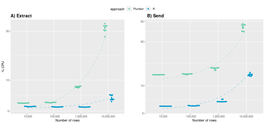
(y-axis in logarithmic scale)
A) For data extraction up to 1 million rows, CPU utilization remains below 10% for both approaches. However, the utilization patterns diverge as row counts increase. Notably, the R-native approach maintains relatively consistent CPU usage (averaging 5.53%, 5.48%, 5.47%) up to 1 million rows, whereas the Plumber approach already experiences a noticeable increase (5.97%, 6.05%, 8.6%). When extracting 10 million rows, CPU usage surpasses 30% for Plumber, while R-native extraction incurs approximately five times less computational overhead. B) In contrast to execution time, a clear difference in CPU utilization becomes evident also during sending data. The R-native approach consistently demonstrates at least half as less CPU demands compared to Plumber across all data row sizes. For 10,000,000 rows, the plumber approach even consumes over three times more CPU power: 13.1% vs. 43.2%. This makes up to almost 30GB in absolute terms.
The Plumber approach, while offering several advantages, encounters clear limitations when dealing with large datasets, be it tables with a substantial number of rows or extensive columns. As a result, data extraction becomes roughly ten times slower, with CPU utilization being up to five and three times higher during getting data out and in, respectively. Digging deeper into it reveals that this gap is likely to result from the necessity of converting data into JSON format when using a web-based architecture. Plumber can’t handle R dataframes directly, which is why serializer have to to be used before sending and retrieving data from an endpoint. Even with lots of RAM capacity, this conversion process can lead to execution errors in practice as JSON representations may surpass the allowed byte size for the R datatype character.
>jsonlite::toJSON(dataframe)
Error in collapse_object(objnames, tmp, indent):
R character strings are limited to 2^31-1 bytes
The only viable workaround in such scenarios involves breaking down tables into smaller chunks based on certain identifiers.
Providing a precise table size limitation where the Plumber approach remains suitable proves challenging, as it hinges on a multitude of factors, including the number of rows, columns, and cell content within the dataset. Personally, I will stick to using the Plumber API for scenarios with limited data traffic, such as querying terminology or a statistical summary, as I generally prioritize code encapsulation and ease of maintenance over maximizing performance.
Micha Christ
Bosch Health Campus Centrum für Medizinische Datenintegration


 Data visualization and charting are actively evolving as a more and more important field of web development. In fact, people perceive information much better when it is represented graphically rather than numerically as raw data. As a result, various business intelligence apps, reports, and so on widely implement graphs and charts to visualize and clarify data and, consequently, to speed up and facilitate its analysis for further decision making.
While there are many ways you can follow to handle data visualization in R, today let’s see how to create interactive charts with the help of popular JavaScript (HTML5) charting library
Data visualization and charting are actively evolving as a more and more important field of web development. In fact, people perceive information much better when it is represented graphically rather than numerically as raw data. As a result, various business intelligence apps, reports, and so on widely implement graphs and charts to visualize and clarify data and, consequently, to speed up and facilitate its analysis for further decision making.
While there are many ways you can follow to handle data visualization in R, today let’s see how to create interactive charts with the help of popular JavaScript (HTML5) charting library 
 For consistency purposes, I am including the code of