I will show here how to create an interactive 3D visualisation of geospatial data, using rgl library, that allows export of the results into HTML.
The dataset to visualize, is a 7 day hike to Kilimajaro mountain (5895 metres) in Tanzania.
Dataset contains latitude, longitude and elevation at sequence of timestamps.
route <- readr::read_delim("https://raw.githubusercontent.com/mvhurban/kilimanjaro/master/Kilimanjaro_ascent.csv", ";", escape_double = FALSE, trim_ws = TRUE)
The elevation gain of hiker in meters can be plotted simply:plot(route$ele)
When visualizing small areas, such as cities, mountains or parts of countries, distortion due to Geoid projection on 2D surface is insignificant and it is sufficient to set the projection center to the visualized area. Our dataset falls into this category and therefore can be bounded by:
max_lat = max(route$lat)
min_lat = min(route$lat)
max_lon = max(route$lon)
min_lon = min(route$lon)
To create a 3D surface, units must match altitude units (meters). This can be achieved by scaling coordinates by factor corresponding to the arclength of
latitude or longitude degree:
We can use function distGeo (this calculates great circle distance between two points on Earth) to obtain conversion scales.
library(geosphere)
library(rgdal)
lon_scale = geosphere::distGeo(c(min_lon, (min_lat+max_lat)/2), c(max_lon,(min_lat+max_lat)/2))/(max_lon-min_lon)
lat_scale = geosphere::distGeo(c(min_lon, min_lat), c(min_lon, max_lat))/(max_lat-min_lat)
By hving conversion scales for latitude and logitude, we can convert GPS coordinates to cartesian coordinates in the plane tangent to the Earth at the center of the dataset. One can see it as placing a sheet of paper on the scrutinized spot on Earth.
route$lon_m <- route$lon * lon_scale
route$lat_m <- route$lat * lat_scale
To obtain the elevation data surrounding the track we define a polygon (rectangle) enclosing the track. Note, that the polygon ends and begins with same point.
y_coord <- c(min_lat, min_lat, max_lat, max_lat, min_lat) # latitude
x_coord <- c(min_lon, max_lon, max_lon, min_lon, min_lon) # longitude
Geospatial polygons can be handled by sp library. Such a polygon must contain a projection string prj_sps defining how to interpret coordinates:
library(sp)
polygon_border <- cbind(x_coord, y_coord)
p <- sp::Polygon(polygon_border)
ps <- sp::Polygons(list(p), 1)
sps <- sp::SpatialPolygons(list(ps))
prj_sps <- sp::CRS("+proj=longlat +datum=WGS84 +no_defs +ellps=WGS84 +towgs84=0,0,0")
sp::proj4string(sps) <- prj_sps
spdf = sp::SpatialPolygonsDataFrame(sps, data.frame(f=99.9))
#plot(spdf)
We define grid with points at which elevation data will be requested. Then we define projection string for a grid object:grid_data <- sp::makegrid(spdf, cellsize = 0.001) # cellsize in map units (here meters)! grid <- sp::SpatialPoints(grid_data, proj4string = prj_sps)The Elevation data for raster object can be downloaded using elevatr library by to accessing the Terrain Tiles on AWS.
library(elevatr)
elevation_df <- elevatr::get_elev_raster(grid, prj = prj_sps, z = 12)
#plot(elevation_df)
Transforming raster object to dataframe:
library(raster)
kili_map <- as.data.frame(raster::rasterToPoints(elevation_df))
Since we have equidistant rectangular grid, we can rearrange points into matrix and project to the plane:
lenX = length(unique(kili_map$x))
lenY = length(unique(kili_map$y))
z_full = matrix(kili_map$layer, nrow=lenX, ncol =lenY, byrow = FALSE )
x_full = lon_scale * matrix(kili_map$x, nrow=lenX, ncol =lenY, byrow = FALSE ) # longitude
y_full = lat_scale * matrix(kili_map$y, nrow=lenX, ncol =lenY, byrow = FALSE ) # latitude
At this stage, it is possible to generate 3D model of route, but depending on the dataset, additional problems may occur.
Here we address mismatch of Track altitudes and of the altitude dowloaded using elevatr library.
I our case elevations do not match and some points of Kilimanjaro dataset are above and some below elevatr altitudes and this overlap makes the display ugly.
We solve this problem by discarding provided elevations and projecting GPS coordinates to dowloaded grid. (Another option would be to use elevatr::get_elev_point(), which returns altitude for the dataframe.)
The projection is done by finding the closest point on a grid to the route point and assigning the elevation, the search of closest neighbour is done by a function provided in data.table library:
library(data.table)
dt_route = data.table::data.table(route)
N = nrow(dt_route)
data.table::setkeyv(dt_route, c('lon_m','lat_m'))
coor_x = data.table::data.table(ind_x=c(1:lenX), lon_m=x_full[ , 1])
coor_y = data.table::data.table(ind_y=c(1:lenY),lat_m=y_full[1, ])
dt_route$ind_y = coor_y[dt_route, on = 'lat_m', roll='nearest']$ind_y
dt_route$ind_x = coor_x[dt_route, on = 'lon_m', roll='nearest']$ind_x
for (i in c(1:N)){
dt_route$altitude[i]<-z_full[dt_route$ind_x[i], dt_route$ind_y[i]]}
For our purposes, the size of grid object is too big and we can skip few points:Note that skipping every 5 grid points makes a reduction of the size by 96%!
skip_cell = 5
x = x_full[seq(1, lenX, by=skip_cell), seq(1, lenY, by=skip_cell)]
y = y_full[seq(1, lenX, by=skip_cell), seq(1, lenY, by=skip_cell)]
z = z_full[seq(1, lenX, by=skip_cell), seq(1, lenY, by=skip_cell)]
Colors can be assigned to a particular altitude by color pallet, for obvious reasons we have choosen terrain.colors. But since Kilimanjaro has snow above 5300 m, we added the snowline.
snowline <- 5300 # above this line color will be white
colorlut <- terrain.colors(snowline-0, alpha = 0)
# maping altitude to color: minimum is 0 - green, maximum 5300 - white
z_col<-z
z_col[z_col>snowline] <- snowline
col <- colorlut[z_col]
Calculating relative time spent on the hike:
dt_route = dt_route[order(time), ]
time <- as.POSIXlt(dt_route$time, format='%Y-%m-%d-%H-%M-%S')
start_time = time[1]
end_time = time[N]
dt_route$relative_time <- as.numeric(difftime(time, start_time, units ='hours'))/as.numeric(difftime(end_time, start_time, units='hours'))
Here we add some additional perks to the map:
#### CAMPS
camp_index<-c(1, 2897, 4771, 7784, 9275, 10396,15485, 17822)
camp_lon <- dt_route[camp_index, lon_m]
camp_lat <- dt_route[camp_index, lat_m]
camp_alt <- dt_route[camp_index, altitude]
camp_names <- c('Machame gate','Machame camp', 'Shira cave', 'Baranco camp', 'Karanga camp', 'Barafu camp', 'Mweka camp', 'Mweka gate')
#### PEAKS
peak_lon <- lon_scale*c( 37.3536381, 37.4561200, 37.3273936, 37.2370328)
peak_lat <- lat_scale*c(-3.0765783, -3.0938911, -3.0679128, -3.0339558)
peak_alt <- c(5895, 5149, 4689, 2962)-50
peak_names<-c("Uhuru peak (5895)", "Mawenzi (5149)", "Lava Tower (4689)", "Shira (2962)")

#### Hike
skip_points <- 10
aux_index <- seq(1, N, by=skip_points)
time <- dt_route[aux_index, relative_time]
hike <- cbind(dt_route[aux_index, lon_m], dt_route[aux_index, lat_m], dt_route[aux_index, altitude])
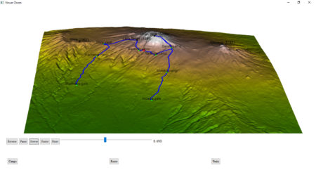
Finally, plotting using rgl library. It is important, that rgl window initialized by rgl::open3d() is open while objects are created. Each object created is loaded to html element within rgl scene3d, and at any moment can be saved as scene object by command: kilimanjaro_scene3d <- scene3d() (which assigns current status of rgl window). Note, that the importance of parameter alpha, where alpha=1 corresponds to non-transparent objects, while for display of texts the transparency is allowed, which smoothes imaging of edges (alpha=0.9).library(rmarkdown)
rgl::open3d()
hike_path <- rgl::plot3d(hike, type="l", alpha = 1, lwd = 4, col = "blue", xlab = "latitude", ylab='longitude', add = TRUE)["data"]
rgl::aspect3d("iso") # set equilateral spacing on axes
camp_shape <- rgl::spheres3d(camp_lon, camp_lat, camp_alt, col="green", radius = 150)
rgl::rgl.surface(x, z, y, color = col, alpha=1)
hiker <- rgl::spheres3d(hike[1, , drop=FALSE], radius = 200, col = "red")
camp_text<-rgl::rgl.texts(camp_lon, camp_lat, camp_alt+400,camp_names
, font = 2, cex=1, color='black', depth_mask = TRUE, depth_test = "always", alpha =0.7)
peak_shape <- rgl::spheres3d(peak_lon, peak_lat, peak_alt, col="black", radius = 150)
peak_text <- rgl::rgl.texts(peak_lon,peak_lat,peak_alt+400,peak_names
,font = 2, cex=1, color='black', depth_mask = TRUE, depth_test = "always", alpha =0.9)
To generate an interactive HTML, rgl library provides the rglwidget function, that can be used to display the motion of a hiker in real time. It is worth to mention how agecontrol object works: it generates a set of objects with predefined life cycle, where birth defines the time of spawn, age defines the vector of time periods (in object age) at which value of object changes like the transparency (alpha).library(rgl)
rgl::rglwidget() %>%
playwidget(
ageControl(births = 0, ages = time, vertices = hike, objids = hiker),step = 0.01, start = 0, stop=1, rate = 0.01, components = c("Reverse", "Play", "Slower", "Faster","Reset", "Slider", "Label"), loop = TRUE) %>%
toggleWidget(ids = c(camp_shape, camp_text), label="Camps") %>%
toggleWidget(ids = hike_path, label="Route") %>%
toggleWidget(ids = c(peak_shape, peak_text), label="Peaks") %>%
asRow(last = 3)
And that’s it!Version modified to satisfy requirements of Shiny apps is posted here:
https://mvhurban.shinyapps.io/GPS_zobrazovanie/