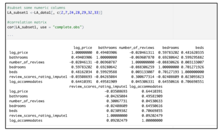
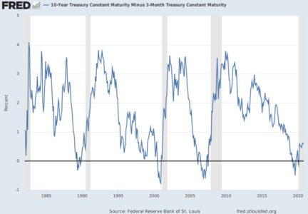
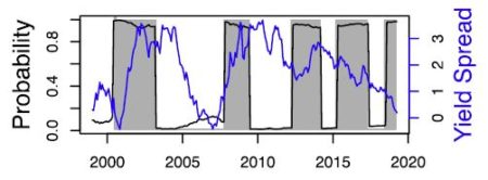
The basic idea is that the slope of the yield curve is somewhat linked to the probability of future recessions. In other words, the difference between the short and the long term rate can be used as a tool for monitoring business cycles. Nothing new about that: Kessel (1965) documented the cyclical behavior of the yield spread, and he showed that the yield spread tended to decline immediately before a recession. This relationship is one of the most famous stylized facts among economists (see Figure 1).
– So, why people don’t use this model to predict recessions ?
– Well, it seems to be related to the fact that (i) they think it only used to work in the US (ii) they don’t feel to be qualified to run a sophisticated R code to estimate this relationship.
This post is about answering these two questions: (i) yes, the yield curve does signal recessions (ii) yes, it is easy to monitor economic cycles with R using the EWS package !
First, if you have some doubts about the predictive power of the yield spread, please have a look on Hasse and Lajaunie (2022)’s recent paper, published in the Quarterly Review of Economics and Finance. The authors – Quentin and I – reexamine the predictive power of the yield spread across countries and over time. Using a dynamic panel/dichotomous model framework and a unique dataset covering 13 OECD countries over the period 1975–2019, we empirically show that the yield spread signals recessions. This result is robust to different econometric specifications, controlling for recession risk factors and time sampling. Main results are reported in Table 1.

– Wait, what does mean “dichotomous model” ?
– Don’t be afraid: the academic literature provides a specific econometric framework to predict future recessions.
Estrella and Hardouvelis (1991) and Kauppi and Saikkonen (2008) have enhanced the use of binary regression models (probit and logit models) to model the relationship between recession dummies (i.e., binary variables) and the yield spread (i.e., continuous variable). Indeed, classic linear regressions cannot do the job here. If you have specific issues about probit/logit models, you should have a look on Quentin’s PhD dissertation. He is a specialist in nonlinear econometrics.
Now, let’s talk about the EWS R package. In a few words, the package is available on the CRAN package repository and it includes data and code you need to replicate our empirical findings. So you only have to run a few lines of code to estimate the predictive power of the yield spread. Not so bad eh ?
Here is an example focusing on the US: first install and load the package, then we extract the data we need.
# Load the package
library(EWS)
# Load the dataset included in the package
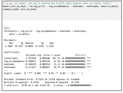
# Data process
Var_Y <- as.vector(data_USA$NBER)
Var_X <- as.vector(data_USA$Spread)
# Estimate the logit regression
results <- Logistic_Estimation(Dicho_Y = Var_Y, Exp_X = Var_X, Intercept = TRUE, Nb_Id = 1, Lag = 1, type_model = 1)
# print results
print(results)
The results can be printed… and plotted ! Here is an illustration what you should have:
$Estimation
name Estimate Std.Error zvalue Pr
1 Intercept -1.2194364 0.3215586 -3.792268 0.0001492776
2 1 -0.5243175 0.2062655 -2.541955 0.0110234400
Nice output, let’s interpret what we have. First the estimation results: the intercept is equal to -1.21 and high significant, and the lagged yield spread is equal to -0.52 and is also highly significant. This basic result illustrates the predictive power of the yield spread.
– But what does mean “1” instead of the name of the lagged variable ? And what if we choose to have another lag ? And if we choose model 2 instead of model 1 ?
– “1” refers to the number associated to the lagged variable, and you can change the model or the number of lags via the function arguments:
$Estimation
name Estimate Std.Error zvalue Pr
1 Intercept 0.08342331 0.101228668 0.8241075 4.098785e-01
2 1 -0.32340655 0.046847136 -6.9034433 5.075718e-12
3 Index_Lag 0.85134073 0.003882198 219.2934980 0.000000e+00
Last but not least, you can choose the best model according to AIC, BIC or R2 criteria:$AIC [1] 164.0884 $BIC [1] 177.8501 $R2 [1] 0.2182592Everything you need to know about the predictive power of the yield spread is here. These in-sample estimations confirm empirical evidences from the literature for the US. And for those who are interested in out-of-sample forecasting… the EWS package provides what you need. I’ll write an another post soon !
References
Estrella, A., & Hardouvelis, G. A. (1991). The term structure as a predictor of real economic activity. The Journal of Finance, 46(2), 555-576.
Hasse, J. B., & Lajaunie, Q. (2022). Does the yield curve signal recessions? new evidence from an international panel data analysis. The Quarterly Review of Economics and Finance, 84, 9-22.
Hasse, J. B., & Lajaunie, Q. (2020). EWS: Early Warning System. R package version 0.1. 0.
Kauppi, H., & Saikkonen, P. (2008). Predicting US recessions with dynamic binary response models. The Review of Economics and Statistics, 90(4), 777-791.
Kessel, Reuben, A. “The Cyclical Behavior of the Term Structure of Interest Rates.” NBER Occasional Paper 91, National Bureau of Economic Research, 1965.