In 2001, I was fortunate to discover a ‘market characteristic’ that transcends virtually every liquid market. Markets often trend in a nonlinear fashion according to hidden support/resistance curves (Stealth Curves). Whereas ‘market anomalies’ are transient and are overwhelmingly market specific, Stealth Curves are highly robust across virtually every market and stand the test of time. Using R, I chart several Stealth Curve examples relative to the wheat market (symbol = WEAT). Download data from my personal GitHub site and read into a ‘weat’ tibble.
library(tidyverse)
library(readxl)
# Original data source - https://www.nasdaq.com/market-activity/funds-and-etfs/weat/historical
# Download reformatted data (columns/headings) from github
# https://github.com/123blee/Stealth_Curves.io/blob/main/WEAT_nasdaq_com_data_reformatted.xlsx
# Insert your file path in the next line of code
weat <- read_excel("... Place your file path Here ... /WEAT_nasdaq_com_data_reformatted.xlsx")
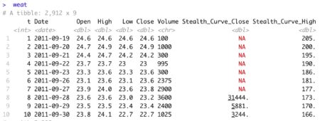
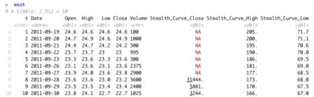
weat
# Convert 'Date and Time' to 'Date' column
weat[["Date"]] <- as.Date(weat[["Date"]])
weat
bars <- nrow(weat)
# Add bar indicator as first tibble column
weat <- weat %>%
add_column(t = 1:nrow(weat), .before = "Date")
weat
View tibble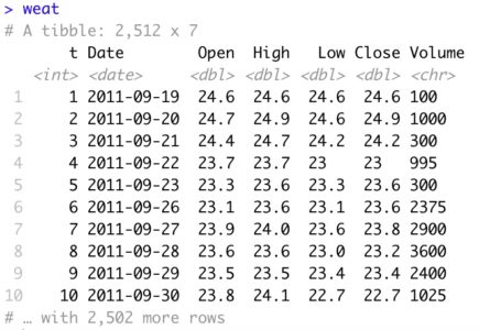
Prior to developing Stealth Curve charts, it is often advantageous to view the raw data in an interactive chart.
# Interactive Pricing Chart

xmin <- 1
ymin <- 0
ymax_close <- ceiling(max(weat[["Close"]]))
ymax_low <- ceiling(max(weat[["Low"]]))
ymax_high <- ceiling(max(weat[["High"]]))

interactive <- hPlot(x = "t", y = "Close", data = weat, type = "line",

               ylim = c(ymin, ymax_close),

               xlim = c(xmin, bars),

               xaxt="n",   # suppress x-axis labels

               yaxt="n",   # suppress y-axis labels,

               ann=FALSE)  # x and y axis titles

interactive$set(height = 600)

interactive$set(width = 700)

interactive$plotOptions(line = list(color = "green"))

interactive$chart(zoomType = "x")   # Highlight range of chart to zoom in

interactive
Interactive ChartWEAT Daily Closing Prices
Highlight any range to zoom data and view price on any bar number.
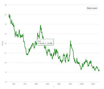
Interactive Chart
WEAT Daily Closing Prices (Zoomed)
Prior to plotting, add 400 additional rows to the tibble in preparation for extending the calculated Stealth Curve into future periods.
# Add 400 future days to the plot for projection of the Stealth Curve

 future <- 400

 weat <- weat %>%
   add_row(t = (bars+1):(bars+future))
Chart the WEAT daily closing prices with 400 days of padding.
 # Chart Closing WEAT prices

 plot.new()

 chart_title_close <- c("Teucrium Wheat ETF (Symbol = WEAT) \nDaily Closing Prices ($)")

 background <- c("azure1")

 u <- par("usr")

 rect(u[1], u[3], u[2], u[4], col = background)

 par(new=TRUE)

 t <- weat[["t"]]
 Price <- weat[["Close"]]

 plot(x=t, y=Price, main = chart_title_close, type="l", col = "blue",

      ylim = c(ymin, ymax_close) ,

      xlim = c(xmin, (bars+future )) )
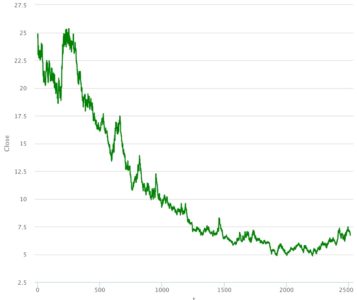
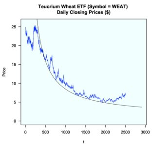
The below chart represents 10 years of closing prices for the WEAT market since inception of the ETF on 9/19/2011. The horizontal axis represents time (t) stated in bar numbers (t=1 = bar 1 = Date 9/19/2011). This starting ‘t‘ value is entirely arbitrary and does not impact the position of a calculated Stealth Curve on a chart.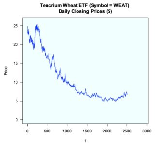
The above chart displays a ‘random’ market in decline over much of the decade.
Stealth Curves reveal an entirely different story. They depict extreme nonlinear order with respect to market pivot lows. In order for Stealth Curves to be robust across most every liquid market, the functional form must not only be simple – it must be extremely simple. The following Stealth Curve equation is charted against the closing price data.
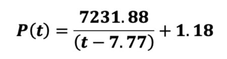
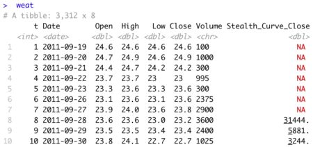
 # Add Stealth Curve to tibble

 # Stealth Curve parameters
 a <- 7231.88
 b <-  1.18
 c <- -7.77

 weat <- weat %>%
   mutate(Stealth_Curve_Close = a/(t + c) + b)
 weat
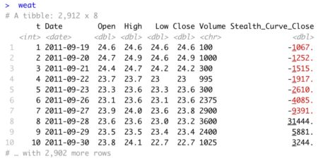
As the Stealth Curve is negative in bars 1 through 7, these values are ignored in the chart by the use of NA padding.
 # Omit negative Stealth Curve values in charting, if any

 z1 <- weat[["Stealth_Curve_Close"]]

 weat[["Stealth_Curve_Close"]] <- ifelse(z1 < 0, NA, z1)
 weat
Add the Stealth Curve to the chart.
# Add Stealth Curve to chart

 lines(t, weat[["Stealth_Curve_Close"]])
Closing Prices with Stealth Curve
Once the Stealth Curve is added to the chart, extreme nonlinear market order is clearly evident.
I personally refer to this process as overlaying a cheat-sheet on a pricing chart to understand why prices bounced where they did and where they may bounce on a go-forward basis. Stealth Curves may be plotted from [-infinity, + infinity].
The human eye is not adept at discerning the extreme accuracy of this Stealth Curve. As such, visual aids are added. This simple curve serves as a strange attractor to WEAT closing prices. The market closely hugs the Stealth Curve just prior to t=500 (oval) for 3 consecutive months. The arrows depict 10 separate market bounces off/very near the curve.
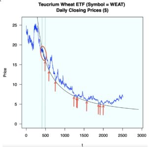
While some of the bounces appear ‘small,’ it is important to note the prices are also relatively small. As an example, the ‘visually small bounce’ at the ‘3rd arrow from the right’ represents a 10%+ market gain. That particular date is of interest, as it is the exact date I personally identified this Stealth trending market for the first time. I typically do not follow the WEAT market. Had I done so, I could have identified this Stealth Curve sooner in time. A Stealth Curve requires only 3 market pivot points for definition.
Reference my real-time LinkedIn post of this Stealth Curve at the ‘3rd arrow’ event here. This multi-year Stealth Curve remains valid to the current date. By definition, a Stealth Curve remains valid until it is penetrated to the downside in a meaningful manner. Even then, it often later serves as market resistance. On occasion, a Stealth Curve will serve as support followed by resistance followed by support (reference last 2 charts in this post).
Next, a Stealth Curve is applied to market pivot lows as defined by high prices.
Chart high prices.
# Market Pivot Lows using High Prices

 # Chart High WEAT prices

 plot.new()

 chart_title_high <- c("Teucrium Wheat ETF (Symbol = WEAT) \nDaily High Prices ($)")

 u <- par("usr")

 rect(u[1], u[3], u[2], u[4], col = background)

 par(ann=TRUE)

 par(new=TRUE)

 t <- weat[["t"]]
 Price <- weat[["High"]]

 plot(x=t, y=Price, main = chart_title_high, type="l", col = "blue",

      ylim = c(ymin, ymax_high) ,

      xlim = c(xmin, (bars+future )) )
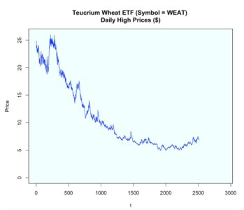
The parameterized Stealth Curve equation is as follows:
Add the Stealth Curve to the tibble.
# Add Stealth Curve to tibble

 # Stealth Curve parameters
 a <- 7815.16
 b <-    1.01
 c <-   37.35

 weat <- weat %>%
   mutate(Stealth_Curve_High = a/(t + c) + b)

 # Omit negative Stealth Curve values in charting, if any

 z2 <- weat[["Stealth_Curve_High"]]

 weat[["Stealth_Curve_High"]] <- ifelse(z2 < 0, NA, z2)
 weat
 # Add Stealth Curve to chart

 lines(t, weat[["Stealth_Curve_High"]])
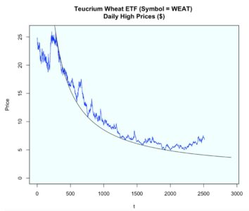
When backcasted in time, this Stealth Curve transitions from resistance to support and is truly amazing. When a backcasted Stealth Curve, relative to the data used for curve parameterization, displays additional periods of market support/resistance; additional confidence is placed in its ability to act as a strange attractor. Based on visual inspection, it is doubtful no other smooth curve (infinitely many) could coincide with as many meaningful pivot highs and lows (21 total) over this 10-year period as this simple Stealth Curve. In order to appreciate the level of accuracy of the backcasted Stealth Curve, a log chart is presented of a zoomed sectional of the data.
 # Natural Log High Prices

 # Chart High WEAT prices

 plot.new()

 chart_title_high <- c("Teucrium Wheat ETF (Symbol = WEAT) \nDaily High Prices ($)")

 u <- par("usr")

 rect(u[1], u[3], u[2], u[4], col = background)

 par(ann=TRUE)

 par(new=TRUE)

 chart_title_log_high <- c("Teucrium Wheat ETF (Symbol = WEAT) \nNatural Log of Daily High Prices ($)")

 t <- weat[["t"]]
 Log_Price <- log(weat[["High"]])

 plot(x=t, y=Log_Price, main = chart_title_log_high, type="l", col = "blue",

      ylim = c(log(7), log(ymax_high)) ,

      xlim = c(xmin, 800) ) # (bars+future )) )

 # Add Log(Stealth Curve) to chart

 lines(t, log(weat[["Stealth_Curve_High"]]))
Zoomed SectionalLog(High Prices) and Log(Stealth Curve)
WEAT
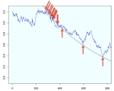
There are 11 successful tests of Stealth Resistance including the all-time market high of the ETF.
In total, this Stealth Curve exactly or closely identifies 21 total market pivots (Stealth Resistance = 11, Stealth Support = 10).
Lastly, a Stealth Curve is presented based on market pivot lows defined by low prices.
# Market Pivot Lows using Low Prices

 # Chart Low WEAT prices

 plot.new()

 u <- par("usr")

 rect(u[1], u[3], u[2], u[4], col = background)

 par(ann=TRUE)

 par(new=TRUE)

 chart_title_low <- c("Teucrium Wheat ETF (Symbol = WEAT) \nDaily Low Prices ($)")

 t <- weat[["t"]]
 Price <- weat[["Low"]]


 plot(x=t, y=Price, main = chart_title_low, type="l", col = "blue",

      ylim = c(ymin, ymax_low) ,

      xlim = c(xmin, (bars+future )) )
Chart the low prices.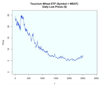
The parameterized Stealth Curve equation based on 3 pivot lows is given below.
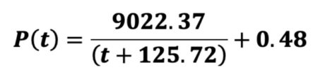 Add the calculated Stealth Curve to the tibble.
 # Add Stealth Curve to tibble

 # Stealth Curve parameters
 a <- 9022.37
 b <-    0.48
 c <-  125.72

 weat <- weat %>%
   mutate(Stealth_Curve_Low = a/(t + c) + b)

 # Omit negative Stealth Curve values in charting, if any

 z3 <- weat[["Stealth_Curve_Low"]]

 weat[["Stealth_Curve_Low"]] <- ifelse(z3 < 0, NA, z3)
 weat
Add the Stealth Curve to the chart.
# Add Stealth Curve to chart

 lines(t, weat[["Stealth_Curve_Low"]])
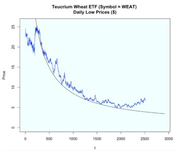
Intentionally omitting identifying arrows, it is clearly obvious this Stealth Curve identifies the greatest number of pivot lows of the 3 different charts presented (close, high, low).
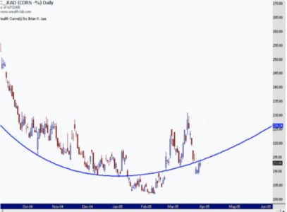
As promised, below are 2 related Stealth Curve charts I posted in 2005 that transitioned from support, to resistance, to support, and then back to resistance (data no longer exists – only graphics). This data used Corn reverse adjusted futures data. The Stealth Curve was defined using pivot low prices. Subsequent market resistance applied to market high prices (Chart 2 of 2).
Chart 1 of 2
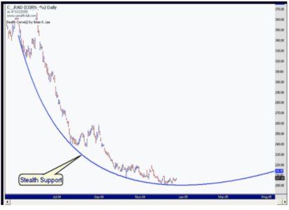
Chart 2 of 2
For those interested in additional Stealth Curve examples applied to various other markets, simply view my LinkedIn post here. Full details of Stealth Curve model parameterization are described in my latest Amazon publication, Stealth Curves: The Elegance of ‘Random’ Markets.
Brian K. Lee, MBA, PRM, CMA, CFA
[email protected]