Learn how to work with image data in R! Join our workshop on working with image data in R which is a part of our workshops for Ukraine series. Here’s some more info: Title: Working with image data in R Date: Thursday, March 23rd, 15:00 – 17:00 CET (Rome, Berlin, Paris timezone) Speaker: Wolfgang Huber is the author of several R packages for statistical analysis of “omics” data and a co-founder of the Bioconductor project. He co-authored the textbook Modern Statistics for Modern Biology with Susan Holmes. He has worked on cellular phenotyping from genetic and chemical screens and is a co-author of the EBImage package). He is a senior group leader at the European Molecular Biology Laboratory, where he co-directs the Molecular Medicine Partnership Unit and the Theory Transversal Theme. Scientific Homepage is here
Description: Images are a rich source of data. In this workshop, we will see how quantitative information can be extracted from images. We will use segmentation to identify objects, measure their properties such as size, intensity distribution moments, shape and morphology descriptors, and explore statistical models to describe spatial relationships between them. The workshop includes a hands-on demonstration of the EBImage package for R, which provides many functions for feature extraction and visualization. Application examples will be taken from biological imaging of cells and tissues, the methods should also be applicable to other types of data.
Minimal registration fee: 20 euro (or 20 USD or 750 UAH)
Save your donation receipt (after the donation is processed, there is an option to enter your email address on the website to which the donation receipt is sent)
Fill in the registration form, attaching a screenshot of a donation receipt (please attach the screenshot of the donation receipt that was emailed to you rather than the page you see after donation).
If you are not personally interested in attending, you can also contribute by sponsoring a participation of a student, who will then be able to participate for free. If you choose to sponsor a student, all proceeds will also go directly to organisations working in Ukraine. You can either sponsor a particular student or you can leave it up to us so that we can allocate the sponsored place to students who have signed up for the waiting list. How can I sponsor a student?
Go to https://bit.ly/3wvwMA6 or https://bit.ly/3PFxtNA and donate at least 20 euro (or 17 GBP or 20 USD or 750 UAH). Feel free to donate more if you can, all proceeds go to support Ukraine!
Save your donation receipt (after the donation is processed, there is an option to enter your email address on the website to which the donation receipt is sent)
Fill in the sponsorship form, attaching the screenshot of the donation receipt (please attach the screenshot of the donation receipt that was emailed to you rather than the page you see after the donation). You can indicate whether you want to sponsor a particular student or we can allocate this spot ourselves to the students from the waiting list. You can also indicate whether you prefer us to prioritize students from developing countries when assigning place(s) that you sponsored.
If you are a university student and cannot afford the registration fee, you can also sign up for the waiting listhere. (Note that you are not guaranteed to participate by signing up for the waiting list).
You can also find more information about this workshop series, a schedule of our future workshops as well as a list of our past workshops which you can get the recordings & materials here. Looking forward to seeing you during the workshop!
Traditionally, data scientists have built models based on data. This article details how to do the exact opposite i.e. generate data based on a model. This article is second in the series of articles on building data from model. You can find part 1 here
Broadly speaking, there are three steps to generating data from model as given below.
Register your details such as email, password etc.
You will receive an email to verify your email id.
Once you verify your email, please head over to the Products section of the developer portal. You can find it on the menu at the top right hand corner of the web page.
Please select the product Starter by clicking it. It will take you to the product page where you will find the section Your subscriptions. Please enter a name for your subscription and hit Subscribe.
Post subscribing, on your profile page, under the subscriptions section, click on show next to the Primary key. That is the subscription key you will need to access the API. Congratulations!!, you now can access the API.
If you have any issues with the signup, please email [email protected]
Step 2: Install R Package Conjurer
Install the latest version of the package from CRAN as follows.
install.packages("conjurer")
Step 3: Generate data from model
The function used to generate data from model is buildModelData(numOfObs, numOfVars, key, modelObj) .
The components of this function buildModelData are as follows.
numOfObsis the number of observations i.e. rows of data that you would like to generate. Please note that the current version allows you to generate from a minimum of 100 observations to a maximum of 10,000.
numOfVarsis the number of independent variables i.e. columns in the data. Please note that the current version allows you to generate from a minimum of 1 variable to a maximum of 100.
keyis the Primary key that you have sourced from the earlier step.
modelObjis the model object. In the current version 1.7.1, this accepts either an lm or a glm model object built using the stats module. This is an optional parameter i.e. if this parameter is not specified, then the function generates the data randomly. However, if the model object is provided, then the intercept, coefficient and the independent variable range is sourced from it.
Generate data completely random using the code below.
library(conjurer)

uncovrJson <- buildModelData(numOfObs = 1000, numOfVars = 3, key = "input your subscription key here")

df <- extractDf(uncovrJson=uncovrJson)
Generate data based on the model object provided. For this example, a simple linear regression model is used.
library(conjurer)

library(datasets)


data(cars)

m <- lm(formula = dist ~ speed, data = cars)

uncovrJson <- buildModelData(numOfObs=100, numOfVars=1, key="insert subscription key here", modelObj = m)

df <- extractDf(uncovrJson=uncovrJson)
Interpretation of results
The data frame df (in the code above) will have two columns with the names iv1 anddv. The columns with prefix iv are the independent variables while the dv is the dependent variable. You can rename them to suit your needs. In the example above iv1 is speed and dv is distance. The details of the model formula and its estimated performance can be inspected as follows.
To begin with, you can inspect the JSON data that is received from the API by using the code str(uncovrJson). This would display all the components of the JSON file. The attributes prefixed as slope are the coefficients of the model formula corresponding to the number. For example, slope1 is the coefficient corresponding to iv1 i.e. independent variable 1.
The regression formula used to construct the data for the example data frame is as follows.
Please note that the formula takes the form of Y = mX + C. If there are multiple variables, then the component (slope1*iv1) will be repeated for each independent variable. dv = intercept + (slope1*iv1) + error.
While the slopes i.e. the coefficients are at variable level, the error is at each observation level. These errors can be accessed as uncovrJson$error
A simple comparison can be made to see how the synthetic data generated compares to the original data with the following code.
summary(cars)

     speed            dist

  Min. : 4.0       Min. : 2.00

1st Qu.:12.0     1st Qu.: 26.00

Median :15.0     Median : 36.00

  Mean :15.4       Mean : 42.98

3rd Qu.:19.0     3rd Qu.: 56.00

  Max. :25.0       Max. :120.00
summary(df)

       iv1              dv

  Min. : 4.080     Min. :-38.76

1st Qu.: 8.915   1st Qu.: 29.35

Median :16.844   Median : 47.03

  Mean :15.405     Mean : 46.13

3rd Qu.:20.461   3rd Qu.: 75.83

  Max. :24.958     Max. :127.66
Limitation and Future Work
Some of the known limitations of this algorithm are as follows.
It can be observed from the above comparison that the independent variable range in synthetic data generated i.e. iv1 is close to the range of the original data i.e. speed. However, the range of the dependent variable i.e. dv in synthetic data is very different from the original data i.e. dist. This is on account of the error terms of the synthetic data being totally random and not sourced from the model object.
While the range of the independent variable is similar across the original and synthetic datasets, a simple visual inspection of the distribution using a histogram plot hist(df$iv1) and hist(cars$speed) shows a drastic difference. This is because the independent data distribution is random and not sourced from the model object.
Additionally, if the same lm model is used to fit the synthetic data, the formula will be similar but the p values, R2 etc will be way off. This is on account of the error terms being random and not sourced from the model object.
These limitations will be addressed in the future versions. To be more specific, the distribution of the independent variables and error terms will be further engineered in the future versions.
Concluding Remarks
The underlying API uncovr is under development by FOYI . As new functionality is released, the R package conjurer will be updated to reflect those changes. Your feedback is valuable. For any feature requests or bug reports, please follow the contribution guidelines on GitHub repository. If you would like to follow the future releases and news, please follow our LinkedIn page.
Learn how to combine both R and Python in the same project! Join our workshop on Python for R Users to learn more about Python & how to combine it with R which is a part of our workshops for Ukraine series. Here’s some more info: Title: Python for R users Date: Thursday, February 16th, 18:00 – 20:00 CET (Rome, Berlin, Paris timezone) Speaker: Dr. Johannes B. Gruber, Post-Doc Researcher at the Department of Communication Science at Vrije Universiteit Amsterdam and open-source developer. Description: R users sometimes hear about the fabulous advantages of Python for advanced data science and modelling. While these claims are regularly exaggerated, it never hurts to be able to use more tools. This workshop will teach you to use Python together with R in the same project. That way, you can keep using the data science tool chain you already know and like in R (e.g., data processing and plotting), while employing tools from the Python world where needed, for example, for modelling. The workshop will include unsupervised machine learning with scikit-learn and BERTopic. We use the excellent reticulate package in a quarto+RStudio workflow to accomplish this, yet the knowledge is transferable to other tools. Minimal registration fee: 20 euro (or 20 USD or 750 UAH)
Save your donation receipt (after the donation is processed, there is an option to enter your email address on the website to which the donation receipt is sent)
Fill in the registration form, attaching a screenshot of a donation receipt (please attach the screenshot of the donation receipt that was emailed to you rather than the page you see after donation).
If you are not personally interested in attending, you can also contribute by sponsoring a participation of a student, who will then be able to participate for free. If you choose to sponsor a student, all proceeds will also go directly to organisations working in Ukraine. You can either sponsor a particular student or you can leave it up to us so that we can allocate the sponsored place to students who have signed up for the waiting list. How can I sponsor a student?
Go to https://bit.ly/3wvwMA6 or https://bit.ly/3PFxtNA and donate at least 20 euro (or 17 GBP or 20 USD or 750 UAH). Feel free to donate more if you can, all proceeds go to support Ukraine!
Save your donation receipt (after the donation is processed, there is an option to enter your email address on the website to which the donation receipt is sent)
Fill in the sponsorship form, attaching the screenshot of the donation receipt (please attach the screenshot of the donation receipt that was emailed to you rather than the page you see after the donation). You can indicate whether you want to sponsor a particular student or we can allocate this spot ourselves to the students from the waiting list. You can also indicate whether you prefer us to prioritize students from developing countries when assigning place(s) that you sponsored.
If you are a university student and cannot afford the registration fee, you can also sign up for the waiting listhere. (Note that you are not guaranteed to participate by signing up for the waiting list).
You can also find more information about this workshop series, a schedule of our future workshops as well as a list of our past workshops which you can get the recordings & materials here. Looking forward to seeing you during the workshop!
DataCamp is an online data learning platform for all levels. Whether you’ve never written a line in R, you’re working to become a Data Scientist / Analyst with R, or you simply want to bring forward your promotion and add in-demand skills to your resume—upskill today to put your future into your own hands.
Across 22 R skill tracks and six R career tracks—alongside 400+ interactive courses covering all major data technologies—DataCamp offers learners a career-advancing upskilling solution, regardless of starting point or professional goals.
To validate your skills and stand out to employers, all learners have access to Forbes’ #1 ranked Certification program, which elevates certified learners to the top 5% of all DataCamp job searches.
From entry-level courses to advanced technical courses in Machine Learning, applied finance, data manipulation, and so much more, DataCamp’s hands-on learning and bite-sized lessons make upskilling efficient and flexible for your career ambitions.
Upskill Now For Less – Exclusive to January, DataCamp is offering its Premium Learn subscription—unlimited access to all of the above and more—up to 67% off for an entire year. Go from zero to job-ready in 2023 and put your future in your own hands to thrive in the era of data.Start Now
Learn how to use color palettes and customize your ggplot plots, while contributing to charity! Join our workshop on Color Palette Choice and Customization in R and ggplot2 to improve your ggplot plots which is a part of our workshops for Ukraine series. Here’s some more info: Title:Color Palette Choice and Customization in R and ggplot2 Date: Thursday, January 26th, 17:00 – 20:00 CET (Rome, Berlin, Paris timezone) Speaker: Dr. Cédric Scherer, independent data visualization designer, consultant, and instructor and graduated computational ecologist from Berlin, Germany. Cédric has created visualizations across all disciplines, purposes, and styles and regularly teaches data visualization principles, the R programming language, and ggplot2. Due to regular participation in social data challenges such as #TidyTuesday, he is now well known for complex and visually appealing figures, entirely made with ggplot2.
Description: In this workshop, we will first cover the basics of color usage in data visualization. Afterward, we will explore different color palettes that are available in R, discuss which extension packages are exceptional in terms of palettes and functionality, and learn how to customize palettes and scales in ggplot2. Minimal registration fee: 20 euro (or 20 USD or 750 UAH)
Save your donation receipt (after the donation is processed, there is an option to enter your email address on the website to which the donation receipt is sent)
Fill in the registration form, attaching a screenshot of a donation receipt (please attach the screenshot of the donation receipt that was emailed to you rather than the page you see after donation).
If you are not personally interested in attending, you can also contribute by sponsoring a participation of a student, who will then be able to participate for free. If you choose to sponsor a student, all proceeds will also go directly to organisations working in Ukraine. You can either sponsor a particular student or you can leave it up to us so that we can allocate the sponsored place to students who have signed up for the waiting list. How can I sponsor a student?
Go to https://bit.ly/3wvwMA6 or https://bit.ly/3PFxtNA and donate at least 20 euro (or 17 GBP or 20 USD or 750 UAH). Feel free to donate more if you can, all proceeds go to support Ukraine!
Save your donation receipt (after the donation is processed, there is an option to enter your email address on the website to which the donation receipt is sent)
Fill in the sponsorship form, attaching the screenshot of the donation receipt (please attach the screenshot of the donation receipt that was emailed to you rather than the page you see after the donation). You can indicate whether you want to sponsor a particular student or we can allocate this spot ourselves to the students from the waiting list. You can also indicate whether you prefer us to prioritize students from developing countries when assigning place(s) that you sponsored.
If you are a university student and cannot afford the registration fee, you can also sign up for the waiting listhere. (Note that you are not guaranteed to participate by signing up for the waiting list).
You can also find more information about this workshop series, a schedule of our future workshops as well as a list of our past workshops which you can get the recordings & materials here. Looking forward to seeing you during the workshop!
Find the next number in the sequence
by Jerry Tuttle
Between ages two and four, most children can count up to at
least ten. If you ask your child, "What number comes next after 1, 2, 3, 4, 5?" they will probably say "6."
But to math nerds, any number can be the next number in a finite sequence. I like -14.
Given a sequence of n real numbers f(x1), f(x2), f(x3), ... , f(xn), there is always a mathematical procedure to find the next number f(x n+1) of the sequence. The resulting solution may not appear to be satisfying to students, but it is mathematically logical.
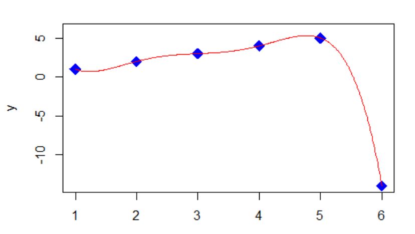
I can draw a smooth curve through the points (1,1), (2,2), (3,3), (4,4), (5,5), (6, -14). If I can find an equation for that smooth curve, then I know my answer of -14 has some logic to it. Actually many equations will work.
In my example one equation is of the form y = (x-1)*(x-2)*(x-3)*(x-4)*(x-5)*(A/120) + x, where A is chosen so that when x is 6, the first term reduces to A, and A + 6 equals the -14 I want. So A is -20. This is called a collocation polynomial.

There is a theorem that for n+1 distinct values of xi and their corresponding yi values, there is a unique polynomial P of degree n with P(xi) = yi. One method to find P is to use polynomial regression. Another way is to use Newton's Forward Difference Formula (probably no longer taught in Numerical Analysis courses).

Higher degree polynomials than degree n is one reason why additional equations will work.

The equation does not have to be a polynomial, which then adds rational functions among others.

Of course the next number after -14 can be any number. It could be 7 :)

There are many famous sequences, and of course someone catalogued  them.

Here is some R code.

xpoints <- c(1,2,3,4,5,6)
ypoints <- c(1,2,3,4,5,-14)
y <- vector()
x <- seq(from=1, to=6, by=.01)
y <- (x-1)*(x-2)*(x-3)*(x-4)*(x-5)*(-20/120) + x
plot(xpoints, ypoints, pch=18, type="p", cex=2, col="blue", xlim=c(1,6), ylim=c(-14,6), xlab="x", ylab="y")
lines(x,y, pch = 19, cex=1.3, col = "red")
fit <- lm(ypoints ~ xpoints + I(xpoints^2) + I(xpoints^3) +I(xpoints^4) +I(xpoints^5) )
s <- summary(fit)
bo <- s$coefficient[1]
b1 <- s$coefficient[2]
b2 <- s$coefficient[3]
b3 <- s$coefficient[4]
b4 <- s$coefficient[5]
b5 <- s$coefficient[6]
x <- seq(from=1, to=6, by=.01)
z <- bo+b1*x+b2*x^2+b3*x^3+b4*x^4+b5*x^5
plot(xpoints, ypoints, pch=18, type="p", cex=2, col="blue", xlim=c(1,6), ylim=c(-14,6), xlab="x", ylab="y")
lines(x,z, pch = 19, cex=1.3, col = "red")
Learn how to use novel datasets such as Google Trends and GDELT, while contributing to charity! Join our workshop on Using Google Trends and GDELT datasets to explore societal trends which is a part of our workshops for Ukraine series. Here’s some more info: Title: Using Google Trends and GDELT datasets to explore societal trends Date: Thursday, January 12th 18:00 – 20:00 CET (Rome, Berlin, Paris time zone) Speaker: Harald Puhr, PhD in international business and assistant professor at the University of Innsbruck. His research and teaching focuses on global strategy, international finance, and data science/methods—primarily with R. As part of his research, Harald developed the globaltrends package (available on CRAN) to handle large-scale downloads from Google Trends. Description: Researchers and analysts are frequently interested in what topics matter for societies. These insights are applied to research fields ranging from Economics to Epidemiology to better understand market demand, political change, or the spread of infectious diseases. In this workshop, we consider Google Trends and GDELT (Global Database of Events, Language, and Tone) as two datasets that help us to explore what matters for societies and whether these issues matter everywhere. We will use these datasets in R and Google Big Query for analysis of online search volume and media reports, and we will discuss what they can tell us about topics that move societies. Minimal registration fee: 20 euro (or 20 USD or 750 UAH)
Save your donation receipt (after the donation is processed, there is an option to enter your email address on the website to which the donation receipt is sent)
Fill in the registration form, attaching a screenshot of a donation receipt (please attach the screenshot of the donation receipt that was emailed to you rather than the page you see after donation).
If you are not personally interested in attending, you can also contribute by sponsoring a participation of a student, who will then be able to participate for free. If you choose to sponsor a student, all proceeds will also go directly to organisations working in Ukraine. You can either sponsor a particular student or you can leave it up to us so that we can allocate the sponsored place to students who have signed up for the waiting list.
How can I sponsor a student?
Go to https://bit.ly/3wvwMA6 or https://bit.ly/3PFxtNA and donate at least 20 euro (or 17 GBP or 20 USD or 750 UAH). Feel free to donate more if you can, all proceeds go to support Ukraine!
Save your donation receipt (after the donation is processed, there is an option to enter your email address on the website to which the donation receipt is sent)
Fill in the sponsorship form, attaching the screenshot of the donation receipt (please attach the screenshot of the donation receipt that was emailed to you rather than the page you see after the donation). You can indicate whether you want to sponsor a particular student or we can allocate this spot ourselves to the students from the waiting list. You can also indicate whether you prefer us to prioritize students from developing countries when assigning place(s) that you sponsored.
If you are a university student and cannot afford the registration fee, you can also sign up for the waiting listhere. (Note that you are not guaranteed to participate by signing up for the waiting list).
You can also find more information about this workshop series, a schedule of our future workshops as well as a list of our past workshops which you can get the recordings & materials here. Looking forward to seeing you during the workshop!
It was when I and one of my friends, Ahel, were playing a game of Ludo, that an idea struck both of our heads. Being final year undergraduate students of Statistics, both of us pondered upon the question, what if we can do some verification for some questions on dice. This brief spark in our brains led us to properly formulate the questions, think and write the solutions using mathematical concepts, and finally simulate them. Note that we did all the simulations using the R programming language. We also included the animation package in R for some visualisations of our graph.
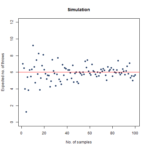
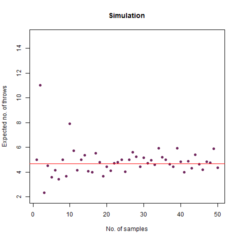
On average, how many times must a 6-sided die be rolled until a 6 turns up?
This seems like an easy one, right? It tells us, that if we are to roll a normal 6-sided die, when can we expect the face showing 6 to turn up. We create a function to do this simulation:
The result we got was 6.018 , which, almost coincides with the theoretical value of 6 . We further create a graph that helps us see the convergence more clearly.
The graph of the expected number of throws vs sample numbers. We notice that as we take a larger sample size, the expected number of throws converges to 6 which is the exact number of throws shown mathematically.
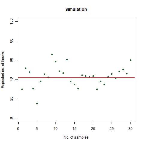
On average, how many times must a 6-sided die be rolled until a 6 turns up twice a row?
We can think of this as an extension of the previous problem. However, in this case, we will stop after two successive rolls result in two 6s. Thus, if we roll a 6, we roll again and then we will get any one of the two results:
We get a 6 again. If this happens, we stop
We get anything other than a 6. Then we continue rolling.
We can use a function to simulate, which is a bit different from the last one:
The result that was expected (as shown mathematically) is 42 . From the simulation, we got the result as 42.32468 , which is almost as close as our theoretical observation. The below graph summarises the above statements:
The graph of the expected number of throws vs sample numbers. We notice that as we take a larger sample size, the expected number of throws converges to 42 which is the exact number of throws shown mathematically.
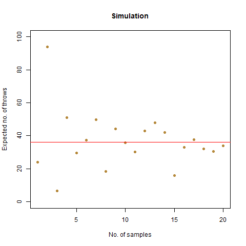
On average, how many times must a 6-sided die be rolled until the sequence 65 appears (that is a 6 followed by a 5)?
What are the possible cases that we can run into, after throwing a 6?
We roll again, and we get a 6. This is a redundant case and we move again.
We roll again, and we get a 5. We stop if this happens.
We roll again, and we get something else. We continue rolling.
We roll again, and we get a 6. This is a redundant case and we move again.
We roll again, and we get a 5. We stop if this happens.
We roll again, and we get something else. We continue rolling.
We expected the number of throws to be 36 . Upon doing simulation, we found our result as 36.07392 , which is almost accurate. We have the following animation which summarises the fact:
The graph of the expected number of throws vs sample numbers. We notice that as we take a larger sample size, the expected number of throws converges to 36 which is the exact number of throws shown mathematically.
Note:
The number of throws, in this case, is smaller than in the previous case, though both appear to be almost the same. The reason is intuitive in the fact that after rolling a 6, we can find three cases for this question, of which one is redundant, but not to be ignored, whereas, for the previous one, we only find two possible scenarios.
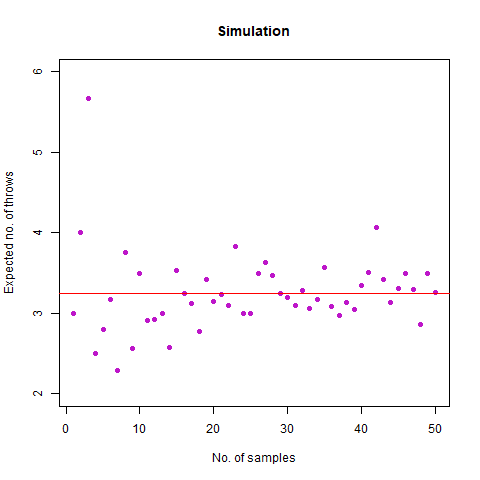
On average, how many times must a 6-sided die be rolled until two rolls in a row differ by 1 (such as a 2 followed by a 1 or 3, or a 6 followed by a 5)?
This is an interesting one. Suppose we roll a 4. Then three cases may happen:
The result of the simulation was 4.69556 which is much closer to the theoretically expected value of 4.68 . We again provide a graph, which describes the convergence adequately:
The graph of the expected number of throws vs sample numbers. We notice that as we take a larger sample size, the expected number of throws converges to 4.68 which is the exact number of throws shown mathematically.
Bonus Question: What if we roll until two rolls in a row differ by no more than 1 (so we stop at a repeated roll, too)?
This question differs from its other part in the sense that here, successive rolls can be equal also for the experiment to stop. With just a minute tweak in the previous function, we can derive the new function for simulating this problem:
We expected the value to be close to our mathematical value of 3.278 . From the simulation, we obtained the result as 3.292 . Further, we create the following graph:
The graph of the expected number of throws vs sample numbers. We notice that as we take a larger sample size, the expected number of throws converges to 3.27 which is the exact number of throws shown mathematically.
We roll a 6-sided die n times. What is the probability that all faces have appeared?
Intuitively, as the number of throws is increased, i.e. n increases, the probability that all the faces have appeared reaches 1 . Fixing a particular value of n , the mathematical probability which we got is as follows:
Now suppose we would like to simulate this experiment. Consider the following function for the work:
We vary our n from 1 to 100 and find that after n=60 , the probability becomes 1 almost surely. This is depicted in the following graph:
The graph of the probability of getting all faces vs the number of throws. We notice that as we number of throws, this probability converges to 1.
We roll a 6-sided die n times. What is the probability that all faces have appeared in order in six consecutive throws?
In short, this question asks what is the probability that among all the throws, sequence 1,2,3,4,5,6 appears. We once again create a function for our task:
The following graph demonstrates that as the number of throws increases, this probability increases:
The graph of the probability of getting all faces vs the number of throws. We notice that as we number of throws, this probability increases.
Taking our n as 300000 , we find that this probability becomes around 0.99 . This implies that the probability converges to 1 as n increases.
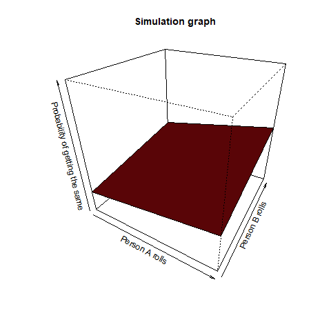
Person A rolls n dice and person B rolls m dice. What is the probability that they have a common face showing up?
This question asks us that if person A rolled a 2, then what is the probability that person B also rolled a 2 among all the dice throws. This is a pretty straightforward question. Intuitively, we can observe, that the value of n and m increases (even a slight bit as >12), the corresponding probability reaches 1. We once again take the help of a function for our purpose:
We find from this graph that as m and n increases (even >12), the value of this probability reaches 1
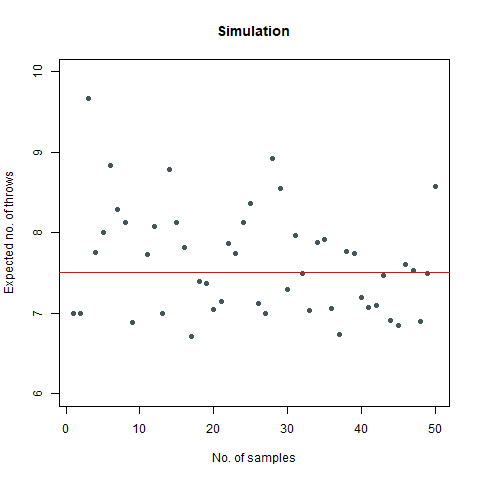
On average, how many times must a pair of 6-sided dice be rolled until all sides appear at least once?
Suppose, we have a die, and we throw it. Then this question asks us to find out the average number of such throws required such that all the faces appear at least once. Now simulating this experiment can be done in a pretty interesting way with the help of a Markov Chain. However, for the sake of simplicity, consider the following function for our use case:
The mathematical value that we got after calculating is around 7.6 which, when rounded off becomes 8. We then proceed to do a Monte Carlo simulation of our experiment:
Here, we find that the value is 7.5, which again rounds off to 8. That’s not the end of it. We further create a plot which can sharpen our views regarding this experiment:
We observe that the number of throws steadies at around 7.5, which turns out to be 8
Further, we find that the probability that our required rolls will be more than 24 is almost negligible (at around 7e-04).
Suppose we can roll a 6-sided die up to n times. At any time we can stop, and that roll becomes our “score”. Our goal is to get the highest possible score, on average. How should we decide when to stop?
This is a particularly vexing problem. We note that our stopping condition is when we will get a number smaller than the average at the nth throw. Consider the following function for this problem:
We thus create a stopping rule and draw the following conclusion regarding the highest possible score on an average:
• If n=1, we choose our score as 3
• If 1<n<4, we choose our score as 4
• If n>3, we choose our score as 5
Finally, we draw a graph of our findings:
We note that as n increases, so is our score and it almost reaches 6
Suppose we roll a fair dice 10 times. What is the probability that the sequence of rolls is non-decreasing?
Suppose we get a sequence of faces as such: 1,1,2,3,2,2,4,5,6,6. We can clearly see that this is not at all a non-decreasing sequence. However, if we get a sequence of faces as like: 1,1,1,1,2,2,4,5,6,6, we can see that this is a non-decreasing sequence. Our question asks us to find the probability of getting a sequence like the second type. We again build a function as:
The result that we get after simulating is 5.1e-05 which is pretty close to our value. Finally, we create a graph:
We note that as n increases, our required probability goes down to 0
We thus come to the end of our little discussion here. Do let us know how you feel about this whole thing. Also, feel free to connect with us on LinkedIn:
Learn how to use Introduction to efficiency analysis in R, while contributing to charity! Join our workshop on Introduction to efficiency analysis in R that is a part of our workshops for Ukraine series. Here’s some more info: Title: Introduction to efficiency analysis in R Date: Thursday, November 17th, 18:00 – 20:00 CEST (Rome, Berlin, Paris timezone)
Speaker: Olha Halytsia, PhD Economics student at the Technical University of Munich. She has a previous working experience in research within the World Bank project, also worked at the National Bank of Ukraine. Description: In this workshop, we will cover all steps of efficiency analysis using production data. Firstly, we will introduce the notion of efficiency with a special focus on technical efficiency and briefly discuss parametric (stochastic frontier model) and non-parametric approaches to efficiency estimation (data envelopment analysis). Subsequently, with help of “Benchmarking” and “frontier” R packages, we will get estimates of technical efficiency and discuss the implications of our analysis. This workshop may be useful for beginners who are interested in working with input-output data and want to learn how R can be used for econometric production analysis. Minimal registration fee: 20 euro (or 20 USD or 750 UAH)
Save your donation receipt (after the donation is processed, there is an option to enter your email address on the website to which the donation receipt is sent)
Fill in the registration form, attaching a screenshot of a donation receipt (please attach the screenshot of the donation receipt that was emailed to you rather than the page you see after donation).
If you are not personally interested in attending, you can also contribute by sponsoring a participation of a student, who will then be able to participate for free. If you choose to sponsor a student, all proceeds will also go directly to organisations working in Ukraine. You can either sponsor a particular student or you can leave it up to us so that we can allocate the sponsored place to students who have signed up for the waiting list.
How can I sponsor a student?
Go to https://bit.ly/3wvwMA6 or https://bit.ly/3PFxtNA and donate at least 20 euro (or 17 GBP or 20 USD or 750 UAH). Feel free to donate more if you can, all proceeds go to support Ukraine!
Save your donation receipt (after the donation is processed, there is an option to enter your email address on the website to which the donation receipt is sent)
Fill in the sponsorship form, attaching the screenshot of the donation receipt (please attach the screenshot of the donation receipt that was emailed to you rather than the page you see after the donation). You can indicate whether you want to sponsor a particular student or we can allocate this spot ourselves to the students from the waiting list. You can also indicate whether you prefer us to prioritize students from developing countries when assigning place(s) that you sponsored.
If you are a university student and cannot afford the registration fee, you can also sign up for the waiting listhere. (Note that you are not guaranteed to participate by signing up for the waiting list).
You can also find more information about this workshop series, a schedule of our future workshops as well as a list of our past workshops which you can get the recordings & materials here. Looking forward to seeing you during the workshop!
Learn how to use TidyFinance package to retrieve and explore financial data, while contributing to charity! Join our workshop on TidyFinance: Financial Data in R that is a part of our workshops for Ukraine series. Here’s some more info: Title: TidyFinance: Financial Data in R Date: Thursday, November 24th, 18:00 – 20:00 CET (Rome, Berlin, Paris timezone) Speaker: Patrick Weiss, PhD, CFA is a postdoctoral researcher at Vienna University of Economics and Business. Jointly with Christoph Scheuch and Stefan Voigt, Patrick wrote the open-source book www.tidy-finance.org, which serves as the basis for this workshops. Visit his webpage for additional information. Description: This workshop explores financial data available for research and practical applications in financial economics. The course relies on material available on www.tidy-finance.org and covers: (1) How to access freely available data from Yahoo!Finance and other vendors. (2) Where to find the data most commonly used in academic research. This main part covers data from CRSP, Compustat, and TRACE. (3) How to store and access data for your research project efficiently. (4) What other data providers are available and how to access their services within R. Minimal registration fee: 20 euro (or 20 USD or 750 UAH)
How can I register?
Go to https://bit.ly/3PFxtNA and donate at least 20 euro. Feel free to donate more if you can, all proceeds go directly to support Ukraine.
Save your donation receipt (after the donation is processed, there is an option to enter your email address on the website to which the donation receipt is sent)
Fill in the registration form, attaching a screenshot of a donation receipt (please attach the screenshot of the donation receipt that was emailed to you rather than the page you see after donation).
If you are not personally interested in attending, you can also contribute by sponsoring a participation of a student, who will then be able to participate for free. If you choose to sponsor a student, all proceeds will also go directly to organisations working in Ukraine. You can either sponsor a particular student or you can leave it up to us so that we can allocate the sponsored place to students who have signed up for the waiting list.
How can I sponsor a student?
Go to https://bit.ly/3PFxtNA and donate at least 20 euro (or 17 GBP or 20 USD or 750 UAH). Feel free to donate more if you can, all proceeds go to support Ukraine!
Save your donation receipt (after the donation is processed, there is an option to enter your email address on the website to which the donation receipt is sent)
Fill in the sponsorship form, attaching the screenshot of the donation receipt (please attach the screenshot of the donation receipt that was emailed to you rather than the page you see after the donation). You can indicate whether you want to sponsor a particular student or we can allocate this spot ourselves to the students from the waiting list. You can also indicate whether you prefer us to prioritize students from developing countries when assigning place(s) that you sponsored.
If you are a university student and cannot afford the registration fee, you can also sign up for the waiting listhere. (Note that you are not guaranteed to participate by signing up for the waiting list).
You can also find more information about this workshop series, a schedule of our future workshops as well as a list of our past workshops which you can get the recordings & materials here. Looking forward to seeing you during the workshop!