However, there is a drawback. The main concept of WooCommerce is that it’s like managing a storefront. Regardless of the size of your business, whether it’s small or large, it’s still just a storefront. This means that it lacks serious back-office capabilities, and the only way to manage your products is one-by-one, similar to how you would rearrange products in a storefront window.
If you’re managing an e-shop professionally, simply rearranging the products one by one as in a shop window won’t suffice. To stay ahead of the competition, you need to provide your customers (or boss) with more advanced capabilities and perform tasks quickly.
While it’s true that there are plugins available for almost anything you can think of, they often come at a cost. Moreover, they can negatively impact the speed of your store and lead to compatibility issues with each other. If you end up using more than 3-4 plugins, errors are bound to occur, making your workflow inefficient.
Over the years, I have faced several challenges in managing e-shops and I have finally decided to overcome them. After putting in a lot of effort, I have written over 90 functions in R (6.400+ lines of code) and utilized the WooCommerce API to develop a highly robust solution for these problems.
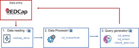
The central concept is to create a duplicate of the essential features of the e-shop such as categories, tags, attributes, products, customers, and orders inside R-Studio, utilize custom functions to perform filtering and CRUD operations through the REST API.
The solution is seamlessly integrated with WooCommerce through the REST API, and the source code is explained in detail, making it easy for you to modify the functions to suit your needs or even create new ones. I have incorporated multiple ways to achieve the same result, including GUI interfaces with the Tcl/Tk package, allowing you to customize your working environment.
My book, “WooCommerce Administrator with R,” is available on Amazon in both Kindle and paperback formats.
One use case included in the book demonstrates how easy it is to add new products, whether they are variable or simple. By creating an xlsx file with the necessary data (one line per product), along with variation attributes and category paths, you can use a single command to pass all the information to your e-shop, with variations created automatically.
Check the video in this link to see how it is done: Create new products with WooCommerce API in R.
filter = list(categories = "Shoes", variations = c("Color : White", "Shoe size : 40|41"))
filtered <- filter_products(filter = filter, search.variations = TRUE)
pr_filtered <- filtered[1] %>% as.data.frame() # parent products
var_filtered <- filtered[2] %>% as.data.frame() # filtered variations
schema_name =create_schema("name, v_Color, v_Shoe size, regular_price, sale_price, date_on_sale_to_gmt", template = F, echo = T)[[1]]
my_products <- populate_schema(schema_name, data = pr_filtered, var_df = var_filtered, values.from.parent = FALSE)
# adjust prices and offer date
my_products$sale_price = as.numeric(my_products$regular_price)*0.5

my_products$date_on_sale_to_gmt = paste0(Sys.Date()+14,"T23:59:59")
my_products <- keep.columns(my_products, "sale_price, date_on_sale_to_gmt") %>%

filter(parent > 0) # we want to update only the variations
my_products <- modify_variations_batch (my_products, add.elements = F)
These commands, which may seem complex now, become simple to use once you have the source code and analysis. With these commands, you can complete your work in a matter of minutes, depending on the number of products you have, without ever needing to access the WP-Admin interface.
In my book, I also address the challenge of managing metadata. The functions I provide enable you to add additional fields to your products, customers, and orders. For instance, you can add information such as barcodes, product costs, discount policies, sales representatives, and more. If you have brick-and-mortar stores, you can even create orders in batches and include metadata about your retail customers, such as age group, sex, new/old customer status, and so on. All of this data can be extracted in a single data frame for further analysis. It’s a powerful tool that you’ll surely find useful!
I am confident that by learning to use the functions and basic directions provided in the book, you will see a significant improvement in your e-shop management capabilities. As an e-shop manager, this will allow you to work more efficiently and productively.
If you are a business owner, you will gain a better understanding of the potential of your e-shop and be able to hire the appropriate personnel to manage it effectively.
Furthermore, if you are interested in learning R, this book provides a great opportunity to do so while tackling real-life problems.
Lastly, for college students and business executives, acquiring the skills and knowledge provided in this book can be valuable for potential employers.
I highly recommend checking out my book on Amazon, as it provides a comprehensive solution to common issues faced by e-shop managers and business owners. Get started today and take your e-shop to the next level!
John Kamaras (www.jkamaras.com)
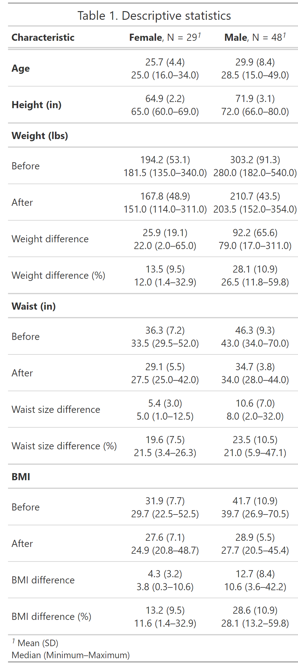
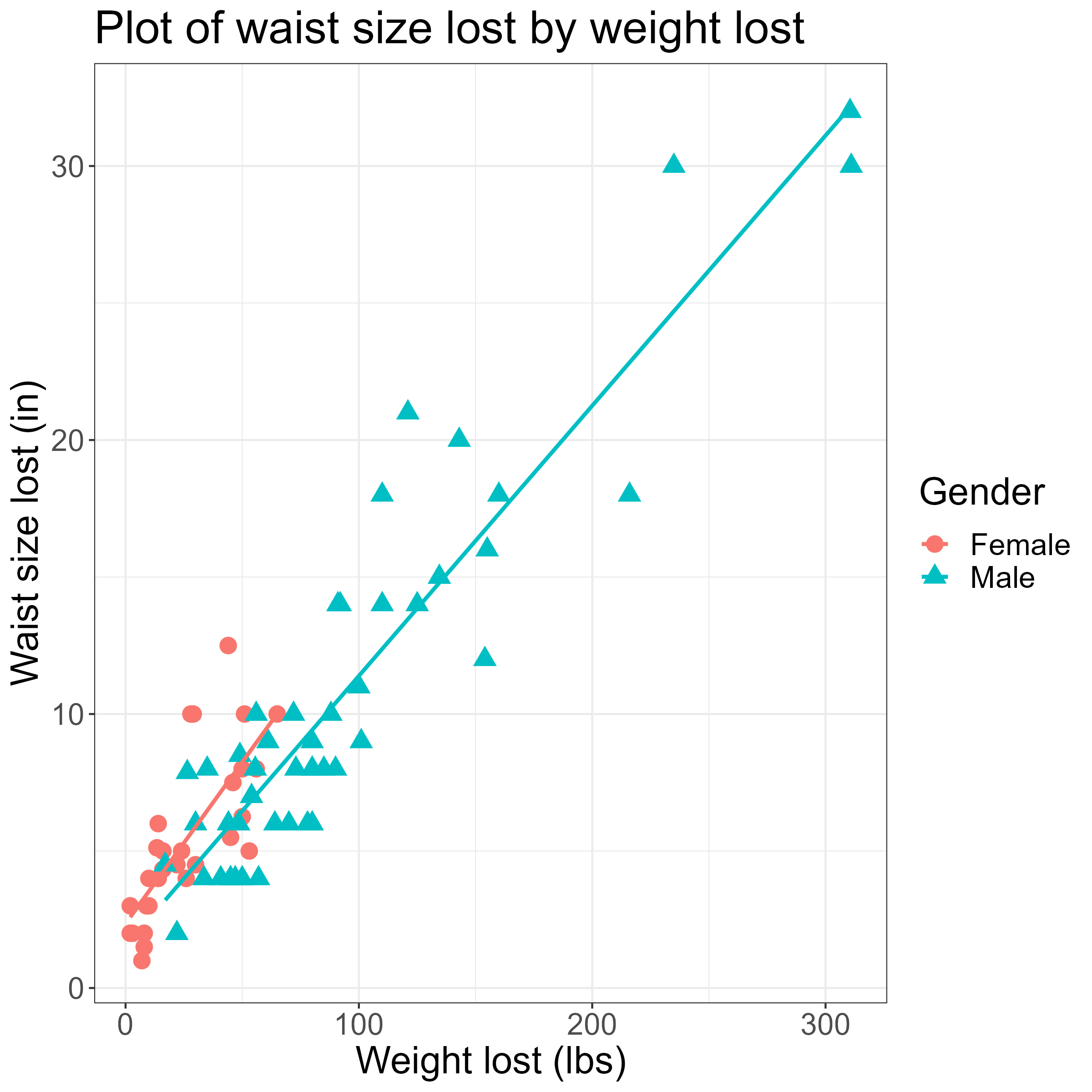 I chose to run four different regression models, for each gender. While Dan’s article only considered weight change, I also included the weight percentage change, BMI change, and BMI percentage change.
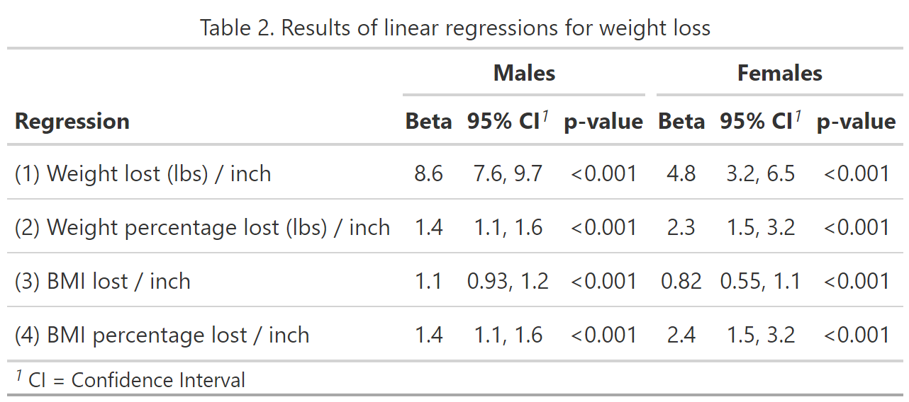
![Creating Standalone Apps from Shiny with Electron [2023, macOS M1]](https://r-posts.com/wp-content/uploads/2023/03/스크린샷-2023-03-14-오전-9.50.31-825x510.png)
 💡 I assume that…