How to Perform Hierarchical Clustering using R

What is Hierarchical Clustering?

Clustering is a technique to club similar data points into one group and separate out dissimilar observations into different groups or clusters. In Hierarchical Clustering, clusters are created such that they have a predetermined ordering i.e. a hierarchy. For example, consider the concept hierarchy of a library. A library has many sections, each section would have many books, and the books would be grouped according to their subject, let’s say. This forms a hierarchy. In Hierarchical Clustering, this hierarchy of clusters can either be created from top to bottom, or vice-versa. Hence, it’s two types namely – Divisive and Agglomerative. Let’s discuss it in detail.

Divisive Method

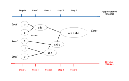
In Divisive method we assume that all of the observations belong to a single cluster and then divide the cluster into two least similar clusters. This is repeated recursively on each cluster until there is one cluster for each observation. This technique is also called DIANA, which is an acronym for Divisive Analysis.

Agglomerative Method

It’s also known as Hierarchical Agglomerative Clustering (HAC) or AGNES (acronym for Agglomerative Nesting). In this method, each observation is assigned to its own cluster. Then, the similarity (or distance) between each of the clusters is computed and the two most similar clusters are merged into one. Finally, steps 2 and 3 are repeated until there is only one cluster left.


Please note that Divisive method is good for identifying large clusters while Agglomerative method is good for identifying small clusters. We will proceed with Agglomerative Clustering for the rest of the article. Since, HAC’s account for the majority of hierarchical clustering algorithms while Divisive methods are rarely used. I think now we have a general overview of Hierarchical Clustering. Let’s also get ourselves familiarized with the algorithm for it.

HAC Algorithm

Given a set of N items to be clustered, and an NxN distance (or similarity) matrix, the basic process of Johnson’s (1967) hierarchical clustering is –
  1. Assign each item to its own cluster, so that if you have N items, you now have N clusters, each containing just one item. Let the distances (similarities) between the clusters equal the distances (similarities) between the items they contain.
  2. Find the closest (most similar) pair of clusters and merge them into a single cluster, so that now you have one less cluster.
  3. Compute distances (similarities) between the new cluster and each of the old clusters.
  4. Repeat steps 2 and 3 until all items are clustered into a single cluster of size N.
In Steps 2 and 3 here, the algorithm talks about finding similarity among clusters. So, before any clustering is performed, it is required to determine the distance matrix that specifies the distance between each data point using some distance function (Euclidean, Manhattan, Minkowski, etc.). Then, the matrix is updated to specify the distance between different clusters that are formed as a result of merging. But, how do we measure the distance (or similarity) between two clusters of observations? For this, we have three different methods as described below. These methods differ in how the distance between each cluster is measured.

Single Linkage

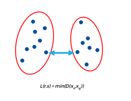
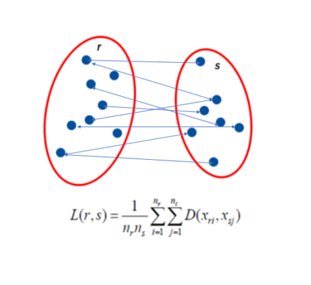
It is also known as the connectedness or minimum method. Here, the distance between one cluster and another cluster is taken to be equal to the shortest distance from any data point of one cluster to any data point in another. That is, distance will be based on similarity of the closest pair of data points as shown in the figure. It tends to produce long, “loose” clusters. Disadvantage of this method is that it can cause premature merging of groups with close pairs, even if those groups are quite dissimilar overall. 

Complete Linkage

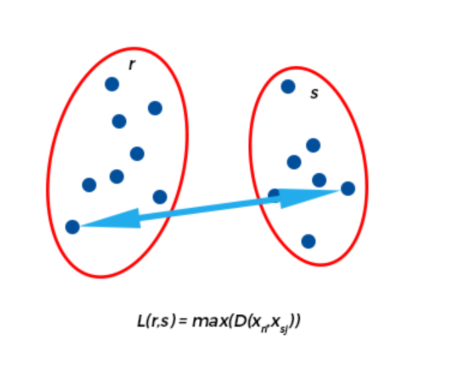
This method is also called the diameter or maximum method. In this method, we consider similarity of the furthest pair. That is, the distance between one cluster and another cluster is taken to be equal to the longest distance from any member of one cluster to any member of the other cluster. It tends to produce more compact clusters. One drawback of this method is that outliers can cause close groups to be merged later than what is optimal. 

Average Linkage

In Average linkage method, we take the distance between one cluster and another cluster to be equal to the average distance from any member of one cluster to any member of the other cluster. A variation on average-link clustering is the UCLUS method of D’Andrade (1978) which uses the median distance instead of mean distance. 

Ward’s Method

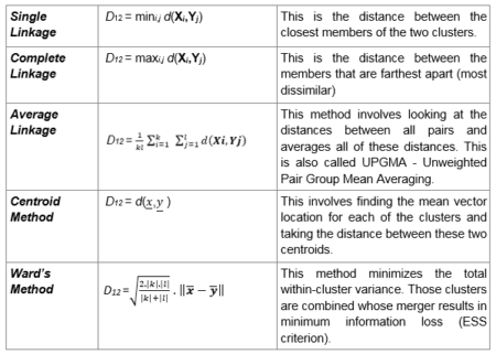
Ward’s method aims to minimize the total within-cluster variance. At each step the pair of clusters with minimum between-cluster distance are merged. In other words, it forms clusters in a manner that minimizes the loss associated with each cluster. At each step, the union of every possible cluster pair is considered and the two clusters whose merger results in minimum increase in information loss are combined. Here, information loss is defined by Ward in terms of an error sum-of-squares criterion (ESS). If you want a mathematical treatment of this visit this link.

The following table describes the mathematical equations for each of the methods —


Where,
  • X1, X2, , Xk = Observations from cluster 1
  • Y1, Y2, , Yl = Observations from cluster 2
  • d (x, y) = Distance between a subject with observation vector x and a subject with observation vector y
  • ||.|| = Euclidean norm

Implementing Hierarchical Clustering in R

Data Preparation

To perform clustering in R, the data should be prepared as per the following guidelines –
  1. Rows should contain observations (or data points) and columns should be variables.
  2. Check if your data has any missing values, if yes, remove or impute them.
  3. Data across columns must be standardized or scaled, to make the variables comparable.
We’ll use a data set called ‘Freedman’ from the ‘car’ package. The ‘Freedman’ data frame has 110 rows and 4 columns. The observations are U. S. metropolitan areas with 1968 populations of 250,000 or more. There are some missing data. (Make sure you install the car package before proceeding)
data <- car::Freedman

To remove any missing value that might be present in the data, type this:
data <- na.omit(data)
This simply removes any row that contains missing values. You can use more sophisticated methods for imputing missing values. However, we’ll skip this as it is beyond the scope of the article. Also, we will be using numeric variables here for the sake of simply demonstrating how clustering is done in R. Categorical variables, on the other hand, would require special treatment, which is also not within the scope of this article. Therefore, we have selected a data set with numeric variables alone for conciseness.

Next, we have to scale all the numeric variables. Scaling means each variable will now have mean zero and standard deviation one. Ideally, you want a unit in each coordinate to represent the same degree of difference. Scaling makes the standard deviation the unit of measurement in each coordinate. This is done to avoid the clustering algorithm to depend to an arbitrary variable unit. You can scale/standardize the data using the R function scale:
data <- scale(data)

Implementing Hierarchical Clustering in R

There are several functions available in R for hierarchical clustering. Here are some commonly used ones:
  • ‘hclust’ (stats package) and ‘agnes’ (cluster package) for agglomerative hierarchical clustering
  • ‘diana’ (cluster package) for divisive hierarchical clustering

Agglomerative Hierarchical Clustering

For ‘hclust’ function, we require the distance values which can be computed in R by using the ‘dist’ function. Default measure for dist function is ‘Euclidean’, however you can change it with the method argument. With this, we also need to specify the linkage method we want to use (i.e. “complete”, “average”, “single”, “ward.D”).
# Dissimilarity matrix
d <- dist(data, method = "euclidean")
# Hierarchical clustering using Complete Linkage
hc1 <- hclust(d, method = "complete" )
# Plot the obtained dendrogram
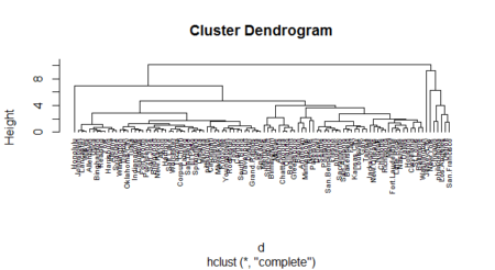
plot(hc1, cex = 0.6, hang = -1)


Another alternative is the agnes function. Both of these functions are quite similar; however, with the agnes function you can also get the agglomerative coefficient, which measures the amount of clustering structure found (values closer to 1 suggest strong clustering structure).
# Compute with agnes (make sure you have the package cluster)
hc2 <- agnes(data, method = "complete")

# Agglomerative coefficient
hc2$ac

## [1] 0.9317012
Let’s compare the methods discussed

# vector of methods to compare
m <- c( "average", "single", "complete", "ward")
names(m) <- c( "average", "single", "complete", "ward")

# function to compute coefficient
ac <- function(x) {
  agnes(data, method = x)$ac
}
map_dbl(m, ac)      

## from ‘purrr’ package
## average single complete ward

## 0.9241325 0.9215283 0.9317012 0.9493598

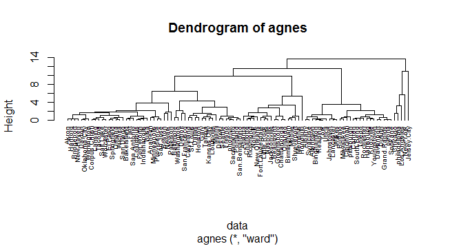
Ward’s method gets us the highest agglomerative coefficient. Let us look at its dendogram.
hc3 <- agnes(data, method = "ward")
pltree(hc3, cex = 0.6, hang = -1, main = "Dendrogram of agnes")


Divisive Hierarchical Clustering

The function ‘diana’ in the cluster package helps us perform divisive hierarchical clustering. ‘diana’ works similar to ‘agnes’. However, there is no method argument here, and, instead of agglomerative coefficient, we have divisive coefficient.
# compute divisive hierarchical clustering
hc4 <- diana(data)

# Divise coefficient
hc4$dc

## [1] 0.9305939

# plot dendrogram
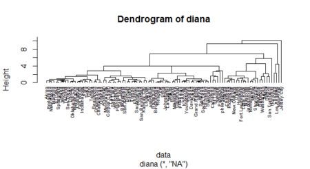
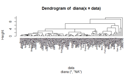
pltree(hc4, cex = 0.6, hang = -1, main = "Dendrogram of diana")

A dendogram is a cluster tree where each group is linked to two or more successor groups. These groups are nested and organized as a tree. You could manage dendograms and do much more with them using the package “dendextend”. Check out the vignette of the package here:
https://cran.r-project.org/web/packages/dendextend/vignettes/Quick_Introduction.html

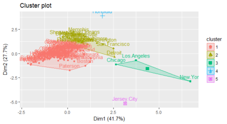
Great! So now we understand how to perform clustering and come up with dendograms. Let us move to the final step of assigning clusters to the data points. This can be done with the R function cutree. It cuts a tree (or dendogram), as resulting from hclust (or diana/agnes), into several groups either by specifying the desired number of groups (k) or the cut height (h). At least one of k or h must be specified, k overrides h if both are given. Following our demo, assign clusters for the tree obtained by diana function (under section Divisive Hierarchical Clustering).
clust <- cutree(hc4, k = 5)
We can also use the fviz_cluster function from the factoextra package to visualize the result in a scatter plot.
fviz_cluster(list(data = data, cluster = clust))  ## from ‘factoextra’ package 

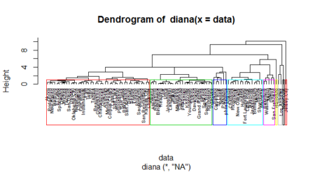
You can also visualize the clusters inside the dendogram itself by putting borders as shown next
pltree(hc4, hang=-1, cex = 0.6)


rect.hclust(hc4, k = 9, border = 2:10)


dendextend

You can do a lot of other manipulation on dendrograms with the dendextend package such as – changing the color of labels, changing the size of text of labels, changing type of line of branches, its colors, etc. You can also change the label text as well as sort it. You can see the many options in the online vignette of the package.

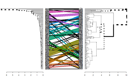
Another important function that the dendextend package offers is tanglegram. It is used to compare two dendrogram (with the same set of labels), one facing the other, and having their labels connected by lines.

As an example, let’s compare the single and complete linkage methods for agnes function.
library(dendextend)

hc_single <- agnes(data, method = "single")
hc_complete <- agnes(data, method = "complete")

# converting to dendogram objects as dendextend works with dendogram objects 
hc_single <- as.dendrogram(hc_single)
hc_complete <- as.dendrogram(hc_complete)

tanglegram(hc_single,hc_complete)

This is useful in comparing two methods. As seen in the figure, one can relate to the methodology used for building the clusters by looking at this comparison. You can find more functionalities of the dendextend package here.

End Notes

Hope now you have a better understanding of clustering algorithms than what you started with. We discussed about Divisive and Agglomerative clustering techniques and four linkage methods namely, Single, Complete, Average and Ward’s method. Next, we implemented the discussed techniques in R using a numeric dataset. Note that we didn’t have any categorical variable in the dataset we used. You need to treat the categorical variables in order to incorporate them into a clustering algorithm. Lastly, we discussed a couple of plots to visualise the clusters/groups formed. Note here that we have assumed value of ‘k’ (number of clusters) is known. However, this is not always the case. There are a number of heuristics and rules-of-thumb for picking number of clusters. A given heuristic will work better on some datasets than others. It’s best to take advantage of domain knowledge to help set the number of clusters, if that’s possible. Otherwise, try a variety of heuristics, and perhaps a few different values of k.

Consolidated code

install.packages('cluster')
install.packages('purrr')
install.packages('factoextra')

library(cluster)
library(purrr)
library(factoextra)
data <- car::Freedman
data <- na.omit(data)
data <- scale(data)

d <- dist(data, method = "euclidean")
hc1 <- hclust(d, method = "complete" )

plot(hc1, cex = 0.6, hang = -1)

hc2 <- agnes(data, method = "complete")
hc2$ac

m <- c( "average", "single", "complete", "ward")
names(m) <- c( "average", "single", "complete", "ward")

ac <- function(x) {
  agnes(data, method = x)$ac
}

map_dbl(m, ac)  

hc3 <- agnes(data, method = "ward")
pltree(hc3, cex = 0.6, hang = -1, main = "Dendrogram of agnes")

hc4 <- diana(data)
hc4$dc

pltree(hc4, cex = 0.6, hang = -1, main = "Dendrogram of diana")

clust <- cutree(hc4, k = 5)
fviz_cluster(list(data = data, cluster = clust))

pltree(hc4, hang=-1, cex = 0.6)
rect.hclust(hc4, k = 9, border = 2:10)

library(dendextend)

hc_single <- agnes(data, method = "single")
hc_complete <- agnes(data, method = "complete")

# converting to dendogram objects as dendextend works with dendogram objects 
hc_single <- as.dendrogram(hc_single)
hc_complete <- as.dendrogram(hc_complete)

tanglegram(hc_single,hc_complete)

Author Bio:

This article was contributed by Perceptive Analytics. Amanpreet Singh, Chaitanya Sagar, Jyothirmayee Thondamallu and Saneesh Veetil contributed to this article.

Perceptive Analytics provides data analytics, business intelligence and reporting services to e-commerce, retail and pharmaceutical industries. Our client roster includes Fortune 500 and NYSE listed companies in the USA and India.

New Course: Working with Dates & Times in R

Hello R users! We just launched another course: Working with Dates and Times in R by Charlotte Wickham!

Dates and times are abundant in data and essential for answering questions that start with when, how long, or how often. However, they can be tricky, as they come in a variety of formats and can behave in unintuitive ways. This course teaches you the essentials of parsing, manipulating, and computing with dates and times in R. By the end, you'll have mastered the lubridate package, a member of the tidyverse, specifically designed to handle dates and times. You'll also have applied your new skills to explore how often R versions are released, when the weather is good in Auckland (the birthplace of R), and how long monarchs ruled in Britain.

Take me to chapter 1!

Working with Dates and Times in R features interactive exercises that combine high-quality video, in-browser coding, and gamification for an engaging learning experience that will make you an expert in dates and times in R!


What you'll learn

1. Dates and Times in R
Dates and times come in a huge assortment of formats, so your first hurdle is often to parse the format you have into an R datetime. This chapter teaches you to import dates and times with the lubridate package. You'll also learn how to extract parts of a datetime. You'll practice by exploring the weather in R's birthplace, Auckland NZ.

2. Parsing and Manipulating Dates and Times with lubridate
Dates and times come in a huge assortment of formats, so your first hurdle is often to parse the format you have into an R datetime. This chapter teaches you to import dates and times with the lubridate package. You'll also learn how to extract parts of a datetime. You'll practice by exploring the weather in R's birthplace, Auckland NZ.

3. Arithmetic with Dates and Times
Getting datetimes into R is just the first step. Now that you know how to parse datetimes, you need to learn how to do calculations with them. In this chapter, you'll learn the different ways of representing spans of time with lubridate and how to leverage them to do arithmetic on datetimes. By the end of the chapter, you'll have calculated how long it's been since the first man stepped on the moon, generated sequences of dates to help schedule reminders, calculated when an eclipse occurs, and explored the reigns of monarch's of England (and which ones might have seen Halley's comet!).

4. Problems in practice
You now know most of what you need to tackle data that includes dates and times, but there are a few other problems you might encounter in practice. In this final chapter you'll learn a little more about these problems by returning to some of the earlier data examples and learning how to handle time zones, deal with times when you don't care about dates, parse dates quickly, and output dates and times.

Master dates and times in R with our latest course!

“Print hello”​ is not enough. A collection of Hello world functions.


I guess I wrote my R “hello world!” function 7 or 8 years ago while approaching R for the first time. And it is too little to illustrate the basic syntax of a programming language for a working program to a wannabe R programmer. Thus, here follows a collection of basic functions that may help a bit more than the famed piece of code.

######################################################
############### Hello world functions ################
######################################################
##################################
# General info
fun <- function( arguments ) { body }


##################################
foo.add <- function(x,y){
  x+y
}

foo.add(7, 5)

----------------------------------

foo.above <- function(x){
  x[x>10]
}

foo.above(1:100)

----------------------------------

foo.above_n <- function(x,n){
  x[x>n]
}

foo.above_n(1:20, 12)

----------------------------------

foo = seq(1, 100, by=2)
foo.squared = NULL

for (i in 1:50 ) {
  foo.squared[i] = foo[i]^2
}

foo.squared

----------------------------------

a <- c(1,6,7,8,8,9,2)

s <- 0
for (i in 1:length(a)){
  s <- s + a[[i]]
}
s

----------------------------------

a <- c(1,6,7,8,8,9,2,100)

s <- 0
i <- 1
while (i <= length(a)){
  s <- s + a[[i]]
  i <- i+1
}
s

----------------------------------

FunSum <- function(a){
  s <- 0
  i <- 1
  while (i <= length(a)){
    s <- s + a[[i]]
    i <- i+1
  }
  print(s)
}

FunSum(a)

-----------------------------------

SumInt <- function(n){
  s <- 0
  for (i in 1:n){
    s <- s + i
  }
  print(s)  
}

SumInt(14)

-----------------------------------
# find the maximum
# right to left assignment
x <- c(3, 9, 7, 2)

# trick: it is necessary to use a temporary variable to allow the comparison by pairs of
# each number of the sequence, i.e. the process of comparison is incremental: each time
# a bigger number compared to the previous in the sequence is found, it is assigned as the
# temporary maximum
# Since the process has to start somewhere, the first (temporary) maximum is assigned to be
# the first number of the sequence

max <- x[1]
for(i in x){
  tmpmax = i
  if(tmpmax > max){
    max = tmpmax
  }
}

max

x <- c(-20, -14, 6, 2)
x <- c(-2, -24, -14, -7)

min <- x[1]
for(i in x){
  tmpmin = i
  if(tmpmin < min){
    min = tmpmin
  }
}

min

----------------------------------
# n is the nth Fibonacci number
# temp is the temporary variable

Fibonacci <- function(n){
  a <- 0
  b <- 1
  for(i in 1:n){
    temp <- b
    b <- a
    a <- a + temp
  }
  return(a)
}

Fibonacci(13)

----------------------------------
# R available factorial function
factorial(5)

# recursive function: ff
ff <- function(x) {
  if(x<=0) {
    return(1)
  } else {
    return(x*ff(x-1)) # function uses the fact it knows its own name to call itself
  }
}
ff(5)

----------------------------------

say_hello_to <- function(name){
  paste("Hello", name)
} 
say_hello_to("Roberto")

----------------------------------

foo.colmean <- function(y){
  nc <- ncol(y)
  means <- numeric(nc)
  for(i in 1:nc){
    means[i] <- mean(y[,i])
  }
  means
}

foo.colmean(airquality)

----------------------------------

foo.colmean <- function(y, removeNA=FALSE){
  nc <- ncol(y)
  means <- numeric(nc)
  for(i in 1:nc){
    means[i] <- mean(y[,i], na.rm=removeNA)
  }
  means
}

foo.colmean(airquality, TRUE)

----------------------------------

foo.contingency <- function(x,y){
  nc <- ncol(x)
  out <- list() 
  for (i in 1:nc){
    out[[i]] <- table(y, x[,i]) 
  }
  names(out) <- names(x)
  out
}

set.seed(123)
v1 <- sample(c(rep("a", 5), rep("b", 15), rep("c", 20)))
v2 <- sample(c(rep("d", 15), rep("e", 20), rep("f", 5)))
v3 <- sample(c(rep("g", 10), rep("h", 10), rep("k", 20)))

data <- data.frame(v1, v2, v3)

foo.contingency(data,v3)
That's all folks! #R #rstats #maRche #Rbloggers This post is also shared in LinkedIn and www.r-bloggers.com

Pipes in R Tutorial For Beginners

You might have already seen or used the pipe operator when you're working with packages such as dplyr, magrittr,… But do you know where pipes and the famous %>% operator come from, what they exactly are, or how, when and why you should use them? Can you also come up with some alternatives?

This tutorial will give you an introduction to pipes in R and will cover the following topics:


Are you interested in learning more about manipulating data in R with dplyr? Take a look at DataCamp's Data Manipulation in R with dplyr course.

Pipe Operator in R: Introduction

To understand what the pipe operator in R is and what you can do with it, it's necessary to consider the full picture, to learn the history behind it. Questions such as "where does this weird combination of symbols come from and why was it made like this?" might be on top of your mind. You'll discover the answers to these and more questions in this section.

Now, you can look at the history from three perspectives: from a mathematical point of view, from a holistic point of view of programming languages, and from the point of view of the R language itself. You'll cover all three in what follows!

History of the Pipe Operator in R

Mathematical History

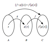
If you have two functions, let's say $f : B → C$ and $g : A → B$, you can chain these functions together by taking the output of one function and inserting it into the next. In short, "chaining" means that you pass an intermediate result onto the next function, but you'll see more about that later.

For example, you can say, $f(g(x))$: $g(x)$ serves as an input for $f()$, while $x$, of course, serves as input to $g()$.

If you would want to note this down, you will use the notation $f ◦ g$, which reads as "f follows g". Alternatively, you can visually represent this as:


Image Credit: James Balamuta, "Piping Data"

Pipe Operators in Other Programming Languages

As mentioned in the introduction to this section, this operator is not new in programming: in the Shell or Terminal, you can pass command from one to the next with the pipeline character |. Similarly, F# has a forward pipe operator, which will prove to be important later on! Lastly, it's also good to know that Haskell contains many piping operations that are derived from the Shell or Terminal.

Pipes in R

Now that you have seen some history of the pipe operator in other programming languages, it's time to focus on R. The history of this operator in R starts, according to this fantastic blog post written by Adolfo Álvarez, on January 17th, 2012, when an anonymous user asked the following question in this Stack Overflow post:

How can you implement F#'s forward pipe operator in R? The operator makes it possible to easily chain a sequence of calculations. For example, when you have an input data and want to call functions foo and bar in sequence, you can write data |> foo |> bar?
The answer came from Ben Bolker, professor at McMaster University, who replied:

I don't know how well it would hold up to any real use, but this seems (?) to do what you want, at least for single-argument functions …
"%>%" <- function(x,f) do.call(f,list(x))
pi %>% sin
[1] 1.224606e-16
pi %>% sin %>% cos
[1] 1
cos(sin(pi))
[1] 1
About nine months later, Hadley Wickham started the dplyr package on GitHub. You might now know Hadley, Chief Scientist at RStudio, as the author of many popular R packages (such as this last package!) and as the instructor for DataCamp's Writing Functions in R course.

Be however it may, it wasn't until 2013 that the first pipe %.% appears in this package. As Adolfo Álvarez rightfully mentions in his blog post, the function was denominated chain(), which had the purpose to simplify the notation for the application of several functions to a single data frame in R.

The %.% pipe would not be around for long, as Stefan Bache proposed an alternative on the 29th of December 2013, that included the operator as you might now know it:
iris %>%
  subset(Sepal.Length > 5) %>%
  aggregate(. ~ Species, ., mean)
Bache continued to work with this pipe operation and at the end of 2013, the magrittr package came to being. In the meantime, Hadley Wickham continued to work on dplyr and in April 2014, the %.% operator got replaced with the one that you now know, %>%.

Later that year, Kun Ren published the pipeR package on GitHub, which incorporated a different pipe operator, %>>%, which was designed to add more flexibility to the piping process. However, it's safe to say that the %>% is now established in the R language, especially with the recent popularity of the Tidyverse.

What Is It?

Knowing the history is one thing, but that still doesn't give you an idea of what F#'s forward pipe operator is nor what it actually does in R.

In F#, the pipe-forward operator |> is syntactic sugar for chained method calls. Or, stated more simply, it lets you pass an intermediate result onto the next function.

Remember that "chaining" means that you invoke multiple method calls. As each method returns an object, you can actually allow the calls to be chained together in a single statement, without needing variables to store the intermediate results.

In R, the pipe operator is, as you have already seen, %>%. If you're not familiar with F#, you can think of this operator as being similar to the + in a ggplot2 statement. Its function is very similar to that one that you have seen of the F# operator: it takes the output of one statement and makes it the input of the next statement. When describing it, you can think of it as a "THEN".

Take, for example, following code chunk and read it aloud:
class="lang-{r}">iris %>%
  subset(Sepal.Length > 5) %>%
  aggregate(. ~ Species, ., mean)
You're right, the code chunk above will translate to something like "you take the Iris data, then you subset the data and then you aggregate the data".

This is one of the most powerful things about the Tidyverse. In fact, having a standardized chain of processing actions is called "a pipeline". Making pipelines for a data format is great, because you can apply that pipeline to incoming data that has the same formatting and have it output in a ggplot2 friendly format, for example.

Why Use It?

R is a functional language, which means that your code often contains a lot of parenthesis, ( and ). When you have complex code, this often will mean that you will have to nest those parentheses together. This makes your R code hard to read and understand. Here's where %>% comes in to the rescue!

Take a look at the following example, which is a typical example of nested code:
class="lang-R"># Initialize `x`
x <- c(0.109, 0.359, 0.63, 0.996, 0.515, 0.142, 0.017, 0.829, 0.907)

# Compute the logarithm of `x`, return suitably lagged and iterated differences, 
# compute the exponential function and round the result
round(exp(diff(log(x))), 1)
  1. 3.3
  2. 1.8
  3. 1.6
  4. 0.5
  5. 0.3
  6. 0.1
  7. 48.8
  8. 1.1
With the help of %<%, you can rewrite the above code as follows:
class="lang-R"># Import `magrittr`
library(magrittr)

# Perform the same computations on `x` as above
x %>% log() %>%
    diff() %>%
    exp() %>%
    round(1)
Does this seem difficult to you? No worries! You'll learn more on how to go about this later on in this tutorial.

Note that you need to import the magrittr library to get the above code to work. That's because the pipe operator is, as you read above, part of the magrittr library and is, since 2014, also a part of dplyr. If you forget to import the library, you'll get an error like Error in eval(expr, envir, enclos): could not find function "%>%".

Also note that it isn't a formal requirement to add the parentheses after log, diff and exp, but that, within the R community, some will use it to increase the readability of the code.

In short, here are four reasons why you should be using pipes in R:
  • You'll structure the sequence of your data operations from left to right, as apposed to from inside and out;
  • You'll avoid nested function calls;
  • You'll minimize the need for local variables and function definitions; And
  • You'll make it easy to add steps anywhere in the sequence of operations.
These reasons are taken from the magrittr documentation itself. Implicitly, you see the arguments of readability and flexibility returning.

Additional Pipes

Even though %>% is the (main) pipe operator of the magrittr package, there are a couple of other operators that you should know and that are part of the same package:
  • The compound assignment operator %<>%;
class="lang-R"># Initialize `x` 
x <- rnorm(100)

# Update value of `x` and assign it to `x`
x %<>% abs %>% sort
  • The tee operator %T>%;
class="lang-R">rnorm(200) %>%
matrix(ncol = 2) %T>%
plot %>% 
colSums
Note that it's good to know for now that the above code chunk is actually a shortcut for:
rnorm(200) %>%
matrix(ncol = 2) %T>%
{ plot(.); . } %>% 
colSums
But you'll see more about that later on!
  • The exposition pipe operator %$%.
class="lang-R">data.frame(z = rnorm(100)) %$% 
  ts.plot(z)
Of course, these three operators work slightly differently than the main %>% operator. You'll see more about their functionalities and their usage later on in this tutorial!

Note that, even though you'll most often see the magrittr pipes, you might also encounter other pipes as you go along! Some examples are wrapr's dot arrow pipe %.>% or to dot pipe %>.%, or the Bizarro pipe ->.;.

How to Use Pipes in R

Now that you know how the %>% operator originated, what it actually is and why you should use it, it's time for you to discover how you can actually use it to your advantage. You will see that there are quite some ways in which you can use it!

Basic Piping

Before you go into the more advanced usages of the operator, it's good to first take a look at the most basic examples that use the operator. In essence, you'll see that there are 3 rules that you can follow when you're first starting out:
  • f(x) can be rewritten as x %>% f
In short, this means that functions that take one argument, function(argument), can be rewritten as follows: argument %>% function(). Take a look at the following, more practical example to understand how these two are equivalent:
class="lang-R"># Compute the logarithm of `x` 
log(x)

# Compute the logarithm of `x` 
x %>% log()
  • f(x, y) can be rewritten as x %>% f(y)
Of course, there are a lot of functions that don't just take one argument, but multiple. This is the case here: you see that the function takes two arguments, x and y. Similar to what you have seen in the first example, you can rewrite the function by following the structure argument1 %>% function(argument2), where argument1 is the magrittr placeholder and argument2 the function call. This all seems quite theoretical. Let's take a look at a more practical example:
class="lang-R"># Round pi
round(pi, 6)

# Round pi 
pi %>% round(6)
  • x %>% f %>% g %>% h can be rewritten as h(g(f(x)))
This might seem complex, but it isn't quite like that when you look at a real-life R example:
class="lang-R"># Import `babynames` data
library(babynames)
# Import `dplyr` library
library(dplyr)

# Load the data
data(babynames)

# Count how many young boys with the name "Taylor" are born
sum(select(filter(babynames,sex=="M",name=="Taylor"),n))

# Do the same but now with `%>%`
babynames%>%filter(sex=="M",name=="Taylor")%>%
            select(n)%>%
            sum
Note how you work from the inside out when you rewrite the nested code: you first put in the babynames, then you use %>% to first filter() the data. After that, you'll select n and lastly, you'll sum() everything.

Remember also that you already saw another example of such a nested code that was converted to more readable code in the beginning of this tutorial, where you used the log(), diff(), exp() and round() functions to perform calculations on x.

Functions that Use the Current Environment

Unfortunately, there are some exceptions to the more general rules that were outlined in the previous section. Let's take a look at some of them here.

Consider this example, where you use the assign() function to assign the value 10 to the variable x.
class="lang-R"># Assign `10` to `x`
assign("x", 10)

# Assign `100` to `x` 
"x" %>% assign(100)

# Return `x`
x
10 You see that the second call with the assign() function, in combination with the pipe, doesn't work properly. The value of x is not updated.

Why is this?

That's because the function assigns the new value 100 to a temporary environment used by %>%. So, if you want to use assign() with the pipe, you must be explicit about the environment:
class="lang-R"># Define your environment
env <- environment()

# Add the environment to `assign()`
"x" %>% assign(100, envir = env)

# Return `x`
x
100

Functions with Lazy Evalution

Arguments within functions are only computed when the function uses them in R. This means that no arguments are computed before you call your function! That means also that the pipe computes each element of the function in turn.

One place that this is a problem is tryCatch(), which lets you capture and handle errors, like in this example:
class="lang-R">tryCatch(stop("!"), error = function(e) "An error")

stop("!") %>% 
  tryCatch(error = function(e) "An error")
'An error'
Error in eval(expr, envir, enclos): !
Traceback:


1. stop("!") %>% tryCatch(error = function(e) "An error")

2. eval(lhs, parent, parent)

3. eval(expr, envir, enclos)

4. stop("!")
You'll see that the nested way of writing down this line of code works perfectly, while the piped alternative returns an error. Other functions with the same behavior are try(), suppressMessages(), and suppressWarnings() in base R.

Argument Placeholder

There are also instances where you can use the pipe operator as an argument placeholder. Take a look at the following examples:
  • f(x, y) can be rewritten as y %>% f(x, .)
In some cases, you won't want the value or the magrittr placeholder to the function call at the first position, which has been the case in every example that you have seen up until now. Reconsider this line of code:
<pi %>% round(6)
If you would rewrite this line of code, pi would be the first argument in your round() function. But what if you would want to replace the second, third, … argument and use that one as the magrittr placeholder to your function call? Take a look at this example, where the value is actually at the third position in the function call:
class="lang-R">"Ceci n'est pas une pipe" %>% gsub("une", "un", .)
'Ceci n\'est pas un pipe'
  • f(y, z = x) can be rewritten as x %>% f(y, z = .)
Likewise, you might want to make the value of a specific argument within your function call the magrittr placeholder. Consider the following line of code:
class="lang-R">6 %>% round(pi, digits=.)

Re-using the Placeholder for Attributes

It is straight-forward to use the placeholder several times in a right-hand side expression. However, when the placeholder only appears in a nested expressions magrittr will still apply the first-argument rule. The reason is that in most cases this results more clean code.

Here are some general "rules" that you can take into account when you're working with argument placeholders in nested function calls:
  • f(x, y = nrow(x), z = ncol(x)) can be rewritten as x %>% f(y = nrow(.), z = ncol(.))
class="lang-R"># Initialize a matrix `ma` 
ma <- matrix(1:12, 3, 4)

# Return the maximum of the values inputted
max(ma, nrow(ma), ncol(ma))

# Return the maximum of the values inputted
ma %>% max(nrow(ma), ncol(ma))
12 12 The behavior can be overruled by enclosing the right-hand side in braces:
  • f(y = nrow(x), z = ncol(x)) can be rewritten as x %>% {f(y = nrow(.), z = ncol(.))}
class="lang-R"># Only return the maximum of the `nrow(ma)` and `ncol(ma)` input values
ma %>% {max(nrow(ma), ncol(ma))}
4 To conclude, also take a look at the following example, where you could possibly want to adjust the workings of the argument placeholder in the nested function call:
class="lang-R"># The function that you want to rewrite
paste(1:5, letters[1:5])

# The nested function call with dot placeholder
1:5 %>%
  paste(., letters[.])
  1. '1 a'
  2. '2 b'
  3. '3 c'
  4. '4 d'
  5. '5 e'
  1. '1 a'
  2. '2 b'
  3. '3 c'
  4. '4 d'
  5. '5 e'
You see that if the placeholder is only used in a nested function call, the magrittr placeholder will also be placed as the first argument! If you want to avoid this from happening, you can use the curly brackets { and }:
class="lang-R"># The nested function call with dot placeholder and curly brackets
1:5 %>% {
  paste(letters[.])
}

# Rewrite the above function call 
paste(letters[1:5])
  1. 'a'
  2. 'b'
  3. 'c'
  4. 'd'
  5. 'e'
  1. 'a'
  2. 'b'
  3. 'c'
  4. 'd'
  5. 'e'

Building Unary Functions

Unary functions are functions that take one argument. Any pipeline that you might make that consists of a dot ., followed by functions and that is chained together with %>% can be used later if you want to apply it to values. Take a look at the following example of such a pipeline:
class="lang-R">. %>% cos %>% sin
This pipeline would take some input, after which both the cos() and sin() fuctions would be applied to it.

But you're not there yet! If you want this pipeline to do exactly that which you have just read, you need to assign it first to a variable f, for example. After that, you can re-use it later to do the operations that are contained within the pipeline on other values.
class="lang-R"># Unary function
f <- . %>% cos %>% sin 

f
structure(function (value) 
freduce(value, `_function_list`), class = c("fseq", "function"
))
Remember also that you could put parentheses after the cos() and sin() functions in the line of code if you want to improve readability. Consider the same example with parentheses: . %>% cos() %>% sin().

You see, building functions in magrittr very similar to building functions with base R! If you're not sure how similar they actually are, check out the line above and compare it with the next line of code; Both lines have the same result!
class="lang-R"># is equivalent to 
f <- function(.) sin(cos(.)) 

f
function (.) 
sin(cos(.))

Compound Assignment Pipe Operations

There are situations where you want to overwrite the value of the left-hand side, just like in the example right below. Intuitively, you will use the assignment operator <- to do this.
class="lang-R"># Load in the Iris data
iris <- read.csv(url("http://archive.ics.uci.edu/ml/machine-learning-databases/iris/iris.data"), header = FALSE)

# Add column names to the Iris data
names(iris) <- c("Sepal.Length", "Sepal.Width", "Petal.Length", "Petal.Width", "Species")

# Compute the square root of `iris$Sepal.Length` and assign it to the variable
iris$Sepal.Length <- 
  iris$Sepal.Length %>%
  sqrt()
However, there is a compound assignment pipe operator, which allows you to use a shorthand notation to assign the result of your pipeline immediately to the left-hand side:
class="lang-R"># Compute the square root of `iris$Sepal.Length` and assign it to the variable
iris$Sepal.Length %<>% sqrt

# Return `Sepal.Length`
iris$Sepal.Length
Note that the compound assignment operator %<>% needs to be the first pipe operator in the chain for this to work. This is completely in line with what you just read about the operator being a shorthand notation for a longer notation with repetition, where you use the regular <- assignment operator.

As a result, this operator will assign a result of a pipeline rather than returning it.

Tee Operations with The Tee Operator

The tee operator works exactly like %>%, but it returns the left-hand side value rather than the potential result of the right-hand side operations.

This means that the tee operator can come in handy in situations where you have included functions that are used for their side effect, such as plotting with plot() or printing to a file.

In other words, functions like plot() typically don't return anything. That means that, after calling plot(), for example, your pipeline would end. However, in the following example, the tee operator %T>% allows you to continue your pipeline even after you have used plot():
class="lang-R">set.seed(123)
rnorm(200) %>%
matrix(ncol = 2) %T>%
plot %>% 
colSums
pipe R

Exposing Data Variables with the Exposition Operator

When you're working with R, you'll find that many functions take a data argument. Consider, for example, the lm() function or the with() function. These functions are useful in a pipeline where your data is first processed and then passed into the function.

For functions that don't have a data argument, such as the cor() function, it's still handy if you can expose the variables in the data. That's where the %$% operator comes in. Consider the following example:
class="lang-R">iris %>%
  subset(Sepal.Length > mean(Sepal.Length)) %$%
  cor(Sepal.Length, Sepal.Width)
0.336696922252551

With the help of %$% you make sure that Sepal.Length and Sepal.Width are exposed to cor(). Likewise, you see that the data in the data.frame() function is passed to the ts.plot() to plot several time series on a common plot:
class="lang-R">data.frame(z = rnorm(100)) %$%
  ts.plot(z)
pipe operator R

dplyr and magrittr

In the introduction to this tutorial, you already learned that the development of dplyr and magrittr occurred around the same time, namely, around 2013-2014. And, as you have read, the magrittr package is also part of the Tidyverse.

In this section, you will discover how exciting it can be when you combine both packages in your R code.

For those of you who are new to the dplyr package, you should know that this R package was built around five verbs, namely, "select", "filter", "arrange", "mutate" and "summarize". If you have already manipulated data for some data science project, you will know that these verbs make up the majority of the data manipulation tasks that you generally need to perform on your data.

Take an example of some traditional code that makes use of these dplyr functions:
class="lang-R">library(hflights)

grouped_flights <- group_by(hflights, Year, Month, DayofMonth)
flights_data <- select(grouped_flights, Year:DayofMonth, ArrDelay, DepDelay)
summarized_flights <- summarise(flights_data, 
                arr = mean(ArrDelay, na.rm = TRUE), 
                dep = mean(DepDelay, na.rm = TRUE))
final_result <- filter(summarized_flights, arr > 30 | dep > 30)

final_result
YearMonthDayofMontharrdep
2011 2 4 44.0808847.17216
2011 3 3 35.1289838.20064
2011 3 14 46.6383036.13657
2011 4 4 38.7165127.94915
2011 4 25 37.7984522.25574
2011 5 12 69.5204664.52039
2011 5 20 37.0285726.55090
2011 6 22 65.5185262.30979
2011 7 29 29.5575531.86944
2011 9 29 39.1964932.49528
2011 10 9 61.9017259.52586
2011 11 15 43.6813439.23333
2011 12 29 26.3009630.78855
2011 12 31 46.4846554.17137
When you look at this example, you immediately understand why dplyr and magrittr are able to work so well together:
class="lang-R">hflights %>% 
    group_by(Year, Month, DayofMonth) %>% 
    select(Year:DayofMonth, ArrDelay, DepDelay) %>% 
    summarise(arr = mean(ArrDelay, na.rm = TRUE), dep = mean(DepDelay, na.rm = TRUE)) %>% 
    filter(arr > 30 | dep > 30)
Both code chunks are fairly long, but you could argue that the second code chunk is more clear if you want to follow along through all of the operations. With the creation of intermediate variables in the first code chunk, you could possibly lose the "flow" of the code. By using %>%, you gain a more clear overview of the operations that are being performed on the data!

In short, dplyr and magrittr are your dreamteam for manipulating data in R!

RStudio Keyboard Shortcuts for Pipes

Adding all these pipes to your R code can be a challenging task! To make your life easier, John Mount, co-founder and Principal Consultant at Win-Vector, LLC and DataCamp instructor, has released a package with some RStudio add-ins that allow you to create keyboard shortcuts for pipes in R. Addins are actually R functions with a bit of special registration metadata. An example of a simple addin can, for example, be a function that inserts a commonly used snippet of text, but can also get very complex!

With these addins, you'll be able to execute R functions interactively from within the RStudio IDE, either by using keyboard shortcuts or by going through the Addins menu.

Note that this package is actually a fork from RStudio's original add-in package, which you can find here. Be careful though, the support for addins is available only within the most recent release of RStudio! If you want to know more on how you can install these RStudio addins, check out this page.

You can download the add-ins and keyboard shortcuts here.

When Not To Use the Pipe Operator in R

In the above, you have seen that pipes are definitely something that you should be using when you're programming with R. More specifically, you have seen this by covering some cases in which pipes prove to be very useful! However, there are some situations, outlined by Hadley Wickham in "R for Data Science", in which you can best avoid them:
  • Your pipes are longer than (say) ten steps.
In cases like these, it's better to create intermediate objects with meaningful names. It will not only be easier for you to debug your code, but you'll also understand your code better and it'll be easier for others to understand your code.
  • You have multiple inputs or outputs.
If you aren't transforming one primary object, but two or more objects are combined together, it's better not to use the pipe.
  • You are starting to think about a directed graph with a complex dependency structure.
Pipes are fundamentally linear and expressing complex relationships with them will only result in complex code that will be hard to read and understand.
  • You're doing internal package development
Using pipes in internal package development is a no-go, as it makes it harder to debug!
For more reflections on this topic, check out this Stack Overflow discussion. Other situations that appear in that discussion are loops, package dependencies, argument order and readability. In short, you could summarize it all as follows: keep the two things in mind that make this construct so great, namely, readability and flexibility. As soon as one of these two big advantages is compromised, you might consider some alternatives in favor of the pipes.

Alternatives to Pipes in R

After all that you have read by you might also be interested in some alternatives that exist in the R programming language. Some of the solutions that you have seen in this tutorial were the following:
  • Create intermediate variables with meaningful names;
Instead of chaining all operations together and outputting one single result, break up the chain and make sure you save intermediate results in separate variables. Be careful with the naming of these variables: the goal should always be to make your code as understandable as possible!
  • Nest your code so that you read it from the inside out;
One of the possible objections that you could have against pipes is the fact that it goes against the "flow" that you have been accustomed to with base R. The solution is then to stick with nesting your code! But what to do then if you don't like pipes but you also think nesting can be quite confusing? The solution here can be to use tabs to highlight the hierarchy.
  • … Do you have more suggestions? Make sure to let me know – Drop me a tweet @willems_karlijn

Conclusion

You have covered a lot of ground in this tutorial: you have seen where %>% comes from, what it exactly is, why you should use it and how you should use it. You've seen that the dplyr and magrittr packages work wonderfully together and that there are even more operators out there! Lastly, you have also seen some cases in which you shouldn't use it when you're programming in R and what alternatives you can use in such cases.

If you're interested in learning more about the Tidyverse, consider DataCamp's Introduction to the Tidyverse course.

Leveraging pipeline in Spark trough scala and Sparklyr

Intro

Pipeline concept is definitely not new for software world, Unix pipe operator (|) links two tasks putting the output of one as the input of the other. In machine learning solutions it is pretty much usual to apply several transformation and manipulation to datasets, or to different portions or sample of the same dataset (from classic test/train slices to samples taken for cross-validation procedure). In these cases, pipelines are definitely useful to define a sequence of tasks chained together to define a complete process, which in turn simplifies the operation of the ml solution. In addition, in BigData environment, it is possible to apply the “laziness” of execution to the entire process in order to make it more scalable and robust, therefore no surprise to see pipeline implemented in Spark machine learning library and R API available, by SparklyR package, to leverage the construct. Pipeline component in Spark are basically of two types :
  • transformer: since dataframe usually need to undergo several kinds of changes column-wide, row-wide or even single value-wide, transformers are the component meant to deliver these transformations. Typically a transformer has a table or dataframe as input and delivers a table/dataframe as output. Sparks, through MLlib, provide a set of feature’s transformers meant to address most common transformations needed;
  • estimator: estimator is the component which delivers a model, fitting an algorithm to train data. Indeed fit() is the key method for an estimator and produces, as said a model which is a transformer. Leveraging the parallel processing which is provided by Spark, it is possible to run several estimators in parallel on different training dataset in order to find the best solution (or even to avoid overfitting issue). ML algorithms are basically a set of Estimators, they build a rich set of machine learning (ML) common algorithms, available from MLlib. This is a library of algorithms meant to be scalable and run in a parallel environment. Starting from the 2.0 release of Spark, the RDD-based library is in maintenance mode (the RDD-based APIs are expected to be removed in 3.0 release) whereas the mainstream development is focused on supporting dataframes. In MLlib features are to be expressed with labeledpoints, which means numeric vectors for features and predictors.Pipelines of transformers are, even for this reason, extremely useful to operationalize an ML solutions Spark-based. For additional details on MLlib refer to Apache Spark documentation
In this post we’ll see a simple example of pipeline usage and we’ll see two version of the same example: the first one using Scala (which is a kind of “native” language for Spark environment), afterward we’ll see how to implement the same example in R, leveraging SaprklyR package in order to show how powerful and complete it is.

The dataset

For this example, the dataset comes from UCI – Machine Learning Repository Irvine, CA: University of California, School of Information and Computer Science. “Adults Income” dataset reports individual’s annual income results from various factors. The annual income will be our label (it is divided into two classes: <=50K and >50K) and there are 14 features, for each individual, we can leverage to explore the possibility in predicting income level. For additional detail on “adults dataset” refer to the UCI machine learning repository http://www.cs.toronto.edu/~delve/data/adult/desc.html.

Scala code

As said, we’ll show how we can use scala API to access pipeline in MLlib, therefore we need to include references to classes we’re planning to use in our example and to start a spark session :
import org.apache.spark.sql.types._
import org.apache.spark.sql.functions._
import org.apache.spark.sql._

import org.apache.spark.ml.Pipeline
import org.apache.spark.ml.feature.{VectorAssembler, StringIndexer, VectorIndexer}
import org.apache.spark.ml.classification.LogisticRegression
import org.apache.spark.sql.SparkSession
then we’ll read dataset and will start to manipulate data in order to prepare for the pipeline. In our example, we’ll get data out of local repository (instead of referring to an eg. HDFS or Datalake repository, there are API – for both scala and R – which allows the access to these repositories as well). We’ll leverage this upload activity also to rename some columns, in particular, we’ll rename the “income” column as “label” since we’ll use this a label column in our logistic regression algorithm.

//load data source from local repository
val csv = spark.read.option("inferSchema","true")
  .option("header", "true").csv("...\yyyy\xxxx\adult.csv")

val data_start = csv.select(($"workclass"),($"gender"),($"education"),($"age"),
($"marital-status").alias("marital"), ($"occupation"),($"relationship"), 
($"race"),($"hours-per-week").alias("hr_per_week"), ($"native-country").alias("country"),
($"income").alias("label"),($"capital-gain").alias("capitalgain"),
($"capital-loss").alias("capitalloss"),($"educational-num").alias("eduyears")).toDF
We’ll do some data clean up basically recoding the “working class” and “marital” columns, in order to reduce the number of codes and we’ll get rid of rows for which “occupation”, “working class”” (even recoded) and “capital gain” are not available. For first two column the dataset has the “?” value instead of “NA”, for capital gain there’s the 99999 value which will be filtered out. To recode “working class” and “marital” columns we’ll use UDF functions which in turn are wrappers of the actual recoding functions. To add a new column to the (new) dataframe we’ll use the “withColumn” method which will add “new_marital” and “new_workclass” to the startingdata dataframe. Afterwards, we’ll filter out all missing values and we’ll be ready to build the pipeline.

// recoding marital status and working class, adding a new column 
def newcol_marital(str1:String): String = { 
    var nw_str = "noVal"
     if ((str1 == "Married-spouse-absent") | (str1 =="Married-AF-spouse") 
         | (str1 == "Married-civ-spouse")) {nw_str = "Married" } 
        else if ((str1 == "Divorced") | (str1 == "Never-married" ) 
                 | (str1 == "Separated" ) | (str1 == "Widowed")) 
          {nw_str = "Nonmarried" } 
        else { nw_str = str1}
    return nw_str
}
val udfnewcol = udf(newcol_marital _)
val recodeddata = data_start.withColumn("new_marital", udfnewcol('marital'))

def newcol_wkclass(str1:String): String = { 
    var nw_str = "noVal"
     if ((str1 == "Local-gov") | (str1 =="Federal-gov") | (str1 == "State-gov")) 
        {nw_str = "Gov" } 
    else if ((str1 == "Self-emp-not-inc") | (str1 == "Self-emp-inc" )) 
        {nw_str = "Selfemployed" } 
    else if ((str1 == "Never-worked") | (str1 == "Without-pay")) 
        {nw_str = "Notemployed" } 
    else { nw_str = str1}
    return nw_str
}

val udfnewcol = udf(newcol_wkclass _)
val startingdata = recodeddata.withColumn("new_workclass", udfnewcol('workclass'))

// remove missing data
val df_work01 = startingdata.na.drop("any")
val df_work = startingdata.filter("occupation <> '?' 
                                and capitalgain < 99999 
                                and new_workclass <> '?' 
                                and country <> '?' ")
In our example, we’re going to use 12 features, 7 are categorical variables and 5 are numeric variables. The feature’s array we’ll use to fit the model will be the results of merging two arrays, one for categorical variables and the second one for numeric variables. Before building the categorical variables array, we need to transform categories to indexes using transformers provided by spark.ml, even the label must be transformed to an index. Our pipeline then will include 7 pipeline stages to transform categorical variables, 1 stage to transform the label, 2 stages to build categorical and numeric arrays, and the final stage to fit the logistic model. Finally, we’ll build an 11-stages pipeline. To transform categorical variables into index we’ll use “Stringindexer” Transformer. StringIndexer encodes a vector of string to a column of non-negative indices, ranging from 0 to the number of values. The indices ordered by label frequencies, so the most frequent value gets index 0. For each variable, we need to define the input column and the output column which we’ll use as input for other transformer or evaluators. Finally it is possible to define the strategy to handle unseen labels (possible when you use the Stringindexer to fit a model and run the fitted model against a test dataframe) through setHandleInvalid method , in our case we simply put “skip” to tell Stringindexer we want to skip unseen labels (additional details are available in MLlib documentation).

// define stages
val new_workclassIdx = new StringIndexer().setInputCol("new_workclass")
.setOutputCol("new_workclassIdx").setHandleInvalid("skip")

val genderIdx = new StringIndexer().setInputCol("gender")
.setOutputCol("genderIdx").setHandleInvalid("skip")

val maritalIdx = new StringIndexer().setInputCol("new_marital")
.setOutputCol("maritalIdx").setHandleInvalid("skip")

val occupationIdx = new StringIndexer().setInputCol("occupation")
.setOutputCol("occupationIdx").setHandleInvalid("skip")

val relationshipIdx = new StringIndexer().setInputCol("relationship")
.setOutputCol("relationshipIdx").setHandleInvalid("skip")

val raceIdx = new StringIndexer().setInputCol("race")
.setOutputCol("raceIdx").setHandleInvalid("skip")

val countryIdx = new StringIndexer().setInputCol("country")
.setOutputCol("countryIdx").setHandleInvalid("skip")

val labelIdx = new StringIndexer().setInputCol("label")
.setOutputCol("labelIdx").setHandleInvalid("skip")
In addition to Transfomer and Estimator provided by spark.ml package, it is possible to define custom Estimator and Transformers. As an example we’ll see how to define a custom transformer aimed at recoding “marital status” in our dataset (basically we’ll do the same task we have already seen, implementing it with a custom transformer; for additional details on implementing customer estimator and transformer see the nice article by H.Karau. To define a custom transformer, we’ll define a new scala class, columnRecoder, which extends the Transformer class, we’ll override the transformSchemamethod to map the correct type of the new column we’re going to add with the transformation and we’ll implement the transform method which actually does the recoding in our dataset. A possible implementation is :

import org.apache.spark.ml.Transformer
class columnRecoder(override val uid: String) extends Transformer {
  final val inputCol= new Param[String](this, "inputCol", "input column")
  final val outputCol = new Param[String](this, "outputCol", "output column")

def setInputCol(value: String): this.type = set(inputCol, value)

def setOutputCol(value: String): this.type = set(outputCol, value)

def this() = this(Identifiable.randomUID("columnRecoder"))

def copy(existingParam: ParamMap): columnRecoder = {defaultCopy(existingParam)}
override def transformSchema(schema: StructType): StructType = {
    // Check inputCol type
    val idx = schema.fieldIndex($(inputCol))
    val field = schema.fields(idx)
    if (field.dataType != StringType) {
      throw new Exception(s"Input type ${field.dataType} type mismatch: String expected")
    }
    // The return field
    schema.add(StructField($(outputCol),StringType, false))
  }

val newcol_recode = new marital_code()

private def newcol_recode(str1: String): String = { 
    var nw_str = "noVal"
     if ((str1 == "Married-spouse-absent") | (str1 =="Married-AF-spouse") 
        | (str1 == "Married-civ-spouse")) 
       {nw_str = "Married" } 
        else if ((str1 == "Divorced") | (str1 == "Never-married" ) 
        | (str1 == "Separated" ) | (str1 == "Widowed")) 
          {nw_str = "Nonmarried" } 
        else { nw_str = str1}
    nw_str
  }
  
private def udfnewcol =  udf(newcol_recode.recode(_))
  
def transform(df: Dataset[_]): DataFrame = { 
  df.withColumn($(outputCol), udfnewcol(df($(inputCol)))) 
  }
}
Once defined as a transformer, we can use it in our pipeline as the first stage.

// define stages
val new_marital = new columnRecoder().setInputCol("marital")
.setOutputCol("new_marital")

val new_workclassIdx = new StringIndexer().setInputCol("new_workclass")
.setOutputCol("new_workclassIdx").setHandleInvalid("skip")

val genderIdx = new StringIndexer().setInputCol("gender")
.setOutputCol("genderIdx").setHandleInvalid("skip")

val maritalIdx = new StringIndexer().setInputCol("new_marital")
.setOutputCol("maritalIdx").setHandleInvalid("skip")

.......
A second step in building our pipeline is to assemble categorical indexes in a single vector, therefore many categorical indexes are put all together in a single vector through the VectorAssemblertransformer. This VectorAssembler will deliver a single column feature which will be, in turn, transformed to indexes by VectorIndexer transformer to deliver indexes within the “catFeatures” column:
// cat vector for categorical variables
val catVect = new VectorAssembler()
                  .setInputCols(Array("new_workclassIdx", "genderIdx", "catVect","maritalIdx", "occupationIdx","relationshipIdx","raceIdx","countryIdx"))
                  .setOutputCol("cat01Features")

val catIdx = new VectorIndexer()
                  .setInputCol(catVect.getOutputCol)
                  .setOutputCol("catFeatures")
For numeric variables we need just to assemble columns with VectorAssembler, then we’re ready to put these two vectors (one for categorical variables, the other for numeric variables) together in a single vector.

// numeric vector for numeric variable
val numVect = new VectorAssembler()
                  .setInputCols(Array("age","hr_per_week","capitalgain","capitalloss","eduyears"))
                  .setOutputCol("numFeatures")

val featVect = new VectorAssembler()
                    .setInputCols(Array("catFeatures", "numFeatures"))
                    .setOutputCol("features")
We have now label and features ready to build the logistic regression model which is the final component of our pipeline. We can also set some parameters for the model, in particular, we can define the threshold (by default set to 0.5) to make the decision between label values, as well as the max number of iterations for this algorithm and a parameter to tune regularization.
When all stages of the pipeline are ready, we just need to define the pipeline component itself, passing as an input parameter an array with all defined stages:
val lr = new LogisticRegression().setLabelCol("labelIdx").setFeaturesCol("features")
  .setThreshold(0.33).setMaxIter(10).setRegParam(0.2)

val pipeline = new Pipeline().setStages(Array(new_marital,new_workclassIdx, labelIdx,maritalIdx,occupationIdx, relationshipIdx,raceIdx,genderIdx, countryIdx,catVect, catIdx, numVect,featVect,lr))
Now the pipeline component, which encompasses a number of transformations as well as the classification algorithm, is ready; to actually use it we supply a train dataset to fit the model and then a test dataset to evaluate our fitted model. Since we have defined a pipeline, we’ll be sure that both, train and test datasets, will undergo the same transformations, therefore, we don’t have to replicate the process twice. We need now to define train and test datasets.In our dataset, label values are unbalanced being the “more than 50k USD per year” value around the 25% of the total, in order to preserve the same proportion between label values we’ll subset the original dataset based on label value, obtaining a low-income dataset and an high-income dataset. We’ll split both dataset for train (70%) and test (30%), then we’ll merge back the two “train”” and the two “test” datasets and we’ll use resulting “train” dataset as input for our pipeline:
// split betwen train and test
val df_low_income = df_work.filter("label == '<=50K'")
val df_high_income = df_work.filter("label == '>50K'")

val splits_LI = df_low_income.randomSplit(Array(0.7, 0.3), seed=123)
val splits_HI = df_high_income.randomSplit(Array(0.7, 0.3), seed=123)

val df_work_train = splits_LI(0).unionAll(splits_HI(0))
val df_work_test = splits_LI(1).unionAll(splits_HI(1))

// fitting the pipeline
val data_model = pipeline.fit(df_work_train)
Once the pipeline is trained, we can use the data_model for testing against the test dataset, calculate the confusion matrix and evaluate the classifier metrics :
// generate prediction
val data_prediction = data_model.transform(df_work_test)
val data_predicted = data_prediction.select("features", "prediction", "label","labelIdx")

// confusion matrix
val tp = data_predicted.filter("prediction == 1 AND labelIdx == 1").count().toFloat
val fp = data_predicted.filter("prediction == 1 AND labelIdx == 0").count().toFloat
val tn = data_predicted.filter("prediction == 0 AND labelIdx == 0").count().toFloat
val fn = data_predicted.filter("prediction == 0 AND labelIdx == 1").count().toFloat
val metrics = spark.createDataFrame(Seq(
 ("TP", tp),
 ("FP", fp),
 ("TN", tn),
 ("FN", fn),
 ("Precision", tp / (tp + fp)),
 ("Recall", tp / (tp + fn)))).toDF("metric", "value")
metrics.show()

R code and SparklyR

Now we’ll try to replicate the same example we just saw in R, more precisely, working with the SparklyR package. We’ll use the developer version of SparklyR (as you possibly know, there’s an interesting debate on the best API to access Apache Spark resources from R. For those that wants to know more about https://github.com/rstudio/sparklyr/issues/502, http://blog.revolutionanalytics.com/2016/10/tutorial-scalable-r-on-spark.html). We need to install it from github before connecting with Spark environment. In our case Spark is a standalone instance running version 2.2.0, as reported in the official documentation for SparklyR, configuration parameters can be set through spark_config() function, in particular, spark_config() provides the basic configuration used by default for spark connection. To change parameters it’s possible to get default configuration via spark_connection() then change parameters as needed ( here’s the link for additional details to run sparklyR on Yarn cluster).
devtools::install_github("rstudio/sparklyr")
library(sparklyr)
library(dplyr)

sc <- spark_connect(master = "local",spark_home = "...\Local\spark",version="2.2.0")
After connecting with Spark, we’ll read the dataset into a Spark dataframe and select fields (with column renaming, where needed) we’re going to use for our classification example. It is worthwhile to remember that dplyr (and therefore sparklyR) uses lazy evaluation when accessing and manipulating data, which means that ‘the data is only fetched at the last moment when it’s needed’ (Efficient R programming, C.Gillespie R.Lovelace).For this reason, later on we’ll that we’ll force the statement execution calling action functions (like collect()). As we did in scala script, we’ll recode “marital status” and “workclass” in order to simplify the analysis. In renaming dataframe columns, we’ll use the “select” function available from dplyr package, indeed one of the SparklyR aims is to allow the manipulation of Spark dataframes/tables through dplyr functions. This is an example of how function like “select” or “filter” can be used also for spark dataframes.
income_table <- spark_read_csv(sc,"income_table","...\adultincome\adult.csv")

income_table <- select(income_table,"workclass","gender","eduyears"="educationalnum",
        "age","marital"="maritalstatus","occupation","relationship",
        "race","hr_per_week"="hoursperweek","country"="nativecountry",
        "label"="income","capitalgain","capitalloss")

# recoding marital status and workingclass

income_table <- income_table %>% mutate(marital = ifelse(marital == "Married-spouse-absent" | marital == "Married-AF-spouse" | 
marital == "Married-civ-spouse","married","nonMarried"))

income_table <- income_table %>% mutate(workclass = ifelse(workclass == "Local-gov"| workclass == "Federal-gov" | workclass == "State_gov",
"Gov",ifelse(workclass == "Self-emp-inc" | workclass == "Self-emp-not-inc","Selfemployed",ifelse(workclass=="Never-worked" | 
workclass == "Without-pay","Notemployed",workclass))))   
SparklyR provides functions which are bound to Spark spark.ml package, therefore it is possible to build Machine Learning solutions putting together the power of dplyr grammar with Spark ML algorithms. To simply link package function to Spark.ml, SparklyR provides functions which use specific prefixes to identify functions group:
  • functions prefixed with sdf_ generally access the Scala Spark DataFrame API directly (as opposed to the dplyr interface which uses Spark SQL) to manipulate dataframes;
  • functions prefixed with ft_ are functions to manipulate and transform features. Pipeline transformers and estimators belong to this group of functions;
  • functions prefixed with ml_ implement algorithms to build machine learning workflow. Even pipeline instance is provided by ml_pipeline() which belongs to these functions.
We can then proceed with pipeline, stages and feature array definition. Ft-prefixed functions recall the spark.ml functions these are bound to:
income_pipe <- ml_pipeline(sc,uid="income_pipe")
income_pipe <-ft_string_indexer(income_pipe,input_col="workclass",output_col="workclassIdx")
income_pipe <- ft_string_indexer(income_pipe,input_col="gender",output_col="genderIdx")
income_pipe <- ft_string_indexer(income_pipe,input_col="marital",output_col="maritalIdx")
income_pipe <- ft_string_indexer(income_pipe,input_col="occupation",output_col="occupationIdx")
income_pipe <- ft_string_indexer(income_pipe,input_col="race",output_col="raceIdx")
income_pipe <- ft_string_indexer(income_pipe,input_col="country",output_col="countryIdx")

income_pipe <- ft_string_indexer(income_pipe,input_col="label",output_col="labelIdx")

array_features <- c("workclassIdx","genderIdx","maritalIdx",
                    "occupationIdx","raceIdx","countryIdx","eduyears",
                    "age","hr_per_week","capitalgain","capitalloss")

income_pipe <- ft_vector_assembler(income_pipe, input_col=array_features, output_col="features")
In our example we’ll use ml_logistic_regression() to implement the classification solution aimed at predicting the income level. Being bound to the LogisticRegression() function in spark.ml package, (as expected) all parameters are available for specific setting, therefore we can can “mirror” the same call we made in scala code: e.g. we can manage the “decision” threshold for our binary classifier (setting the value to 0.33).
# putting in pipe the logistic regression evaluator
income_pipe <- ml_logistic_regression(income_pipe, 
features_col = "features", label_col = "labelIdx",
family= "binomial",threshold = 0.33, reg_param=0.2, max_iter=10L)
Final steps in our example are to split data between train and test subset, fit the pipeline and evaluate the classifier. As we’ve had already done in scala code, we’ll manage the unbalance in label values, splitting the dataframe in a way which secures the relative percentage of label values. Afterwards, we’ll fit the pipeline and get the predictions relative to test dataframe (as we did already in scala code).
# data split
# dealing with label inbalance

df_low_income = filter(income_table,income_table$label == "<=50K")
df_high_income = filter(income_table,income_table$label == ">50K")

splits_LI <- sdf_partition(df_low_income, test=0.3, train=0.7, seed = 7711)
splits_HI <- sdf_partition(df_high_income,test=0.3,train=0.7,seed=7711)

df_test <- sdf_bind_rows(splits_LI[[1]],splits_HI[[1]])
df_train <- sdf_bind_rows(splits_LI[[2]],splits_HI[[2]])

df_model <- ml_fit(income_pipe,df_train)
Once fitted, the model exposes, for each pipeline stage, all parameters and logistic regression (which is the last element in the stages list) coefficients.
df_model$stages
df_model$stages[[9]]$coefficients
We can then process the test dataset putting it in the pipeline to get predictions and evaluate the fitted model
df_prediction <- ml_predict(df_model,df_test)
df_results <- select(df_prediction,"prediction","labelIdx","probability")
We can then proceed to evaluate the confusion matrix and get main metrics to evaluate the model (from precision to AUC).
# calculating confusion matrix

df_tp <- filter(df_results,(prediction == 1 && labelIdx == 1))
df_fp <- filter(df_results,(prediction ==1 && labelIdx == 0))
df_tn <- filter(df_results,(prediction == 1 && labelIdx == 0))
df_fn <- filter(df_results,(prediction == 1 && labelIdx == 1))


tp <- df_tp %>% tally() %>% collect() %>% as.integer()
fp <- df_fp %>% tally() %>% collect() %>% as.integer()
tn <- df_tn %>% tally() %>% collect() %>% as.integer()
fn <- df_fn %>% tally() %>% collect() %>% as.integer()

df_precision <- (tp/(tp+fp))
df_recall <- (tp/(tp+fn))
df_accuracy = (tp+tn)/(tp+tn+fp+fn)

c_AUC <- ml_binary_classification_eval(df_prediction, label_col = "labelIdx",
prediction_col = "prediction", metric_name = "areaUnderROC")

Conclusion

As we have seen, pipelines are a useful mechanism to assemble and serialize transformation in order to make it repeatable for different sets of data. Are then a simple way for fitting and evaluating models through train/test datasets, but also suitable to run the same sequence of transformer/estimator in parallel over different nodes of the Spark cluster (i.e. to find the best parameter set). Moreover, a powerful API to deal with pipelines in R is available by SparklyR package, which provides in addition a comprehensive set of functions to leverage the ML spark package (here’s a link for a guide to deploy SparlyR in different cluster environment). Finally a support to run R code distributed across a Spark cluster has been to SparklyR with the spark_apply() function (https://spark.rstudio.com/guides/distributed-r/) which makes evenmore interesting the possibility to leverage pipelines in R in ditributed environment for analytical solutions.

New R Course: Introduction to the Tidyverse!

Hi! Big announcement today as we just launched Introduction to the Tidyverse R course by David Robinson!

This is an introduction to the programming language R, focused on a powerful set of tools known as the “tidyverse”. In the course you’ll learn the intertwined processes of data manipulation and visualization through the tools dplyr and ggplot2. You’ll learn to manipulate data by filtering, sorting and summarizing a real dataset of historical country data in order to answer exploratory questions. You’ll then learn to turn this processed data into informative line plots, bar plots, histograms, and more with the ggplot2 package. This gives a taste both of the value of exploratory data analysis and the power of tidyverse tools. This is a suitable introduction for people who have no previous experience in R and are interested in learning to perform data analysis.

Take me to chapter 1! Introduction to the Tidyverse features interactive exercises that combine high-quality video, in-browser coding, and gamification for an engaging learning experience that will make you a Tidyverse expert!


What you’ll learn

1. Data wrangling
In this chapter, you’ll learn to do three things with a table: filter for particular observations, arrange the observations in a desired order, and mutate to add or change a column. You’ll see how each of these steps lets you answer questions about your data.

2. Data visualization
You’ve already been able to answer some questions about the data through dplyr, but you’ve engaged with them just as a table (such as one showing the life expectancy in the US each year). Often a better way to understand and present such data is as a graph. Here you’ll learn the essential skill of data visualization, using the ggplot2 package. Visualization and manipulation are often intertwined, so you’ll see how the dplyr and ggplot2 packages work closely together to create informative graphs.

3. Grouping and summarizing
So far you’ve been answering questions about individual country-year pairs, but we may be interested in aggregations of the data, such as the average life expectancy of all countries within each year. Here you’ll learn to use the group by and summarize verbs, which collapse large datasets into manageable summaries.

4. Types of visualizations
You’ve learned to create scatter plots with ggplot2. In this chapter you’ll learn to create line plots, bar plots, histograms, and boxplots. You’ll see how each plot needs different kinds of data manipulation to prepare for it, and understand the different roles of each of these plot types in data analysis.

Master the Tidyverse with our course Introduction to the Tidyverse

Using Microsoft’s Azure Face API to analyze videos (in R)

Microsoft had a cool API called “Emotion API”. With it you could submit a URL of a video, and the API would return a json file with the faces and emotions expressed in the video (per frame). However, that API never matured from preview mode, and in fact was deprecated on October 30th 2017 (it no longer works).

I stumbled upon the Emotion API when I read a post by Kan Nishida from exploritory.io, which analyzed the facial expressions of Trump and Clinton during a presedential debate last year.  However, that tutorial (like many others) no longer works, since it used the old Emotion API.

Lately I needed a tool for an analysis I did at work on the facial expressions in TV commercials. I had a list of videos showing faces, and I needed to code these faces into emotions.

I noticed that Microsft still offers a simpler “face API”. This API doesn’t work with videos, it only runs on still images (e.g. jpegs). I decided to use it and here are the results (bottom line – you can use it for videos after some prep work).

By the way, AWS and google have similar APIs (for images) called: Amazon Rekognition (not a typo) and Vision API respectively.

Here is guide on how to do a batch analysis of videos and turn them into a single data frame (or tibble) of emotions which are displayed in the videos per frame.

To use the API you need a key – if you don’t already have it, register to Microsoft’s Azure API and register a new service of type Face API. You get an initial “gratis” credit of about $200 (1,000 images cost $1.5 so $200 is more than enough).

Preparations

First, we’ll load the packages we’re going to use httr to send our requests to the server, and tidyverse (mostly for ggplot, dplyr, tidyr, tibble). Also, lets define the API access point we will use, and the appropriate key. My face API service was hosted on west Europe (hence the URL starts with westeurope.api.
# ==== Load required libraries ====
library(tidyverse)
library(httr)
# ==== Microsoft's Azure Face API ====
end.point <- "https://westeurope.api.cognitive.microsoft.com/face/v1.0/detect"
key1 <- "PUT YOUR SECRET KEY HERE"
To get things going, lets check that the API and key works. We’ll send a simple image (of me) to the API and see what comes out.
sample.img.simple <- POST(url = end.point,
                          add_headers(.headers = c("Ocp-Apim-Subscription-Key" = key1)),
                          body = '{"url":"http://www.sarid-ins.co.il/files/TheTeam/Adi_Sarid.jpg"}',
                          query = list(returnFaceAttributes = "emotion"),
                          accept_json())
This is the simplest form of the API, which returns only emotions of the faces depicted in the image. You can ask for a lot of other features by setting them in the query parameter. For example, to get the emotions, age, gender, hair, makeup and accessories use returnFaceAttributes = "emotion,age,gender,hair,makeup,accessories".

Here’s a full documentation of what you can get.

Later on we’ll change the body parameter at the POST from a json which contains a URL to a local image file which will be uploaded to Microsoft’s servers.

For now, lets look at the response of this query (notice the reference is for the first identified face [[1]], for an image with more faces, face i will appear in location [[i]]).
as_tibble(content(sample.img.simple)[[1]]$faceAttributes$emotion) %>% t()
##            [,1]
## anger     0.001
## contempt  0.062
## disgust   0.002
## fear      0.000
## happiness 0.160
## neutral   0.774
## sadness   0.001
## surprise  0.001
You can see that the API is pretty sure I’m showing a neutral face (0.774), but I might also be showing a little bit of happiness (0.160). Anyway these are weights (probabilities to be exact), they will always sum up to 1. If you want a single classification you should probably choose the highest weight as the classified emotion. Other results such as gender, hair color, work similarly.

Now we’re ready to start working with videos. We’ll be building a number of functions to automate the process.

Splitting a video to individual frames

To split the video file into individual frames (images which we can send to the API), I’m going to (locally) use ffmpeg by calling it from R (it is run externally by the system – I’m using windows for this). Assume that file.url contains the location of the video (can be online or local), and that id.number is a unique string identifier of the video.
movie2frames <- function(file.url, id.number){
  base.dir <- "d:/temp/facial_coding/"
  dir.create(paste0(base.dir, id.number))
  system(
    paste0(
      "ffmpeg -i ", file.url, 
      " -vf fps=2 ", base.dir, 
      id.number, "/image%07d.jpg")
        )
}
The parameter fps=2 in the command means that we are extracting two frames per second (for my needs that was a reasonable fps res, assuming that emotions don’t change that much during 1/2 sec).
Be sure to change the directory location (base.dir from d:/temp/facial_coding/) to whatever you need. This function will create a subdirectory within the base.dir, with all the frames extracted by ffmpeg. Now were ready to send these frames to the API.

A function for sending a (single) image and reading back emotions

Now, I defined a function for sending an image to the API and getting back the results. You’ll notice that I’m only using a very small portion of what the API has to offer (only the faces). For the simplicity of the example, I’m reading only the first face (there might be more than one on a single image).
send.face <- function(filename) {
  face_res <- POST(url = end.point,
                   add_headers(.headers = c("Ocp-Apim-Subscription-Key" = key1)),
                   body = upload_file(filename, "application/octet-stream"),
                   query = list(returnFaceAttributes = "emotion"),
                   accept_json())
 
  if(length(content(face_res)) > 0){
    ret.expr <- as_tibble(content(face_res)[[1]]$faceAttributes$emotion)
  } else {
    ret.expr <- tibble(contempt = NA,
                       disgust = NA,
                       fear = NA,
                       happiness = NA,
                       neutral = NA,
                       sadness = NA,
                       surprise = NA)
   }
  return(ret.expr)
}

A function to process a batch of images

As I mentioned, in my case I had videos, so I had to work with a batch of images (each image representing a frame in the original video). After splitting the video, we now have a directory full of jpgs and we want to send them all to analysis. Thus, another function is required to automate the use of send.face() (the function we had just defined).
extract.from.frames <- function(directory.location){
  base.dir <- "d:/temp/facial_coding/"
  # enter directory location without ending "/"
  face.analysis <- dir(directory.location) %>%
    as_tibble() %>%
    mutate(filename = paste0(directory.location,"/", value)) %>%
    group_by(filename) %>%
    do(send.face(.$filename)) %>%
    ungroup() %>%
    mutate(frame.num = 1:NROW(filename)) %>%
    mutate(origin = directory.location)
  
  # Save temporary data frame for later use (so not to loose data if do() stops/fails)
  temp.filename <- tail(stringr::str_split(directory.location, stringr::fixed("/"))[[1]],1)
  write_excel_csv(x = face.analysis, path = paste0(base.dir, temp.filename, ".csv"))
  
  return(face.analysis)
}
The second part of the function (starting from “# Save temporary data frame for later use…”) is not mandatory. I wanted the results saved per frame batch into a file, since I used this function for a lot of movies (and you don’t want to loose everything if something temporarily doesn’t work). Again, if you do want the function to save its results to a file, be sure to change base.dir in extract.from.frames as well – to suit your own location.

By the way, note the use of do(). I could also probably use walk(), but do() has the benefit of showing you a nice progress bar while it processes the data. 

Once you call this results.many.frames <- extract.from.frames("c:/some/directory"), you will receive a nice tibble that looks like this one:
## Observations: 796
## Variables: 11
## $ ..filename  d:/temp/facial_coding/119/image00001.jpg, d:/temp...
## $ anger        0.000, 0.000, 0.000, 0.000, 0.000, 0.000, 0.000, 0...
## $ contempt     0.001, 0.001, 0.000, 0.001, 0.002, 0.001, 0.001, 0...
## $ disgust      0, 0, 0, 0, 0, 0, 0, 0, 0, 0, 0, 0, 0, 0, 0, 0, 0,...
## $ fear         0, 0, 0, 0, 0, 0, 0, 0, 0, 0, 0, 0, 0, 0, 0, 0, 0,...
## $ happiness    0.000, 0.000, 0.000, 0.000, 0.000, 0.000, 0.000, 0...
## $ neutral      0.998, 0.998, 0.999, 0.993, 0.996, 0.997, 0.997, 0...
## $ sadness      0.000, 0.000, 0.000, 0.001, 0.001, 0.000, 0.000, 0...
## $ surprise     0.001, 0.001, 0.000, 0.005, 0.001, 0.002, 0.001, 0...
## $ frame.num    1, 2, 3, 4, 5, 6, 7, 8, 9, 10, 11, 12, 13, 14, 15,...
## $ origin       d:/temp/facial_coding/119, d:/temp/facial_coding/...

Visualization

Here is the visualization of the emotion classification which were detected in this movie, as a function of frame number.
res.for.gg <- results.many.frames %>%
 select(anger:frame.num) %>%
 gather(key = emotion, value = intensity, -frame.num)
 glimpse(res.for.gg)
 ## Observations: 6,368
 ## Variables: 3
 ## $ frame.num <int> 1, 2, 3, 4, 5, 6, 7, 8, 9, 10, 11, 12, 13, 14, 15, 1...
 ## $ emotion <chr> "anger", "anger", "anger", "anger", "anger", "anger"...
 ## $ intensity <dbl> 0.000, 0.000, 0.000, 0.000, 0.000, 0.000, 0.000, 0.0...
ggplot(res.for.gg, aes(x = frame.num, y = intensity, color = emotion)) + geom_point()


Since most of the frames show neutrality at a very high probability, the graph is not very informative. Just for the show, lets drop neutrality and focus on all other emotions. We can see that the is a small probability of some contempt during the video. The next plot shows only the points and the third plot shows only the smoothed version (without the points).
ggplot(res.for.gg %>% filter(emotion != "neutral"),
 aes(x = frame.num, y = intensity, color = emotion)) + geom_point()
ggplot(res.for.gg %>% filter(emotion != "neutral"),
 aes(x = frame.num, y = intensity, color = emotion)) + stat_smooth()

Conclusions

Though the Emotion API which used to analyze a complete video has been deprecated, the Face API can be used for this kind of video analysis, with the addition of splitting the video file to individual frames.

The possibilities with the face API are endless and can fit a variety of needs. Have fun playing around with it, and let me know if you found this tutorial helpful, or if you did something interesting with the API.

New DataCamp Course: Working with Web Data in R

Hi there! We just launched Working with Web Data in R by Oliver Keyes and Charlotte Wickham, our latest R course!

Most of the useful data in the world, from economic data to news content to geographic information, lives somewhere on the internet – and this course will teach you how to access it. You’ll explore how to work with APIs (computer-readable interfaces to websites), access data from Wikipedia and other sources, and build your own simple API client. For those occasions where APIs are not available, you’ll find out how to use R to scrape information out of web pages. In the process, you’ll learn how to get data out of even the most stubborn website, and how to turn it into a format ready for further analysis. The packages you’ll use and learn your way around are rvest, httr, xml2 and jsonlite, along with particular API client packages like WikipediR and pageviews.

Take me to chapter 1!

Working with Web Data in R features interactive exercises that combine high-quality video, in-browser coding, and gamification for an engaging learning experience that will make you an expert in getting information from the Internet!


What you’ll learn

1. Downloading Files and Using API Clients
Sometimes getting data off the internet is very, very simple – it’s stored in a format that R can handle and just lives on a server somewhere, or it’s in a more complex format and perhaps part of an API but there’s an R package designed to make using it a piece of cake. This chapter will explore how to download and read in static files, and how to use APIs when pre-existing clients are available.

2. Using httr to interact with APIs directly
If an API client doesn’t exist, it’s up to you to communicate directly with the API. But don’t worry, the package httr makes this really straightforward. In this chapter, you’ll learn how to make web requests from R, how to examine the responses you get back and some best practices for doing this in a responsible way.

3. Handling JSON and XML
Sometimes data is a TSV or nice plaintext output. Sometimes it’s XML and/or JSON. This chapter walks you through what JSON and XML are, how to convert them into R-like objects, and how to extract data from them. You’ll practice by examining the revision history for a Wikipedia article retrieved from the Wikipedia API using httr, xml2 and jsonlite.

4. Web scraping with XPATHs
Now that we’ve covered the low-hanging fruit (“it has an API, and a client”, “it has an API”) it’s time to talk about what to do when a website doesn’t have any access mechanisms at all – when you have to rely on web scraping. This chapter will introduce you to the rvest web-scraping package, and build on your previous knowledge of XML manipulation and XPATHs.

5. ECSS Web Scraping and Final Case Study
CSS path-based web scraping is a far-more-pleasant alternative to using XPATHs. You’ll start this chapter by learning about CSS, and how to leverage it for web scraping. Then, you’ll work through a final case study that combines everything you’ve learnt so far to write a function that queries an API, parses the response and returns data in a nice form.

Master web data in R with our course Working with Web Data in R!

Cyber Week Only: Save 50% on DataCamp!

For Cyber Week only, DataCamp offers the readers of R-bloggers over $150 off for unlimited access to its data science library. That’s over 90 courses and 5,200 exercises of which a large chunk are R-focused, plus access to the mobile app, Practice Challenges, and hands-on Projects. All by expert instructors such as Hadley Wickham (RStudio), Matt Dowle (data.table), Garrett Grolemund (RStudio), and Max Kuhn (caret)!
Clair your offer now! Offer ends 12/5!


Skills track:

  • Data Analyst with R

    • Learn how to translate numbers into plain English for businesses, whether it’s sales figures, market research, logistics, or transportation costs get the most of your data.

  • Data Scientist with R

    • Learn how to combine statistical and machine learning techniques with R programming to analyze and interpret complex data.

  • Quantitative Analyst with R

    • Learn how to ensure portfolios are risk balanced, help find new trading opportunities, and evaluate asset prices using mathematical models.

Skills track:

  • Data Visualization in R

    • Communicate the most important features of your data by creating beautiful visualizations using ggplot2 and base R graphics.

  • Importing and Cleaning Data

    • Learn how to parse data in any format. Whether it’s flat files, statistical software, databases, or web data, you’ll learn to handle it all.

  • Statistics with R

    • Learn key statistical concepts and techniques like exploratory data analysis, correlation, regression, and inference.

  • Applied Finance

    • Apply your R skills to financial data, including bond valuation, financial trading, and portfolio analysis.

Individual courses:

A word about DataCamp
For those of you who don’t know DataCamp: it’s the most intuitive way out there to learn data science thanks to its combination of short expert videos and immediate hands-on-the-keyboard exercises as well as its instant personalized feedback on every exercise. They focus only on data science to offer the best learning experience possible and rely on expert instructors to teach. 

How to identify risky bank loans using C.50 decision trees

This tutorial has been taken from Machine Learning with R Second Edition   by Brett Lantz. Use the code  MLR250RB at the checkout to save 50% on the RRP.

Or pick up this title with 4 others for just $50 – get the R-Bloggers bundle.

The global financial crisis of 2007-2008 highlighted the importance of transparency and rigor in banking practices. As the availability of credit was limited, banks tightened their lending systems and turned to machine learning to more accurately identify risky loans. Decision trees are widely used in the banking industry due to their high accuracy and ability to formulate a statistical model in plain language. Since government organizations in many countries carefully monitor lending practices, executives must be able to explain why one applicant was rejected for a loan while the others were approved. This information is also useful for customers hoping to determine why their credit rating is unsatisfactory. It is likely that automated credit scoring models are employed to instantly approve credit applications on the telephone and web. In this tutorial, we will develop a simple credit approval model using C5.0 decision trees. We will also see how the results of the model can be tuned to minimize errors that result in a financial loss for the institution.

Step 1 – collecting data

The idea behind our credit model is to identify factors that are predictive of higher risk of default. Therefore, we need to obtain data on a large number of past bank loans and whether the loan went into default, as well as information on the applicant. Data with these characteristics is available in a dataset donated to the UCI Machine Learning Data Repository by Hans Hofmann of the University of Hamburg. The data set contains information on loans obtained from a credit agency in Germany.
The data set presented in this tutorial has been modified slightly from the original in order to eliminate some preprocessing steps. To follow along with the examples, download the credit.csv file from Packt’s website and save it to your R working directory. Simply click here and then click ‘code files’ beneath the cover image.
The credit data set includes 1,000 examples on loans, plus a set of numeric and nominal features indicating the characteristics of the loan and the loan applicant. A class variable indicates whether the loan went into default. Let’s see whether we can determine any patterns that predict this outcome.

Step 2 – exploring and preparing the data


As we did previously, we will import data using the read.csv() function. We will ignore the stringsAsFactors option and, therefore, use the default value of TRUE, as the majority of the features in the data are nominal:
> credit <- read.csv("credit.csv")

The first several lines of output from the str() function are as follows:
> str(credit)
'data.frame':1000 obs. of  17 variables:
 $ checking_balance : Factor w/ 4 levels "< 0 DM","> 200 DM",..
 $ months_loan_duration: int  6 48 12 ...
 $ credit_history      : Factor w/ 5 levels "critical","good",..
 $ purpose             : Factor w/ 6 levels "business","car",..
 $ amount              : int  1169 5951 2096 ...
We see the expected 1,000 observations and 17 features, which are a combination of factor and integer data types. Let’s take a look at the table() output for a couple of loan features that seem likely to predict a default. The applicant’s checking and savings account balance are recorded as categorical variables:
> table(credit$checking_balance)
    < 0 DM   > 200 DM 1 - 200 DM    unknown 
       274         63        269        394
> table(credit$savings_balance)
     < 100 DM > 1000 DM  100 - 500 DM 500 - 1000 DM   unknown 
          603        48           103            63       183
The checking and savings account balance may prove to be important predictors of loan default status. Note that since the loan data was obtained from Germany, the currency is recorded in Deutsche Marks (DM). Some of the loan’s features are numeric, such as its duration and the amount of credit requested:
> summary(credit$months_loan_duration)
   Min. 1st Qu.  Median    Mean 3rd Qu.    Max. 
    4.0    12.0    18.0    20.9    24.0    72.0 
> summary(credit$amount)
   Min. 1st Qu.  Median    Mean 3rd Qu.    Max. 
    250    1366    2320    3271    3972   18420
The loan amounts ranged from 250 DM to 18,420 DM across terms of 4 to 72 months with a median duration of 18 months and an amount of 2,320 DM. The default vector indicates whether the loan applicant was unable to meet the agreed payment terms and went into default. A total of 30 percent of the loans in this dataset went into default:
> table(credit$default)
 no yes 
700 300
A high rate of default is undesirable for a bank, because it means that the bank is unlikely to fully recover its investment. If we are successful, our model will identify applicants that are at high risk to default, allowing the bank to refuse credit requests.

Data preparation: Creating random training and test data sets

In this example, we’lll split our data into two portions: a training dataset to build the decision tree and a test dataset to evaluate the performance of the model on new data. We will use 90 percent of the data for training and 10 percent for testing, which will provide us with 100 records to simulate new applicants. We’ll use a random sample of the credit data for training. A random sample is simply a process that selects a subset of records at random. In R, the sample() function is used to perform random sampling. However, before putting it in action, a common practice is to set a seed value, which causes the randomization process to follow a sequence that can be replicated later on if desired. It may seem that this defeats the purpose of generating random numbers, but there is a good reason for doing it this way. Providing a seed value via the set.seed() function ensures that if the analysis is repeated in the future, an identical result is obtained. The following commands use the sample() function to select 900 values at random out of the sequence of integers from 1 to 1000. Note that the set.seed() function uses the arbitrary value 123. Omitting this seed will cause your training and testing split to differ from those shown in the remainder of this tutorial:
> set.seed(123)
> train_sample <- sample(1000, 900)
As expected, the resulting train_sample object is a vector of 900 random integers:
> str(train_sample)
 int [1:900] 288 788 409 881 937 46 525 887 548 453 ... 
By using this vector to select rows from the credit data, we can split it into the 90 percent training and 10 percent test datasets we desired. Recall that the dash operator used in the selection of the test records tells R to select records that are not in the specified rows; in other words, the test data includes only the rows that are not in the training sample.
> credit_train <- credit[train_sample, ]
> credit_test  <- credit[-train_sample, ]
If all went well, we should have about 30 percent of defaulted loans in each of the datasets:
> prop.table(table(credit_train$default))
       no       yes 
0.7033333 0.2966667 

> prop.table(table(credit_test$default))
  no  yes 
0.67 0.33
This appears to be a fairly even split, so we can now build our decision tree. Tip: If your results do not match exactly, ensure that you ran the command
set.seed(123)
immediately prior to creating the
train_sample
vector.

Step 3: Training a model on the data

We will use the C5.0 algorithm in the C50 package to train our decision tree model. If you have not done so already, install the package with install.packages(“C50”) and load it to your R session, using library(C50). The following syntax box lists some of the most commonly used commands to build decision trees. Compared to the machine learning approaches we used previously, the C5.0 algorithm offers many more ways to tailor the model to a particular learning problem, but more options are available. Once the C50package has been loaded, the ?C5.0Control command displays the help page for more details on how to finely-tune the algorithm.

For the first iteration of our credit approval model, we’ll use the default C5.0 configuration, as shown in the following code. The 17th column in credit_train is the default class variable, so we need to exclude it from the training data frame, but supply it as the target factor vector for classification:
> credit_model <- C5.0(credit_train[-17], credit_train$default)
The credit_model object now contains a C5.0 decision tree. We can see some basic data about the tree by typing its name:
> credit_model

Call:
C5.0.default(x = credit_train[-17], y = credit_train$default)

Classification Tree
Number of samples: 900 
Number of predictors: 16 

Tree size: 57 

Non-standard options: attempt to group attributes
The preceding text shows some simple facts about the tree, including the function call that generated it, the number of features (labeled predictors), and examples (labeled samples) used to grow the tree. Also listed is the tree size of 57, which indicates that the tree is 57 decisions deep—quite a bit larger than the example trees we’ve considered so far! To see the tree’s decisions, we can call the summary() function on the model:
> summary(credit_model)
This results in the following output:

The preceding output shows some of the first branches in the decision tree. The first three lines could be represented in plain language as:

If the checking account balance is unknown or greater than 200 DM, then classify as “not likely to default.” Otherwise, if the checking account balance is less than zero DM or between one and 200 DM. And the credit history is perfect or very good, then classify as “likely to default.”

The numbers in parentheses indicate the number of examples meeting the criteria for that decision, and the number incorrectly classified by the decision. For instance, on the first line, 412/50 indicates that of the 412 examples reaching the decision, 50 were incorrectly classified as not likely to default. In other words, 50 applicants actually defaulted, in spite of the model’s prediction to the contrary. Tip: Sometimes a tree results in decisions that make little logical sense. For example, why would an applicant whose credit history is very good be likely to default, while those whose checking balance is unknown are not likely to default? Contradictory rules like this occur sometimes. They might reflect a real pattern in the data, or they may be a statistical anomaly. In either case, it is important to investigate such strange decisions to see whether the tree’s logic makes sense for business use.
After the tree, the summary(credit_model) output displays a confusion matrix, which is a cross-tabulation that indicates the model’s incorrectly classified records in the training data:
Evaluation on training data (900 cases):

      Decision Tree   
    ----------------  
    Size      Errors  
      56  133(14.8%)   <<

     (a)   (b)    <-classified as
    ----  ----
     598    35    (a): class no
      98   169    (b): class yes
The Errors output notes that the model correctly classified all but 133 of the 900 training instances for an error rate of 14.8 percent. A total of 35 actual no values were incorrectly classified as yes (false positives), while 98 yes values were misclassified as no (false negatives). Decision trees are known for having a tendency to overfit the model to the training data. For this reason, the error rate reported on training data may be overly optimistic, and it is especially important to evaluate decision trees on a test data set.

Step 4: Evaluating model performance

To apply our decision tree to the test dataset, we use the predict() function, as shown in the following line of code:
> credit_pred <- predict(credit_model, credit_test)
This creates a vector of predicted class values, which we can compare to the actual class values using the CrossTable() function in the gmodels package. Setting the prop.c and prop.r parameters to FALSE removes the column and row percentages from the table. The remaining percentage (prop.t) indicates the proportion of records in the cell out of the total number of records:
> library(gmodels)
> CrossTable(credit_test$default, credit_pred,
             prop.chisq = FALSE, prop.c = FALSE, prop.r = FALSE,
             dnn = c('actual default', 'predicted default'))
This results in the following table:


Out of the 100 test loan application records, our model correctly predicted that 59 did not default and 14 did default, resulting in an accuracy of 73 percent and an error rate of 27 percent. This is somewhat worse than its performance on the training data, but not unexpected, given that a model’s performance is often worse on unseen data. Also note that the model only correctly predicted 14 of the 33 actual loan defaults in the test data, or 42 percent. Unfortunately, this type of error is a potentially very costly mistake, as the bank loses money on each default. Let’s see if we can improve the result with a bit more effort.

Step 5: Improving model performance

Our model’s error rate is likely to be too high to deploy it in a real-time credit scoring application. In fact, if the model had predicted “no default” for every test case, it would have been correct 67 percent of the time—a result not much worse than our model’s, but requiring much less effort! Predicting loan defaults from 900 examples seems to be a challenging problem. Making matters even worse, our model performed especially poorly at identifying applicants who do default on their loans. Luckily, there are a couple of simple ways to adjust the C5.0 algorithm that may help to improve the performance of the model, both overall and for the more costly type of mistakes.

Boosting the accuracy of decision trees

One way the C5.0 algorithm improved upon the C4.5 algorithm was through the addition of adaptive boosting. This is a process in which many decision trees are built and the trees vote on the best class for each example. Boosting is essentially rooted in the notion that by combining a number of weak performing learners, you can create a team that is much stronger than any of the learners alone. Each of the models has a unique set of strengths and weaknesses and they may be better or worse in solving certain problems. Using a combination of several learners with complementary strengths and weaknesses can therefore dramatically improve the accuracy of a classifier. The C5.0() function makes it easy to add boosting to our C5.0 decision tree. We simply need to add an additional trials parameter indicating the number of separate decision trees to use in the boosted team. The trials parameter sets an upper limit; the algorithm will stop adding trees if it recognizes that additional trials do not seem to be improving the accuracy. We’ll start with 10 trials, a number that has become the de facto standard, as research suggests that this reduces error rates on test data by about 25%:
> credit_boost10 <- C5.0(credit_train[-17], credit_train$default,
                         trials = 10)
While examining the resulting model, we can see that some additional lines have been added, indicating the changes:
> credit_boost10
Number of boosting iterations: 10 
Average tree size: 47.5
Across the 10 iterations, our tree size shrunk. If you would like, you can see all 10 trees by typing summary(credit_boost10) at the command prompt. It also lists the model’s performance on the training data:
> summary(credit_boost10)

     (a)   (b)    <-classified as
    ----  ----
     629     4    (a): class no
      30   237    (b): class yes
The classifier made 34 mistakes on 900 training examples for an error rate of 3.8 percent. This is quite an improvement over the 13.9 percent training error rate we noted before adding boosting! However, it remains to be seen whether we see a similar improvement on the test data. Let’s take a look:
> credit_boost_pred10 <- predict(credit_boost10, credit_test)
> CrossTable(credit_test$default, credit_boost_pred10,
             prop.chisq = FALSE, prop.c = FALSE, prop.r = FALSE,
             dnn = c('actual default', 'predicted default'))
The resulting table is as follows:


Here, we reduced the total error rate from 27 percent prior to boosting down to 18 percent in the boosted model. It does not seem like a large gain, but it is in fact larger than the 25 percent reduction we expected. On the other hand, the model is still not doing well at predicting defaults, predicting only 20/33 = 61%correctly. The lack of an even greater improvement may be a function of our relatively small training data set, or it may just be a very difficult problem to solve.

This said, if boosting can be added this easily, why not apply it by default to every decision tree? The reason is twofold. First, if building a decision tree once takes a great deal of computation time, building many trees may be computationally impractical. Secondly, if the training data is very noisy, then boosting might not result in an improvement at all. Still, if greater accuracy is needed, it’s worth giving it a try.

Making mistakes more costlier than others

Giving a loan out to an applicant who is likely to default can be an expensive mistake. One solution to reduce the number of false negatives may be to reject a larger number of borderline applicants, under the assumption that the interest the bank would earn from a risky loan is far outweighed by the massive loss it would incur if the money is not paid back at all. The C5.0 algorithm allows us to assign a penalty to different types of errors, in order to discourage a tree from making more costly mistakes. The penalties are designated in a cost matrix, which specifies how much costlier each error is, relative to any other prediction. To begin constructing the cost matrix, we need to start by specifying the dimensions. Since the predicted and actual values can both take two values, yes or no, we need to describe a 2 x 2 matrix, using a list of two vectors, each with two values. At the same time, we’ll also name the matrix dimensions to avoid confusion later on:
> matrix_dimensions <- list(c("no", "yes"), c("no", "yes"))
> names(matrix_dimensions) <- c("predicted", "actual")
Examining the new object shows that our dimensions have been set up correctly:
> matrix_dimensions
$predicted
[1] "no"  "yes"

$actual
[1] "no"  "yes"
Next, we need to assign the penalty for the various types of errors by supplying four values to fill the matrix. Since R fills a matrix by filling columns one by one from top to bottom, we need to supply the values in a specific order:

  • Predicted no, actual no
  • Predicted yes, actual no
  • Predicted no, actual yes
  • Predicted yes, actual yes
Suppose we believe that a loan default costs the bank four times as much as a missed opportunity. Our penalty values could then be defined as:
> error_cost <- matrix(c(0, 1, 4, 0), nrow = 2,
    dimnames = matrix_dimensions)
This creates the following matrix:
> error_cost
         actual
predicted no yes
      no   0   4
      yes  1   0
As defined by this matrix, there is no cost assigned when the algorithm classifies a no or yes correctly, but a false negative has a cost of 4 versus a false positive’s cost of 1. To see how this impacts classification, let’s apply it to our decision tree using the costs parameter of the C5.0() function. We’ll otherwise use the same steps as we did earlier:
> credit_cost <- C5.0(credit_train[-17], credit_train$default,
                            costs = error_cost)
> credit_cost_pred <- predict(credit_cost, credit_test)
> CrossTable(credit_test$default, credit_cost_pred,
             prop.chisq = FALSE, prop.c = FALSE, prop.r = FALSE,
             dnn = c('actual default', 'predicted default'))
This produces the following confusion matrix:


Compared to our boosted model, this version makes more mistakes overall: 37 percent error here versus 18 percent in the boosted case. However, the types of mistakes are very different. Where the previous models incorrectly classified only 42 and 61 percent of defaults correctly, in this model, 79 percent of the actual defaults were predicted to be non-defaults. This trade resulting in a reduction of false negatives at the expense of increasing false positives may be acceptable if our cost estimates were accurate.

This tutorial has been taken from Machine Learning with R Second Edition   by Brett Lantz. Use the code  MLR250RB at the checkout to save 50% on the RRP.