Note: Some of the code blocks below got reformated by the WordPress editor. To see the working code, please visit the original vignette in the Repo’s README.md file.
The Backstory: Podlove – a WordPress plugin for Podcasting
The
Podlove podcasting suite is an open source toolset to help you publish and manage a podcast within a WordPress blog. Over the years it has become the de facto standard for easy while flexible podcast publishing in the German-speaking podcast community.
Podlove includes an analytics dashboard to give you an overview of how your podcast is performing over time and various dimensions such as media formats. While being a practical overview for everyday analytics, it is limited when it comes to more complex or fine-grained analytics.
podlover Brings Podlove Data into R
The
podlover package allows you to access the access data behind the Podlove dashboard. It connects to the relevant WordPress MySQL tables, fetches the raw data, connects and cleans it into a tidy dataset with one row per download attempt.
Furthermore, it allows you to:
-
- plot download data for multiple episodes as point, line, area and ridgeline graphs
- use options for absolute vs relative display (think: release dates vs. days since release) and cumulative vs. non-cumulative display.
- compare episodes, epsiode formats, sources/contexts, podcast clients, and operating systems over time
- create and compare performance data for episode launches and long-term performance
- calculate and plot regressions to see if you are gaining or losing listeners over time.
This vignette demonstrates what
podlover can do.
Installation
This package is based on the statistical programming framework R. If you’re a podcast producer who is new R, you will need to install R as well as its programming environment RStudio and familiarize yourself with it. Both of them are free open source tools.
Start here to get RStudio and R.
podlover is available as a package from GitHub at
https://github.com/lordyo/podlover and can be installed via
devtools:
# install devtools if you don't have it already
install.packages("devtools")
# install podlover from GitHub
devtools::install_github("lordyo/podlover")
Once installed, you can load the package.
library(podlover)
Ways to Access Podlove Data
There are two ways to get your download data into
podlover:
-
- You either fetch the data directly from the WordPress data base with podlove_get_and_clean(). This will give you the most recent data and, once established, is the most comfortable way of accessing data. Establishing the connection can be tricky though.
- Or you download the necessary tables and feed it to podlover with podlove_clean_stats(). This is easier, but takes longer and will only give you a snapshot of the data at a certain point in time.
Fetching Download Data via a Database Connection
Behind every WordPress site is a MySQL database containing almost everything that’s stored in the blog. When installing Podlove under WordPress, the plugin creates additional database tables containing podcast-specific data. The function
podlove_get_and_clean() fetches those.
To make that happen, you will need:
-
- db_name: The WordPress database’s name.
- db_host: The (external) hostname of the database.
- db_user: The databases’s user name (usually not the same as your WordPress login)
- db_password: The user’s password for database (usually not the same as your Worpdress password)
- Permissions to access your database from an external IP address.
- The names of the database tables
Database name, user and password
db_name,
db_user and
db_password can be found in the
wp-config.php file in the root folder of your podcast’s WordPress directory. Look for the following passage:
// ** MySQL settings - You can get this info from your web host ** //
/** The name of the database for WordPress */
define( 'DB_NAME', 'lorem_wp_ipsum' );
/** MySQL database username */
define( 'DB_USER', 'lorem_dolor' );
/** MySQL database password */
define( 'DB_PASSWORD', 'my_password' );
External Database Hostname
Note that this file also includes a hostname, but this is the internal hostname – you’re looking for the
external hostname. This you will need to get from your hoster’s admin panel, usually where MySQL databases are managed. Check your hoster’s support section if you get stuck.
Access permissions
MySQL databases are sensitive to hacking attacks, which is why they usually aren’t accessible to just any visitor – even if she has the correct access information. You will probably need to set allow an
access permission to your database and user from the IP address R is running on (“whitelisting”). This is also done via your hoster’s admin panel. Check your hoster’s support sections for more info. (Note: Some hosters are stricter and don’t allow any access except via SSH tunnels.
podlover doesn’t provide that option yet.)
Prefix of the Table Names
Finally, you might need to check if the
tables name prefix in your WordPress database corresponds to the usual naming conventions. Most WordPress installations start the tables with
wp_, but sometimes, this prefix differs (e.g.
wp_wtig_). For starters, you can just try to use the default prefix built into the function. If the prefix is different than the default, you will get an error message. If that’s the case, access your hoster’s MySQL management tool (e.g. phpMyAdmin, PHP Workbench), open your database and check if the tables are starting with something else than just
wp_... and write down the prefix. You can of course also use a locally installed MySQL tool to do so (e.g. HeidiSQL).
Downloading the data
Once you gathered all this, it’s time to access your data and store it to a data frame:
download_data <- podlove_get_and_clean()
Four input prompts will show up, asking for the database name, user, password and host. You have the option to save these values to your system’s keyring, so you don’t have to enter them repeatedly. Use
?rstudioapi::askForSecret to learn more about where these values are stored or
?keyring to learn more how keyrings and how they are used within R.
After entering the information, you should see something like this:
connection established
fetched table wp_podlove_downloadintentclean
fetched table wp_podlove_mediafile
fetched table wp_podlove_useragent
fetched table wp_podlove_episode
fetched table wp_posts
connection closed
Troubleshooting
You might also get an error message, meaning something went wrong. If you see the following error message…
Error in .local(drv, ...) :
  Failed to connect to database: Error: Access denied for user 'username'@'XX.XX.XX.XXX' to database 'databasename'
…then the function couldn’t access the databse. This means either that there’s something wrong with your database name, user name, password or host name (see sections “Database name, user name, password” or “External Database Hostname” above) Or it could mean that access to this database with this username is restricted, i.e. your IP is not whitelisted (see “Access Permissions” above). If you can’t make that work, you’re only option is to download the tables yourself (see “Working with Local Table Downloads”).
If your error says…
connection established
Error in .local(conn, statement, ...) :
  could not run statement: Table 'dbname.tablename' doesn't exist
…this means you were able to access the database (congrats!), but the table names/prefix are incorrect. Check your table name prefix as described under “Prefix of the table names” and try again while specifying the prefix:
download_data <- podlove_get_and_clean(tbl_prefix = "PREFIX")
Working with Local Table Downloads
If you can’t or don’t want to work with
podlove_get_and_clean(), you can still analyze your data by downloading the individual database tables yourself and feed it directly to the cleaning function
podlove_clean_stats().
First, you will need to get the necessary tables. The easiest way is to use your hoster’s database management tool, e.g. phpMyAdmin or PHP Workbench. These can usually be accessed from your hosting administration overview: Look for a “databases”, “MySQL” or “phpMyAdmin” option, find a list of tables, usually starting with
wp_..., select the table and look for an “export” option. Export the tables to CSV. If you get stuck, check your hoster’s support section.
Warning: When using database tools, you can break things – i.e. your site and your podcast. To be on the safe side, always make a backup first, don’t change any names or options, and don’t delete anything!
You will need the following tables, each in its own CSV file with headings (column titles):
-
- wp_podlove_downloadintentclean
- wp_podlove_episode
- wp_podlove_mediafile
- wp_podlove_useragent
- wp_posts
Note: The prefix of the tables (here
wp_) might be different or longer in your case.
Once you have downloaded the tables, you need to import them into R as data frames: to use the
podlove_clean_stats() function to connect the table and clean the data:
# replace file names with your own
download_table <- read.csv("wp_podlove_downloadintentclean.csv", as.is = TRUE)
episode_table <- read.csv("wp_podlove_episode.csv", as.is = TRUE)
mediafile_table <- read.csv("wp_podlove_mediafile.csv", as.is = TRUE)
useragent_table <- read.csv("wp_podlove_useragent.csv", as.is = TRUE)
posts_table <- read.csv("wp_posts.csv", as.is = TRUE)
# connect & clean the tables
download_data <- podlove_clean_stats(df_stats = download_table,
                                     df_episode = episode_table,
                                     df_mediafile = mediafile_table,
                                     df_user = useragent_table,
                                     df_posts = posts_table)
Create Example Data
podlover includes a number of functions to generate example download tables. This can be useful if you want to test the package without having real data, or to write reproducible examples for a vignette like this. We will use an example data set for the next chapters.
Generate some random data with the function
podlove_create_example() with ~10.000 downloads in total. The
seed parameter fixes the randomization to give you the same data as in this example. The
clean parameter states that you want a dataframe of cleaned data, not raw input tables.
downloads <- podlove_create_example(total_dls = 10000, seed = 12, clean = TRUE)
Here it is:
print(downloads)
#> # A tibble: 6,739 x 20
#>    ep_number title ep_num_title duration post_date  post_datehour
#>
#>  1 01        Asht~ 01: Ashton-~ 00:32:2~ 2019-01-01 2019-01-01 00:00:00
#>  2 01        Asht~ 01: Ashton-~ 00:32:2~ 2019-01-01 2019-01-01 00:00:00
#>  3 01        Asht~ 01: Ashton-~ 00:32:2~ 2019-01-01 2019-01-01 00:00:00
#>  4 01        Asht~ 01: Ashton-~ 00:32:2~ 2019-01-01 2019-01-01 00:00:00
#>  5 01        Asht~ 01: Ashton-~ 00:32:2~ 2019-01-01 2019-01-01 00:00:00
#>  6 01        Asht~ 01: Ashton-~ 00:32:2~ 2019-01-01 2019-01-01 00:00:00
#>  7 01        Asht~ 01: Ashton-~ 00:32:2~ 2019-01-01 2019-01-01 00:00:00
#>  8 01        Asht~ 01: Ashton-~ 00:32:2~ 2019-01-01 2019-01-01 00:00:00
#>  9 01        Asht~ 01: Ashton-~ 00:32:2~ 2019-01-01 2019-01-01 00:00:00
#> 10 01        Asht~ 01: Ashton-~ 00:32:2~ 2019-01-01 2019-01-01 00:00:00
#> # ... with 6,729 more rows, and 14 more variables: ep_age_hours ,
#> #   ep_age_days , hours_since_release , days_since_release ,
#> #   source , context , dldate , dldatehour ,
#> #   weekday , hour , client_name , client_type ,
#> #   os_name , dl_attempts
Nice – this is all the data you need for further analysis. It contains information about the episode (what was downloaded?), the download (when was it downloaded?) and the user agent (how / by which agent was it downloaded?).
By the way, if you want get access the raw data or try out the cleaning function, you can set the
podlove_create_example() parameter
clean = FALSE:
table_list <- podlove_create_example(total_dls = 10000, seed = 12)
The result is a list of 5 named tables (
posts,
episodes,
mediafiles,
useragents,
downloads) wrapped in a list. Now all you have to do is feed them to the cleaning function:
downloads <- podlove_clean_stats(df_stats = table_list$downloads,
                                 df_mediafile = table_list$mediafiles,
                                 df_user = table_list$useragents,
                                 df_episodes = table_list$episodes,
                                 df_posts = table_list$posts)
Summary
Now that you have the clean download data, it’s time to check it out.
podlover includes a simple summary function to give you an overview of the data:
podlove_podcast_summary(downloads)
#> 'downloads':
#>
#> A podcast with 10 episodes, released between 2019-01-01 and 2019-12-05.
#>
#> Total runtime:  11m 4d 22H 0M 0S.
#> Average time between episodes: 2928240s (~4.84 weeks).
#>
#> Episodes were downloaded 6739 times between 2019-01-01 and 2020-01-04.
#>
#> Downloads per episode: 673.9
#> min: 132 | 25p: 375 | med: 703 | 75p: 791 | max: 1327
#>
#> Downloads per day: 18.3
#> min: 1 | 25p: 3 | med: 7 | 75p: 16 | max: 572
#> NULL
If you set the parameter
return_params to
TRUE, you can access the individual indicators directly. The
verbose parameter defines if you want to see the printed summary.
pod_sum <- podlove_podcast_summary(downloads, return_params = TRUE, verbose = FALSE)
names(pod_sum)
#>  [1] "n_episodes"                 "ep_first_date"
#>  [3] "ep_last_date"               "runtime"
#>  [5] "ep_interval"                "n_downloads"
#>  [7] "dl_first_date"              "dl_last_date"
#>  [9] "downloads_per_episode_mean" "downloads_per_episode_5num"
#> [11] "downloads_per_day_mean"     "downloads_per_day_5num"
pod_sum$n_downloads
#> [1] 6739
pod_sum$dl_last_date
#> [1] "2020-01-04 22:00:00 UTC"
Download curves
One of the main features of the
podlover package is that it lets you plot all kinds of download curves over time – aggregated and grouped, with relative and absolute starting points. The plotting function relies on the
ggplot2 package and the data needs to be prepared first. The function
podlove_prepare_stats_for_graph() does just that, and the function
podlove_graph_download_curves() takes care of the plotting.
Parameters
The functional combo of
podlove_prepare_stats_for_graph() and
podlove_graph_download_curves() accepts the following parameters for a graph:
-
- df_stats: The clean data to be analyzed, as prepared by the import or cleaning function.
- gvar: The grouping variable. Defining one will create multiple curves, one for each group. This needs to be one of the variables (columns) in the clean data:
- ep_number: The episode’s official number
- title: The episode’s title
- ep_num_title: The episode’s title with the number in front
- source: The dowload source – e.g. “feed” for RSS, “webplayer” for plays on a website, “download” for file downloads
- context: The file type for feeds and downloads, “episode” for feed accesses
- client_name: The client application (e.g. the podcatcher’s or brower’s name)
- client_type: A more coarse grouping of the clients, e.g. “mediaplayer”, “browser”, “mobile app”.
- os_name: The operating system’s name of the client (e.g. Android, Linux, Mac)
- Any other grouping variable you create yourself from the existing data.
- hourly (podlove_prepare_stats_for_graph() only): If set to TRUE, the downloads will be shown per hour, otherwise per day
- relative (podlove_prepare_stats_for_graph() only): If set to TRUE, the downloads will be shown relative to their publishing date, i.e. all curves starting at 0. Otherwise, the curves will show the download on their specific dates.
- cumulative (podlove_graph_download_curves() only): If set to TRUE, the downloads will accumulate and show the total sum over time (rising curve). Otherwise, they will uncumulated downloads (scattered peaks).
- plot_type (podlove_graph_download_curves() only): What kind of plot to use – either line plots ("line") on one graph, or individual ridgeline plots ("ridge").
- labelmethod (podlove_graph_download_curves() only): Where to attach the labels ("first.points" for the beginning of the line, "last.points" for the end of the line)
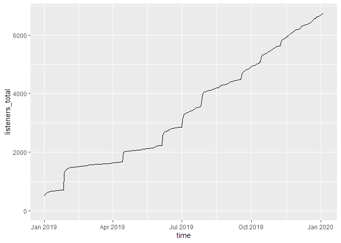
Total downloads over time
Let’s say you want to see the daily total downloads of your podcast over time, in accumulated fashion. First, you prepare the graphics data necessary:
total_dls_acc <- podlove_prepare_stats_for_graph(df_stats = downloads,
                                                 hourly = FALSE,
                                                 relative = FALSE)
Here, you are not specifying any
gvar (which means you’ll get just one curve instead of many).
hourly is set to
FALSE (= daily data) and
relative is set
FALSE (absolute dates). Now feed this data over to the plotting function:
g_tdlacc <- podlove_graph_download_curves(df_tidy_data = total_dls_acc,
                                          cumulative = TRUE,
                                          plot_type = "line",
                                          printout = FALSE)
print(g_tdlacc)
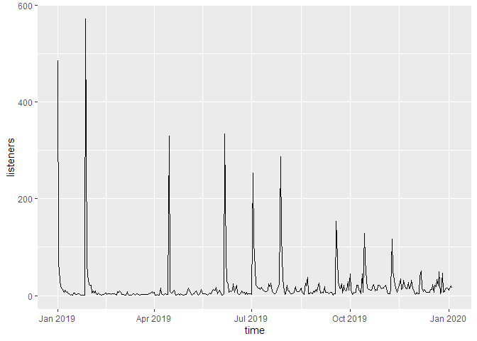
If we don’t cumulate the data, we can see the individual spikes of the episode launches:
g_tdl <- podlove_graph_download_curves(df_tidy_data = total_dls_acc,
                                          cumulative = FALSE,
                                          plot_type = "line",
                                          printout = FALSE)
print(g_tdl)
Downloads by episode
Now you want to look at the individual episodes. For this, you will need to use the
gvar parameter. For an episode overviewer, you can either set it to
title,
ep_number or
ep_num_title. Here, we’re using
title (unquoted!), and add specify the
labelmethod to show the labels at the beginning of the curves.
ep_dls_acc <- podlove_prepare_stats_for_graph(df_stats = downloads,
                                              gvar = title, # group by episode title
                                              hourly = FALSE,
                                              relative = FALSE)
g_ep_dlsacc <- podlove_graph_download_curves(df_tidy_data = ep_dls_acc,
                                             gvar = title, # use the same gvar!
                                             cumulative = TRUE,
                                             plot_type = "line",
                                             labelmethod = "first.points",
                                             printout = FALSE)
print(g_ep_dlsacc)
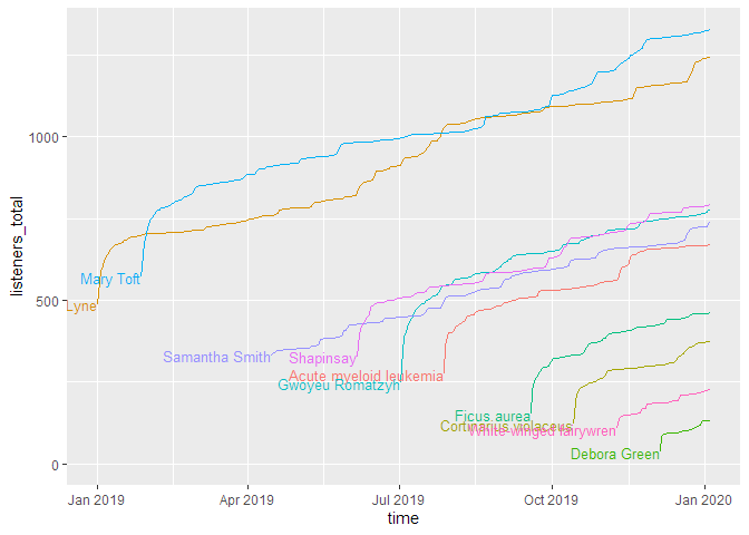
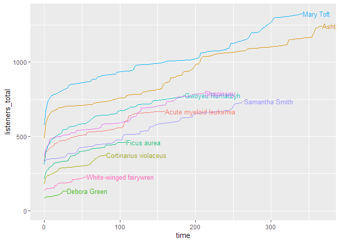
As you can see, this shows the curves spread over the calendar X axis. But how do the episodes hold up against each other? For this, we will use the parameter
relative = TRUE, which lets all curves start at the same point. The labelling paramter
labelmethod = "last.points" works better for this kind of curve.
ep_dls_acc_rel <- podlove_prepare_stats_for_graph(df_stats = downloads,
                                              gvar = title,
                                              hourly = FALSE,
                                              relative = TRUE) # relative plotting
g_ep_dlsaccrel <- podlove_graph_download_curves(df_tidy_data = ep_dls_acc_rel,
                                             gvar = title,
                                             cumulative = TRUE,
                                             plot_type = "line",
                                             labelmethod = "last.points",
                                             printout = FALSE)
print(g_ep_dlsaccrel)
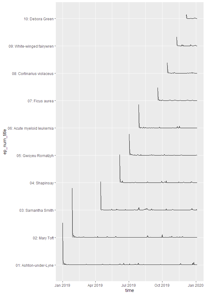
If you want to look at the uncumulated data, the line plot doesn’t work very well. For this, a ridge plot is the right choice (but only if you don’t have too many episodes):
ep_dls <- podlove_prepare_stats_for_graph(df_stats = downloads,
                                              gvar = ep_num_title, # better for sorting
                                              hourly = FALSE,
                                              relative = FALSE)
g_ep_dls <- podlove_graph_download_curves(df_tidy_data = ep_dls,
                                             gvar = ep_num_title,
                                             cumulative = FALSE, # no cumulation
                                             plot_type = "ridge", # use a ridgeline plot
                                             printout = FALSE)
print(g_ep_dls)
Downloads by other parameters
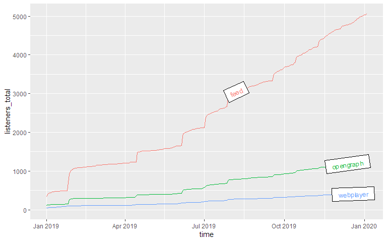
You can compare not only episodes, but also aspects of episodes or downloads. Let’s look at the parameter
source, which lists by what way our listeners get their episodes. The labelmethod here is set to
angled.boxes:
source_acc <- podlove_prepare_stats_for_graph(df_stats = downloads,
                                              gvar = source, # new gvar
                                              hourly = FALSE,
                                              relative = FALSE)
g_source_acc <- podlove_graph_download_curves(df_tidy_data = source_acc,
                                             gvar = source,  # same as above!
                                             cumulative = TRUE,
                                             plot_type = "line",
                                             labelmethod = "angled.boxes",
                                             printout = FALSE)
print(g_source_acc)
Epsiode Performance
Podcast episode downloads typically follow a “heavy front, long tail” distribution: Many downloads are made over automatic downloads by podcatchers, while fewer are downloaded in the long-term. It therefore helps to distinguish between the episode launch period (the heavy front) and the long term performance (the long tail). For this, you can use the function
podlove_performance_stats(), which creates a table of performance stats per episode. For this, you will first need to define how long a “launch” goes and when the long-term period starts. Those two don’t have to be the same. Here, we’ll use 0-3 days for the launch and 30 and above for the long-term.
perf <- podlove_performance_stats(downloads, launch = 3, post_launch = 30)
perf
#> # A tibble: 10 x 5
#>    title               dls dls_per_day dls_per_day_at_lau~ dls_per_day_after_la~
#>
#>  1 Acute myeloid le~   669        4.17               131                  1.20
#>  2 Ashton-under-Lyne  1243        3.37               198.                 1.46
#>  3 Cortinarius viol~   375        4.57                75.4                1.05
#>  4 Debora Green        132        4.40                39                  0.0333
#>  5 Ficus aurea         461        4.26                86.2                1.17
#>  6 Gwoyeu Romatzyh     776        4.16               132.                 1.23
#>  7 Mary Toft          1327        3.87               226.                 1.49
#>  8 Samantha Smith      737        2.79               133.                 1.38
#>  9 Shapinsay           791        3.72               140                  1.33
#> 10 White-winged fai~   228        4.07                61.5                0.732
colnames(perf)
#> [1] "title"                    "dls"
#> [3] "dls_per_day"              "dls_per_day_at_launch"
#> [5] "dls_per_day_after_launch"
The table shows four values per episode: The overall downlaods, the overall average downloads, the average downloads during the launch and the average downloads during the post-launch period. If you want to see a ranking of the best launches, you can just sort the list:
perf %>%
  dplyr::select(title, dls_per_day_at_launch) %>%
  dplyr::arrange(desc(dls_per_day_at_launch))
#> # A tibble: 10 x 2
#>    title                  dls_per_day_at_launch
#>
#>  1 Mary Toft                              226.
#>  2 Ashton-under-Lyne                      198.
#>  3 Shapinsay                              140
#>  4 Samantha Smith                         133.
#>  5 Gwoyeu Romatzyh                        132.
#>  6 Acute myeloid leukemia                 131
#>  7 Ficus aurea                             86.2
#>  8 Cortinarius violaceus                   75.4
#>  9 White-winged fairywren                  61.5
#> 10 Debora Green                            39
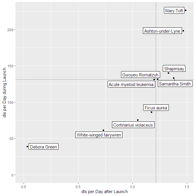
So there are episodes with different launches strengths long-term performance. Can you plot them against each other? Yes, you can! The function
podlove_graph_performance() gives you a nice four-box grid. The top right corner is showing “evergreen” episodes with strong launches and long-term performance, the top left the “shooting stars” with strong launches and loss of interest over time, the bottom right shows “slow burners” which took a while to get an audience, and the bottom left is showing… well, the rest.
g_perf <- podlove_graph_performance(perf, printout = FALSE)
print(g_perf)
Regression Analysis: Is your podcast gaining or losing listeners?
The one question every podcast producer is asking themselves is: “Is my podcast’s audience growing?”. This is not an easy question to answer, because you’re dealing with lagging time series data. One approach to deal answer the question is to calculate a regression model of downloads against time or episode number (tip of the hat to
Bernhard Fischer, who prototyped this idea). If the number of downloads after a specified date after launch is rising over time, the podcast is gaining listeners. If it falls, it’s losing listeners. If it stays stable, it’s keeping listeners.
To prepare the regression, you first need to use the function
podlove_downloads_until() to create a dataset of downloads at a specific point. The longer the period between launch and measuring point is, the more valid the model will be – but you’ll also have less data points. For this example, we’ll pick a period of 30 days after launch:
du <- podlove_downloads_until(downloads, 30)
du
#> # A tibble: 10 x 12
#>    ep_number title ep_num_title duration post_date  post_datehour
#>
#>  1 01        Asht~ 01: Ashton-~ 00:32:2~ 2019-01-01 2019-01-01 00:00:00
#>  2 02        Mary~ 02: Mary To~ 00:46:0~ 2019-01-27 2019-01-27 01:00:00
#>  3 03        Sama~ 03: Samanth~ 00:30:3~ 2019-04-15 2019-04-15 06:00:00
#>  4 04        Shap~ 04: Shapins~ 00:41:1~ 2019-06-06 2019-06-06 10:00:00
#>  5 05        Gwoy~ 05: Gwoyeu ~ 00:27:0~ 2019-07-02 2019-07-02 12:00:00
#>  6 06        Acut~ 06: Acute m~ 00:23:4~ 2019-07-28 2019-07-28 13:00:00
#>  7 07        Ficu~ 07: Ficus a~ 00:33:2~ 2019-09-18 2019-09-18 17:00:00
#>  8 08        Cort~ 08: Cortina~ 00:19:0~ 2019-10-14 2019-10-14 18:00:00
#>  9 09        Whit~ 09: White-w~ 00:18:3~ 2019-11-09 2019-11-09 20:00:00
#> 10 10        Debo~ 10: Debora ~ 00:28:5~ 2019-12-05 2019-12-05 22:00:00
#> # ... with 6 more variables: ep_age_hours , ep_age_days ,
#> #   ep_rank , measure_day , measure_hour , downloads
This dataset we can feed into the regression function
podlove_episode_regression(). You can choose if you want to use the
post_datehour parameter (better if your episodes don’t come out regularly), or
ep_rank, which corresponds to the episode number (it has a different name because episode numbers are strings):
reg <- podlove_episode_regression(du, terms = "ep_rank")
If you’re statistically inclined, you can check out the model directly and see if your model is significant:
summary(reg)
#>
#> Call:
#> stats::lm(formula = formula_string, data = df_regression_data)
#>
#> Residuals:
#>     Min      1Q  Median      3Q     Max
#> -222.21  -23.69  -11.74   57.09  155.70
#>
#> Coefficients:
#>             Estimate Std. Error t value Pr(>|t|)
#> (Intercept)   789.47      71.28  11.075 3.94e-06 ***
#> ep_rank       -64.08      11.49  -5.578 0.000523 ***
#> ---
#> Signif. codes:  0 '***' 0.001 '**' 0.01 '*' 0.05 '.' 0.1 ' ' 1
#>
#> Residual standard error: 104.3 on 8 degrees of freedom
#> Multiple R-squared:  0.7955, Adjusted R-squared:  0.7699
#> F-statistic: 31.12 on 1 and 8 DF,  p-value: 0.0005233
Or you could just check out the regression plot with the function
podlove_graph_regression() and see in which direction the line points:
g_reg <- podlove_graph_regression(du, predictor = ep_rank)
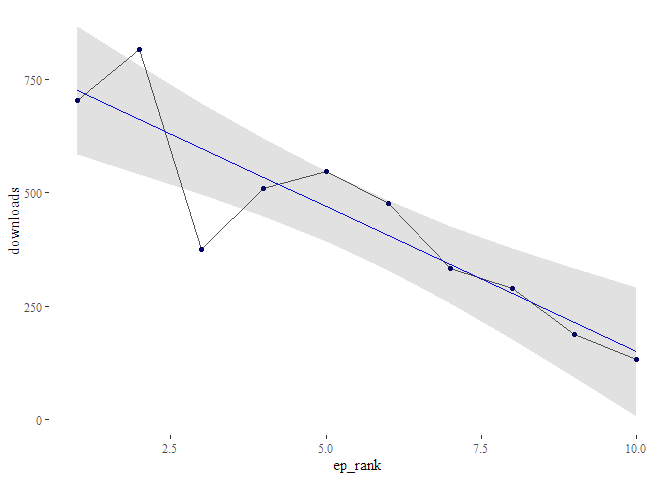
Oh noes! It seems like your podcast is steadily losing listeners at the rate of -64 listeners per episode!
Finally
There could be much more possible with Podlove data and R and
podlover. For example, some of the download data have not yet been included in the import script, such as the geolocation data. Some of the functions are still too manual and require wrapping functions to quickly analyze data. If you want to contribute, check out the GitHub repo under:
https://github.com/lordyo/podlover
And if you want to use or contribute to the Podlove project (the Podcasting tools), check out:
https://podlove.org

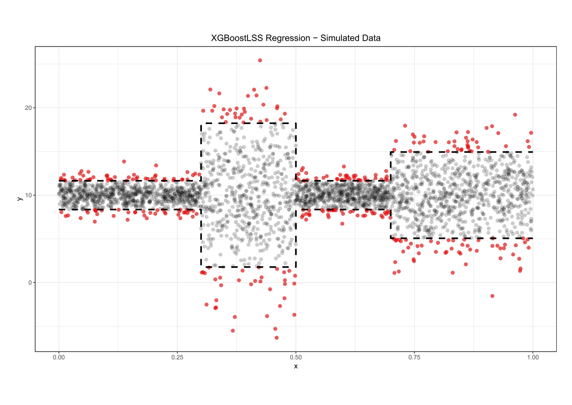
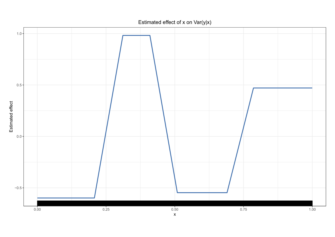
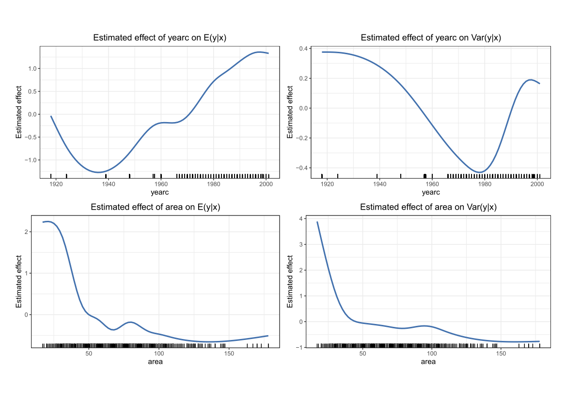
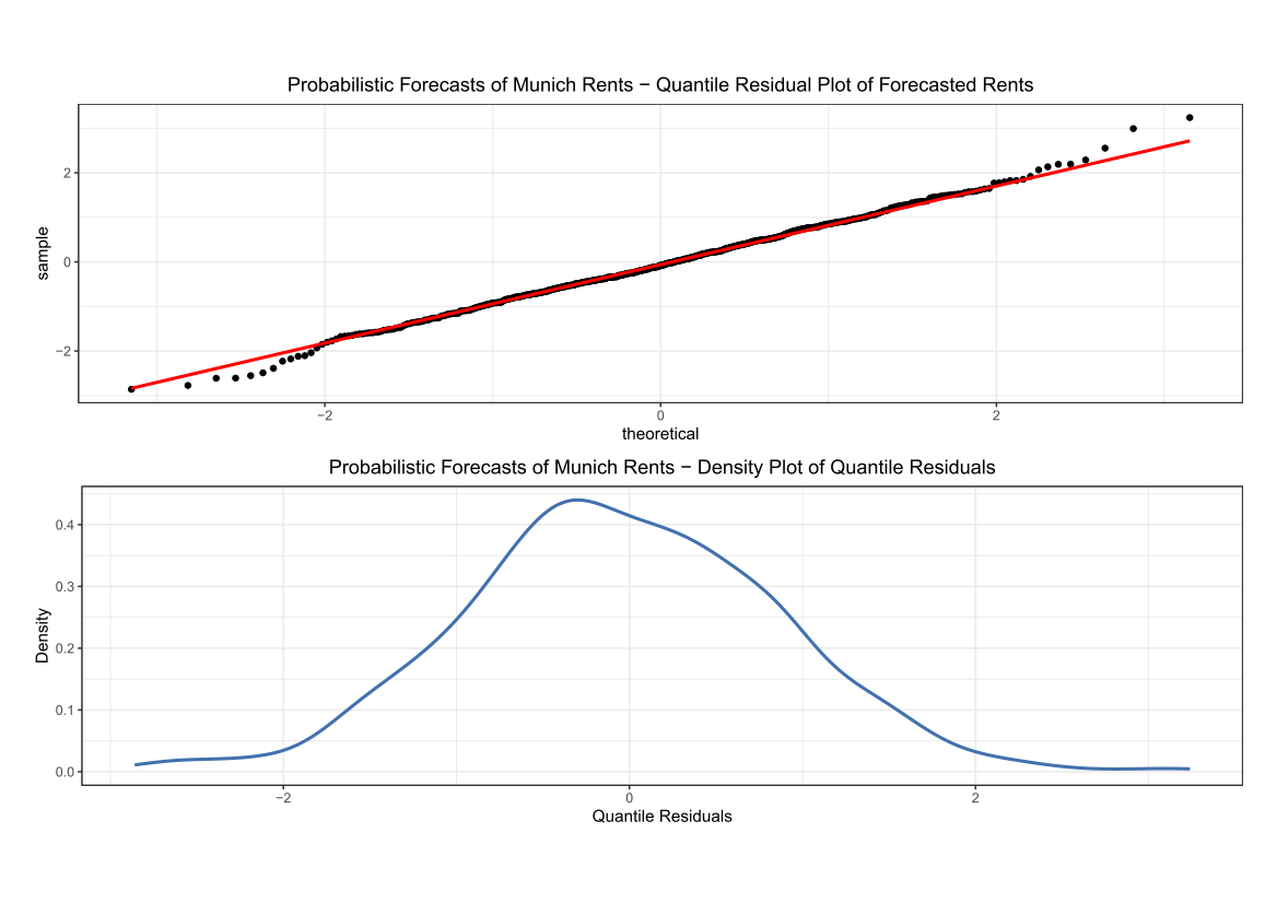
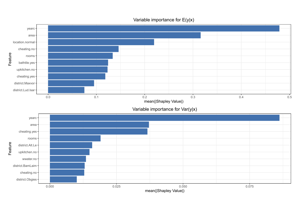
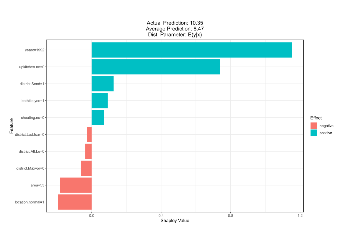
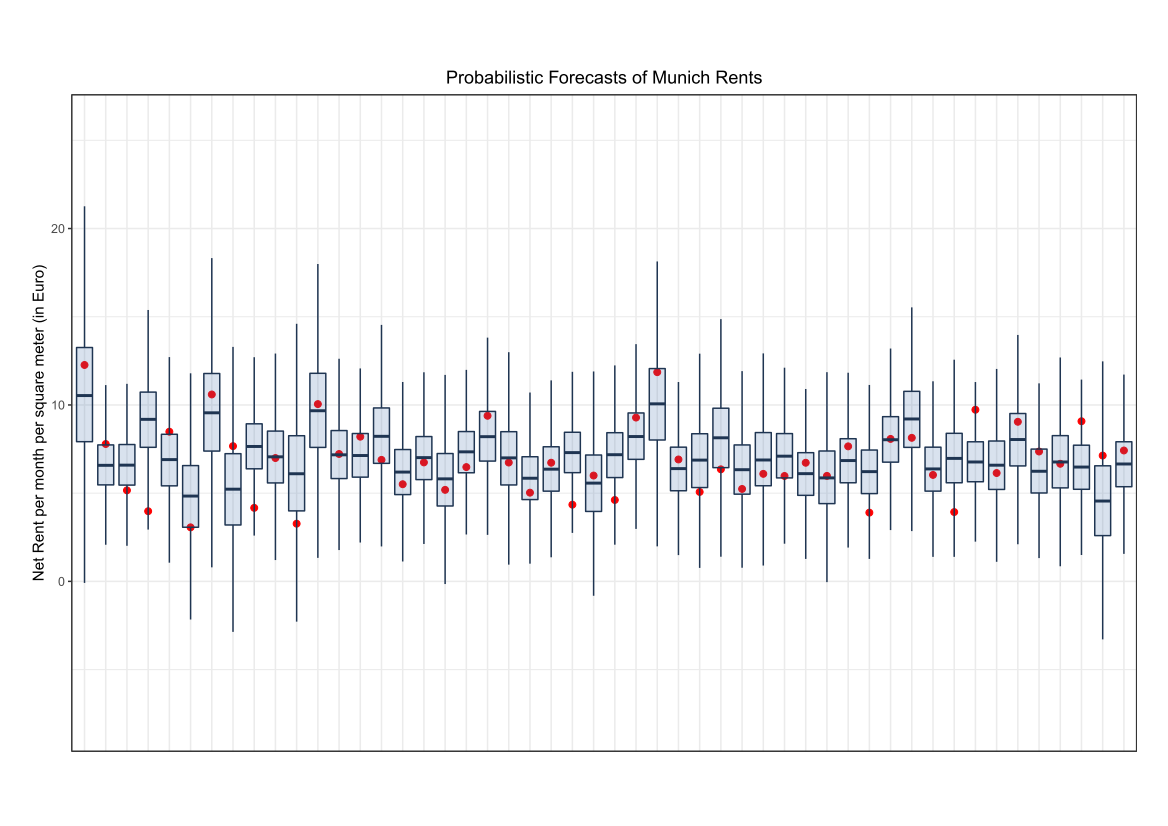
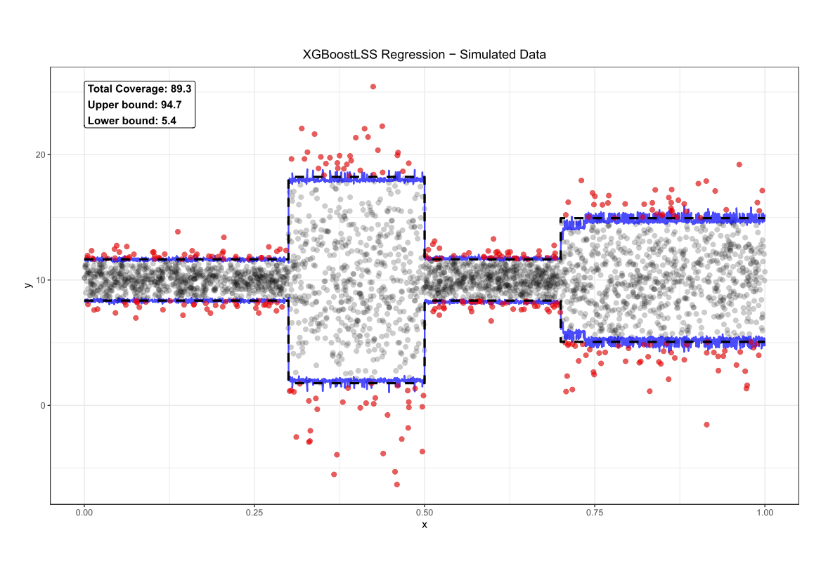 Comparing the coverage of the intervals with the nominal level of 90% shows that XGBoostLSS does not only correctly model the heteroskedasticity in the data, but it also provides an accurate forecast for the 5% and 95% quantiles. The flexibility of XGBoostLSS also comes from its ability to provide attribute importance, as well as partial dependence plots, for all of the distributional parameters. In the following we only investigate the effect on the conditional variance.