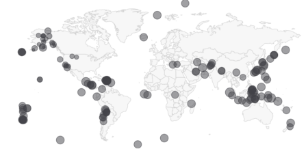
Beginners guide to Bubble Map with Shiny

Map Bubble
Map bubble is type of map chart where bubble or circle position  indicates geoghraphical location and bubble size is used to show differences in magnitude of quantitative variables like population.

We will be using
Highcharter package to show earthquake magnitude and depth . Highcharter is a versatile charting library to build interactive charts, one of the easiest to learn and for shiny integration.

Bubble Map


About dataset
Dataset used here is from US Geological survey website of recent one week earthquake events. There are about 420 recorded observation with magnitude more than 2.0 globally. Dataset has 22 variables, of which we will be using time, latitude, longitude, depth, magnitude(mag) and nearest named place of event.

Shiny Application
This application has single app.R file and earthquake dataset. Before we start with UI function, we will load dataset  and fetch world json object from highcharts map collection with hcmap function. See the app here

library(shiny)
library(highcharter)
library(dplyr)
edata <- read.csv('earthquake.csv') %>% rename(lat=latitude,lon = longitude)
wmap <- hcmap()
Using dplyr package latitude and longitude variables are renamed as lat and lon with rename verb. Column names are important. 
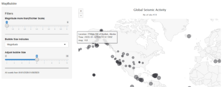

ui
It has sidebar panel with 3 widgets and main panel for displaying map.

  • Two sliders, one for filtering out low magnitude values and other for adjusting bubble  size.
  • One select widget for bubble size variable. User can select magnitude or depth of earthquake event. mag and depth are columns in dataset.
  • Widget output function highchartOutput for use in shiny.
ui <- fluidPage(
   
titlePanel("MapBubble"), # Application title
 sidebarLayout(
 sidebarPanel(     
  
   sliderInput('mag','Magnitude more than(Richter Scale)', min = 1,max = 6,step = 0.5,value = 0),
 
   selectInput('bubble','Bubble Size indicates',choices = c('Magnitude'= 'mag','Depth(in Km)' = 'depth')),

   sliderInput('bublesize','Adjust bubble Size',min = 2,max = 10,step = 1,value = 6)      
        ),
      
      # Display a Map Bubble
      mainPanel(
        highchartOutput('eqmap',height = "500px")         
      )
   )
)
Server
Before rendering, we will filter the dataset within reactive context. Any numeric column that we want to indicate with bubble size should be named z. input$bubble comes from select widget. 

renderHighchart is render function for use in shiny. We will pass the filtered data and chart type as mapbubble in hc_add_series function. Place, time and z variable are displayed in the tooltip with “point” format. 
Sub-title is used to show no. of  filtered observation  in the map

 
  server <- function(input, output) { 
  data <- reactive(edata %>% 
               filter(mag >= input$mag) %>%
               rename(z = input$bubble))


output$eqmap <-renderHighchart(
  
 wmap %>% hc_legend(enabled = F) %>%

  hc_add_series(data = data(), type = "mapbubble", name = "", maxSize = paste0(input$bublesize,'%')) %>% #bubble size in perc %

 hc_tooltip(useHTML = T,headerFormat='',pointFormat = paste('Location :{point.place} 
 Time: {point.time} 
',input$bubble,': {point.z}')) %>%

 hc_title(text = "Global Seismic Activity") %>%
 hc_subtitle(text = paste('No of obs:', nrow(data()),sep = '')) %>%
 hc_mapNavigation(enabled = T)%>%
 )
}

# Run the application 
shinyApp(ui = ui, server = server)
Shiny R file can be found here at the github repository

Choropleth maps with Highcharts and Shiny

We use Choropleth maps to show differences in colors or shading of pre-defined regions like states or countries, which correspond to differences in quantitative values like total rainfall, average temperature, economic indicators etc


In our case we will use sales of a toy making company, as quantitative value, in different countries around the world. See example with this shiny app


Highcharter is a R wrapper for Highcharts javascript based charting  modules.

Rendering Choropleth Maps with Highcharts in Shiny

  • To see Highcharts/Shiny interaction, we will begin by creating basic Shiny dashboard layout: It contains a single select widget and single tab for displaying map.

library(shiny)
library(shinydashboard)
library(highcharter)
library(countrycode)
library(dplyr)

sales <- read.csv('salespoint.csv')
ui<-

dashboardPage(
dashboardHeader(title = "Map"),

dashboardSidebar(
sidebarMenu(
selectInput('yearid','Select Year',choices = c(2003,2004,2005),selected = 2003)
)),

dashboardBody(
tabBox(title = 'ToyShop',id = 'tabset1',width = 12, tabPanel('World-Sales',highchartOutput('chart',height = '500px')))

)
)


  • In server function, filtering and summarize data with dplyr library and create a reactive object
server <- function(input, output, session){

total <- reactive(
{
sales %>%
filter(YEAR_ID == as.numeric(input$yearid)) %>%
group_by(COUNTRY) %>%
summarize("TOTAL_SALES" = as.integer(sum(SALES))) %>%
mutate(iso3 = countrycode(COUNTRY,"country.name","iso3c"))
}
)


Here we used library countrycode to convert long country names into one of many coding schemes. Adding new column iso3 in the summarized data with mutate function.

  • Passing reactive object in renderHighchart function. Customizing tooltip and sub-title content with reactive widgets.

output$chart <- renderHighchart(highchart(type = "map") %>%
hc_add_series_map(map = worldgeojson, df = total(), value = "TOTAL_SALES", joinBy = "iso3") %>%
hc_colorAxis(stops = color_stops()) %>%
hc_tooltip(useHTML=TRUE,headerFormat='',pointFormat = paste0(input$yearid,' {point.COUNTRY} Sales : {point.TOTAL_SALES} ')) %>%
hc_title(text = 'Global Sales') %>%
hc_subtitle(text = paste0('Year: ',input$yearid)) %>%
hc_exporting(enabled = TRUE,filename = 'custom')
)
}


Dataset and shiny R file can be downloaded from here

Predicting and visualizing user-defined data point with K-Nearest Neighbors

K-nearest neighbors is easy to understand supervised learning method which is often used to solve classification problems.  The algorithm assumes that similar objects are closer to each other.


To understand it better and keeping it simple, explore this  shiny app, where user can define data point, no. of neighbors and predict the outcome. Data used here is popular Iris dataset and ggplot2 is used for visualizing existing data and user defined data point. Scatter-plot and table are updated for each new observation.

shinyapp   

Data is more interesting in overlapping region between versicolor and virginica.  Especially at K=2 error is more vivid, as same data point is classified into different categories. In the overlapping region, if there is a tie between different categories outcome is decided randomly.

One can also see accuracy  with 95% Confidence Interval for different values K neighbors with 80/20 training-validation data . While classification is done with ‘class’ package, accuracy is calculated with ‘caret’ library.