How do I count thee? Let me count the ways?
by Jerry Tuttle
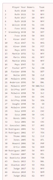
In Major League Baseball, a player who hits 50 home runs in a single season
has hit a lot of home runs. Suppose I want to count the number of 50 homer
seasons by team, and also the number of 50 homer seasons by New York Yankees.
(I will count Maris and Mantle in 1961 as two.) Here is the data including Aaron Judge’s 62 in 2022
:
You would think base R would have a count function such as count(df$Team) and
count(df$Team == “NYY”) but this gives the error “could not find function
‘count'”. Base R does not have a count function.
Base R has at last four ways to perform a count:
1. The table function will count items in a vector.
table(df$Team) presents results horizontally, and data.frame(table(df$Team))
presents results vertically. table(df$Team == “NYY”) displays results 37
false and 10 true, while table(df$Team == “NYY”)[2] just displays the result 10 true.
2. The sum function can be used to count the number of rows meeting a
condition. sum(df$Team == “NYY”) displays the result 10. Here
df$Team == “NYY” is creating a logical vector, and sum is summing the number
of true = 1.
3. Similar to sum, nrow(df[df$Team == “NYY”, ]) counts the number of rows
meeting the NYY condition.
4. The length function counts the number of elements in an R object.
length(which(df$Team == “NYY”)) , length(df$Team[df$Team ==
“NYY”]) , and length(grep(“NYY”, df[ , “Team”])) are all ways that will count
the 10 Yankees.
The more direct solution to counting uses the count function in the dplyr
library. Note that dplyr’s count function applies to a data frame or tibble,
but not to a vector. After loading library(dplyr) ,
1. df %>% count(Team) lists the count for each team.
2. df %>% filter(Team = “NYY”) lists each Yankee, and you can see there are
10.
3. df %>% count(Team == “NYY”) displays 37 false and 10 true, while df %>%
filter(Team == “NYY”) %>% count() just displays the 10 true.
The following is a bar chart of the results by team for teams with at least 1
50 homer season:

Finally, “How do I count thee? Let me count the ways?” is of course adapted from
Elizabeth Barrett Browning’s poem “How do I
love thee? Let me count the
ways?” But in her poem, just how would we count the number of times “love” is
mentioned? The tidytext library makes counting words fairly easy, and the answer
is ten, the same number of 50 homer Yankee seasons. Coincidence?
The following is all the R code. Happy counting!
  library(dplyr)

  library(ggplot2)

  library(tidytext)


  df <- data.frame(

     Player=c('Ruth','Ruth','Ruth','Ruth','Wilson','Foxx','Greenberg','Foxx','Kiner','Mize','Kiner','Mays','Mantle','Maris',
  'Mantle','Mays','Foster','Fielder','Belle','McGwire','Anderson','McGwire','Griffey','McGwire','Sosa','Griffey',
  'Vaughn','McGwire','Sosa','Sosa','Bonds','Sosa','Gonzalez','Rodriguez','Rodriguez','Thome','Jones','Howard','Ortiz',
  'Rodriguez','Fielder','Bautista','Davis','Stanton','Judge','Alonso','Judge'),


     Year=c(1920,1921,1927,1928,1930,1932,1938,1938,1947,1947,1949,1955,1956,1961,1961,1965,1977,1990,1995,1996,1996,1997,1997,
  1998,1998,1998,1998,1999,1999,2000,2001,2001,2001,2001,2002,2002,2005,2006,2006,2007,2007,2010,2013,2017,2017,2019,2022),


     Homers=c(54,59,60,54,56,58,58,50,51,51,54,51,52,61,54,52,52,51,50,52,50,58,56,70,66,56,50,65,63,50,73,64,57,52,57,52,51,
  58,54,54,50,54,53,59,52,53,62),

     Team=c('NYY','NYY','NYY','NYY','CHC','PHA','DET','BOS','PIT','NYG','PIT','NYG','NYY','NYY','NYY','SF','CIN','DET','CLE',
  'OAK','BAL','OAK/SLC','SEA','SLC','CHC','SEA','SD','SLC','CHC','CHC','SF','CHC','ARI','TEX','TEX','CLE','ATL','PHP',
  'BOR','NYY','MIL','TOR','BAL','MIA','NYY','NYM','NYY'))


head(df)

# base R ways to count:


  table(df$Team)    # shows results horizontally

  data.frame(table(df$Team))    #shows results vertically

  table(df$Team == "NYY")    # displays 37 false and 10 true


  table(df$Team == "NYY")[2]


sum(df$Team == "NYY")    # displays the result 10.


  nrow(df[df$Team == "NYY", ])    # counts the number of rows
  meeting the NYY condition.


  length(which(df$Team == "NYY"))     # which returns a vector of
  indices which are true

  length(df$Team[df$Team == "NYY"])

  length(grep("NYY", df[ , "Team"]))     # grep returns a vector
  of indices that match the pattern


# dplyr R ways to count; remember to load library(dplyr):

df %>% count(Team)    # lists the count for each team.


  df %>% filter(Team == "NYY")    # lists each Yankee, and you
  can see there are 10.


  df %>% count(Team == "NYY")    # displays 37 false and 10 true,
  while
 df %>% filter(Team == "NYY") %>% count()    #
  just displays the 10 true.


  # barplot of all teams with at least 1 50 homer season; remember to load
  library(ggplot2)


  df %>%

      group_by(Team) %>%

      summarise(count = n()) %>%

      ggplot(aes(x=reorder(Team, count), y=count, fill=Team)) +


      geom_bar(stat = 'identity') +

      ggtitle("Count of 50 Homer Seasons") +

      xlab("Team") +

      scale_y_continuous(breaks=c(1,2,3,4,5,6,7,8,9,10)) +

      coord_flip() +

      theme(plot.title = element_text(face="bold", size=18)) +


      theme(axis.title.y = element_text(face="bold")) +

      theme(axis.title.x = element_blank()) +

      theme(axis.text.x = element_text(size=12, face="bold"),


      axis.text.y = element_text(size=12, face="bold")) +

      theme(legend.position="none")


  # count number of times "love" is mentioned in Browning's poem; remember to
  load library(tidytext)


  textfile <- c("How do I love thee? Let me count the ways.",

  "I love thee to the depth and breadth and height",

  "My soul can reach, when feeling out of sight",

  "For the ends of being and ideal grace.",

  "I love thee to the level of every day's",

  "Most quiet need, by sun and candle-light.",

  "I love thee freely, as men strive for right.",

  "I love thee purely, as they turn from praise.",

  "I love thee with the passion put to use", <br

  "In my old griefs, and with my childhood's faith.",

  "I love thee with a love I seemed to lose",

  "With my lost saints. I love thee with the breath,", <br

  "Smiles, tears, of all my life; and, if God choose,",

  "I shall but love thee better after death.")


  df<-data.frame(line=1:length(textfile), text=textfile) <br <br

  df_words % unnest_tokens(word, text) <br

  cleaned_words % anti_join(get_stopwords())

  cleaned_words %>% count(word, sort = TRUE) %>% head(6)

  cleaned_words %>% filter(word == "love") %>% count()