It has been two years since I started to develop various interactive web applications by using R-Shiny packages. Due to Coronavirus disease (COVID-19) at this moment, I spent some time at home on preparing a simple COVID-19 related Dashboard. To share my experiences and consideration, especially those about how to create interactive maps, the following details has been discussed.
Data Source
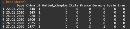
Dataset (data/key-countries-pivoted.csv) from Github (https://github.com/datasets/covid-19), which contains the data of daily confirmed cases of COVID-19 since 22th Jan 2020 from the eight most rapidly-spread countries (China, USA, United Kingdom, Italy, France, Germany, Spain and Iran), has been used. An example of overview of the dataset is given as follows:
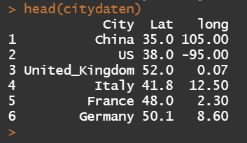
 In addition, the geographic coordinates (Latitude and Longitude) of the centroids of these countries have been collected for placing charts in the leaflet map.
R Shiny: Introduction
Shiny application consists of two components, a user interface object and a server function. In user interface object, you are able to create dynamic dashboard interface, while the server function contains code provides an interactive connection between objects used for input and output. The UI object and server function will be further listed, respectively.
R library
We use the R library leaflet, which is a Javascript Library and allows users to create and customize interactive maps. For more details, we refer users to the link: https://cran.r-project.org/web/packages/leaflet/index.html
 library(shiny)
 library(leaflet.minicharts)
 library(leaflet)
Shiny-UI
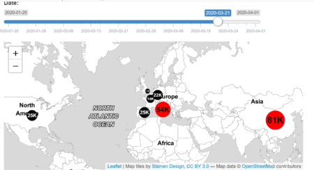
The user Interface is constructed as follows, where two blocks are included. The upper block shows the worldwide COVID-19 distribution and the total number of the confirmed cases of each country. The amount of cases is labelled separately and those countries with more than 500,000 cases are marked as red, otherwise black. Note that the function leafletOutput() is used for turning leaflet map object into an interface output.
 In the lower block, we are able to visualize the time dependent development of confirmed cases for a selected country and time history. The classical layout sideBarLayout, which consists of a sidebar (sidebarPanel()) and the main area (mainPanel()), is used. Moreover, a checkbox is provided to select whether plotting the daily new confirmed cases is desired.
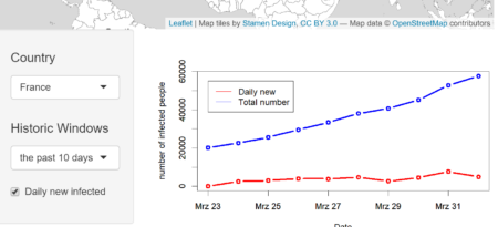
The R code for UI is given as follows:
 ui<- fluidPage(
   #Assign Dasbhoard title
   titlePanel("COVID19 Analytics"),

  # Start:  the First Block
  # Sliderinput: select from the date between 01.20.2020
  # and 01.04.2020
  sliderInput(inputId = "date", "Date:", min =
  as.Date("2020-01-20"), max = as.Date("2020-04-01"),
  value = as.Date("2020-03-01"), width = "600px"),

  # plot leaflet object (map)
  leafletOutput(outputId = "distPlot", width = "700px",
  height = "300px"),
  #End:  the First Block

  #Start: the second Block
  sidebarLayout(

    #Sidebar Panel: the selected country, history and
    #whether to plot daily new confirmed cases.
    sidebarPanel(
      selectInput("selectedcountry", h4("Country"), choices
      =list("China","US","United_Kingdom","Italy","France",
      "Germany", "Spain"), selected = "US"),
      selectInput("selectedhistoricwindow", h4("History"),
      choices = list("the past 10 days", "the past 20
      days"), selected = "the past 10 days"),
      checkboxInput("dailynew", "Daily new infected",
      value = TRUE),
      width = 3
    ),

    #Main Panel: plot the selected values
    mainPanel (
      plotOutput(outputId = "Plotcountry", width = "500px",
      height = "300px")
    )
  ),
  #End: the second Block
)
Shiny-ServerInput and output objects are connected in the Server function. Note that, the input arguments are stored in a list-like object and each input argument is identified under its unique name, for example the sliderInput is named after “date”.
server <- function(input, output){

  #Assign output$distPlot with renderLeaflet object
  output$distPlot <- renderLeaflet({

    # row index of the selected date (from input$date)
    rowindex = which(as.Date(as.character(daten$Date),
    "%d.%m.%Y") ==input$date)

    # initialise the leaflet object
    basemap= leaflet()  %>%
      addProviderTiles(providers$Stamen.TonerLite,
      options = providerTileOptions(noWrap = TRUE))

    # assign the chart colors for each country, where those
    # countries with more than 500,000 cases are marked
    # as red, otherwise black
    chartcolors = rep("black",7)
    stresscountries
    = which(as.numeric(daten[rowindex,c(2:8)])>50000)
    chartcolors[stresscountries]
    = rep("red", length(stresscountries))

    # add chart for each country according to the number of
    # confirmed cases to selected date
    # and the above assigned colors
    basemap %>%
      addMinicharts(
        citydaten$long, citydaten$Lat,
        chartdata = as.numeric(daten[rowindex,c(2:8)]),
        showLabels = TRUE,
        fillColor = chartcolors,
        labelMinSize = 5,
        width = 45,
        transitionTime = 1
      )
  })

  #Assign output$Plotcountry with renderPlot object
  output$Plotcountry <- renderPlot({

    #the selected country
    chosencountry = input$selectedcountry

    #assign actual date
    today = as.Date("2020/04/02")

    #size of the selected historic window
    chosenwindow = input$selectedhistoricwindow
    if (chosenwindow == "the past 10 days")
       {pastdays = 10}
    if (chosenwindow  == "the past 20 days")
       {pastdays = 20}

    #assign the dates of the selected historic window
    startday = today-pastdays-1
    daten$Date=as.Date(as.character(daten$Date),"%d.%m.%Y")
    selecteddata
    = daten[(daten$Date>startday)&(daten$Date<(today+1)),
    c("Date",chosencountry)]

    #assign the upperbound of the y-aches (maximum+100)
    upperboundylim = max(selecteddata[,2])+100

    #the case if the daily new confirmed cases are also
    #plotted
    if (input$dailynew == TRUE){

      plot(selecteddata$Date, selecteddata[,2], type = "b",
      col = "blue", xlab = "Date",
      ylab = "number of infected people", lwd = 3,
      ylim = c(0, upperboundylim))
      par(new = TRUE)
      plot(selecteddata$Date, c(0, diff(selecteddata[,2])),
      type = "b", col = "red", xlab = "", ylab =
      "", lwd = 3,ylim = c(0,upperboundylim))

      #add legend
      legend(selecteddata$Date[1], upperboundylim*0.95,
      legend=c("Daily new", "Total number"),
      col=c("red", "blue"), lty = c(1,1), cex=1)
    }

    #the case if the daily new confirmed cases are
    #not plotted
    if (input$dailynew == FALSE){

      plot(selecteddata$Date, selecteddata[,2], type = "b",
      col = "blue", xlab = "Date",
      ylab = "number of infected people", lwd = 3,
      ylim = c(0, upperboundylim))
      par(new = TRUE)

      #add legend
      legend(selecteddata$Date[1], upperboundylim*0.95,
      legend=c("Total number"), col=c("blue"),
      lty = c(1), cex=1)
    }

  })

}
Shiny-UIAt the end, we create a complelte application by using the shinyApp function.
shinyApp(ui = ui, server = server)The Dashboard is deployed under the following URL: https://sangmeng.shinyapps.io/COVID19/