The purpose of our Multinav package is to ingest multivariate data streams, compute multivariate summaries, and allow us to query the data interactively when an anomaly is detected.
In the following example we look into an agricultural IoT use-case, and try to detect sensors with anomalous readings. The data consists of hourly measurements, during 5 days, of the girth of 100 avocado trees. For each such tree, an anomaly score is computed using four variation of Hotelling’s T2 statistic. The full details are available in the official documentation.
This one line of code will produce the following dashboard:
MultiNav(data, type = "scores", xlbl="Date id")
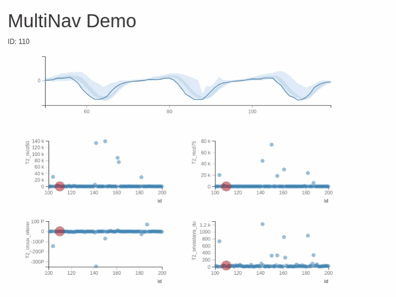
Crucially for our purposes, this dashboard is interactive. Charts are linked so that one may hover over a particular point, and it will light in all panels (JMP and S+ style). Hovering over a point will also draw the raw evolution of the measurement in time and compare it to the group via a functional boxplot.
There is a lot more that MultiNav can do. The details can be found in the inline-help, and the official documentation. For the purpose of this blog, we merely summarize the reasons we find Multinav very useful:
1. Interactive visualizations that link anomaly score with raw data.
2. Functional boxplot for querying the source of the anomalies.
3. Out-of-the-box multivariate scoring functions, with the possibility of extension by the user.
4. The interactive component are embeddable in Shiny apps, for a full blown interactive dashboard.