So far, we have found and recorded 423 COVID posts in English. In an effort to encourage others to explore such posts, we’ve published a Shiny web app which allow users to find the names of the 231 bloggers who wrote those posts, their roles, and their country of focus. The app also lets users interactively search the collection of posts by primary topic, post title, date, and whether the post uses a particular mathematical technique or data source. To learn more about the evolution of this dataset, one of the authors (Rees) has published nine articles on Medium, which you can find here.
We encourage users to submit their own posts-or others’ posts-for inclusion, which can be done on this Google Form. Our dataset, as well as the code for the Shiny app, is available on GitHub. If anyone has corrections to the dataset, please write Rees (at) ReesMorrison (dot) com.
The remainder of this post highlights some of the findings from the dataset of COVID-19 posts. As will be made evident by the plots that follow, this is by no means a comprehensive review of every COVID-19 R blog post, but rather an overview of the data that we have found.
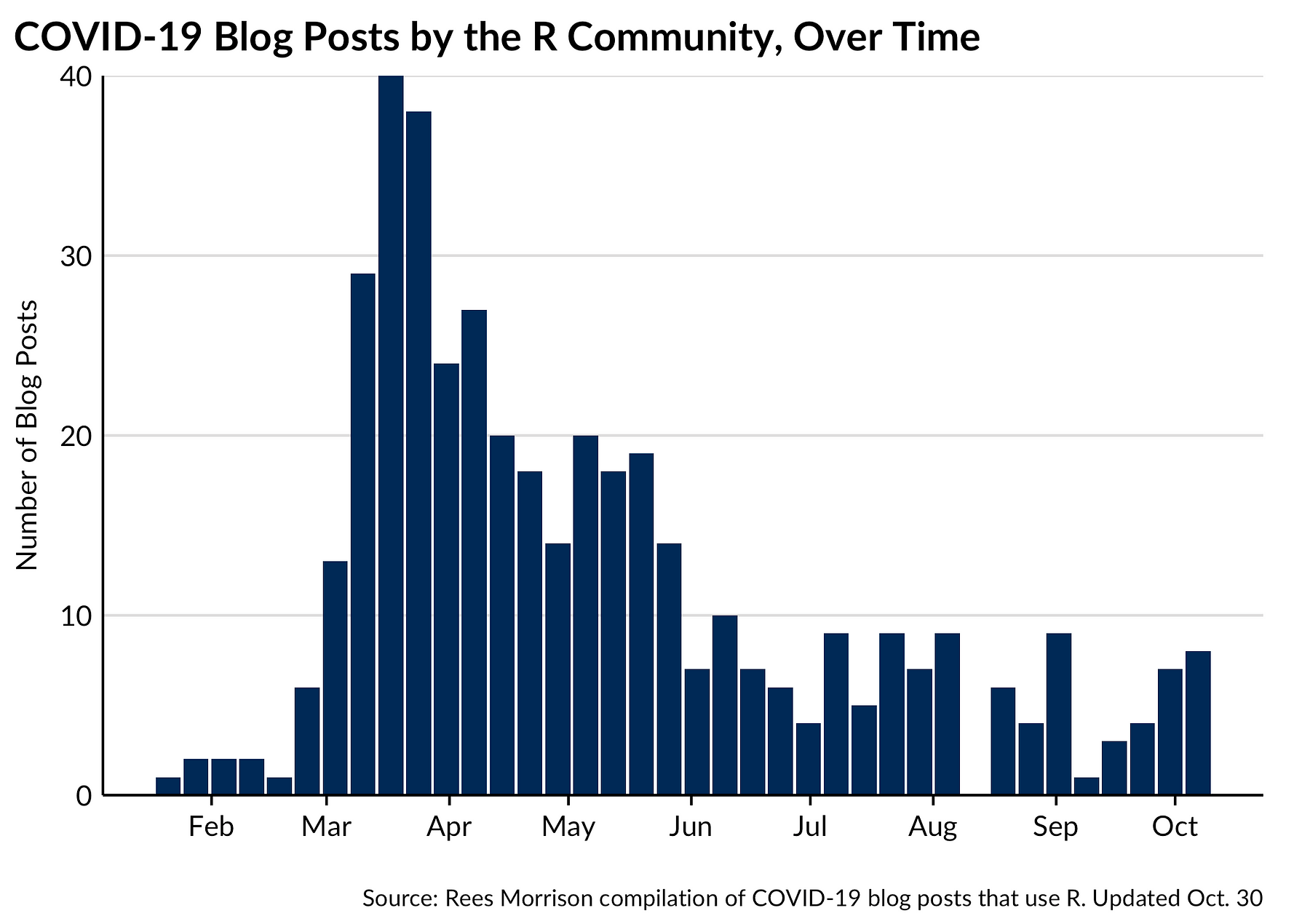
Posts Over Time
As the pandemic has progressed, fewer bloggers have engaged with COVID-related data, as we notice that blog posts peaked in March of 2020.
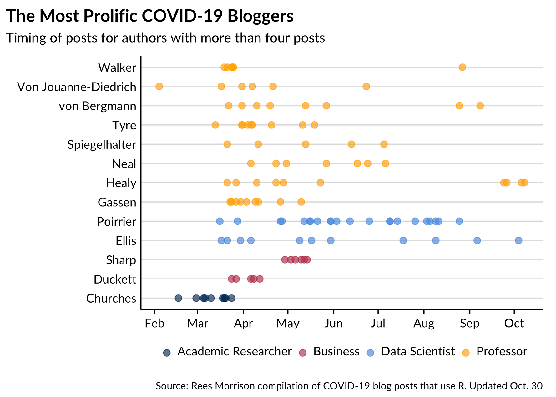
Some bloggers have been prolific; many more have been one and done. The plot below shows the names and posts of the 23 bloggers who have so far published at least four posts. For an example of how to read the plot, Tim Churches, at the bottom of the y-axis, has published a total of nine posts, but none after early April.
The color of the points corresponds to the work role of the blogger as explained in the legend at the bottom. It is immediately apparent that professors and academic researchers predominate in this group of bloggers. If you include the postgraduate students, universities writ large account for nearly all of the prolific bloggers.
Roles of Authors
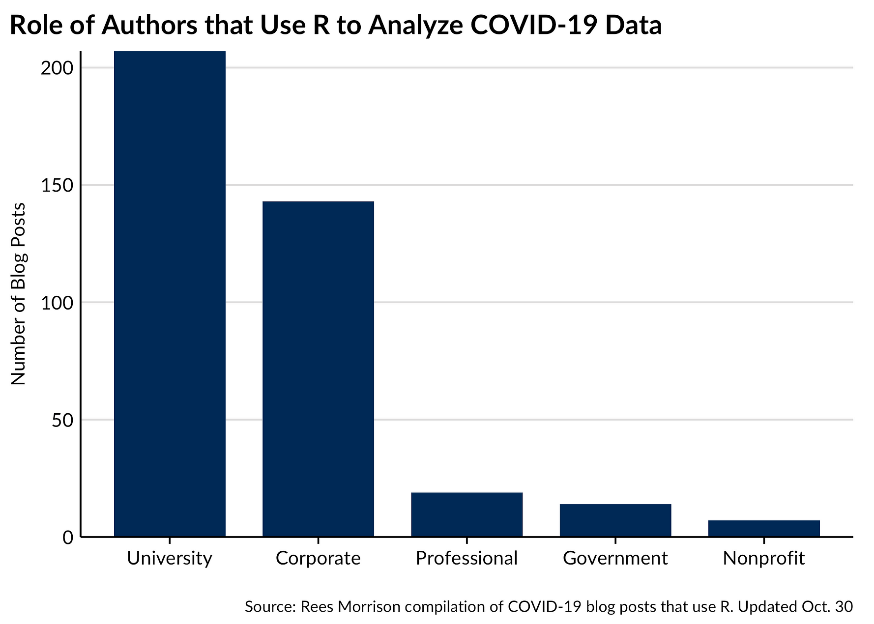
The bloggers in our dataset describe their work-day roles in a variety of ways. One of the authors (Rees) standardized these job roles by categorizing the multitude of terms and descriptions, but it is quite possible that this effort misrepresented what some of these bloggers do for a living. We welcome corrections.
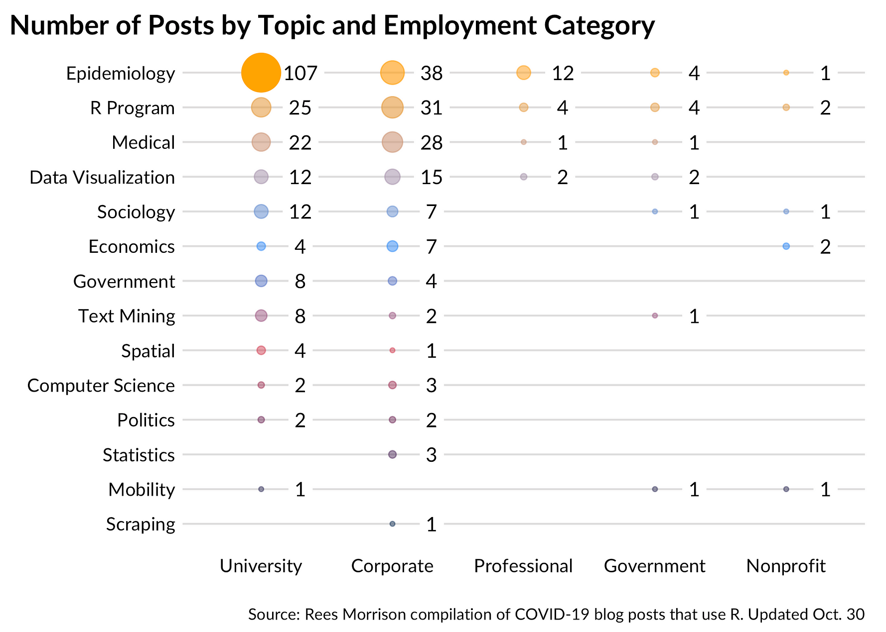
We’ve further categorized roles into a broad typology where professions fall into one of five categories: university, corporate, professional, government, and nonprofit. Those broader categories are represented as columns in the following chart.
Data Sources
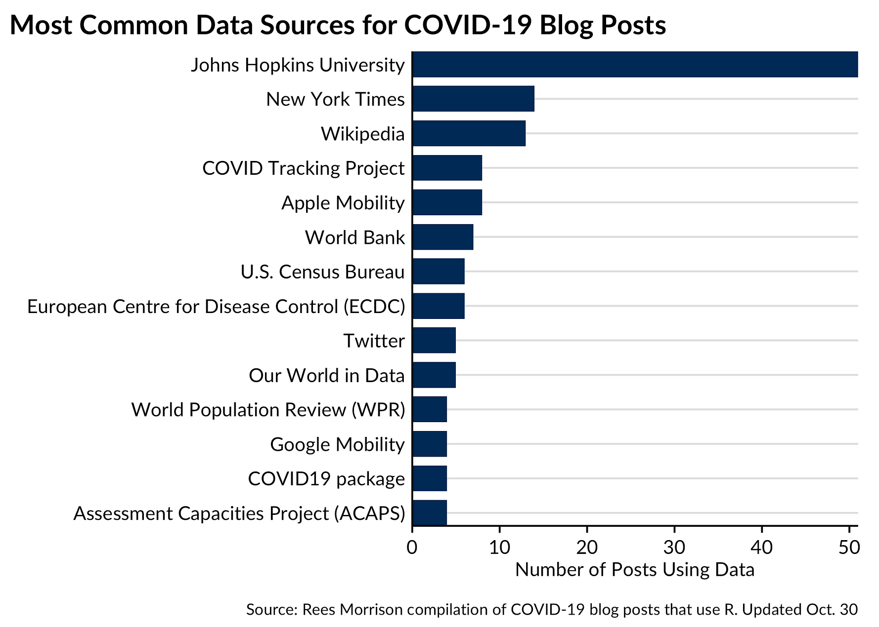
A greater number of data sources related to COVID-19 will yield richer insights. Combining different datasets can shed new light on an issue, yield improvements, and allow authors to contruct better indices and measures. For that reason, one of the authors (Rees) extracted dataset information from our collection of blog posts.
For the most part, bloggers identified the data source they drew on for their analysis. On occasion, we had to apply some effort to standardize the 140 data sources.
By far the most prevalent data source is Johns Hopkins University, who early, comprehensively and consistently has set the standard for COVID-19 data collection and dissemination to the public.
Blog Post Topics
It may also be the case that readers want a summary of blogs, or to only look at posts that pertain to a certain topic. Assigning each blog post a primary topic introduces a fair amount of subjectivity, to be sure, but the hope is that these broad topics will help researchers find content and colleagues who share similar interests.
Here, a balloon plot shows various categories that the 423 posts address as their primary topic. Topics fall on the y axis and the blogger’s category of employment is on the x axis. The size (and opacity) of each bubble represents the count of posts that match that combination. Epidemiology leads the way, as might be expected, but quite a few posts seem to use COVID data to showcase something else, or apply R in novel ways.
Concluding Thoughts
We encourage you to use our Shiny application to explore the data for yourself. If you’d like to submit your post to be included, fill out this Google Form.
As we note in the footer of the application, the R community is intelligent and produces interesting content, but not all of us are experts when it comes to COVID-19. Engaging with these posts will allow you to better understand the application of R to our current moment, and perhaps provide feedback to post authors. We do not endorse the findings of any particular author and encourage you to find accurate, relevant, and recent information from reputable sources such as the CDC and the WHO.