Gaussian Simulation of Spatial Data Using R

Gaussian Simulation of Spatial Data Using R

Richard E. Plant

This post is a condensed version of an Additional Topic to accompany Spatial Data Analysis in Ecology and Agriculture using R, Second Edition. The full version together with the data and R code can be found in the Additional Topics section of the book’s website, http://psfaculty.plantsciences.ucdavis.edu/plant/sda2.htm Chapter and section references are contained in that text, which is referred to as SDA2.

1.     Introduction

Probably the most common task in spatial data analysis is to estimate the values of some quantity at locations other than those at which it was measured. Beginning GIS classes often emphasize the use of spatial interpolation methods such as inverse distance weighting and kriging to carry out this task, and these are indeed important tools. They are not the whole story, however, and for some applications they may actually give results that lead to incorrect conclusions. A common alternative to interpolation is a method called conditional simulation. The purpose of this post is to describe conditional simulation, in particular conditional Gaussian simulation, to compare it with interpolation, and to show how to program it in R. We will also touch on the related topic of unconditional Gaussian simulation and see how the two differ. To demonstrate conditional simulation we need a data set that is densely defined in space so that we may sample from it, use the sample data to predict population values at unsampled points, and compare these predicted values with the true data values. The yield monitor data associated with Data Set 4 of SDA2 are very suitable for this purpose. In particular, we will use the wheat yield data of Field 2. A cleaned version of this data set was developed in Section 6.3.2 of SDA2, and this was converted to a regular grid. Fig. 1 shows the full gridded data set. The grid has 144 cells in the east-west direction and 72 cells in the north-south direction. Also shown in the figure are the 78 points at which field sample data were collected. The locations of these points in the grid were set to the closest grid cell to each sample point. Here is a part of the code showing the names of the R data objects and the assignment of sample point locations. > data.Set4.2 <- read.csv(“set4\\set4.296sample.csv”, header = TRUE)
> Y.full.data.sf <- st_read(“Created\\Set42pop.shp”)
> Y.full.data.sp <- as(Y.full.data.sf, “Spatial”)
> gridded(Y.full.data.sp) <- TRUE
> proj4string(Y.full.data.sp) <- CRS(“+proj=utm +zone=10
    +ellps=WGS84″)

> sample.coords <- cbind(data.Set4.2$Easting, data.Set4.2$Northing)                      
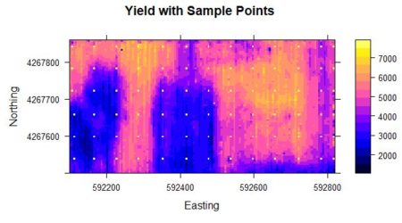
Figure 1. Yield population data. The sample points are shown as bright yellow pixels.

As was discussed in SDA2, the areas in the western half of the field with very low yield were the result of a failed herbicide application due to equipment malfunction. We will use the sample points to extract from the full grid the data values that will be used to develop our kriging interpolations and conditional simulations. We will also need the record numbers of the sample points.

> closest.point <- function(sample.pt, grid.data){
+    dist.sq <- (coordinates(grid.data)[,1]-sample.pt[1])^2 +
+       (coordinates(grid.data)[,2]-sample.pt[2])^2
+    return(which.min(dist.sq))
+ }
> samp.pts <- apply(sample.coords, 1, closest.point,
+   grid.data = Y.full.data.sp)
> data.Set4.2$ptno <- samp.pts
> data.Set4.2$Yield <- Y.full.data.sp$Yield[samp.pts]
 The kriging analysis is similar, but not identical, to the analysis carried out in Sec. 6.3.2 of SDA2. > # Convert data.Set4.2 to a Spatial Points Data Frame
> # This is needed for the function krige()
> data.Set4.2.sp <- data.Set4.2
> coordinates(data.Set4.2.sp) <- c(“Easting”, “Northing”)
> proj4string(data.Set4.2.sp) <- CRS(“+proj=utm +zone=10
+   +ellps=WGS84″)
> # Kriging
> data.var <- variogram(object = Yield ~ 1, locations =
+    data.Set4.2.sp, cutoff = 600)
> data.fit <- fit.variogram(object = data.var, model =
+    vgm(150000, “Sph”, 250, 1))
> Yield.krige <- krige(formula = Yield ~ 1,
+    locations = data.Set4.2.sp, newdata = Y.full.data.sp,
+    model = data.fit)

Figure 2a. Kriged interpolation of the sample point data in Figure 1.     

 
Figure 2b. Conditional Gaussian simulation of the sample point data in Figure 1. Fig. 2a shows the result of an ordinary kriging interpolation of the data. Fig. 2b shows a conditional Gaussian simulation of the same data. The code to develop this simulation will be given in Section 4. Comparison of the three figures shows that the kriging interpolation well approximates the pattern of yield but is much smoother than the original data. The simulation is considerably less smooth than the kriging interpolation. The smoothness of the kriged interpolation relative to those of the real data and the conditional Gaussian simulation is easy to see. Based on Fig. 2 one can say that although the kriged interpolation may be “optimal,” the pattern of variation of the conditional Gaussian simulation in some sense more closely resembles that of the true data. In what sense is the kriged interpolation optimal? The answer to this question is given in SDA2 Sec. 6.3.2, and in much greater detail by Isaacs and Srivastava (1989, Chapter 12). Here it is in brief: if the quantity to be estimated is denoted Y(x) and the estimates are denoted , where x represents the position vector, and if Y is measured at locations xi, then the kriged estimate   minimizes the error variance

.

(1)
This obviously does not mean that the kriged interpolation is the “best” estimate in every sense. The weaknesses of the kriged interpolation are described so well by Goovaerts (1997, p. 370) that I can do no better than to quote him. Interpolated estimates like that produced by kriging “…tend to smooth out local details of the spatial variation of the attribute. Typically, small values are overestimated, whereas large values are underestimated. Such conditional bias is a serious shortcoming when trying to detect patterns of extreme attribute values, such as zones of high permeability values or zones rich in a metal. Another drawback of estimation is that the smoothing is not uniform. Rather, it depends on the local data configuration: smoothing is minimal close to the data locations and increases as the location being estimated gets farther away. A map of kriging estimates appears more variable in densely sampled areas that in sparsely sampled areas.” An example from my own experience may make the first point clearer. I was involved for many years in experiments at the UC Davis Long Term Research in Agricultural Systems (LTRAS) site, a large agricultural field experiment. At one point, we were interested in conducting experiments on soil drainage at the site. This was made very difficult (actually, almost impossible) by the fact that the site lies directly next to, and at a higher elevation than, a creek. The site has some local areas of very high drainage, and water applied to the soil runs through these local areas and into the creek in the way that water drains from a bathtub. This means that taking soil samples and interpolating them would provide an unacceptably false estimate of the drainage of the site, because the interpolation would likely undervalue the very high drainage areas, where the water more quickly drains to the creek. Conditional simulation is a Monte Carlo process (see SDA2 Sec. 3.3). For convenience we will repeat a bit of the discussion in that section here. The basic idea of “traditional” Monte Carlo simulation is to formulate a probabilistic model of a process, run this model many times, and collect statistics on the outcomes. SDA2 Sec. 3.3 contains a simple example of a Monte Carlo simulation of the tossing of a fair coin 20 times. The simulation is carried out using a function called coin.toss() that generates the number of heads as a pseudorandom number from a binomial distribution. > coin.toss <- function (n.tosses, p){
+   n.heads <- rbinom(1,n.tosses,p)
+ }
The function takes two arguments, the number of tosses n.tosses and the probability of heads p. The simulation is then carried out as follows.

> set.seed(123)
> n.tosses <- 20
> p <- 0.5
> n.reps <- 10000
> U <- replicate(n.reps, coin.toss(n.tosses, p))

The function replicate() generates a vector U whose elements are the number of heads in each of the 10,000 replications of the experiment.

> mean(U)
[1] 9.9814
> var(U)
[1] 4.905345
The mean and variance of U are close to their theoretically predicted values of 10 and 5, respectively.
In this post we will only discuss a specific kind of conditional simulation, called conditional Gaussian simulation. As the name implies, the value of the quantity being simulated is assumed to follow a normal (i.e., Gaussian) distribution. We will see that this greatly improves the analysis. Zanon and Leuangthong (2004) give a nice outline of the steps involved in conditional Gaussian simulation. They are as follows.

1. If the data are not normally distributed, transform them into a distribution that is to the greatest extent possible normal.
2. Generate a random sequence of steps that encounters each data value once.
3. At each step sequentially,
    a. search to find nearby sample data and previously simulated values,
    b.  calculate the conditional distribution based on these data, and
    c. perform Monte Carlo simulation to obtain a single value from the
        distribution.
4. Repeat Step 3 until every data location has been visited.
5. If necessary, back transform the simulated data to the original distribution. As with neural networks in the Additional Topic on that technology, probably the best way to gain understanding of conditional Gaussian simulation is to construct a conditional Gaussian simulation algorithm that carries out the process in a similar way to the R function used to construct the simulation shown in Fig. 2b. To do this we must first review some important aspects of geostatistics (Section 2). In Section 3 we will construct the simple conditional Gaussian simulation algorithm, and in Section 4 we will describe the use of R gstat library (Pebesma, 2003, 2004) functions to carry out conditional and unconditional Gaussian simulation.

2.     Geostatistics Review

a. Variance and covariance
Let Y(x)  represent the quantity of interest measured at n locations xi, i =1,…,n, where xi is a two dimensional position vector. It is traditional in statistics to use this subscript notation, whereas in geostatistics it is traditional to use a notation involving the spatial lag, and we will switch to that in a moment. The key step in the conditional simulation algorithm described in the previous section is Step 3b, computing the probability distribution of the process Y(x) at the current location x conditional on the values of Y at nearby already sampled or simulated locations. To do this we must be able to compute the covariance between Y values at these locations, and this is done using the variogram. Much of the material that we will be going over in Subsection a is contained in SDA2 Sections 4.6.1 and 6.3.2, but it is convenient to repeat it in greater detail. Let the lag distance h be the distance between two points in the region. Assume that the region is stationary and isotropic (see SDA2, Sec. 3.2.2), so that h only depends on the magnitude of the distance and not its direction or the location of the points in the region. The derivation of the relationship between the covariance and the variogram follows an argument similar to that used in the Additional Topic on Spatial Sampling. The covariance between Y(x) and Y(x+h) is defined as

C(h) = Cov{Y(x),Y(x+h)}.

(2)
To carry out a conditional simulation we must relate this covariance to the variogram. The variogram γ(h) is defined as (SDA2, Sec. 4.6.1)
(3)
If  Var{Y} = σ 2 then it turns out (see the Additional Topic for a derivation) that
(4)
As discussed in SDA2, Sec. 4.6.1, the variogram is estimated by the experimental variogram . It is worthwhile noting that an experimental variogram may have a nugget, i.e. that if   is the experimental variogram then it may be the case that > 0, but nevertheless the variogram γ(h) is always 0 at h = 0, so that the variance is given by C(0) = σ 2.

b. Simple kriging
The interpolation exercise carried out in Section 1 involved ordinary kriging. The difference between simple kriging and ordinary kriging is that in simple kriging the value of the mean μ of the distribution  is assumed to be known, whereas in ordinary kriging it is not. In the most common interpolation applications, the mean is obviously not known, and so ordinary kriging is the more widely used of the two. We will see, however, that simple kriging can be employed in conditional simulation, and so we will develop it here. Since the mean μ is known, we can define a new variable  

Z(x) = Y(x) – μ.

(5)
and derive the equations in terms of Z, which has mean zero. The kriging interpolator   is a linear interpolation, which means that it is defined by the equation

,

(6)
where the xi are the locations at which Y, and therefore Z, is measured, and x is the location at which it is to be interpolated. Kriging interpolation is based on the assumption of a probability model for , and is derived within that model with the objective of minimizing the variance of the error associated with the interpolator.

It turns out (again, see the Additional Topic for a derivation) that the minimum of the expected variance is achieved under the condition

                                                ΣφiC(xi,xi + hij) – C(xi,x) = 0, i = 1,…,n.                           (7)
The equations (7) are called the simple kriging equations.

Equations (7) can be written in matrix form. If we let the n by n matrix C have elements Cij = C(xi,xi +hij) (hopefully this abuse of notation is not confusing: C is a matrix and C(xi,xi +hij)  is the covariance between locations xi and xi + hij, and let the vector c have components C(xi,x) then a system of n equations of the form of Equation (7) for the n coefficients φi can be written as the matrix equation
                                                                     Cφ = c.                                                   (8)
The values of φ the can be determined by solving Equation (8). This is not, however, the most computationally efficient way to compute these quantities, as will be discussed below. We will follow in the footsteps of Leuangthong et al. (2008) and create a simple four-point example in which we can directly compute the appropriate simple kriging quantities. In our case we will use the four points in the northwest corner of the sample set. We will krige on the quantity Z, the value of Yield minus its mean over the full 78 point data set. > Y.mean <- mean(data.Set4.2$Yield)
> data.Set4.2$Z <- data.Set4.2$Yield – Y.mean
> data.4pts <- data.Set4.2[which(data.Set4.2$Easting < 592200 &
+    data.Set4.2$Northing > 4267750),]

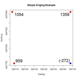
Figure 4. Simple four-point example, showing the Z values. The value at the blue point is to be estimated based on the values at the red points. Fig. 4 shows the four points. We will use the values of the three points shown in red to estimate the value of the point shown in blue. The values of Z are shown at each point. We can anticipate that the value of the blue point will be seriously overestimated, which illustrates the smoothing nature of kriging described above. First, we compute the distance matrix of these points and then we apply the variogram formula computed in Section 1. The way this is coded we need to be careful about the order of the data and make sure that the point to be estimated is the last in that order. > print(h4.mat <-as.matrix(with(data.4pts,
+   dist(cbind(Easting, Northing))))
       1       2        3        4
1  0.00000 61.0000 61.03278 86.26703
2 61.00000  0.0000 84.86460 61.00000
3 61.03278 84.8646  0.00000 59.00000
4 86.26703 61.0000 59.00000  0.00000

> print(nugget <- data.fit$psill[1])
[1] 0
> print(psill <- data.fit$psill[2])
[1] 1533706
> print(rnge <- data.fit$range[2])

[1] 248.2806

Using the formula for the spherical variogram given by Issacs and Srivastava (1997), we can construct a function sph.vgm() in terms of the nugget, the partial sill, and the range (the sill is the sum of the nugget and the partial sill). Here is the computation of the variogram matrix. > sph.vgm <- function(nug, psill, rnge, hh){
+    if (hh == 0) return(0)
+    if (hh > rnge) return(nug + psill)
+    return(nug + psill*((3*hh)/(2*rnge) – 0.5 * (hh/rnge)^3))
+    }
> gam.mat <- matrix(0, 4, 4)
> for (i in 1:4)
+    for (j in 1:4)
+       gam.mat[i,j] <- sph.vgm(0, psill, rnge, h4.mat[i,j])
> gam.mat
        [,1]     [,2]     [,3]     [,4]
[1,]      0.0 553850.7 554136.1 767179.4
[2,] 553850.7      0.0 755728.0 553850.7
[3,] 554136.1 755728.0      0.0 536401.1
[4,] 767179.4 553850.7 536401.1      0.0
We can then use Equation (5) to compute the variance-covariance matrix > # The fourth point is the point to be estimated
> print(C.full <- nugget + psill – gam.mat)

         [,1]      [,2]      [,3]      [,4]
[1,] 1533705.6  979855.0  979569.6  766526.3
[2,]  979855.0 1533705.6  777977.7  979855.0
[3,]  979569.6  777977.7 1533705.6  997304.5
[4,]  766526.3  979855.0  997304.5 1533705.6
The matrix C in Equation (8) is the 3 x 3 upper left corner of C.full and the vector c is the first three elements of the fourth column. We can solve Equation (8) for φ and then compute the simple kriging estimate of Z.
> C.mat <- Cfull[1:3, 1:3]
> c.vec <- Cfull[1:3,4]
> print(phi <- solve(C.mat, c.vec))
[1] -0.1015358  0.4591511  0.4822024
> print(Z.est <- sum(phi * data.4pts$Z[1:3]))
[1] 979.1371
As predicted, the estimate is rather poor, since the true value of Z is anomalously low. In the next subsection we will see that the simple kriging Equation (8) can be expressed as a linear regression model.

c. Regression digression
The derivation in Subsection b showed that the simple kriging estimator is the best linear unbiased estimator in the sense that among unbiased estimators it minimizes the variance of the error. The Gauss-Markov theorem (Kutner et al., 2005, p. 18) states that the estimator of the linear regression model is the best linear unbiased estimator. It must therefore be the case that the solution of the simple kriging equations is the same as that of corresponding linear regression equation. The purpose of this brief subsection is to give an informal argument to show this. SDA2 Appendix A.2 contains a discussion of the equations of multiple linear regression. We will reproduce some of this discussion here. Multiple linear regression provides the least squares estimate for the parameters  of the model

                       .   (9)

Here I have changed to a nonstandard notation different from that of SDA2 but matching that of this Additional Topic. To observe the analogy between simple kriging and linear regression we will be concerned with the special case in which β = 0. (regression through the mean). The reason β = 0 is that simple kriging is concerned with estimating the value of a quantity Z having mean 0, and this corresponds to regression through the mean. The equations for the regression model turn out to be (again, see the Additional Topic for a derivation)                              ΣjβjXiXjXiY = 0, i = 1, … n .                               (10)

If we compare this equation with Equation (7), the simple kriging equations, which is repeated here,

                             ΣφiC(xi,xi + hij) – C(xi,x) = 0, i = 1,…,n.                           (11)

we can see that

                             XiXj = C(xi,xj), φi = βiXiY = C(xi,x) .                       (12)

Thus, we have shown (albeit with a bit of hand waving) that simple kriging does indeed produce the same result as linear regression. In the next subsection we will see that they are also the same as those generated by Bayes’ rule.
 
d. Bayesian statistics
Recall that Bayes’ rule is written as follows. Let A and B be two events. The joint probability, denoted P{A,B}, is the probability that both events A and B occur. The conditional probability that A occurs given that B occurs is denoted P{A|B}, and one can similarly define the conditional probability P{B|A} that B occurs given that A occurs. The laws of probability state that (Larsen and Marx, 86, p. 42)
                          P{A,B} = P{A|B}P{B} = P{B|A} P{A}, (13)
and these can be used to formally define the conditional probability. Bayes’ rule is obtained by dividing the second equation in (13) by P{A},                                                   .                              (14)

If we have observed the event A then Bayes’ rule gives us a means to compute the probability that B occurs given this observation together with any prior information that we may already have about event B. In order to describe how Bayes’ rule is applied to conditional simulation we will shift from a model expressed in terms of events A and B to one in which the probabilities involve two scalar quantities y1 and y2. The following discussion is taken primarily from Leuangthong et al. (2008, p. 107), although I have changed the notation to better match mine. Rather than considering the probability of events, we consider probability densities, which we denote with a lower case p. We will assume that our objective is to compute the value of the quantity Y2 based on having computed the value of Y1, and that p(y1) and p(y2)  represent probability densities of the values of Y1 andY2. Bayes’ rule becomes
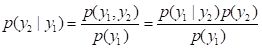
                                         .             (15)
The density p(y2|y1) is in geostatistics generally called the conditional density, p(y1,y2) is called the joint density, and p(y1) is called the marginal density. I should note that if you are familiar with Bayesian statistics in the context of subjective probability theory then both the terminology and the concepts as applied here are slightly different and should not be confused. The formula for the probability density of a univariate distribution of a Gaussian random variable with mean m and variance  is (Larsen and Marx, 1986, p. 210)
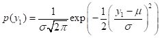
                                       .                      (16)

I will not repeat the mathematical derivations here (again, see the Additional Topic) but note that they are based on Leuangthong et al. (2008, p. 108). They show that if the distribution p(y1) of Y1 is Gaussian (i.e., normal) then the conditional density p(y2|y1) of Y2 is also Gaussian.  This property, that the densities all have the same Gaussian form, is a rare one not shared by other probability densities. It is a primary reason why we do conditional Gaussian simulation. The great advantage of taking a Bayesian approach to conditional Gaussian simulation is that it facilitates the successive incorporation of the new data at each step of the simulation process (i.e. at each new visit to a point to be simulated). This incorporation is described, for example, by Leuangthong et al. (2008, p. 109) and by Goovaerts (1997, p. 376). Basically, once we know Y1 = y1,  we can compute Y2 = y2 based on the formulas given above. Once we know Y2 = y2, we can compute Y3 = y3, and so forth. In other words, the calculation at each new visit point is a computationally simple matter of Bayesian updating. As described by Goovaerts, this provides tremendous efficiency in the simulation. This is the way that the computations are carried out in software such as the gstat package. The presentation of the algorithm is simplified, however, if one adopts a simple matrix inversion approach like that used in the four-point example above, and this is what we shall do in Section 3. Because they use Bayesian updating of a Gaussian distribution, however, R library algorithms such as those in gstat require that the data be normally distributed, and for this reason if they are not then they must be transformed. That is the subject of the next subsection.

e. The normal scores transformation
If you have had a course in linear regression, one of the topics you probably covered was transforming the data to a form that more closely fits the assumptions made to derive the method. The situation is similar with conditional simulation, but the objective is different. Linear regression is fairly robust to deviations from normality of the distribution of errors but is highly sensitive to deviations in error magnitude, and for this reason transformations may be carried out to “stabilize the variance,” that is, to make the error distribution more homogeneous. Conditional Gaussian simulation, on the other hand, assumes a normal distribution of the data, and thus data whose distribution is not Gaussian must be transformed to come closer to matching this assumption. The standard transformation used in geostatistics is called the normal scores transformation and is quite simple to describe and implement. It is described by Pyrcz and Deutsch (2018) and by Goovaerts (1997); we will follow the nice description by Goovaerts (1997, p. 268). Step 1. Arrange the sample data in ascending order, breaking ties if necessary. > # First compute normal scores of Yield at sample points:
> # Arrange Yield values in ascending order
> # data.Set4.2 is the original sample data, still a data frame

> data.Yield.ord <- data.Set4.2$Yield[order(data.Set4.2$Yield)]
> # Check for ties
> min(diff(data.Yield.ord))
[1] 0.5649183
Step 2. Compute the cumulative frequency of the ordered data values (i.e., the quantiles). In the next section we will also need their coordinates as well as their record numbers so we will include these as well. > data.Set4.2.ord <- data.frame(Yield = data.Yield.ord,
+    Yquant = seq(1:length(data.Yield.ord)) /
+       length(data.Yield.ord),
+    Easting = data.Set4.2$Easting[order(data.Set4.2$Yield)],
+    Northing = data.Set4.2$Northing[order(data.Set4.2$Yield)],
+    ptno = data.Set4.2$ptno[order(data.Set4.2$Yield)])
Step 3. Match the quantile of each of the ordered values with the corresponding quantile of the normal distribution. > data.ordered$Z <- qnorm(data.ordered$Yquant)
> data.ordered$Z[length(data.ordered$Z)]
[1] Inf
> data.Set4.2.ord$Z[length(data.Set4.2.ord$Z) – 1]
[1] 2.231606
> data.ordered$Z[length(data.ordered$Z)] <- 3.0
The function qnorm() assigns the value Inf to the largest quantile, so this replaced with a suitably large finite value. In theory the normal score transformation produces a quantity Z(x) with mean exactly zero, but in practice numerical issues plus our adjustment of the largest quantile may upset this a bit, so we will adjust the values to return their mean to zero, > # Give the z values a mean of zero
> mean(data.Set4.2.ord$Z)
[1] 0.03846154
> data.Set4.2.ord$Z <- data.Set4.2.ord$Z – mean(data.Set4.2.ord$Z)
Fig. 5 shows the normal score transformation schematically. The fiftieth quantile Yield out of 78 has the value 5167 kg, and corresponds to the quantile value 50/78 = 0.64. The quantile value 0.64 of the normal distribution on the right corresponds to the value 0.32, which is the normal score.

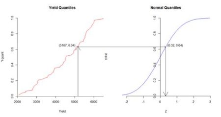
                                     Figure 5. Diagrammatic representation of normal score transformation. Based on similar figures by Goovaerts (1997, p. 268) and Pyrcz and Deutsch (2018).

After the Gaussian simulation is completed the results must be transformed back to the original data units. Because the data are so densely arranged, this can be accomplished by simple linear interpolation.

3. The Conditional Gaussian Simulation Algorithm

In Section 2 we created a normal score transformation Z of the yields of the sample points. We will use this transformed quantity in the simulation. Here are the steps. Step 1, the visit order. Since we start with a set of 78 locations whose Z value is known, we will randomly pick one of these as are starting point. Then we randomly arrange all the locations, sampled and unsampled. > set.seed(123)
> print(pt1 <- sample(samp.pts, 1))
[1] 5763
> visit.order <- sample(1:length(data.Full.ordered$Z),
+   replace = FALSE)
> visit.order <- c(pt1, visit.order[-which(visit.order == pt1)])
> visit.order[1:10]
[1] 5763 2463 2511 8718 2986 1842 9334 3371 4761 6746
Step 2. At the current visit point, if it is a sample point, insert its known value. If not, determine the parameters (mean and variance) of the Gaussian cumulative distribution function using simple kriging of nearby known values. This where software such as gstat uses Bayesian updating and we will use simple matrix inversion. We will base our estimate on the ten closest points whose value has already been determined. We create a data field Zsim in the original sf object Y.full.data.sf to hold the simulated values. We also determine the quantities to be used in the simple kriging. > Y.full.data.sf$Zsim <- 0
> data.varn <- variogram(object = Z ~ 1, locations =
+    data.Set4.2.ord.sp, cutoff = 600)
> data.fitn <- fit.variogram(object = data.varn, model =
+    vgm(1, “Sph”, 250, 1))
> print(Z.nug <- data.fitn$psill[1])
[1] 0
> print(Z.sill <- Z.nug + data.fitn$psill[2])
[1] 1.157344
> print(Z.range <- data.fitn$range[2])
[1] 239.7456
> n.kr.pts <- 10
The variogram() argument cutoff is the spatial separation distance up to which point pairs are included in the computation. The arguments of the function vgm() are respectively the initial guess of the partial sill, the model, and the initial guesses of the range and the nugget. Again, the partial sill is the sill minus the nugget. Fig. 6 shows the setup for the 100th visit point. The point to be simulated is shown in red, the sample points are shown in green, and the points whose Z values have already been simulated are shown in blue. It is evident that the simulation is based on a combination of sample values and previously simulated values.
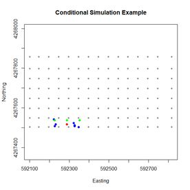
                                         Figure 6. Diagram of the simulation data for the one hundredth visit point. Next we create a function closest.points() to find the closest points to the current visit point. The argument coord.data is used to pass the data frame Y.full.data.sf. The argument n.pts has the value 10. > closest.points <- function(visit.pt, coord.data,
+    known.pts, n.pts){
+    c.pts <- numeric(n.pts)
+ # Determine the coordinates of the current visit point
+    visit.coords <- with(coord.data, c(Easting[visit.pt],
+          Northing[visit.pt]))
+ # Determine the coordinates of all the points whose value is known
+    known.coords <- with(coord.data,
+        cbind(Easting[known.pts], Northing[known.pts]))
+ # Respectively go through the known points and find the
+ # n.pts closest points

+    test.coords <- known.coords
+    for (n in 1:(n.pts + 1)){
+       dist.sq <- (test.coords[,1] – visit.coords[1])^2 +
+          (test.coords[,2] – visit.coords[2])^2
+       min.pt <- which.min(dist.sq)
+       c.pts[n] <- known.pts[min.pt]
# Once a point is selected, change its coordinates to an
# impossible value to keep it from being selected again

+       test.coords[min.pt,] <- 0
+       }
+    return(c.pts)
+    }
We use the array known.pts to hold the indices of the locations whose Z value is known. Initially these are the sample points. > known.pts <- samp.pts At each point in the visit order, if it is a sample then that value is used (Step 2a). These values are assigned at the start > for (i in 1:length(samp.pts))
+    Y.full.data.sf$Zsim[samp.pts[i]] <- with(data.Set4.2.ord,
+       Z[which(ptno == samp.pts[i])])
 If the visit point is not a sample point then the Monte Carlo computation is implemented. Rather than using the R function dist() to compute the distance matrix, as was done for the simple four point example, it is more convenient to use our own function to compute the distances. > pt.dist <- function(x1, x2) sqrt(sum((x1 – x2)^2))  There is a lot of code, so I have tried to liberally include comments to explain what is going on. The drawing of the value from the normal distribution takes place at the end of the loop. The first line of code sets up the cycling through the visit points. > for (visit.pt in visit.order){
+ # If visit point not a sample point use the kriging variance to
+ # construct the distribution and draw a value from this
+       distribution

+    if (!(visit.pt %in% samp.pts)){
+ # Find the closest points to the visit point
+       cl.pts <- closest.points(visit.pt, Y.full.data.sf,
+          known.pts, n.kr.pts)
+ # Add the visit point to end of the set of closest points
+       krige.pts <- c(cl.pts, visit.pt)
+ # Determine the distance matrix
+       h.mat <- matrix(0, length(krige.pts), length(krige.pts))
+       for (i in 1:length(krige.pts))
+          for (j in 1:length(krige.pts)){
+             x1 <- with(Y.full.data.sf,
+               c(Easting[krige.pts[i]],Northing[krige.pts[i]]))
+             x2 <- with(Y.full.data.sf,
+               c(Easting[krige.pts[j]],Northing[krige.pts[j]]))
+             h.mat[i,j] <- pt.dist(x1, x2)
+             }
+ # Determine the gamma matrix
+       gam.mat <- matrix(0, nrow(h.mat), nrow(h.mat))
+       for (i in 1:(n.kr.pts + 1))
+          for (j in 1:(n.kr.pts + 1))
+             gam.mat[i,j] <-
+                sph.vgm(Z.nug, Z.sill, Z.range, h.mat[i,j])
+       C.full <- Z.sill – gam.mat
+       C.mat <- C.full[1:(n.kr.pts), 1:(n.kr.pts)]
+       c.vec <- C.full[1:(n.kr.pts),(n.kr.pts + 1)]
+ # Solve for the phi values
+       phi <- solve(C.mat, c.vec)
+ #Estimate the mean via simple kriging
+       mu.est <- sum(phi * Y.full.data.sf$Zsim[cl.pts])
+ # Variance equals the sill
+       sd.est <- sqrt(Z.sill)
+ # Draw a value from a normal distribution with these parameters
+       Y.full.data.sf$Zsim[visit.pt] <- rnorm(1, mu.est, sd.est)
+ # Add the visit point to the list of known points
+       known.pts <- c(known.pts, visit.pt)
+       }
+    }
If you use the code accompanying this post to run this example, then as you watch the little blue wheel go around, think about the fact that when we repeat this example in the next section using the gstat function krige(), the computation will be effectively instantaneous. R library functions are generally better than anything we could make by hand. Finally, we use interpolation to transform the simulation back to the original scale (the function to do this was created in Section 1 but will be shown in Section 4). Fig. 6 shows the result. It is a considerably cruder simulation of the original data, although it does preserve some of the reduction in yield on the west side of the field.

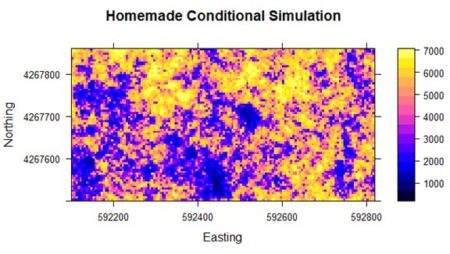
Figure 6. Results of the “homemade” conditional simulation.   Although the homemade simulation is clearly much cruder, the general yield pattern is still discernable. In the next section we will go through the same code as was used in Section 1 to illustrate the use of the gstat package to carry out conditional and unconditional Gaussian simulation.

4. Conditional and Unconditional Gaussian Simulation using gstat

Now that we have an idea of how conditional Gaussian simulation works, we will go over the code used to generate Figs. 2b and 3 in Section 1. After that we will create code to generate an unconditional Gaussian simulation and compare the two. The R code in the code file accompanying this Additional topic is repeated to match the presentation order here. The first step is the normal score transformation of the 78 sample points. This has already been described in Subsection 2e. The next step is to create a SpatialPointsDataFrame for the gstat function variogram() to compute and fit the variogram. We have already seen the last four lines of code in Section 3.

> coordinates(data.ordered) <- c(“Easting”, “Northing”)
> proj4string(data.ordered) <- CRS(“+proj=utm +zone=10 +ellps=WGS84”)
> data.varn <- variogram(object = Z ~ 1,
+    locations = data.ordered, cutoff = 600)
> data.fitn <- fit.variogram(object = data.varn,
+    model = vgm(1, “Sph”, 250, 1))


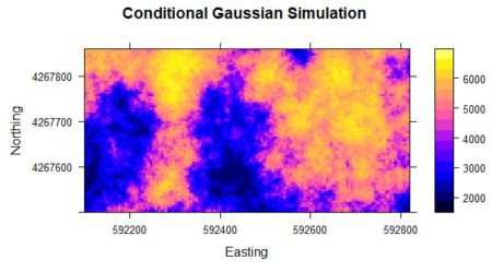
The last step is the actual computation of the conditional Gaussian simulation. > Z.sim <- krige(formula = Z ~ 1, locations = data.ordered,+  newdata = Y.full.data.sp, model = data.fitn, nmax = 10, nsim = 6)
drawing 6 GLS realisations of beta…
[using conditional Gaussian simulation]

> class(Z.sim)
[1] “SpatialPixelsDataFrame”
attr(,”package”)
[1] “sp”

> spplot(Z.sim) # Check
Note the I am using krige() to carry out the conditional simulation. There are other ways to do it but I find this the most straightforward. The function krige() is a “wrapper” for the function gstat() A wrapper function provides a more convenient interface to another function, often for certain specialized applications. The argument locations contains the known data values, in the form of a Spatial object such as a SpatialPointsDataFrame, and the argument newdata contains the locations at which the simulation values are to be computed, again in the form of a Spatial object. In this case I use a SpatialPixelsDataFrame. The argument nsim is the number of simulations to be computed. The function gstat() is so efficient that it does not take much more time to compute 100, or ever 1000, simulations than to compute one (You will use this feature in Exercise 3). The last step in the code above is to do a quick and dirty plot to check that the result is reasonable.

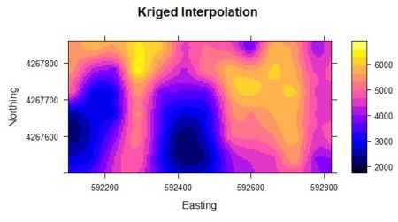
The code for the function krige() when used for ordinary kriging is very similar to that used for conditional Gaussian simulation, so let’s take a look at the former in order to compare the two. Here is the call to the function krige() used to produce Fig. 2a. > Yield.krige <- krige(formula = Yield ~ 1,
+    locations = data.Set4.2.sp, newdata = Y.full.data.sp,
+    model = data.fit)
The difference in the two function calls is the assignment of a positive value to the argument nsim in the conditional Gaussian simulation (the default value of nsim is zero). This positive value signals that conditional Gaussian simulation rather than kriging is to be used. The value of the argument nsim if it is not zero indicates the number of simulations to be computed. The argument nmax provides an indication of the number of known values to be used, but the algorithm is much more sophisticated than the simple one used in Section 3. The last step in the conditional Gaussian simulation process is to transform the data back to the initial units. As indicated, this is done using simple linear interpolation. We first create an interpolation function xform() and then do the transformation. > xform <- function(in.vec, out.vec, val){
+    i <- 1
+    while (i < length(in.vec) & val >= in.vec[i+1]) i <- i + 1
+    if (i == length(in.vec)) return(out.vec[i])
+    return(out.vec[i]  + ((val – in.vec[i]) /
+      (in.vec[i+1] – in.vec[i])) * (out.vec[i+1] – out.vec[i]))
+    }
> # Back transform on a point by point basis
> Yield.sim <- Z.sim
> for(i in 1:nrow(Yield.sim@data))
+    for(j in 1:ncol(Yield.sim@data))
+       Yield.sim@data[i,j] <- xform(data.ordered@data$Z,
+          data.ordered@data$Yield, Z.sim@data[i,j])
Now we move on to unconditional Gaussian simulation. The difference between conditional and unconditional simulation is that in unconditional simulation only previously simulated values are used in Step 3a, the establishment of “known” values. The simulation begins with no “known” sample values. Unconditional Gaussian simulation cannot be done using krige() but rather requires the direct use of the function gstat(). The argument dummy = T signals that this is an unconditional simulation. The argument nmax is the number of nearest observations used for a simulation. The object returned by the function gstat() is then used as an argument in the function predict() to generate the actual simulation. > Z.pred <- gstat(formula = Z ~ 1, locations = ~Easting + Northing,
+   dummy = T, beta = 0, model = data.fitn, nmax = 20)
> set.seed(123)
> Z.usim <- predict(Z.pred, newdata = Y.full.data.sp, nsim = 6)
[using unconditional Gaussian simulation]
In a simple kriging application beta is the value of the mean, which in our Gaussian simulation is zero. Fig. 8 shows a plot of the result. The simulation has the same general local spatial structure as the original data but does not preserve the global spatial pattern.

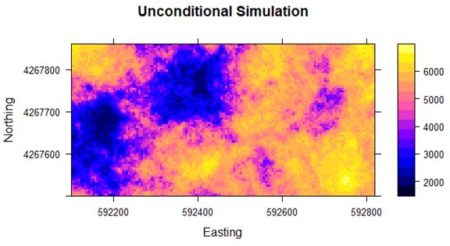
Figure 8. Unconditional simulation using yield data

5. Further Reading

Much of the discussion in this Additional Topic is taken from Leuangthong et al. (2008). Goovaerts (1997) contains the same material, but the presentation is at a higher mathematical level. Wackernagel (2003) and Journel (2009) contain more mathematically sophisticated discussions of the relationship between kriging and linear regression.


6. Exercises

  1. Using the four-point data set of Fig. 6, compute a conditional Gaussian simulation of the fourth point based on the other three.
 
  1. Try carrying out conditional simulation on the original Yield data without using the normal score transformation. How does the result compare with that computed here?
 
  1. In principle, since a conditional Gaussian simulation is a set of pointwise Monte Carlo simulations, the mean of a large number of simulations should converge to the kriged interpolation. Compute 10, 100, 1000 simulations of the normalized data and see if they do converge.
 
  1. A naïve way to address the problems associated with kriging would be to simply krige the data and then add a normally distributed random variable to each kriged value using the variance as computed from the variogram. Try this out and compare the results with those obtained using conditional Gaussian simulation. How do you explain the difference?
 
  1. One of Goovaerts’ assertion about kriging is that smoothing is least close to the data locations and increases as the location being estimated gets farther away. Using the variogram information from the full 78 sample points (computing a variogram with only 39 data points is not wise), carry out a kriging interpolation and a conditional Gaussian simulation based on only the western half of the sample data and see whether kriging in the “unsampled” eastern half is indeed smoother than the simulation.
 
  1. Using multiple simulations, construct several histogram and variogram comparisons similar to those of Fig. 4b and Fig. 5b and see how they compare with each other.

7. References

Box, G. E. P., and G. C. Tiao (1973). Bayesian Inference in Statistical Analysis. Addison-Wesley, Menlo Park, CA. Leuangthong, O, K.D. Khan, and C.V. Deutsch (2008). Solved Problems in Geostatistics. Wiley, New York. Goovaerts, P. (1997). Geostatistics for Natural Resources Evaluation. Oxford, UK, Oxford University Press. Isaaks, E. H., and R. M. Srivastava (1989). An Introduction to Applied Geostatistics. Oxford University Press, Oxford, U.K. Journel, A.G. (1989) Fundamentals of Geostatistics in Five Lessons. American Geophysical Union, Washington, D.C. Kutner, M. H., C. J. Nachtsheim, J. Neter, and W. Li (2005). Applied Linear Statistical Models. Mc-GrawHill Irwin, Boston, MA. Larsen, R. J., and M. L. Marx (1986). An Introduction to Mathematical Statistics and its Applications. Prentice-Hall, Englewood Cliffs, NJ. Leuangthong, O, K.D. Kahn, and C.V. Deutsch (2008). Solved Problems in Geostatistics. Wiley, Hoboken, NJ Pebesma, E. (2003), gstat User’s Manual. Utrecht University, Utrecht, The Netherlands Pebesma, E. J. (2004). Multivariable geostatistics in S: the gstat package. Computers and Geosciences 30: 683-691. Pyrcz, N.J. and C.V. Deutsch (2018). Transforming Data to a Gaussian Distribution. https://geostatisticslessons.com/lessons/normalscore Ripley, B. D. (1981). Spatial Statistics. Wiley, New York. Wackernagel, H. (2003) Multivariate Geostatistics. Springer, Berlin Zanon, S. and O. Leuangthong (2004) Implementation Aspects of Sequential Simulation. Geostatistics Banff 2004  DOI: 10.1007/978-1-4020-3610-1_55 Copyright © 2022 Richard E. Plant  

Spatial Data Analysis Using Artificial Neural Networks, Part 2

Spatial Data Analysis Using Artificial Neural Networks, Part 2

Richard E. Plant

Additional topic to accompany Spatial Data Analysis in Ecology and Agriculture using R, Second Edition http://psfaculty.plantsciences.ucdavis.edu/plant/sda2.htm Chapter and section references are contained in that text, which is referred to as SDA2. Data sets and R code are available in the Additional Topics through the link above.

Forward

This post originally appeared as an Additional Topic to my book as described above. Because it may be of interest to a wider community than just agricultural scientists and ecologists, I am posting it here as well. However, it is too long to be a single post. I have therefore divided it into two parts, posted successively. I have also removed some of the mathematical derivations. This is the second of these two posts. In the first post we discussed ANNs with a single hidden layer and constructed one to see how it functions. This second post discusses multilayer and radial basis function ANNs,  ANNs for multiclass problems, and the determination of predictor variable importance.  Some of the graphics and formulas became somewhat blurred when I transfered them from the original document to this post. I apologize for that, and again, if you want to see the clearer version you should go to the website listed above and download the pdf file.

3. The Multiple Hidden Layer ANN

Although artificial neural networks with a single hidden layer can provide quite general solution capabilities (Venables and Ripley, 2002, p. 245), preference is sometimes expressed for multiple hidden layers. The most widely used R ANN package providing multiple hidden layer capability is neuralnet (Fritsch et al., 2019). Let’s try it out on our training data set using two hidden layers with four cells each (Fig. 19).

> set.seed(1)
> mod.neuralnet <- neuralnet(QUDO ~ MAT +
+     Precip,
data = Set2.Train,
+     hidden = c(4, 4), act.fct = “logistic”,

+     linear.output = FALSE)
> Predict.neuralnet <-
+     predict(mod.neuralnet, Set2.Test)

> plotnet(mod.neuralnet, cex = 0.75) # Fig. 19a
> p <- plot.ANN(Set2.Test,
+  Predict.neuralnet, 0.5,
“neuralnet Predictions, Two Hidden Layers”) 

The argument hidden = c(4, 4) specifies two hidden layers of four cells each, and the argument linear.output = FALSE specifies that this is a classification and not a regression problem. As with the single layer ANNs of the previous section, the two layer ANNs of neuralnet() produce a variety of outputs, some tame and some not so tame (Exercise 6).


Figure 19. (a) Diagram of the neuralnet ANN with two hidden layers; (b) prediction map of the ANN.

 
Instead of using Newton’s method found in the function nlm() and approximated in nnet(),  it has become common in ANN work to use an alternative method called gradient descent. The neuralnet package permits the selection of various versions of the gradient descent algorithm. Suppose for definiteness that the objective function J is the sum of squared errors (everything works the same if it is, for example, the cross entropy, but the discussion is more complex). Denote the combined sets of biases and weights by wi, 1 = 1,…,nw,  (for our example of Section 2, with one hidden layer and M = 4, nw = 17). If the ANN returns an estimate of the vector Y of class labels then we can then write the sum of squared errors of the ANN as

.

(7)
The intent of this notation is to indicate explicitly that the vector of estimates  depends on the biases and weights. Minimizing  J(w1,…,wnw) is the unconstrained nonlinear minimization problem to which the gradient descent method is applied. The set of values of J(w1,…,wnw) describes a surface (technically a “hypersurface”) sitting “above” the nw dimensional space of the weights and biases. If you have trouble visualizing this, it might help to imagine the case in which nw = 2, in which case the surface of values of J(w1,w2)  lies above the plane of values of (w1,w2). The Wikipedia article discussing the gradient descent method is truly excellent, and I will not try to improve on it. From this article we can see that in order to find the minimum of the objective function J, starting from a particular point in the  space we move in the direction of the gradient

.

(8)
Here the ei are unit vectors in the space of the weights and biases, and the gradient points in the direction of steepest descent (and of steepest ascent – which would take us in the wrong direction) of J. As described in the Wikipedia article, the algorithm moves in a sequence of steps

.

(9)
Here w(k) is the estimate of the vector w of biases and weights at the kth gradient descent step, and  is the length of the step taken in the direction of the negative gradient (sometimes called the learning rate). All of the partial derivatives in Equation (8) must be estimated numerically, so it is evident that although the problem is much smaller than that involving the computation of the Hessian matrix of second partial derivatives, it still involves a lot of computation. For that reason, ANN algorithms often use an approximate form of gradient descent. The most common of these is stochastic gradient descent. In this method, instead of estimating all nw partial derivatives at each step, a random subset of a fixed size (possibly as small as one) is chosen and the direction is determined based on minimizing this subset. If you have read the Wikipedia article above then this short description provides a good explanation of stochastic gradient descent, and this discussion provides more detail. In particular, you can see from these articles that it is even possible that the stochastic gradient descent method can actually move past a local minimum and find the global minimum. In fact, the gradient in Equation (9) is not actually computed directly. Instead, an algorithm called back propagation is generally used to estimate the partial derivatives. The Additional Topic on which this post is based includes a mathematical description of back propagation, but I have decided to remove that from this post, both to bring the post to a reasonable length and to reduce the mathematical complexity. The basic idea of back propagation is to compute the partial derivatives in Equation (8) by repeated applications of the chain rule of differential calculus. You can see the full derivation by downloading the Additional Topic. The neuralnet() function has available several forms of back propagation. As a default it uses the resilient propagation algorithm (Riedmiller et al., 1993). This algorithm recognizes that the size of the step from w(k to w(k+1 depends not only on the size of  but also on the sizes of the components of , and that this latter dependence may be disadvantageous. For this reason resilient propagation develops a step size that is less dependent on the magnitudes of the components of , using these values primarily to determine the direction of the step. There are other methods available and you can see the neuralnet package documentation for details. The package also makes available the cross-entropy error function in addition to the default error sum of squares. Now that we have an idea of how the function neuralnet() works, let’s try it out on the full QUDO data set. We will use two hidden layers of four cells each, similar to Fig 19a. When I worked with on this problem it turned out that neuralnet() failed to converge in several attempts when applied to the full data set. The largest training set for which convergence was obtained had n = 200 data records evenly divided between QUDO = 0 and QUDO = 1. Fig. 20a shows the result of applying neuralnet() to this training data set using a cutoff of 0.73, which was determined from a ROC curve analysis (code not shown). The error rate is 0.225, which is not as good as that obtained in Section 2 using nnet().


                                       (a)                                                      (b)
Figure 20. (a) Plot of prediction regions of neuralnet() with two hidden layers and a training data set of 200 randomly selected records; (b) application of the resulting model to the full set.

  Sections 2 and 3 have given us a general idea of how a multilayer perceptron works. Although the MLP is probably the most commonly used ANN for the type of classification problem discussed here, several alternatives exist. The next section discusses one of them, the radial basis function ANN.

4. The Radial Basis Function ANN

The seemingly obscure term radial basis function ANN is actually not hard to parse out. We will start with word basis. As you may remember from linear algebra, a basis is a set of vectors in the vector space that have the property that any vector in the vector space can be described as a linear combination of elements of this set. For discussion and a picture see here. If you had a course in Fourier series, you may remember that the Fourier series functions form a basis for a set of functions on an infinite dimensional vector space. Radial basis functions do the same sort of thing. A radial function is a function of the form
                  , (10)
where c is the center point of a vector space. In other words, a radial function is radially symmetric and depends only on the distance of the vector x from the center. Again we are using the terms “point” and “vector” synonymously. The radial basis function commonly used in ANNs is the Gaussian function (i.e., the normal distribution). When x is a two dimensional quantity, as it is in our case (MAT and Precip), the function  can be visualized, and a picture of it is shown here. Thus, as with a Fourier series, a radial basis function forms a basis with which to approximate other functions – in particular, in our case, functions associated with the process of classification via an ANN.        
Figure 21. Architecture of the radial basis function ANN.

  The way a radial basis function (RBF) works is as follows. Suppose again that the cost function J is based on the sum of squared errors. Referring to Fig. 21, which shows a schematic of a radial basis function ANN with a single hidden layer, the input activations for the ith data record are, as with the multilayer perceptron, simply the values Xi,j. We will describe the combined output of all of the hidden cells in terms of the basis function . Specifically, for a fixed i define a function f(X) by
. (11)
Here cm is the center of the mth radial basis function and jm measures the size of the contribution of this component to the overall function . If our objective function is the sum of squared errors then we plug Equation (11) into the definition of J to get
. (12)
Each of the M elements of the sum  forms one of the cells in the hidden layer of the ANN (Fig. 19) (note that the order of the summation has been reversed from Section 2 so that first the summation over i takes place first in each cell and then second over the m hidden cells). The links between the hidden cells and the output cell hold the weights jm. The weighted outputs of the m cells, given by , are summed to determine the activation a(3) of the output cell. The architecture described here and shown in Fig. 21 is the simplest form of a radial basis function ANN. More bells and whistles can be added; for example, biases can be incorporated as constant terms in the sums of Equation (11). In addition, a logistic or other function can be interposed between the output cell level internal value  and the activation a(3), similar to that of the MLP (Fig. 8).
The first step in the RBF computational process is to determine a set of centers cm in Equation (11). The determination is made by trying to place the centers so that their location matches as closely as possible the distribution in the data space of values . Some RBF systems do this by carrying out a k-means clustering (SDA2 Sec. 12.6.1) of the space of data records, where the number of means k equals the number M of hidden cells (e.g. Nunes da Silva et al., 2017, p.121). Another possibility is to carry out a Kohonen training process. This is basically an unsupervised clustering algorithm analogous to k-means clustering, although, as is often the case with methods related to ANNs, the terminology is a bit more pretentious: in this case the result is called a “self-organizing map.” We will be using the function rbf() of the RSNNS package (Bergmeir and Benitez, 2012). It does not use k-means clustering, but the use of the Kohonen training process is available as an option. The default method, which in my experience works the best, is called the “rbf weights” method. Fundamentally, the rbf weights method is, in the words of the creators of the package (Zell et al, 1998, p. 177), “rather simple.” Essentially, the weights are distributed in the data space to match a random sample of the values of the data records. There are a few adjustments that can be used, but this description captures the basics. Once the values of the centers cm are established the final step of the training process is to determine the values of the link weights jm along with the values of the biases if there are any. This is accomplished in rbf() by gradient descent. Similarly to the multilayer perceptron ANNs described in Section 3, the gradient descent algorithm carries out an iterative process in which the link weights are adjusted by a series of small steps of the form

,

(13)
where   is a small constant. This brief introduction is sufficient to allow us to try out an RBF ANN. The package RSNNS is a port to R of the Stuttgart Neural Network Simulator (Zell et al, 1998), or SNNS, which contains implementations of many ANNs. As a segue to the use of the function rbf(), which creates a radial basis function ANN, we will first test the function mlp() from the same package. This provides a multilayer perceptron solution that can be compared with those of Sections 2 and 3. The use of functions with the SNNS package is slightly different from what we have seen in Sections 2 and 3. Working initially with the 50 record Training data set, we first prepare its data records to serve as arguments for the ANN functions.

library(RSNNS)
Train.Values <- Set2.Train[,c(“MAT”, “Precip”)]
Train.Targets <-
+   decodeClassLabels(as.character(Set2.Train$QUDO))
 

We will start by testing the RSNNS multilayer perceptron using a single hidden layer with four cells. The package has a very nice function called plotIterativeError() that permits one to visualize how the error declines as the iterations proceed. We will first run the ANN and check out the output. These are slight differences in how the polymorphic R functions are implemented from those of the previous sections.


> set.seed(1)
> mod.SNNS <- mlp(Train.Values, Train.Targets,
+    size = 4)

> Predict.SNNS <- predict(mod.SNNS,
+     Set2.Test[,1:2])

> head(Predict.SNNS)
         [,1]      [,2]
[1,] 0.6385500 0.3543552
[2,] 0.6247426 0.3684126
[3,] 0.6107571 0.3826691
[4,] 0.5966275 0.3970889
[5,] 0.5823891 0.4116347
[6,] 0.5680778 0.4262682
 

For this binary classification problem the output of the function predict() is in the form of a matrix whose columns sum to 1, reflecting the alternative predictions. Using this information, we can plot the prediction region (Fig. 22a).


Figure 22. Plots of (a) the predicted regions and (b) the iterative error with the default iteration limit.

  Next we plot the iterative error (Fig. 22b).


> plotIterativeError(mod.SNNS) # Fig. 22b
 

The error clearly declines, and it may or may not be leveling off. To check, we will set the argument maxit to a very large value and see what happens.


> mod.SNNS <- mlp(Train.Values, Train.Targets,
+    size = 4,
maxit = 50000)
> stop_time <- Sys.time()
> stop_time – start_time
Time difference of 5.016404 secs
> Predict.SNNS <- predict(mod.SNNS,
+    Set2.Test[,1:2])

> p <- plot.ANN(Set2.Test, Predict.SNNS[,2],
+    0.5,

+    “RSNNS mlp Prediction, 50,000 Iterations”)
> plotIterativeError(mod.SNNS) # Fig. 23b

                    
                                  (a)                                            (b)
Figure 23. Plots of (a) the predicted regions and (b) the iterative error with an iteration limit of 50,000.

  The iteration error clearly declines some more. The prediction region does not look like most of those that we have seen earlier, and does not look very intuitive, but of course the machine doesn’t know that. The time to run 50,000 iterations for this problem is not bad at all.
Now we can move on to the radial basis function ANN, implemented via the function rbf(). First we will try it with all arguments set to their default values (Fig. 24).


> set.seed(1)
> mod.SNNS <- rbf(Train.Values, Train.Targets)
> Predict.SNNS <- predict(mod.SNNS, Set2.Test)
> p <- plot.ANN(Set2.Test, Predict.SNNS[,2],
+   0.5,
“RSNNS rbf Prediction,
+   Default Values”) 

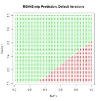
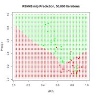
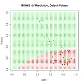
Figure 24. Prediction regions for the model developed using rbf() with default values.

 
The “radial” part of the term radial basis function becomes very apparent! A glance at the documentation via ?rbf reveals that the default value for the number of hidden cells is 5. Many sources discussing radial basis function ANNs point out that a large number of hidden cells is often necessary to correctly model the data. We will try another run with the number of hidden cells increased to 40.


> set.seed(1)
> mod.SNNS <- rbf(Train.Values, Train.Targets,
+    size = 40)
 
The rest of the code is identical to what we have seen before and is not shown. The prediction region is similar to that of Fig. 25a below and is not shown. The error rate is about what we have seen from the other methods.

> length(which(Set2.Pred$TrueVal !=
+   Set2.Pred$PredVal)) /
nrow(Set2.Train)
[1] 0.22
                              
                                       (a)                                      (b)
Figure 25. (a) Prediction regions and (b) error estimate for the model developed using rbf() with the full data set.

  The performance of rbf() on the full data set is not particularly spectacular.

> length(which(Set2.Pred$TrueVal !=
+   Set2.Pred$PredVal)) /
nrow(data.Set2U)
[1] 0.2324658  

Now that we have had a chance to compare several ANNs on a binary selection problem, an inescapable conclusion is that, for the problem we are studying at least, the old workhorse nnet() acquits itself pretty well. In Section 5 we will try out various ANNs on a multi-category classification process. In this case each of the ANNs we are considering has an output cell for each class label.  

5. A Multicategory Classification Problem

The multicategory classification problem that we will study in this chapter is the same one that we studied in the Additional Topic on Comparison of Supervised Classification Methods. A detailed introduction is given there. In brief, the data set is the augmented Data Set 2 from SDA2. It is based on the Wieslander survey of oak species in California (Wieslander, 1935) and contains records of the presence or absence of blue oak (Quercus douglasii, QUDO), coast live oak (Quercus agrifolia, QUAG), canyon oak (Quercus chrysolepis, QUCH), black oak (Quercus kelloggii, QUKE), valley oak (Quercus lobata, QULO), and interior live oak (Quercus wislizeni, QUWI). As implemented it is the data frame data.Set2U; until now we have grouped all of the non-QUDO species together and assigned them the value QUDO = 0. In this section we will create the class label species and assign the appropriate character value to each record.

> species <- character(nrow(data.Set2U))
> species[which(data.Set2U$QUAG == 1)] <- “QUAG”
> species[which(data.Set2U$QUWI == 1)] <- “QUWI”
> species[which(data.Set2U$QULO == 1)] <- “QULO”
> species[which(data.Set2U$QUDO == 1)] <- “QUDO”
> species[which(data.Set2U$QUKE == 1)] <- “QUKE”
> species[which(data.Set2U$QUCH == 1)] <- “QUCH”
> data.Set2U$species <- as.factor(species)
> table(data.Set2U$species)
QUAG QUCH QUDO QUKE QULO QUWI
551   99  731  717   47  122
 

As can be seen, the data set is highly unbalanced. This property always poses a severe challenge for classification algorithms. The data are also highly autocorrelated spatially. In the Additional Topic on Method Comparison we found that 83% of the data records have the same species classification as their nearest neighbor. As in other Additional Topics, we want to be able to take advantage of locational information both through spatial relationships and by including Latitude and Longitude in the set of predictors. I won’t repeat the discussion about this since it is covered in the other Additional Topics. We will use the same spatialPointsDataFrame (Bivand et al, 2011) D of rescaled predictors and species class labels that was used in the Additional Topic on method comparison. Again, if you are not familiar with the spatialPointsDataFrame object, don’t worry about it: you can easily understand what is going anyway.


> library(spdep)
> coordinates(data.Set2U) <-
+   c(“Longitude”, “Latitude”)
> proj4string(data.Set2U) <-
+    CRS(“+proj=longlat +datum=WGS84”)
> D <- cbind(coordinates(data.Set2U),
+    data.Set2U@data[,c(2:19, 28:34, 43)])
> for (i in 1:2)) D[,i] <- rescale(D[,i]) 

  In this section we will use the predictors selected as optimal in the variable selection process for support vector machine analysis. This established as optimal the predictors Precip, CoastDist, the distance from the Pacific Coast, TempR, the average annual temparature range, Elevation, and Latitude. We will first try out nnet() using these predictors (Fig. 26). After playing around a bit with the number of hidden and skip layers, here is a result.

> set.seed(1)
> modf.nnet <- nnet(species ~ Precip +
+    CoastDist + TempR + Elevation + Latitude,

+    data = D, size = 10, skip = 4,
+    maxit = 10000)
# weights:  156
initial  value 3635.078808
iter2190 value 925.764437
     *     *     *     *
final  value 925.760573
converged
> plotnet(modf.nnet, cex = 0.6)

> Predict.nnet <- predict(modf.nnet, D)
> pred.nnet <- apply(Predict.nnet, 1,
+      which.max)

> 1 – (sum(diag(conf.mat)) / nrow(D))
[1] 0.1433613
> print(conf.mat <- table(pred.nnet, D$species))

pred.nnet QUAG QUCH QUDO QUKE QULO QUWI
        1  514    9   29    7   16   24
        2    1   27    2    6    2    1
        3   27    7  661   19   11   22
        4    1   54   27  673    4   20
        5    1    0    4    0   12    0
        6    7    2    8   12    2   55
> print(diag(conf.mat) /
+   table(data.Set2U$species), digits = 2)

QUAG QUCH QUDO QUKE QULO QUWI
0.93 0.27 0.90 0.94 0.26 0.45
 

The overall error rate is about 0.14, and, as usual, the rare species are not predicted particularly well.   Figure 26. Schematic of the multicategory ANN.

  In the Additional Topic on method comparison it was noted that, owing to the high level of spatial autocorrelation of these data, one can obtain an error rate of about 0.18 by simply predicting that a particular data record will be the same species as that of its nearest neighbor. We will try using that to our advantage by adding the species of the nearest and second nearest geographic neighbors to the set of predictors.


> set.seed(1)
> start_time <- Sys.time()
> modf.nnet <- nnet(species ~ Precip +
+    CoastDist + TempR +
Elevation + Latitude +
+    nearest1 + nearest2,
data = D, size = 12,
+    skip = 2, maxit = 10000)

> stop_time <- Sys.time()
> stop_time – start_time
Time difference of 11.64763 secs
> plotnet(modf.nnet, cex = 0.6)

> Predict.nnet <- predict(modf.nnet, D)
> pred.nnet <- apply(Predict.nnet, 1,
+    which.max)

> print(conf.mat <- table(pred.nnet,
+    D$species))

pred.nnet QUAG QUCH QUDO QUKE QULO QUWI
        1  527    3   13    4   11   12
        2    1   48    0    3    1    0
        3   12    2  695    7    7   18
        4    1   45   17  698    1   16
        5    6    0    2    0   27    0
        6    4    1    4    5    0   76
> 1 – (sum(diag(conf.mat)) / nrow(D))

[1] 0.08645787
> print(diag(conf.mat) /
+     table(data.Set2U$species), digits = 2)

QUAG QUCH QUDO QUKE QULO QUWI
0.96 0.48 0.95 0.97 0.57 0.62
 

The error rate is a little under 9%, which is really quite good. The improvement is particularly good for the rare species. Of course, this only works if one knows the species of the nearest neighbors! Nevertheless, it does show that incorporation of spatial information, if possible, can work to one’s advantage. The neuralnet ANN was not as successful in my limited testing. The best results were obtained when nearest neighbors were not used. The code is not shown, but here are the results.


> stop_time – start_time
Time difference of 2.726899 mins
> print(conf.mat <- table(pred.neuralnet,
+    D$species))

pred.neuralnet QUAG QUCH QUDO QUKE QULO QUWI
             1  499   22   31   16   21   35
             2    0    8    2    2    0    0
             3   51    5  654   27   22   47
             4    1   62   34  672    4   23
             6    0    2   10    0    0   17
> 1 – (sum(diag(conf.mat[1:4,1:4])) +

+         conf.mat[5,6]) / nrow(D)
[1] 0.1839435  

No records were predicted to be QULO. The performance of the SNNS MLP was about the same. The RBF ANN performed even worse.


> print(conf.mat <- table(pred.SNNS,
+   D$species))
pred.SNNS QUAG QUCH QUDO QUKE QULO QUWI
        1  471   24   42   18   13   33
        3   80   15  665   63   31   68
        4    0   60   24  636    3   21
> 1 – (conf.mat[1:1] +conf.mat[2,3] +
+      conf.mat[3,4]) / nrow(D)

[1] 0.2183502  

Once again, despite being the oldest and arguably the simplest package, nnet has performed the best in our analysis. There may, of course, be problems for which it does not do as well as the alternatives. Nevertheless, we will limit our remaining work to this package alone. The last topic we need to cover is variable selection for ANNs.

6. Variable Selection for ANNs

There have been numerous papers published on variable selection for ANNs (try googling the topic!). Olden and Jackson (2002), Gevery et al. (2003), and Olden et al. (2004) provide, in my opinion, particularly useful ones for the practitioner. Gevery et al. (2003) discuss some stepwise selection methods in which variables enter and leave the model based on the mean squared error (see SDA2 Sec. 8.2.1 for a discussion of stepwise methods in linear regression). These methods actually have much to recommend them, but they are not much different from stepwise selection methods we have discussed in SDA2 and in other Additional Topics and we won’t consider them further here. The unique distinguishing feature of ANNs in terms of variable selection is their connection weights, and several methods for estimating variable importance based on these weights have been developed. The most commonly used methods for ANNs involve a single output variable, implying only binary classification or regression. We will therefore discuss them by returning to the QUDO classification problem of Sections 2-4. We will carry over the data frame D from Section 5. Our model will include three predictors. Two of them are MAT and Precip, as used in Sections 2-4. The third, called Dummy, is just that: a dummy variable consisting of a uniformly distributed set of random numbers having no predictive power at all. A good method should identify Dummy as a prime candidate for elimination.

> set.seed(1)
> D$Dummy <- runif(nrow(D))
> size <- 2
> set.seed(1)  

For simplicity our demonstration ANN will have only two hidden cells (Fig. 27). We will first select the random number seed with the best performance, using the same procedure as that carried out in Section 2. Here is the result.


> seeds [1]  1  2  3  4  5  6  7  8  9 10 11 12 13 14 15 16 17 18 19 20> sort(error.rate)
[1] 0.2077636 0.2077636 0.2082047 0.2254080 0.2271725 0.2271725 0.2271725
[8] 0.2271725 0.2271725 0.2271725 0.2271725 0.2271725 0.2276136 0.2280547
[15] 0.2284958 0.2289369 0.3224526 0.3224526 0.3224526 0.3224526
> print(best.seed <- which.min(error.rate))

[1] 10
> mod.nnet <- nnet(X.t, Y.t, size = size,
+     maxit = 10000)

> plotnet(mod.nnet, cex_val = 0.75)

  Fig. 27 shows the plotnet() plot of this ANN. Here are the numerical values of the biases and weights


> mod.nnet$wts [1] -80.82405907   0.87215226  85.41369339 108.51778012  -4.8336825
[6]   0.04523967   2.83945431  -0.84126067  -2.81207163  -2.34322065
[11]  71.37131603
 

The order of biases and weights is {B1H1, I1H1, I2H1, I3H1, B1H2, I1H2 I2H2, I3H2, B2O1, H1O1, H2O1}.

Figure 27. plotnet() diagram of the simple ANN.

  Since the biases act on all predictors equally, they are not considered in the algorithm. One of the earliest ANN methods for determining the relative importance of each predictor was developed by Garson (1991) and Goh (1995). We will present this method following the discussion of Olden and Jackson (2002). The following replicates for our current case the set of tables displayed in Box 1 of that paper. First, we compute the matrix of weights.


> print(n.wts <- length(mod.nnet$wts))
[1] 11
> # Remove H1O1, H2O1
> print(M.seq <- seq(1,(n.wts-size)))

[1] 1 2 3 4 5 6 7 8 9
> n.X <- 3

> print(M.out <-  seq(1,(n.wts-size),
+    by = n.X + 1))

[1] 1 5 9
> print(M1 <- matrix(mod.nnet$wts[M.seq[-M.out]],

+   n.X, size), digits = 2)
      [,1]   [,2]
[1,]   0.87  0.045
[2,]  85.41  2.839
[3,] 108.52 -0.841
 

Next we compute the output weights.

> print(O <- matrix(mod.nnet$wts
+   [seq(n.wts-size+1,n.wts)],

+   1, size), digits = 2)
    [,1] [,2]
[1,] -2.3   71
 

You may want to compare the numerical values with the sign and shade of the links in Fig. 27. Table 4 shows the weights and output in in tabular form, analogous to the first table in Box 1 of Olden and Jackson (2002) (from this you can see the reason for the convention involving the arrangement of subscripts described in Section 2).  
Table 4. Input – hidden – output link weights.
  Hidden H1 Hidden H2
Input I1 w(1)11 = 0.87 w(1)12 = 0.045
Input I2 w(1)21 = 84.41 w(1)22 = 2.839
Input I3 w(1)31 = 108.52 w(1)32 = –0.841
Output w(2)1 = -2.3 w(2)2 = 71
    If your output is different from mine then of course your table will have different values, but you should be able to check them by comparing your output with mine. Next we compute the matrix C.m, which contains the contribution of each input cell to the output cell (C is a reserved word in R and can’t be used).


> C.m <- matrix(0, n.X, size)
> for (i in 1:n.X) C.m[i,] <- M1[i,] * O[1,]
> print(C.m, digits = 2)
    [,1]  [,2]
[1,]   -2   3.2
[2,] -200 202.7
[3,] -254 -60.0
 

These row sums represent the total weight that each input applies to the computation of the output. Next, we compute the matrix R, which is defined the ratio of the absolute value of each element of C.m to the column sum. This is considered to be the relative contribution of each input cell to the activation of each output cell. We won’t be generalizing this code, and it is easier to write it using the fixed values of n.X and size.


> R <- matrix(0, 3, 2)
> for (i in 1:3) R[i,] <-
+    abs(C.m[i,]) / (abs(C.m[1,]) +
+    abs(C.m[2,]) + abs(C.m[3,]))
> print(R, digits = 2)
      [,1]  [,2]
[1,] 0.0045 0.012
[2,] 0.4385 0.762
[3,] 0.5571 0.226
 

Next, we compute the matrix S, which is the sum of the relative contributions of each input cell to the activation of each output cell.

> S <- matrix(0, 3, 1)
> for (i in 1:3) S[i] <- R[i,1] + R[i,2]
> print(S, digits = 2)
     [,1]
[1,] 0.017
[2,] 1.201
[3,] 0.783
 

Finally, we compute the matrix RI, which is the relative importance of each input cell to the activation of each output cell.

> RI <- matrix(0, 3, 1)
> for (i in 1:3) RI[i,1] <- S[i,1] / sum(S)
> print(RI, 2)
      [,1]
[1,] 0.0083
[2,] 0.6003
[3,] 0.3914

The package NeuralNetTools contains the function garson(), which carries out these computations.


> print(garson(mod.nnet, bar_plot = FALSE),
+   digits = 2)

      rel_imp
Dummy   0.0083
MAT     0.6003
Precip  0.3914
 
The function garson() can also be used to create a barplot of these values (Fig. 29a).

   
                     (a)                                             (b)
Fig. 29. a) barplot of Garson importance values; b) barplot of Olden-Jackson importance values.


  Olden and Jackson (2002) criticized Garson’s algorithm on the grounds that by computing absolute values of link weights it ignores the possibility that a large positive input-hidden link weight followed by a large negative hidden-output link weight might cancel each other out. In a comparison of various methods for evaluating variable importance, Olden et al. (2004) found that Garson’s algorithm fared the worst among alternatives tested. Olden and Jackson (2002) suggest a permutation test (SDA2 Sec. 3.4) as an alternative to Garson’s algorithm. In reality, this method provides useful information even without employing a permutation test, and we will present it in that way. The test involves the following steps (we will use the same numbering as Olden and Jackson).

Step 1. Test several random seeds and select the one giving the smallest error. This step has already been carried out.
Step 2a
. Compute the matrix C.m above for the selected weight set. Again, this step has already been carried out.

> print(C.m, digits = 2)
[,1]  [,2]
[1,]   -2   3.2
[2,] -200 202.7
[3,] -254 -60.0
 

Step 2b
. Compute the row sums of C.m.

> print(C.sum <- apply(C.m, 1, sum),
+      digits = 2)

[1]    1.2    2.5 -314.3  

The package NeuralNetTools has a function olden() to carry out these computations and to plot a barplot (Fig. 29b).

> print(olden(mod.nnet, bar_plot = FALSE), digits = 2)
      importance
Dummy         1.2
MAT           2.5
Precip     -314.3
 

In this particular example, one might say that the Garson method acquits itself better than the Olden-Jackson method. This shows that one must keep an open mind when playing with these toys. Lek (1996) developed a method that is also discussed by Gevery et al. (2003). We will follow the discussion in this latter publication as well as the Details section of ?lekprofile. It is easiest to present the method via an example. The package NeuralNetTools contains the function lekprofile() that does the computations and sets up the graphical output. The default output of the function is a ggplot (Wickham, 2016) object.

> library(ggplot2)
> lekprofile(mod, steps = 5,
+    group_vals = seq(0, 1, by = 0.5))   

The figure is shown below after the explanation. The procedure divides the range of each predictor into (steps – 1) equally spaced segments. In our case, steps = 5, so there are 4 segments and 5 steps (the default steps value is 100). It is also possible to obtain the numerical values to compute the values represented in the plot. Here is a portion of it.

> lekprofile(mod.nnet, steps = 5,
+    group_vals = seq(0, 1, by = 0.5),
+    val_out = TRUE)

[[1]] Explanatory     resp_name    Response Groups exp_name
1  0.0006052661      QUDO 0.095468020      1    Dummy
2  0.2504365980      QUDO 0.096018057      1    Dummy
3  0.5002679299      QUDO 0.096577123      1    Dummy
4  0.7500992618      QUDO 0.097145396      1    Dummy
5  0.9999305937      QUDO 0.097723053      1    Dummy
6  0.0006052661      QUDO 0.189228401      2    Dummy
7  0.2504365980      QUDO 0.195418722      2    Dummy
8  0.5002679299      QUDO 0.201826448      2    Dummy
9  0.7500992618      QUDO 0.208457333      2    Dummy
10 0.9999305937      QUDO 0.215317020      2    Dummy
11 0.0006052661      QUDO 0.231719048      3    Dummy
         *         *            *           *
30 1.0000000000      QUDO 0.263814961      3      MAT
31 0.0000000000      QUDO 0.095468020      1   Precip
32 0.2500000000      QUDO 0.086684129      1   Precip
33 0.5000000000      QUDO 0.080092615      1   Precip
34 0.7500000000      QUDO 0.017896195      1   Precip
35 1.0000000000      QUDO 0.007309402      1   Precip
36 0.0000000000      QUDO 0.867860787      2   Precip
37 0.2500000000      QUDO 0.213604259      2   Precip
38 0.5000000000      QUDO 0.119027224      2   Precip
39 0.7500000000      QUDO 0.070552909      2   Precip
40 1.0000000000      QUDO 0.045104426      2   Precip
41 0.0000000000      QUDO 0.977067535      3   Precip
42 0.2500000000      QUDO 0.902834305      3   Precip
43 0.5000000000      QUDO 0.720770997      3   Precip
44 0.7500000000      QUDO 0.468084251      3   Precip
45 1.0000000000      QUDO 0.263814961      3   Precip
 
[[2]]
            Dummy       MAT    Precip
0%   0.0006052661 0.0000000 0.0000000
50%  0.4781180343 0.7601916 0.2747424
100% 0.9999305937 1.0000000 1.0000000
 

The numerical output is a list with two elements. The first element is a data frame and the second is a matrix. The explanation is clearest if we start with the second element. The components of the matrix are percentile values of each of the predictors. For example, the fiftieth percentile value of MAT is 0.7601916. Note that the 0 and 100 percentile values of MAT and Precip are 0 and 1 because these variables have been rescaled. The number of percentiles is specified via the argument group_vals, which has the default value seq(0, 1, by = 0.2). In the example we use a coarser sequence to make the interpretation easier.
Moving to the first element of the list, the data frame, the first data field is the column labeled explanatory. Its first five values represent the subdivision into five (as specified by the value of steps) equal segments of the range of values of Dummy from the 0% to the 100% percentile. For each explanatory variable, the data field exp_name, there are three Groups; the 0, 50 and 100 percentile groups, as specified by the group_vals argument. The values of the input to the mod.nnet ANN object are cycled as follows. Starting with MAT, this variable is first set to its 0 percentile value, which is 0. This forms Group 1 for MAT. Holding MAT at this value, the other two inputs are both set successively to the values specified by steps: 0, 0.25, 0.5, 0.75, and 1. The output of the ANN is calculated for each of these combinations of values and recorded in the Response data field. Thus, for example, the second data record has Response = 0.096018057, which is the value of QUDO computed by the ANN for the input vector {Dummy, MAT, Precip} = {0, 0.25, 0.25}. This value of Response is encircled by the small black circle.

 
Figure 30. a) Lek plot of the three-variable model. The response to {Dummy, MAT, Precip} = {0, 0.25, 0.25} is encircled by the small black circle; b) plot of the data.

  Now we can interpret Fig. 30a. For each of the three predictors, the colored lines represent the ANN response as that predictor is held fixed and the other two predictors are successively increased in value. For Dummy there is, unsurprisingly, very little response. Discounting the effect of Dummy, at low values of MAT (Group 1), the response QUDO is high until Precip reaches a high value. Fig 30b shows (again) the data, helping to interpret the plots in Fig. 30a. The Lek profile allows us to interpret how the predictors interact to generate the value of the class label. In terms of variable selection, we can see that the Lek plot would indeed suggest that we eliminate Dummy, since the values of QUDO are virtually unresponsive to it. Depending on how we implement it, the Lek method can be used for stepwise selection, by bringing explanatory variables in and out of the model depending on how they line up in plots such as Fig. 30, or one can simply carry out comparison of all of the explanatory variables at once. The Details section of ?lekprofile describes other uses of the results of an analysis based on the Lek method.

7. Further Reading

Bishop (1995) is probably the most widely cited introductory book on ANNs. The text by Nunes da Silva et al. (2017) is also a good resource. Venables and Ripley (2002) provide an excellent discussion at a more advanced and theoretical level. A blog by Hatwell (2016) provides a nice discussion of the variable selection methods in a regression context. The manual by Zell et al. (1998), although specifically developed for the SNNS library, gives a good practical discussion of many aspects of ANNs. Finally, this site, developed by Daniel Smilkov and Shan Carter, is a “neural net playground” where you can try out various ANN configurations and see the results (I am grateful to Kevin Ryan for pointing this site out to me).

8. Exercises

1) Repeat the analysis of Section 2 using nnet(), but apply it to a data set in which MAT and Precip are normalized rather than rescaled. Determine the difference in predicted value of the class labels.   2) Explore the use of the homemade ANN ANN.1() with differently sized hidden layers in terms of the stability of the prediction.   3) By computing the sum of squared errors for a set of predictions of nnet(), determine whether it is converging to different local minima for different random starting values and number of hidden cells.   4) Using a set of predictions of nnet(), compare the error rates when entropy is TRUE with the default of FALSE.   5) If you have access to Venables and Ripley (2002), read about the softmax option. Repeat Exercise (4) for this option.   6) Generate a “bestiary” of predictions of neuralnet() analogous to that of Fig. 9 for ANN1.().

7) Look up the word “beastiary” in the dictionary.

9. References

Beck, M. W. (2018). NeuralNetTools: Visualization and Analysis Tools for Neural Networks. _Journal of Statistical Software 85: 1-20. doi: 10.18637/jss.v085.i11 (URL: https://doi.org/10.18637/jss.v085.i11).   Bishop, C.M. (1995). Neural Networks for Pattern Recognition. Clarendon Press, Oxford, UK.   Bergmeir, C. and J. M. Benitez (2012). Neural Networks in R Using the Stuttgart Neural Network Simulator: RSNNS. Journal of Statistical Software, 46(7): 1-26. URL http://www.jstatsoft.org/v46/i07/   Bivand, R. (with contributions by M. Altman, L. Anselin, R. Assunçăo, O. Berke, A. Bernat, G. Blanchet, E. Blankmeyer, M. Carvalho, B. Christensen, Y. Chun, C. Dormann, S. Dray, R. Halbersma, E. Krainski, N. Lewin-Koh, H. Li, J. Ma, G. Millo, W. Mueller, H. Ono, P. Peres-Neto, G. Piras, M. Reder, M. Tiefelsdorf and and D. Yu) (2011). spdep: Spatial dependence: weighting schemes, statistics and models. http://CRAN.R-project.org/package=spdep.   Du, K.-L. and M.N.S. Swamy (2014). Neural Networks and Statistical Learning. Springer, London   Fritsch, S., F. Guenther and M. N. Wright (2019). neuralnet: Training of Neural Networks. R package version 1.44.2. https://CRAN.R-project.org/package=neuralnet   Gevery, M. I. Dimopoulos and S. Lek (2003). Review and comparison of methods to study the contribution of variables in artificial neural network models. Ecological Modelling 160: 249-264. Guenther, F. and S. Fritsch (2010). neuralnet: Training of Neural Networks. The R Journal 2:30-38.   Hatwell, J. (2016) Artificial Neural Networks in R. https://rpubs.com/julianhatwell/annr   Meyer, D, E. Dimitriadou, K. Hornik, A. Weingessel and F. Leisch (2019). e1071: Misc Functions  of the Department of Statistics, Probability Theory Group (Formerly: E1071), TU Wien. R package version 1.7-3. https://CRAN.R-project.org/package=e1071   Nunes DaSilva, I.N, D. Hernane Spatti, R. Andrade Flauzino, L.H. Bartocci Liboni and S.F. dos Reis Alves (2017). Artificial Neural Networks: A Practical Course. Springer International, Switzerland.   Riedmiller M. and H. Braun (1993) A direct adaptive method for faster backpropagation learning: The RPROP algorithm. Proceedings of the IEEE International Conference on Neural Networks: 586-591. San Francisco, CA.   Ripley, B.D. (1996). Pattern Recognition and Neural Networks. Cambridge University Press, Cambridge, UK   Rosenblatt, F. (1958). The perceptron: A probabilistic model for information storage and organization in the brain. Psychological Review, 65(6), 386–408. https://doi.org/10.1037/h0042519   Venables, W. N. and B.D. Ripley (2002) Modern Applied Statistics with S. Fourth Edition. Springer, New York.   Wickham, H. (2016). ggplot2: Elegant Graphics for Data Analysis. Springer-Verlag New York.   Wieslander, A. E. (1935). A vegetation type map of California. Madroño 3: 140-144.   Zell, A. and 27 others (1998), SNNS Stuttgart Neural Network Simulator User Manual, Version 4.2. IPVR, University of Stuttgart and WSI, University of Tubingen. URL http://www.ra.cs.uni-tuebingen.de/SNNS/        

Spatial Data Analysis Using Artificial Neural Networks Part 1

Spatial Data Analysis Using Artificial Neural Networks, Part 1

Richard E. Plant

Additional topic to accompany Spatial Data Analysis in Ecology and Agriculture using R, Second Edition

http://psfaculty.plantsciences.ucdavis.edu/plant/sda2.htm
Chapter and section references are contained in that text, which is referred to as SDA2. Data sets and R code are available in the Additional Topics through the link above.

Forward

This post originally appeared as an Additional Topic to my book as described above. Because it may be of interest to a wider community than just agricultural scientists and ecologists, I am posting it here as well. However, it is too long to be a single post. I have therefore divided it into two parts, to be posted successively. I have also removed some of the mathematical derivations. This is the first of these two posts in which we discuss ANNs with a single hidden layer and construct one to see how it functions. The second post will discuss multilayer and radial basis function ANNs,  ANNs for multiclass problems, and the determination of predictor variable importance. All references are listed at the end of the second post (if you are in a hurry, you can go to the link above and get the full Additional Topic). Finally, some of the graphics and formulas became somewhat blurred when I transfered them from the original document to this post. I apologize for that, and again, if you want to see the clearer version you should go to the website listed above and download the pdf file.

1. Introduction

Artificial neural networks (ANNs) have become one of the most widely used analytical tools for both supervised and unsupervised classification. Nunes da Silva et al. (2017) give a detailed history of ANNs and the interested reader is referred to that source. One of the first functioning artificial neural networks was constructed by Frank Rosenblatt (1958), who called his creation a perceptron. Rosenblatt’s perceptron was an actual physical device, but it was also simulated on a computer, and after a hiatus of a decade or so work began in earnest on simulated ANNs. The term “perceptron” was retained to characterize a certain type of artificial neural network and this type has become one of the most commonly used today. Different authors use the term “perceptron” in different ways, but most commonly it refers to a type of ANN called a multilayer perceptron, or MLP. This is the first type of ANN that we will explore, in Section 2.
                                               (a)                                                                   (b)
Figure 1. Two plots of the same simple ANN. (a) Display of numerical values of connections, (b) schematic representation of connection values.

Fig. 1 shows two representations of a very simple ANN constructed using the R package neuralnet (Fritsch et al. 2019). The representation in Fig. 1a shows greater detail, displaying numerical values at each link, or connection, indicating the weight and sign. The representation in Fig. 1b of the same ANN but using the plotnet() function of the NeuralNetTools package (Beck, 2018) is more schematic, with the numerical value of the link indicated by its thickness and the sign by its shade, with black for positive and gray for negative. The circles in this context represent artificial nerve cells. If you have never seen a sketch of a typical nerve cell, you can see one here. In vast oversimplification, a nerve cell, when activated by some stimulus, transmits an action potential to other nerve cells via its axons. At the end of the axon are synapses, which release synaptic vesicles that are taken up by the dendrites of the next nerve cell in the chain. The signal transmitted in this way can be either excitatory, tending to make the receptor nerve cell develop an action potential, or inhibitory, tending to impede the production of an action potential. Multiple input cells combine their transmitted signal, and if the strength of the combined signal surpasses a threshold then the receptor cell initiates an action potential of its own and transmits the signal down its axon to other cells in the network. In this context the circles in Fig. 1 represent “nerve cells” and the links correspond to axons linking one “nerve cell” to another. The “artificial neural network” of Fig. 1 is a multilayer perceptron because it has at least one layer between the input and the output. The circles with an I represent the inputs, the circles with an H are the “hidden” cells, so called because they are “hidden” from the observer, and circle with an O is the output. The numerical values beside the arrows in Fig. 1a, which are called the weights, represent the strength of the connection, with positive values corresponding to excitatory connections and negative values to inhibitory connections. The response of each cell is typically characterized by a nonlinear function such as a logistic function (Fig. 2). This represents schematically the response of a real nerve cell, which is nonlinear. The circles at the top in Fig. 1, denoted with a 1 in Fig. 1a and with a B in Fig. 1b, represent the bias, which is supposed to correspond to the activation threshold in a nerve cell. Obviously, a system like that represented in Fig. 1 does not rise to the level of being a caricature of the neural network of even the simplest organism. As Venables and Ripley (2002) point out, it is better to drop the biological metaphor altogether and simply think of this as a very flexible nonlinear model of the data. Nevertheless, we will conform to universal practice and use the term “artificial neural network,” abbreviated ANN, to characterize these constructs.

Figure 2. A logistic function.

In Section 2 we introduce the topic by manually constructing a multilayer perceptron (MLP) and comparing it to an MLP constructed using the nnet package (Venables and Ripley, 2002), which comes with the base R software. In Section 3 (in Part 2) we will use the neuralnet package (Fritsch et al., 2019) to develop and test an MLP with more than one hidden layer, like that in Fig. 1. Although the MLP is probably the most common ANN used for the sort of classification and regression problems discussed here, it is not the only one. In Section 4 we use the RSNNS package (Bergmeir and Benitez, 2012) to develop a radial basis function ANN. This is, for these types of application, probably the second most commonly used ANN. These first three sections apply the ANN to a binary classification problem. In Section 5 (in Part 3) we examine them in a classification problem with more than two alternatives. In Section 6 we take a look at the issue of variable selection for ANNs. Section 7 contains the Exercises and Section 8 the references. We do not discuss regression problems, but the practical aspects of this sort of application are virtually identical to those of a binary classification problem.

2. The Single Hidden Layer ANN

We will start the discussion by creating a training data set like the one that we used in our Additional Topic on the K nearest neighbor method to introduce that method. The application is the classification of oak woodlands in California using an augmented version of Data Set 2 of SDA2. In SDA2 that data set was only concerned with the presence or absence in the California landscape of blue oaks (Quercus douglasii), denoted in Data Set 2 by the variable QUDO. The original Wieslander survey on which this data set is based (Wieslander, 1935), however, contains records for other oak species as well. Here we employ an augmented version of Data Set 2, denoted Data Set 2A, that also contains records for coast live oak (Quercus agrifolia, QUAG), canyon oak (Quercus chrysolepis, QUCH), black oak (Quercus kelloggii, QUKE), valley oak (Quercus lobata, QULO), and interior live oak (Quercus wislizeni, QUWI). The data set contains records for the basal area of each species as well as its presence/absence, but we will only use the presence/absence data here. Of the 4,101 records in the data set, 2,267 contain only one species and we will analyze this subset, denoted Data Set 2U. If you want to see a color coded map of the locations, there is one here.

In this and the following two sections we will restrict ourselves to a binary classification problem: whether or not the species at the given location is QUDO. In the general description we will denote the variable to be classified by Y. As with the other Additional Topics discussing supervised classification, we will refer to the Yi, i = 1,…,n,  as the class labels. The data fields on which the classification is to be based are called the predictors and will in the general case be denoted Xi, . When we wish to distinguish the individual data fields we will write the components of the predictor Xi as Xi,j, j = 1,…,p. As mentioned in the Introduction, the application of ANNs to problems in which Y takes on continuous numerical values (i.e., to regression as opposed to classification problems) is basically the same as that described here. Because ANNs incorporate weights like those in Fig. 1a, it is important that all predictors have approximately the same numerical range. Ordinarily this is assured by normalizing them, but for ease of graphing it will be more useful for us to rescale them to the interval 0 to 1. There is little or no difference between normalizing and rescaling as far as the results are concerned (Exercise 1). Let’s take a look at the setup of the data set.

data.Set2A <- read.csv(“set2\\set2Adata.csv”,
+ header = TRUE)

> data.Set2U <- data.Set2A[which(data.Set2A$QUAG +
+   data.Set2A$QUWI +
data.Set2A$QULO +
+   data.Set2A$QUDO + data.Set2A$QUKE +
+   data.Set2A$QUCH == 1),]
> names(data.Set2U)
[1] “ID”        “Longitude” “Latitude”  “CoastDist” “MAT”     
[6] “Precip”    “JuMin”     “JuMax”     “JuMean”    “JaMin”  
[11] “JaMax”     “JaMean”    “TempR”     “GS32”      “GS28”   
[16] “PE”        “ET”        “Elevation” “Texture”   “AWCAvg” 
[21] “Permeab”   “PM100”     “PM200”     “PM300”     “PM400”  
[26] “PM500”     “PM600”     “SolRad6”   “SolRad12”  “SolRad” 
[31] “QUAG”      “QUWI”      “QULO”      “QUDO”      “QUKE”   
[36] “QUCH”      “QUAG_BA”   “QUWI_BA”   “QULO_BA”   “QUDO_BA”
[41] “QUKE_BA”   “QUCH_BA” 


Later on we are going to convert the data frame to a SpatialPointsDataFrame (Bivand et al. 2011), so we will not rescale the spatial coordinates. If you are not familiar with the SpatialPointsDataFrame concept, don’t worry about it – it is not essential to understanding what follows.

> rescale <- function(x) (x – min(x)) / (max(x) – min(x))
> for (j in 4:30) data.Set2U[,j] <- rescale(data.Set2U[,j])
> nrow(data.Set2U)
[1] 2267
> length(which(data.Set2U$QUDO == 1)) / nrow(data.Set2U)
[1] 0.3224526


The fraction of data records having the true value QUDO = 1 is about 0.32. This would be the error rate obtained by not assigning QUDO = 1 to any records and represents an error rate against which others can be compared. To simplify the explanations further we will begin by using a subset of Data Set 2U called the Training data set that consists of 25 randomly selected records each of QUDO = 0 and QUDO = 1 records.

> set.seed(5)
> oaks <- sample(which(data.Set2U$QUDO == 1), 25)
> no.oaks <- sample(which(data.Set2U$QUDO == 0), 25)
> Set2.Train <- data.Set2U[c(oaks,no.oaks),]


As usual I played with the random seed until I got a training set that gave good results.

We will begin each of the first three sections by applying the ANN to a simple “practice problem” having only two predictors (i.e., p = 2), mean annual temperature MAT and mean annual precipitation Precip. Fig. 3 shows plots of the full and training data sets in the data space of these predictors. We begin our discussion with the oldest R ANN package, nnet (Venables and Ripley, 2002), which includes the function nnet(). Venables and Ripley provide an excellent description of the package, and the source code is available here. An ANN created using nnet() is restricted to one hidden layer, although a “skip layer,” that is, a set of one or more links directly from the input to the output, is also allowed. A number of options are available, and we will begin with the most basic. We will start with a very simple call to nnet(), accepting the default value wherever possible. We will set the random number seed before each run of any ANN. The algorithm begins with randomly selected initial values, and this way we achieve repeatable results. Again, your results will probably differ from mine even if you use the same seed.

                  
                                     (a)                                       (b)

Figure 3. (a) Plot of the full data set, (b) plot of the training data set.

> library(nnet)
> set.seed(3)
> mod.nnet <- nnet(QUDO ~ MAT + Precip,
+   data = Set2.Train, size = 4)

# weights:  17
initial  value 12.644382
iter  10 value 8.489889
      *      *      *
iter 100 value 6.158126
final  value 6.158126
stopped after 100 iterations
 
If you are not familiar with the R formula notation QUDO ~ MAT + Precip see here. As already stated, nnet() allows only one hidden layer, and the argument size = 4 specifies four “cells” in this layer. From now on to avoid being pedantic we will drop the quotation marks around the word cell. The output tells us that there are 17 weights to iteratively compute (we will see in a bit where this figure comes from), and nnet() starts with a default maximum value of 100 iterations, after which the algorithm has failed to converge. Let’s try increasing the value of the maximum number of iterations as specified by the argument maxit.

> set.seed(3)
> mod.nnet <- nnet(QUDO ~ MAT + Precip,
+   data = Set2.Train,
size = 4, maxit = 10000)
# weights:  17
initial  value 12.644382
iter  10 value 8.489889
     *      *       *
iter 170 value 6.117850
final  value 6.117849
converged
 
This time it converges. Sometimes it does and sometimes it doesn’t, and again your results may be different from mine.


Fig. 4. Schematic diagram of an ANN with a single hidden layer having four cells.


Fig. 4 shows a plot of the ANN made using the plotnet() function. Again, the thickness of the lines indicates the strength of the corresponding link, and the color indicates the direction, with black indicating positive and gray indicating negative. Thus, for example, MAT has a strong positive effect on hidden cell 3 and Precip has a strong negative effect. The function nnet() returns a lot of information, some of which we will explore later. The nnet package includes a predict() function similar to the ones encountered in packages covered in other Additional Topics. We will use it to generate values of a test data set. Unlike other Additional Topics, the test data set here will not be drawn from the QUDO data. Instead, we will cover the data space uniformly so that we can see the boundaries of the predicted classes and compare them with the values of the training data set. As is usually true, there is an R function available that can be called to carry out this operation (in this case it is expand.grid()). However, I do not see any advantage in using functions like this to perform tasks that can be accomplished more transparently with a few lines of code.

> n <- 50
> MAT.test <- rep((1:n), n) / n
> Precip.test <- sort(rep((1:n), n) / n)     
> Set2.Test <- data.frame(MAT = MAT.test,
+   Precip = Precip.test)

> Predict.nnet <- predict(mod.nnet, Set2.Test)

Let’s first take a look at the structure of Predict.nnet.

> str(Predict.nnet)
 num [1:2500, 1] 0 0 0 0 0 0 0 0 0 0 …
 – attr(*, “dimnames”)=List of 2
  ..$ : chr [1:2500] “1” “2” “3” “4” …
  ..$ : NULL
  It is a 2500 x 1 array, with rows named 1 through 2500. We can examine the range of values by constructing a histogram (Fig. 5)


Figure 5. Histogram of values of Predict.nnet.

This shows a range of values between 0 and 1. Those values above a certain threshold will be interpreted as QUDO = 1. With more complex models we will choose the threshold by constructing a receiver operating characteristic curve (i.e., a ROC curve), but for this simple situation it is pretty clear that the value one half will suffice. Since we will be constructing many plots of a similar nature, we will develop a function to carry out this process.

> plot.ANN <- function(Data, Pred, Thresh,
+      header.str){

+   Data$Color <- “red”
+   Data$Color[which(Pred < Thresh)] <- “green”
+   with(Data, plot(x = MAT, y = Precip, pch = 16,
+     col = Color,
cex = 0.5, main = header.str))
+   }  

Next we apply the function.

> plot.ANN(Set2.Test, Predict.nnet, 0.5, “nnet
+     Predictions”) # Fig. 6

> with(Set2.Train, points(x = MAT, y = Precip,
+    pch = 16, col = Color))


Figure 6. A “bestiary” of predictions delivered by the function nnet(). Most of the time the function returns “boring” predictions like the first and fourth, but occasionally an interesting one is produced.

If we run the code sequence several times, each time using a different random number seed, each run generates a different set of starting weights and returns a potentially different prediction. Fig. 6 shows some of them. Why does this happen? There are a few possibilities. The plots in Fig. 6 represent the results of the solution of an unconstrained nonlinear minimization problem (we will delve into this problem more deeply in a bit). Solving a problem such as this is analogous to trying to find the lowest point in hilly terrain in a dense fog. Moreover, this search is taking place in the seventeen-dimensional space of the biases and weights. It is possible that some of the solutions represent local minima, and some may also arise if the area around the global minimum is relatively flat so that convergence is declared before reaching the true minimum. It is, of course, also possible that the true global minimum gives rise to an oddly shaped prediction. Exercise 3 explores this issue a bit more deeply.

Now that we have been introduced to some of the concepts, let’s take a deeper look at how a multilayer perceptron ANN works. Since each individual cell is a logistic response function, we can start by simply fitting a logistic curve to the data.  Logistic regression is discussed in SDA Sec. 8.4. The logistic regression model is generally written as (cf. SDA2 Equation 8.20)

                                   , (1)
where is the logistic regression estimator of . Based on the discussion in SDA2 we will use the function glm() of the base package to determine the logistic model for our training data set.

> mod.glm <- glm(QUDO ~ MAT + Precip,
+    data = Set2.Train, family = binomial)
> Predict.glm <- predict(mod.glm, Set2.Test)
> p <- with(Set2.Train, c(MAT, Precip, QUDO))
 
The results are plotted as a part of Fig. 7 below after first switching to a perspective more in line with ANN applications. Specifically, the function glm() computes a logistic regression model based not on minimizing the error sum of squares but on a maximum likelihood procedure. As a transition from logistic regression to ANNs we will compute a least squares solution to Equation (1) using the R base function nlm(). In this case, rather than being interpreted as a probability as in Equation (1), the logistic function is interpreted as the response of a cell such as those shown in Fig. 1. We will change the form of the logistic function to
                                               . (2)
Note that as Z increases, approaches 1, and as decreases toward minus infinity,  approaches 0. This form of the function is different from Equation (1) but it is an easy exercise to show that they are equivalent. The form of the function in Equation (2) follows that of Venables and Ripley (2002, p. 224) and is more common in the ANN literature.

We will write the R code for the logistic function (this was used to plot Fig. 2) as follows.

> # Logistic function
> lg.fn <- function(coefs, a){
+    b <- coefs[1]
+    w <- coefs[2:length(coefs)]
+    return(1 / (1 + exp(-(b + sum(w * a)))))
+    }

Here the b corresponds to the bias terms B and the w corresponds to the weights terms W in Fig. 1b. The a corresponds to the level of activation that the cell receives as input. Thus each cell receives an input activation a and produces an output activation . Next we create a function SSE() to compute the sum of squared errors. For simplicity of code we will restrict our models to the case of two predictors (i.e., p = 2).

> SSE <- function(w.io, X.Y, fn){
+    n <- length(X.Y) / 3
+    X1 <- X.Y[1:n]
+    X2 <- X.Y[(n+1):(2n)]
+    Y <- X.Y[(2
n+1):(3*n)]
+    Yhat <- numeric(n)
+    for (i in 1:n) Yhat[i] <- fn(w.io,
+       c(X1[i], X2[i]))

+    sse <- 0
+    for (i in 1:n) sse <- sse + (Y[i] – Yhat[i])^2
+    return(sse)
+    }

Here the argument w.io contains the biases and weights (the b and w terms), which are the nonlinear regression coefficients, X.Y contains the Xi and Yi terms, and fn is the function to compute (in this case lg.fn()). Here is the code to compute the least squares regression using nlm(), compare its coefficients and error sum of squares with that obtained from glm(), and draw Fig. 7. As with nnet() above, the iteration in nlm() is started with a set of random numbers drawn from a unit normal distribution.

> print(coefs.glm <- coef(mod.glm))
(Intercept)       MAT    Precip
 -0.7704258   3.1803868  -5.3868261
> SSE(coefs.glm, p, lg.fn)
[1] 8.931932
> print(coefs.nlm <- nlm(SSE, rnorm(3), p,
+      lg.fn)$estimate)

[1] -0.9089667  3.3558542 -4.9486441
> SSE(coefs.nlm, p, lg.fn)
[1] 8.90217
> plot.ANN(Set2.Test, Predict.glm, 0.5, “Logistic
+     Regression”) # Fig. 7

> with(Set2.Train, points(x = MAT, y = Precip,
+  pch = 16,
col = Color))  
> c <- coefs.nlm
> abline(-c[1]/c[3], -c[2]/c[3])


Figure 7. Prediction zones computed using glm(). The black line shows the boundary of the prediction zones computed by minimizing the error sum of squares using nlm().

Now that we have a function to compute the logistic function and one to minimize the sum of squares, we are ready to construct a simple ANN with one hidden layer.  

Table 1. Notation used in the single hidden cell ANN.
Subscript or superscript Significance Range symbol Max value
( ) Layer I, H, M (1), (2), (3) (3)
i Data record n 50
j Predictor p 2
m Hidden cell number M 4
  Table 1 shows the notation that we will use. There are p input cells at layer 1, numbered 1,…,p. In our case, p = 2. Each input cell receives an input activation pair Xi,j, j = 1,…,n. For the training data, n = 50. Fig. 8 shows a schematic of an ANN in which there is one hidden layer with four cells. As shown in the figure, the layers of cells are numbered in increasing order, so that the input layer is layer 1, the hidden layer is layer 2, and the output layer is layer 3. The layers are indicated by superscripts in parentheses. The connections between input cells and the hidden cells pass the weighted signal to the hidden layer cells. In Fig. 8 for each data record i each cell receives a signal consisting of the pair Xi,j, j = 1, 2, and passes it along to the hidden layer cells as an activation . Here we have to be a bit careful. The superscript (1) refers to the layer, i indexes the data record, which ranges from 1 to 50, j refers to the component of the predictor variable and has the value 1 or 2, and m indexes the hidden layer cell number and ranges from 1 to M = 4. 
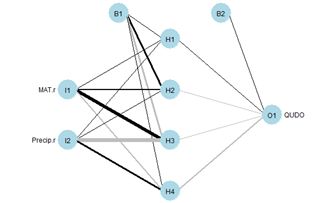
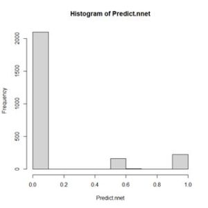
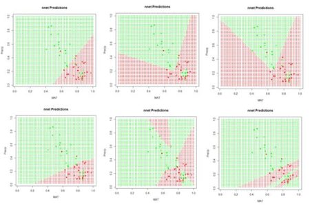
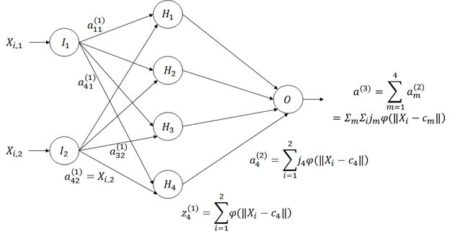
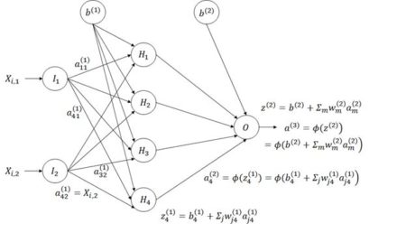
Figure 8. Diagram of an ANN with one hidden layer having four cells.

  The subscripts in Fig. 8 are the reverse of what one might expect in that information flows from input cell j in layer 1, the input layer, to cell m in layer 2, the hidden layer (for example, we write   instead of ; here j =2 identifies the input cell and m = 4 identifies the hidden layer cell). This seemingly backwards notation is traditional in the ANN literature and is used because the set of values is often represented as a matrix in which the values in the same layer form the rows. We will encounter this usage in Section 6. The activation   is part of the information processed by hidden cell m in layer 2. The hidden cells respond to the sum of input activations. according to the equation
                            . (3)
This action takes place for each of the  data records. The one output cell (layer 3) receives the activation values  of each of the M hidden cells and processes these according to the equation
                 . (4)
The quantity Qi represents the estimate of Yi given the current set of weights. Assuming that the sum of squared errors is used as the objective function, the value of the objective function

(5)
is computed. This quantity is then minimized to yield the final estimate . Table 2 summarizes this sequence of steps.  
Table 2 Sequence of steps in the computation of the ANN weights and biases.

We are now ready to start constructing our homemade ANN. First let’s see how many weights we will need. Fig. 8 indicates that if there are M hidden cells and two predictors then there will be 2M weights to cover the links from the input, plus M for the bias , for a total of 3M. From the hidden cells to the output cell there will be M, plus a final weight for the bias  for a grand total of 4M + 1 weights. Recall that the function nnet() reported 17 weights; this is where that number came from. We must pass all of the weights through the code as an array. Table 3 shows how the code of our homemade ANN arranges this array for an ANN with four hidden cells. The arrangement is organized to make the programming as simple as possible. Note, by the way, that the bias  is applied to layer 2 and the bias  is applied to layer 3. This seems confusing, but again is be nearly universal practice, so I will go with it as well. Remember that  is the weight applied to the activation from the  cell in layer l applied to the  cell in layer l + 1.

Table 3. Arrangement of the 17 biases and weights for an ANN with four hidden cells.
We will first construct a prediction function pred.ann() that, given a set of weights  and a pair of input values  for a fixed i calculates an estimate according to Equation (3).

> pred.ANN1 <- function(w.io, X){
+     b.2 <- w.io[1] # First beta is output bias
+     b.w <- w.io[-1] # Biases and weights
+     M <- length(b.w) / 4 # Number of hidden cells
# vector to hold hidden cell output activation
+     a.2 <- numeric(M)
# Hidden cell biases and weights

+     w.2 <- b.w[(3 * M + 1):(4 * M)]
+     for (m in 1:M){
+        bw.1 <-
+           b.w[(1 + (m – 1) * 3):(3 + (m – 1) * 3)]

+        a.2[m] <- lg.fn(bw.1, X)
+        }
+     phi.out <- lg.fn(c(b.2, w.2), a.2)
+     return(phi.out)
+     }
}

The arguments w.io and X contain the biases and weights and the predictor values X, respectively. The first two lines extract the output cell bias b.2, which corresponds to in Table 3, and the third lines determines the number of hidden cells by dividing the number of weights by 4. The next three lines establish locations to hold the values of the quantities in Table 3. The remaining lines of code compute the quantity Qi in Equation (4).

The next function generates the ANN itself, which we call ANN.1().

> ANN.1 <- function(X, Y, M, fn, niter){
+    w.io <- rnorm(4*M + 1)
+    X.Y <- c(as.vector(X), Y)
+    return(nlm(SSE, w.io, X.Y, fn, iterlim = niter))
+    } 

The arguments are respectively X, a matrix or data frame whose columns are the Xi,j, Y, the vector of Y values, M, the number of hidden cells, fn, the function defining the cells’ response, and niter, the maximum allowable number of iterations. The first line in the function generates the random starting weights and the second line arranges the data as a single column. The function then calls nlm() to carry out the nonlinear minimization of the sum of squared errors. There are other error measures beside the sum of squared errors that we could use, and some will be discussed later. Now we must set the quantities to feed to the ANN and pass them along.

> set.seed(1)
> X <- with(Set2.Train, (c(MAT, Precip)))
> mod.ANN1 <- ANN.1(X, Set2.Train$QUDO, 4, pred.ANN,
+    1000)
 
The function ANN.1() returns the full output of nlm(), which includes the coefficients as well as a code indicating the conditions under which the function terminated. There are five possible values of this code; you can use ?nlm to see what they signify. One point, however, must be noted. The function nlm() makes use of Newton’s method to estimate the minimum of a function. The specific algorithm is described by Schnabel et al. (1985). The important point is that the method makes use of the Hessian matrix, which is the matrix of second derivatives. If there are thousands of weights, as there might be in an ANN, this is an enormous matrix. For this reason, newer ANN algorithms generally use the gradient descent method, for which only first derivatives are needed. We will return to this issue in Section 3. Here is the output from ANN.1(). Again, your output will probably be different from mine.

> print(beta.ann <- mod.ANN1$estimate)
[1]  191.48348  198.97750 -407.10859  269.84118 -824.73518
[6]  898.75456  826.91247  473.50764 -469.37435 -241.65738
[11]  443.55838 -201.72335 -149.85410 -188.09470 -168.33946
[16]  -96.12398   73.12316
> print(code.ann <- mod.ANN1$code)

[1] 3  
The code value 3 indicates that at least a local minimum was probably found. The output is plotted in Fig. 9.

> Set2.Test$QUDO <- 0
> for (i in 1:length(Set2.Test$QUDO))
+    Set2.Test$QUDO[i] <- pred.ANN1(beta.ann,
+        c(Set2.Test$MAT[i],
Set2.Test$Precip[i]))
> plot.ANN(Set2.Test, Set2.Test$QUDO, 0.5,
+    “ANN.1 Predictions”)

> with(Set2.Train, points(x = MAT, y = Precip,
+    pch = 16,
col = Color)) # Fig. 9   
Similar to Fig. 6, this figure shows a “bestiary” of predictions of this artificial neural network. This was created by sequencing the random number seed through integer values starting at 1 and picking out results that looked interesting.

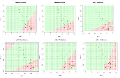
  Figure 9. A “bestiary” of ANN.1() predictions. As with nnet(), most of the time the output is relatively tame, but sometimes it is not.  

In order to examine more closely the workings of the ANN we will focus on the lower middle prediction in Fig. 9, which was created using the random number seed set to 7, and examine this for a fixed value of the predictor Precip. Fig. 10 plots the ANN output with the set of values Precip = 0.8 highlighted.


Figure 10. Replot of the sixth output displayed in Figure 8 with values Precip = 0.8 highlighted.


Figure 11. Activation  of each individual hidden cell.

Fig. 11 shows the hidden cell activation  together with the value of the weight  multiplying this response in Equation (3). Note that the individual cells can be said to “organize” themselves to respond in different ways to the inputs. For this reason during the heady days of early work in ANNs systems like this were sometimes called “self-organizing systems.” Also, the first two cells appear to have similar response, although, as can be seen by inspecting the bias and weight values in the output of ANN.1() above (with reference to Table 1), these values are actually very different. Fig. 12 is a plot along the highlighted line Precip = 0.8 of the same output as displayed in Fig. 11.   
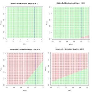
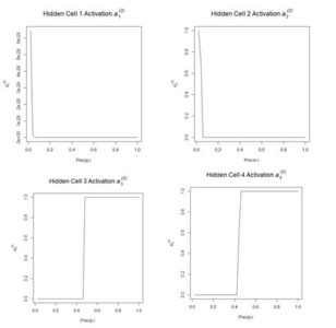
Figure 12. Plot of the hidden cell activation   along the highlighted line in Fig. 10.   Figure 13 shows the weighted activation values  of the hidden cells along the row of highlighted values. Note the different abscissa ranges of the plots in Figs. 12 and 13. 
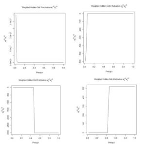
Figure 13. Plot of the weighted hidden cell activation  along the highlighted line in Fig. 10. 
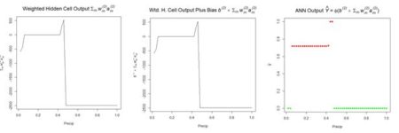
Fig. 14a shows the sum passed to the output cell, given by  in Equation (3), and Fig. 14b shows the sum  when the bias  is added. Finally, Fig. 14c shows the output value .
               (a)                                       (b)                                       (c) Figure 14. Referring to Equation (3): (a) sum  of inputs to the output cell; (b) bias added to sum of weighted inputs, ; (c) final output. The values of the first cell are universally low, so it apparently plays almost no role in the final result, we might be able achieve some simplification by pruning it. Let’s check it out.

> Set2.Test$QUDO1 <- 0
> beta.ann1 <- beta.ann[c(1,5:16)]
> for (i in 1:length(Set2.Test$QUDO))
+    Set2.Test$QUDO1[i] <- pred.ANN1(beta.ann1, c(Set2.Test$MAT[i],
+         Set2.Test$Precip[i]))
> max(abs(Set2.Test$QUDO – Set2.Test$QUDO1))  
[1] 1


Obviously, cell 1 does play an important role for some values of the predictors. Sometimes a cell can be pruned in this way without changing the results and sometimes not. Algorithms do exist for determining whether individual cells in an ANN can be pruned (Bishop, 1995). We will see in Section 6 that examination of the contributions of cells can also be used in variable selection. We mentioned earlier that the function nlm(), used in our function SSE() to locate the minimum of the sum of squared errors, could be consumptive of time and memory for large problems. Ripley (1996, p. 158), writing at a time when computers were much slower than today, asserted that any ANN with fewer than around 1,000 weights could be solved effectively using Newton’s method. The function nnet() uses an approximation of Newton’s method called the BGFS method (see ?nnet and ?optim). We can to some extent test Newton’s method by expanding the size of our ANN to ten hidden cells and running it on the full data set of 2267 records.

> set.seed(3)
> X <- with(data.Set2U, (c(MAT, Precip)))
> start_time <- Sys.time()
> mod.ANN1 <- ANN.1(X, data.Set2U$QUDO, 10,
+     pred.ANN1, 1000)

> print(code.ann <- mod.ANN1$code)
[1] 1
> stop_time <- Sys.time()
> stop_time – start_time
Time difference of 9.562427 secs


The return code of 1 indicates iteration to convergence. When using other random seeds the program occasionally goes down a rabbit hole and has to be manually stopped by hitting the <esc> key. When it does converge, it usually doesn’t take too long. We now return to the nnet package and the nnet() function, which we will apply to the entire data set. First, however, we need to discuss the use of this function for classification as opposed to regression. Our use of the numerical values 0 and 1 for the class label QUDO makes nnet() treat this as a regression problem. We can change to a classification problem easily by defining a factor valued data field and using this in the nnet() model. This seemingly small change, however, gives us the opportunity to look more closely at how the ANN computes its values and how error is interpreted. As with logistic regression, when QUDO is an integer quantity, the estimate returns values on the interval (0,1) (i.e., all numbers greater than 0 and less than 1). The use of nnet() in classification is discussed by Venables and Ripley (2002, p. 342). We will define a new quantity QUDOF as a factor taking on the factor values “0” and “1”.


> data.Set2U$QUDOF <- as.factor(data.Set2U$QUDO)
> unique(data.Set2U$QUDOF)
[1] 1 0
Levels: 0 1
modf.nnet <- nnet(QUDOF ~ MAT + Precip,
+    data = data.Set2U,
size = 4, maxit = 1000)
Let’s take a closer look at the predicted values

> hist(Predict.nnet, breaks = seq(0, 1, 0.1),
+   main = “Histogram of nnet Predictions”) #Fig. 15

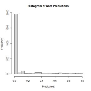
Figure 15.  Histogram of predicted values of the function nnet().   As shown in Fig. 15, although QUDOF is a nominal scale quantity (see SDA2, Sec. 4.2.1), the function nnet() still returns values on the interval (0,1). Unlike the case with logistic regression, these cannot be interpreted as probabilities, but we can interpret the output as an indication of the “strength” of the classification. Since the returned values are distributed all along the range from 0 to 1, it makes sense to establish the cutoff point using a ROC curve. We will use the functions of the package ROCR to do so.

> library(ROCR)
> pred.QUDO <- predict(modf.nnet, data.Set2U)
> pred <- prediction(pred.QUDO, data.Set2U$QUDO)
> perf <- performance(pred, “tpr”, “fpr”)
> plot(perf, colorize = TRUE,
+      main = “nnet ROC Curve”) # Fig. 16a
> perf2 <- performance(pred, “acc”)

> plot(perf2, main =
+   “nnet Prediction Accuracy”)  # Fig 16b
> print(best.cut <- which.max([email protected][[1]]))

[1] 565
> print(cutoff <- [email protected][[1]][best.cut])

[1] 0.4547653
                                   (a)                                                  (b)
Figure 16. (a) ROC curve for the nnet() prediction of QUDO presence/absence; (b) plot of prediction accuracy against cutoff value. The ROC curve analysis indicates that the cutoff value leading to the highest prediction accuracy is around 0.45. Fig. 17a shows a replot of the full data set plotted in Fig. 3a and Fig. 17b shows a plot of the prediction regions.                   
                                      (a)                                              (b) Figure 17.  (a) Plot of the QUDO data; (b) plot of the prediction regions. The ROC curve can be used to compute a widely used performance measure, the area under the ROC curve, commonly known as the AUC. Looking at Fig. 16a, one can see that if the predictor provides a perfect prediction (zero false positives or false negatives) then the AUC will be one, and if the predictor is no better than flipping a coin then the AUC will be one half. The Wikipedia article on the ROC curve provides a thorough discussion of the AUC. Here is the calculation for the current case.

> auc.perf <- performance(pred,”auc”)
> print(auc <- as.numeric([email protected]))
[1] 0.8872358

 Returning to the nnet() function, another feature of this function when the class labels are factors is its default error measure (this is discussed in the Details section of ?nnet). We can see this by applying the str() function to the nnet() output.

> str(modf.nnet)
List of 19
  *    *    Deleted    *    *
$ entropy      : logi TRUE
  *    *    Deleted    *    *

The argument entropy is by default set to TRUE. If you try this with the nnet object created earlier with QUDO taking on integer values, you will see that the default value of entropy in this case is FALSE (the value of entropy can be controlled in nnet() via the entropy argument). When entropy is TRUE, the prediction error is not measured by the sum of squared errors as defined in Equation (5). Instead, it is measured by the cross entropy. For a factor valued quantity we can define this as (Guenther and Frisch, 2010, Venables and Ripley, 2002, p. 245)
                                                 , (6)
where ti is 1 for those values of Qi that do not match the corresponding Yi, and 0 for those that do, and ai is a measure of the activity of the output cell. There is some evidence (e.g., Du and Swamy 2014, p. 37) that this measure avoids the creation of “flat spots” in the surface (or hypersurface) over which the optimization is being computed. Fig. 18 gives a sense of the difference. We will meet the cross entropy again in Section 3.

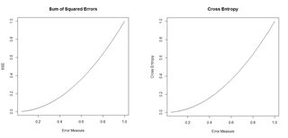
                           Figure 18. Plots of the sum of squared errors and the cross entropy for a range of error measures between 0 and 1. 
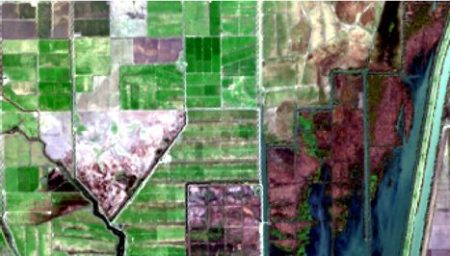
A potentially important issue in the development of an ANN is the number of cells. The tune() function of the e1071 package (Meyer et al., 2019), discussed in the Additional Topic on Support Vector Machines, has an implementation tune.nnet(). The primary intended use of the function is for cross-validation, which will be discussed below. The function can, however, also be used to rapidly assess the effect of increasing the number of hidden cells.

> library(e1071)
> tune.nnet(QUDOF ~ MAT + Precip, data = data.Set2U,
+    size = 4)
Error estimation of ‘nnet’ using 10-fold cross validation: 0.2056282
Time difference of 9.346614 secs
> tune.nnet(QUDOF ~ MAT + Precip, data = data.Set2U,

+    size = 8) Error estimation of ‘nnet’ using 10-fold cross validation: 0.2024174
Time difference of 15.9804 secs
> tune.nnet(QUDOF ~ MAT + Precip, data = data.Set2U,

+    size = 12)
Error estimation of ‘nnet’ using 10-fold cross validation: 0.1943285
Time difference of 22.1304 secs

 The code to calculate the elapsed time is not shown. These results provide evidence that for this particular problem there is only a very limited advantage to increasing the number of cells. We can use repeated evaluation to pick the prediction that provides the best fit. We will try twenty different random starting configurations to see the distribution of error rates (keeping the same cutoff value for all of them).

> seeds <- numeric(20)
> error.rate <- numeric(length(seeds))
> conv <- numeric(length(seeds))
> seed <- 0
> i <- 1
> data.set <- Set2.Test
> while (i <= length(seeds)){
+    seed <- seed + 1
+    set.seed(seed)
+    md <- nnet(QUDO ~ MAT + Precip,
+      data = data.Set2U,
size = 4, maxit = 1000,
+      trace = FALSE)

+    if (md$convergence == 0){
+       seeds[i] <- seed
+       pred <- predict(md)
+       QP <- numeric(length(pred))
+       QP[which(pred > cutoff)] <- as.factor(1)
+       error.rate[i] <-
+          length(which(QP != data.Set2U$QUDOF)) /
+              nrow(data.Set2U)

+       i <- i + 1
+       }
+    }
> seeds
[1]  1  3  4  5  6  7  8  9 10 11 12 13 14 15 16 17 18 19 20 21
> sort(error.rate)

[1] 0.1782091 0.1804146 0.1817380 0.1821791 0.1830613 0.1839435 0.1843846
[8] 0.1843846 0.1848258 0.1857080 0.1865902 0.1874724 0.1887958 0.1905602
[15] 0.1932069 0.1954124 0.1971769 0.2015880 0.2037936 0.2042347
> which.min(error.rate)

[1] 17   All but one of the seeds converged, and the best error rate is obtained using the seventeenth random number seed. The error rate here is not the same as the cross-validation error rate calculated above, as reflected in the different values. A plot of the predictions using this seed is similar to that shown in Fig. 16b. Looking at that figure, one might suspect that the model may overfit the data. The concept of overfitting and underfitting in terms of the bias-variance tradeoff is discussed in a linear regression context in SDA2 Section 8.2.1 and in a classification context in the Additional Topic on Support Vector Machines. In summary, a model that fits a training data set too closely (overfits) may do a worse job of fitting a different data set and, as discussed in the two sources, has a high variance. A simpler model that does not fit the training data as well has a higher bias, and the decision of which model to choose is a matter of balancing these two factors. Ten-fold cross validation is commonly used to test where a model stands the bias-variance tradeoff (again see the two sources given above). The following code carries out such a cross-validation.

> best.seed <- seeds[which.min(error.rate)]
> ntest <- trunc(nrow(data.Set2U) / 10) * 10
> data.set <- data.Set2U[1:ntest,]
> n.rand <- sample(1:nrow(data.set))
> n <- nrow(data.set) / 10
> folds <- matrix(n.rand, nrow = n, ncol = 10)
> SSE <- 0
> for (i in 1:10){
+    test.fold <- i
+    if (i == 1) train.fold <- 2:10
+    if (i == 10) train.fold <- 1:9
+    if ((i > 1) & (i < 10)) train.fold <-
+         c(1:(i-1), (i+1):10)

+    train <-
+       data.frame(data.set[folds[,train.fold],])

+    test <-
+         data.frame(data.set[folds[,test.fold],])

+    true.sp <- data.set$QUDO[folds[,test.fold]]
+    set.seed(best.seed)
+    modf.nnet <- nnet(QUDOF ~ MAT + Precip,
+       data = train, size = 8, maxit = 10000,
+           Trace = FALSE)

+    pred.1 <- predict(modf.nnet, test)
+    test$QUDO <- 0
+    test$QUDO[which(pred.1 >= 0.52)] <- 1
+    E <- length(which(test$QUDO != true.sp)) /
+        length(true.sp)

+    SSE <- SSE + E^2
+    }
> print(RMSE <- sqrt(SSE / 10))
[1] 0.1930847   The RMSE seems aligned with the error rate. Venables and Ripley (2002) and Ripley (1996) discuss some of the options available with the function nnet(). Some of these are explored in Exercises (4) and (5). Now that we have some experience with an ANN having a single hidden layer, we will move on to the package neuralnet, in which multiple hidden layers are possible. This concludes the first installment. Part 2 will be published subsequently. Again, R code and data are available in the Additional Topics section of SDA2, http://psfaculty.plantsciences.ucdavis.edu/plant/sda2.htm  

Analyzing Remote Sensing Data using Image Segmentation

This post summarizes material posted as an Additional Topic to accompany the book Spatial Data Analysis in Ecology and Agriculture using R, Second Edition. The full post, together with R code and data, can be found in the Additional Topics section of the book’s website, http://psfaculty.plantsciences.ucdavis.edu/plant/sda2.htm

1. Introduction
The idea is best described with images. Here is a display in mapview of an agricultural region in California’s Central Valley. The boundary of the region is a rectangle developed from UTM coordinates, and it is interesting that the boundary of the region is slightly tilted with respect to the network of roads and field boundaries. There are several possible explanations for this, but it does not affect our presentation, so we will ignore it.
There are clearly several different cover types in the region, including fallow fields, planted fields, natural regions, and open water. Our objective is to develop a land classification of the region based on Landsat data. A common method of doing this is based on the so-called false color image. In a false color image, radiation in the green wavelengths is displayed as blue, radiation in the red wavelengths is displayed as green, and radiation in the infrared wavelengths is displayed as red. Here is a false color image of the region shown in the black rectangle.  

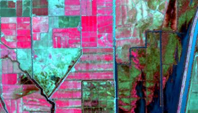
Because living vegetation strongly reflects radiation in the infrared region and absorbs it in the red region, the amount of vegetation contained in a pixel can be estimated by using the normalized difference vegetation index, or NDVI, defined as
where IR is the pixel intensity of the infrared band and R is the pixel intensity of the red band. Here is the NDVI of the region in the false color image above.
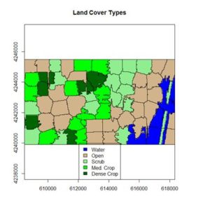
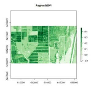
If you compare the images you can see that the areas in  black rectangle above that appear green have a high NDVI, the areas that appear brown have a low NDVI, and the open water in the southeast corner of the image actually has a negative NDVI, because water strongly absorbs infrared radiation. Our objective is to generate a classification of the land surface into one of five classes: dense vegetation, sparse vegetation, scrub, open land, and open water. Here is the classification generated using the method I am going to describe.

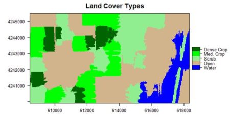
There are a number of image analysis packages available in R. I elected to use the OpenImageR and SuperpixelImageSegmentation packages, both of which were developed by L. Mouselimis (2018, 2019a). One reason for this choice is that the objects created by these packages have a very simple and transparent data structure that makes them ideal for data analysis and, in particular, for integration with the raster package.  The packages are both based on the idea of image segmentation using superpixels . According to Stutz et al. (2018), superpixels were introduced by Ren and Malik (2003). Stutz et al. define a superpixel as “a group of pixels that are similar to each other in color and other low level properties.” Here is the false color image above divided into superpixels.
The superpixels of can then be represented by groups of pixels all having the same pixel value, as shown here. This is what we will call image segmentation.


In the next section we will introduce the concepts of superpixel image segmentation and the application of these packages. In Section 3 we will discuss the use of these concepts in data analysis. The intent of image segmentation as implemented in these and other software packages is to provide support for human visualization. This can cause problems because sometimes a feature that improves the process of visualization detracts from the purpose of data analysis. In Section 4 we will see how the simple structure of the objects created by Mouselimis’s two packages can be used to advantage to make data analysis more powerful and flexible. This post is a shortened version of the Additional Topic that I described at the start of the post.

2. Introducing superpixel image segmentation
The discussion in this section is adapted from the R vignette Image Segmentation Based on Superpixels and Clustering (Mouselimis, 2019b). This vignette describes the R packages OpenImageR and SuperpixelImageSegmentation. In this post I will only discuss the OpenImageR package. It uses simple linear iterative clustering (SLIC, Achanta et al., 2010), and a modified version of this algorithm called SLICO (Yassine et al., 2018), and again for brevity I will only discuss the former. To understand how the SLIC algorithm works, and how it relates to our data analysis objective, we need a bit of review about the concept of color space. Humans perceive color as a mixture of the primary colors red, green, and blue (RGB), and thus a “model” of any given color can in principle be described as a vector in a three-dimensional vector space. The simplest such color space is one in which each component of the vector represents the intensity of one of the three primary colors. Landsat data used in land classification conforms to this model. Each band intensity is represented as an integer value between 0 and 255. The reason is that this covers the complete range of values that can be represented by a sequence of eight binary (0,1) values because 28 – 1 = 255.  For this reason it is called the eight-bit RGB color model.
There are other color spaces beyond RGB, each representing a transformation for some particular purpose of the basic RGB color space. A common such color space is the CIELAB color space, defined by the International Commission of Illumination (CIE). You can read about this color space here. In brief, quoting from this Wikipedia article, the CIELAB color space “expresses color as three values: L* for the lightness from black (0) to white (100), a* from green (−) to red (+), and b* from blue (−) to yellow (+). CIELAB was designed so that the same amount of numerical change in these values corresponds to roughly the same amount of visually perceived change.”
Each pixel in an image contains two types of information: its color, represented by a vector in a three dimensional space such as the RGB or CIELAB color space, and its location, represented by a vector in two dimensional space (its x and y coordinates). Thus the totality of information in a pixel is a vector in a five dimensional space. The SLIC algorithm performs a clustering operation similar to K-means clustering on the collection of pixels as represented in this five-dimensional space.
The SLIC algorithm measures total distance between pixels as the sum of two components, dlab, the distance in the CIELAB color space, and dxy, the distance in pixel (x,y) coordinates. Specifically, the distance Ds is computed as
where S is the grid interval of the pixels and m is a compactness parameter that allows one to emphasize or de-emphasize the spatial compactness of the superpixels. The algorithm begins with a set of K cluster centers regularly arranged in the (x,y) grid and performs K-means clustering of these centers until a predefined convergence measure is attained.
The following discussion assumes some basic familiarity with the raster package. If you are not familiar with this package, an excellent introduction is given here. After downloading the data files, you can use them to first construct RasterLayer objects and then combine them into a RasterBrick.

library(raster)
> b2 <- raster(“region_blue.grd”)
> b3 <- raster(“region_green.grd”)
> b4 <- raster(“region_red.grd”)
> b5 <- raster(“region_IR.grd”)
> region.brick <- brick(b2, b3, b4, b5)

We will need to save the number of rows and columns for present and future use.
> print(nrows <- region.brick@nrows)
[1] 187
> print(ncols <- region.brick@ncols)

[1] 329
Next we plot the region.brick object (shown above) and write it to disk.
> # False color image
> plotRGB(region.brick, r = 4, g = 3, b = 2,
+   stretch = “lin”)

> # Write the image to disk
> jpeg(“FalseColor.jpg”, width = ncols,
+   height = nrows)

> plotRGB(region.brick, r = 4, g = 3, b = 2,
+   stretch = “lin”)

> dev.off()
We will now use SLIC for image segmentation. The code here is adapted directly from the superpixels vignette.

> library(OpenImageR)
> False.Color <- readImage(“FalseColor.jpg”)
> Region.slic = superpixels(input_image =
+   False.Color, method = “slic”, superpixel = 80,
+   compactness = 30, return_slic_data = TRUE,
+   return_labels = TRUE, write_slic = “”,
+   verbose = FALSE)
Warning message:
The input data has values between 0.000000 and 1.000000. The image-data will be multiplied by the value: 255!
> imageShow(Region.slic$slic_data)

 
We will discuss the warning message in Section 3. The function imageShow() is part of the OpenImageR package.
The OpenImageR function superpixels() creates superpixels, but it does not actually create an image segmentation in the sense that we are using the term is defined in Section 1. This is done by functions in the SuperPixelImageSegmentation package (Mouselimis, 2018), whose discussion is also contained in the superpixels vignette. This package is also described in the Additional Topic. As pointed out there, however, some aspects that make the function well suited for image visualization detract from its usefulness for data analysis, so we won’t discuss it further in this post. Instead, we will move directly to data analysis using the OpenImageR package.

3. Data analysis using superpixels
To use the functions in the OpenImageR package for data analysis, we must first understand the structure of objects created by these packages. The simple, open structure of the objects generated by the function superpixels() makes it an easy matter to use these objects for our purposes. Before we begin, however, we must discuss a preliminary matter: the difference between a Raster* object and a raster object. In Section 2 we used the function raster() to generate the blue, green, red and IR band objects b2, b3, b4, and b5, and then we used the function brick() to generate the object region.brick. Let’s look at the classes of these objects.

> class(b3)
[1] “RasterLayer”
attr(,”package”)
[1] “raster”
> class(full.brick)

[1] “RasterBrick”
attr(,”package”)
[1] “raster”

Objects created by the raster packages are called Raster* objects, with a capital “R”. This may seem like a trivial detail, but it is important to keep in mind because the objects generated by the functions in the OpenImageR and SuperpixelImageSegmentation packages are raster objects that are not Raster* objects (note the deliberate lack of a courier font for the word “raster”).
In Section 2 we used the OpenImageR function readImage() to read the image data into the object False.Color for analysis. Let’s take a look at the structure of this object.

> str(False.Color)
num [1:187, 1:329, 1:3] 0.373 0.416 0.341 0.204 0.165 …
It is a three-dimensional array, which can be thought of as a box, analogous to a rectangular Rubik’s cube. The “height” and “width” of the box are the number of rows and columns respectively in the image and at each value of the height and width the “depth” is a vector whose three components are the red, green, and blue color values of that cell in the image, scaled to [0,1] by dividing the 8-bit RGB values, which range from 0 to 255, by 255. This is the source of the warning message that accompanied the output of the function superpixels(), which said that the values will be multiplied by 255. For our purposes, however, it means that we can easily analyze images consisting of transformations of these values, such as the NDVI. Since the NDVI is a ratio, it doesn’t matter whether the RGB values are normalized or not. For our case the RasterLayer object b5 of the RasterBrick False.Color is the IR band and the object b4 is the R band. Therefore we can compute the NDVI as

> NDVI.region <- (b5 – b4) / (b5 + b4)

Since NDVI is a ratio scale quantity, the theoretically best practice is to plot it using a monochromatic representation in which the brightness of the color (i.e., the color value) represents the value (Tufte, 1983). We can accomplish this using the RColorBrewer function brewer.pal().

> library(RColorBrewer)
> plot(NDVI.region, col = brewer.pal(9, “Greens”),
+   axes = TRUE,
main = “Region NDVI”)
 
This generates the NDVI map shown above. The darkest areas have the highest NDVI. Let’s take a look at the structure of the RasterLayer object NDVI.region.
> str(NDVI.region)
Formal class ‘RasterLayer’ [package “raster”] with 12 slots
              *                 *                   *
..@ data    :Formal class ‘.SingleLayerData’ [package “raster”] with 13 slots
              *                 *                   *
.. .. ..@ values    : num [1:61523] 0.1214 0.1138 0.1043 0.0973 0.0883 …
              *                 *                   *
..@ ncols   : int 329
..@ nrows   : int 187
Only the relevant parts are shown, but we see that we can convert the raster data to a matrix that can be imported into our image segmentation machinery as follows. Remember that by default R constructs matrices by columns. The data in Raster* objects such as NDVI.region are stored by rows, so in converting these data to a matrix we must specify byrow = TRUE.

> NDVI.mat <- matrix(NDVI.region@data@values,
+   nrow = NDVI.region@nrows,
+  
ncol = NDVI.region@ncols, byrow = TRUE)

The function imageShow() works with data that are either in the eight bit 0 – 255 range or in the [0,1] range (i.e., the range of x between and including 0 and 1). It does not, however, work with NDVI values if these values are negative. Therefore, we will scale NDVI values to [0,1].

> m0 <- min(NDVI.mat)
> m1 <- max(NDVI.mat)
> NDVI.mat1 <- (NDVI.mat – m0) / (m1 – m0)
> imageShow(NDVI.mat)

 Here is the resulting image.

The function imageShow() deals with a single layer object by producing a grayscale image. Unlike the green NDVI plot above, in this plot the lower NDVI regions are darker.
We are now ready to carry out the segmentation of the NDVI data. Since the structure of the NDVI image to be analyzed is the same as that of the false color image, we can simply create a copy of this image, fill it with the NDVI data, and run it through the superpixel image segmentation function. If an image has not been created on disk, it is also possible (see the Additional Topic) to create the input object directly from the data.

> NDVI.data <- False.Color
> NDVI.data[,,1] <- NDVI.mat1
> NDVI.data[,,2] <- NDVI.mat1
> NDVI.data[,,3] <- NDVI.mat1 In the next section we will describe how to create an image segmentation of the NDVI data and how to use cluster analysis to create a land classification.

4. Expanding the data analysis capacity of superpixels
Here is an application of the function superpixels() to the NDVI data generated in Section 3.


> NDVI.80 = superpixels(input_image = NDVI.data,
+   method = “slic”, superpixel = 80,
+   compactness = 30, return_slic_data = TRUE,
+   return_labels = TRUE, write_slic = “”,
+   verbose = FALSE)
> imageShow(Region.slic$slic_data)

Here is the result.
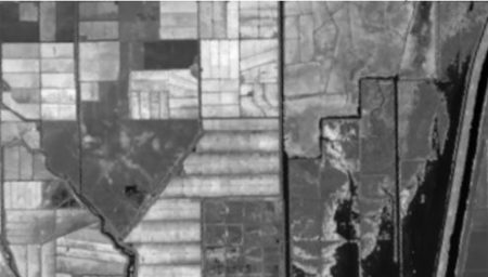
Here the structure of the object NDVI.80 .

> str(NDVI.80)
List of 2
$ slic_data: num [1:187, 1:329, 1:3] 95 106 87 52 42 50 63 79 71 57 …
$ labels   : num [1:187, 1:329] 0 0 0 0 0 0 0 0 0 0 …

It is a list with two elements, NDVI.80$slic_data, a three dimensional array of pixel color data (not normalized), and NDVI.80$labels, a matrix whose elements correspond to the pixels of the image. The second element’s name hints that it may contain values identifying the superpixel to which each pixel belongs. Let’s see if this is true.

> sort(unique(as.vector(NDVI.80$labels)))
[1]  0  1  2  3  4  5  6  7  8  9 10 11 12 13 14 15 16 17 18 19 20 21 22 23
[25] 24 25 26 27 28 29 30 31 32 33 34 35 36 37 38 39 40 41 42 43 44 45 46 47
[49] 48 49 50 51 52 53 54 55 56 57 58 59 60 61 62 63 64 65 66 67 68 69 70 71

There are 72 unique labels. Although the call to superpixels() specified 80 superpixels, the function generated 72. We can see which pixels have the label value 0 by setting the values of all of the other pixels to [255, 255, 255], which will plot as white.

> R0 <- NDVI.80
for (i in 1:nrow(R0$label))
+    for (j in 1:ncol(R0$label))
+       if (R0$label[i,j] != 0)
+          R0$slic_data[i,j,] <- c(255,255,255)
> imageShow(R0$slic_data)


This produces the plot shown here.
The operation isolates the superpixel in the upper right corner of the image, together with the corresponding portion of the boundary. We can easily use this approach to figure out which value of NDVI.80$label corresponds to which superpixel. Now let’s deal with the boundary. A little exploration of the NDVI.80 object suggests that pixels on the boundary have all three components equal to zero. Let’s isolate and plot all such pixels by coloring all other pixels white.

> Bdry <- NDVI.80
for (i in 1:nrow(Bdry$label))
+    for (j in 1:ncol(Bdry$label))
+     if (!(Bdry$slic_data[i,j,1] == 0 &
+     Bdry$slic_data[i,j,2] == 0 &
+       Bdry$slic_data[i,j,3] == 0))

+       Bdry$slic_data[i,j,] <- c(255,255,255)
> Bdry.norm <- NormalizeObject(Bdry$slic_data)
> imageShow(Bdry$slic_data)


This shows that we have indeed identified the boundary pixels. Note that the function imageShow() displays these pixels as white with a black edge, rather than pure black. Having done a preliminary analysis, we can organize our segmentation process into two steps. The first step will be to replace each of the superpixels generated by the OpenImageR function superpixels() with one in which each pixel has the same value, corresponding to a measure of central tendency (e.g, the mean, median , or mode) of the original superpixel. The second step will be to use the K-means unsupervised clustering procedure to organize the superpixels from step 1 into a set of clusters and give each cluster a value corresponding to a measure of central tendency of the cluster. I used the code developed to identify the labels and to generate the  boundary to construct a function make.segments() to carry out the segmentation. The first argument of make.segments() is the superpixels object, and the second is the functional measurement of central tendency. Although in this case each of the three colors of the object NDVI.80 have the same values, this may not be true for every application, so the function analyzes each color separately. Because the function is rather long, I have not included it in this post. If you want to see it, you can go to the Additional Topic linked to the book’s website.

Here is the application of the function to the object NDVI.80 with the second argument set to mean.

> NDVI.means <- make.segments(NDVI.80, mean)
> imageShow(NDVI.means$slic_data)

Here is the result.

The next step is to develop clusters that represent identifiable land cover types. In a real project the procedure would be to collect a set of ground truth data from the site, but that option is not available to us. Instead we will work with the true color rendition of the Landsat scene, shown here.
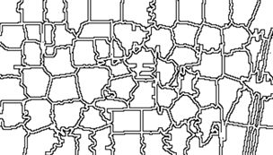
The land cover is subdivided using K-means into five types: dense crop, medium crop, scrub, open, and water.

> set.seed(123)
> NDVI.clus <-
+ kmeans(as.vector(NDVI.means$slic_data[,,1]), 5)

> vege.class <- matrix(NDVI.clus$cluster,
+    nrow = NDVI.region@nrows,

+    ncol = NDVI.region@ncols, byrow = FALSE)
> class.ras <- raster(vege.class, xmn = W,
+    xmx = E, ymn = S, ymx = N, crs =
+    CRS(“+proj=utm +zone=10 +ellps=WGS84”))

Next I used the raster function ratify() to assign descriptive factor levels to the clusters.


> class.ras <- ratify(class.ras)
> rat.class <- levels(class.ras)[[1]]
> rat.class$landcover <- c(“Water”, “Open”,
+  “Scrub”, “Med. Crop”, “Dense Crop”)

> levels(class.ras) <- rat.class
> levelplot(class.ras, margin=FALSE,
+   col.regions= c(“blue”, “tan”,

+   “lightgreen”, “green”, “darkgreen”),
+    main = “Land Cover Types”)


The result is shown in the figure at the start of the post. We can also overlay the original boundaries on top of the image. This is more easily done using plot() rather than levelplot(). The function plot() allows plots to be built up in a series of statements. The function levelplot() does not.

> NDVI.rasmns <- raster(NDVI.means$slic_data[,,1],
+   xmn = W,
xmx = E, ymn = S, ymx = N,
+   crs = CRS(“+proj=utm +zone=10 +ellps=WGS84”))

> NDVI.polymns <- rasterToPolygons(NDVI.rasmns,
+   dissolve = TRUE)

> plot(class.ras, col = c(“blue”, “tan”,
+   “lightgreen”,
“green”, “darkgreen”),
+   main = “Land Cover Types”,
legend = FALSE)
> legend(“bottom”, legend = c(“Water”, “Open”,
+   “Scrub”, “Med. Crop”,
“Dense Crop”),
+   fill = c(“blue”, “tan”, “lightgreen”, “green”,

+   “darkgreen”))
> plot(NDVI.polymns, add = TRUE)


The application of image segmentation algorithms to remotely sensed image classification is a rapidly growing field, with numerous studies appearing every year. At this point, however, there is little in the way of theory on which to base an organization of the topic. If you are interested in following up on the subject, I encourage you to explore it on the Internet.

References
Achanta, R., A. Shaji, K. Smith, A. Lucchi, P. Fua, and S. Susstrunk (2010). SLIC Superpixels. Ecole Polytechnique Fedrale de Lausanne Technical Report 149300.

Appelhans, T., F. Detsch, C. Reudenbach and S. Woellauer (2017).  mapview: Interactive Viewing of Spatial Data in R. R package version 2.2.0.  https://CRAN.R-project.org/package=mapview Bivand, R., E. Pebesma, and V. Gómez-Rubio. (2008). Applied Spatial Data Analysis with R. Springer, New York, NY.

Frey, B.J. and D. Dueck (2006). Mixture modeling by affinity propagation. Advances in Neural Information Processing Systems 18:379.

Hijmans, R. J. (2016). raster: Geographic Data Analysis and Modeling. R package version 2.5-8. https://CRAN.R-project.org/package=raster

Mouselimis, L. (2018). SuperpixelImageSegmentation: Superpixel Image Segmentation. R package version 1.0.0. https://CRAN.R-project.org/package=SuperpixelImageSegmentation

Mouselimis, L. (2019a). OpenImageR: An Image Processing Toolkit. R package version 1.1.5. https://CRAN.R-project.org/package=OpenImageR

Mouselimis, L. (2019b) Image Segmentation Based on Superpixel Images and Clustering. https://cran.r-project.org/web/packages/OpenImageR/vignettes/Image_segmentation_superpixels_clustering.html.

Ren, X., and J. Malik (2003) Learning a classification model for segmentation. International Conference on Computer Vision, 2003, 10-17.

Stutz, D., A. Hermans, and B. Leibe (2018). Superpixels: An evaluation of the state-of-the-art. Computer Vision and Image Understanding 166:1-27.

Tufte, E. R. (1983). The Visual Display of Quantitative Information. Graphics Press, Cheshire, Conn.

Yassine, B., P. Taylor, and A. Story (2018).  Fully automated lung segmentation from chest radiographs using SLICO superpixels. Analog Integrated Circuits and Signal Processing 95:423-428.

Zhou, B. (2013) Image segmentation using SLIC superpixels and affinity propagation clustering. International Journal of Science and Research. https://pdfs.semanticscholar.org/6533/654973054b742e725fd433265700c07b48a2.pdf  


< p style=”text-align: center”>