Below are some basic equivalences demonstrating partial moments’ role as the elements of variance.
Why is this relevant?
The additional information generated from partial moments permits a level of analysis simply not possible with traditional summary statistics. There is further introductory material on partial moments and their extension into nonlinear analysis & behavioral finance applications available at:
> cov(cbind(x,y))
            x           y
x  0.83323283 -0.04372107
y -0.04372107  0.93506310

> cov.mtx=PM.matrix(LPM.degree = 1,UPM.degree = 1,target = 'mean', variable = cbind(x,y), pop.adj = TRUE)

> cov.mtx
$clpm
          x         y
x 0.4033078 0.1559295
y 0.1559295 0.3939005

$cupm
          x         y
x 0.4299250 0.1033601
y 0.1033601 0.5411626

$dlpm
          x         y
x 0.0000000 0.1469182
y 0.1560924 0.0000000

$dupm
          x         y
x 0.0000000 0.1560924
y 0.1469182 0.0000000

$matrix
            x           y
x  0.83323283 -0.04372107
y -0.04372107  0.93506310
Politics with a big data: data analysis in social research using R20 -22 December 2019 Presidency University Department of Political Science, Presidency University In association with Association SNAP
Invites you to a workshop on R Statistical software designed exclusively for social science researchers. The workshop will introduce basic statistical concepts and provide the fundamental R programming skills necessary for analyzing policy and political data in India.
This is an applied course for researchers, scientists with little-to-no programming experienceand aims teach best practices for data analysis to apply skills to conduct reproducible research.
The workshop will also introduce available datasets in India; along with hands-on training on data management and analysis using R software.
Course:The broad course contents include: a) use of big data in democracy, b) Familiarization with Basic operations in R c) Data Management d) Observe Data Relationships: Statistics and Visualization, e) Finding Statistically Meaningful Relationships, f) Text analysis of policy document. The full course module available upon registration.
For whom:ideal for early career researcher, academic, researcher with Think-tank, Journalists and students with interest in political data.
Fees:Rs 1500 (inclusive of working Lunch, tea coffee and workshop kit). Participants need to arrange their own accommodation and travel. Participants must bring their own computer (wi-fi access will be provided by Presidency University).
To Register:Please visit the website www.google.comto register interest. If your application successful, we shall notify through email and payment details.
The last date for receiving application is 15 December, 2015
[contact-form][contact-field label=”Name” type=”name” required=”true” /][contact-field label=”Email” type=”email” required=”true” /][contact-field label=”Website” type=”url” /][contact-field label=”Message” type=”textarea” /][/contact-form]
[contact-form][contact-field label=”Name” type=”name” required=”true” /][contact-field label=”Email” type=”email” required=”true” /][contact-field label=”Website” type=”url” /][contact-field label=”Message” type=”textarea” /][/contact-form]
[contact-form][contact-field label=”Name” type=”name” required=”true” /][contact-field label=”Email” type=”email” required=”true” /][contact-field label=”Website” type=”url” /][contact-field label=”Message” type=”textarea” /][/contact-form]
[contact-form][contact-field label=”Name” type=”name” required=”true” /][contact-field label=”Email” type=”email” required=”true” /][contact-field label=”Website” type=”url” /][contact-field label=”Message” type=”textarea” /][/contact-form]
[contact-form][contact-field label=”Name” type=”name” required=”true” /][contact-field label=”Email” type=”email” required=”true” /][contact-field label=”Website” type=”url” /][contact-field label=”Message” type=”textarea” /][/contact-form]
.
For further details https://presiuniv.ac.in/web/email- [email protected]Resources Persons:
Dr. Neelanjan Sircar, Assistant Professor of Political Science at Ashoka University and Visiting Senior Fellow at the Centre for Policy Research in New Delhi
Dr. PraveshTamang, Assistant Professor of Economics at Presidency University
Sabir Ahmed, National Research Coordinator Pratichi (India) Trust- Kolkata
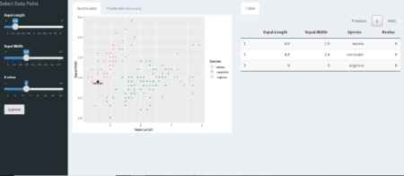
K-nearest neighbors is easy to understand supervised learning method which is often used to solve classification problems. The algorithm assumes that similar objects are closer to each other.
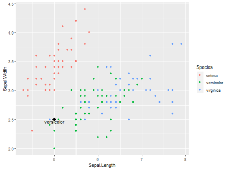
To understand it better and keeping it simple, explore thisshiny app, where user can define data point, no. of neighbors and predict the outcome. Data used here is popular Iris dataset and ggplot2 is used for visualizing existing data and user defined data point. Scatter-plot and table are updated for each new observation.
Data is more interesting in overlapping region between versicolor and virginica. Especially at K=2 error is more vivid, as same data point is classified into different categories. In the overlapping region, if there is a tie between different categories outcome is decided randomly.
One can also see accuracy with 95% Confidence Interval for different values K neighbors with 80/20 training-validation data . While classification is done with ‘class’ package, accuracy is calculated with ‘caret’ library.
I got fed up with the manual process, so I started to automate the entire process Ubuntu in a bash script. This script should work for most Debian based distros.
sudo ./configure --prefix=/opt/R/$r_ver --enable-R-shlib && \
sudo make && \
sudo make install
4. Update environment variable for R-Studio
export RSTUDIO_WHICH_R="/opt/R/3.4.4/bin/R"
5. Launch R-Studio (in the context of this environment variable)
rstudio
I started down the road of manually downloading all the .tar.gz files of the versions that I might want to install, so then I grabbed a method for un-archiving all these files at one time.
find . -name '*.tar.gz' -execdir tar -xzvf '{}' \;
Here is where I started to Build and install R from source in an automating script at once I use this
#!/bin/bash
# run with sudo
function config_make_install_r(){
  folder_path=$1
  r_version=$2
  cd $folder_path
  sudo ./configure --prefix=/opt/R/$r_version --enable-R-shlib && \
  sudo make && \
  sudo make install
}
config_make_install_r ~/Downloads/R-3.4.4 3.4.4
From here i added a menu system i found on stack overflow. This script prompts to install whatever version of R you are attempting to launch if not yet installed.
Executing this script also places a copy of it’s self in the current users local profile, and a link to a new .desktop for the local Unity Launcher on first run. This allows me to run this custom launcher from the application launcher. I then pin it as a favorite to the Dock manually.
Longitudinal changes in a population of interest are often heterogeneous and may be influenced by a combination of baseline factors. The longitudinal tree (that is, regression tree with longitudinal data) can be very helpful to identify and characterize the sub-groups with distinct longitudinal profile in a heterogenous population. This blog presents the capabilities of the R package LongCART for constructing longitudinal tree according to the LongCART algorithm (Kundu and Harezlak 2019). In addition, this packages can also be used to formally evaluate whether any particular baseline covariate affects the longitudinal profile via parameter instability test. In this blog, construction of longitudinal tree is illlustrated with an R dataset in step by step approach and the results are explained.
Get the example dataset The ACTG175 dataset in speff2trial package contains longitudinal observation of CD4 counts from clinical trial in HIV patients. This dataset is in “wide” format, and, we need to convert it to first “long” format.
Longtudinal model of interest Since the count data including CD4 counts are often log transformed before modeling, a simple longitudinal model for CD4 counts would be: log(CD4 countit) = beta0 + beta1*t + bi + epsilonit Does the fixed parameters of above longitdinal vary with the level of baseline covariate? Categorical baseline covariate Suppose we want to evaluate whether any of the fixed model parameters changes with the levels of any baseline categorical partitioning variable, say, gender.
R> adata$Y=ifelse(!is.na(adata$cd4),log(adata$cd4+1), NA)
R> StabCat(data=adata, patid="pidnum", fixed=Y~time, splitvar="gender")
Stability Test for Categorical grouping variable
Test.statistic=0.297, p-value=0.862
The p-value is 0.862 which indicates that we don’t have any evidence that fixed parameters vary with the levels of gender. Continuous baseline covariate Now suppose we are interested to evaluate whether any of the fixed model parameters changes with the levels of any baseline continuous partitioning variable, say, wtkg.
R> StabCont(data=adata, patid="pidnum", fixed=Y~time, splitvar="wtkg")
Stability Test for Continuous grouping variable
Test.statistic=1.004 1.945, Adj. p-value=0.265 0.002
The result returns two two p-values – the first p-value correspond to parameter instability test of beta0 and the second ones correspond to beta1 . Constructing tree for longitudinal profile The ACTG175 dataset contains several baseline variables including gender, hemo (presence of hemophilia), homo (homosexual activity), drugs (history of intravenous drug use ), oprior (prior non-zidovudine antiretroviral therapy), z30 (zidovudine use 30 days prior to treatment initiation), zprior (zidovudine use prior to treatment initiation), race, str2 (antiretroviral history), treat (treatment indicator), offtrt (indicator of off-treatment before 96 weeks), age, wtkg (weight) and karnof (Karnofsky score). We can construct longitudinal tree to identify the sub-groups defined by these baseline variables such that the individuals within the given sub-groups are homogeneous with respect to longitudinal profile of CD4 counts but the longitudinal profiles among the sub-groups are heterogenous.
All the baseline variables are listed in gvars argument. The gvars argument is accompanied with the tgvars argument which indicates type of the partitioning variables (0=categorical or 1=continuous). Note that the LongCART() function currently can handle the categorical variables with numerical levels only. For nominal variables, please create the corresponding numerically coded dummy variable(s). Now let’s view the tree results
R> out.tree$Treeout
ID n yval var index p (Instability) loglik improve Terminal
1 1 2139 5.841-0.003time offtrt 1.00 0.000 -4208 595 FALSE
2 2 1363 5.887-0.002time treat 1.00 0.000 -2258 90 FALSE
3 4 316 5.883-0.004time str2 1.00 0.005 -577 64 FALSE
4 8 125 5.948-0.002time symptom NA 1.000 -176 NA TRUE
5 9 191 5.84-0.005time symptom NA 0.842 -378 NA TRUE
6 5 1047 5.888-0.001time wtkg 68.49 0.008 -1645 210 FALSE
7 10 319 5.846-0.002time karnof NA 0.260 -701 NA TRUE
8 11 728 5.907-0.001time age NA 0.117 -849 NA TRUE
9 3 776 5.781-0.007time karnof 100.00 0.000 -1663 33 FALSE
10 6 360 5.768-0.009time wtkg NA 0.395 -772 NA TRUE
11 7 416 5.795-0.005time z30 1.00 0.014 -883 44 FALSE
12 14 218 5.848-0.003time treat NA 0.383 -425 NA TRUE
13 15 198 5.738-0.007time age NA 0.994 -444 NA TRUE
In the above output, each row corresponds to single node including the 7 terminal nodes identified by TERMINAL=TRUE. Now let’s visualize the tree results
This tutorial illustrates how to use the bwimge R package (Biagolini-Jr 2019) to describe patterns in images of natural structures. Digital images are basically two-dimensional objects composed by cells (pixels) that hold information of the intensity of three color channels (red, green and blue). For some file formats (such as png) another channel (the alpha channel) represents the degree of transparency (or opacity) of a pixel. If the alpha channel is equal to 0 the pixel will be fully transparent, if the alpha channel is equal to 1 the pixel will be fully opaque. Bwimage’s images analysis is based on transforming color intensity data to pure black-white data, and transporting the information to a matrix where it is possible to obtain a series of statistics data. Thus, the general routine of bwimage image analysis is initially to transform an image into a binary matrix, and secondly to apply a function to extract the desired information. Here, I provide examples and call attention to the following key aspects: i) transform an image to a binary matrix; ii) introduce distort images function; iii) demonstrate examples of bwimage application to estimate canopy openness; and iv) describe vertical vegetation complexity. The theoretical background of the available methods is presented in Biagolini & Macedo (2019) and in references cited along this tutorial. You can reproduce all examples of this tutorial by typing the given commands at the R prompt. All images used to illustrate the example presented here are in public domain. To download images, check out links in the Data availability section of this tutorial. Before starting this tutorial, make sure that you have installed and loaded bwimage, and all images are stored in your working directory.
install.packages("bwimage") # Download and install bwimage
library("bwimage") # Load bwimage package
setwd(choose.dir()) # Choose your directory. Remember to stores images to be analyzed in this folder.
Transform an image to a binary matrix
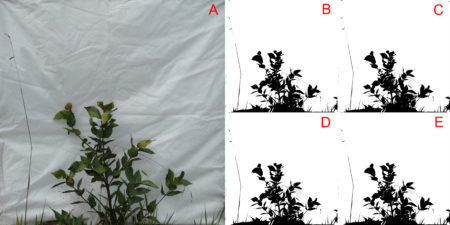
Transporting your image information to a matrix is the first step in any bwimage analysis. This step is critical for high quality analysis. The function threshold_color can be used to execute the thresholding process; with this function the averaged intensity of red, green and blue (or only just one channel if desired) is compared to a threshold (argument threshold_value). If the average intensity is less than the threshold (default is 50%) the pixel will be set as black, otherwise it will be white. In the output matrix, the value one represents black pixels, zero represents white pixels and NA represents transparent pixels. Figure 1 shows a comparison of threshold output when using all three channels in contrast to using just one channel (i.e. the effect of change argument channel).
Figure 1. The effect of using different color channels for thresholding a bush image. Figure A represents the original image. Figures B, C, D, and E, represent the output using all three channels, and just red, green and blue channels, respectively.
You can reproduce the threshold image by following the code:
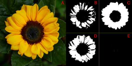
In this first example, the overall variations in thresholding are hard to detect with a simple visual inspection. This is because the way images were produced create a high contrast between the vegetation and the white background. Later in this tutorial, more information about this image will be presented. For a clear visual difference in the effect of change argument channel, let us repeat the thresholding process with two new images with more extreme color channel contrasts: sunflower (Figure 2), and Brazilian flag (Figure 3).
Figure 2. The effect of using different color channels for thresholding a sunflower image. Figure A represents the original image. Figures B, C, D, and E, represent the output using all three channels, and just red, green and blue, respectively.Figure 3. The effect of using different color channels for thresholding a Brazilian flag image. Figure A represents the original image. Figures B, C, D, and E, represent the output using all three channels, and just red, green and blue, respectively.
You can reproduce the thresholding output of images 2 and 3, by changing the first line of the previous code for the following codes, and just follow the remaining code lines.
file_name="sunflower.JPG" # for figure 2
file_name="brazilian_flag.JPG" # for figure 03
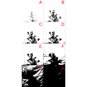
Another important parameter that can affect output quality is the threshold value used to define if the pixel must be converted to black or white (i.e. the argument threshold_value in function threshold_color). Figure 4 compares the effect of using different threshold limits in the threshold output of the same bush image processed above.
Figure 4 Comparison of different threshold values (i.e. threshold_value argument) to threshold a bush image. In this example, all color channels were considered, and thresholding values selected for images A to H, were 0.1,0.2,0.3,0.4,0.5,0.6,0.7,0.8 and 0.9, respectively.
You can reproduce the threshold image with the following code:
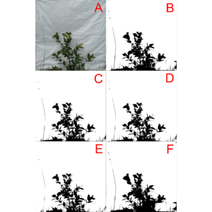
The bwimage package s threshold algorithm (described above) provides a simple, powerful and easy to understand process to convert colored images to a pure black and white scale. However, this algorithm was not designed to meet specific demands that may arise according to user applicability. Users interested in specific algorithms can use others R packages, such as auto_thresh_mask (Nolan 2019), to create a binary matrix to apply bwimage function. Below, we provide examples of how to apply four algorithms (IJDefault, Intermodes, Minimum, and RenyiEntropy) from the auto_thresh_mask function (auto_thresh_mask package – Nolan 2019), and use it to calculate vegetation density of the bush image (i.e. proportion of black pixels in relation to all pixels). I repeated the same analysis using bwimage algorithm to compare results. Figure 5 illustrates differences between image output from algorithms.
The calculated vegetation density for each algorithm was:
Algorithm
Vegetation density
IJDefault
0.1334882
Intermodes
0.1199355
Minimum
0.1136603
RenyiEntropy
0.1599628
Bwimage
0.1397852
For a description of each algorithms, check out the documentation of function auto_thresh_mask and its references.
?auto_thresh_mask
Figure 5 Comparison of thresholding output from the bush image using five algorithms. Image A represents the original image, and images from letters B to F, represent the output from thresholding of bwimage, IJDefault, Intermodes, Minimum, and RenyiEntropy algorithms, respectively.
You can reproduce the threshold image with the following code:
par(mar = c(0,0,0,0)) ## Remove the plot margin
image(t(bw_matrix)[,nrow(bw_matrix):1], col = c("white","black"), xaxt = "n", yaxt = "n")
image(t(bw_matrix)[,nrow(bw_matrix):1], col = c("white","black"), xaxt = "n", yaxt = "n")
image(t(IJDefault_matrix)[,nrow(IJDefault_matrix):1], col = c("white","black"), xaxt = "n", yaxt = "n")
image(t(Intermodes_matrix)[,nrow(Intermodes_matrix):1], col = c("white","black"), xaxt = "n", yaxt = "n")
image(t(Minimum_matrix)[,nrow(Minimum_matrix):1], col = c("white","black"), xaxt = "n", yaxt = "n")
image(t(RenyiEntropy_matrix)[,nrow(RenyiEntropy_matrix):1], col = c("white","black"), xaxt = "n", yaxt = "n")
dev.off()
If you applied the above functions, you may have noticed that high resolution images imply in large R objects that can be computationally heavy (depending on your GPU setup). The argument compress_method from threshold_color and threshold_image_list functions can be used to reduce the output matrix. It reduces GPU usage and time necessary to run analyses. But it is necessary to keep in mind that by reducing resolution the accuracy of data description will be lowered. To compare different resamplings, from a figure of 2500×2500 pixels, check out figure 2 from Biagolini-Jr and Macedo (2019) .
The available methods for image reduction are: i) frame_fixed, which resamples images to a desired target width and height; ii) proportional, which resamples the image by a given ratio provided in the argument “proportion”; iii) width_fixed, which resamples images to a target width, and also reduces the image height by the same factor. For instance, if the original file had 1000 pixels in width, and the new width_was set to 100, height will be reduced by a factor of 0.1 (100/1000); and iv) height_fixed, analogous to width_fixed, but assumes height as reference.
Distort images function
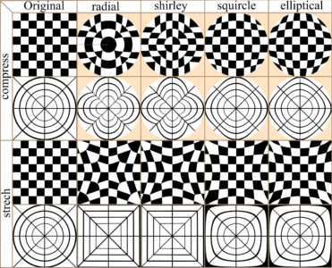
In many cases image distortion is intrinsic to image development, for instance global maps face a trade-off between distortion and the total amount of information that can be presented in the image. The bwimage package has two functions for distorting images (stretch and compress functions) which allow allow application of four different algorithms for mapping images, from circle to square and vice versa. Algorithms were adapted from Lambers (2016). Figure 6 compares image distortion of two images using stretch and compress functions, and all available algorithms.
Figure 6. Overview differences in the application of two distortion functions (stretch and compress) and all available algorithms.
You can reproduce distortion images with the following the code:
Canopy openness is one of the most common vegetation parameters of interest in field ecology surveys. Canopy openness can be calculated based on pictures on the ground or by an aerial system e.g. (Díaz and Lencinas 2018). Next, we demonstrate how to estimate canopy openness, using a picture taken on the ground. The photo setup is described in Biagolini-Jr and Macedo (2019). Canopy closure can be calculated by estimating the total amount of vegetation in the canopy. Canopy openness is equal to one minus the canopy closure. You can calculate canopy openness for the canopy image example (provide by bwimage package) using the following code:
For users interested in deeper analyses of canopy images, I also recommend the caiman package.
Describe vertical vegetation complexity
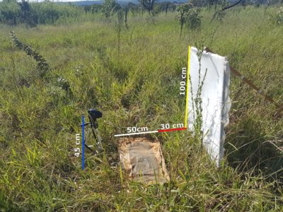
There are several metrics to describe vertical vegetation complexity that can be performed using a picture of a vegetation section against a white background, as described by Zehm et al. (2003). Part of the metrics presented by these authors were implemented in bwimage, and the following code shows how to systematically extract information for a set of 12 vegetation pictures. A description of how to obtain a digital image for the following methods is presented in Figure 7.
Figure 7. Illustration of setup to obtain a digital image for vertical vegetation complexity analysis. A vegetation section from a plot of 30 x 100 cm (red line), is photographed against a white cloth panel of 100 x 100 cm (yellow line) placed perpendicularly to the ground on the 100 cm side of the plot. A plastic canvas of 50x100cm (white line) was used to lower the vegetation along a narrow strip in front of a camera positioned on a tripod at a height of 45 cm (blue line).
As illustrated above, the first step to analyze images is to convert them into a binary matrix. You can use the function threshold_image_list to create a list for holding all binary matrices.
Once you obtain the list of matrices, you can use a loop or apply family functions to extract information from all images and save them into objects or a matrix. I recommend storing all image information in a matrix, and exporting this matrix as a csv file. It is easier to transfer information to another database software, such as an excel sheet. Below, I illustrate how to apply functions denseness_total, heigh_propotion_test, and altitudinal_profile, to obtain information on vegetation density, a logical test to calculate the height below which 75% of vegetation denseness occurs, and the average height of 10 vertical image sections and its SD (note: sizes expressed in cm).
answer_matrix=matrix(NA,ncol=4,nrow=length(image_matrix_list))
row.names(answer_matrix)=files_names
colnames(answer_matrix)=c("denseness", "heigh 0.75", "altitudinal mean", "altitudinal SD")
# Loop to analyze all images and store values in the matrix
for(i in 1:length(image_matrix_list)){
  answer_matrix[i,1]=denseness_total(image_matrix_list[[i]])
  answer_matrix[i,2]=heigh_propotion_test(image_matrix_list[[i]],proportion=0.75, height_size= 100)
  answer_matrix[i,3]=altitudinal_profile(image_matrix_list[[i]],n_sections=10, height_size= 100)[[1]]
  answer_matrix[i,4]=altitudinal_profile(image_matrix_list[[i]],n_sections=10, height_size= 100)[[2]]
}
Finally, we analyze information of holes data (i.e. vegetation gaps), in 10 image lines equally distributed among image (Zehm et al. 2003). For this purpose, we use function altitudinal_profile. Sizes are expressed in number of pixels.
# set a number of samples
nsamples=10
# create a matrix to receive calculated values
answer_matrix2=matrix(NA,ncol=7,nrow=length(image_matrix_list)*nsamples)
colnames(answer_matrix2)=c("Image name", "heigh", "N of holes", "Mean size", "SD","Min","Max")

# Loop to analyze all images and store values in the matrix
for(i in 1:length(image_matrix_list)){
  for(k in 1:nsamples){
  line_heigh= k* length(image_matrix_list[[i]][,1])/nsamples
  aux=hole_section_data(image_matrix_list[[i]][line_heigh,] )
  answer_matrix2[((i-1)*nsamples)+k ,1]=files_names[i]
  answer_matrix2[((i-1)*nsamples)+k ,2]=line_heigh
  answer_matrix2[((i-1)*nsamples)+k ,3:7]=aux
}}

write.table(answer_matrix2, file = "Image_data2.csv", sep = ",", col.names = NA, qmethod = "double")
Zehm A, Nobis M, Schwabe A (2003) Multiparameter analysis of vertical vegetation structure based on digital image processing. Flora-Morphology, Distribution, Functional Ecology of Plants 198:142-160 https://doi.org/10.1078/0367-2530-00086
Go HERE to learn more about the ODSC West 2019 conference with a 20% discount! (or use the code: ODSCRBloggers)At this point, most of us know the basics of using and deploying R—maybe you took a class on it, maybe you participated in a hackathon. That’s all important (and we have tracks for getting started with Python if you’re not there yet), but once you have those baseline skills, where do you go? You move from just knowing how to do things, to expanding and applying your skills to the real world.
For example, in the talk “Introduction to RMarkdown in Shiny” you’ll go beyond the basic tools and techniques and be able to focus in on a framework that’s often overlooked. You’ll be taken through the course by Jared Lander, the chief data scientist at Lander Analytics, and the author of R for Everyone. If you wanted to delve into the use of a new tool, this talk will give you a great jumping-off point.
Or, you could learn to tackle one of data science’s most common issues: the black box problem. Presented by Rajiv Shah, Data Scientist at DataRobot, the workshop “Deciphering the Black Box: Latest Tools and Techniques for Interpretability” will guide you through use cases and actionable techniques to improve your models, such as feature importance and partial dependence.
If you want more use cases, you can be shown a whole spread of them and learn to understand the most important part of a data science practice: adaptability. The talk, “Adapting Machine Learning Algorithms to Novel Use Cases” by Kirk Borne, the Principal Data Scientist and Executive Advisor at Booz Allen Hamilton, will explain some of the most interesting use cases out there today, and help you develop your own adaptability.
More and more often, businesses are looking for specific solutions to problems they’re facing—they don’t want to waste money on a project that doesn’t pan out. So maybe instead, you want to learn how to use R for common business problems. In the session “Building Recommendation Engines and Deep Learning Models using Python, R, and SAS,” Ari Zitin, an analytical training consultant at SAS, will take you through the steps to apply neural networks and convolutional neural networks to business issues, such as image classification, data analysis, and relationship modeling.
You can even move beyond the problems of your company and help solve a deep societal need, in the talk “Tackling Climate Change with Machine Learning.” Led by NSF Postdoctoral Fellow at the University of Pennsylvania, David Rolnick, you’ll see how ML can be a powerful tool in helping society adapt and manage climate change.
And if you’re keeping the focus on real-world applications, you’ll want to make sure you’re up-to-date on the ones that are the most useful. The workshop “Building Web Applications in R Using Shiny” by Dean Attali, Founder and Lead Consultant at AttaliTech, will show you a way to build a tangible, accessible web app that (by the end of the session) can be deployed for use online, all using R Shiny. It’ll give you a skill to offer employers, and provide you with a way to better leverage your own work.
Another buzz-worthy class that will keep you in the loop is the “Tutorial on Deep Reinforcement Learning” by Pieter Abbeel, a professor at UC Berkeley, the founder/president/chief scientist at covariant.ai, and the founder of Gradescope. He’ll cover the basics of deepRL, as well as some deeper insights on what’s currently successful and where the technology is heading. It’ll give you information on one of the most up-and-coming topics in data science.
After all that, you’ll want to make sure your data looks and feels good for presentation. Data visualization can make or break your funding proposal or your boss’s good nature, so it’s always an important skill to brush up on. Mark Schindler, co-founder and Managing Director of GroupVisual.io, will help you get there in his talk “Synthesizing Data Visualization and User Experience.” Because you can’t make a change in your company, in your personal work, or in the world, without being able to communicate your ideas.
Ready to apply all of your R skills to the above situations? Learn more techniques, applications, and use cases at ODSC West 2019 in San Francisco this October 29 to November 1! Register here.
Save 10% off the public ticket price when you use the code RBLOG10 today.Register Here
More on ODSC:
ODSC West 2019 is one of the largest applied data science conferences in the world. Speakers include some of the core contributors to many open source tools, libraries, and languages. Attend ODSC West in San Francisco this October 29 to November 1 and learn the latest AI & data science topics, tools, and languages from some of the best and brightest minds in the field.
R is one of the most commonly-used languages within data science, and its applications are always expanding. From the traditional use of data or predictive analysis, all the way to machine or deep learning, the uses of R will continue to grow and we’ll have to do everything we can to keep up.To help those beginning their journey with R, we have made strides to bring some of the best possible talks and workshops ODSC West 2019 to make sure you know how to work with R.
At the talk “Machine Learning in R” by Jared Lander of Columbia Business School and author of R for Everyone, you will go through the basic steps to begin using R for machine learning. He’ll start out with the theory behind machine learning and the analyzation of model quality, before working up to the technical side of implementation. Walk out of this talk with a solid, actionable groundwork of machine learning.
After you have the groundwork of machine learning with R, you’ll have a chance to dive even deeper, with the talk “Causal Inference for Data Science” by Data Scientist at Coursera, Vinod Bakthavachalam. First he’ll present an overview of some causal inference techniques that could help any data scientist, and then will dive into the theory and how to perform these with R. You’ll also get an insight into the recent advancements and future of machine learning with R and causal inference. This is perfect if you have the basics down and want to be pushed a little harder. Read ahead on this topic with Bakthavachalam’s speaker blog here.
Here, you’ll get to implement all you’ve learned by learning some of the most popular applications of R. Joy Payton, the Supervisor of Data Education at Children’s Hospital of Philadelphia will give a talk on “Mapping Geographic Data in R.” It’s a hands-on workshop where you’ll leave having gone through the steps of using open-source data, and applying techniques in R into real data visualization. She’ll leave you will the skills to do your own mapping projects and a publication-quality product.
Throughout ODSC West, you’ll have learned the foundations, the deeper understanding, and visualization in popular applications, but the last step is to learn how to tell a story with all this data. Luckily, Paul Kowalczyk, the Senior Data Scientist at Solvay, will be giving a talk on just that. He knows that the most important part of doing data science is making sure others are able to implement and use your work, so he’s going to take you step-by-step through literate computing, with particular focus on reporting your data. The workshop shows you three ways to report your data: HTML pages, slides, and a pdf document (like you would submit to a journal). Everything will be done in R and Python, and the code will be made available. We’ve tried our best to make these talks and workshops useful to you, taking you from entry-level to publication-ready materials in R. To learn all of this and even more—and be in the same room as hundreds of the leading data scientists today—sign up for ODSC West. It’s hosted in San Francisco (one of the best tech cities in the world) from October 29th through November 1st.
By Beth Milhollin, Russell Zaretzki, and Audris Mockus
Coke vs. Pepsi is an age-old rivalry, but I am from Atlanta, so it’s Coke for me. Coca-Cola, to be exact. But I am relatively new to R, so when it comes to data.table vs. tidy, I am open to input from experienced users. A group of researchers at the University of Tennessee recently sent out a survey to R users identified by their commits to repositories, such as GitHub. The results of the full survey can be seen here. The project contributors were identified as “data.table” users or “tidy” users by their inclusion of these R libraries in their projects. Both libraries are an answer to some of the limitations associated with the basic R data frame. In the first installment of this series (found here) we used the survey data to calculate the Net Promoter Score for data.table and tidy.
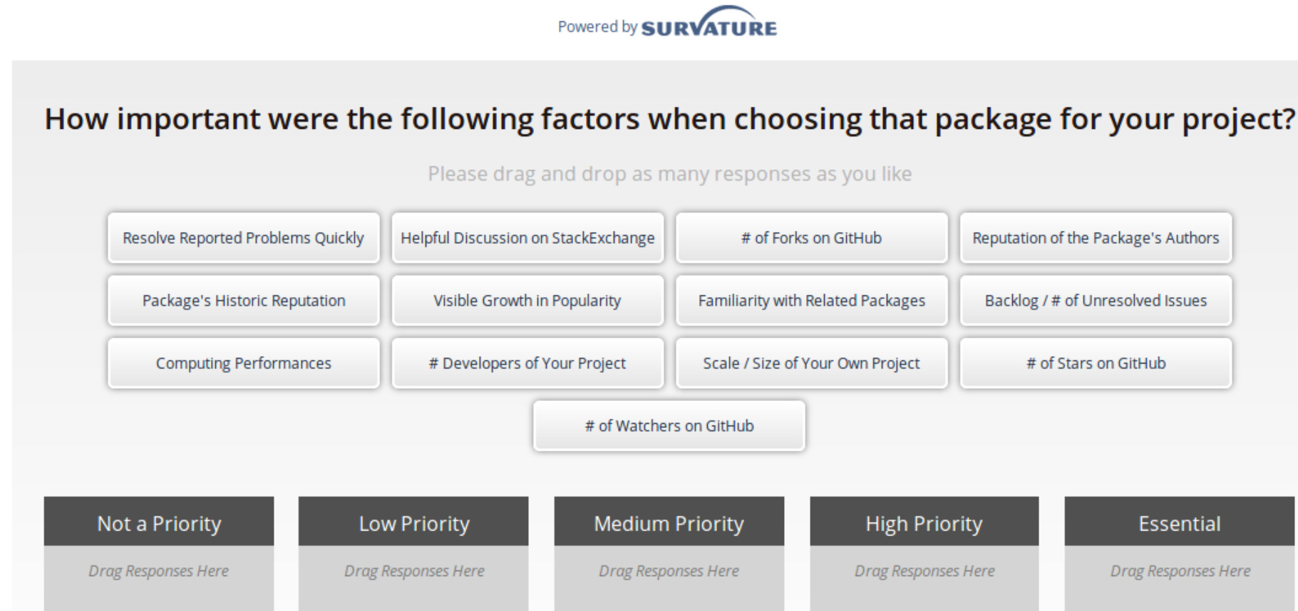
To recap, the Net Promoter Score (NPS) is a measure of consumer enthusiasm for a product or service based on a single survey question – “How likely are you to recommend the brand to your friends or colleagues, using a scale from 0 to 10?” Detractors of the product will respond with a 0-6, while promoters of the product will offer up a 9 or 10. A passive user will answer with a score of 7 or 8. To calculate the NPS, subtract the percentage of detractors from the percentage of promoters. When the percentage of promoters exceeds the percentage of detractors, there is potential to expand market share as the negative chatter is drowned out by the accolades.We were surprised when our survey results indicated data.table had an NPS of 28.6, while tidy’s NPS was double, at 59.4. Why are tidy user’s so much more enthusiastic? What do tidy-lovers “love” about their dataframe enhancement choice? Fortunately, a few of the other survey questions may offer some insights.The survey question shown below asks the respondents how important 13 common factors were when selecting their package. Respondents select a factor-tile, such as “Package’s Historic Reputation”, and drag it to the box that presents the priority that user places on that factor. A user can select/drag as many or as few tiles as they choose.
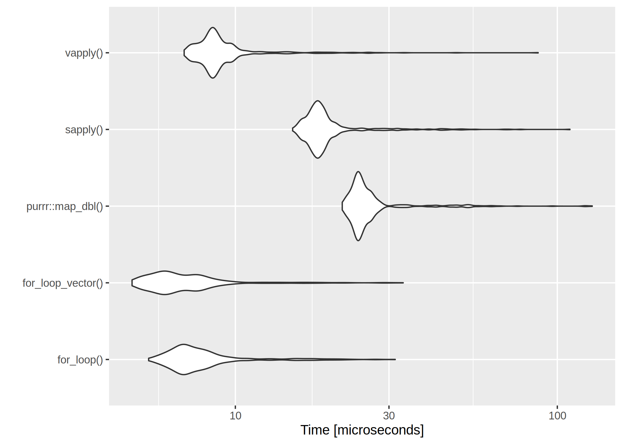
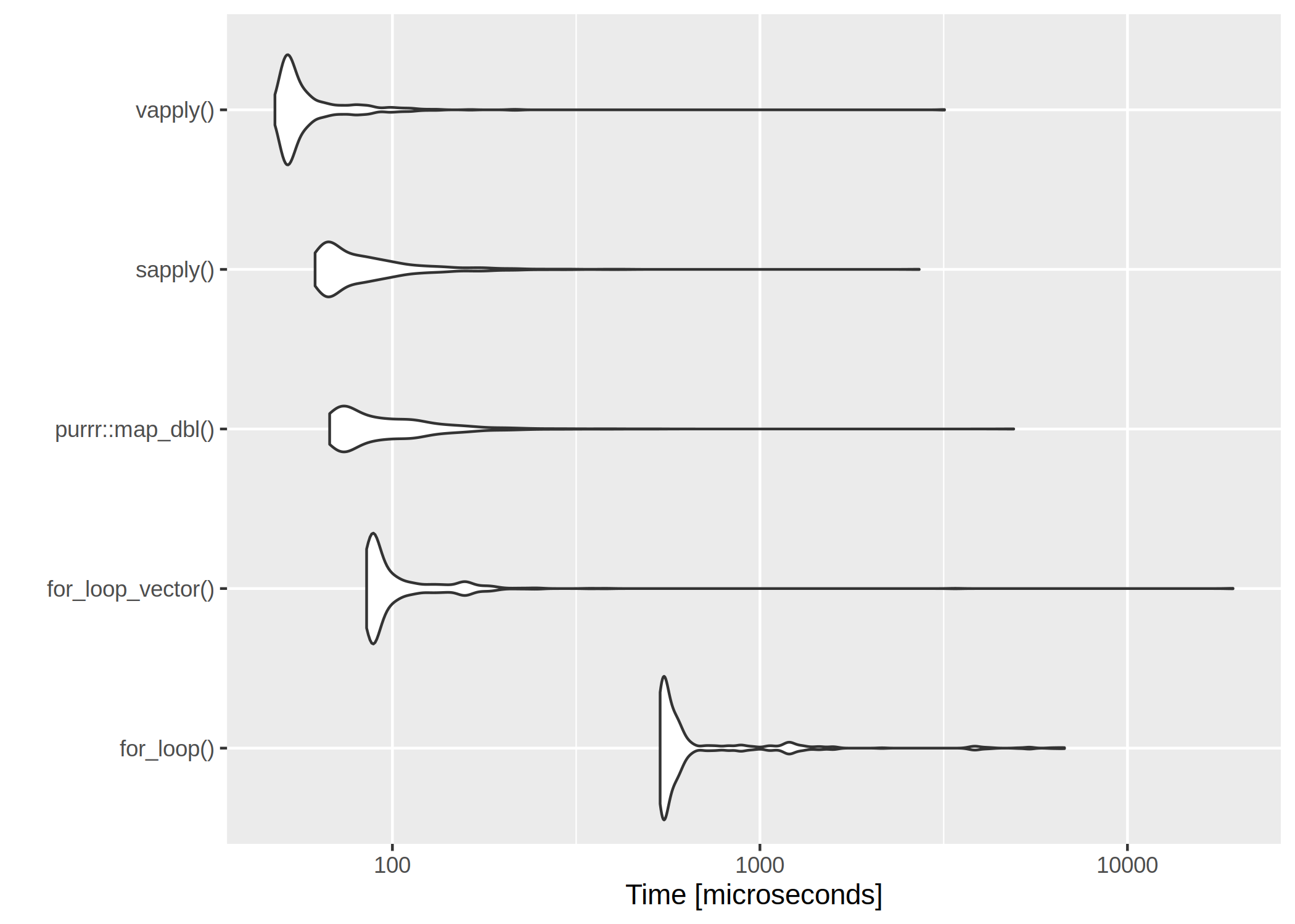
It is usually said, that for– and while-loops should be avoided in R. I was curious about just how the different alternatives compare in terms of speed.
The first loop is perhaps the worst I can think of – the return vector is initialized without type and length so that the memory is constantly being allocated.
use_for_loop <- function(x){
  y <- c()

  for(i in x){
    y <- c(y, x[i] * 100)
  }
  return(y)
}
The second for loop is with preallocated size of the return vector.
The clear winner is vapply() and for-loops are rather slow. However, if we have a very low number of iterations, even the worst for-loop isn’t too bad:

 The clear winner is