In this blog, we explored how to set up cross-validation in R using the caret package, a powerful tool for evaluating machine learning models. Here’s a quick recap of what we covered:
-
Introduction to Cross-Validation:
-
Cross-validation is a resampling technique that helps assess model performance and prevent overfitting by testing the model on multiple subsets of the data.
-
-
Step-by-Step Setup:
-
We loaded the
caretpackage and defined a cross-validation configuration usingtrainControl, specifying 10-fold repeated cross-validation with 5 repeats. -
We also saved the configuration for reuse using
saveRDS.
-
-
Practical Example:
-
Using the
irisdataset, we trained a k-nearest neighbors (KNN) model with cross-validation and evaluated its performance.
-
-
Why It Matters:
-
Cross-validation ensures robust model evaluation, avoids overfitting, and improves reproducibility and model selection.
-
-
Conclusion:
-
By following this workflow, you can confidently evaluate your machine learning models and ensure they are ready for deployment.
-
Let’s dive into the details!
1. Introduction to Cross-Validation
Cross-validation is a resampling technique used to assess the performance and generalizability of machine learning models. It helps address issues like overfitting and ensures that the model’s performance is consistent across different subsets of the data. By splitting the data into multiple folds and repeating the process, cross-validation provides a robust estimate of model performance.
2. Step-by-Step Cross-Validation Setup
Step 1: Load Necessary Library
library(caret)
-
Purpose: The
caretpackage provides tools for training and evaluating machine learning models, including cross-validation.
Step 2: Define Train Control for Cross-Validation
train_control <- trainControl(
  method = "repeatedcv",      # Repeated cross-validation
  number = 10,                # 10 folds
  repeats = 5,                # 5 repeats
  savePredictions = "final"   # Save predictions for the final model
)
-
Purpose: Configures the cross-validation process:
-
Repeated Cross-Validation: Splits the data into 10 folds and repeats the process 5 times.
-
Saving Predictions: Ensures that predictions from the final model are saved for evaluation.
-
Step 3: Save Train Control Object
saveRDS(train_control, "./train_control_config.Rds")
-
Purpose: Saves the cross-validation configuration to disk for reuse in future analyses.
3. Example: Cross-Validation in Action
Let’s walk through a practical example using a sample dataset.
Step 1: Load the Dataset
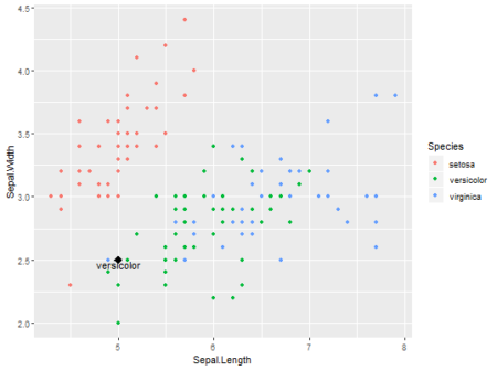
For this example, we’ll use the iris dataset, which is included in R.
data(iris)
Step 2: Define the Cross-Validation Configuration
library(caret)

# Define the cross-validation configuration
train_control <- trainControl(
  method = "repeatedcv",      # Repeated cross-validation
  number = 10,                # 10 folds
  repeats = 5,                # 5 repeats
  savePredictions = "final"   # Save predictions for the final model
)
Step 3: Train a Model Using Cross-Validation
We’ll train a simple k-nearest neighbors (KNN) model using cross-validation.
# Train a KNN model using cross-validation
set.seed(123)
model <- train(
  Species ~ .,                # Formula: Predict Species using all other variables
  data = iris,                # Dataset
  method = "knn",             # Model type: K-Nearest Neighbors
  trControl = train_control   # Cross-validation configuration
)

# View the model results
print(model)
Output:
k-Nearest Neighbors

150 samples
  4 predictor
  3 classes: 'setosa', 'versicolor', 'virginica'

No pre-processing
Resampling: Cross-Validated (10 fold, repeated 5 times)
Summary of sample sizes: 135, 135, 135, 135, 135, 135, ...
Resampling results across tuning parameters:

  k  Accuracy   Kappa
  5  0.9666667  0.95
  7  0.9666667  0.95
  9  0.9666667  0.95

Accuracy was used to select the optimal model using the largest value.
The final value used for the model was k = 5.
Step 4: Save the Cross-Validation Configuration
saveRDS(train_control, "./train_control_config.Rds")

# (Optional) Load the saved configuration
train_control <- readRDS("./train_control_config.Rds")
4. Why This Workflow Matters
This workflow ensures that your model is evaluated robustly and consistently. By using cross-validation, you can:
-
Avoid Overfitting: Cross-validation provides a more reliable estimate of model performance by testing on multiple subsets of the data.
-
Ensure Reproducibility: Saving the cross-validation configuration allows you to reuse the same settings in future analyses.
-
Improve Model Selection: Cross-validation helps you choose the best model by comparing performance across different configurations.
5. Conclusion
Cross-validation is an essential technique for evaluating machine learning models. By following this workflow, you can ensure that your models are robust, generalizable, and ready for deployment. Ready to try it out? Install the caret package and start setting up cross-validation in your projects today!
install.packages("caret")
library(caret)
Happy coding! 😊