Spatial Data Analysis Using Artificial Neural Networks, Part 2
Richard E. Plant Additional topic to accompany Spatial Data Analysis in Ecology and Agriculture using R, Second Edition http://psfaculty.plantsciences.ucdavis.edu/plant/sda2.htm Chapter and section references are contained in that text, which is referred to as SDA2. Data sets and R code are available in the Additional Topics through the link above.Forward
This post originally appeared as an Additional Topic to my book as described above. Because it may be of interest to a wider community than just agricultural scientists and ecologists, I am posting it here as well. However, it is too long to be a single post. I have therefore divided it into two parts, posted successively. I have also removed some of the mathematical derivations. This is the second of these two posts. In the first post we discussed ANNs with a single hidden layer and constructed one to see how it functions. This second post discusses multilayer and radial basis function ANNs, ANNs for multiclass problems, and the determination of predictor variable importance. Some of the graphics and formulas became somewhat blurred when I transfered them from the original document to this post. I apologize for that, and again, if you want to see the clearer version you should go to the website listed above and download the pdf file.3. The Multiple Hidden Layer ANN
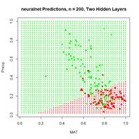
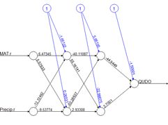
Although artificial neural networks with a single hidden layer can provide quite general solution capabilities (Venables and Ripley, 2002, p. 245), preference is sometimes expressed for multiple hidden layers. The most widely used R ANN package providing multiple hidden layer capability is neuralnet (Fritsch et al., 2019). Let’s try it out on our training data set using two hidden layers with four cells each (Fig. 19).> set.seed(1)
> mod.neuralnet <- neuralnet(QUDO ~ MAT +
+ Precip, data = Set2.Train,
+ hidden = c(4, 4), act.fct = “logistic”,
+ linear.output = FALSE)
> Predict.neuralnet <-
+ predict(mod.neuralnet, Set2.Test)
> plotnet(mod.neuralnet, cex = 0.75) # Fig. 19a
> p <- plot.ANN(Set2.Test,
+ Predict.neuralnet, 0.5,
+ “neuralnet Predictions, Two Hidden Layers”)
The argument hidden = c(4, 4) specifies two hidden layers of four cells each, and the argument linear.output = FALSE specifies that this is a classification and not a regression problem. As with the single layer ANNs of the previous section, the two layer ANNs of neuralnet() produce a variety of outputs, some tame and some not so tame (Exercise 6).
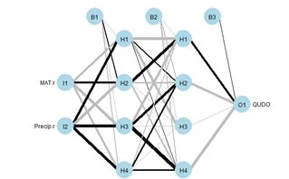
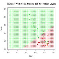
Figure 19. (a) Diagram of the neuralnet ANN with two hidden layers; (b) prediction map of the ANN.
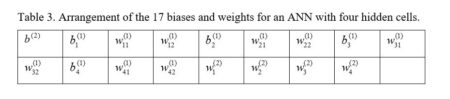
Instead of using Newton’s method found in the function nlm() and approximated in nnet(), it has become common in ANN work to use an alternative method called gradient descent. The neuralnet package permits the selection of various versions of the gradient descent algorithm. Suppose for definiteness that the objective function J is the sum of squared errors (everything works the same if it is, for example, the cross entropy, but the discussion is more complex). Denote the combined sets of biases and weights by wi, 1 = 1,…,nw, (for our example of Section 2, with one hidden layer and M = 4, nw = 17). If the ANN returns an estimate
|
|
(7) |
|
|
(8) |
|
|
(9) |
(a) (b)
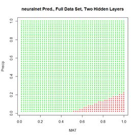
Figure 20. (a) Plot of prediction regions of neuralnet() with two hidden layers and a training data set of 200 randomly selected records; (b) application of the resulting model to the full set.
Sections 2 and 3 have given us a general idea of how a multilayer perceptron works. Although the MLP is probably the most commonly used ANN for the type of classification problem discussed here, several alternatives exist. The next section discusses one of them, the radial basis function ANN.
4. The Radial Basis Function ANN
The seemingly obscure term radial basis function ANN is actually not hard to parse out. We will start with word basis. As you may remember from linear algebra, a basis is a set of vectors in the vector space that have the property that any vector in the vector space can be described as a linear combination of elements of this set. For discussion and a picture see here. If you had a course in Fourier series, you may remember that the Fourier series functions form a basis for a set of functions on an infinite dimensional vector space. Radial basis functions do the same sort of thing. A radial function is a function of the form|
|
(10) |
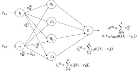
Figure 21. Architecture of the radial basis function ANN.
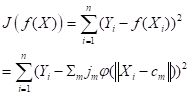
The way a radial basis function (RBF) works is as follows. Suppose again that the cost function J is based on the sum of squared errors. Referring to Fig. 21, which shows a schematic of a radial basis function ANN with a single hidden layer, the input activations for the ith data record are, as with the multilayer perceptron, simply the values Xi,j. We will describe the combined output of all of the hidden cells in terms of the basis function
| (11) |
 . . |
(12) |
The first step in the RBF computational process is to determine a set of centers cm in Equation (11). The determination is made by trying to place the centers so that their location matches as closely as possible the distribution in the data space of values
|
|
(13) |
library(RSNNS)
Train.Values <- Set2.Train[,c(“MAT”, “Precip”)]
Train.Targets <-
+ decodeClassLabels(as.character(Set2.Train$QUDO))
We will start by testing the RSNNS multilayer perceptron using a single hidden layer with four cells. The package has a very nice function called plotIterativeError() that permits one to visualize how the error declines as the iterations proceed. We will first run the ANN and check out the output. These are slight differences in how the polymorphic R functions are implemented from those of the previous sections.
> set.seed(1)
> mod.SNNS <- mlp(Train.Values, Train.Targets,
+ size = 4)
> Predict.SNNS <- predict(mod.SNNS,
+ Set2.Test[,1:2])
> head(Predict.SNNS)
[,1] [,2]
[1,] 0.6385500 0.3543552
[2,] 0.6247426 0.3684126
[3,] 0.6107571 0.3826691
[4,] 0.5966275 0.3970889
[5,] 0.5823891 0.4116347
[6,] 0.5680778 0.4262682
For this binary classification problem the output of the function predict() is in the form of a matrix whose columns sum to 1, reflecting the alternative predictions. Using this information, we can plot the prediction region (Fig. 22a).
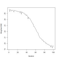
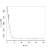
Next we plot the iterative error (Fig. 22b).
> plotIterativeError(mod.SNNS) # Fig. 22b
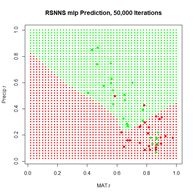
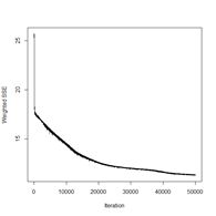
The error clearly declines, and it may or may not be leveling off. To check, we will set the argument maxit to a very large value and see what happens.
> mod.SNNS <- mlp(Train.Values, Train.Targets,
+ size = 4, maxit = 50000)
> stop_time <- Sys.time()
> stop_time – start_time
Time difference of 5.016404 secs
> Predict.SNNS <- predict(mod.SNNS,
+ Set2.Test[,1:2])
> p <- plot.ANN(Set2.Test, Predict.SNNS[,2],
+ 0.5,
+ “RSNNS mlp Prediction, 50,000 Iterations”)
> plotIterativeError(mod.SNNS) # Fig. 23b
(a) (b)
Figure 23. Plots of (a) the predicted regions and (b) the iterative error with an iteration limit of 50,000.
The iteration error clearly declines some more. The prediction region does not look like most of those that we have seen earlier, and does not look very intuitive, but of course the machine doesn’t know that. The time to run 50,000 iterations for this problem is not bad at all.
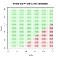
Now we can move on to the radial basis function ANN, implemented via the function rbf(). First we will try it with all arguments set to their default values (Fig. 24).
> set.seed(1)
> mod.SNNS <- rbf(Train.Values, Train.Targets)
> Predict.SNNS <- predict(mod.SNNS, Set2.Test)
> p <- plot.ANN(Set2.Test, Predict.SNNS[,2],
+ 0.5, “RSNNS rbf Prediction,
+ Default Values”)
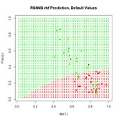 Figure 24. Prediction regions for the model developed using rbf() with default values.
The “radial” part of the term radial basis function becomes very apparent! A glance at the documentation via ?rbf reveals that the default value for the number of hidden cells is 5. Many sources discussing radial basis function ANNs point out that a large number of hidden cells is often necessary to correctly model the data. We will try another run with the number of hidden cells increased to 40.
> set.seed(1)
> mod.SNNS <- rbf(Train.Values, Train.Targets,
+ size = 40)
The rest of the code is identical to what we have seen before and is not shown. The prediction region is similar to that of Fig. 25a below and is not shown. The error rate is about what we have seen from the other methods.
> length(which(Set2.Pred$TrueVal !=
+ Set2.Pred$PredVal)) / nrow(Set2.Train)
[1] 0.22
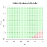
(a) (b)
Figure 25. (a) Prediction regions and (b) error estimate for the model developed using rbf() with the full data set.
The performance of rbf() on the full data set is not particularly spectacular.
> length(which(Set2.Pred$TrueVal !=
+ Set2.Pred$PredVal)) / nrow(data.Set2U)
[1] 0.2324658
Now that we have had a chance to compare several ANNs on a binary selection problem, an inescapable conclusion is that, for the problem we are studying at least, the old workhorse nnet() acquits itself pretty well. In Section 5 we will try out various ANNs on a multi-category classification process. In this case each of the ANNs we are considering has an output cell for each class label.
5. A Multicategory Classification Problem
The multicategory classification problem that we will study in this chapter is the same one that we studied in the Additional Topic on Comparison of Supervised Classification Methods. A detailed introduction is given there. In brief, the data set is the augmented Data Set 2 from SDA2. It is based on the Wieslander survey of oak species in California (Wieslander, 1935) and contains records of the presence or absence of blue oak (Quercus douglasii, QUDO), coast live oak (Quercus agrifolia, QUAG), canyon oak (Quercus chrysolepis, QUCH), black oak (Quercus kelloggii, QUKE), valley oak (Quercus lobata, QULO), and interior live oak (Quercus wislizeni, QUWI). As implemented it is the data frame data.Set2U; until now we have grouped all of the non-QUDO species together and assigned them the value QUDO = 0. In this section we will create the class label species and assign the appropriate character value to each record.> species <- character(nrow(data.Set2U))
> species[which(data.Set2U$QUAG == 1)] <- “QUAG”
> species[which(data.Set2U$QUWI == 1)] <- “QUWI”
> species[which(data.Set2U$QULO == 1)] <- “QULO”
> species[which(data.Set2U$QUDO == 1)] <- “QUDO”
> species[which(data.Set2U$QUKE == 1)] <- “QUKE”
> species[which(data.Set2U$QUCH == 1)] <- “QUCH”
> data.Set2U$species <- as.factor(species)
> table(data.Set2U$species)
QUAG QUCH QUDO QUKE QULO QUWI
551 99 731 717 47 122
As can be seen, the data set is highly unbalanced. This property always poses a severe challenge for classification algorithms. The data are also highly autocorrelated spatially. In the Additional Topic on Method Comparison we found that 83% of the data records have the same species classification as their nearest neighbor. As in other Additional Topics, we want to be able to take advantage of locational information both through spatial relationships and by including Latitude and Longitude in the set of predictors. I won’t repeat the discussion about this since it is covered in the other Additional Topics. We will use the same spatialPointsDataFrame (Bivand et al, 2011) D of rescaled predictors and species class labels that was used in the Additional Topic on method comparison. Again, if you are not familiar with the spatialPointsDataFrame object, don’t worry about it: you can easily understand what is going anyway.
> library(spdep)
> coordinates(data.Set2U) <-
+ c(“Longitude”, “Latitude”)
> proj4string(data.Set2U) <-
+ CRS(“+proj=longlat +datum=WGS84”)
> D <- cbind(coordinates(data.Set2U),
+ data.Set2U@data[,c(2:19, 28:34, 43)])
> for (i in 1:2)) D[,i] <- rescale(D[,i])
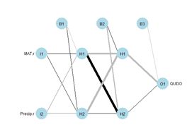
In this section we will use the predictors selected as optimal in the variable selection process for support vector machine analysis. This established as optimal the predictors Precip, CoastDist, the distance from the Pacific Coast, TempR, the average annual temparature range, Elevation, and Latitude. We will first try out nnet() using these predictors (Fig. 26). After playing around a bit with the number of hidden and skip layers, here is a result.
> set.seed(1)
> modf.nnet <- nnet(species ~ Precip +
+ CoastDist + TempR + Elevation + Latitude,
+ data = D, size = 10, skip = 4,
+ maxit = 10000)
# weights: 156
initial value 3635.078808
iter2190 value 925.764437
* * * *
final value 925.760573
converged
> plotnet(modf.nnet, cex = 0.6)
> Predict.nnet <- predict(modf.nnet, D)
> pred.nnet <- apply(Predict.nnet, 1,
+ which.max)
> 1 – (sum(diag(conf.mat)) / nrow(D))
[1] 0.1433613
> print(conf.mat <- table(pred.nnet, D$species))
pred.nnet QUAG QUCH QUDO QUKE QULO QUWI
1 514 9 29 7 16 24
2 1 27 2 6 2 1
3 27 7 661 19 11 22
4 1 54 27 673 4 20
5 1 0 4 0 12 0
6 7 2 8 12 2 55
> print(diag(conf.mat) /
+ table(data.Set2U$species), digits = 2)
QUAG QUCH QUDO QUKE QULO QUWI
0.93 0.27 0.90 0.94 0.26 0.45
The overall error rate is about 0.14, and, as usual, the rare species are not predicted particularly well.
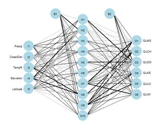 Figure 26. Schematic of the multicategory ANN.
In the Additional Topic on method comparison it was noted that, owing to the high level of spatial autocorrelation of these data, one can obtain an error rate of about 0.18 by simply predicting that a particular data record will be the same species as that of its nearest neighbor. We will try using that to our advantage by adding the species of the nearest and second nearest geographic neighbors to the set of predictors.
> set.seed(1)
> start_time <- Sys.time()
> modf.nnet <- nnet(species ~ Precip +
+ CoastDist + TempR + Elevation + Latitude +
+ nearest1 + nearest2, data = D, size = 12,
+ skip = 2, maxit = 10000)
> stop_time <- Sys.time()
> stop_time – start_time
Time difference of 11.64763 secs
> plotnet(modf.nnet, cex = 0.6)
> Predict.nnet <- predict(modf.nnet, D)
> pred.nnet <- apply(Predict.nnet, 1,
+ which.max)
> print(conf.mat <- table(pred.nnet,
+ D$species))
pred.nnet QUAG QUCH QUDO QUKE QULO QUWI
1 527 3 13 4 11 12
2 1 48 0 3 1 0
3 12 2 695 7 7 18
4 1 45 17 698 1 16
5 6 0 2 0 27 0
6 4 1 4 5 0 76
> 1 – (sum(diag(conf.mat)) / nrow(D))
[1] 0.08645787
> print(diag(conf.mat) /
+ table(data.Set2U$species), digits = 2)
QUAG QUCH QUDO QUKE QULO QUWI
0.96 0.48 0.95 0.97 0.57 0.62
The error rate is a little under 9%, which is really quite good. The improvement is particularly good for the rare species. Of course, this only works if one knows the species of the nearest neighbors! Nevertheless, it does show that incorporation of spatial information, if possible, can work to one’s advantage. The neuralnet ANN was not as successful in my limited testing. The best results were obtained when nearest neighbors were not used. The code is not shown, but here are the results.
> stop_time – start_time
Time difference of 2.726899 mins
> print(conf.mat <- table(pred.neuralnet,
+ D$species))
pred.neuralnet QUAG QUCH QUDO QUKE QULO QUWI
1 499 22 31 16 21 35
2 0 8 2 2 0 0
3 51 5 654 27 22 47
4 1 62 34 672 4 23
6 0 2 10 0 0 17
> 1 – (sum(diag(conf.mat[1:4,1:4])) +
+ conf.mat[5,6]) / nrow(D)
[1] 0.1839435
No records were predicted to be QULO. The performance of the SNNS MLP was about the same. The RBF ANN performed even worse.
> print(conf.mat <- table(pred.SNNS,
+ D$species))
pred.SNNS QUAG QUCH QUDO QUKE QULO QUWI
1 471 24 42 18 13 33
3 80 15 665 63 31 68
4 0 60 24 636 3 21
> 1 – (conf.mat[1:1] +conf.mat[2,3] +
+ conf.mat[3,4]) / nrow(D)
[1] 0.2183502
Once again, despite being the oldest and arguably the simplest package, nnet has performed the best in our analysis. There may, of course, be problems for which it does not do as well as the alternatives. Nevertheless, we will limit our remaining work to this package alone. The last topic we need to cover is variable selection for ANNs.
6. Variable Selection for ANNs
There have been numerous papers published on variable selection for ANNs (try googling the topic!). Olden and Jackson (2002), Gevery et al. (2003), and Olden et al. (2004) provide, in my opinion, particularly useful ones for the practitioner. Gevery et al. (2003) discuss some stepwise selection methods in which variables enter and leave the model based on the mean squared error (see SDA2 Sec. 8.2.1 for a discussion of stepwise methods in linear regression). These methods actually have much to recommend them, but they are not much different from stepwise selection methods we have discussed in SDA2 and in other Additional Topics and we won’t consider them further here. The unique distinguishing feature of ANNs in terms of variable selection is their connection weights, and several methods for estimating variable importance based on these weights have been developed. The most commonly used methods for ANNs involve a single output variable, implying only binary classification or regression. We will therefore discuss them by returning to the QUDO classification problem of Sections 2-4. We will carry over the data frame D from Section 5. Our model will include three predictors. Two of them are MAT and Precip, as used in Sections 2-4. The third, called Dummy, is just that: a dummy variable consisting of a uniformly distributed set of random numbers having no predictive power at all. A good method should identify Dummy as a prime candidate for elimination.> set.seed(1)
> D$Dummy <- runif(nrow(D))
> size <- 2
> set.seed(1)
For simplicity our demonstration ANN will have only two hidden cells (Fig. 27). We will first select the random number seed with the best performance, using the same procedure as that carried out in Section 2. Here is the result.
> seeds [1] 1 2 3 4 5 6 7 8 9 10 11 12 13 14 15 16 17 18 19 20> sort(error.rate)
[1] 0.2077636 0.2077636 0.2082047 0.2254080 0.2271725 0.2271725 0.2271725
[8] 0.2271725 0.2271725 0.2271725 0.2271725 0.2271725 0.2276136 0.2280547
[15] 0.2284958 0.2289369 0.3224526 0.3224526 0.3224526 0.3224526
> print(best.seed <- which.min(error.rate))
[1] 10
> mod.nnet <- nnet(X.t, Y.t, size = size,
+ maxit = 10000)
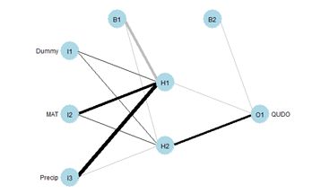
> plotnet(mod.nnet, cex_val = 0.75)
Fig. 27 shows the plotnet() plot of this ANN. Here are the numerical values of the biases and weights
> mod.nnet$wts [1] -80.82405907 0.87215226 85.41369339 108.51778012 -4.8336825
[6] 0.04523967 2.83945431 -0.84126067 -2.81207163 -2.34322065
[11] 71.37131603
The order of biases and weights is {B1H1, I1H1, I2H1, I3H1, B1H2, I1H2 I2H2, I3H2, B2O1, H1O1, H2O1}.
Since the biases act on all predictors equally, they are not considered in the algorithm. One of the earliest ANN methods for determining the relative importance of each predictor was developed by Garson (1991) and Goh (1995). We will present this method following the discussion of Olden and Jackson (2002). The following replicates for our current case the set of tables displayed in Box 1 of that paper. First, we compute the matrix of weights.
> print(n.wts <- length(mod.nnet$wts))
[1] 11
> # Remove H1O1, H2O1
> print(M.seq <- seq(1,(n.wts-size)))
[1] 1 2 3 4 5 6 7 8 9
> n.X <- 3
> print(M.out <- seq(1,(n.wts-size),
+ by = n.X + 1))
[1] 1 5 9
> print(M1 <- matrix(mod.nnet$wts[M.seq[-M.out]],
+ n.X, size), digits = 2)
[,1] [,2]
[1,] 0.87 0.045
[2,] 85.41 2.839
[3,] 108.52 -0.841
Next we compute the output weights.
> print(O <- matrix(mod.nnet$wts
+ [seq(n.wts-size+1,n.wts)],
+ 1, size), digits = 2)
[,1] [,2]
[1,] -2.3 71
You may want to compare the numerical values with the sign and shade of the links in Fig. 27. Table 4 shows the weights and output in in tabular form, analogous to the first table in Box 1 of Olden and Jackson (2002) (from this you can see the reason for the convention involving the arrangement of subscripts described in Section 2).
Table 4. Input – hidden – output link weights.
| Hidden H1 | Hidden H2 | |
| Input I1 | w(1)11 = 0.87 | w(1)12 = 0.045 |
| Input I2 | w(1)21 = 84.41 | w(1)22 = 2.839 |
| Input I3 | w(1)31 = 108.52 | w(1)32 = –0.841 |
| Output | w(2)1 = -2.3 | w(2)2 = 71 |
> C.m <- matrix(0, n.X, size)
> for (i in 1:n.X) C.m[i,] <- M1[i,] * O[1,]
> print(C.m, digits = 2)
[,1] [,2]
[1,] -2 3.2
[2,] -200 202.7
[3,] -254 -60.0
These row sums represent the total weight that each input applies to the computation of the output. Next, we compute the matrix R, which is defined the ratio of the absolute value of each element of C.m to the column sum. This is considered to be the relative contribution of each input cell to the activation of each output cell. We won’t be generalizing this code, and it is easier to write it using the fixed values of n.X and size.
> R <- matrix(0, 3, 2)
> for (i in 1:3) R[i,] <-
+ abs(C.m[i,]) / (abs(C.m[1,]) +
+ abs(C.m[2,]) + abs(C.m[3,]))
> print(R, digits = 2)
[,1] [,2]
[1,] 0.0045 0.012
[2,] 0.4385 0.762
[3,] 0.5571 0.226
Next, we compute the matrix S, which is the sum of the relative contributions of each input cell to the activation of each output cell.
> S <- matrix(0, 3, 1)
> for (i in 1:3) S[i] <- R[i,1] + R[i,2]
> print(S, digits = 2)
[,1]
[1,] 0.017
[2,] 1.201
[3,] 0.783
Finally, we compute the matrix RI, which is the relative importance of each input cell to the activation of each output cell.
> RI <- matrix(0, 3, 1)
> for (i in 1:3) RI[i,1] <- S[i,1] / sum(S)
> print(RI, 2)
[,1]
[1,] 0.0083
[2,] 0.6003
[3,] 0.3914
The package NeuralNetTools contains the function garson(), which carries out these computations.
> print(garson(mod.nnet, bar_plot = FALSE),
+ digits = 2)
rel_imp
Dummy 0.0083
MAT 0.6003
Precip 0.3914
The function garson() can also be used to create a barplot of these values (Fig. 29a).
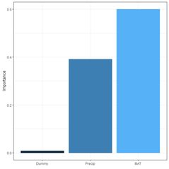
(a) (b)
Fig. 29. a) barplot of Garson importance values; b) barplot of Olden-Jackson importance values.
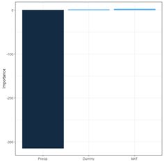
Olden and Jackson (2002) criticized Garson’s algorithm on the grounds that by computing absolute values of link weights it ignores the possibility that a large positive input-hidden link weight followed by a large negative hidden-output link weight might cancel each other out. In a comparison of various methods for evaluating variable importance, Olden et al. (2004) found that Garson’s algorithm fared the worst among alternatives tested. Olden and Jackson (2002) suggest a permutation test (SDA2 Sec. 3.4) as an alternative to Garson’s algorithm. In reality, this method provides useful information even without employing a permutation test, and we will present it in that way. The test involves the following steps (we will use the same numbering as Olden and Jackson).
Step 1. Test several random seeds and select the one giving the smallest error. This step has already been carried out.
Step 2a. Compute the matrix C.m above for the selected weight set. Again, this step has already been carried out.
> print(C.m, digits = 2)
[,1] [,2]
[1,] -2 3.2
[2,] -200 202.7
[3,] -254 -60.0
Step 2b. Compute the row sums of C.m.
> print(C.sum <- apply(C.m, 1, sum),
+ digits = 2)
[1] 1.2 2.5 -314.3
The package NeuralNetTools has a function olden() to carry out these computations and to plot a barplot (Fig. 29b).
> print(olden(mod.nnet, bar_plot = FALSE), digits = 2)
importance
Dummy 1.2
MAT 2.5
Precip -314.3
In this particular example, one might say that the Garson method acquits itself better than the Olden-Jackson method. This shows that one must keep an open mind when playing with these toys. Lek (1996) developed a method that is also discussed by Gevery et al. (2003). We will follow the discussion in this latter publication as well as the Details section of ?lekprofile. It is easiest to present the method via an example. The package NeuralNetTools contains the function lekprofile() that does the computations and sets up the graphical output. The default output of the function is a ggplot (Wickham, 2016) object.
> library(ggplot2)
> lekprofile(mod, steps = 5,
+ group_vals = seq(0, 1, by = 0.5))
The figure is shown below after the explanation. The procedure divides the range of each predictor into (steps – 1) equally spaced segments. In our case, steps = 5, so there are 4 segments and 5 steps (the default steps value is 100). It is also possible to obtain the numerical values to compute the values represented in the plot. Here is a portion of it.
> lekprofile(mod.nnet, steps = 5,
+ group_vals = seq(0, 1, by = 0.5),
+ val_out = TRUE)
[[1]] Explanatory resp_name Response Groups exp_name
1 0.0006052661 QUDO 0.095468020 1 Dummy
2 0.2504365980 QUDO 0.096018057 1 Dummy
3 0.5002679299 QUDO 0.096577123 1 Dummy
4 0.7500992618 QUDO 0.097145396 1 Dummy
5 0.9999305937 QUDO 0.097723053 1 Dummy
6 0.0006052661 QUDO 0.189228401 2 Dummy
7 0.2504365980 QUDO 0.195418722 2 Dummy
8 0.5002679299 QUDO 0.201826448 2 Dummy
9 0.7500992618 QUDO 0.208457333 2 Dummy
10 0.9999305937 QUDO 0.215317020 2 Dummy
11 0.0006052661 QUDO 0.231719048 3 Dummy
* * * *
30 1.0000000000 QUDO 0.263814961 3 MAT
31 0.0000000000 QUDO 0.095468020 1 Precip
32 0.2500000000 QUDO 0.086684129 1 Precip
33 0.5000000000 QUDO 0.080092615 1 Precip
34 0.7500000000 QUDO 0.017896195 1 Precip
35 1.0000000000 QUDO 0.007309402 1 Precip
36 0.0000000000 QUDO 0.867860787 2 Precip
37 0.2500000000 QUDO 0.213604259 2 Precip
38 0.5000000000 QUDO 0.119027224 2 Precip
39 0.7500000000 QUDO 0.070552909 2 Precip
40 1.0000000000 QUDO 0.045104426 2 Precip
41 0.0000000000 QUDO 0.977067535 3 Precip
42 0.2500000000 QUDO 0.902834305 3 Precip
43 0.5000000000 QUDO 0.720770997 3 Precip
44 0.7500000000 QUDO 0.468084251 3 Precip
45 1.0000000000 QUDO 0.263814961 3 Precip
[[2]]
Dummy MAT Precip
0% 0.0006052661 0.0000000 0.0000000
50% 0.4781180343 0.7601916 0.2747424
100% 0.9999305937 1.0000000 1.0000000
The numerical output is a list with two elements. The first element is a data frame and the second is a matrix. The explanation is clearest if we start with the second element. The components of the matrix are percentile values of each of the predictors. For example, the fiftieth percentile value of MAT is 0.7601916. Note that the 0 and 100 percentile values of MAT and Precip are 0 and 1 because these variables have been rescaled. The number of percentiles is specified via the argument group_vals, which has the default value seq(0, 1, by = 0.2). In the example we use a coarser sequence to make the interpretation easier.
Moving to the first element of the list, the data frame, the first data field is the column labeled explanatory. Its first five values represent the subdivision into five (as specified by the value of steps) equal segments of the range of values of Dummy from the 0% to the 100% percentile. For each explanatory variable, the data field exp_name, there are three Groups; the 0, 50 and 100 percentile groups, as specified by the group_vals argument. The values of the input to the mod.nnet ANN object are cycled as follows. Starting with MAT, this variable is first set to its 0 percentile value, which is 0. This forms Group 1 for MAT. Holding MAT at this value, the other two inputs are both set successively to the values specified by steps: 0, 0.25, 0.5, 0.75, and 1. The output of the ANN is calculated for each of these combinations of values and recorded in the Response data field. Thus, for example, the second data record has Response = 0.096018057, which is the value of QUDO computed by the ANN for the input vector {Dummy, MAT, Precip} = {0, 0.25, 0.25}. This value of Response is encircled by the small black circle.
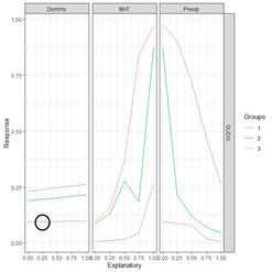

Figure 30. a) Lek plot of the three-variable model. The response to {Dummy, MAT, Precip} = {0, 0.25, 0.25} is encircled by the small black circle; b) plot of the data.
Now we can interpret Fig. 30a. For each of the three predictors, the colored lines represent the ANN response as that predictor is held fixed and the other two predictors are successively increased in value. For Dummy there is, unsurprisingly, very little response. Discounting the effect of Dummy, at low values of MAT (Group 1), the response QUDO is high until Precip reaches a high value. Fig 30b shows (again) the data, helping to interpret the plots in Fig. 30a. The Lek profile allows us to interpret how the predictors interact to generate the value of the class label. In terms of variable selection, we can see that the Lek plot would indeed suggest that we eliminate Dummy, since the values of QUDO are virtually unresponsive to it. Depending on how we implement it, the Lek method can be used for stepwise selection, by bringing explanatory variables in and out of the model depending on how they line up in plots such as Fig. 30, or one can simply carry out comparison of all of the explanatory variables at once. The Details section of ?lekprofile describes other uses of the results of an analysis based on the Lek method.
7. Further Reading
Bishop (1995) is probably the most widely cited introductory book on ANNs. The text by Nunes da Silva et al. (2017) is also a good resource. Venables and Ripley (2002) provide an excellent discussion at a more advanced and theoretical level. A blog by Hatwell (2016) provides a nice discussion of the variable selection methods in a regression context. The manual by Zell et al. (1998), although specifically developed for the SNNS library, gives a good practical discussion of many aspects of ANNs. Finally, this site, developed by Daniel Smilkov and Shan Carter, is a “neural net playground” where you can try out various ANN configurations and see the results (I am grateful to Kevin Ryan for pointing this site out to me).8. Exercises
1) Repeat the analysis of Section 2 using nnet(), but apply it to a data set in which MAT and Precip are normalized rather than rescaled. Determine the difference in predicted value of the class labels. 2) Explore the use of the homemade ANN ANN.1() with differently sized hidden layers in terms of the stability of the prediction. 3) By computing the sum of squared errors for a set of predictions of nnet(), determine whether it is converging to different local minima for different random starting values and number of hidden cells. 4) Using a set of predictions of nnet(), compare the error rates when entropy is TRUE with the default of FALSE. 5) If you have access to Venables and Ripley (2002), read about the softmax option. Repeat Exercise (4) for this option. 6) Generate a “bestiary” of predictions of neuralnet() analogous to that of Fig. 9 for ANN1.().7) Look up the word “beastiary” in the dictionary.

 (a) (b)
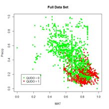
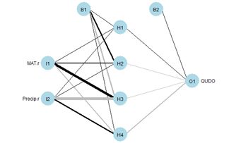
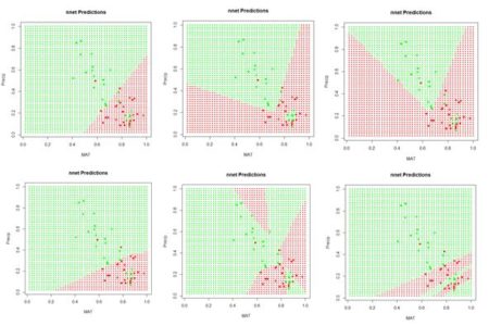
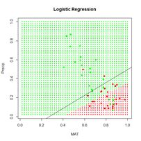
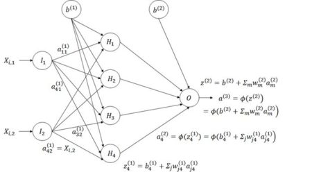 Figure 8. Diagram of an ANN with one hidden layer having four cells.
 We will first construct a prediction function
 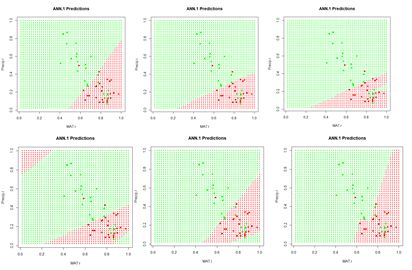 Figure 9. A “bestiary” of
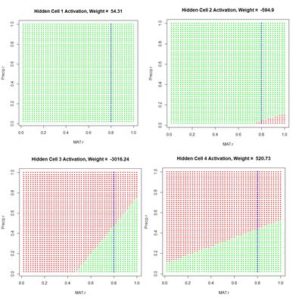
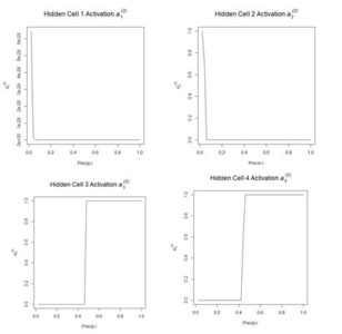 Figure 12. Plot of the hidden cell activation
 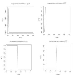 Figure 13. Plot of the weighted hidden cell activation along the highlighted line in Fig. 10.
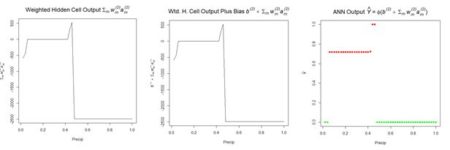
Fig. 14a shows the sum passed to the output cell, given by in Equation (3), and Fig. 14b shows the sum when the bias is added. Finally, Fig. 14c shows the output value .
Figure 13. Plot of the weighted hidden cell activation along the highlighted line in Fig. 10.
Fig. 14a shows the sum passed to the output cell, given by in Equation (3), and Fig. 14b shows the sum when the bias is added. Finally, Fig. 14c shows the output value .
 (a) (b) (c)
Figure 14. Referring to Equation (3): (a) sum of inputs to the output cell; (b) bias added to sum of weighted inputs, ; (c) final output.
The values of the first cell are universally low, so it apparently plays almost no role in the final result, we might be able achieve some simplification by pruning it. Let’s check it out.
(a) (b) (c)
Figure 14. Referring to Equation (3): (a) sum of inputs to the output cell; (b) bias added to sum of weighted inputs, ; (c) final output.
The values of the first cell are universally low, so it apparently plays almost no role in the final result, we might be able achieve some simplification by pruning it. Let’s check it out.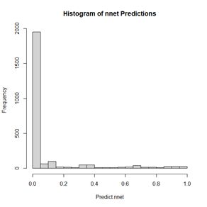 Figure 15. Histogram of predicted values of the function
 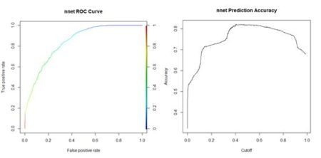 (a) (b)
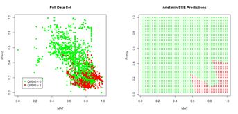
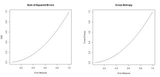 Figure 18. Plots of the sum of squared errors and the cross entropy for a range of error measures between 0 and 1.
A potentially important issue in the development of an ANN is the number of cells. The
Figure 18. Plots of the sum of squared errors and the cross entropy for a range of error measures between 0 and 1.
A potentially important issue in the development of an ANN is the number of cells. The