I am sure you must have heard of Six Sigma quality standard or Six Sigma experts. But, what is Six Sigma?
Six Sigma is a set of techniques used by organizations to improve their processes and optimize operations. Six Sigma was popularized by manufacturing organizations and Jack Welch, former CEO of GE, was one of advocators of Six Sigma. At the heart of Six Sigma lies the core strategies to improve the quality of processes by identifying and removing the causes leading to defects and variability in product quality and business processes. Six Sigma uses empirical and statistical quality management methods to carry out operational improvement and excellence projects in organizations.
Six Sigma projects follow methodologies which are called as DMAIC and DMADV. DMAIC methodology is used for projects aimed at improving existing business processes; while, DMADV is used for projects which aims at creating new processes. Since this article talks about control charts, we will focus on DMAIC project methodology of which control charts is a part of. DMAIC methodology has five phases:
- Define
- Measure
- Analyze
- Improve
- Control
Define
Defining the goals that you wish to achieve – basically, identifying the problem statement you are trying to solve. In this stage, everyone involved in the project understands his/her role and responsibilities. There should be clarity on ‘Why is the project being undertaken?’
Measure
Understanding the ‘As-Is’ state of the process. Based on the goal defined in the ‘Define’ phase, you understand the process in detail and collect relevant data which is to be used in subsequent phases.
Analyze
By this phase, you know the goal that are you trying to achieve and also, you understand the entire process and have the relevant data to diagnose and analyze the problem. In this phase, make sure that your biases don’t lead you to results. Instead, it should be a complete fact-based and data-driven exercise to identify the root cause.
Improve
Now, you are aware about the entire process and cause behind the problems. In this phase, you need to find out ways or methodologies to work on the problem and improve the current processes. You have to think of new ways using techniques such as design of experiments and set up pilot projects to test the idea.
Control
You have implemented new processes and now, you have to ensure that any deviations in the optimized processes are corrected before they result in any defects. One of the techniques that can be used in control phase is statistical process control. Statistical process control can be used to monitor the processes and ensure that the desired quality level is maintained.
Control chart is the primary statistical process control tool used to monitor the performance of processes and ensure that they are operating within the permissible limits. Let’s understand what are control charts and how are they used in process improvement.
According to Wikipedia, “The data from measurements of variations at points on the process map is monitored using control charts. Control charts attempt to differentiate “assignable” (“special”) sources of variation from “common” sources. “Common” sources, because they are an expected part of the process, are of much less concern to the manufacturer than “assignable” sources. Using control charts is a continuous activity, ongoing over time.”
Let’s take an example and understand it step by step using above definition. You leave for office from your home every day at 9:00 AM. The average time it takes you to reach office is 35 minutes; while in most of the cases it takes 30 to 40 minutes for you to reach office. There is a variation of 5 minutes less or more because of slight traffic or you get all the traffic signals red on your way. However, on one fine day you leave from your home and you reach office in 60 minutes because there was an accident on the way and the entire traffic was diverted which caused additional delay of around 20 minutes. Now, relating our example with the definition above:
Measurements: Time to reach office – the time taken on daily basis to reach office from home is measured to monitor the system/process.
Variations: Deviations from the average time of 35 minutes – these variations are due to inherent attributes in the system such as traffic or traffic signals on the route.
Common sources: Slight traffic or traffic signals on the route – these are usually part of the processes and are of much less concern while driving to office.
Excessive Variation: Accident – these are events which leads to variations in the processes, leading to defects in the outputs or delayed processes.
Summing up everything, control charts are graphical techniques to monitor the performance of a process over time. In the control chart, the performance of these processes is monitored visually to identify any anomalies or variations from the usual behavior. For every control chart, there are control limits or decision limits set which define the normal behavior of the process. Any movement outside those limits indicate variation in the process and needs to be corrected to prevent further damage.
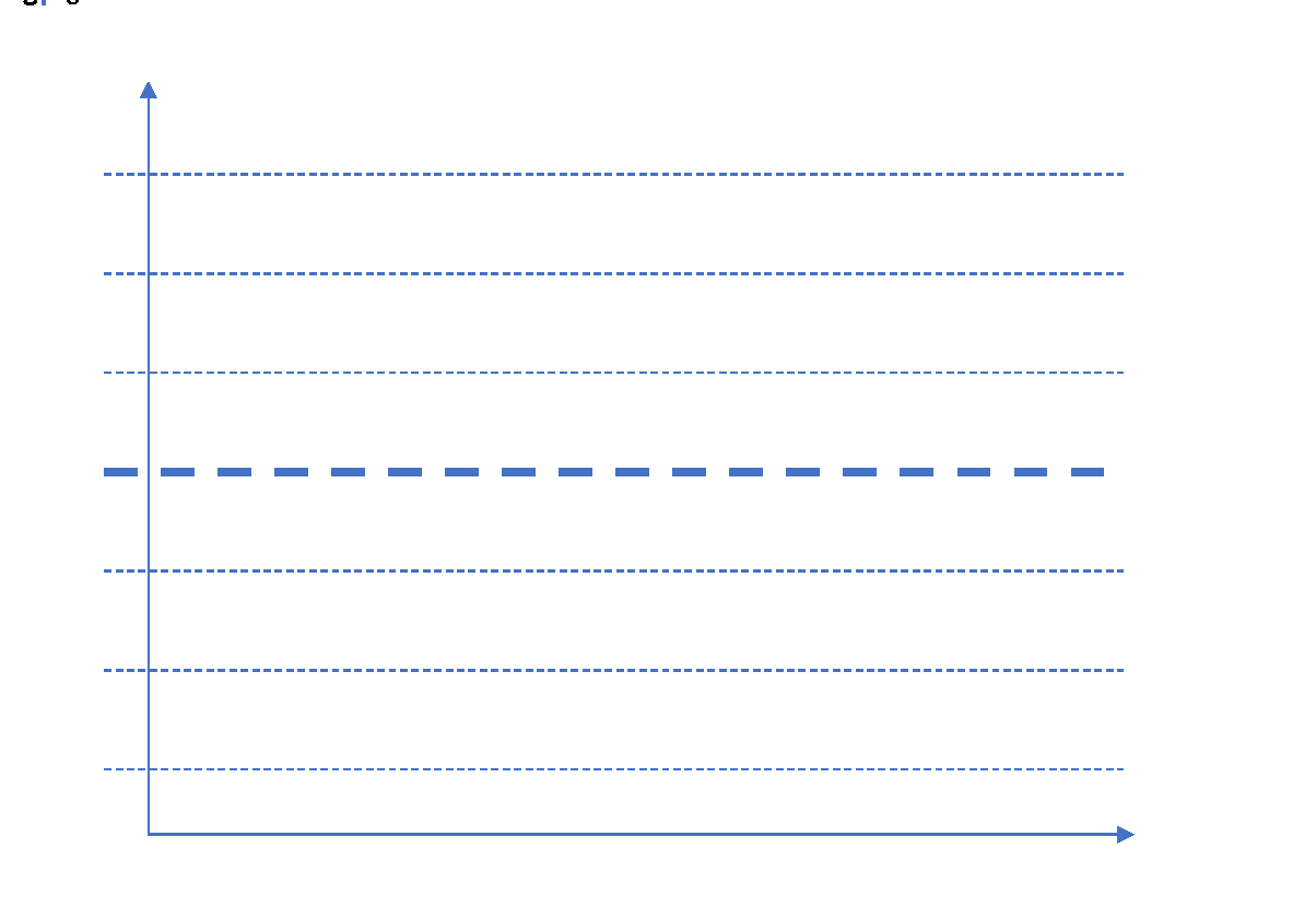
In any control chart, there are three main attributes – Average Line, UCL and LCL. Average line is the mean of all the observations taken in the process. UCL and LCL are upper control limit and lower control limit, respectively. These limits define the control or decision limits within which a process should always fall for efficient and optimized operations. These three values are determined by the process. For a process where all the values lie within the control limits and there is no specific pattern in the values, the process is said to be “in-control.”
X-axis can have either time or sample sequence; while, the Y-axis can have individual values or deviations. There are different control charts based on the data you have, continuous or variable (height, weight, density, cost, temperature, age) and attribute (number of defective parts produced). Accordingly, you choose the control chart and control objective.
Following steps present the step-by-step approach to implement a control chart:
- What process needs to be controlled?
Answer to this question will come from the DMAIC process while implementing the entire project methodology.
- Which system will provide the data to monitor?
Identifying the systems that will provide the data based on which control charts will be prepared and monitored.
- Develop and monitor control charts
Develop the control charts by specifying the X-axis and Y-axis.
- What actions to take based on control charts?
Once you have developed control charts, you need to monitor the processes and check for any special or excessive variations which may lead to defects in the processes.
By now, we have understood what control charts are and what information do they provide. Let us understand further uses of control charts and what more information can be extracted from these charts. Apart from manufacturing, control charts find their applications in healthcare industry and a host of other industries.
- Control charts provide a very simple and easy to understand methodology to understand the performance of processes.
- It reduces the need for inspection – the need for inspection arises only when the process behavior is significantly different from the usual behavior.
- If changes have been made to the process, control charts can help in understanding the impact of those changes on desired results.
- The data collected in the process can be used for improvement in the subsequent of follow-up projects
Control Chart Rules
For a process ‘in-control’, most of the points should lie near the average line i.e. Zone A, followed by Zone B and Zone C. Very few points should lie close to control limits and none of the points should fall beyond the control limits. There are eight rules which are helpful in identifying if there are certain patterns or special causes of variation in the observations.
Rule 1: One or more points beyond the control limits
Rule 2: 8 out of 9 points on the same side of the center line (Average line)
Rule 3: 6 consecutive points increasing or decreasing (monotonic)
Rule 4: 14 consecutive points are alternating up and down
Rule 5: 2 out of 3 consecutive points in Zone C or beyond
Rule 6: 4 out of 5 consecutive points in Zone B or beyond
Rule 7: 15 consecutive points are in Zone A
Rule 8: 8 consecutive points on either side of the Average line but not in Zone A
Now, we have understood the control charts, attributes, applications and associated rules, let’s try to implement a small example in R.
Let’s assume that there is a company which manufactures cylindrical piston rings. For each of the rings manufactured, measurement of the diameter is taken 5 times and captured to examine the within piece variability. These five measurements for one-piece forms one sample or one sub-group. Similarly, measurements for 25 pieces is taken. Using rnorm function in R, let’s create the measurement values.
| > obs V1 V2 V3 V4 V5 1 1.448786 1.555614 1.400382 1.451316 1.328760 2 1.748518 1.525284 1.552703 1.417736 1.420078 3 1.600783 1.409819 1.350917 1.521953 1.358915 4 1.529281 1.582439 1.544136 1.712162 1.553276 5 1.479104 1.343972 1.642736 1.589858 1.460230 6 1.685809 1.553799 1.493372 1.609255 1.471565 7 1.493397 1.373165 1.660502 1.535789 1.512498 8 1.483724 1.564052 1.415218 1.436863 1.578013 9 1.480014 1.446424 1.604218 1.565367 1.412440 10 1.530056 1.398036 1.469385 1.667835 1.384063 11 1.423609 1.419212 1.420791 1.347140 1.485413 12 1.508196 1.505683 1.642166 1.559233 1.332157 13 1.574303 1.595021 1.484574 1.375992 1.367742 14 1.491598 1.387324 1.486832 1.372965 1.444112 15 1.420711 1.479883 1.411519 1.377991 1.251022 16 1.407785 1.477150 1.671345 1.562293 1.617919 17 1.586156 1.555872 1.515936 1.498874 1.579370 18 1.700294 1.574875 1.710501 1.544640 1.660743 19 1.593655 1.691820 1.470600 1.479399 1.506595 20 1.338427 1.600721 1.434118 1.541265 1.602901 21 1.442494 1.825335 1.450115 1.493083 1.433342 22 1.499603 1.483825 1.479840 1.466675 1.465325 23 1.432389 1.533376 1.456744 1.460206 1.456417 24 1.395037 1.382133 1.460687 1.449885 1.305300 25 1.445672 1.607760 1.534657 1.422726 1.416209 |
| > qq = qcc(obs, type = “R”, nsigmas = 3) |
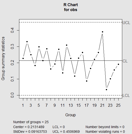
In R chart, we look for all rules that we have mentioned above. If any of the above rules is violated, then R chart is out of control and we don’t need to evaluate further. This indicates the presence of special cause variation. If the R chart appears to be in control, then we check the run rules against the X-Bar chart. In the above chart, R chart appears to be in control; hence, we move to check run rules against the X-Bar chart.
| > summary(qq) Call: qcc(data = obs, type = “R”, nsigmas = 3) R chart for obs Summary of group statistics: Min. 1st Qu. Median Mean 3rd Qu. Max. 0.0342775 0.1627947 0.2212205 0.2131489 0.2644740 0.3919933 Group sample size: 5 Number of groups: 25 Center of group statistics: 0.2131489 Standard deviation: 0.09163753 Control limits: LCL UCL 0 0.4506969 |
| > qq = qcc(obs, type = “xbar”, nsigmas = 3) |
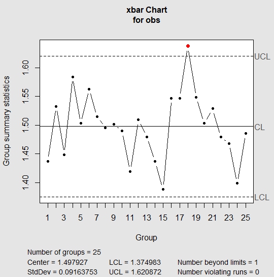
In the above chart, one of the points lie outside the UCL which implies that the process is out of control. The standard deviation in the above chart is the standard deviation of means of each of the samples. If we were to look at the sample 18, we see that the values in sample 18 are usually higher than values in other samples.
| > obs[18,] V1 V2 V3 V4 V5 18 1.700294 1.574875 1.710501 1.54464 1.660743 |
Now, let’s check process capability. By process capability, we can check if control limits and specification limits are in sync with each other. For instance, in the case we have taken, our client wanted piston rings with target diameter of 1.5 cm with a variation of +/- 0.1 cm. Process capability will help us in identifying whether our system is capable to meeting the specified requirements. It is measured by process capability index Cpk.
| > process.capability(qq, spec.limits = c(1.4,1.6)) Process Capability Analysis Call: process.capability(object = qq, spec.limits = c(1.4, 1.6)) Number of obs = 125 Target = 1.5 Center = 1.498 LSL = 1.4 StdDev = 0.09164 USL = 1.6 Capability indices: Value 2.5% 97.5% Cp 0.3638 0.3185 0.4089 Cp_l 0.3562 0.2947 0.4178 Cp_u 0.3713 0.3088 0.4338 Cp_k 0.3562 0.2829 0.4296 Cpm 0.3637 0.3186 0.4087 Exp<LSL 14% Obs<LSL 15% Exp>USL 13% Obs>USL 16% |
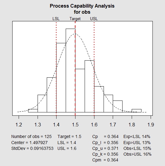
In the above plot, red lines indicate the target value, the lower and upper specified range. It can easily be inferred that the system is not capable to manufacture products within the specified range. Also, for a capable process, value of Cpk should be greater than or equal to 1.33. In the above chart, the value is 0.356 which is less than the required value. This shows that the above process is neither stable nor capable.
I am sure after going through this article, you will be able to use and create control charts in multiple other cases in your work. We would love to hear your experience with creating control charts in different settings.
Author Bio:
This article was contributed by Perceptive Analytics. Jyothirmayee Thondamallu, Chaitanya Sagar and Saneesh Veetil contributed to this article.
Perceptive Analytics is a marketing analytics company and it also provides Tableau Consulting, data analytics, business intelligence and reporting services to e-commerce, retail, healthcare and pharmaceutical industries. Our client roster includes Fortune 500 and NYSE listed companies in the USA and India.
QCC looks good, but as far as I can tell it doesn’t generate the Laney u-chart, which is like the u-chart but with corrections for over-dispersion. Is it in there and I’m missing it somehow, or is there another package I should look into for that?