Abstract
This blog post is to describe how to parse medically relevant non-image meta information from DICOM files using the programming language R. The resulting structure of the whole parsing process is an R data frame in form of a name – value table that is both easy to handle and flexible.
We first describe the general structure of DICOM files and which kind of information they contain. Following this, our DicomParseR module in R is explained in detail. The package has been developed as part of practical DICOM parsing from our hospital’s cardiac magnetic resonance (CMR) modalities in order to populate a scientific database. The given examples hence refer to CMR information parsing, however, due to its generic nature, DicomParseR may be used to parse information from any type of DICOM file.
The following graph illustrates the use of DicomParseR in our use case as an example:
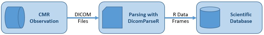
Structure of CMR DICOM files
On top level, a DICOM file generated by a CMR modality consists of a header (hdr) section and the image (img) information. In between an XML part can be found.
The hdr section mainly contains baseline information about the patient, including name, birth date and system ID. It also contains contextual information about the observation, such as date and time, ID of the modality and the observation protocol.
The XML section contains quantified information generated by the modality’s embedded AI, e. g. regarding myocardial blood flow (MBF). All information is stored between specifically named sub tags. These tags will serve to search for specific information. For further information on DICOM files, please refer to dicomstandard.org.
The heterogeneous structure of DICOM files as described above requires the use of distinct submodules to compose a technically harmonized name – value table. The information from the XML section will be extended by information from the hdr section. The key benefit of our DicomParseR module is to parse these syntactically distinct sections, which will be described in the following.
Technical Approach
To extract information from the sub tags in the XML section and any additional relevant meta information from the hdr section of the DICOM file, following steps are performed:
-
- Check if a DICOM file contains desired XML tag
- If the desired tag is present, extract and transform baseline information from hdr part
- If step 1 applied, extract and transform desired tag information from XML part
- Combine the two sets of information into an integrated R data frame
- Write the data frame into a suitable database for future scientific analysis
The steps mentioned above will be explained in detail in the following.
Step 1: Check if a DICOM file contains the desired XML tag
At the beginning of processing, DicomParseR will check whether a certain tag is present in the DICOM file, in our case <ismrmrdMeta>. In case that tag exists, quantified medical information will be stored here. Please refer to ISMRMRD for further information about the ismrmrd data format.
For this purpose, DicomParseR offers the function file_has_content() that expects the file and a search tag as parameters. The function will use base::readLines() to read in the file and stringr::str_detect() to detect if the given tag is available in the file. Performance tests with help of the package microbenchmark have proven stringr’s outstanding processing speed in this context. If the given tag was found, TRUE is returned, otherwise FALSE.
Any surrounding application may hence call
if (DicomParseR::file_has_content(file, "ismrmrdMeta")) {…}
to only continue parsing DICOM files that contain the desired tag.
It is important to note, that the information generated by the CMR modality is actually not a single DICOM file but rather a composition of a multitude of files. These files may or may not contain the desired XML tag(s). If step 1 were omitted, our parsing module would import many more files than necessary.
Step 2: Extract and transform baseline hdr information
Step 2 will extract hdr information from the file. For this purpose, DicomParseR uses the function readDICOMFile() provided by package oro.dicom. By calling
oro.dicom::readDICOMFile(dicom_file)[["hdr"]]
the XML and image part are removed. The hdr section contains information such as patient’s name, sex and birthdate as well as meta information about the observation, such as date, time and contrast bolus. DicomParseR will save the hdr part as a data frame (in the following called df_hdr) in this step and later append it to the data frame that is generated in the next step.
Note that the oro.dicom package provides functionality to extract header and image data from a DICOM file as shown in the code snippet. However, it does not provide an out-of-the-box solution to extract the XML section and return it as an R data frame. For this purpose, the DicomParseR wraps the extra functionality required around existing packages for DICOM processing.
Step 3: Extract and transform information from XML part
In this step, the data within the provided XML tag is extracted and transformed into a data frame.
Following snippet shows an example about how myocardial blood flow numbers are stored in the respective DICOM files (values modified in terms of data privacy):
<ismrmrdMeta>
…
<meta>
<name>GADGETRON_FLOW_ENDO_S_1</name>
<value>1.95</value>
<value>0.37</value>
<value>1.29</value>
<value>3.72</value>
<value>1.89</value>
<value>182</value>
</meta>
…
</ismrmrdMeta> |
Within each meta tag, “name” specifies the context of the observation and “value” stores the myocardial blood flow data. The different data points between the value tags correspond to different descriptive metrics, such as mean, median, minimum and maximum values. Other meta tags may be structured differently. In order to stay flexible, the final extraction of a concrete value is done in the last step of data processing, see step 5.
Now, to extract and transform the desired information from the DICOM file, DicomParseR will first use its function extract_xml_from_file() for extraction and subsequently the function convert_xml2df() for transformation. With
extract_xml_from_file <- function(file, tag) {
  file_content <- readLines(file, encoding = "UTF-16LE", skipNul = TRUE)
  indeces <- grep(tag, file_content)
  xml_part <- paste(file_content[indeces[[1]]:indeces[[2]]], collapse = "\n")
  return(xml_part)
}
and “ismrmrdMeta” as tag, the function will return a string in XML structure. That string is then converted to an R data frame in the form of a name – value table by convert_xml2df(). Based on our example above, the resulting data frame will look like this:
| name |
value |
[index] |
| GADGETRON_FLOW_ENDO_S1 |
1.95 |
[1] |
| GADGETRON_FLOW_ENDO_S1 |
0.37 |
[2] |
| … |
… |
|
That data frame is called df_ismrmrdMeta in the following. A specific value can be accesses with the combination of name and index, see the example in step 5.
Step 4: Integrate hdr and XML data frames
At this point in time, two data frames have resulted from processing the original DICOM file: df_hdr and df_ismrmrdMeta.
In this step, those two data frames are combined into one single data frame called df_filtered. This is done by using base::rbind().
For example, executing
df_filtered <- rbind(c("Pat_Weight", df_hdr$value[df_hdr$name=="PatientsWeight"][1]), df_ismrmrdMeta)
will extend the data frame df_ismrmrdMeta by the patient’s weight. The result is returned in form of the target data frame df_filtered. As with df_ismrmrdMeta, df_filtered will be a name – value table. This design has been chosen in order to stay as flexible as possible when it comes to subsequent data analysis.
Step 5: Populate scientific database
The data frame df_filtered contains all information from the DICOM file as a name – value table. In the final step 5, df_filtered may now be split again as required to match the use case specific schema of the scientific database.
For example, in our use case, the table “cmr_data” in the scientific database is dedicated to persist MBF values. An external program (in this case, an R Shiny application providing a GUI for end-user interaction) will call its function transform_input_to_cmr_data() to generate a data frame in format of the “cmr_data” table. By calling
transform_input_to_cmr_data <- function(df) {
  mbf_endo_s1 = as.double(df$value[df$name=="GADGETRON_FLOW_ENDO_S_1"][1])
  mbf_endo_s2 = ...
}
with df_filtered as parameter, the mean MBF values of the heart segments are extracted and can now be sent to the database. Another sub step would be to call transform_input_to_baseline_data() to persist baseline information in the database.
Summary and Outlook
This blog post has described the way DICOM files from CMR observations can be processed with R in order to extract quantified myocardial blood flow values for scientific analysis. Apart from R, different approaches by other institutes have been discussed publicly as well, e. g. by using MATLAB. Interested readers may refer to NIH, among others, for further information.
The chosen approach tries to respect both the properties of DICOM files, that is, their heterogeneous inner structure, the different types of information and their file size, as well as the specific data requirements by our institute’s use cases. With a single R data frame in form of a
name – value table, the result of the process is easy to handle for further data analysis. At the same time, due to its flexible setup,
DicomParseR may serve as a module in any kind of DICOM-related use case.
Thomas Schröder
Centrum für medizinische Datenintegration BHC Stuttgart


 (Number is expected user flow)
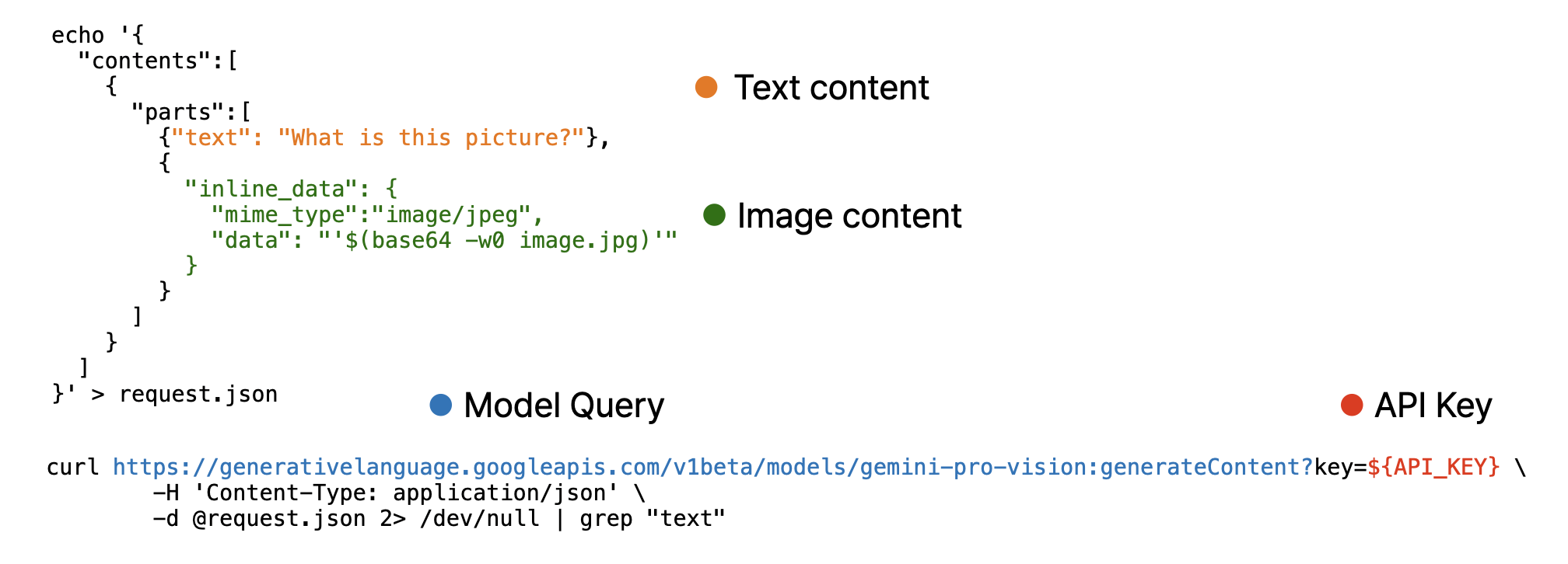
 Note that, image must encoded as base64 using base64encode function and provided as separated list.