https://thibautfabacher.shinyapps.io/covid-19/
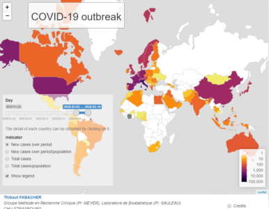
This map, which complements the Johns Hopkins University tool (Coronavirus COVID-19 Global Cases by Johns Hopkins CSSE), focuses on the evolution of the number of cases per country and for a given period, but in terms of incidence and prevalence. It is updated daily.
The period of interest can be defined by the user and it is possible to choose :
- The count of new cases over a period of time or the same count in relation to the population of the country (incidence).
- The total case count over a period of time or the same count reported to the population (prevalence).
This map is made using R with shiny, leaflet and dplyr packages.
Code available here : https://github.com/DrFabach/Corona/blob/master/shiny.r
Reference
Dong E, Du H, Gardner L. An interactive web-based dashboard to track COVID-19 in real time. Lancet Infect Dis; published online Feb 19. https://doi.org/10.1016/S1473-3099(20)30120-1.