Predicting future recessions

Even if this sounds incredible, yes, we can predict future recessions using a couple of time series, some simple econometric models, and … R

The basic idea is that the slope of the yield curve is somewhat linked to the probability of future recessions. In other words, the difference between the short and the long term rate can be used as a tool for monitoring business cycles. Nothing new about that: Kessel (1965) documented the cyclical behavior of the yield spread, and he showed that the yield spread tended to decline immediately before a recession. This relationship is one of the most famous stylized facts among economists (see Figure 1).
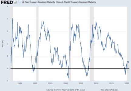
Figure_1_FRED
Figure 1: The yield spread and recessions

– So, why people don’t use this model to predict recessions ?
– Well, it seems to be related to the fact that (i) they think it only used to work in the US (ii) they don’t feel to be qualified to run a sophisticated R code to estimate this relationship.

This post is about answering these two questions: (i) yes, the yield curve does signal recessions (ii) yes, it is easy to monitor economic cycles with R using the EWS package !

First, if you have some doubts about the predictive power of the yield spread, please have a look on Hasse and Lajaunie (2022)’s recent paper, published in the Quarterly Review of Economics and Finance. The authors – Quentin and I –  reexamine the predictive power of the yield spread across countries and over time. Using a dynamic panel/dichotomous model framework and a unique dataset covering 13 OECD countries over the period 1975–2019, we empirically show that the yield spread signals recessions. This result is robust to different econometric specifications, controlling for recession risk factors and time sampling. Main results are reported in Table 1.
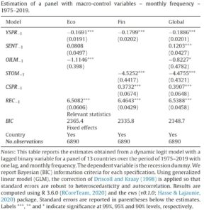
Table_1
Table 1: Estimation of the predictive power of the yield spread (1975–2019)

– Wait, what does mean “dichotomous model” ?
– Don’t be afraid: the academic literature provides a specific econometric framework to predict future recessions.

Estrella and Hardouvelis (1991) and Kauppi and Saikkonen (2008) have enhanced the use of binary regression models (probit and logit models) to model the relationship between recession dummies (i.e., binary variables) and the yield spread (i.e., continuous variable). Indeed, classic linear regressions cannot do the job here. If you have specific issues about probit/logit models, you should have a look on Quentin’s PhD dissertation. He is a specialist in nonlinear econometrics.

Now, let’s talk about the EWS R package. In a few words, the package is available on the CRAN package repository and it includes data and code you need to replicate our empirical findings. So you only have to run a few lines of code to estimate the predictive power of the yield spread. Not so bad eh ?

Here is an example focusing on the US: first install and load the package, then we extract the data we need.
# Load the package
library(EWS)

# Load the dataset included in the package
data("data_USA") # Print the first six rows of the dataframe head(data_USA)
Well, now we just have to run these few lines:
# Data process
Var_Y <- as.vector(data_USA$NBER)
Var_X <- as.vector(data_USA$Spread)
# Estimate the logit regression
results <- Logistic_Estimation(Dicho_Y = Var_Y, Exp_X = Var_X, Intercept = TRUE, Nb_Id = 1, Lag = 1, type_model = 1)
# print results
print(results)
The results can be printed… and plotted ! Here is an illustration what you should have:

$Estimation
name Estimate Std.Error zvalue Pr
1 Intercept -1.2194364 0.3215586 -3.792268 0.0001492776
2 1 -0.5243175 0.2062655 -2.541955 0.0110234400
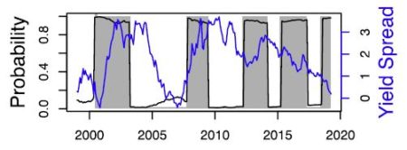
and then what you could plot:

Figure_2
Figure 2: The predictive power of the yield spread in the US (1999-2020)

Nice output, let’s interpret what we have. First the estimation results: the intercept is equal to -1.21 and high significant, and the lagged yield spread is equal to -0.52 and is also highly significant. This basic result illustrates the predictive power of the yield spread.

– But what does mean “1” instead of the name of the lagged variable ? And what if we choose to have another lag  ? And if we choose model 2 instead of model 1 ?
– “1” refers to the number associated to the lagged variable, and you can change the model or the number of lags via the function arguments:
$Estimation
name Estimate Std.Error zvalue Pr
1 Intercept 0.08342331 0.101228668 0.8241075 4.098785e-01
2 1 -0.32340655 0.046847136 -6.9034433 5.075718e-12
3 Index_Lag 0.85134073 0.003882198 219.2934980 0.000000e+00

Last but not least, you can choose the best model according to AIC, BIC or R2 criteria:

$AIC
[1] 164.0884
$BIC
[1] 177.8501
$R2
[1] 0.2182592

Everything you need to know about the predictive power of the yield spread is here. These in-sample estimations confirm empirical evidences from the literature for the US. And for those who are interested in out-of-sample forecasting… the EWS package provides what you need. I’ll write an another post soon !

References

Estrella, A., & Hardouvelis, G. A. (1991). The term structure as a predictor of real economic activity. The Journal of Finance46(2), 555-576.

Hasse, J. B., & Lajaunie, Q. (2022). Does the yield curve signal recessions? new evidence from an international panel data analysis. The Quarterly Review of Economics and Finance, 84, 9-22.

Hasse, J. B., & Lajaunie, Q. (2020). EWS: Early Warning System. 
R package version 0.1. 0.

Kauppi, H., & Saikkonen, P. (2008). Predicting US recessions with dynamic binary response models. The Review of Economics and Statistics90(4), 777-791.

Kessel, Reuben, A. “The Cyclical Behavior of the Term Structure of Interest Rates.” NBER Occasional Paper 91, National Bureau of Economic Research, 1965.

Four (4) Different Ways to Calculate DCF Based ‘Equity Cash Flow (ECF)’ – Part 2 of 4

This represents Part 2 of a 4-part series relative to the calculation of Equity Cash Flow (ECF) using R.  If you missed Part 1, be certain read that first part before proceeding. The content builds off prior described information/data.

Part 1 previous post is located here.
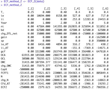
‘ECF – Method 2’ is defined as follows: 
 
The equation appears innocent enough, though there are many underlying terms that require definition for understanding of the calculation. In words, ‘ECF – Method 2’ equals free cash Flow (FCFF) minus after-tax Debt Cash Flow (CFd).


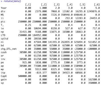
Reference details of the 5-year capital project’s fully integrated financial statements developed in R at the following link.  The R output is formatted in Excel.  Zoom for detail. 

https://www.dropbox.com/s/lx3uz2mnei3obbb/financial_statements.pdf?dl=0
The first order of business is to define the terms necessary to calculate FCFF.


Next, pretax Debt Cash Flow (CFd) and its components are defined as follows:

  The following data are added to the ‘data’ tibble from the prior article relative to the financial statements.
data <- data %>%
  mutate(ie    = c(0, 10694, 8158, 527, 627, 717 ),
         np    = c(31415, 9188, 13875,  16500, 18863, 0),
         LTD   = c(250000, 184952, 0, 0, 0, 0),
         cpltd = c(0, 20550, 0, 0, 0, 0),
         ni    =  c(0, 47584,  141355,  262035, 325894, 511852),
         bd    =  c(0, 62500,  62500,   62500,   62500,   62500),
         chg_DTL_net = c(0, 35000,  55000,  35000, -25000, -100000),
         cash  = c(30500,  61250, 92500, 110000, 125750, 0),
         ar    = c(0, 61250,  92500,  110000,  125750, 0),
         inv   = c(30500, 61250, 92500, 110000,  125750, 0),
         pe    = c(915, 1838, 2775, 3300, 3773, 0),
         ap    = c(30500, 73500, 111000, 132000, 150900, 0),
         wp    = c(0, 5513, 8325, 9900, 11318, 0),
         itp   = c(0, -819.377,  9809,  34923, 60566, 0),
         CapX  = c(500000,0,0,0,0,0),
         gain  = c(0,0,0,0,0,162500),
         sp  = c(0,0,0,0,0,350000))
View tibble.


All of the above calculations are defined in the below R function ECF_2. ‘ECF – Method 2’ R function
ECF_2 <- function(a) {
  
  ECF2 <-      tibble(T_        = a$T_,
                       ie       = a$ie,
                       ii       = a$ii,
                       Year     = c(0:(length(ii)-1)),
                       ni       = a$ni,
                       bd       = a$bd,
                       chg_DTL_net = a$chg_DTL_net,
                       gain     = - a$gain,
                       sp       = a$sp,
                       ie_AT    = ie*(1-a$T_),
                       ii_AT    = - ii*(1-a$T_),
                       gcf      = ni + bd + chg_DTL_net + gain + sp 
                                + ie_AT + ii_AT,
                       OCA      = a$cash + a$ar + a$inv + a$pe,
                       OCL      = a$ap + a$wp + a$itp,
                       OWC      = OCA - OCL,
                       chg_OWC  = OWC - lag(OWC, default=0),
                       CapX     = - a$CapX,
                       FCFF1    = gcf + CapX - chg_OWC,
                       N        = a$LTD + a$cpltd + a$np,
                       chg_N    = N - lag(N, default=0),
                       CFd_AT   = ie*(1-T_) - chg_N,   
                       ECF2     = FCFF1 - CFd_AT )
                      
  
  ECF2 <- rotate(ECF2)
  return(ECF2)
  
}

Run the R function and view the output.


R Output formatted in Excel
Method 2


ECF Method 2‘ agrees with the prior results from ‘ECF Method 1‘ each year.  Any differences are due to rounding error.

This ECF calculation example is taken from my newly published textbook, ‘Advanced Discounted Cash Flow (DCF) Valuation using R.’  It is discussed in far greater detail along with development of the integrated financials using R as well as numerous, advanced DCF valuation modeling approaches – some never before published. The text importantly clearly explains ‘why’ these ECF calculation methods are mathematically exactly equivalent, though the individual components appear vastly different.

Reference my website for further details.

https://www.leewacc.com/

Next up, ‘ECF – Method 3’ …

Brian K. Lee, MBA, PRM, CMA, CFA


Hands-on: How to build an interactive map in R-Shiny: An example for the COVID-19 Dashboard

It has been two years since I started to develop various interactive web applications by using R-Shiny packages. Due to Coronavirus disease (COVID-19) at this moment, I spent some time at home on preparing a simple COVID-19 related Dashboard. To share my experiences and consideration, especially those about how to create interactive maps, the following details has been discussed.

Data Source 

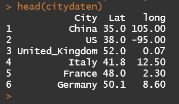
Dataset (data/key-countries-pivoted.csv) from Github (https://github.com/datasets/covid-19), which contains the data of daily confirmed cases of COVID-19 since 22th Jan 2020 from the eight most rapidly-spread countries (China, USA, United Kingdom, Italy, France, Germany, Spain and Iran), has been used. An example of overview of the dataset is given as follows:
In addition, the geographic coordinates (Latitude and Longitude) of the centroids of these countries have been collected for placing charts in the leaflet map.


R Shiny: Introduction 

Shiny application consists of two components, a user interface object and a server function. In user interface object, you are able to create dynamic dashboard interface, while the server function contains code provides an interactive connection between objects used for input and output. The UI object and server function will be further listed, respectively.

R library 
We use the R library leaflet, which is a Javascript Library and allows users to create and customize interactive maps. For more details, we refer users to the link: https://cran.r-project.org/web/packages/leaflet/index.html
 library(shiny)
 library(leaflet.minicharts)
 library(leaflet)
Shiny-UI
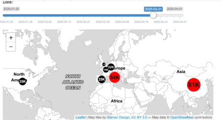
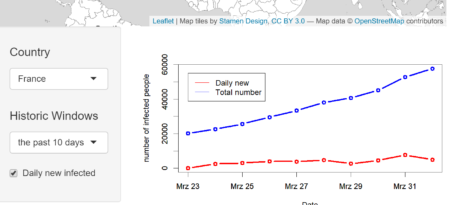
The user Interface is constructed as follows, where two blocks are included. The upper block shows the worldwide COVID-19 distribution and the total number of the confirmed cases of each country. The amount of cases is labelled separately and those countries with more than 500,000 cases are marked as red, otherwise black. Note that the function leafletOutput() is used for turning leaflet map object into an interface output. In the lower block, we are able to visualize the time dependent development of confirmed cases for a selected country and time history.  The classical layout sideBarLayout, which consists of a sidebar (sidebarPanel()) and the main area (mainPanel()), is used. Moreover, a checkbox is provided to select whether plotting the daily new confirmed cases is desired.


The R code for UI is given as follows:
 ui<- fluidPage(
   #Assign Dasbhoard title 
   titlePanel("COVID19 Analytics"),
  
  # Start:  the First Block
  # Sliderinput: select from the date between 01.20.2020 
  # and 01.04.2020
  sliderInput(inputId = "date", "Date:", min = 
  as.Date("2020-01-20"), max = as.Date("2020-04-01"), 
  value = as.Date("2020-03-01"), width = "600px"),
    
  # plot leaflet object (map) 
  leafletOutput(outputId = "distPlot", width = "700px", 
  height = "300px"),
  #End:  the First Block
  
  #Start: the second Block
  sidebarLayout(
    
    #Sidebar Panel: the selected country, history and 
    #whether to plot daily new confirmed cases.
    sidebarPanel(
      selectInput("selectedcountry", h4("Country"), choices 
      =list("China","US","United_Kingdom","Italy","France",
      "Germany", "Spain"), selected = "US"),
      selectInput("selectedhistoricwindow", h4("History"), 
      choices = list("the past 10 days", "the past 20 
      days"), selected = "the past 10 days"),
      checkboxInput("dailynew", "Daily new infected", 
      value = TRUE),
      width = 3  
    ),
    
    #Main Panel: plot the selected values
    mainPanel (
      plotOutput(outputId = "Plotcountry", width = "500px", 
      height = "300px")
    )
  ),
  #End: the second Block 
)
Shiny-Server
Input and output objects are connected in the Server function. Note that, the input arguments are stored in a list-like object and each input argument is identified under its unique name, for example the sliderInput is named after “date”.
server <- function(input, output){
  
  #Assign output$distPlot with renderLeaflet object
  output$distPlot <- renderLeaflet({
  
    # row index of the selected date (from input$date)
    rowindex = which(as.Date(as.character(daten$Date), 
    "%d.%m.%Y") ==input$date)
    
    # initialise the leaflet object
    basemap= leaflet()  %>%
      addProviderTiles(providers$Stamen.TonerLite,
      options = providerTileOptions(noWrap = TRUE)) 
    
    # assign the chart colors for each country, where those 
    # countries with more than 500,000 cases are marked 
    # as red, otherwise black
    chartcolors = rep("black",7)
    stresscountries 
    = which(as.numeric(daten[rowindex,c(2:8)])>50000)
    chartcolors[stresscountries] 
    = rep("red", length(stresscountries))
    
    # add chart for each country according to the number of 
    # confirmed cases to selected date 
    # and the above assigned colors
    basemap %>%
      addMinicharts(
        citydaten$long, citydaten$Lat,
        chartdata = as.numeric(daten[rowindex,c(2:8)]),
        showLabels = TRUE,
        fillColor = chartcolors,
        labelMinSize = 5,
        width = 45,
        transitionTime = 1
      ) 
  })
  
  #Assign output$Plotcountry with renderPlot object
  output$Plotcountry <- renderPlot({
    
    #the selected country 
    chosencountry = input$selectedcountry
    
    #assign actual date
    today = as.Date("2020/04/02")
    
    #size of the selected historic window
    chosenwindow = input$selectedhistoricwindow
    if (chosenwindow == "the past 10 days")
       {pastdays = 10}
    if (chosenwindow  == "the past 20 days")
       {pastdays = 20}
    
    #assign the dates of the selected historic window
    startday = today-pastdays-1
    daten$Date=as.Date(as.character(daten$Date),"%d.%m.%Y")
    selecteddata 
    = daten[(daten$Date>startday)&(daten$Date<(today+1)), 
    c("Date",chosencountry)]
    
    #assign the upperbound of the y-aches (maximum+100)
    upperboundylim = max(selecteddata[,2])+100
    
    #the case if the daily new confirmed cases are also
    #plotted
    if (input$dailynew == TRUE){
    
      plot(selecteddata$Date, selecteddata[,2], type = "b", 
      col = "blue", xlab = "Date", 
      ylab = "number of infected people", lwd = 3, 
      ylim = c(0, upperboundylim))
      par(new = TRUE)
      plot(selecteddata$Date, c(0, diff(selecteddata[,2])), 
      type = "b", col = "red", xlab = "", ylab = 
      "", lwd = 3,ylim = c(0,upperboundylim))
      
      #add legend
      legend(selecteddata$Date[1], upperboundylim*0.95, 
      legend=c("Daily new", "Total number"), 
      col=c("red", "blue"), lty = c(1,1), cex=1)
    }
    
    #the case if the daily new confirmed cases are 
    #not plotted
    if (input$dailynew == FALSE){
      
      plot(selecteddata$Date, selecteddata[,2], type = "b", 
      col = "blue", xlab = "Date", 
      ylab = "number of infected people", lwd = 3,
      ylim = c(0, upperboundylim))
      par(new = TRUE)
      
      #add legend
      legend(selecteddata$Date[1], upperboundylim*0.95, 
      legend=c("Total number"), col=c("blue"), 
      lty = c(1), cex=1)
    }
    
  })
    
} 
Shiny-UI
At the end, we create a complelte application by using the shinyApp function.
 shinyApp(ui = ui, server = server)
The Dashboard is deployed under the following URL: https://sangmeng.shinyapps.io/COVID19/

Statistics Challenge Invites Students to Tackle Opioid Crisis Using Real-World Data


In 2016, 2.1 million Americans were found to have an opioid use disorder (according to SAMHSA), with drug overdose now the leading cause of injury and death in the United States. But some of the country’s top minds are working to fight this epidemic, and statisticians are helping to lead the charge. 

In This is Statistics’ second annual fall data challenge, high school and undergraduate students will use statistics to analyze data and develop recommendations to help address this important public health crisis. 

The contest invites teams of two to five students to put their statistical and data visualization skills to work using the Centers for Disease Control and Prevention (CDC)’s Multiple Cause of Death (Detailed Mortality) data set, and contribute to creating healthier communities. Given the size and complexity of the CDC dataset, programming languages such as R can be used to manipulate and conduct analysis effectively.

Each submission will consist of a short essay and presentation of recommendations. Winners will be awarded for best overall analysis, best visualization and best use of external data. Submissions are due November 12, 2018.

If you or a student you know is interested in participating, get full contest details here

Teachers, get resources about how to engage your students in the contest here.

Introducing R-Ladies Remote Chapter

R-Ladies Remote is kicking off and we want YOU! Do you want to be part of the R community but can’t attend meetups? There are many R-Ladies across the globe who love the idea of the organisation, but aren’t able to connect with it easily due to their distance, their work or their caring responsibilities. If child care ends at 6pm, ducking out to a chapter meeting at 6:30 isn’t always easy.

What do you need to join in? An interest in R and to be part of a gender minority in tech, that’s all. We are open to all R users, from new starters to experienced users. Sign up here.

What will RLadies Remote be doing? We’ll be hosting a variety of online events and speakers. We’ll be covering introductions to basic R and more advanced topics, discussions about remote working, independent consulting and seminars from our members.

Do you have an idea for an event, would you like to give a talk or would you like to come along to learn? If so we’d love to hear from you. Please show your interest by filling in our initial survey.