We use Choropleth maps to show differences in colors or shading of pre-defined regions like states or countries, which correspond to differences in quantitative values like total rainfall, average temperature, economic indicators etc
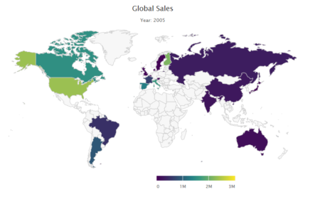
In our case we will use sales of a toy making company, as quantitative value, in different countries around the world. See example with this shiny app
Highcharter is a R wrapper for Highcharts javascript based charting modules.
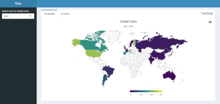
Rendering Choropleth Maps with Highcharts in Shiny
- To see Highcharts/Shiny interaction, we will begin by creating basic Shiny dashboard layout: It contains a single select widget and single tab for displaying map.
library(shiny)

library(shinydashboard)

library(highcharter)

library(countrycode)

library(dplyr)


sales <- read.csv('salespoint.csv')

ui<-


dashboardPage(

  dashboardHeader(title = "Map"),


  dashboardSidebar(

  sidebarMenu(

  selectInput('yearid','Select Year',choices = c(2003,2004,2005),selected =    2003)

  )),


  dashboardBody(

    tabBox(title = 'ToyShop',id = 'tabset1',width = 12, tabPanel('World-Sales',highchartOutput('chart',height = '500px')))


  )

)
- In server function, filtering and summarize data with dplyr library and create a reactive object
server <- function(input, output, session){


  total <- reactive(

    {

    sales %>%

    filter(YEAR_ID == as.numeric(input$yearid)) %>%

    group_by(COUNTRY) %>%

    summarize("TOTAL_SALES" = as.integer(sum(SALES))) %>%

    mutate(iso3 = countrycode(COUNTRY,"country.name","iso3c"))

    }

    )
Here we used library countrycode to convert long country names into one of many coding schemes. Adding new column iso3 in the summarized data with mutate function.
- Passing reactive object in renderHighchart function. Customizing tooltip and sub-title content with reactive widgets.
output$chart <- renderHighchart(highchart(type = "map") %>%

                                    hc_add_series_map(map = worldgeojson, df = total(), value = "TOTAL_SALES", joinBy = "iso3") %>%

                                    hc_colorAxis(stops = color_stops()) %>%

                                    hc_tooltip(useHTML=TRUE,headerFormat='',pointFormat = paste0(input$yearid,'  {point.COUNTRY} Sales : {point.TOTAL_SALES} ')) %>%

                                    hc_title(text = 'Global Sales') %>%

                                    hc_subtitle(text = paste0('Year: ',input$yearid)) %>%

                                    hc_exporting(enabled = TRUE,filename = 'custom')

                                    )

}
Dataset and shiny R file can be downloaded from here