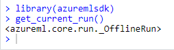
How to reverse engineer a heat map into its underlying values

Astrolabe Diagnostics is a fully bootstrapped five-person biotech startup. We offer the Antibody Staining Data Set (ASDS), a free service that helps immunologists find out the expression of different molecules (markers) across subsets in the immune system. Essentially, the ASDS is a big table of numbers, where every row is a subset and every column a marker. Recently, the Sean Bendall lab at Stanford released the preprint of a similar study, where they measured markers for four of the subsets that the ASDS covered. Since the two studies used different techniques for their measurements I was curious to examine the correlation between the results. However, the preprint did not include any of the actual data. The closest was Figure 1D, a heat map for 98 of the markers measured in the study:


I decided to take the heat map image and “reverse engineer” it into the underlying values. Specifically, what I needed was the “Median scaled expression” referred to in the legend in the bottom right. Since I could not find any existing packages or use cases for easily doing this I decided to hack a solution (check out the code and PNG and CSV files at the github repository). First, I manually entered the marker names from the X-axis into a spreadsheet. Then, I cropped the above image, removing the legends, axes, and the top heat map row which includes an aggregate statistic not relevant to this exercise.


I loaded the image into R using the readPNG function from the png package. This results in a three-dimensional matrix where the first two dimensions are the X- and Y-values and the third is the RGB values. The X axis maps to the markers and the Y axis maps to the four subsets (“Transitional”, “Naive”, “Non-switched”, and “Switched”), and I wanted to get a single pixel value for each (Subset, Marker) combination. Deciding on the row for each subset was easy enough: I loaded the image in GIMP and picked rows 50, 160, 270, and 380. In order to find the column for each marker I initially planned to iterate over the tile width. Unfortunately, tile widths are not consistent, which is further complicated by the vertical white lines. I ended up choosing them manually in GIMP as well:

Marker,Pixel
CD1d,14
CD31,40
HLA-DQ,70
CD352,100
CD21,128
CD196,156
CD79b,185
CD1c,219
...
I could now get the RGB value for a (Subset, Marker) from the PNG. For example, if I wanted the CD31 value for the “Non-switched” subset, I would go to heat_map_png[270, 40, ]. This will give me the vector [0.6823529, 0.0000000, 0.3882353]. In order to map these values into the “Median scaled expression” values, I used the legend in the bottom left. First, I cropped it into its own PNG file:


I imported it into R using readPNG, arbitrarily took the pixels from row 10, and mapped them into values using seq:

# Import legend PNG, keep only one row, and convert to values. The values "0"
# and "0.86" are taken from the image.
legend_png <- png::readPNG("legend.png")
legend_mtx <- legend_png[10, , ]
legend_vals <- seq(0, 0.86, length.out = nrow(legend_mtx))
At this point I planned to reshape the heat map PNG matrix into a data frame and join the RGB values into the legend values. However, this led to two issues.

One, reshaping a three-dimensional matrix into two dimensions is a headache since I want to make sure I end up with the row and column order I need. Sticking to the spirit of the hack, I iterated over all (Subset, Marker) values instead. This is inelegant (iterating in R is frowned upon) but is a reasonable compromise given the small image size.

Two, I can’t actually join on the legend RGB values. The heat map uses a gradient and therefore some of its values might be missing from the legend itself (the reader can visually infer them). Instead, I calculated the distance between each heat map pixel and the legend pixels and picked the nearest legend pixel for its “Median scaled expression”.

heat_map_df <- lapply(names(marker_cols), function(marker) {
  lapply(names(cell_subset_rows), function(cell_subset) {
    v <- t(heat_map_png[cell_subset_rows[cell_subset], marker_cols[marker], ])
    dists <- apply(legend_mtx, 1, function(x) sqrt(sum((x - v) ^ 2)))
    data.frame(
      Marker = marker,
      CellSubset = cell_subset,
      Median = legend_vals[which.min(dists)],
      stringsAsFactors = FALSE
    )
  }) %>% dplyr::bind_rows()
}) %>% dplyr::bind_rows()
I now have the heat_map_df values I need to compare to the ASDS! As a sanity check, I reproduced the original heat map using ggplot:
heat_map_df$Marker <- 
  factor(heat_map_df$Marker, levels = names(marker_cols))
heat_map_df$CellSubset <-
  factor(heat_map_df$CellSubset, levels = rev(names(cell_subset_rows)))

ggplot(heat_map_df, aes(x = Marker, y = CellSubset)) +
  geom_tile(aes(fill = Median), color = "white") +
  scale_fill_gradient2(
    name = "Median Scaled Expression",
    low = "black", mid = "red", high = "yellow",
    midpoint = 0.4) +
  theme(axis.text.x = element_text(angle = -90, hjust = 0, vjust = 0.4),
        axis.title = element_blank(),
        legend.position = "bottom",
        panel.background = element_blank())


The resulting code gets the job done and can be easily repurposed for other heat maps. There will be some manual work involved, namely, setting cell_subset_rows to the rows in the new heat map, updating marker_cols.csv accordingly, and setting the boundary values in the seq call when calculating legend_vals. Furthermore, we should be able to adapt the above into a more autonomous solution by calculating the boundaries between tiles using diff, running it separately on the rows and the columns (getting the row and column labels will not be trivial and will require OCR). For a one-time exercise, though, the above hack works remarkably well — sometimes that is all the data science you need to get the job done. Check out this YouTube video for the actual comparison between the data sets!

Vignette: Podlover – A Package to Analyze Podcasting Data

Note: Some of the code blocks below got reformated by the WordPress editor. To see the working code, please visit the original vignette in the Repo’s README.md file.

The Backstory: Podlove – a WordPress plugin for Podcasting

The Podlove podcasting suite is an open source toolset to help you publish and manage a podcast within a WordPress blog. Over the years it has become the de facto standard for easy while flexible podcast publishing in the German-speaking podcast community. Podlove includes an analytics dashboard to give you an overview of how your podcast is performing over time and various dimensions such as media formats. While being a practical overview for everyday analytics, it is limited when it comes to more complex or fine-grained analytics.

podlover Brings Podlove Data into R

The podlover package allows you to access the access data behind the Podlove dashboard. It connects to the relevant WordPress MySQL tables, fetches the raw data, connects and cleans it into a tidy dataset with one row per download attempt. Furthermore, it allows you to:
    • plot download data for multiple episodes as point, line, area and ridgeline graphs
    • use options for absolute vs relative display (think: release dates vs. days since release) and cumulative vs. non-cumulative display.
    • compare episodes, epsiode formats, sources/contexts, podcast clients, and operating systems over time
    • create and compare performance data for episode launches and long-term performance
    • calculate and plot regressions to see if you are gaining or losing listeners over time.
This vignette demonstrates what podlover can do.

Installation

This package is based on the statistical programming framework R. If you’re a podcast producer who is new R, you will need to install R as well as its programming environment RStudio and familiarize yourself with it. Both of them are free open source tools. Start here to get RStudio and R. podlover is available as a package from GitHub at https://github.com/lordyo/podlover and can be installed via devtools:
# install devtools if you don't have it already
install.packages("devtools")
# install podlover from GitHub
devtools::install_github("lordyo/podlover")
Once installed, you can load the package.
library(podlover)

Ways to Access Podlove Data

There are two ways to get your download data into podlover:
    • You either fetch the data directly from the WordPress data base with podlove_get_and_clean(). This will give you the most recent data and, once established, is the most comfortable way of accessing data. Establishing the connection can be tricky though.
    • Or you download the necessary tables and feed it to podlover with podlove_clean_stats(). This is easier, but takes longer and will only give you a snapshot of the data at a certain point in time.

Fetching Download Data via a Database Connection

Behind every WordPress site is a MySQL database containing almost everything that’s stored in the blog. When installing Podlove under WordPress, the plugin creates additional database tables containing podcast-specific data. The function podlove_get_and_clean() fetches those. To make that happen, you will need:
    1. db_name: The WordPress database’s name.
    2. db_host: The (external) hostname of the database.
    3. db_user: The databases’s user name (usually not the same as your WordPress login)
    4. db_password: The user’s password for database (usually not the same as your Worpdress password)
    5. Permissions to access your database from an external IP address.
    6. The names of the database tables

Database name, user and password

db_name, db_user and db_password can be found in the wp-config.php file in the root folder of your podcast’s WordPress directory. Look for the following passage:
// ** MySQL settings - You can get this info from your web host ** //
/** The name of the database for WordPress */
define( 'DB_NAME', 'lorem_wp_ipsum' );
/** MySQL database username */
define( 'DB_USER', 'lorem_dolor' );
/** MySQL database password */
define( 'DB_PASSWORD', 'my_password' );

External Database Hostname

Note that this file also includes a hostname, but this is the internal hostname – you’re looking for the external hostname. This you will need to get from your hoster’s admin panel, usually where MySQL databases are managed. Check your hoster’s support section if you get stuck.

Access permissions

MySQL databases are sensitive to hacking attacks, which is why they usually aren’t accessible to just any visitor – even if she has the correct access information. You will probably need to set allow an access permission to your database and user from the IP address R is running on (“whitelisting”). This is also done via your hoster’s admin panel. Check your hoster’s support sections for more info. (Note: Some hosters are stricter and don’t allow any access except via SSH tunnels. podlover doesn’t provide that option yet.)

Prefix of the Table Names

Finally, you might need to check if the tables name prefix in your WordPress database corresponds to the usual naming conventions. Most WordPress installations start the tables with wp_, but sometimes, this prefix differs (e.g. wp_wtig_). For starters, you can just try to use the default prefix built into the function. If the prefix is different than the default, you will get an error message. If that’s the case, access your hoster’s MySQL management tool (e.g. phpMyAdmin, PHP Workbench), open your database and check if the tables are starting with something else than just wp_... and write down the prefix. You can of course also use a locally installed MySQL tool to do so (e.g. HeidiSQL).

Downloading the data

Once you gathered all this, it’s time to access your data and store it to a data frame:
download_data <- podlove_get_and_clean()
Four input prompts will show up, asking for the database name, user, password and host. You have the option to save these values to your system’s keyring, so you don’t have to enter them repeatedly. Use ?rstudioapi::askForSecret to learn more about where these values are stored or ?keyring to learn more how keyrings and how they are used within R. After entering the information, you should see something like this:
connection established
fetched table wp_podlove_downloadintentclean
fetched table wp_podlove_mediafile
fetched table wp_podlove_useragent
fetched table wp_podlove_episode
fetched table wp_posts
connection closed

Troubleshooting

You might also get an error message, meaning something went wrong. If you see the following error message…
Error in .local(drv, ...) : 
  Failed to connect to database: Error: Access denied for user 'username'@'XX.XX.XX.XXX' to database 'databasename'
…then the function couldn’t access the databse. This means either that there’s something wrong with your database name, user name, password or host name (see sections “Database name, user name, password” or “External Database Hostname” above) Or it could mean that access to this database with this username is restricted, i.e. your IP is not whitelisted (see “Access Permissions” above). If you can’t make that work, you’re only option is to download the tables yourself (see “Working with Local Table Downloads”). If your error says…
connection established
Error in .local(conn, statement, ...) : 
  could not run statement: Table 'dbname.tablename' doesn't exist
…this means you were able to access the database (congrats!), but the table names/prefix are incorrect. Check your table name prefix as described under “Prefix of the table names” and try again while specifying the prefix:
download_data <- podlove_get_and_clean(tbl_prefix = "PREFIX")

Working with Local Table Downloads

If you can’t or don’t want to work with podlove_get_and_clean(), you can still analyze your data by downloading the individual database tables yourself and feed it directly to the cleaning function podlove_clean_stats(). First, you will need to get the necessary tables. The easiest way is to use your hoster’s database management tool, e.g. phpMyAdmin or PHP Workbench. These can usually be accessed from your hosting administration overview: Look for a “databases”, “MySQL” or “phpMyAdmin” option, find a list of tables, usually starting with wp_..., select the table and look for an “export” option. Export the tables to CSV. If you get stuck, check your hoster’s support section. Warning: When using database tools, you can break things – i.e. your site and your podcast. To be on the safe side, always make a backup first, don’t change any names or options, and don’t delete anything! You will need the following tables, each in its own CSV file with headings (column titles):
    • wp_podlove_downloadintentclean
    • wp_podlove_episode
    • wp_podlove_mediafile
    • wp_podlove_useragent
    • wp_posts
Note: The prefix of the tables (here wp_) might be different or longer in your case. Once you have downloaded the tables, you need to import them into R as data frames: to use the podlove_clean_stats() function to connect the table and clean the data:
# replace file names with your own
download_table <- read.csv("wp_podlove_downloadintentclean.csv", as.is = TRUE)
episode_table <- read.csv("wp_podlove_episode.csv", as.is = TRUE)
mediafile_table <- read.csv("wp_podlove_mediafile.csv", as.is = TRUE)
useragent_table <- read.csv("wp_podlove_useragent.csv", as.is = TRUE)
posts_table <- read.csv("wp_posts.csv", as.is = TRUE)
# connect & clean the tables
download_data <- podlove_clean_stats(df_stats = download_table,
                                     df_episode = episode_table,
                                     df_mediafile = mediafile_table,
                                     df_user = useragent_table,
                                     df_posts = posts_table)

Create Example Data

podlover includes a number of functions to generate example download tables. This can be useful if you want to test the package without having real data, or to write reproducible examples for a vignette like this. We will use an example data set for the next chapters. Generate some random data with the function podlove_create_example() with ~10.000 downloads in total. The seed parameter fixes the randomization to give you the same data as in this example. The clean parameter states that you want a dataframe of cleaned data, not raw input tables.
downloads <- podlove_create_example(total_dls = 10000, seed = 12, clean = TRUE)
Here it is:
print(downloads)
#> # A tibble: 6,739 x 20
#>    ep_number title ep_num_title duration post_date  post_datehour      
#>                                        
#>  1 01        Asht~ 01: Ashton-~ 00:32:2~ 2019-01-01 2019-01-01 00:00:00
#>  2 01        Asht~ 01: Ashton-~ 00:32:2~ 2019-01-01 2019-01-01 00:00:00
#>  3 01        Asht~ 01: Ashton-~ 00:32:2~ 2019-01-01 2019-01-01 00:00:00
#>  4 01        Asht~ 01: Ashton-~ 00:32:2~ 2019-01-01 2019-01-01 00:00:00
#>  5 01        Asht~ 01: Ashton-~ 00:32:2~ 2019-01-01 2019-01-01 00:00:00
#>  6 01        Asht~ 01: Ashton-~ 00:32:2~ 2019-01-01 2019-01-01 00:00:00
#>  7 01        Asht~ 01: Ashton-~ 00:32:2~ 2019-01-01 2019-01-01 00:00:00
#>  8 01        Asht~ 01: Ashton-~ 00:32:2~ 2019-01-01 2019-01-01 00:00:00
#>  9 01        Asht~ 01: Ashton-~ 00:32:2~ 2019-01-01 2019-01-01 00:00:00
#> 10 01        Asht~ 01: Ashton-~ 00:32:2~ 2019-01-01 2019-01-01 00:00:00
#> # ... with 6,729 more rows, and 14 more variables: ep_age_hours ,
#> #   ep_age_days , hours_since_release , days_since_release ,
#> #   source , context , dldate , dldatehour ,
#> #   weekday , hour , client_name , client_type ,
#> #   os_name , dl_attempts 
Nice – this is all the data you need for further analysis. It contains information about the episode (what was downloaded?), the download (when was it downloaded?) and the user agent (how / by which agent was it downloaded?). By the way, if you want get access the raw data or try out the cleaning function, you can set the podlove_create_example() parameter clean = FALSE:
table_list <- podlove_create_example(total_dls = 10000, seed = 12)
The result is a list of 5 named tables (posts, episodes, mediafiles, useragents, downloads) wrapped in a list. Now all you have to do is feed them to the cleaning function:
downloads <- podlove_clean_stats(df_stats = table_list$downloads,
                                 df_mediafile = table_list$mediafiles,
                                 df_user = table_list$useragents,
                                 df_episodes = table_list$episodes,
                                 df_posts = table_list$posts)

Summary

Now that you have the clean download data, it’s time to check it out. podlover includes a simple summary function to give you an overview of the data:
podlove_podcast_summary(downloads)
#> 'downloads': 
#> 
#> A podcast with 10 episodes, released between 2019-01-01 and 2019-12-05.
#> 
#> Total runtime:  11m 4d 22H 0M 0S.
#> Average time between episodes: 2928240s (~4.84 weeks).
#> 
#> Episodes were downloaded 6739 times between 2019-01-01 and 2020-01-04.
#> 
#> Downloads per episode: 673.9
#> min: 132 | 25p: 375 | med: 703 | 75p: 791 | max: 1327
#> 
#> Downloads per day: 18.3
#> min: 1 | 25p: 3 | med: 7 | 75p: 16 | max: 572
#> NULL
If you set the parameter return_params to TRUE, you can access the individual indicators directly. The verbose parameter defines if you want to see the printed summary.
pod_sum <- podlove_podcast_summary(downloads, return_params = TRUE, verbose = FALSE)
names(pod_sum)
#>  [1] "n_episodes"                 "ep_first_date"             
#>  [3] "ep_last_date"               "runtime"                   
#>  [5] "ep_interval"                "n_downloads"               
#>  [7] "dl_first_date"              "dl_last_date"              
#>  [9] "downloads_per_episode_mean" "downloads_per_episode_5num"
#> [11] "downloads_per_day_mean"     "downloads_per_day_5num"
pod_sum$n_downloads
#> [1] 6739
pod_sum$dl_last_date
#> [1] "2020-01-04 22:00:00 UTC"

Download curves

One of the main features of the podlover package is that it lets you plot all kinds of download curves over time – aggregated and grouped, with relative and absolute starting points. The plotting function relies on the ggplot2 package and the data needs to be prepared first. The function podlove_prepare_stats_for_graph() does just that, and the function podlove_graph_download_curves() takes care of the plotting.

Parameters

The functional combo of podlove_prepare_stats_for_graph() and podlove_graph_download_curves() accepts the following parameters for a graph:
    • df_stats: The clean data to be analyzed, as prepared by the import or cleaning function.
    • gvar: The grouping variable. Defining one will create multiple curves, one for each group. This needs to be one of the variables (columns) in the clean data:
      • ep_number: The episode’s official number
      • title: The episode’s title
      • ep_num_title: The episode’s title with the number in front
      • source: The dowload source – e.g. “feed” for RSS, “webplayer” for plays on a website, “download” for file downloads
      • context: The file type for feeds and downloads, “episode” for feed accesses
      • client_name: The client application (e.g. the podcatcher’s or brower’s name)
      • client_type: A more coarse grouping of the clients, e.g. “mediaplayer”, “browser”, “mobile app”.
      • os_name: The operating system’s name of the client (e.g. Android, Linux, Mac)
      • Any other grouping variable you create yourself from the existing data.
    • hourly (podlove_prepare_stats_for_graph() only): If set to TRUE, the downloads will be shown per hour, otherwise per day
    • relative (podlove_prepare_stats_for_graph() only): If set to TRUE, the downloads will be shown relative to their publishing date, i.e. all curves starting at 0. Otherwise, the curves will show the download on their specific dates.
    • cumulative (podlove_graph_download_curves() only): If set to TRUE, the downloads will accumulate and show the total sum over time (rising curve). Otherwise, they will uncumulated downloads (scattered peaks).
    • plot_type (podlove_graph_download_curves() only): What kind of plot to use – either line plots ("line") on one graph, or individual ridgeline plots ("ridge").
    • labelmethod (podlove_graph_download_curves() only): Where to attach the labels ("first.points" for the beginning of the line, "last.points" for the end of the line)

Total downloads over time

Let’s say you want to see the daily total downloads of your podcast over time, in accumulated fashion. First, you prepare the graphics data necessary:
total_dls_acc <- podlove_prepare_stats_for_graph(df_stats = downloads, 
                                                 hourly = FALSE, 
                                                 relative = FALSE)
Here, you are not specifying any gvar (which means you’ll get just one curve instead of many). hourly is set to FALSE (= daily data) and relative is set FALSE (absolute dates). Now feed this data over to the plotting function:
g_tdlacc <- podlove_graph_download_curves(df_tidy_data = total_dls_acc,
                                          cumulative = TRUE, 
                                          plot_type = "line",
                                          printout = FALSE)
print(g_tdlacc)
If we don’t cumulate the data, we can see the individual spikes of the episode launches:
g_tdl <- podlove_graph_download_curves(df_tidy_data = total_dls_acc,
                                          cumulative = FALSE, 
                                          plot_type = "line",
                                          printout = FALSE)
print(g_tdl)

Downloads by episode

Now you want to look at the individual episodes. For this, you will need to use the gvar parameter. For an episode overviewer, you can either set it to title, ep_number or ep_num_title. Here, we’re using title (unquoted!), and add specify the labelmethod to show the labels at the beginning of the curves.
ep_dls_acc <- podlove_prepare_stats_for_graph(df_stats = downloads,  
                                              gvar = title, # group by episode title
                                              hourly = FALSE,  
                                              relative = FALSE)
g_ep_dlsacc <- podlove_graph_download_curves(df_tidy_data = ep_dls_acc,
                                             gvar = title, # use the same gvar!
                                             cumulative = TRUE,
                                             plot_type = "line", 
                                             labelmethod = "first.points",
                                             printout = FALSE)
print(g_ep_dlsacc)
As you can see, this shows the curves spread over the calendar X axis. But how do the episodes hold up against each other? For this, we will use the parameter relative = TRUE, which lets all curves start at the same point. The labelling paramter labelmethod = "last.points" works better for this kind of curve.
ep_dls_acc_rel <- podlove_prepare_stats_for_graph(df_stats = downloads,  
                                              gvar = title,
                                              hourly = FALSE,  
                                              relative = TRUE) # relative plotting
g_ep_dlsaccrel <- podlove_graph_download_curves(df_tidy_data = ep_dls_acc_rel,
                                             gvar = title,
                                             cumulative = TRUE,
                                             plot_type = "line", 
                                             labelmethod = "last.points",
                                             printout = FALSE)
print(g_ep_dlsaccrel)
If you want to look at the uncumulated data, the line plot doesn’t work very well. For this, a ridge plot is the right choice (but only if you don’t have too many episodes):
ep_dls <- podlove_prepare_stats_for_graph(df_stats = downloads,  
                                              gvar = ep_num_title, # better for sorting
                                              hourly = FALSE,  
                                              relative = FALSE)
g_ep_dls <- podlove_graph_download_curves(df_tidy_data = ep_dls,
                                             gvar = ep_num_title,
                                             cumulative = FALSE, # no cumulation
                                             plot_type = "ridge", # use a ridgeline plot
                                             printout = FALSE)
print(g_ep_dls)

Downloads by other parameters

You can compare not only episodes, but also aspects of episodes or downloads. Let’s look at the parameter source, which lists by what way our listeners get their episodes. The labelmethod here is set to angled.boxes:
source_acc <- podlove_prepare_stats_for_graph(df_stats = downloads,  
                                              gvar = source, # new gvar
                                              hourly = FALSE,  
                                              relative = FALSE) 
g_source_acc <- podlove_graph_download_curves(df_tidy_data = source_acc,
                                             gvar = source,  # same as above!
                                             cumulative = TRUE,
                                             plot_type = "line", 
                                             labelmethod = "angled.boxes",
                                             printout = FALSE)
print(g_source_acc)

Epsiode Performance

Podcast episode downloads typically follow a “heavy front, long tail” distribution: Many downloads are made over automatic downloads by podcatchers, while fewer are downloaded in the long-term. It therefore helps to distinguish between the episode launch period (the heavy front) and the long term performance (the long tail). For this, you can use the function podlove_performance_stats(), which creates a table of performance stats per episode. For this, you will first need to define how long a “launch” goes and when the long-term period starts. Those two don’t have to be the same. Here, we’ll use 0-3 days for the launch and 30 and above for the long-term.
perf <- podlove_performance_stats(downloads, launch = 3, post_launch = 30)
perf
#> # A tibble: 10 x 5
#>    title               dls dls_per_day dls_per_day_at_lau~ dls_per_day_after_la~
#>                                                        
#>  1 Acute myeloid le~   669        4.17               131                  1.20  
#>  2 Ashton-under-Lyne  1243        3.37               198.                 1.46  
#>  3 Cortinarius viol~   375        4.57                75.4                1.05  
#>  4 Debora Green        132        4.40                39                  0.0333
#>  5 Ficus aurea         461        4.26                86.2                1.17  
#>  6 Gwoyeu Romatzyh     776        4.16               132.                 1.23  
#>  7 Mary Toft          1327        3.87               226.                 1.49  
#>  8 Samantha Smith      737        2.79               133.                 1.38  
#>  9 Shapinsay           791        3.72               140                  1.33  
#> 10 White-winged fai~   228        4.07                61.5                0.732
colnames(perf)
#> [1] "title"                    "dls"                     
#> [3] "dls_per_day"              "dls_per_day_at_launch"   
#> [5] "dls_per_day_after_launch"
The table shows four values per episode: The overall downlaods, the overall average downloads, the average downloads during the launch and the average downloads during the post-launch period. If you want to see a ranking of the best launches, you can just sort the list:
perf %>%
  dplyr::select(title, dls_per_day_at_launch) %>% 
  dplyr::arrange(desc(dls_per_day_at_launch))
#> # A tibble: 10 x 2
#>    title                  dls_per_day_at_launch
#>                                      
#>  1 Mary Toft                              226. 
#>  2 Ashton-under-Lyne                      198. 
#>  3 Shapinsay                              140  
#>  4 Samantha Smith                         133. 
#>  5 Gwoyeu Romatzyh                        132. 
#>  6 Acute myeloid leukemia                 131  
#>  7 Ficus aurea                             86.2
#>  8 Cortinarius violaceus                   75.4
#>  9 White-winged fairywren                  61.5
#> 10 Debora Green                            39
So there are episodes with different launches strengths long-term performance. Can you plot them against each other? Yes, you can! The function podlove_graph_performance() gives you a nice four-box grid. The top right corner is showing “evergreen” episodes with strong launches and long-term performance, the top left the “shooting stars” with strong launches and loss of interest over time, the bottom right shows “slow burners” which took a while to get an audience, and the bottom left is showing… well, the rest.
g_perf <- podlove_graph_performance(perf, printout = FALSE)
print(g_perf)

Regression Analysis: Is your podcast gaining or losing listeners?

The one question every podcast producer is asking themselves is: “Is my podcast’s audience growing?”. This is not an easy question to answer, because you’re dealing with lagging time series data. One approach to deal answer the question is to calculate a regression model of downloads against time or episode number (tip of the hat to Bernhard Fischer, who prototyped this idea). If the number of downloads after a specified date after launch is rising over time, the podcast is gaining listeners. If it falls, it’s losing listeners. If it stays stable, it’s keeping listeners. To prepare the regression, you first need to use the function podlove_downloads_until() to create a dataset of downloads at a specific point. The longer the period between launch and measuring point is, the more valid the model will be – but you’ll also have less data points. For this example, we’ll pick a period of 30 days after launch:
du <- podlove_downloads_until(downloads, 30)
du
#> # A tibble: 10 x 12
#>    ep_number title ep_num_title duration post_date  post_datehour      
#>                                        
#>  1 01        Asht~ 01: Ashton-~ 00:32:2~ 2019-01-01 2019-01-01 00:00:00
#>  2 02        Mary~ 02: Mary To~ 00:46:0~ 2019-01-27 2019-01-27 01:00:00
#>  3 03        Sama~ 03: Samanth~ 00:30:3~ 2019-04-15 2019-04-15 06:00:00
#>  4 04        Shap~ 04: Shapins~ 00:41:1~ 2019-06-06 2019-06-06 10:00:00
#>  5 05        Gwoy~ 05: Gwoyeu ~ 00:27:0~ 2019-07-02 2019-07-02 12:00:00
#>  6 06        Acut~ 06: Acute m~ 00:23:4~ 2019-07-28 2019-07-28 13:00:00
#>  7 07        Ficu~ 07: Ficus a~ 00:33:2~ 2019-09-18 2019-09-18 17:00:00
#>  8 08        Cort~ 08: Cortina~ 00:19:0~ 2019-10-14 2019-10-14 18:00:00
#>  9 09        Whit~ 09: White-w~ 00:18:3~ 2019-11-09 2019-11-09 20:00:00
#> 10 10        Debo~ 10: Debora ~ 00:28:5~ 2019-12-05 2019-12-05 22:00:00
#> # ... with 6 more variables: ep_age_hours , ep_age_days ,
#> #   ep_rank , measure_day , measure_hour , downloads 
This dataset we can feed into the regression function podlove_episode_regression(). You can choose if you want to use the post_datehour parameter (better if your episodes don’t come out regularly), or ep_rank, which corresponds to the episode number (it has a different name because episode numbers are strings):
reg <- podlove_episode_regression(du, terms = "ep_rank")
If you’re statistically inclined, you can check out the model directly and see if your model is significant:
summary(reg)
#> 
#> Call:
#> stats::lm(formula = formula_string, data = df_regression_data)
#> 
#> Residuals:
#>     Min      1Q  Median      3Q     Max 
#> -222.21  -23.69  -11.74   57.09  155.70 
#> 
#> Coefficients:
#>             Estimate Std. Error t value Pr(>|t|)    
#> (Intercept)   789.47      71.28  11.075 3.94e-06 ***
#> ep_rank       -64.08      11.49  -5.578 0.000523 ***
#> ---
#> Signif. codes:  0 '***' 0.001 '**' 0.01 '*' 0.05 '.' 0.1 ' ' 1
#> 
#> Residual standard error: 104.3 on 8 degrees of freedom
#> Multiple R-squared:  0.7955, Adjusted R-squared:  0.7699 
#> F-statistic: 31.12 on 1 and 8 DF,  p-value: 0.0005233
Or you could just check out the regression plot with the function podlove_graph_regression() and see in which direction the line points:
g_reg <- podlove_graph_regression(du, predictor = ep_rank)
Oh noes! It seems like your podcast is steadily losing listeners at the rate of -64 listeners per episode!

Finally

There could be much more possible with Podlove data and R and podlover. For example, some of the download data have not yet been included in the import script, such as the geolocation data. Some of the functions are still too manual and require wrapping functions to quickly analyze data. If you want to contribute, check out the GitHub repo under: https://github.com/lordyo/podlover And if you want to use or contribute to the Podlove project (the Podcasting tools), check out: https://podlove.org

Choropleth maps with Highcharts and Shiny

We use Choropleth maps to show differences in colors or shading of pre-defined regions like states or countries, which correspond to differences in quantitative values like total rainfall, average temperature, economic indicators etc


In our case we will use sales of a toy making company, as quantitative value, in different countries around the world. See example with this shiny app


Highcharter is a R wrapper for Highcharts javascript based charting  modules.

Rendering Choropleth Maps with Highcharts in Shiny

  • To see Highcharts/Shiny interaction, we will begin by creating basic Shiny dashboard layout: It contains a single select widget and single tab for displaying map.

library(shiny)
library(shinydashboard)
library(highcharter)
library(countrycode)
library(dplyr)

sales <- read.csv('salespoint.csv')
ui<-

dashboardPage(
dashboardHeader(title = "Map"),

dashboardSidebar(
sidebarMenu(
selectInput('yearid','Select Year',choices = c(2003,2004,2005),selected = 2003)
)),

dashboardBody(
tabBox(title = 'ToyShop',id = 'tabset1',width = 12, tabPanel('World-Sales',highchartOutput('chart',height = '500px')))

)
)


  • In server function, filtering and summarize data with dplyr library and create a reactive object
server <- function(input, output, session){

total <- reactive(
{
sales %>%
filter(YEAR_ID == as.numeric(input$yearid)) %>%
group_by(COUNTRY) %>%
summarize("TOTAL_SALES" = as.integer(sum(SALES))) %>%
mutate(iso3 = countrycode(COUNTRY,"country.name","iso3c"))
}
)


Here we used library countrycode to convert long country names into one of many coding schemes. Adding new column iso3 in the summarized data with mutate function.

  • Passing reactive object in renderHighchart function. Customizing tooltip and sub-title content with reactive widgets.

output$chart <- renderHighchart(highchart(type = "map") %>%
hc_add_series_map(map = worldgeojson, df = total(), value = "TOTAL_SALES", joinBy = "iso3") %>%
hc_colorAxis(stops = color_stops()) %>%
hc_tooltip(useHTML=TRUE,headerFormat='',pointFormat = paste0(input$yearid,' {point.COUNTRY} Sales : {point.TOTAL_SALES} ')) %>%
hc_title(text = 'Global Sales') %>%
hc_subtitle(text = paste0('Year: ',input$yearid)) %>%
hc_exporting(enabled = TRUE,filename = 'custom')
)
}


Dataset and shiny R file can be downloaded from here

The Elements of Variance

Partial Moments Equivalences

Below are some basic equivalences demonstrating partial moments’ role as the elements of variance.

Why is this relevant?

The additional information generated from partial moments permits a level of analysis simply not possible with traditional summary statistics. There is further introductory material on partial moments and their extension into nonlinear analysis & behavioral finance applications available at:

https://www.linkedin.com/pulse/elements-variance-fred-viole

Installation

require(devtools); install_github('OVVO-Financial/NNS',ref = "NNS-Beta-Version")

Mean

A difference between the upside area and the downside area of f(x).
set.seed(123); x=rnorm(100); y=rnorm(100)

> mean(x)
[1] 0.09040591

> UPM(1,0,x)-LPM(1,0,x)
[1] 0.09040591

Variance

A sum of the squared upside area and the squared downside area.
> var(x)
[1] 0.8332328

# Sample Variance:
> UPM(2,mean(x),x)+LPM(2,mean(x),x)
[1] 0.8249005

# Population Variance:
> (UPM(2,mean(x),x)+LPM(2,mean(x),x))*(length(x)/(length(x)-1))
[1] 0.8332328

# Variance is also the co-variance of itself:
> (Co.LPM(1,1,x,x,mean(x),mean(x))+Co.UPM(1,1,x,x,mean(x),mean(x))-D.LPM(1,1,x,x,mean(x),mean(x))-D.UPM(1,1,x,x,mean(x),mean(x)))*(length(x)/(length(x)-1))
[1] 0.8332328

Standard Deviation

> sd(x)
[1] 0.9128159

> ((UPM(2,mean(x),x)+LPM(2,mean(x),x))*(length(x)/(length(x)-1)))^.5
[1] 0.9128159

Covariance

> cov(x,y)
[1] -0.04372107

> (Co.LPM(1,1,x,y,mean(x),mean(y))+Co.UPM(1,1,x,y,mean(x),mean(y))-D.LPM(1,1,x,y,mean(x),mean(y))-D.UPM(1,1,x,y,mean(x),mean(y)))*(length(x)/(length(x)-1))
[1] -0.04372107

Covariance Elements and Covariance Matrix

> cov(cbind(x,y))
            x           y
x  0.83323283 -0.04372107
y -0.04372107  0.93506310

> cov.mtx=PM.matrix(LPM.degree = 1,UPM.degree = 1,target = 'mean', variable = cbind(x,y), pop.adj = TRUE)

> cov.mtx
$clpm
          x         y
x 0.4033078 0.1559295
y 0.1559295 0.3939005

$cupm
          x         y
x 0.4299250 0.1033601
y 0.1033601 0.5411626

$dlpm
          x         y
x 0.0000000 0.1469182
y 0.1560924 0.0000000

$dupm
          x         y
x 0.0000000 0.1560924
y 0.1469182 0.0000000

$matrix
            x           y
x  0.83323283 -0.04372107
y -0.04372107  0.93506310

Pearson Correlation

> cor(x,y)
[1] -0.04953215

> cov.xy=(Co.LPM(1,1,x,y,mean(x),mean(y))+Co.UPM(1,1,x,y,mean(x),mean(y))-D.LPM(1,1,x,y,mean(x),mean(y))-D.UPM(1,1,x,y,mean(x),mean(y)))*(length(x)/(length(x)-1))

> sd.x=((UPM(2,mean(x),x)+LPM(2,mean(x),x))*(length(x)/(length(x)-1)))^.5

> sd.y=((UPM(2,mean(y),y)+LPM(2,mean(y),y))*(length(y)/(length(y)-1)))^.5

> cov.xy/(sd.x*sd.y)
[1] -0.04953215

Skewness*

A normalized difference between upside area and downside area.
> skewness(x)
[1] 0.06049948

> ((UPM(3,mean(x),x)-LPM(3,mean(x),x))/(UPM(2,mean(x),x)+LPM(2,mean(x),x))^(3/2))
[1] 0.06049948

UPM/LPM – a more intuitive measure of skewness. (Upside area / Downside area)

> UPM(1,0,x)/LPM(1,0,x)
[1] 1.282673

Kurtosis*

A normalized sum of upside area and downside area.
> kurtosis(x)
[1] -0.161053

> ((UPM(4,mean(x),x)+LPM(4,mean(x),x))/(UPM(2,mean(x),x)+LPM(2,mean(x),x))^2)-3
[1] -0.161053

CDFs

> P=ecdf(x)

> P(0);P(1)
[1] 0.48
[1] 0.83

> LPM(0,0,x);LPM(0,1,x)
[1] 0.48
[1] 0.83

# Vectorized targets:
> LPM(0,c(0,1),x)
[1] 0.48 0.83

# Joint CDF:
> Co.LPM(0,0,x,y,0,0)
[1] 0.28

# Vectorized targets:
> Co.LPM(0,0,x,y,c(0,1),c(0,1))
[1] 0.28 0.73

PDFs

> tgt=sort(x)

# Arbitrary d/dx approximation
> d.dx=(max(x)+abs(min(x)))/100

> PDF=(LPM.ratio(1,tgt+d.dx,x)-LPM.ratio(1,tgt-d.dx,x))

> plot(sort(x),PDF,col='blue',type='l',lwd=3,xlab="x")

Numerical Integration – [UPM(1,0,f(x))-LPM(1,0,f(x))]=[F(b)-F(a)]/[b-a]

# x is uniform sample over interval [a,b]; y = f(x)
> x=seq(0,1,.001);y=x^2

> UPM(1,0,y)-LPM(1,0,y)
[1] 0.3335

Bayes’ Theorem

https://github.com/OVVO-Financial/NNS/blob/NNS-Beta-Version/examples/Bayes’%20Theorem%20From%20Partial%20Moments.pdf

*Functions are called from the PerformanceAnalytics package

require(PerformanceAnalytics)

workshop (Presidency University): Politics with big data social science analysis with R

 Politics with a big data: data analysis in social research using R      

20 -22 December 2019 Presidency University Department of Political Science, Presidency University In association with Association SNAP Invites you to a workshop on R Statistical software designed exclusively for social science researchers. The workshop will introduce basic statistical concepts and provide the fundamental R programming skills necessary for analyzing policy and political data in India. This is an applied course for researchers, scientists with little-to-no programming experienceand aims teach best practices for data analysis to apply skills to conduct reproducible research. The workshop will also introduce available datasets in India; along with hands-on training on data management and analysis using R software. Course:The broad course contents include: a) use of big data in democracy, b) Familiarization with Basic operations in R c) Data Management d) Observe Data Relationships: Statistics and Visualization, e) Finding Statistically Meaningful Relationships, f) Text analysis of policy document.  The full course module available upon registration. For whom:ideal for early career researcher, academic, researcher with Think-tank, Journalists and students with interest in political data. Fees:Rs 1500 (inclusive of working Lunch, tea coffee and workshop kit). Participants need to arrange their own accommodation and travel. Participants must bring their own computer (wi-fi access will be provided by Presidency University). To Register:Please visit the website www.google.comto register interest. If your application successful, we shall notify through email and payment details. The last date for receiving application is 15 December, 2015 [contact-form][contact-field label=”Name” type=”name” required=”true” /][contact-field label=”Email” type=”email” required=”true” /][contact-field label=”Website” type=”url” /][contact-field label=”Message” type=”textarea” /][/contact-form] [contact-form][contact-field label=”Name” type=”name” required=”true” /][contact-field label=”Email” type=”email” required=”true” /][contact-field label=”Website” type=”url” /][contact-field label=”Message” type=”textarea” /][/contact-form] [contact-form][contact-field label=”Name” type=”name” required=”true” /][contact-field label=”Email” type=”email” required=”true” /][contact-field label=”Website” type=”url” /][contact-field label=”Message” type=”textarea” /][/contact-form] [contact-form][contact-field label=”Name” type=”name” required=”true” /][contact-field label=”Email” type=”email” required=”true” /][contact-field label=”Website” type=”url” /][contact-field label=”Message” type=”textarea” /][/contact-form] [contact-form][contact-field label=”Name” type=”name” required=”true” /][contact-field label=”Email” type=”email” required=”true” /][contact-field label=”Website” type=”url” /][contact-field label=”Message” type=”textarea” /][/contact-form] . For further details https://presiuniv.ac.in/web/ email- [email protected] Resources Persons: Dr. Neelanjan Sircar, Assistant Professor of Political Science at Ashoka University and Visiting Senior Fellow at the Centre for Policy Research in New Delhi Dr. PraveshTamang, Assistant Professor of Economics at Presidency University Sabir Ahmed, National Research Coordinator Pratichi (India) Trust- Kolkata  

Predicting and visualizing user-defined data point with K-Nearest Neighbors

K-nearest neighbors is easy to understand supervised learning method which is often used to solve classification problems.  The algorithm assumes that similar objects are closer to each other.


To understand it better and keeping it simple, explore this  shiny app, where user can define data point, no. of neighbors and predict the outcome. Data used here is popular Iris dataset and ggplot2 is used for visualizing existing data and user defined data point. Scatter-plot and table are updated for each new observation.

shinyapp   

Data is more interesting in overlapping region between versicolor and virginica.  Especially at K=2 error is more vivid, as same data point is classified into different categories. In the overlapping region, if there is a tie between different categories outcome is decided randomly.

One can also see accuracy  with 95% Confidence Interval for different values K neighbors with 80/20 training-validation data . While classification is done with ‘class’ package, accuracy is calculated with ‘caret’ library.

Running different versions of R in the RStudio IDE is, on occasion, required to load older packages.

This is a re-post by the author from:
https://www.bsetmet.com/index.php/2019/05/26/gist-rstudio-vsersions-ubuntu/

I got fed up with the manual process, so I started to automate the entire process Ubuntu in a bash script. This script should work for most Debian based distros.

TLDR -> Get to the Code on Github!


(Through out this process stackoverflow was my friend.)

Generally the process for 3.4.4 (for example) is to:

1. Download R from CRAN

https://cran.r-project.org/src/base/R-3/R-3.4.4.tar.gz

2. Un-archive files

tar -xzvf R-3.4.4.tar.gz

3. Make from source

(from inside the un-archived directory)

sudo ./configure --prefix=/opt/R/$r_ver --enable-R-shlib && \
sudo make && \
sudo make install

4. Update environment variable  for R-Studio

export RSTUDIO_WHICH_R="/opt/R/3.4.4/bin/R"

5. Launch R-Studio (in the context of this environment variable)

rstudio

I started down the road of manually downloading all the .tar.gz files of the versions that I might want to install, so then I grabbed a method for un-archiving all these files at one time.

find . -name '*.tar.gz' -execdir tar -xzvf '{}' \;

Here is where I started to Build and install R from source in an automating script at once I use this

#!/bin/bash
# run with sudo
function config_make_install_r(){
  folder_path=$1
  r_version=$2
  cd $folder_path
  sudo ./configure --prefix=/opt/R/$r_version --enable-R-shlib && \
  sudo make && \
  sudo make install
}
config_make_install_r ~/Downloads/R-3.4.4 3.4.4

From here i added a menu system i found on stack overflow. This script prompts to install whatever version of R you are attempting to launch if not yet installed.

https://gist.github.com/seakintruth/95d49b6ea316c2b8a6e283e1ee1a3f3a

This file can be downloaded, inspected and run from the github RAW link, of course to run a .sh file it needs to be updated to be executable with

sudo chmod +x RSTUDIO_Version_Launcher.sh

I have found that by just directing the gist’s contents directly into bash i can skip that step!

bash <(curl -s https://gist.githubusercontent.com/seakintruth/95d49b6ea316c2b8a6e283e1ee1a3f3a/raw)

Executing this script also places a copy of it’s self in the current users local profile, and a link to a new .desktop for the local Unity Launcher on first run. This allows me to run this custom launcher from the application launcher. I then pin it as a favorite to the Dock manually.

The completed can be found on Github HERE or view RAW script from Github

Jeremy D. Gerdes
[email protected]
April 2019
(CC BY-SA 3.0) https://creativecommons.org/licenses/by-sa/3.0/ 

LongCART – Regression tree for longitudinal data

Longitudinal changes in a population of interest are often heterogeneous and may be influenced by a combination of baseline factors. The longitudinal tree (that is, regression tree with longitudinal data) can be very helpful to identify and characterize the sub-groups with distinct longitudinal profile in a heterogenous population. This blog presents the capabilities of the R package LongCART for constructing longitudinal tree according to the LongCART algorithm (Kundu and Harezlak 2019). In addition, this packages can also be used to formally evaluate whether any particular baseline covariate affects the longitudinal profile via parameter instability test. In this blog, construction of longitudinal tree is illlustrated with an R dataset in step by step approach and the results are explained.

Installing and Loading LongCART package
R> install.packages("LongCART")
R> library(LongCART)
Get the example dataset The ACTG175 dataset in speff2trial package contains longitudinal observation of CD4 counts from clinical trial in HIV patients. This dataset is in “wide” format, and, we need to convert  it to first “long” format.
R> library(speff2trial)
R> data("ACTG175", package = "speff2trial")
R> adata<- reshape(data=ACTG175[,!(names(ACTG175) %in% c("cd80", "cd820"))],
+ varying=c("cd40", "cd420", "cd496"), v.names="cd4",
+ idvar="pidnum", direction="long", times=c(0, 20, 96))
R> adata<- adata[order(adata$pidnum, adata$time),]
Longtudinal model of interest Since the count data including CD4 counts are often log transformed before modeling, a simple longitudinal model for CD4 counts would be: log(CD4 countit) = beta0 + beta1*t + bi + epsilonit Does the fixed parameters of above longitdinal vary with the level of baseline covariate? Categorical baseline covariate Suppose we want to evaluate whether any of the fixed model parameters changes with the levels of any baseline categorical partitioning variable, say, gender.
R> adata$Y=ifelse(!is.na(adata$cd4),log(adata$cd4+1), NA)
R> StabCat(data=adata, patid="pidnum", fixed=Y~time, splitvar="gender")
Stability Test for Categorical grouping variable
Test.statistic=0.297, p-value=0.862
The p-value is 0.862 which indicates that we don’t have any evidence that fixed parameters vary with the levels of gender. Continuous baseline covariate Now suppose we are interested to evaluate whether any of the fixed model parameters changes with the levels of any baseline continuous partitioning variable, say, wtkg.
R> StabCont(data=adata, patid="pidnum", fixed=Y~time, splitvar="wtkg")
Stability Test for Continuous grouping variable
Test.statistic=1.004 1.945, Adj. p-value=0.265 0.002
The result returns two two p-values – the first p-value correspond to parameter instability test of beta0 and the second ones correspond to beta1 . Constructing tree for longitudinal profile The ACTG175 dataset contains several baseline variables including gender, hemo (presence of hemophilia), homo (homosexual activity), drugs (history of intravenous drug use ), oprior (prior non-zidovudine antiretroviral therapy), z30 (zidovudine use 30 days prior to treatment initiation), zprior (zidovudine use prior to treatment initiation), race, str2 (antiretroviral history), treat (treatment indicator), offtrt (indicator of off-treatment before 96 weeks), age, wtkg (weight) and karnof (Karnofsky score). We can construct longitudinal tree to identify the sub-groups defined by these baseline variables such that the individuals within the given sub-groups are homogeneous with respect to longitudinal profile of CD4 counts but the longitudinal profiles among the sub-groups are heterogenous.
R> gvars=c("age", "gender", "wtkg", "hemo", "homo", "drugs",
+ "karnof", "oprior", "z30", "zprior", "race",
+ "str2", "symptom", "treat", "offtrt", "strat")
R> tgvars=c(1, 0, 1, 0, 0, 0,
+ 1, 0, 0, 0, 0,
+ 0, 0, 0, 0, 0)
R> out.tree<- LongCART(data=adata, patid="pidnum", fixed=Y~time,
+ gvars=gvars, tgvars=tgvars, alpha=0.05,
+ minsplit=100, minbucket=50, coef.digits=3)
All the baseline variables are listed in gvars argument. The gvars argument is accompanied with the tgvars argument which indicates type of the partitioning variables (0=categorical or 1=continuous). Note that the LongCART() function currently can handle the categorical variables with numerical levels only. For nominal variables, please create the corresponding numerically coded dummy variable(s).  Now let’s view the tree results
R> out.tree$Treeout
ID n yval var index p (Instability) loglik improve Terminal
1 1 2139 5.841-0.003time offtrt 1.00 0.000 -4208 595 FALSE
2 2 1363 5.887-0.002time treat 1.00 0.000 -2258 90 FALSE
3 4 316 5.883-0.004time str2 1.00 0.005 -577 64 FALSE
4 8 125 5.948-0.002time symptom NA 1.000 -176 NA TRUE
5 9 191 5.84-0.005time symptom NA 0.842 -378 NA TRUE
6 5 1047 5.888-0.001time wtkg 68.49 0.008 -1645 210 FALSE
7 10 319 5.846-0.002time karnof NA 0.260 -701 NA TRUE
8 11 728 5.907-0.001time age NA 0.117 -849 NA TRUE
9 3 776 5.781-0.007time karnof 100.00 0.000 -1663 33 FALSE
10 6 360 5.768-0.009time wtkg NA 0.395 -772 NA TRUE
11 7 416 5.795-0.005time z30 1.00 0.014 -883 44 FALSE
12 14 218 5.848-0.003time treat NA 0.383 -425 NA TRUE
13 15 198 5.738-0.007time age NA 0.994 -444 NA TRUE
In the above output, each row corresponds to single node including the 7  terminal nodes identified by TERMINAL=TRUE.  Now let’s visualize the tree results
R> par(xpd = TRUE)
R> plot(out.tree, compress = TRUE)
R> text(out.tree, use.n = TRUE)
The resultant tree is as follows:

ACTG175tree

Using bwimge R package to describe patterns in images of natural structures

This tutorial illustrates how to use the bwimge R package (Biagolini-Jr 2019) to describe patterns in images of natural structures. Digital images are basically two-dimensional objects composed by cells (pixels) that hold information of the intensity of three color channels (red, green and blue). For some file formats (such as png) another channel (the alpha channel) represents the degree of transparency (or opacity) of a pixel. If the alpha channel is equal to 0 the pixel will be fully transparent, if the alpha channel is equal to 1 the pixel will be fully opaque. Bwimage’s images analysis is based on transforming color intensity data to pure black-white data, and transporting the information to a matrix where it is possible to obtain a series of statistics data. Thus, the general routine of bwimage image analysis is initially to transform an image into a binary matrix, and secondly to apply a function to extract the desired information. Here, I provide examples and call attention to the following key aspects: i) transform an image to a binary matrix; ii) introduce distort images function; iii) demonstrate examples of bwimage application to estimate canopy openness; and iv) describe vertical vegetation complexity. The theoretical background of the available methods is presented in Biagolini & Macedo (2019) and in references cited along this tutorial. You can reproduce all examples of this tutorial by typing the given commands at the R prompt. All images used to illustrate the example presented here are in public domain. To download images, check out links in the Data availability section of this tutorial. Before starting this tutorial, make sure that you have installed and loaded bwimage, and all images are stored in your working directory.

install.packages("bwimage") # Download and install bwimage 
library("bwimage") # Load bwimage package 
setwd(choose.dir()) # Choose your directory. Remember to stores images to be analyzed in this folder. 

Transform an image to a binary matrix

Transporting your image information to a matrix is the first step in any bwimage analysis. This step is critical for high quality analysis. The function threshold_color can be used to execute the thresholding process; with this function the averaged intensity of red, green and blue (or only just one channel if desired) is compared to a threshold (argument threshold_value). If the average intensity is less than the threshold (default is 50%) the pixel will be set as black, otherwise it will be white. In the output matrix, the value one represents black pixels, zero represents white pixels and NA represents transparent pixels. Figure 1 shows a comparison of threshold output when using all three channels in contrast to using just one channel (i.e. the effect of change argument channel).

Figure 1. The effect of using different color channels for thresholding a bush image. Figure A represents the original image. Figures B, C, D, and E, represent the output using all three channels, and just red, green and blue channels, respectively.
You can reproduce the threshold image by following the code:
# RGB comparassion
imagename="VD01.JPG"
bush_rgb=threshold_color(imagename, channel = "rgb")
bush_r=threshold_color(imagename, channel = "r")
bush_g=threshold_color(imagename, channel = "g")
bush_b=threshold_color(imagename, channel = "b")

par(mfrow = c(2, 2), mar = c(0,0,0,0))
image(t(bush_rgb)[,nrow(bush_rgb):1], col = c("white","black"), xaxt = "n", yaxt = "n")
image(t(bush_r)[,nrow(bush_r):1], col = c("white","black"), xaxt = "n", yaxt = "n")
image(t(bush_g)[,nrow(bush_g):1], col = c("white","black"), xaxt = "n", yaxt = "n")
image(t(bush_b)[,nrow(bush_b):1], col = c("white","black"), xaxt = "n", yaxt = "n")
dev.off()
In this first example, the overall variations in thresholding are hard to detect with a simple visual inspection. This is because the way images were produced create a high contrast between the vegetation and the white background. Later in this tutorial, more information about this image will be presented. For a clear visual difference in the effect of change argument channel, let us repeat the thresholding process with two new images with more extreme color channel contrasts: sunflower (Figure 2), and Brazilian flag (Figure 3).

Figure 2. The effect of using different color channels for thresholding a sunflower image. Figure A represents the original image. Figures B, C, D, and E, represent the output using all three channels, and just red, green and blue, respectively.
Figure 3. The effect of using different color channels for thresholding a Brazilian flag image. Figure A represents the original image. Figures B, C, D, and E, represent the output using all three channels, and just red, green and blue, respectively.
You can reproduce the thresholding output of images 2 and 3, by changing the first line of the previous code for the following codes, and just follow the remaining code lines.
file_name="sunflower.JPG" # for figure 2
file_name="brazilian_flag.JPG" # for figure 03
Another important parameter that can affect output quality is the threshold value used to define if the pixel must be converted to black or white (i.e. the argument threshold_value in function threshold_color). Figure 4 compares the effect of using different threshold limits in the threshold output of the same bush image processed above.


Illustrate tutorial examples
Figure 4 Comparison of different threshold values (i.e. threshold_value argument) to threshold a bush image. In this example, all color channels were considered, and thresholding values selected for images A to H, were 0.1,0.2,0.3,0.4,0.5,0.6,0.7,0.8 and 0.9, respectively.
You can reproduce the threshold image with the following code:
# Threshold value comparassion
file_name="VD01.JPG"
bush_1=threshold_color(file_name, threshold_value = 0.1)
bush_2=threshold_color(file_name, threshold_value = 0.2)
bush_3=threshold_color(file_name, threshold_value = 0.3)
bush_4=threshold_color(file_name, threshold_value = 0.4)
bush_5=threshold_color(file_name, threshold_value = 0.5)
bush_6=threshold_color(file_name, threshold_value = 0.6)
bush_7=threshold_color(file_name, threshold_value = 0.7)
bush_8=threshold_color(file_name, threshold_value = 0.8)

par(mfrow = c(4, 2), mar = c(0,0,0,0))
image(t(bush_1)[,nrow(bush_1):1], col = c("white","black"), xaxt = "n", yaxt = "n")
image(t(bush_2)[,nrow(bush_2):1], col = c("white","black"), xaxt = "n", yaxt = "n")
image(t(bush_3)[,nrow(bush_3):1], col = c("white","black"), xaxt = "n", yaxt = "n")
image(t(bush_4)[,nrow(bush_4):1], col = c("white","black"), xaxt = "n", yaxt = "n")
image(t(bush_5)[,nrow(bush_5):1], col = c("white","black"), xaxt = "n", yaxt = "n")
image(t(bush_6)[,nrow(bush_6):1], col = c("white","black"), xaxt = "n", yaxt = "n")
image(t(bush_7)[,nrow(bush_7):1], col = c("white","black"), xaxt = "n", yaxt = "n")
image(t(bush_8)[,nrow(bush_8):1], col = c("white","black"), xaxt = "n", yaxt = "n")
dev.off()
The bwimage package s threshold algorithm (described above) provides a simple, powerful and easy to understand process to convert colored images to a pure black and white scale. However, this algorithm was not designed to meet specific demands that may arise according to user applicability. Users interested in specific algorithms can use others R packages, such as auto_thresh_mask (Nolan 2019), to create a binary matrix to apply bwimage function. Below, we provide examples of how to apply four algorithms (IJDefault, Intermodes, Minimum, and RenyiEntropy) from the auto_thresh_mask function (auto_thresh_mask package – Nolan 2019), and use it to calculate vegetation density of the bush image (i.e. proportion of black pixels in relation to all pixels). I repeated the same analysis using bwimage algorithm to compare results. Figure 5 illustrates differences between image output from algorithms.
# read tif image
img = ijtiff::read_tif("VD01.tif")

#  IJDefault 
IJDefault_mask= auto_thresh_mask(img, "IJDefault")
IJDefault_matrix = 1*!IJDefault_mask[,,1,1]
denseness_total(IJDefault_matrix) 
# 0.1216476

#  Intermodes 
Intermodes_mask= auto_thresh_mask(img, "Intermodes")
Intermodes_matrix = 1*!Intermodes_mask[,,1,1]
denseness_total(Intermodes_matrix) 
# 0.118868

#  Minimum 
Minimum_mask= auto_thresh_mask(img, "Minimum")
Minimum_matrix = 1*!Minimum_mask[,,1,1]
denseness_total(Minimum_matrix) 
# 0.1133822

#  RenyiEntropy 
RenyiEntropy_mask= auto_thresh_mask(img, "RenyiEntropy")
RenyiEntropy_matrix = 1*!RenyiEntropy_mask[,,1,1]
denseness_total(RenyiEntropy_matrix) 
# 0.1545827


# bWimage
bw_matrix=threshold_color("VD01.JPG")
denseness_total(bw_matrix) 
# 0.1398836

The calculated vegetation density for each algorithm was:

Algorithm Vegetation density
IJDefault 0.1334882
Intermodes 0.1199355
Minimum 0.1136603
RenyiEntropy 0.1599628
Bwimage 0.1397852

For a description of each algorithms, check out the documentation of function auto_thresh_mask and its references.

?auto_thresh_mask

Illustrate tutorial examples
Figure 5 Comparison of thresholding output from the bush image using five algorithms. Image A represents the original image, and images from letters B to F, represent the output from thresholding of bwimage, IJDefault, Intermodes, Minimum, and RenyiEntropy algorithms, respectively.
You can reproduce the threshold image with the following code:
par(mar = c(0,0,0,0)) ## Remove the plot margin
image(t(bw_matrix)[,nrow(bw_matrix):1], col = c("white","black"), xaxt = "n", yaxt = "n")
image(t(IJDefault_matrix)[,nrow(IJDefault_matrix):1], col = c("white","black"), xaxt = "n", yaxt = "n")
image(t(Intermodes_matrix)[,nrow(Intermodes_matrix):1], col = c("white","black"), xaxt = "n", yaxt = "n")
image(t(Minimum_matrix)[,nrow(Minimum_matrix):1], col = c("white","black"), xaxt = "n", yaxt = "n")
image(t(RenyiEntropy_matrix)[,nrow(RenyiEntropy_matrix):1], col = c("white","black"), xaxt = "n", yaxt = "n")
dev.off()
If you applied the above functions, you may have noticed that high resolution images imply in large R objects that can be computationally heavy (depending on your GPU setup). The argument compress_method from threshold_color and threshold_image_list functions can be used to reduce the output matrix. It reduces GPU usage and time necessary to run analyses. But it is necessary to keep in mind that by reducing resolution the accuracy of data description will be lowered. To compare different resamplings, from a figure of 2500×2500 pixels, check out figure 2 from Biagolini-Jr and Macedo (2019)
The available methods for image reduction are: i) frame_fixed, which resamples images to a desired target width and height; ii) proportional, which resamples the image by a given ratio provided in the argument “proportion”; iii) width_fixed, which resamples images to a target width, and also reduces the image height by the same factor. For instance, if the original file had 1000 pixels in width, and the new width_was set to 100, height will be reduced by a factor of 0.1 (100/1000); and iv) height_fixed, analogous to width_fixed, but assumes height as reference.

Distort images function

In many cases image distortion is intrinsic to image development, for instance global maps face a trade-off between distortion and the total amount of information that can be presented in the image. The bwimage package has two functions for distorting images (stretch and compress functions) which allow allow application of four different algorithms for mapping images, from circle to square and vice versa. Algorithms were adapted from Lambers (2016). Figure 6 compares image distortion of two images using stretch and compress functions, and all available algorithms.

Illustrate tutorial examples
Figure 6. Overview differences in the application of two distortion functions (stretch and compress) and all available algorithms.
You can reproduce distortion images with the following the code:
# Distortion images
chesstablet_matrix=threshold_color("chesstable.JPG")
target_matrix=threshold_color("target.JPG")

## Compress
# chesstablet_matrix
comp_cmr=compress(chesstablet_matrix,method="radial",background=0.5)
comp_cms=compress(chesstablet_matrix,method="shirley",background=0.5)
comp_cmq=compress(chesstablet_matrix,method="squircle",background=0.5)
comp_cme=compress(chesstablet_matrix,method="elliptical",background=0.5)

# target_matrix
comp_tmr=compress(target_matrix,method="radial",background=0.5)
comp_tms=compress(target_matrix,method="shirley",background=0.5)
comp_tmq=compress(target_matrix,method="squircle",background=0.5)
comp_tme=compress(target_matrix,method="elliptical",background=0.5)


## stretch
# chesstablet_matrix
stre_cmr=stretch(chesstablet_matrix,method="radial")
stre_cms=stretch(chesstablet_matrix,method="shirley")
stre_cmq=stretch(chesstablet_matrix,method="squircle")
stre_cme=stretch(chesstablet_matrix,method="elliptical")

# target_matrix
stre_tmr=stretch(target_matrix,method="radial")
stre_tms=stretch(target_matrix,method="shirley")
stre_tmq=stretch(target_matrix,method="squircle")
stre_tme=stretch(target_matrix,method="elliptical")

# Plot
par(mfrow = c(4,5), mar = c(0,0,0,0))
image(t(chesstablet_matrix)[,nrow(chesstablet_matrix):1], col = c("white","bisque","black"), xaxt = "n", yaxt = "n")
image(t(comp_cmr)[,nrow(comp_cmr):1], col = c("white","bisque","black"), xaxt = "n", yaxt = "n")
image(t(comp_cms)[,nrow(comp_cms):1], col = c("white","bisque","black"), xaxt = "n", yaxt = "n")
image(t(comp_cmq)[,nrow(comp_cmq):1], col = c("white","bisque","black"), xaxt = "n", yaxt = "n")
image(t(comp_cme)[,nrow(comp_cme):1], col = c("white","bisque","black"), xaxt = "n", yaxt = "n")
image(t(target_matrix)[,nrow(target_matrix):1], col = c("white","bisque","black"), xaxt = "n", yaxt = "n")
image(t(comp_tmr)[,nrow(comp_tmr):1], col = c("white","bisque","black"), xaxt = "n", yaxt = "n")
image(t(comp_tms)[,nrow(comp_tms):1], col = c("white","bisque","black"), xaxt = "n", yaxt = "n")
image(t(comp_tmq)[,nrow(comp_tmq):1], col = c("white","bisque","black"), xaxt = "n", yaxt = "n")
image(t(comp_tme)[,nrow(comp_tme):1], col = c("white","bisque","black"), xaxt = "n", yaxt = "n")
image(t(chesstablet_matrix)[,nrow(chesstablet_matrix):1], col = c("white","bisque","black"), xaxt = "n", yaxt = "n")
image(t(stre_cmr)[,nrow(stre_cmr):1], col = c("white","black"), xaxt = "n", yaxt = "n")
image(t(stre_cms)[,nrow(stre_cms):1], col = c("white","black"), xaxt = "n", yaxt = "n")
image(t(stre_cmq)[,nrow(stre_cmq):1], col = c("white","black"), xaxt = "n", yaxt = "n")
image(t(stre_cme)[,nrow(stre_cme):1], col = c("white","black"), xaxt = "n", yaxt = "n")
image(t(target_matrix)[,nrow(target_matrix):1], col = c("white","black"), xaxt = "n", yaxt = "n")
image(t(stre_tmr)[,nrow(stre_tmr):1], col = c("white","black"), xaxt = "n", yaxt = "n")
image(t(stre_tms)[,nrow(stre_tms):1], col = c("white","black"), xaxt = "n", yaxt = "n")
image(t(stre_tmq)[,nrow(stre_tmq):1], col = c("white","black"), xaxt = "n", yaxt = "n")
image(t(stre_tme)[,nrow(stre_tme):1], col = c("white","black"), xaxt = "n", yaxt = "n")
dev.off()

Application examples

Estimate canopy openness

Canopy openness is one of the most common vegetation parameters of interest in field ecology surveys. Canopy openness can be calculated based on pictures on the ground or by an aerial system e.g. (Díaz and Lencinas 2018). Next, we demonstrate how to estimate canopy openness, using a picture taken on the ground. The photo setup is described in Biagolini-Jr and Macedo (2019). Canopy closure can be calculated by estimating the total amount of vegetation in the canopy. Canopy openness is equal to one minus the canopy closure. You can calculate canopy openness for the canopy image example (provide by bwimage package) using the following code:
canopy=system.file("extdata/canopy.JPG",package ="bwimage")
canopy_matrix=threshold_color(canopy,"jpeg", compress_method="proportional",compress_rate=0.1)
1-denseness_total(canopy_matrix) # canopy openness
For users interested in deeper analyses of canopy images, I also recommend the caiman package.

Describe vertical vegetation complexity

There are several metrics to describe vertical vegetation complexity that can be performed using a picture of a vegetation section against a white background, as described by Zehm et al. (2003). Part of the metrics presented by these authors were implemented in bwimage, and the following code shows how to systematically extract information for a set of 12 vegetation pictures. A description of how to obtain a digital image for the following methods is presented in Figure 7.

Illustrate tutorial examples
Figure 7. Illustration of setup to obtain a digital image for vertical vegetation complexity analysis. A vegetation section from a plot of 30 x 100 cm (red line), is photographed against a white cloth panel of 100 x 100 cm (yellow line) placed perpendicularly to the ground on the 100 cm side of the plot. A plastic canvas of 50x100cm (white line) was used to lower the vegetation along a narrow strip in front of a camera positioned on a tripod at a height of 45 cm (blue line).
As illustrated above, the first step to analyze images is to convert them into a binary matrix. You can use the function threshold_image_list to create a list for holding all binary matrices.
files_names= c("VD01.JPG", "VD02.JPG", "VD03.JPG", "VD04.JPG", "VD05.JPG", "VD06.JPG", "VD07.JPG", "VD08.JPG", "VD09.JPG", "VD10.JPG", "VD11.JPG", "VD12.JPG")

image_matrix_list=threshold_image_list(files_names, filetype = "jpeg",compress_method = "frame_fixed",target_width = 500,target_height=500)
Once you obtain the list of matrices, you can use a loop or apply family functions to extract information from all images and save them into objects or a matrix. I recommend storing all image information in a matrix, and exporting this matrix as a csv file. It is easier to transfer information to another database software, such as an excel sheet. Below, I illustrate how to apply functions denseness_total, heigh_propotion_test, and altitudinal_profile, to obtain information on vegetation density, a logical test to calculate the height below which 75% of vegetation denseness occurs, and the average height of 10 vertical image sections and its SD (note: sizes expressed in cm).
answer_matrix=matrix(NA,ncol=4,nrow=length(image_matrix_list))
row.names(answer_matrix)=files_names
colnames(answer_matrix)=c("denseness", "heigh 0.75", "altitudinal mean", "altitudinal SD")
# Loop to analyze all images and store values in the matrix
for(i in 1:length(image_matrix_list)){
  answer_matrix[i,1]=denseness_total(image_matrix_list[[i]])
  answer_matrix[i,2]=heigh_propotion_test(image_matrix_list[[i]],proportion=0.75, height_size= 100)
  answer_matrix[i,3]=altitudinal_profile(image_matrix_list[[i]],n_sections=10, height_size= 100)[[1]]
  answer_matrix[i,4]=altitudinal_profile(image_matrix_list[[i]],n_sections=10, height_size= 100)[[2]]
}
Finally, we analyze information of holes data (i.e. vegetation gaps), in 10 image lines equally distributed among image (Zehm et al. 2003). For this purpose, we use function altitudinal_profile. Sizes are expressed in number of pixels.
# set a number of samples
nsamples=10
# create a matrix to receive calculated values
answer_matrix2=matrix(NA,ncol=7,nrow=length(image_matrix_list)*nsamples)
colnames(answer_matrix2)=c("Image name", "heigh", "N of holes", "Mean size", "SD","Min","Max")

# Loop to analyze all images and store values in the matrix
for(i in 1:length(image_matrix_list)){
  for(k in 1:nsamples){
  line_heigh= k* length(image_matrix_list[[i]][,1])/nsamples
  aux=hole_section_data(image_matrix_list[[i]][line_heigh,] )
  answer_matrix2[((i-1)*nsamples)+k ,1]=files_names[i]
  answer_matrix2[((i-1)*nsamples)+k ,2]=line_heigh
  answer_matrix2[((i-1)*nsamples)+k ,3:7]=aux
}}

write.table(answer_matrix2, file = "Image_data2.csv", sep = ",", col.names = NA, qmethod = "double")

Data availability

To download images access: https://figshare.com/articles/image_examples_for_bwimage_tutorial/9975656

References

Biagolini-Jr C (2019) bwimage: Describe Image Patterns in Natural Structures. https://cran.r-project.org/web/packages/bwimage/index.html

Biagolini-Jr C, Macedo RH (2019) bwimage: A package to describe image patterns in natural structures. F1000Research 8 https://f1000research.com/articles/8-1168

Díaz GM, Lencinas JD (2018) Model-based local thresholding for canopy hemispherical photography. Canadian Journal of Forest Research 48:1204-1216 https://www.nrcresearchpress.com/doi/abs/10.1139/cjfr-2018-0006

Lambers M (2016) Mappings between sphere, disc, and square. Journal of Computer Graphics Techniques Vol 5:1-21 http://jcgt.org/published/0005/02/01/paper-lowres.pdf

Nolan R (2019) autothresholdr: An R Port of the ‘ImageJ’ Plugin ‘Auto Threshold. https://cran.r-project.org/web/packages/autothresholdr/

Zehm A, Nobis M, Schwabe A (2003) Multiparameter analysis of vertical vegetation structure based on digital image processing. Flora-Morphology, Distribution, Functional Ecology of Plants 198:142-160 https://doi.org/10.1078/0367-2530-00086

ODSC West 2019 Talks and Workshops to Expand and Apply R Skills (20% discount)

Go HERE to learn more about the ODSC West 2019 conference with a 20% discount! (or use the code: ODSCRBloggers)

At this point, most of us know the basics of using and deploying R—maybe you took a class on it, maybe you participated in a hackathon. That’s all important (and we have tracks for getting started with Python if you’re not there yet), but once you have those baseline skills, where do you go? You move from just knowing how to do things, to expanding and applying your skills to the real world. 

For example, in the talk “Introduction to RMarkdown in Shiny” you’ll go beyond the basic tools and techniques and be able to focus in on a framework that’s often overlooked. You’ll be taken through the course by Jared Lander, the chief data scientist at Lander Analytics, and the author of R for Everyone. If you wanted to delve into the use of a new tool, this talk will give you a great jumping-off point. 

Or, you could learn to tackle one of data science’s most common issues: the black box problem. Presented by Rajiv Shah, Data Scientist at DataRobot, the workshop “Deciphering the Black Box: Latest Tools and Techniques for Interpretability” will guide you through use cases and actionable techniques to improve your models, such as feature importance and partial dependence.  

If you want more use cases, you can be shown a whole spread of them and learn to understand the most important part of a data science practice: adaptability. The talk, “Adapting Machine Learning Algorithms to Novel Use Cases” by Kirk Borne, the Principal Data Scientist and Executive Advisor at Booz Allen Hamilton, will explain some of the most interesting use cases out there today, and help you develop your own adaptability. 

More and more often, businesses are looking for specific solutions to problems they’re facing—they don’t want to waste money on a project that doesn’t pan out. So maybe instead, you want to learn how to use R for common business problems. In the session “Building Recommendation Engines and Deep Learning Models using Python, R, and SAS,” Ari Zitin, an analytical training consultant at SAS, will take you through the steps to apply neural networks and convolutional neural networks to business issues, such as image classification, data analysis, and relationship modeling. 

You can even move beyond the problems of your company and help solve a deep societal need, in the talk “Tackling Climate Change with Machine Learning.” Led by NSF Postdoctoral Fellow at the University of Pennsylvania, David Rolnick, you’ll see how ML can be a powerful tool in helping society adapt and manage climate change.

A
nd if you’re keeping the focus on real-world applications, you’ll want to make sure you’re up-to-date on the ones that are the most useful. The workshop “Building Web Applications in R Using Shiny” by Dean Attali, Founder and Lead Consultant at AttaliTech, will show you a way to build a tangible, accessible web app that (by the end of the session) can be deployed for use online, all using R Shiny. It’ll give you a skill to offer employers, and provide you with a way to better leverage your own work. 

Another buzz-worthy class that will keep you in the loop is the “Tutorial on Deep Reinforcement Learning” by Pieter Abbeel, a professor at UC Berkeley, the founder/president/chief scientist at covariant.ai, and the founder of Gradescope. He’ll cover the basics of deepRL, as well as some deeper insights on what’s currently successful and where the technology is heading. It’ll give you information on one of the most up-and-coming topics in data science.

After all that, you’ll want to make sure your data looks and feels good for presentation. Data visualization can make or break your funding proposal or your boss’s good nature, so it’s always an important skill to brush up on. Mark Schindler, co-founder and Managing Director of GroupVisual.io, will help you get there in his talk “Synthesizing Data Visualization and User Experience.” Because you can’t make a change in your company, in your personal work, or in the world, without being able to communicate your ideas. 

Ready to apply all of your R skills to the above situations? Learn more techniques, applications, and use cases at ODSC West 2019 in San Francisco this October 29 to November 1! Register here.

Save 10% off the public ticket price when you use the code RBLOG10 today. Register Here

More on ODSC:

ODSC West 2019 is one of the largest applied data science conferences in the world. Speakers include some of the core contributors to many open source tools, libraries, and languages. Attend ODSC West in San Francisco this October 29 to November 1 and learn the latest AI & data science topics, tools, and languages from some of the best and brightest minds in the field.