Spatial Data Analysis Using Artificial Neural Networks, Part 1
Richard E. Plant
Additional topic to accompany
Spatial Data Analysis in Ecology and Agriculture using R, Second Edition
http://psfaculty.plantsciences.ucdavis.edu/plant/sda2.htm
Chapter and section references are contained in that text, which is referred to as SDA2. Data sets and R code are available in the Additional Topics through the link above.
Forward
This post originally appeared as an Additional Topic to my book as described above. Because it may be of interest to a wider community than just agricultural scientists and ecologists, I am posting it here as well. However, it is too long to be a single post. I have therefore divided it into two parts, to be posted successively. I have also removed some of the mathematical derivations. This is the first of these two posts in which we discuss ANNs with a single hidden layer and construct one to see how it functions. The second post will discuss multilayer and radial basis function ANNs, ANNs for multiclass problems, and the determination of predictor variable importance. All references are listed at the end of the second post (if you are in a hurry, you can go to the link above and get the full Additional Topic). Finally, some of the graphics and formulas became somewhat blurred when I transfered them from the original document to this post. I apologize for that, and again, if you want to see the clearer version you should go to the website listed above and download the pdf file.
1. Introduction
Artificial neural networks (ANNs) have become one of the most widely used analytical tools for both supervised and unsupervised classification. Nunes da Silva et al. (2017) give a detailed history of ANNs and the interested reader is referred to that source. One of the first functioning artificial neural networks was constructed by Frank Rosenblatt (1958), who called his creation a
perceptron. Rosenblatt’s perceptron was an actual physical device, but it was also simulated on a computer, and after a hiatus of a decade or so work began in earnest on simulated ANNs. The term “perceptron” was retained to characterize a certain type of artificial neural network and this type has become one of the most commonly used today. Different authors use the term “perceptron” in different ways, but most commonly it refers to a type of ANN called a
multilayer perceptron, or MLP. This is the first type of ANN that we will explore, in Section 2.
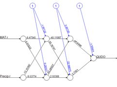
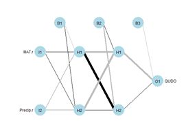
(a) (b)
Figure 1. Two plots of the same simple ANN. (a) Display of numerical values of connections, (b) schematic representation of connection values.
Fig. 1 shows two representations of a very simple ANN constructed using the R package
neuralnet (Fritsch et al. 2019). The representation in Fig. 1a shows greater detail, displaying numerical values at each link, or connection, indicating the weight and sign. The representation in Fig. 1b of the same ANN but using the
plotnet() function of the
NeuralNetTools package (Beck, 2018) is more schematic, with the numerical value of the link indicated by its thickness and the sign by its shade, with black for positive and gray for negative. The circles in this context represent artificial nerve cells. If you have never seen a sketch of a typical nerve cell, you can see one
here. In vast oversimplification, a nerve cell, when activated by some stimulus, transmits an
action potential to other nerve cells via its
axons. At the end of the axon are
synapses, which release
synaptic vesicles that are taken up by the
dendrites of the next nerve cell in the chain. The signal transmitted in this way can be either
excitatory, tending to make the receptor nerve cell develop an action potential, or
inhibitory, tending to impede the production of an action potential. Multiple input cells combine their transmitted signal, and if the strength of the combined signal surpasses a
threshold then the receptor cell initiates an action potential of its own and transmits the signal down its axon to other cells in the network.
In this context the circles in Fig. 1 represent “nerve cells” and the links correspond to axons linking one “nerve cell” to another. The “artificial neural network” of Fig. 1 is a
multilayer perceptron because it has at least one layer between the input and the output. The circles with an
I represent the inputs, the circles with an
H are the “hidden” cells, so called because they are “hidden” from the observer, and circle with an
O is the output. The numerical values beside the arrows in Fig. 1a, which are called the
weights, represent the strength of the connection, with positive values corresponding to excitatory connections and negative values to inhibitory connections. The response of each cell is typically characterized by a nonlinear function such as a logistic function (Fig. 2). This represents schematically the response of a real nerve cell, which is nonlinear. The circles at the top in Fig. 1, denoted with a 1 in Fig. 1a and with a
B in Fig. 1b, represent the
bias, which is supposed to correspond to the activation threshold in a nerve cell. Obviously, a system like that represented in Fig. 1 does not rise to the level of being a caricature of the neural network of even the simplest organism. As Venables and Ripley (2002) point out, it is better to drop the biological metaphor altogether and simply think of this as a very flexible nonlinear model of the data. Nevertheless, we will conform to universal practice and use the term “artificial neural network,” abbreviated ANN, to characterize these constructs.
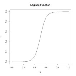
Figure 2. A logistic function.
In Section 2 we introduce the topic by manually constructing a multilayer perceptron (MLP) and comparing it to an MLP constructed using the
nnet package (Venables and Ripley, 2002), which comes with the base R software. In Section 3 (in Part 2) we will use the
neuralnet package (Fritsch et al., 2019) to develop and test an MLP with more than one hidden layer, like that in Fig. 1. Although the MLP is probably the most common ANN used for the sort of classification and regression problems discussed here, it is not the only one. In Section 4 we use the
RSNNS package (Bergmeir and Benitez, 2012) to develop a
radial basis function ANN. This is, for these types of application, probably the second most commonly used ANN. These first three sections apply the ANN to a binary classification problem. In Section 5 (in Part 3) we examine them in a classification problem with more than two alternatives. In Section 6 we take a look at the issue of variable selection for ANNs. Section 7 contains the Exercises and Section 8 the references. We do not discuss regression problems, but the practical aspects of this sort of application are virtually identical to those of a binary classification problem.
2. The Single Hidden Layer ANN
We will start the discussion by creating a training data set like the one that we used in our
Additional Topic on the K nearest neighbor method to introduce that method. The application is the classification of
oak woodlands in California using an augmented version of Data Set 2 of SDA2. In SDA2 that data set was only concerned with the presence or absence in the California landscape of blue oaks (
Quercus douglasii), denoted in Data Set 2 by the variable
QUDO. The original Wieslander survey on which this data set is based (Wieslander, 1935), however, contains records for other oak species as well. Here we employ an augmented version of Data Set 2, denoted Data Set 2A, that also contains records for coast live oak (
Quercus agrifolia, QUAG), canyon oak (
Quercus chrysolepis, QUCH), black oak (
Quercus kelloggii, QUKE), valley oak (
Quercus lobata, QULO), and interior live oak (
Quercus wislizeni, QUWI). The data set contains records for the basal area of each species as well as its presence/absence, but we will only use the presence/absence data here. Of the 4,101 records in the data set, 2,267 contain only one species and we will analyze this subset, denoted Data Set 2U. If you want to see a color coded map of the locations, there is one
here.
In this and the following two sections we will restrict ourselves to a binary classification problem: whether or not the species at the given location is
QUDO. In the general description we will denote the variable to be classified by
Y. As with the other Additional Topics discussing supervised classification, we will refer to the
Yi,
i = 1,…,
n, as the
class labels. The data fields on which the classification is to be based are called the
predictors and will in the general case be denoted
Xi, . When we wish to distinguish the individual data fields we will write the components of the predictor
Xi as
Xi,j,
j = 1,…,
p. As mentioned in the Introduction, the application of ANNs to problems in which
Y takes on continuous numerical values (i.e., to regression as opposed to classification problems) is basically the same as that described here.
Because ANNs incorporate weights like those in Fig. 1a, it is important that all predictors have approximately the same numerical range. Ordinarily this is assured by normalizing them, but for ease of graphing it will be more useful for us to rescale them to the interval 0 to 1. There is little or no difference between normalizing and rescaling as far as the results are concerned (Exercise 1). Let’s take a look at the setup of the data set.
data.Set2A <- read.csv(“set2\\set2Adata.csv”,
+ header = TRUE)
> data.Set2U <- data.Set2A[which(data.Set2A$QUAG +
+ data.Set2A$QUWI + data.Set2A$QULO +
+ data.Set2A$QUDO + data.Set2A$QUKE +
+ data.Set2A$QUCH == 1),]
> names(data.Set2U)
[1] “ID” “Longitude” “Latitude” “CoastDist” “MAT”
[6] “Precip” “JuMin” “JuMax” “JuMean” “JaMin”
[11] “JaMax” “JaMean” “TempR” “GS32” “GS28”
[16] “PE” “ET” “Elevation” “Texture” “AWCAvg”
[21] “Permeab” “PM100” “PM200” “PM300” “PM400”
[26] “PM500” “PM600” “SolRad6” “SolRad12” “SolRad”
[31] “QUAG” “QUWI” “QULO” “QUDO” “QUKE”
[36] “QUCH” “QUAG_BA” “QUWI_BA” “QULO_BA” “QUDO_BA”
[41] “QUKE_BA” “QUCH_BA”
Later on we are going to convert the data frame to a
SpatialPointsDataFrame (Bivand et al. 2011), so we will not rescale the spatial coordinates. If you are not familiar with the
SpatialPointsDataFrame concept, don’t worry about it – it is not essential to understanding what follows.
> rescale <- function(x) (x – min(x)) / (max(x) – min(x))
> for (j in 4:30) data.Set2U[,j] <- rescale(data.Set2U[,j])
> nrow(data.Set2U)
[1] 2267
> length(which(data.Set2U$QUDO == 1)) / nrow(data.Set2U)
[1] 0.3224526
The fraction of data records having the true value
QUDO = 1 is about 0.32. This would be the error rate obtained by not assigning
QUDO = 1 to any records and represents an error rate against which others can be compared.
To simplify the explanations further we will begin by using a subset of Data Set 2U called the Training data set that consists of 25 randomly selected records each of
QUDO = 0 and
QUDO = 1 records.
> set.seed(5)
> oaks <- sample(which(data.Set2U$QUDO == 1), 25)
> no.oaks <- sample(which(data.Set2U$QUDO == 0), 25)
> Set2.Train <- data.Set2U[c(oaks,no.oaks),]
As usual I played with the random seed until I got a training set that gave good results.
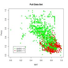
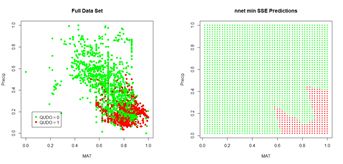
We will begin each of the first three sections by applying the ANN to a simple “practice problem” having only two predictors (i.e.,
p = 2), mean annual temperature
MAT and mean annual precipitation
Precip. Fig. 3 shows plots of the full and training data sets in the data space of these predictors. We begin our discussion with the oldest R ANN package,
nnet (Venables and Ripley, 2002), which includes the function
nnet(). Venables and Ripley provide an excellent description of the package, and the source code is available
here. An ANN created using
nnet() is restricted to one hidden layer, although a “skip layer,” that is, a set of one or more links directly from the input to the output, is also allowed. A number of options are available, and we will begin with the most basic. We will start with a very simple call to
nnet(), accepting the default value wherever possible. We will set the random number seed before each run of any ANN. The algorithm begins with randomly selected initial values, and this way we achieve repeatable results. Again, your results will probably differ from mine even if you use the same seed.
(a) (b)
Figure 3. (a) Plot of the full data set, (b) plot of the training data set.
> library(nnet)
> set.seed(3)
> mod.nnet <- nnet(QUDO ~ MAT + Precip,
+ data = Set2.Train, size = 4)
# weights: 17
initial value 12.644382
iter 10 value 8.489889
* * *
iter 100 value 6.158126
final value 6.158126
stopped after 100 iterations
If you are not familiar with the R formula notation
QUDO ~ MAT + Precip see
here. As already stated,
nnet() allows only one hidden layer, and the argument
size = 4 specifies four “cells” in this layer. From now on to avoid being pedantic we will drop the quotation marks around the word cell. The output tells us that there are 17 weights to iteratively compute (we will see in a bit where this figure comes from), and
nnet() starts with a default maximum value of 100 iterations, after which the algorithm has failed to converge. Let’s try increasing the value of the maximum number of iterations as specified by the argument
maxit.
> set.seed(3)
> mod.nnet <- nnet(QUDO ~ MAT + Precip,
+ data = Set2.Train, size = 4, maxit = 10000)
# weights: 17
initial value 12.644382
iter 10 value 8.489889
* * *
iter 170 value 6.117850
final value 6.117849
converged
This time it converges. Sometimes it does and sometimes it doesn’t, and again your results may be different from mine.
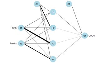
Fig. 4. Schematic diagram of an ANN with a single hidden layer having four cells.
Fig. 4 shows a plot of the ANN made using the
plotnet() function. Again, the thickness of the lines indicates the strength of the corresponding link, and the color indicates the direction, with black indicating positive and gray indicating negative. Thus, for example,
MAT has a strong positive effect on hidden cell 3 and
Precip has a strong negative effect. The function
nnet() returns a lot of information, some of which we will explore later. The
nnet package includes a
predict() function similar to the ones encountered in packages covered in other Additional Topics. We will use it to generate values of a test data set. Unlike other Additional Topics, the test data set here will not be drawn from the
QUDO data. Instead, we will cover the data space uniformly so that we can see the boundaries of the predicted classes and compare them with the values of the training data set. As is usually true, there is an R function available that can be called to carry out this operation (in this case it is
expand.grid()). However, I do not see any advantage in using functions like this to perform tasks that can be accomplished more transparently with a few lines of code.
> n <- 50
> MAT.test <- rep((1:n), n) / n
> Precip.test <- sort(rep((1:n), n) / n)
> Set2.Test <- data.frame(MAT = MAT.test,
+ Precip = Precip.test)
> Predict.nnet <- predict(mod.nnet, Set2.Test)
Let’s first take a look at the structure of
Predict.nnet.
> str(Predict.nnet)
num [1:2500, 1] 0 0 0 0 0 0 0 0 0 0 …
– attr(*, “dimnames”)=List of 2
..$ : chr [1:2500] “1” “2” “3” “4” …
..$ : NULL
It is a 2500 x 1 array, with rows named 1 through 2500. We can examine the range of values by constructing a histogram (Fig. 5)
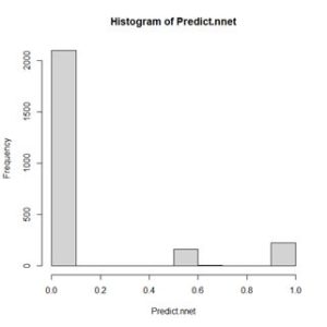
Figure 5. Histogram of values of Predict.nnet.
This shows a range of values between 0 and 1. Those values above a certain threshold will be interpreted as
QUDO = 1. With more complex models we will choose the threshold by constructing a receiver operating characteristic curve (i.e., a
ROC curve), but for this simple situation it is pretty clear that the value one half will suffice. Since we will be constructing many plots of a similar nature, we will develop a function to carry out this process.
> plot.ANN <- function(Data, Pred, Thresh,
+ header.str){
+ Data$Color <- “red”
+ Data$Color[which(Pred < Thresh)] <- “green”
+ with(Data, plot(x = MAT, y = Precip, pch = 16,
+ col = Color, cex = 0.5, main = header.str))
+ }
Next we apply the function.
> plot.ANN(Set2.Test, Predict.nnet, 0.5, “nnet
+ Predictions”) # Fig. 6
> with(Set2.Train, points(x = MAT, y = Precip,
+ pch = 16, col = Color))
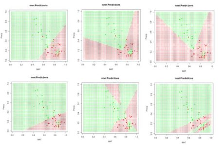
Figure 6. A “bestiary” of predictions delivered by the function
nnet(). Most of the time the function returns “boring” predictions like the first and fourth, but occasionally an interesting one is produced.
If we run the code sequence several times, each time using a different random number seed, each run generates a different set of starting weights and returns a potentially different prediction. Fig. 6 shows some of them. Why does this happen? There are a few possibilities. The plots in Fig. 6 represent the results of the solution of an unconstrained nonlinear minimization problem (we will delve into this problem more deeply in a bit). Solving a problem such as this is analogous to trying to find the lowest point in hilly terrain in a dense fog. Moreover, this search is taking place in the seventeen-dimensional space of the biases and weights. It is possible that some of the solutions represent local minima, and some may also arise if the area around the global minimum is relatively flat so that convergence is declared before reaching the true minimum. It is, of course, also possible that the true global minimum gives rise to an oddly shaped prediction. Exercise 3 explores this issue a bit more deeply.
Now that we have been introduced to some of the concepts, let’s take a deeper look at how a multilayer perceptron ANN works. Since each individual cell is a logistic response function, we can start by simply fitting a logistic curve to the data. Logistic regression is discussed in SDA Sec. 8.4. The logistic regression model is generally written as (cf. SDA2 Equation 8.20)
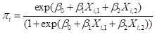 , ,
|
(1)
|
where

is the logistic regression estimator of

. Based on the discussion in SDA2 we will use the function
glm() of the base package to determine the logistic model for our training data set.
> mod.glm <- glm(QUDO ~ MAT + Precip,
+ data = Set2.Train, family = binomial)
> Predict.glm <- predict(mod.glm, Set2.Test)
> p <- with(Set2.Train, c(MAT, Precip, QUDO))
The results are plotted as a part of Fig. 7 below after first switching to a perspective more in line with ANN applications.
Specifically, the function
glm() computes a logistic regression model based not on minimizing the error sum of squares but on a maximum likelihood procedure. As a transition from logistic regression to ANNs we will compute a least squares solution to Equation (1) using the R base function
nlm(). In this case, rather than being interpreted as a probability as in Equation (1), the logistic function is interpreted as the response of a cell such as those shown in Fig. 1. We will change the form of the logistic function to
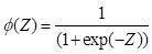 . .
|
(2)
|
Note that as
Z increases,

approaches 1, and as
Z decreases toward minus infinity,
approaches 0. This form of the function is different from Equation (1) but it is an easy exercise to show that they are equivalent. The form of the function in Equation (2) follows that of Venables and Ripley (2002, p. 224) and is more common in the ANN literature.
We will write the R code for the logistic function (this was used to plot Fig. 2) as follows.
> # Logistic function
> lg.fn <- function(coefs, a){
+ b <- coefs[1]
+ w <- coefs[2:length(coefs)]
+ return(1 / (1 + exp(-(b + sum(w * a)))))
+ }
Here the
b corresponds to the bias terms
B and the
w corresponds to the weights terms
W in Fig. 1b. The
a corresponds to the level of
activation that the cell receives as input. Thus each cell receives an input activation
a and produces an output activation

.
Next we create a function
SSE() to compute the sum of squared errors. For simplicity of code we will restrict our models to the case of two predictors (i.e.,
p = 2).
> SSE <- function(w.io, X.Y, fn){
+ n <- length(X.Y) / 3
+ X1 <- X.Y[1:n]
+ X2 <- X.Y[(n+1):(2n)]
+ Y <- X.Y[(2n+1):(3*n)]
+ Yhat <- numeric(n)
+ for (i in 1:n) Yhat[i] <- fn(w.io,
+ c(X1[i], X2[i]))
+ sse <- 0
+ for (i in 1:n) sse <- sse + (Y[i] – Yhat[i])^2
+ return(sse)
+ }
Here the argument
w.io contains the biases and weights (the
b and
w terms), which are the nonlinear regression coefficients,
X.Y contains the
Xi and
Yi terms, and
fn is the function to compute (in this case
lg.fn()). Here is the code to compute the least squares regression using
nlm(), compare its coefficients and error sum of squares with that obtained from
glm(), and draw Fig. 7. As with
nnet() above, the iteration in
nlm() is started with a set of random numbers drawn from a unit normal distribution.
> print(coefs.glm <- coef(mod.glm))
(Intercept) MAT Precip
-0.7704258 3.1803868 -5.3868261
> SSE(coefs.glm, p, lg.fn)
[1] 8.931932
> print(coefs.nlm <- nlm(SSE, rnorm(3), p,
+ lg.fn)$estimate)
[1] -0.9089667 3.3558542 -4.9486441
> SSE(coefs.nlm, p, lg.fn)
[1] 8.90217
> plot.ANN(Set2.Test, Predict.glm, 0.5, “Logistic
+ Regression”) # Fig. 7
> with(Set2.Train, points(x = MAT, y = Precip,
+ pch = 16, col = Color))
> c <- coefs.nlm
> abline(-c[1]/c[3], -c[2]/c[3])
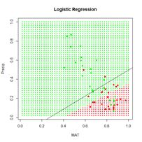
Figure 7. Prediction zones computed using glm(). The black line shows the boundary of the prediction zones computed by minimizing the error sum of squares using nlm().
Now that we have a function to compute the logistic function and one to minimize the sum of squares, we are ready to construct a simple ANN with one hidden layer.
Table 1. Notation used in the single hidden cell ANN.
|
Subscript or superscript
|
Significance
|
Range symbol
|
Max value
|
|
( )
|
Layer I, H, M
|
(1), (2), (3)
|
(3)
|
|
i
|
Data record
|
n
|
50
|
|
j
|
Predictor
|
p
|
2
|
|
m
|
Hidden cell number
|
M
|
4
|
Table 1 shows the notation that we will use. There are
p input cells at layer 1, numbered
1,…,p. In our case,
p = 2. Each input cell receives an input activation pair
Xi,j, j = 1,…,n. For the training data,
n = 50. Fig. 8 shows a schematic of an ANN in which there is one hidden layer with four cells. As shown in the figure, the layers of cells are numbered in increasing order, so that the input layer is layer 1, the hidden layer is layer 2, and the output layer is layer 3. The layers are indicated by superscripts in parentheses. The connections between input cells and the hidden cells pass the weighted signal to the hidden layer cells. In Fig. 8 for each data record
i each cell receives a signal consisting of the pair
Xi,j,
j = 1, 2, and passes it along to the hidden layer cells as an
activation 
. Here we have to be a bit careful. The superscript (1) refers to the layer,
i indexes the data record, which ranges from 1 to 50,
j refers to the component of the predictor variable and has the value 1 or 2, and
m indexes the hidden layer cell number and ranges from 1 to
M = 4.
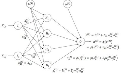
Figure 8. Diagram of an ANN with one hidden layer having four cells.
The subscripts in Fig. 8 are the reverse of what one might expect in that information flows from input cell
j in layer 1, the input layer, to cell
m in layer 2, the hidden layer (for example, we write

instead of

; here
j =2 identifies the input cell and
m = 4 identifies the hidden layer cell). This seemingly backwards notation is traditional in the ANN literature and is used because the set of values is often represented as a matrix in which the values in the same layer form the rows. We will encounter this usage in Section 6.
The activation

is part of the information processed by hidden cell
m in layer 2. The hidden cells respond to the sum of input activations. according to the equation
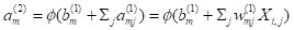 . .
|
(3)
|
This action takes place for each of the data records. The one output cell (layer 3) receives the activation values of each of the
M hidden cells and processes these according to the equation
 . .
|
(4)
|
The quantity
Qi represents the estimate of
Yi given the current set of weights. Assuming that the sum of squared errors is used as the objective function, the value of the objective function
|
|
(5)
|
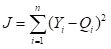
is computed. This quantity is then minimized to yield the final estimate . Table 2 summarizes this sequence of steps.
Table 2 Sequence of steps in the computation of the ANN weights and biases.
We are now ready to start constructing our homemade ANN. First let’s see how many weights we will need. Fig. 8 indicates that if there are
M hidden cells and two predictors then there will be 2
M weights to cover the links from the input, plus
M for the bias

, for a total of 3
M. From the hidden cells to the output cell there will be
M, plus a final weight for the bias

for a grand total of 4
M + 1 weights. Recall that the function
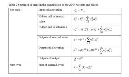
nnet() reported 17 weights; this is where that number came from. We must pass all of the weights through the code as an array. Table 3 shows how the code of our homemade ANN arranges this array for an ANN with four hidden cells. The arrangement is organized to make the programming as simple as possible. Note, by the way, that the bias
is applied to layer 2 and the bias
is applied to layer 3. This seems confusing, but again is be nearly universal practice, so I will go with it as well. Remember that is the weight applied to the activation from the cell in layer
l applied to the cell in layer
l + 1.
Table 3. Arrangement of the 17 biases and weights for an ANN with four hidden cells.
We will first construct a prediction function
pred.ann() that, given a set of weights and a pair of input values for a fixed
i calculates an estimate according to Equation (3).
> pred.ANN1 <- function(w.io, X){
+ b.2 <- w.io[1] # First beta is output bias
+ b.w <- w.io[-1] # Biases and weights
+ M <- length(b.w) / 4 # Number of hidden cells
# vector to hold hidden cell output activation
+ a.2 <- numeric(M)
# Hidden cell biases and weights
+ w.2 <- b.w[(3 * M + 1):(4 * M)]
+ for (m in 1:M){
+ bw.1 <-
+ b.w[(1 + (m – 1) * 3):(3 + (m – 1) * 3)]
+ a.2[m] <- lg.fn(bw.1, X)
+ }
+ phi.out <- lg.fn(c(b.2, w.2), a.2)
+ return(phi.out)
+ }
}
The arguments
w.io and
X contain the biases and weights and the predictor values
X, respectively. The first two lines extract the output cell bias
b.2, which corresponds to
in Table 3, and the third lines determines the number of hidden cells by dividing the number of weights by 4. The next three lines establish locations to hold the values of the quantities in Table 3. The remaining lines of code compute the quantity
Qi in Equation (4).
The next function generates the ANN itself, which we call
ANN.1().
> ANN.1 <- function(X, Y, M, fn, niter){
+ w.io <- rnorm(4*M + 1)
+ X.Y <- c(as.vector(X), Y)
+ return(nlm(SSE, w.io, X.Y, fn, iterlim = niter))
+ }
The arguments are respectively
X, a matrix or data frame whose columns are the
Xi,j,
Y, the vector of
Y values,
M, the number of hidden cells,
fn, the function defining the cells’ response, and
niter, the maximum allowable number of iterations. The first line in the function generates the random starting weights and the second line arranges the data as a single column. The function then calls
nlm() to carry out the nonlinear minimization of the sum of squared errors. There are other error measures beside the sum of squared errors that we could use, and some will be discussed later.
Now we must set the quantities to feed to the ANN and pass them along.
> set.seed(1)
> X <- with(Set2.Train, (c(MAT, Precip)))
> mod.ANN1 <- ANN.1(X, Set2.Train$QUDO, 4, pred.ANN,
+ 1000)
The function
ANN.1() returns the full output of
nlm(), which includes the coefficients as well as a code indicating the conditions under which the function terminated. There are five possible values of this code; you can use
?nlm to see what they signify. One point, however, must be noted. The function
nlm() makes use of Newton’s method to estimate the minimum of a function. The specific algorithm is described by Schnabel et al. (1985). The important point is that the method makes use of the
Hessian matrix, which is the matrix of second derivatives. If there are thousands of weights, as there might be in an ANN, this is an enormous matrix. For this reason, newer ANN algorithms generally use the
gradient descent method, for which only first derivatives are needed. We will return to this issue in Section 3.
Here is the output from
ANN.1(). Again, your output will probably be different from mine.
> print(beta.ann <- mod.ANN1$estimate)
[1] 191.48348 198.97750 -407.10859 269.84118 -824.73518
[6] 898.75456 826.91247 473.50764 -469.37435 -241.65738
[11] 443.55838 -201.72335 -149.85410 -188.09470 -168.33946
[16] -96.12398 73.12316
> print(code.ann <- mod.ANN1$code)
[1] 3
The code value 3 indicates that at least a local minimum was probably found. The output is plotted in Fig. 9.
> Set2.Test$QUDO <- 0
> for (i in 1:length(Set2.Test$QUDO))
+ Set2.Test$QUDO[i] <- pred.ANN1(beta.ann,
+ c(Set2.Test$MAT[i], Set2.Test$Precip[i]))
> plot.ANN(Set2.Test, Set2.Test$QUDO, 0.5,
+ “ANN.1 Predictions”)
> with(Set2.Train, points(x = MAT, y = Precip,
+ pch = 16, col = Color)) # Fig. 9
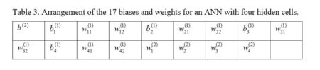
Similar to Fig. 6, this figure shows a “bestiary” of predictions of this artificial neural network. This was created by sequencing the random number seed through integer values starting at 1 and picking out results that looked interesting.
Figure 9. A “bestiary” of
ANN.1() predictions. As with
nnet(), most of the time the output is relatively tame, but sometimes it is not.
In order to examine more closely the workings of the ANN we will focus on the lower middle prediction in Fig. 9, which was created using the random number seed set to 7, and examine this for a fixed value of the predictor Precip. Fig. 10 plots the ANN output with the set of values Precip = 0.8 highlighted.
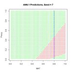
Figure 10. Replot of the sixth output displayed in Figure 8 with values
Precip = 0.8 highlighted.
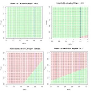
Figure 11. Activation of each individual hidden cell.
Fig. 11 shows the hidden cell activation together with the value of the weight multiplying this response in Equation (3). Note that the individual cells can be said to “organize” themselves to respond in different ways to the inputs. For this reason during the heady days of early work in ANNs systems like this were sometimes called “self-organizing systems.” Also, the first two cells appear to have similar response, although, as can be seen by inspecting the bias and weight values in the output of
ANN.1() above (with reference to Table 1), these values are actually very different.
Fig. 12 is a plot along the highlighted line
Precip = 0.8 of the same output as displayed in Fig. 11.
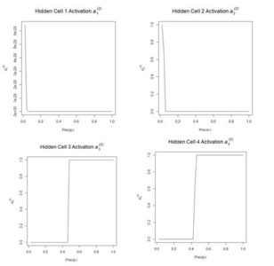
Figure 12. Plot of the hidden cell activation
along the highlighted line in Fig. 10.
Figure 13 shows the weighted activation values of the hidden cells along the row of highlighted values. Note the different abscissa ranges of the plots in Figs. 12 and 13.
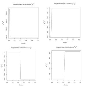
Figure 13. Plot of the weighted hidden cell activation along the highlighted line in Fig. 10.
Fig. 14a shows the sum passed to the output cell, given by in Equation (3), and Fig. 14b shows the sum when the bias is added. Finally, Fig. 14c shows the output value .
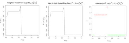
(a) (b) (c)
Figure 14. Referring to Equation (3): (a) sum of inputs to the output cell; (b) bias added to sum of weighted inputs, ; (c) final output.
The values of the first cell are universally low, so it apparently plays almost no role in the final result, we might be able achieve some simplification by pruning it. Let’s check it out.
> Set2.Test$QUDO1 <- 0
> beta.ann1 <- beta.ann[c(1,5:16)]
> for (i in 1:length(Set2.Test$QUDO))
+ Set2.Test$QUDO1[i] <- pred.ANN1(beta.ann1, c(Set2.Test$MAT[i],
+ Set2.Test$Precip[i]))
> max(abs(Set2.Test$QUDO – Set2.Test$QUDO1))
[1] 1
Obviously, cell 1 does play an important role for some values of the predictors. Sometimes a cell can be pruned in this way without changing the results and sometimes not. Algorithms do exist for determining whether individual cells in an ANN can be pruned (Bishop, 1995). We will see in Section 6 that examination of the contributions of cells can also be used in variable selection.
We mentioned earlier that the function
nlm(), used in our function
SSE() to locate the minimum of the sum of squared errors, could be consumptive of time and memory for large problems. Ripley (1996, p. 158), writing at a time when computers were much slower than today, asserted that any ANN with fewer than around 1,000 weights could be solved effectively using Newton’s method. The function
nnet() uses an approximation of Newton’s method called the BGFS method (see
?nnet and
?optim). We can to some extent test Newton’s method by expanding the size of our ANN to ten hidden cells and running it on the full data set of 2267 records.
> set.seed(3)
> X <- with(data.Set2U, (c(MAT, Precip)))
> start_time <- Sys.time()
> mod.ANN1 <- ANN.1(X, data.Set2U$QUDO, 10,
+ pred.ANN1, 1000)
> print(code.ann <- mod.ANN1$code)
[1] 1
> stop_time <- Sys.time()
> stop_time – start_time
Time difference of 9.562427 secs
The return code of 1 indicates iteration to convergence. When using other random seeds the program occasionally goes down a rabbit hole and has to be manually stopped by hitting the <esc> key. When it does converge, it usually doesn’t take too long.
We now return to the
nnet package and the
nnet() function, which we will apply to the entire data set. First, however, we need to discuss the use of this function for classification as opposed to regression. Our use of the numerical values 0 and 1 for the class label
QUDO makes
nnet() treat this as a regression problem. We can change to a classification problem easily by defining a factor valued data field and using this in the
nnet() model. This seemingly small change, however, gives us the opportunity to look more closely at how the ANN computes its values and how error is interpreted. As with logistic regression, when
QUDO is an integer quantity, the estimate returns values on the interval (0,1) (i.e., all numbers greater than 0 and less than 1). The use of
nnet() in classification is discussed by Venables and Ripley (2002, p. 342). We will define a new quantity
QUDOF as a factor taking on the factor values “0” and “1”.
> data.Set2U$QUDOF <- as.factor(data.Set2U$QUDO)
> unique(data.Set2U$QUDOF)
[1] 1 0
Levels: 0 1
modf.nnet <- nnet(QUDOF ~ MAT + Precip,
+ data = data.Set2U, size = 4, maxit = 1000)
Let’s take a closer look at the predicted values
> hist(Predict.nnet, breaks = seq(0, 1, 0.1),
+ main = “Histogram of nnet Predictions”) #Fig. 15
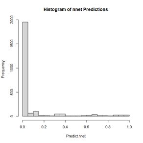
Figure 15. Histogram of predicted values of the function
nnet().
As shown in Fig. 15, although
QUDOF is a nominal scale quantity (see SDA2, Sec. 4.2.1), the function
nnet() still returns values on the interval (0,1). Unlike the case with logistic regression, these cannot be interpreted as probabilities, but we can interpret the output as an indication of the “strength” of the classification. Since the returned values are distributed all along the range from 0 to 1, it makes sense to establish the cutoff point using a ROC curve. We will use the functions of the package
ROCR to do so.
> library(ROCR)
> pred.QUDO <- predict(modf.nnet, data.Set2U)
> pred <- prediction(pred.QUDO, data.Set2U$QUDO)
> perf <- performance(pred, “tpr”, “fpr”)
> plot(perf, colorize = TRUE,
+ main = “nnet ROC Curve”) # Fig. 16a
> perf2 <- performance(pred, “acc”)
> plot(perf2, main =
+ “nnet Prediction Accuracy”) # Fig 16b
> print(best.cut <- which.max([email protected][[1]]))
[1] 565
> print(cutoff <- [email protected][[1]][best.cut])
[1] 0.4547653
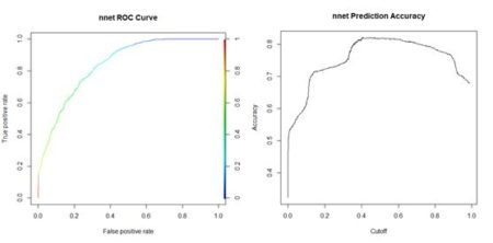
(a) (b)
Figure 16. (a) ROC curve for the nnet() prediction of
QUDO presence/absence; (b) plot of prediction accuracy against cutoff value.
The ROC curve analysis indicates that the cutoff value leading to the highest prediction accuracy is around 0.45. Fig. 17a shows a replot of the full data set plotted in Fig. 3a and Fig. 17b shows a plot of the prediction regions.
(a) (b)
Figure 17. (a) Plot of the QUDO data; (b) plot of the prediction regions.
The ROC curve can be used to compute a widely used performance measure, the area under the ROC curve, commonly known as the AUC. Looking at Fig. 16a, one can see that if the predictor provides a perfect prediction (zero false positives or false negatives) then the AUC will be one, and if the predictor is no better than flipping a coin then the AUC will be one half. The Wikipedia article on the
ROC curve provides a thorough discussion of the AUC. Here is the calculation for the current case.
> auc.perf <- performance(pred,”auc”)
> print(auc <- as.numeric([email protected]))
[1] 0.8872358
Returning to the
nnet() function, another feature of this function when the class labels are factors is its default error measure (this is discussed in the
Details section of
?nnet). We can see this by applying the
str() function to the
nnet() output.
> str(modf.nnet)
List of 19
* * Deleted * *
$ entropy : logi TRUE
* * Deleted * *
The argument
entropy is by default set to
TRUE. If you try this with the
nnet object created earlier with
QUDO taking on integer values, you will see that the default value of
entropy in this case is
FALSE (the value of
entropy can be controlled in
nnet() via the
entropy argument). When
entropy is
TRUE, the prediction error is not measured by the sum of squared errors as defined in Equation (5). Instead, it is measured by the
cross entropy. For a factor valued quantity we can define this as (Guenther and Frisch, 2010, Venables and Ripley, 2002, p. 245)
 , ,
|
(6)
|
where
ti is 1 for those values of
Qi that do not match the corresponding
Yi, and 0 for those that do, and
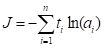
ai is a measure of the activity of the output cell. There is some evidence (e.g., Du and Swamy 2014, p. 37) that this measure avoids the creation of “flat spots” in the surface (or hypersurface) over which the optimization is being computed. Fig. 18 gives a sense of the difference. We will meet the cross entropy again in Section 3.
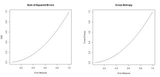
Figure 18. Plots of the sum of squared errors and the cross entropy for a range of error measures between 0 and 1.
A potentially important issue in the development of an ANN is the number of cells. The
tune() function of the
e1071 package (Meyer et al., 2019), discussed in the
Additional Topic on Support Vector Machines, has an implementation
tune.nnet(). The primary intended use of the function is for cross-validation, which will be discussed below. The function can, however, also be used to rapidly assess the effect of increasing the number of hidden cells.
> library(e1071)
> tune.nnet(QUDOF ~ MAT + Precip, data = data.Set2U,
+ size = 4)
Error estimation of ‘nnet’ using 10-fold cross validation: 0.2056282
Time difference of 9.346614 secs
> tune.nnet(QUDOF ~ MAT + Precip, data = data.Set2U,
+ size = 8)
Error estimation of ‘nnet’ using 10-fold cross validation: 0.2024174
Time difference of 15.9804 secs
> tune.nnet(QUDOF ~ MAT + Precip, data = data.Set2U,
+ size = 12)
Error estimation of ‘nnet’ using 10-fold cross validation: 0.1943285
Time difference of 22.1304 secs
The code to calculate the elapsed time is not shown. These results provide evidence that for this particular problem there is only a very limited advantage to increasing the number of cells.
We can use repeated evaluation to pick the prediction that provides the best fit. We will try twenty different random starting configurations to see the distribution of error rates (keeping the same cutoff value for all of them).
> seeds <- numeric(20)
> error.rate <- numeric(length(seeds))
> conv <- numeric(length(seeds))
> seed <- 0
> i <- 1
> data.set <- Set2.Test
> while (i <= length(seeds)){
+ seed <- seed + 1
+ set.seed(seed)
+ md <- nnet(QUDO ~ MAT + Precip,
+ data = data.Set2U, size = 4, maxit = 1000,
+ trace = FALSE)
+ if (md$convergence == 0){
+ seeds[i] <- seed
+ pred <- predict(md)
+ QP <- numeric(length(pred))
+ QP[which(pred > cutoff)] <- as.factor(1)
+ error.rate[i] <-
+ length(which(QP != data.Set2U$QUDOF)) /
+ nrow(data.Set2U)
+ i <- i + 1
+ }
+ }
> seeds
[1] 1 3 4 5 6 7 8 9 10 11 12 13 14 15 16 17 18 19 20 21
> sort(error.rate)
[1] 0.1782091 0.1804146 0.1817380 0.1821791 0.1830613 0.1839435 0.1843846
[8] 0.1843846 0.1848258 0.1857080 0.1865902 0.1874724 0.1887958 0.1905602
[15] 0.1932069 0.1954124 0.1971769 0.2015880 0.2037936 0.2042347
> which.min(error.rate)
[1] 17
All but one of the seeds converged, and the best error rate is obtained using the seventeenth random number seed. The error rate here is not the same as the cross-validation error rate calculated above, as reflected in the different values. A plot of the predictions using this seed is similar to that shown in Fig. 16b.
Looking at that figure, one might suspect that the model may overfit the data. The concept of overfitting and underfitting in terms of the
bias-variance tradeoff is discussed in a linear regression context in SDA2 Section 8.2.1 and in a classification context in the
Additional Topic on Support Vector Machines. In summary, a model that fits a training data set too closely (overfits) may do a worse job of fitting a different data set and, as discussed in the two sources, has a high variance. A simpler model that does not fit the training data as well has a higher bias, and the decision of which model to choose is a matter of balancing these two factors. Ten-fold cross validation is commonly used to test where a model stands the bias-variance tradeoff (again see the two sources given above). The following code carries out such a cross-validation.
> best.seed <- seeds[which.min(error.rate)]
> ntest <- trunc(nrow(data.Set2U) / 10) * 10
> data.set <- data.Set2U[1:ntest,]
> n.rand <- sample(1:nrow(data.set))
> n <- nrow(data.set) / 10
> folds <- matrix(n.rand, nrow = n, ncol = 10)
> SSE <- 0
> for (i in 1:10){
+ test.fold <- i
+ if (i == 1) train.fold <- 2:10
+ if (i == 10) train.fold <- 1:9
+ if ((i > 1) & (i < 10)) train.fold <-
+ c(1:(i-1), (i+1):10)
+ train <-
+ data.frame(data.set[folds[,train.fold],])
+ test <-
+ data.frame(data.set[folds[,test.fold],])
+ true.sp <- data.set$QUDO[folds[,test.fold]]
+ set.seed(best.seed)
+ modf.nnet <- nnet(QUDOF ~ MAT + Precip,
+ data = train, size = 8, maxit = 10000,
+ Trace = FALSE)
+ pred.1 <- predict(modf.nnet, test)
+ test$QUDO <- 0
+ test$QUDO[which(pred.1 >= 0.52)] <- 1
+ E <- length(which(test$QUDO != true.sp)) /
+ length(true.sp)
+ SSE <- SSE + E^2
+ }
> print(RMSE <- sqrt(SSE / 10))
[1] 0.1930847
The RMSE seems aligned with the error rate.
Venables and Ripley (2002) and Ripley (1996) discuss some of the options available with the function
nnet(). Some of these are explored in Exercises (4) and (5). Now that we have some experience with an ANN having a single hidden layer, we will move on to the package
neuralnet, in which multiple hidden layers are possible.
This concludes the first installment. Part 2 will be published subsequently. Again, R code and data are available in the Additional Topics section of SDA2,
http://psfaculty.plantsciences.ucdavis.edu/plant/sda2.htm