TL;DR: {bdlnm} brings Bayesian Distributed Lag Non-Linear Models (B-DLNMs) to R using INLA, allowing to model complex DLNMs, quantify uncertainty, and produce rich visualizations.
Background
Climate change is increasing exposure to extreme environmental conditions such as heatwaves and air pollution. However, these exposures rarely have immediate effects. For example:
-
- A heatwave today may increase mortality several days later
- Air pollution can have cumulative and delayed impacts
Distributed Lag Non-Linear Models (DLNMs) are the standard framework for studying these effects. They simultaneously model:
-
- How risk changes with exposure level (exposure-response)
- How risk evolve over time (lag-response)
Usually in the presence of non-linear effects, splines are used to define these two relationships. These two basis are then combined through a cross-basis function.
As datasets become larger and more complex (e.g., studies with different regions and longer time periods), classical approaches show limitations. Bayesian DLNMs extend this framework by:
-
- Supporting more flexible model structures
- Providing full posterior distributions
- Enabling richer uncertainty quantification
The new {bdlnm} package extends the framework of the {dlnm} package to a Bayesian setting, using Integrated Nested Laplace Approximation (INLA), a fast alternative to MCMC for Bayesian inference.
Installing and loading the package
As of March 2026, the package is available on CRAN:
install.packages("bdlnm")
library(bdlnm)
At least the stable version of INLA 23.4.24 (or newest) must be installed beforehand. You can install the newest stable INLA version by:
install.packages(
  "INLA",
  repos = c(
    getOption("repos"),
    INLA = "https://inla.r-inla-download.org/R/stable"
  ),
  dep = TRUE
)
Now, let’s load all the libraries we will need for this short tutorial:
Load required libraries
# DLNMs and splines
library(dlnm)
library(splines)

# Data manipulation
library(dplyr)
library(reshape2)
library(stringr)
library(lubridate)

# Visualization
library(ggplot2)
library(gganimate)
library(ggnewscale)
library(patchwork)
library(scales)
library(plotly)

# Tables
library(gt)

# Execution time
library(tictoc)
Hands-on example
We use the built-in london dataset with daily temperature and mortality (age 75+) from 2000-2012.
Before fitting any model, it is useful to explore the raw data. This plot shows daily mean temperature and mortality for the 75+ age group in London from 2000 to 2012, providing a first look at the time series we are trying to model:
col_mort <- "#2f2f2f"
col_temp <- "#8e44ad"

# Scaling parameters
a <- (max(london$mort_75plus) - min(london$mort_75plus)) /
  (max(london$tmean) - min(london$tmean))
b <- min(london$mort_75plus) - min(london$tmean) * a

p <- ggplot(london, aes(x = yday(date))) +
  geom_line(
    aes(y = a * tmean + b, color = "Mean Temperature"),
    linewidth = 0.4
  ) +
  geom_line(
    aes(y = mort_75plus, color = "Daily Mortality (+75 years)"),
    linewidth = 0.4
  ) +
  facet_wrap(~year, ncol = 3) +
  scale_y_continuous(
    name = "Daily Mortality (+75 years)",
    breaks = seq(0, 225, by = 50),
    sec.axis = sec_axis(
      name = "Mean Temperature (°C)",
      transform = ~ (. - b) / a,
      breaks = seq(-10, 30, by = 10)
    )
  ) +
  scale_x_continuous(
    breaks = yday(as.Date(paste0(
      "2000-",
      c("01", "03", "05", "07", "09", "11"),
      "-01"
    ))),
    labels = c("Jan", "Mar", "May", "Jul", "Sep", "Nov"),
    expand = c(0.01, 0)
  ) +
  scale_color_manual(
    values = c(
      "Daily Mortality (+75 years)" = col_mort,
      "Mean Temperature" = col_temp
    )
  ) +
  labs(x = NULL, color = NULL) +
  guides(color = "none") +
  theme_minimal() +
  theme(
    axis.title.y.left = element_text(
      color = col_mort,
      face = "bold",
      margin = margin(r = 8)
    ),
    axis.title.y.right = element_text(
      color = col_temp,
      face = "bold",
      margin = margin(l = 8)
    ),
    axis.text.y.left = element_text(color = col_mort),
    axis.text.y.right = element_text(color = col_temp)
  ) +
  transition_reveal(as.numeric(date))

animate(p, nframes = 300, fps = 10, end_pause = 100)
Model overview
Conceptually, DLNMs model:
-
-
Exposure-response: how risk changes with exposure level
-
Lag-response: how risk unfold over time
-
A typical model is:
where:
-
- α is the intercept
- cb(·) is the cross-basis function, defining both the exposure-response and lag-response relationships
- β are the coefficients associated with the cross-basis terms
- ukt are time-varying covariates with corresponding coefficients γk
Model specification & setup
Before fitting the model, we have to define the spline-based exposure-response and lag-response functions using the {dlnm} package.
For our example, we will use common specifications in the literature in temperature-mortality studies:
-
-
Exposure-response: natural spline with three knots placed at the 10th, 75th, and 90th percentiles of daily mean temperature
-
Lag-response: natural spline with three knots equally spaced on the log scale up to a maximum lag of 21 days
-
# Exposure-response and lag-response spline parameters
dlnm_var <- list(
  var_prc = c(10, 75, 90),
  var_fun = "ns",
  lag_fun = "ns",
  max_lag = 21,
  lagnk = 3
)

# Cross-basis parameters
argvar <- list(
  fun = dlnm_var$var_fun,
  knots = quantile(london$tmean, dlnm_var$var_prc / 100, na.rm = TRUE),
  Bound = range(london$tmean, na.rm = TRUE)
)

arglag <- list(
  fun = dlnm_var$lag_fun,
  knots = logknots(dlnm_var$max_lag, nk = dlnm_var$lagnk)
)

# Create crossbasis
cb <- crossbasis(london$tmean, lag = dlnm_var$max_lag, argvar, arglag)
As it’s commonly done in these scenarios, we will also control for the seasonality of the mortality time series using a natural spline with 8 degrees of freedom per year, which flexibly controls for long-term and seasonal trends in mortality:
seas <- ns(london$date, df = round(8 * length(london$date) / 365.25))Finally, we also have to define the temperature values for which predictions will be generated:
temp <- round(seq(min(london$tmean), max(london$tmean), by = 0.1), 1)Fit the model
Fit the previously defined Bayesian DLNM using the function bdlnm(). We draw 1000 samples from the posterior distribution and set a seed for reproducibility:
tictoc::tic()
mod <- bdlnm(
  mort_75plus ~ cb + factor(dow) + seas,
  data = london,
  family = "poisson",
  sample.arg = list(n = 1000, seed = 5243)
)
tictoc::toc()
8.33 sec elapsedInternally, bdlnm():
-
-
fits the model using INLA
-
returns posterior samples for all parameters
-
Minimum mortality temperature
We estimate the minimum mortality temperature (MMT), defined as the temperature at which the overall mortality risk is minimized. This optimal value will later be used to center the estimated relative risks.
tictoc::tic()
mmt <- optimal_exposure(mod, exp_at = temp)
tictoc::toc()
7.3 sec elapsedThe Bayesian framework, compared to the frequentist perspective, provides directly the full posterior distribution of the MMT. It is useful to inspect this distribution to assess whether multiple candidate optimal exposure values exist and to verify that the median provides a reasonable centering value:
ggplot(as.data.frame(mmt$est), aes(x = mmt$est)) +
  geom_histogram(
    fill = "#A8C5DA",
    bins = length(unique(mmt$est)),
    alpha = 0.6,
    color = "white"
  ) +
  geom_density(
    aes(y = after_stat(density) * length(mmt$est) / length(unique(mmt$est))),
    color = "#2E5E7E",
    linewidth = 1.2,
    adjust = 2 # <-- key change: higher = smoother
  ) +
  geom_vline(
    xintercept = mmt$summary["0.5quant"],
    color = "#2E5E7E",
    linewidth = 1.1,
    linetype = "dashed"
  ) +
  scale_x_continuous(breaks = seq(min(mmt$est), max(mmt$est), by = 0.1)) +
  labs(x = "Temperature (°C)", y = "Frequency") +
  theme_minimal()
The posterior distribution of the MMT is concentrated around 18.9ºC and is unimodal, so the median is a stable centering value for the relative risk estimates.
The posterior distribution of the MMT can also be visualized directly using the package’s plot() method: plot(mmt).
Predict exposure-lag-response effects
We predict the exposure-lag-response association between temperature and mortality from the fitted model at the supplied temperature grid:
cen <- mmt$summary[["0.5quant"]]
tictoc::tic()
cpred <- bcrosspred(mod, exp_at = temp, cen = cen)
tictoc::toc()
6.83 sec elapsedCentering at the MMT means that relative risks (RR) are interpeted relative to this optimal temperature with minimum mortality.
Several visualizations can be produced from these predictions. While simpler visualizations can be created using the package’s plot() method, here we will use fancier ggplot2 visualizations:
3D exposure-lag-response surface
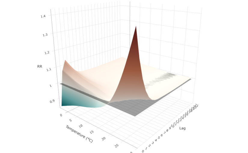
We can plot the full exposure-lag-response association using a 3-D surface:
matRRfit_median <- cpred$matRRfit.summary[,, "0.5quant"]
x <- rownames(matRRfit_median)
y <- colnames(matRRfit_median)
z <- t(matRRfit_median)

zmin <- min(z, na.rm = TRUE)
zmax <- max(z, na.rm = TRUE)
mid <- (1 - zmin) / (zmax - zmin)

plot_ly() |>
  add_surface(
    x = x,
    y = y,
    z = z,
    surfacecolor = z,
    cmin = zmin,
    cmax = zmax,
    colorscale = list(
      c(0, "#00696e"),
      c(mid * 0.5, "#80c8c8"),
      c(mid, "#f5f0e8"),
      c(mid + (1 - mid) * 0.5, "#c2714f"),
      c(1, "#6b1c1c")
    ),
    colorbar = list(title = "RR")
  ) |>
  add_surface(
    x = x,
    y = y,
    z = matrix(1, nrow = length(y), ncol = length(x)),
    colorscale = list(c(0, "black"), c(1, "black")),
    opacity = 0.4,
    showscale = FALSE
  ) |>
  layout(
    title = "Exposure-Lag-Response Surface",
    scene = list(
      xaxis = list(title = "Temperature (°C)"),
      yaxis = list(title = "Lag", tickvals = y, ticktext = gsub("lag", "", y)),
      zaxis = list(title = "RR"),
      camera = list(eye = list(x = 1.5, y = -1.8, z = 0.8))
    )
  )
The surface reveals two distinct risk regions. Hot temperatures produce a sharp, acute risk concentrated at the first lags, peaking at lag 0 and dissipating rapidly after the first lags. Cold temperatures produce a more modest and gradual increase in the first lags that does not fully disappear at longer lags. Intermediate temperatures near the MMT sit close to the RR = 1 reference plane across all lags.
The differential lag structure observed for heat- and cold-related mortality is consistent with known physiological mechanisms. Heat-related mortality tends to occur rapidly after exposure due to acute physiological stress, whereas cold-related mortality develops more gradually through delayed cardiovascular and respiratory effects, leading to increasing risk over longer lag periods.
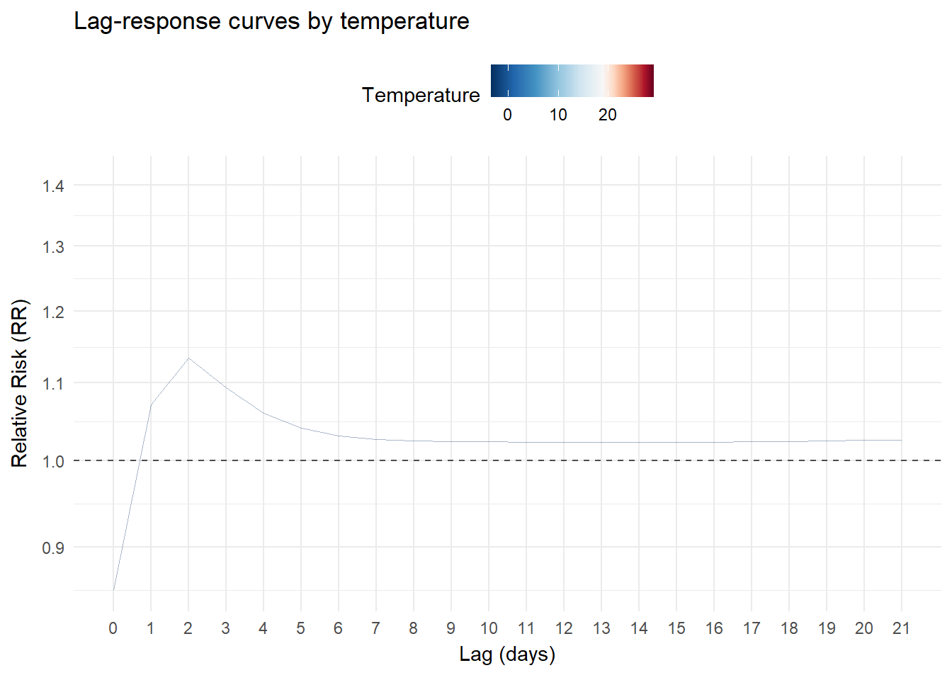
Lag-response curves
We can also visualizes slices of the previous surface. For example, the lag-response relationship for different temperature values:
matRRfit <- cbind(
  melt(cpred$matRRfit.summary[,, "0.5quant"], value.name = "RR"),
  RR_lci = melt(
    cpred$matRRfit.summary[,, "0.025quant"],
    value.name = "RR_lci"
  )$RR_lci,
  RR_uci = melt(
    cpred$matRRfit.summary[,, "0.975quant"],
    value.name = "RR_uci"
  )$RR_uci
) |>
  rename(temperature = Var1, lag = Var2) |>
  mutate(
    lag = as.numeric(gsub("lag", "", lag))
  )

temp_min <- min(matRRfit$temperature, na.rm = TRUE)
temp_max <- max(matRRfit$temperature, na.rm = TRUE)
mmt_pos <- (cen - temp_min) / (temp_max - temp_min)

temp_values <- c(
  seq(0, mmt_pos, length.out = 6),
  seq(mmt_pos, 1, length.out = 6)[-1]
)

temp_colours <- c(
  "#053061",
  "#2166ac",
  "#4393c3",
  "#92c5de",
  "#d1e5f0",
  "#f7f7f7",
  "#fddbc7",
  "#f4a582",
  "#d6604d",
  "#b2182b",
  "#67001f"
)

p <- ggplot() +
  geom_line(
    data = matRRfit,
    aes(x = lag, y = RR, group = temperature, color = temperature),
    alpha = 0.35,
    linewidth = 0.35
  ) +
  scale_color_gradientn(
    colours = temp_colours, # same 11-colour palette as before
    values = temp_values,
    limits = c(temp_min, temp_max),
    name = "Temperature"
  ) +
  ggnewscale::new_scale_color() +
  geom_hline(
    yintercept = 1,
    linetype = "dashed",
    color = "grey30",
    linewidth = 0.5
  ) +
  scale_x_continuous(breaks = cpred$lag_at) +
  scale_y_continuous(trans = "log10", breaks = pretty_breaks(6)) +
  labs(
    title = "Lag-response curves by temperature",
    x = "Lag (days)",
    y = "Relative Risk (RR)"
  ) +
  theme_minimal() +
  theme(legend.position = "top", panel.grid.minor.x = element_blank()) +
  transition_states(
    temperature,
    transition_length = 1,
    state_length = 0
  ) +
  shadow_mark(past = TRUE, future = FALSE, alpha = 0.6)

animate(p, nframes = 300, fps = 15, end_pause = 100)
Cold temperatures (blue) gradually increase in the initial lags and then decline gradually without fully disappearing in the longer lags. Hot temperatures (red) show a different pattern: a higher risk immediately after lag 0, which drops rapidly and largely dissipates after the first lags:
Exposure-responses curves
We can also plot the exposure-responses curves by lag and the overall cumulative curve across all the lag period:
allRRfit <- data.frame(
  temperature = as.numeric(rownames(cpred$allRRfit.summary)),
  lag = "overall",
  RR = cpred$allRRfit.summary[, "0.5quant"],
  RR_lci = cpred$allRRfit.summary[, "0.025quant"],
  RR_uci = cpred$allRRfit.summary[, "0.975quant"]
)

RRfit <- rbind(matRRfit, allRRfit)

# Split data
RRfit_lags <- RRfit |>
  filter(!lag %in% c("overall")) |>
  mutate(lag = as.numeric(lag))
RRfit_overall <- RRfit |>
  filter(lag %in% c("overall"))

temps <- cpred$exp_at
t_cold <- temps[which.min(abs(temps - quantile(temps, 0.01)))]
t_hot <- temps[which.min(abs(temps - quantile(temps, 0.99)))]

# --- Top plot ---
p_main <- ggplot() +
  # Background: all lags, fading from vivid (small) to pale (large)
  geom_line(
    data = RRfit_lags,
    aes(x = temperature, y = RR, group = lag, color = lag),
    linewidth = 0.8
  ) +
  scale_color_gradientn(
    colours = c(
      "black",
      "#2b1d2f",
      "#4a2f5e",
      "#6a4c93",
      "#8b6bb8",
      "#b39cdb",
      "#d8c9f1",
      "#f3eef5"
    ),
    values = scales::rescale(c(0, 0.5, 1, 2, 3, 4, 5, 10, 20))
  ) +
  new_scale_color() +
  new_scale_fill() +
  # Credible intervals
  geom_ribbon(
    data = RRfit_overall,
    aes(
      x = temperature,
      ymin = RR_lci,
      ymax = RR_uci,
      fill = "1"
    ),
    alpha = 0.2
  ) +
  # Highlighted curves
  geom_line(
    data = RRfit_overall,
    aes(x = temperature, y = RR, color = "1"),
    linewidth = 1.2
  ) +
  geom_hline(
    yintercept = 1,
    linetype = "dashed"
  ) +
  scale_color_manual(values = "#a6761d", labels = "Overall (CrI95%)") +
  scale_fill_manual(values = "#a6761d", labels = "Overall (CrI95%)") +
  scale_y_continuous(
    transform = "log10",
    breaks = sort(c(0.8, pretty_breaks(5)(c(0.8, 4))))
  ) +
  labs(
    x = NULL,
    y = "Relative Risk (RR)",
    color = NULL,
    fill = NULL
  ) +
  theme_minimal() +
  theme(
    legend.position = "top",
    axis.text.x = element_blank(),
    plot.margin = margin(8, 8, 0, 8)
  )

# --- Bottom plot: histogram with annotated percentile lines ---
# center the color palette to the MMT temperature
temp_min <- min(cpred$exp_at, na.rm = TRUE)
temp_max <- max(cpred$exp_at, na.rm = TRUE)
mmt_pos <- (cen - temp_min) / (temp_max - temp_min)

temp_values <- c(
  seq(0, mmt_pos, length.out = 6),
  seq(mmt_pos, 1, length.out = 6)[-1]
)

temp_colours <- c(
  "#053061",
  "#2166ac",
  "#4393c3",
  "#92c5de",
  "#d1e5f0",
  "#f7f7f7",
  "#fddbc7",
  "#f4a582",
  "#d6604d",
  "#b2182b",
  "#67001f"
)

p_hist <- ggplot(london, aes(x = tmean)) +
  geom_histogram(
    aes(y = after_stat(density), fill = after_stat(x)),
    binwidth = 0.5,
    color = "black",
    linewidth = 0.2
  ) +
  geom_vline(
    xintercept = t_cold,
    linetype = "dashed",
    color = "#053061",
    linewidth = 0.6
  ) +
  geom_vline(
    xintercept = t_hot,
    linetype = "dashed",
    color = "#67001f",
    linewidth = 0.6
  ) +
  geom_vline(
    xintercept = cen,
    linetype = "dashed",
    color = "grey20",
    linewidth = 0.6
  ) +
  annotate(
    "text",
    x = t_cold,
    y = Inf,
    label = "1st pct",
    vjust = 1.4,
    hjust = 1.1,
    size = 3.2,
    color = "#053061"
  ) +
  annotate(
    "text",
    x = t_hot,
    y = Inf,
    label = "99th pct",
    vjust = 1.4,
    hjust = -0.1,
    size = 3.2,
    color = "#67001f"
  ) +
  annotate(
    "text",
    x = cen,
    y = Inf,
    label = "MMT",
    vjust = 1.4,
    hjust = -0.1,
    size = 3.2,
    color = "grey20"
  ) +
  scale_x_continuous(limits = c(temp_min, temp_max)) +
  scale_fill_gradientn(
    colours = temp_colours,
    values = temp_values,
    limits = c(temp_min, temp_max),
    name = "Temperature"
  ) +
  labs(x = "Temperature (°C)", y = "Density") +
  theme_minimal() +
  theme(
    plot.margin = margin(20, 8, 8, 8),
    legend.position = "bottom"
  )

# --- Combine ---
p_main / p_hist + plot_layout(heights = c(3, 1))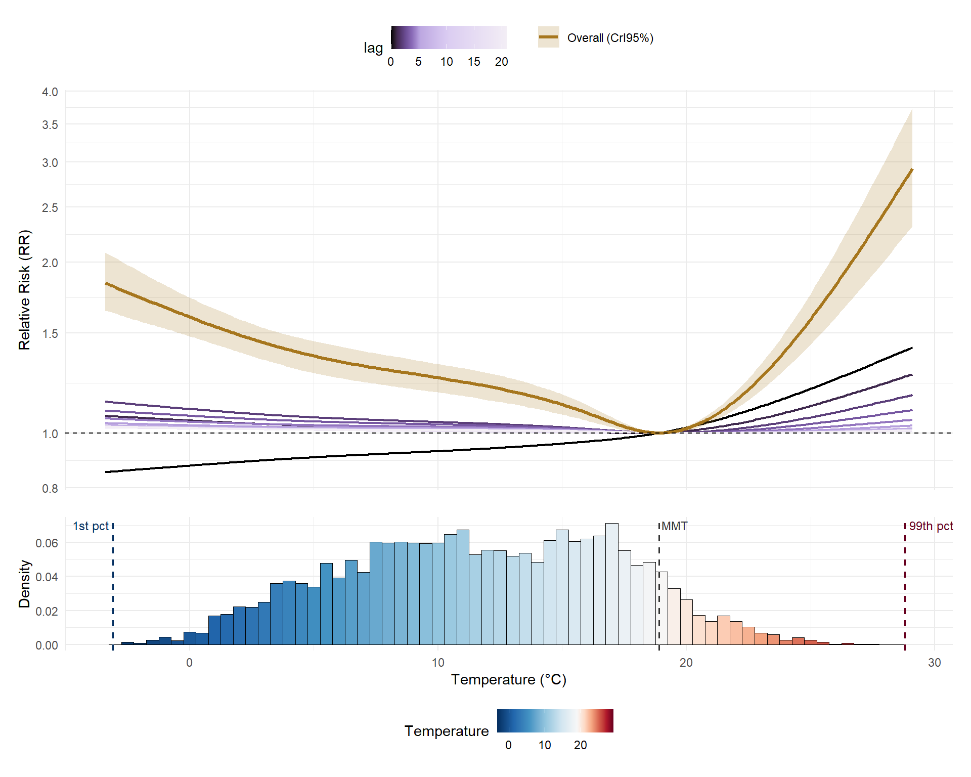
The overall cumulative curve (mustard) is clearly asymmetric: risk increases on both sides of the MMT, but the rise is much steeper for hot temperatures than for cold temperatures. The lag-0 curve (black), which reflects the immediate effect, behaves differently for cold than heat: it is below 1 at cold temperatures (reflecting the delayed nature of cold temperature effects) and increases approximately linearly for heat. The histogram confirms that most London days fall between 5°C and 20°C, so extreme temperatures, despite their high individual risks, are relatively rare events.
Attributable risk
We can also calculate attributable numbers and fractions from a B-DLNM, which allows to quantify the impact of all the observed exposures in 75+ years mortality. We compute the number of mortality events attributable to the temperature exposures (attributable number) and the fraction of all the mortality events it constitutes (attributable fraction).
Two different perspectives can be used:
-
-
Backward (
dir = "back"): what today’s deaths were explained by past temperature exposures? -
Forward (
dir = "forw"): what future deaths will today’s temperature exposure cause?
-
Let’s use the forward perspective, more commonly used:
tictoc::tic()
attr_forw <- attributable(
  mod,
  london,
  name_date = "date",
  name_exposure = "tmean",
  name_cases = "mort_75plus",
  cen = cen,
  dir = "forw"
)
tictoc::toc()
110.12 sec elapsedAttributable fraction evolution
We can plot the time series of daily attributable fractions (AF):
col_af <- "black"

temp_colours <- c(
  "#053061",
  "#2166ac",
  "#4393c3",
  "#92c5de",
  "#d1e5f0",
  "#f7f7f7",
  "#fddbc7",
  "#f4a582",
  "#d6604d",
  "#b2182b",
  "#67001f"
)

# Compute the position of MMT within the actual temperature range
temp_min <- min(london$tmean, na.rm = TRUE)
temp_max <- max(london$tmean, na.rm = TRUE)
mmt_pos <- (cen - temp_min) / (temp_max - temp_min)

temp_values <- c(
  seq(0, mmt_pos, length.out = 6),
  seq(mmt_pos, 1, length.out = 6)[-1]
)

af_med <- attr_forw$af.summary[, "0.5quant"]

af_min <- min(af_med, na.rm = TRUE) - 0.01
af_max <- max(af_med, na.rm = TRUE) + 0.01

df <- data.frame(
  date = london$date,
  x = yday(london$date),
  year = year(london$date),
  tmean = london$tmean,
  af = af_med
)

ggplot(df, aes(x = x)) +
  geom_rect(
    aes(
      xmin = x - 0.5,
      xmax = x + 0.5,
      ymin = af_min,
      ymax = af_max,
      fill = tmean
    )
  ) +
  scale_fill_gradientn(
    colours = temp_colours,
    values = temp_values,
    limits = c(temp_min, temp_max),
    name = "Temperature (°C)"
  ) +
  geom_line(
    aes(y = af),
    color = col_af,
    linewidth = 0.7
  ) +
  scale_y_continuous(
    name = "Attributable Fraction (AF)",
    breaks = seq(0, 1, by = 0.1),
    limits = c(af_min, af_max),
    expand = c(0, 0)
  ) +
  scale_x_continuous(
    breaks = yday(as.Date(paste0(
      "2000-",
      c("01", "03", "05", "07", "09", "11"),
      "-01"
    ))),
    labels = c("Jan", "Mar", "May", "Jul", "Sep", "Nov"),
    expand = c(0, 0)
  ) +
  facet_wrap(~year, ncol = 3, axes = "all_x") +
  labs(x = NULL) +
  theme_minimal(base_size = 11) +
  theme(
    panel.spacing.x = unit(0, "pt"),
    strip.text = element_text(face = "bold", size = 10),
    legend.position = "top",
    legend.key.width = unit(2.5, "cm")
  )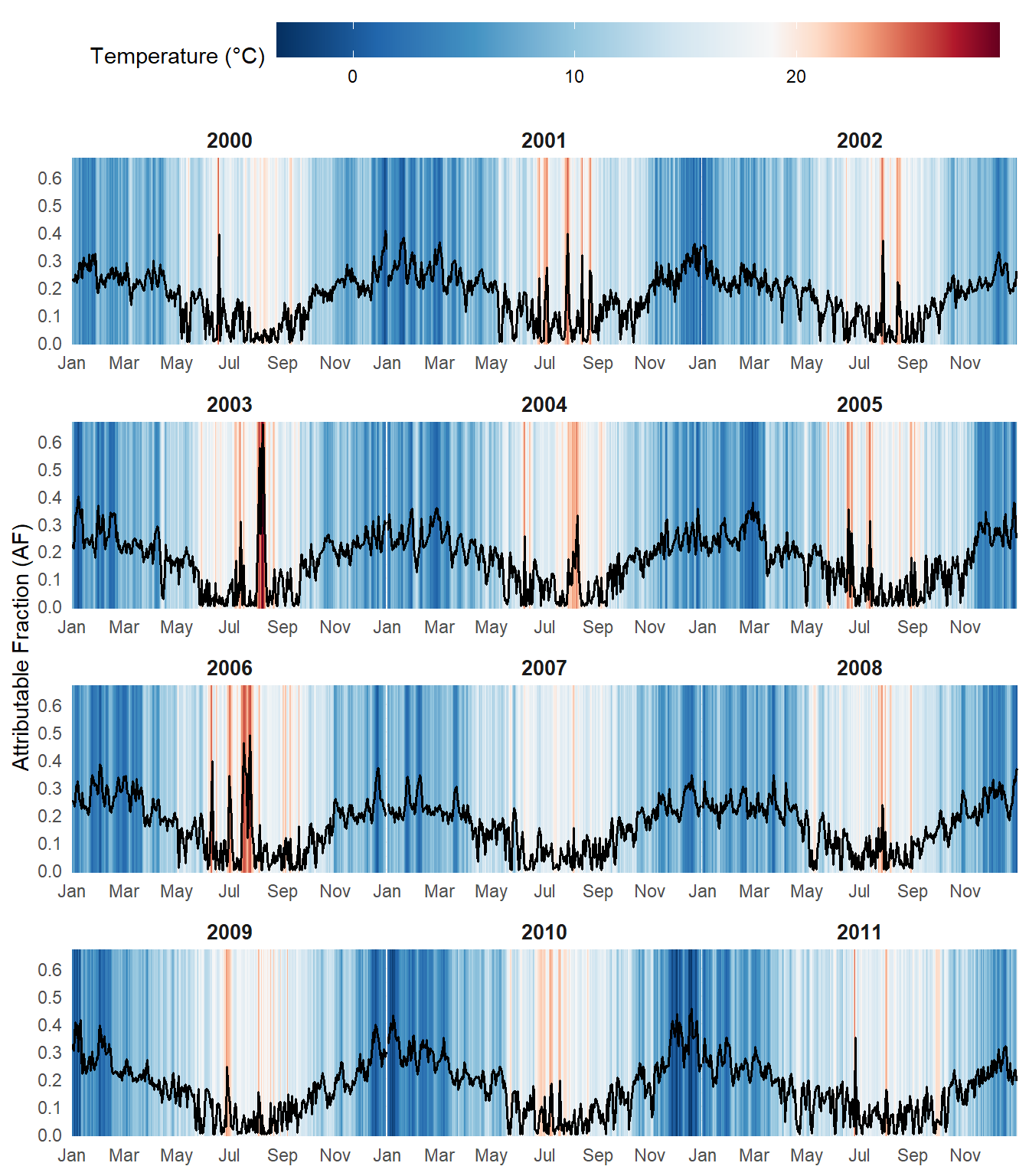
Sharp spikes in AF exceeding 60% are visible in summer 2003 and 2006, coinciding with the major European heatwaves. In general, summer episodes produce higher and more abrupt peaks in AF, whereas cold winter days are associated with more sustained elevations over time, though less pronounced in magnitude.
Total attributable burden
Summing across the full study period, the table quantifies the total mortality burden attributable to non-optimal temperature exposures in the 75+ population:
rbind(
  "Attributable fraction" = attr_forw$aftotal.summary,
  "Attributable number" = attr_forw$antotal.summary
) |>
  as.data.frame() |>
  round(3) |>
gt(rownames_to_stub = TRUE)| mean | sd | 0.025quant | 0.5quant | 0.975quant | mode | |
|---|---|---|---|---|---|---|
| Attributable fraction | 0.174 | 0.018 | 0.139 | 0.175 | 0.207 | 0.176 |
| Attributable number | 68857.597 | 7131.526 | 55071.066 | 69178.391 | 81995.459 | 69842.155 |
Conclusions
The {bdlnm} package provides a powerful and accessible implementation of Bayesian Distributed Lag Non-Linear Models in R. By combining the flexibility of DLNMs with full Bayesian inference via INLA, it enables researchers to better quantify uncertainty and fit complex exposure-lag-response relationships. This makes it a valuable tool for studying the health impacts of climate change and other environmental risks in increasingly data-rich settings.
This framework is not limited to environmental epidemiology. In fact it can be applied to any setting involving time-varying exposures and delayed effects (e.g., market shocks may affect asset prices over several days), making it a powerful and general tool for time series analysis.
Development is ongoing. Upcoming features include:
-
- Multi-location analyses: pooling exposure-lag-response curves across different cities or regions within a single model
- Spatial B-DLNMs (SB-DLNM): explicitly modelling spatial heterogeneity in the exposure-lag-response curves of different regions
The package is on CRAN. Bug reports and contributions are welcome via GitHub.
References
-
-
Gasparrini A. (2011). Distributed lag linear and non-linear models in R: the package dlnm. Journal of Statistical Software, 43(8), 1-20. doi:10.18637/jss.v043.i08.
-
Quijal-Zamorano M., Martinez-Beneito M.A., Ballester J., Marí-Dell’Olmo M. (2024). Spatial Bayesian distributed lag non-linear models (SB-DLNM) for small-area exposure-lag-response epidemiological modelling. International Journal of Epidemiology, 53(3), dyae061. doi:10.1093/ije/dyae061.
-
Rue H., Martino S., Chopin N. (2009). Approximate Bayesian inference for latent Gaussian models by using integrated nested Laplace approximations. Journal of the Royal Statistical Society: Series B, 71(2), 319-392. doi:10.1111/j.1467-9868.2008.00700.x.
-
Gasparrini A., Leone M. (2014). Attributable risk from distributed lag models. BMC Medical Research Methodology, 14, 55. doi:10.1186/1471-2288-14-55.
-