{SLmetrics}: scalable and memory efficient AI/ML performance evaluation in R

On December 3rd, 2024, a post about the release of {SLmetrics} was published. Today, January 11th, 2025, version 0.3-1 has been released and comes with many new features. Among these are weighted classification and regression metrics, OpenMP support and a wide array of new evaluation metrics.

In this blog post, I will benchmark {SLmetrics} and demostrate how it compares to the similar R packages {MLmetrics} and {yardstick} in terms execution time and memory efficiency – essential determinants for scalability and efficiency.

Benchmark Function

To run the benchmark of {SLmetrics}, {MLmetrics} and {yardstick}, I will use {bench} which measures the median execution time and memory efficiency. Below I have created a wrapper function:

## benchmark function
benchmark <- function(
  ..., 
  m = 10) {
  library(magrittr)
  # 1) create list
  # for storing values
  performance <- list()

  for (i in 1:m) {

     # 1) run the benchmarks
    results <- bench::mark(
      ...,
      iterations = 10,
      check = FALSE
    )

    # 2) extract values
    # and calculate medians
    performance$time[[i]]  <- setNames(
        lapply(results$time, mean), 
        results$expression
        )

    performance$memory[[i]] <- setNames(
        lapply(results$memory, function(x) {
             sum(x$bytes, na.rm = TRUE)}
             ), results$expression)

    performance$n_gc[[i]] <- setNames(
        lapply(results$n_gc, sum), results$expression
        )

  }

  purrr::pmap_dfr(
  list(performance$time, performance$memory, performance$n_gc), 
  ~{
    tibble::tibble(
      expression = names(..1),
      time = unlist(..1),
      memory = unlist(..2),
      n_gc = unlist(..3)
    )
  }
) %>%
  dplyr::mutate(expression = factor(expression, levels = unique(expression))) %>%
  dplyr::group_by(expression) %>%
  dplyr::filter(dplyr::row_number() > 1) %>%
  dplyr::summarize(
    execution_time = bench::as_bench_time(median(time)),
    memory_usage = bench::as_bench_bytes(median(memory)),
    gc_calls = median(n_gc),
    .groups = "drop"
  )

}

The wrapper function runs 10 x 10 benchmarks of each passed function – it discards the first run to allow the functions to warm up, before the benchmarks are recorded.

All values are averaged across runs and then presented as the median runtime, median memory usage and median number of gc()-calls during the benchmark.

Benchmarking {SLmetrics}

Bechmarking with and without OpenMP

In the first set of benchmarks, I will demonstrate the new OpenMP feature that has been shipped with version 0.3-1. For the benchmark, we will compare the execution time and memory efficiency of computing a 3×3 confusion matrix on two vectors of length 10,000,000 with and without OpenMP. The source code and results are shown below:

## 1) set seed
set.seed(1903)

## 2) define values
## for classes
actual <- factor(sample(letters[1:3], 1e7, TRUE))
predicted <- factor(sample(letters[1:3], 1e7, TRUE))

## 3) benchmark with OpenMP
SLmetrics::setUseOpenMP(TRUE)
#> OpenMP usage set to: enabled

benchmark(`{With OpenMP}` = SLmetrics::cmatrix(actual, predicted))
#> # A tibble: 1 × 4
#>   expression    execution_time memory_usage gc_calls
#>   <fct>               <bch:tm>    <bch:byt>    <dbl>
#> 1 {With OpenMP}            1ms           0B        0

## 4) benchmark without OpenMP
SLmetrics::setUseOpenMP(FALSE)
#> OpenMP usage set to: disabled

benchmark(`{Without OpenMP}`  = SLmetrics::cmatrix(actual, predicted))
#> # A tibble: 1 × 4
#>   expression       execution_time memory_usage gc_calls
#>   <fct>                  <bch:tm>    <bch:byt>    <dbl>
#> 1 {Without OpenMP}         6.27ms           0B        0

The confusion matrix is computed in less than a millisecond and around six milliseconds with and without OpenMP, respectively. In both cases, it uses zero or near-zero memory.

Benchmarking against {MLmetrics} and {yardstick}

In the second set of benchmarks, I will compare the execution time and memory efficiency of {SLmetrics} against {MLmetrics} and {yardstick}. The source code and results are shown below:

## 1) define classes
set.seed(1903)
fct_actual    <- factor(sample(letters[1:3], size = 1e7, replace = TRUE))
fct_predicted <- factor(sample(letters[1:3], size = 1e7, replace = TRUE))

## 2) perform benchmark
benchmark(
    `{SLmetrics}` = SLmetrics::cmatrix(fct_actual, fct_predicted),
    `{MLmetrics}` = MLmetrics::ConfusionMatrix(fct_predicted, fct_actual),
    `{yardstick}` = yardstick::conf_mat(table(fct_actual, fct_predicted))
)
#> # A tibble: 3 × 4
#>   expression  execution_time memory_usage gc_calls
#>   <fct>             <bch:tm>    <bch:byt>    <dbl>
#> 1 {SLmetrics}         6.34ms           0B        0
#> 2 {MLmetrics}       344.13ms        381MB       19
#> 3 {yardstick}       343.75ms        381MB       19

{SLmetrics} is roughly 60 times faster than both, and significantly more memory efficient as demonstrated by memory_usage and gc_calls. In this perspective, {SLmetrics} is more efficient and scalable than both packages as the memory usage is basically linear. See below:

## 1) define classes
set.seed(1903)
fct_actual    <- factor(sample(letters[1:3], size = 2e7, replace = TRUE))
fct_predicted <- factor(sample(letters[1:3], size = 2e7, replace = TRUE))

## 2) perform benchmark
benchmark(
    `{SLmetrics}` = SLmetrics::cmatrix(fct_actual, fct_predicted),
    `{MLmetrics}` = MLmetrics::ConfusionMatrix(fct_predicted, fct_actual),
    `{yardstick}` = yardstick::conf_mat(table(fct_actual, fct_predicted))
)
#> # A tibble: 3 × 4
#>   expression  execution_time memory_usage gc_calls
#>   <fct>             <bch:tm>    <bch:byt>    <dbl>
#> 1 {SLmetrics}         12.3ms           0B        0
#> 2 {MLmetrics}        648.5ms        763MB       19
#> 3 {yardstick}        654.7ms        763MB       19

{SLmetrics} can process 60x the data in the same time it takes {MLmetrics} and {yardstick} to process 40,000,000 data-points – without any additional memory cost.

Summary

The benchmarks suggests that {SLmetrics} is a strong contender to the more established packages {MLmetrics} and {yardstick} in terms of scalability, memory efficiency and speed.

Installing {SLmetrics}

{SLmetrics} is still under development and is therefore not on CRAN. But the latest release can be installed using {devtools}. A development version is also available for those living on the edge. See below:

Stable version

## install stable release
devtools::install_github(
  repo = 'https://github.com/serkor1/SLmetrics@*release',
  ref  = 'main'
)

Development version

## install development version
devtools::install_github(
  repo = 'https://github.com/serkor1/SLmetrics',
  ref  = 'development'
)

If you made it this far: Thank you for reading the blog post, and feel free to leave a comment here or in the repository.
Gauging Cryptocurrency Market Sentiment in R

Navigating the volatile world of cryptocurrencies requires a keen understanding of market sentiment. This blog post explores some of the essential tools and techniques for analyzing the mood of the crypto market, using the cryptoQuotes-package.

The Cryptocurrency Fear and Greed Index in R

The Fear and Greed Index is a market sentiment tool that measures investor emotions, ranging from 0 (extreme fear) to 100 (extreme greed). It analyzes data like volatility, market momentum, and social media trends to indicate potential overvaluation or undervaluation of cryptocurrencies. This index helps investors identify potential buying or selling opportunities by gauging the market’s emotional extremes.

This index can be retrieved by using the cryptoQuotes::getFGIndex()-function, which returns the daily index within a specified time-frame,

## Fear and Greed Index
## from the last 14 days
tail(
  FGI <- cryptoQuotes::getFGIndex(
    from = Sys.Date() - 14
  )
)
#>            FGI
#> 2024-01-03  70
#> 2024-01-04  68
#> 2024-01-05  72
#> 2024-01-06  70
#> 2024-01-07  71
#> 2024-01-08  71

The Long-Short Ratio of a Cryptocurrency Pair in R

The Long-Short Ratio is a financial metric indicating market sentiment by comparing the number of long positions (bets on price increases) against short positions (bets on price decreases) for an asset. A higher ratio signals bullish sentiment, while a lower ratio suggests bearish sentiment, guiding traders in making informed decisions.

The Long-Short Ratio can be retrieved by using the cryptoQuotes::getLSRatio()-function, which returns the ratio within a specified time-frame and granularity. Below is an example using the Daily Long-Short Ratio on Bitcoin (BTC),

## Long-Short Ratio
## from the last 14 days
tail(
  LSR <- cryptoQuotes::getLSRatio(
    ticker = "BTCUSDT",
    interval = '1d',
    from = Sys.Date() - 14
  )
)
#>              Long  Short LSRatio
#> 2024-01-03 0.5069 0.4931  1.0280
#> 2024-01-04 0.6219 0.3781  1.6448
#> 2024-01-05 0.5401 0.4599  1.1744
#> 2024-01-06 0.5499 0.4501  1.2217
#> 2024-01-07 0.5533 0.4467  1.2386
#> 2024-01-08 0.5364 0.4636  1.1570

Putting it all together

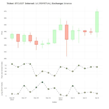
Even though cryptoQuotes::getLSRatio() is an asset-specific sentiment indicator, and cryptoQuotes::getFGIndex() is a general sentiment indicator, there is much information to be gathered by combining this information.

This information can be visualized by using the the various charting-functions in the cryptoQuotes-package,

## get the BTCUSDT
## pair from the last 14 days
BTCUSDT <- cryptoQuotes::getQuote(
  ticker = "BTCUSDT",
  interval = "1d",
  from = Sys.Date() - 14
)
## chart the BTCUSDT
## pair with sentiment indicators
cryptoQuotes::chart(
  slider = FALSE,
  chart = cryptoQuotes::kline(BTCUSDT) %>%
    cryptoQuotes::addFGIndex(FGI = FGI) %>% 
    cryptoQuotes::addLSRatio(LSR = LSR)
)
Bitcoin charted against Fear and Greed Index and the Long-Short Ratio using R
Bitcoin (BTC) plotted with Fear and Greed Index along side the Long-Short Ratio

Installing cryptoQuotes

Installing via CRAN

# install from CRAN
install.packages(
  pkgs = 'cryptoQuotes',
  dependencies = TRUE
)

Installing via Github

# install from github
devtools::install_github(
  repo = 'https://github.com/serkor1/cryptoQuotes/',
  ref = 'main'
)

Note: The latest price may vary depending on time of publication relative to the rendering time of the document. This document were rendered at 2024-01-08 23:30 CET

55,000 in Awards for Energy & Buildings Hackathon, Sponsored by NYSERDA

The New York State Energy Research & Development Agency (NYSERDA) is partnering with Onboard Data to host a $55,000 Global Energy & Buildings Hackathon. We’re inviting all engineers, data scientists and software developers whether they are professionals, professors, researchers or students to participate. More below…


Challenge participants will propose exciting, new ideas that can improve our world’s buildings. The hackathon will share data from 200+ buildings to participants. This data set is rich and one of a kind. The data set is normalized from equipment, systems and IoT devices found within buildings.
We seek submissions that positively impact or accelerate the decarbonization of New York State buildings. 

Total awards are $55,000. Sign-ups stay open until April 15th and the competition is open from April 22nd to May 30th. More can be found here: www.rtemhackathon.com.

Advance the next generation of building technology!

Create a hyper-marketing model using Naïve Bayes

By Huey Fern Tay with Greg Page

Everyone loves an extra income stream – even the super-wealthy owners of luxurious properties that they only inhabit for just a few weeks each year.  Offering a property as a short-term rental through a platform like Airbnb can provide a wonderful side hustle.  For some owners, however, the associated hassles could be a powerful deterrent to using the service.  Text messages at 3 a.m. about Wi-Fi passwords, stopped-up toilets, and the lack of water pressure in the shower might be just enough to tip the scales against such an undertaking…especially when such messages are followed up by angry “Why isn’t this fixed yet?” queries just 30 minutes later.

So what if an all-in-one concierge service could take away ALL of those hassles?  If an intermediary service could handle all of the tenant interactions, the marketing, the logistics of the key hand-offs, etc. then suddenly the idle rich jetsetters might be a bit more willing to open up their pied-a-terres to the unbathed masses.  Such a service would benefit all stakeholders – travelers would have more options, the property owners would earn more income, and the platform would receive more commission fees from the extra transactions. In exchange for a fee paid to the service, willing property owners could have a side hustle that was “all side, no hustle.”  

Let’s imagine that such a service is looking to establish itself, with an initial marketing outreach effort to high-end property owners not already using Airbnb.  Let’s also imagine that this new service is operating on a shoestring budget, and therefore needs to. How can it identify the properties within a city that are most likely to command high values in the short-term rental market? 

The Naïve Bayes classifier is a good candidate for the task at hand because of its simplicity, computational efficiency, and ability to handle categorical variables.  Furthermore, its classification outcomes come with associated probability values – we can use those to identify records that are most likely to belong to some particular group. 

To illustrate how this method could be used to solve the business problem outlined above, I will utilize Airbnb data of San Francisco listings.

One of the first decisions the modeler must make is deciding how to bin the data. In this case, the question is which numerical variable would you use to separate the properties? Would you use price, review ratings, or number of reviews? Each of these variables has a different impact on the outcome and may not be equally effective at separating classes. If the classes are not well separated, then even a large dataset will not be helpful.

The next important decision is to determine the number of classification categories you would like to create. Also, what would the cut-off be for each group? In other words, should you create four groups and bin them equally? Or should you create three groups by dividing the data according to a 15-70-15 proportion, 20-40-20, or 30-40-30…etc? The decision made at this step has a big impact on the model.

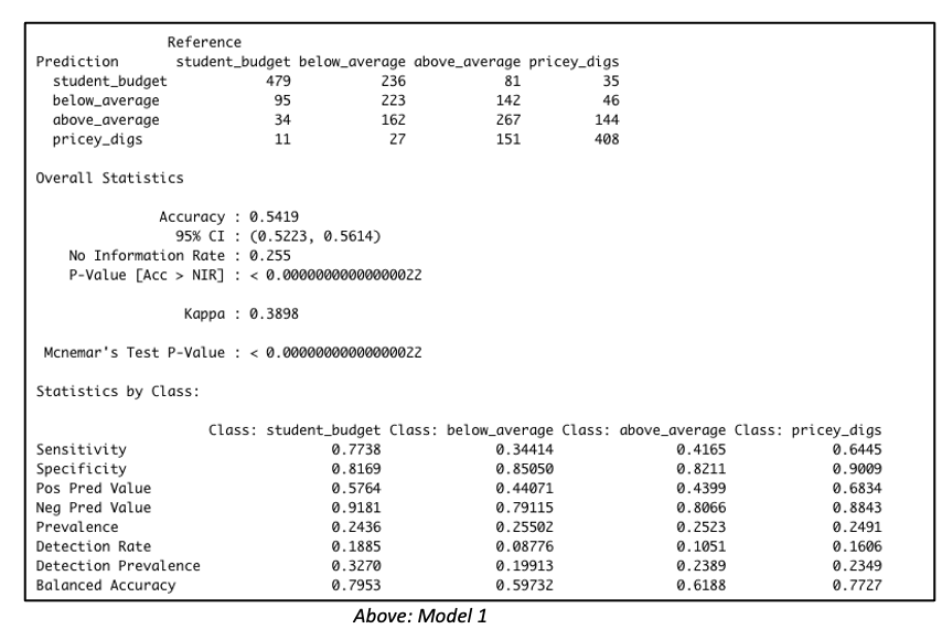
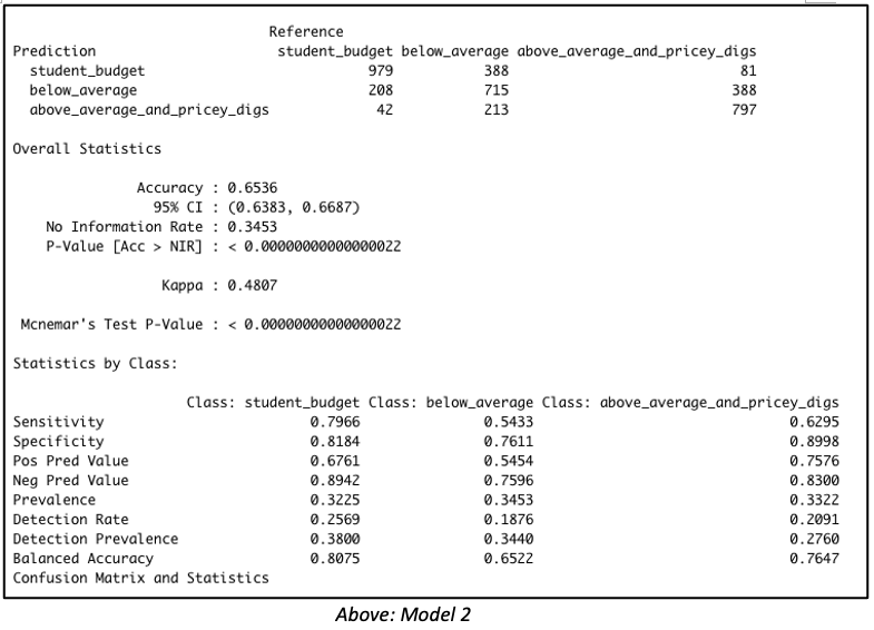
Consider both models below which were each created with 3811 rows of data representing 60% of the total dataset. Both models were created with the same predictor variables, such as the number of bedrooms, bathrooms, property type, location, etc. But in Model 1, the data was binned into 4 equal groups while in Model 2, the data was binned into 3 equal groups. The model summary for Model 1 showed the model has an accuracy of 54.19%, which is good considering that this performance is slightly more than double the No Information Rate (Naïve Rate). Model 2’s accuracy’s level is at 65.36%, a level which is nearly double its No Information Rate.

These are encouraging results but in our Airbnb example, we are more interested in knowing how well our model performs when it is asked to classify properties into any of the classes used in the model. For this reason, it is worth considering the true positive rate i.e. ‘sensitivity’. Model 1 is better at predicting the true positives (‘sensitivity’) for classes at opposite ends of the spectrum. This suggests Model 1 has difficulty reading nuances. On the other hand, Model 2’s performance in this regard is comparatively more balanced.


Naive Bayes model with four classification outcome


Naive Bayes output with three classification outcome


But wait – let’s get back to our original goal.  While overall accuracy is good to see, what we are most interested in here is identifying that high-end price group.  Owners of such units will be the best targets for our all-in-one concierge service.  Therefore, let’s dive a bit deeper to examine this model’s suitability for identifying such properties. 

By running the predict() function with the type=’raw’ parameter included, we can view the associated probabilities for each outcome class, and then rank records by probability of belonging to some particular outcome group. 

Taking this approach with the validation set, we find that among the 100 records identified by the model as most likely to land in the top tier group, 96 truly belonged to “Above Average and Pricey Digs.”   Among the 150 likeliest, 140 units, or 93.33%, actually belonged to that group, and among the 200 likeliest, 185 units, or 92.5%, were truly in that top tier. 

But that’s not all. It is worth going one step further by evaluating the model with lift charts or decile-wise lift charts because these charts determine how effectively our model ‘skims the cream’.

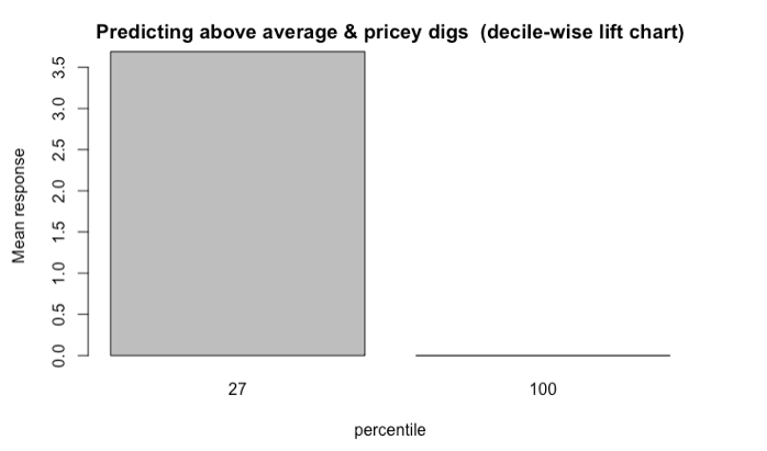
The decile-wise lift charts below illustrate how effectively the model can predict membership in the ‘above average and pricey digs’ group. When the model is used to classify the top 27% properties in this category, its performance is more than 3.5x better than a random guess.

Decile-wise lift chart shows the model is 3.5 times better at classifying the top 27 percent properties

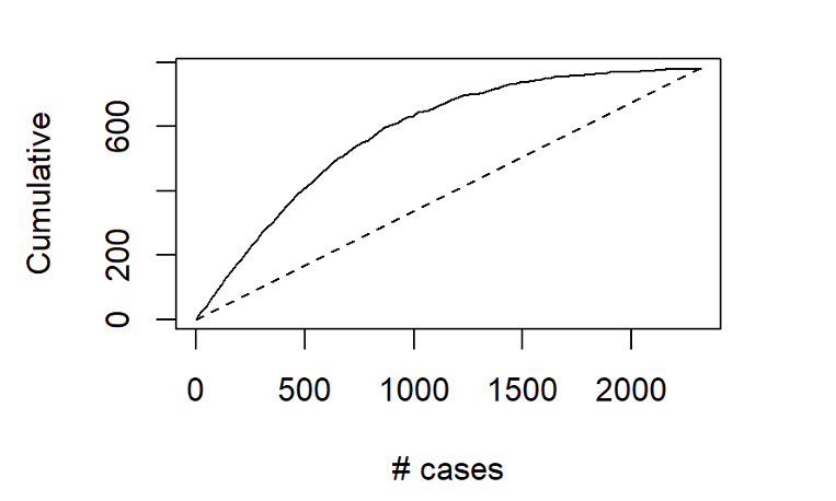
Another way to assess the model’s ability to identify top-tier rentals is with a two-dimensional lift chart.  Such a chart only works with two-outcome class scenarios, so we start here by collapsing the first and second tiers together, and then labelling that group as “other.”  

Gains chart shows among the 500 records that the model says are most likely to land in the Above Average & Pricey Digs Tier, just over 400 truly did belong to that group

In the entire validation set, there are 780 units that land in the highest price tier.  The values along the x-axis represent all the validation set records, ranked in order of their probability of belonging to the highest-tier class.  The y-axis shows the number of correct predictions.  The solid line represents the model’s performance – it shows us, for instance, that among the 500 records that the model says are most likely to land in the Above Average & Pricey Digs Tier, just over 400 truly did belong to that group.  The line flattens out at around x=1500, because by that point, the model has already identified nearly all of the records that truly belonged to this outcome class. 

The dotted line, by contrast, shows how effective a model would be if it simply labelled all the records as belonging to the top tier.  Since 33.6%, of the validation records belong to this group, each x-axis value here corresponds to a y-axis value that is exactly 33.6% as large.  The difference between the solid line and the dotted line represents the model’s improvement as the number of cases increases.

What do these results mean for the concierge service?  Let’s revisit our original assumptions: 


  • such a service would most likely appeal to the owners of properties in the highest pricing tier;
  • the initial outreach efforts should be made to owners of properties not already registered with Airbnb; and that
  • the new service has a limited budget, and therefore needs to carefully focus its outreach efforts only on that tier of properties whose owners would be likeliest to use it
Given these assumptions, our primary interest does not lie with overall model accuracy.  The model’s ability to distinguish between the bottom two pricing tiers is almost immaterial to us; however, we are keenly interested in the answer to this question:  When the model predicts that a property will belong to the highest pricing tier, how often is it correct? 

As demonstrated here, the model delivers quite effectively in this regard, especially when we maintain a relatively narrow focus on the properties that are most likely to be top tier.  Splashy magazine inserts, Super Bowl advertisements, and big-ticket endorsements from celebrities might be in the cards for this service down the road, after it spreads across the globe and prepares for its IPO roadshow.  For now, though, the hyper-specific focus that can come from “skimming the cream” off the top of those Naïve Bayes model probability predictions may be the surest next step for this service’s success. 

Data source: Inside Airbnb
 

Tutorial: Cleaning and filtering data from Qualtrics surveys, and creating new variables from existing data

Hi fellow R users (and Qualtrics users),

As many Qualtrics surveys produce really similar output datasets, I created a tutorial with the most common steps to clean and filter data from datasets directly downloaded from Qualtrics.

You will also find some useful codes to handle data such as creating new variables in the dataframe from existing variables with functions and logical operators.

The tutorial is presented in the format of a downloadable R code with  explanations and annotations of each step. You will also find a raw Qualtrics dataset to work with.

Link to the tutorial: https://github.com/angelajw/QualtricsDataCleaning

This dataset comes from a Qualtrics survey with an experiment format (control and treatment conditions), but the codes can be applicable to non-experimental datasets as well, as many cleaning steps are the same.

A single loop is not enough. A collection of hello world control structures


As the post on “hello world” functions has been quite appreciated by the R community, here follows the second round of functions for wannabe R programmer.

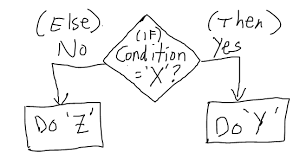
# If else statement:
# See the code syntax below for if else statement
x=10
if(x>1){
print(“x is greater than 1”)
}else{
print(“x is less than 1”)
}

# See the code below for nested if else statement

x=10
if(x>1 & x<7){
print(“x is between 1 and 7”)} else if(x>8 & x< 15){
print(“x is between 8 and 15”)
}


# For loops:
# Below code shows for loop implementation
x = c(1,2,3,4,5)
for(i in 1:5){
print(x[i])
}


# While loop :
# Below code shows while loop in R
x = 2.987
while(x <= 4.987) {
x = x + 0.987
print(c(x,x-2,x-1))
}


# Repeat Loop:
# The repeat loop is an infinite loop and used in association with a break statement.

# Below code shows repeat loop:
a = 1
repeat{
print(a)
a = a+1
if (a > 4) {
break
}
}

# Break statement:
# A break statement is used in a loop to stop the iterations and flow the control outside of the loop.

#Below code shows break statement:
x = 1:10
for (i in x){
if (i == 6){
break
}
print(i)
}

# Next statement:
# Next statement enables to skip the current iteration of a loop without terminating it.

#Below code shows next statement
x = 1: 4
for (i in x) {
if (i == 2){
next
}
print(i)
}


# function

words = c(“R”, “datascience”, “machinelearning”,”algorithms”,”AI”)
words.names = function(x) {
for(name in x){
print(name)
}
}

words.names(words) # Calling the function


# extract the elements above the main diagonal of a (square) matrix
# example of a correlation matrix

cor_matrix <- matrix(c(1, -0.25, 0.89, -0.25, 1, -0.54, 0.89, -0.54, 1), 3,3)
rownames(cor_matrix) <- c(“A”,”B”,”C”)
colnames(cor_matrix) <- c(“A”,”B”,”C”)
cor_matrix

rho <- list()
name <- colnames(cor_matrix)
var1 <- list()
var2 <- list()
for (i in 1:ncol(cor_matrix)){
for (j in 1:ncol(cor_matrix)){
if (i != j & i<j){
rho <- c(rho,cor_matrix[i,j])
var1 <- c(var1, name[i])
var2 <- c(var2, name[j])
}
}
}

d <- data.frame(var1=as.character(var1), var2=as.character(var2), rho=as.numeric(rho))
d

var1 var2 rho
1 A B -0.25
2 A C 0.89
3 B C -0.54


As programming is the best way to learn and think, have fun programming awesome functions!

This post is also shared in R-bloggers and LinkedIn

Lyric Analysis with NLP and Machine Learning using R: Part One – Text Mining

June 22
By Debbie Liske

This is Part One of a three part tutorial series originally published on the DataCamp online learning platform in which you will use R to perform a variety of analytic tasks on a case study of musical lyrics by the legendary artist, Prince. The three tutorials cover the following:


Musical lyrics may represent an artist’s perspective, but popular songs reveal what society wants to hear. Lyric analysis is no easy task. Because it is often structured so differently than prose, it requires caution with assumptions and a uniquely discriminant choice of analytic techniques. Musical lyrics permeate our lives and influence our thoughts with subtle ubiquity. The concept of Predictive Lyrics is beginning to buzz and is more prevalent as a subject of research papers and graduate theses. This case study will just touch on a few pieces of this emerging subject.


Prince: The Artist

To celebrate the inspiring and diverse body of work left behind by Prince, you will explore the sometimes obvious, but often hidden, messages in his lyrics. However, you don’t have to like Prince’s music to appreciate the influence he had on the development of many genres globally. Rolling Stone magazine listed Prince as the 18th best songwriter of all time, just behind the likes of Bob Dylan, John Lennon, Paul Simon, Joni Mitchell and Stevie Wonder. Lyric analysis is slowly finding its way into data science communities as the possibility of predicting “Hit Songs” approaches reality.

Prince was a man bursting with music – a wildly prolific songwriter, a virtuoso on guitars, keyboards and drums and a master architect of funk, rock, R&B and pop, even as his music defied genres. – Jon Pareles (NY Times)
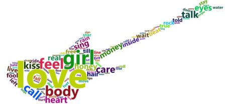
In this tutorial, Part One of the series, you’ll utilize text mining techniques on a set of lyrics using the tidy text framework. Tidy datasets have a specific structure in which each variable is a column, each observation is a row, and each type of observational unit is a table. After cleaning and conditioning the dataset, you will create descriptive statistics and exploratory visualizations while looking at different aspects of Prince’s lyrics.

Check out the article here!


(reprint by permission of DataCamp online learning platform)

R as learning tool: solving integrals


Integrals are so easy only math teachers could make them difficult.When I was in high school I really disliked math and, with hindsight, I would say it was just because of the the prehistoric teaching tools (when I saw this video I thought I’m not alone). I strongly believe that interaction CAUSES learning (I’m using “causes” here on purpose being quite aware of the difference between correlation and causation), practice should come before theory and imagination is not a skill you, as a teacher, could assume in your students. Here follows a short and simple practical explanation of integrals. The only math-thing I will write here is the following: f(x) = x + 7. From now on everything will be coded in R. So, first of all, what is a function? Instead of using the complex math philosophy let’s just look at it with a programming eye: it is a tool that takes something in input and returns something else as output. For example, if we use the previous tool with 2 as an input we get a 9. Easy peasy. Let’s look at the code:
# here we create the tool (called "f")
# it just takes some inputs and add it to 7
f <- function(x){x+7}

# if we apply it to 2 it returns a 9
f(2)
9

Then the second question comes by itself. What is an integral? Even simpler, it is just the sum of this tool applied to many inputs in a range. Quite complicated, let’s make it simpler with code: 
# first we create the range of inputs
# basically x values go from 4 to 6 
# with a very very small step (0.01)
# seq stands for sequence(start, end, step)


x <- seq(4, 6, 0.01) 
x
4.00 4.01 4.02 4.03 4.04 4.05 4.06 4.07...

x[1]
4

x[2]
4.01
As you see, x has many values and each of them is indexed so it’s easy to find, e.g. the first element is 4 (x[1]). Now that we have many x values (201) within the interval from 4 to 6, we compute the integral.
# since we said that the integral is 
# just a sum, let's call it IntSum and 
# set it to the start value of 0
# in this way it will work as an accumulator
IntSum = 0
Differently from the theory in which the calculation of the integral produces a new non-sense formula (just kidding, but this seems to be what math teachers are supposed to explain), the integral does produce an output, i.e. a number. We find this number by summing the output of each input value we get from the tool (e.g. 4+7, 4.01+7, 4.02+7, etc) multiplied by the step between one value and the following (e.g. 4.01-4, 4.02-4.01, 4.03-4.02, etc). Let’s clarify this, look down here:
# for each value of x 
for(i in 2:201){
    
    # we do a very simple thing:
    # we cumulate with a sum
    # the output value of the function f 
    # multiplied by each steps difference
    
    IntSum = IntSum + f(x[i])*(x[i]-x[i-1])
    
    
    # So for example,  
    # with the first and second x values the numbers will be:
    #0.1101 = 0 + (4.01 + 7)*(4.01 - 4)
    
    # with the second and third:
    #0.2203 = 0.1101 + (4.02 + 7)*(4.02 - 4.01)
    
    # with the third and fourth:
    #0.3306 = 0.2203 + (4.03 + 7)*(4.03 - 4.02)
    
    # and so on... with the sum (integral) growing and growing
    # up until the last value
}

IntSum
24.01
Done! We have the integral but let’s have a look to the visualization of this because it can be represented and made crystal clear. Let’s add a short line of code to serve the purpose of saving the single number added to the sum each time. The reason why we decide to call it “bin” instead of, for example, “many_sum” will be clear in a moment.
# we need to store 201 calculation and we
# simply do what we did for IntSum but 201 times
bin = rep(0, 201)
bin
0 0 0 0 0 0 0 0 0 0 0 0 ...
Basically, we created a sort of memory to host each of the calculation as you see down here:
for (i in 2:201){
    
    # the sum as earlier
    IntSum = IntSum + f(x[i])*(x[i]-x[i-1])
    
    # overwrite each zero with each number
    bin[i] = f(x[i])*(x[i]-x[i-1])
}

IntSum
24.01

bin
0.0000 0.1101 0.1102 0.1103 0.1104 0.1105 ..

sum(bin)
24.01
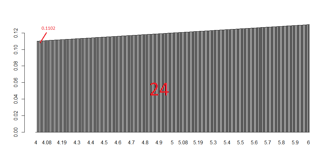
Now if you look at the plot below you get the whole story: each bin is a tiny bar with a very small area and is the smallest part of the integral (i.e. the sum of all the bins).
# plotting them all
barplot(bin, names.arg=x)
This tells you a lot about the purpose of integral and the possibility of calculating areas of curvy surfaces. To have an idea of this just change the function f with, let’s say, sin(x) or log(x). What is happening? And what if you increase/decrease the number of bins? Have fun replicating the code changing some numbers and functions. Integrals should be clearer in the end. That’s all folks! #R #rstats #maRche #Rbloggers 

“Print hello”​ is not enough. A collection of Hello world functions.


I guess I wrote my R “hello world!” function 7 or 8 years ago while approaching R for the first time. And it is too little to illustrate the basic syntax of a programming language for a working program to a wannabe R programmer. Thus, here follows a collection of basic functions that may help a bit more than the famed piece of code.

######################################################
############### Hello world functions ################
######################################################
##################################
# General info
fun <- function( arguments ) { body }


##################################
foo.add <- function(x,y){
  x+y
}

foo.add(7, 5)

----------------------------------

foo.above <- function(x){
  x[x>10]
}

foo.above(1:100)

----------------------------------

foo.above_n <- function(x,n){
  x[x>n]
}

foo.above_n(1:20, 12)

----------------------------------

foo = seq(1, 100, by=2)
foo.squared = NULL

for (i in 1:50 ) {
  foo.squared[i] = foo[i]^2
}

foo.squared

----------------------------------

a <- c(1,6,7,8,8,9,2)

s <- 0
for (i in 1:length(a)){
  s <- s + a[[i]]
}
s

----------------------------------

a <- c(1,6,7,8,8,9,2,100)

s <- 0
i <- 1
while (i <= length(a)){
  s <- s + a[[i]]
  i <- i+1
}
s

----------------------------------

FunSum <- function(a){
  s <- 0
  i <- 1
  while (i <= length(a)){
    s <- s + a[[i]]
    i <- i+1
  }
  print(s)
}

FunSum(a)

-----------------------------------

SumInt <- function(n){
  s <- 0
  for (i in 1:n){
    s <- s + i
  }
  print(s)  
}

SumInt(14)

-----------------------------------
# find the maximum
# right to left assignment
x <- c(3, 9, 7, 2)

# trick: it is necessary to use a temporary variable to allow the comparison by pairs of
# each number of the sequence, i.e. the process of comparison is incremental: each time
# a bigger number compared to the previous in the sequence is found, it is assigned as the
# temporary maximum
# Since the process has to start somewhere, the first (temporary) maximum is assigned to be
# the first number of the sequence

max <- x[1]
for(i in x){
  tmpmax = i
  if(tmpmax > max){
    max = tmpmax
  }
}

max

x <- c(-20, -14, 6, 2)
x <- c(-2, -24, -14, -7)

min <- x[1]
for(i in x){
  tmpmin = i
  if(tmpmin < min){
    min = tmpmin
  }
}

min

----------------------------------
# n is the nth Fibonacci number
# temp is the temporary variable

Fibonacci <- function(n){
  a <- 0
  b <- 1
  for(i in 1:n){
    temp <- b
    b <- a
    a <- a + temp
  }
  return(a)
}

Fibonacci(13)

----------------------------------
# R available factorial function
factorial(5)

# recursive function: ff
ff <- function(x) {
  if(x<=0) {
    return(1)
  } else {
    return(x*ff(x-1)) # function uses the fact it knows its own name to call itself
  }
}
ff(5)

----------------------------------

say_hello_to <- function(name){
  paste("Hello", name)
} 
say_hello_to("Roberto")

----------------------------------

foo.colmean <- function(y){
  nc <- ncol(y)
  means <- numeric(nc)
  for(i in 1:nc){
    means[i] <- mean(y[,i])
  }
  means
}

foo.colmean(airquality)

----------------------------------

foo.colmean <- function(y, removeNA=FALSE){
  nc <- ncol(y)
  means <- numeric(nc)
  for(i in 1:nc){
    means[i] <- mean(y[,i], na.rm=removeNA)
  }
  means
}

foo.colmean(airquality, TRUE)

----------------------------------

foo.contingency <- function(x,y){
  nc <- ncol(x)
  out <- list() 
  for (i in 1:nc){
    out[[i]] <- table(y, x[,i]) 
  }
  names(out) <- names(x)
  out
}

set.seed(123)
v1 <- sample(c(rep("a", 5), rep("b", 15), rep("c", 20)))
v2 <- sample(c(rep("d", 15), rep("e", 20), rep("f", 5)))
v3 <- sample(c(rep("g", 10), rep("h", 10), rep("k", 20)))

data <- data.frame(v1, v2, v3)

foo.contingency(data,v3)
That's all folks! #R #rstats #maRche #Rbloggers This post is also shared in LinkedIn and www.r-bloggers.com

Web data acquisition: from database to dataframe for data analysis and visualization (Part 4)

The previous post described how the deeply nested JSON data on fligths were parsed and stored in an R-friendly database structure. However, looking into the data, the information is not yet ready for statistical analysis and visualization and some further processing is necessary before extracting insights and producing nice plots. In the parsed batch, it is clearly visible the redundant structure of the data with the flight id repeted for each segment of each flight. This is also confirmed with the following simple check as the rows of the dataframe are more than the unique counts of the elements in the id column.
dim(data_items)
[1] 397  15

length(unique(data_items$id))
201

# real time changes of data could produce different results
This implies that the information of each segment of each flight has to be aggregated and merged in a dataset as single observations of a statistical analysis between, for example, price and distance. First, a unique primary key for each observation has to be used as reference variable to uniquely identify each element of the dataset.
library(plyr) # sql like functions
library(readr) # parse numbers from strings
 
data_items <- data.frame(data_items)
 
# id (primary key)
data <- data.frame(unique(data_items$id))
colnames(data) <- c('id')
 
# n° of segment
n_segment <- aggregate(data_items['segment.id'], by=data_items['id'], length)
data <- join(data, n_segment, by='id', type='left', match='first') # sql left join
# mileage
mileage <- aggregate(data_items['segment.leg.mileage'], by=data_items['id'], sum)
data <- join(data, mileage, by='id', type='left', match='first') # sql left join
# price
price <- data.frame('id'=data_items$id, 'price'=parse_number(data_items$saleTotal))
data <- join(data, price, by='id', type='left', match='first') # sql left join
# dataframe
colnames(data) <- c('id','segment', 'mileage', 'price')
head(data)

The aggregation of mileage and price using the unique primary key allows to set up a dataframe ready for statistical analysis and data visualization. Current data tells us that there is a maximum of three segments in the connection between FCO and LHR with a minimum price of around EUR 122 and a median around EUR 600.

# descriptive statistics
summary(data)
 
 
# histogram price & distance
g1 <- ggplot(data, aes(x=price)) + 
  geom_histogram(bins = 50) +  
  ylab("Distribution of the Price (EUR)") +
  xlab("Price (EUR)") 
 
g2 <- ggplot(data, aes(x=mileage)) + 
  geom_histogram(bins = 50) +  
  ylab("Distribution of the Distance") +
  xlab("Distance (miles)")
 
grid.arrange(g1, g2)
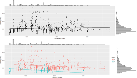
# price - distance relationship
s0 <- ggplot(data = data, aes(x = mileage, y = price)) +
    geom_smooth(method = "lm", se=FALSE, color="black") +
    geom_point() + labs(x = "Distance in miles", y = "Price (EUR)")
s0 <- ggMarginal(s0, type = "histogram", binwidth = 30)
s0

Of course, plenty of other analysis and graphical representations using flights features are possible given the large set of variables available in QPX Express API and the availability of data in real time.
To conclude the 4-step (flight) trip from data acquisition to data analysis, let's recap the most important concepts described in each of the post: 1) Client-Server connection 2) POST request in R 3) Data parsing and structuring 4) Data analysis and visualization
That's all folks! #R #rstats #maRche #json #curl #qpxexpress #Rbloggers This post is also shared in www.r-bloggers.com