INTRODUCTION The surface energy balance equation explains the net solar radiation from the sun to and from the earth’s surface and is comprised of three important elements namely: latent heat (LE), sensible heat (H) and ground heat flux (G). LE is the latent heat flux that results from both evapotranspiration from the soil and vegetation. Sensible heat warms the layer above the surface while ground flux is associated with heat stored in the soil or pedozone. The sum of these 3 components totals the radiative flux which is a combination of both longwave and shortwave radiation energy. Quantification of these components within a watershed or field, assists scientific understanding of plant development, precipitation and water demands by competing users. There are several micrometeorological methods available to measure these components both directly and indirectly. The eddy covariance (EC) method utilizes an omnidirectional 3D sonic anemometer as well as either an open or closed-path infrared H2O gas analyzing system to measure LE. Solar radiation can be measured using radiometers. Soil heat plates placed at various depths, measure ground heat flux (G) while sensible heat is measured indirectly as the remainder after subtracting G and H from net solar radiation. The EC methodology is rather expensive and has several limitations which are discussed by several micrometeorologists (e.g. Castellvi et al., (2006); Castellvi et al, (2009a, 2009b); and Suvočarev et al., 2014)). The surface renewal method (SR) however provides an efficient and cheap option for estimating H, LE energy and methane (CH4) and carbon dioxide (CO2) gas exchange fluxes to and from varied ecosystems such as uniform pine forest (Katul et al., 1996); grapevine canopies (Spano et al., 2000); rice fields (Castellvi et al., 2006); and rangelands (Castellvi et al., 2008). The method is both cheaper and simple to implement on medium spatial scales such as livestock paddocks and feedlots. SR method does not require instrument levelling and has no limitations in orientation (Suvočarev et al., 2014)). Additionally, the SR method has demonstrated better energy balance closure (Castellvi, et al., 2008). To estimate H flux, measurements are taken at one height together with horizontal wind speeds and temperature. To estimate LE fluxes, measurements may be taken at one height together with horizontal wind speeds and moisture concentrations. The Surface Renewal (SR) process is derived from understandings of gaseous flux exchanges to or from an air parcel traveling at a known or specified height over a canopy. In the SR process an air parcel moves into the lower reaches of the canopy and remains for a duration τ (tau); before another parcel replaces it ejecting it upwards. Paw et al, (1995) created a diagram of this process and likened it to a ramp-like event.
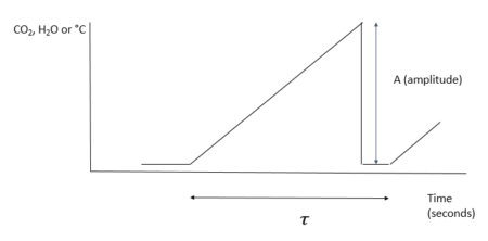
The ramp is characterized by both an amplitude (A) and period (τ – Greek letter :tau). The purpose of this R code is to calculate these two characteristics for measuring both gaseous and energy flux exchanges occurring during the SR process. These values are then applied in estimating H, LE, CO2 and CH4. Ramp Characteristics Amplitude Van Atta (1977) and Antonia and Van Atta (1978) (both cited in Synder et al., 2007) pioneered structure function analysis for ramp patterns in temperature. However, they did not connect ramps and structure functions to the concept of surface renewal but rather relegated the structure function analysis to other features of turbulent flow. The Biomicrometeorological Research Team at the University of California, Davis were the first to connect to the concepts of surface renewal to ramp patterns analyzed by structure functions. The surface renewal method was thus developed and refined by scientific contributions of several researchers led by Kyaw Tha Paw U, (Professor of Atmospheric Sciences and Biometeorologist)** at the University of California, Davis; researchers at INRA, France and the University of Sassari, Italy. These later researchers not only developed surface renewal, but were the first to show usage of structure functions in surface renewal for micrometeorological purposes (A list of their publications and presentations highlighting these early innovations are provided below). These researchers studied structure functions, ramp patterns and turbulence and their relationships. They utilized the structure function approach to estimate both amplitude and duration from moments recorded in the field (Equation 1).
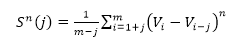 (Equation 1)
Where h(Vi -Vi-j) is the difference between two sequential high-frequency measurements (time lag interval, j) of water vapor density or air temperature. M represents the total number of data points in the 0.5 hour time period. i represents the summation index while n is the structure function order. The R code builds of these procedures and calculates the 2nd, 3rd and 5th moments of a structure function following Van Atta (1977). Applying the three moments to calculate p and q; as:
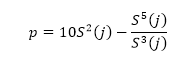 (Equation 2)
And;
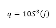 (Equation 3)
A cubic equation encompassing ramp amplitude is provided as:
Equating y to 0 and solving for the real roots of the equation yields the ramp amplitude.
Ramp duration
The “inverse ramp frequency” also known as the mean ramp event, τ , is calculated as:
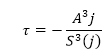 (Equation 5)
j represents the instance when the ratio between the third moment and observation time (seconds) is a maximum.
Demonstration The sample dataset (test.csv) utilized in this package consists of water vapor measurements (gm-3) recorded over 30 minutes (half an hour) at 20 Hz per second. Therefore a total of 36000 measurements are provided. The sample dataset can be downloaded here.
R code
The code provided below converts the H2O concentrations from g per m3 to mmol per m3. Thereafter, 2nd, 3rd and 5th moments are calculated for each 1/20th of a second. These values are then applied to calculating two values; p and q. A (amplitude) is derived by solving for the true roots of a cubic polynomial equation. The R code generates a numeric vector that consists of three values: 1) r value – this is the time (seconds) when the ratio between the third moment and observation time (seconds) is a maximum. 2) τ (Greek letter – tau) is the total ramp duration 3) A is the amplitude of the ramp that models the SR process. In order for the package to function, two supporting packages are necessary. These are the NISTunits and polynom packages.
ipak <- function(pkg){
  new.pkg <- pkg[!(pkg %in% installed.packages()[, “Package”])]
  if (length(new.pkg))
    install.packages(new.pkg, dependencies = TRUE)
  sapply(pkg, require, character.only = TRUE)
}

### usage of packages

packages <- c(“NISTunits”,“polynom”,“bigmemory”)
ipak(packages) ## Loading required package: NISTunits ## Loading required package: polynom ## Loading required package: bigmemory ## Loading required package: bigmemory.sri ## NISTunits   polynom bigmemory
##      TRUE      TRUE      TRUE require(NISTunits)


 ### cube root function
Math.cbrt <- function(x)
  {
  sign(x) * abs(x)^(1/3)
  }

####
#### set the directory and read file. In my case my dataset is stored in
#### D:SurfaceRENEWAL folder

setwd(“D:/SurfaceRENEWAL/”)
df<-read.csv(“test.csv”, header=TRUE)

## creating empty data frame
### based on the value of hertz. In this case it is 20 Hz per second..

hertz<-20


dat <- data.frame(col1=numeric(hertz), col2=numeric(hertz), col3=numeric(hertz),stringsAsFactors = FALSE)

####convert to mmol m-3

df$H2O<-1000*df$H2O/18.01528

### Creating and Initializing the table with three columns
dat <- data.frame(col1=numeric(hertz), col2=numeric(hertz), col3=numeric(hertz),stringsAsFactors = FALSE)
dat ##    col1 col2 col3
## 1     0    0    0
## 2     0    0    0
## 3     0    0    0
## 4     0    0    0
## 5     0    0    0
## 6     0    0    0
## 7     0    0    0
## 8     0    0    0
## 9     0    0    0
## 10    0    0    0
## 11    0    0    0
## 12    0    0    0
## 13    0    0    0
## 14    0    0    0
## 15    0    0    0
## 16    0    0    0
## 17    0    0    0
## 18    0    0    0
## 19    0    0    0
## 20    0    0    0 for (p in 1:hertz)
{
  #### initializing cumulative totals
  tempTot2<-0
  tempTot3<-0
  tempTot5<-0
  #### the first column is the frequency
  #### the second column is the duration (in seconds)
  dat$col1[p]<-p
  dat$col2[p]<-p/hertz

  #### initializing temporary variables for calculating
  #### 2nd, 3rd and 5th moments

  tem2<-0
  tem3<-0
  tem5<-0
    for (i in (p+1):nrow(df))
      {
      tem2<-(df$H2O[i]-df$H2O[i-p])^2
      tempTot2<-tem2+tempTot2
      tem3<-(df$H2O[i]-df$H2O[i-p])^3
      tempTot3<-tem3+tempTot3
      tem5<-(df$H2O[i]-df$H2O[i-p])^5
      tempTot5<-tem5+tempTot5
      }

  dat$col3[p]<-(tempTot2/(nrow(df)-dat$col1[p]))
  dat$col4[p]<-(tempTot3/(nrow(df)-dat$col1[p]))
  dat$col5[p]<-(tempTot5/(nrow(df)-dat$col1[p]))

}


dat$moment2<-abs(dat$col3)
dat$moment3<-abs(dat$col4)
dat$moment5<-abs(dat$col5)

#### Solution following Synder et al.(2007)
#### values for p and q
dat$p<-10*dat$col3 – (dat$col5/dat$col4)
dat$q <- 10*dat$col4
#### solutions to the cubic equation after Synder et al., (2007)
dat$D<-(((dat$q)^2)/4)+(((dat$p)^3)/27)

for (i in 1:hertz) {
  if (dat$D[i]>0)
    {
        one1<-(dat$D[i])^0.5
        one2<–0.5*dat$q[i]
        dat$x1[i]<-Math.cbrt(one2+one1)
        dat$x2[i]<-Math.cbrt(one2-one1)
        dat$a[i]<-dat$x1[i]+dat$x2[i]
        rm(one1)
        rm(one2)
    }
 else {
   if (dat$D[i]<0)
   {
     one1<-(dat$D[i])^0.5
     one2<–0.5*dat$q[i]
     dat$x1[i]<-Math.cbrt(one1+one2)
     dat$x2[i]<-Math.cbrt(one1-one2)
     rm(one1)
     rm(one2)

     part1<-((-1)*dat$p[i]/3)^3
    b<-NISTradianTOdeg(acos((-0.5*dat$q[i])/((part1)^0.5)))

    a1=2*((-dat$p[i]/3)^0.5)*(cos(NISTdegTOradian(b/3)))
    a2=2*((-dat$p[i]/3)^0.5)*(cos(NISTdegTOradian(120+b/3)))
    a3=2*((-dat$p[i]/3)^0.5)*(cos(NISTdegTOradian(240+b/3)))
    c<-max(a1, a2, a3)
    dat$a[i]<-c
    rm(c, a1, a2, a3, part1)

   }
 }
}

myvars <- names(dat) %in% c(“x1”, “x2”)
dat <- dat[!myvars]

##### using polynomial solver for a ####
require(polynom)

for (i in 1:hertz){

  p<-polynomial(coef = c(dat$q[i],dat$p[i], 0, 1))
  pz <- solve(p)
  length(pz)
  for (j in 1:length(pz))
       {
    assign(paste(“sol”, j, sep = “”), pz[j]) }
      dat$sol1[i]<-sol1
  dat$sol2[i]<-sol2
  dat$sol3[i]<-sol3
    rm(pz)
    rm(sol1, sol2, sol3)
}


for(i in 1:hertz)
{
z1<-dat$sol1[i]
z2<-dat$sol2[i]
z3<-dat$sol3[i]

dat$realsol1[i]<-Re(z1)
dat$Imsol1[i]<-Im(z1)
dat$realsol1[i]
dat$Imsol1[i]


dat$realsol2[i]<-Re(z2)
dat$Imsol2[i]<-Im(z2)
dat$realsol2[i]
dat$Imsol2[i]

dat$realsol3[i]<-Re(z3)
dat$Imsol3[i]<-Im(z3)
dat$realsol3[i]
dat$Imsol3[i]

max(dat$realsol1[i],dat$realsol2[i],dat$realsol3[i])
dat$valA[i]<-max(dat$realsol1[i],dat$realsol2[i],dat$realsol3[i])
dat$max3lagtime[i]<-dat$moment3[i]/dat$col2[i]
}

myvars <- names(dat) %in% c(“col1”, “col2”,
                            “moment2”, “moment3”,
                            “moment5”,“p”, “q”, “a”,“valA”,  “max3lagtime” )
summaryTable <- dat[myvars]

summaryTable ##    col1 col2   moment2    moment3    moment5          p           q
## 1     1 0.05  39.97585   227.4659   262452.8  -754.0533   -2274.659
## 2     2 0.10 115.63242  1134.9434  3160154.1 -1628.0914  -11349.434
## 3     3 0.15 189.03933  2265.2436  8969219.4 -2069.1011  -22652.436
## 4     4 0.20 254.38826  3320.6327 15645921.7 -2167.8465  -33206.327
## 5     5 0.25 312.56747  4242.6024 22015534.6 -2063.4833  -42426.024
## 6     6 0.30 364.54446  5068.9708 27896667.6 -1857.9740  -50689.708
## 7     7 0.35 410.76632  5884.4135 34475044.8 -1751.0421  -58844.135
## 8     8 0.40 452.93659  6660.0190 41266600.0 -1666.8026  -66600.190
## 9     9 0.45 492.31085  7343.4792 47495349.9 -1544.5819  -73434.792
## 10   10 0.50 529.03029  7939.6602 53081193.5 -1395.2721  -79396.602
## 11   11 0.55 562.93084  8509.7643 59150608.6 -1321.6019  -85097.643
## 12   12 0.60 593.42319  9046.5529 66051182.5 -1367.0223  -90465.529
## 13   13 0.65 620.52924  9426.8395 71306547.4 -1358.9127  -94268.395
## 14   14 0.70 644.90293  9647.2450 73292986.2 -1148.2677  -96472.450
## 15   15 0.75 667.44272  9846.4826 73991999.9  -840.1344  -98464.826
## 16   16 0.80 689.19924 10113.5842 75160476.5  -539.6436 -101135.842
## 17   17 0.85 710.79955 10484.7886 78308090.9  -360.7380 -104847.886
## 18   18 0.90 732.54936 10959.1331 83838648.3  -324.6232 -109591.331
## 19   19 0.95 754.19575 11389.8848 89552992.0  -320.5445 -113898.848
## 20   20 1.00 775.68790 11665.0130 94068144.4  -307.2478 -116650.130
##           a     valA max3lagtime
## 1  28.85951 28.85951    4549.317
## 2  43.46502 43.46502   11349.434
## 3  50.20279 50.20279   15101.624
## 4  52.87582 52.87582   16603.163
## 5  53.45273 53.45273   16970.410
## 6  53.04339 53.04339   16896.569
## 7  53.41124 53.41124   16812.610
## 8  53.87871 53.87871   16650.048
## 9  53.91351 53.91351   16318.843
## 10 53.62664 53.62664   15879.320
## 11 53.86497 53.86497   15472.299
## 12 54.90598 54.90598   15077.588
## 13 55.33885 55.33885   14502.830
## 14 54.13317 54.13317   13781.779
## 15 52.21134 52.21134   13128.643
## 16 50.44371 50.44371   12641.980
## 17 49.70186 49.70186   12335.045
## 18 50.11435 50.11435   12176.815
## 19 50.67653 50.67653   11989.352
## 20 50.95577 50.95577   11665.013 ### picking the ramp characteristics based on the rato of third moment and lag time.

shortened_sol<-dat[which(dat$max3lagtime==max(dat$max3lagtime)),]
shortened_sol ##   col1 col2     col3      col4      col5  moment2  moment3  moment5
## 5    5 0.25 312.5675 -4242.602 -22015535 312.5675 4242.602 22015535
##           p         q         D        a               sol1
## 5 -2063.483 -42426.02 124575728 53.45273 -26.72637-8.91137i
##                 sol2        sol3  realsol1    Imsol1  realsol2   Imsol2
## 5 -26.72637+8.91137i 53.45273+0i -26.72637 -8.911368 -26.72637 8.911368
##   realsol3 Imsol3     valA max3lagtime
## 5 53.45273      0 53.45273    16970.41 amplitude<-shortened_sol$a
tau<-((-1*shortened_sol$col2)*(shortened_sol$valA)^3)/shortened_sol$col4
r<-shortened_sol$col2

solution<-data.frame(“Parameters” = c(“r”, “amplitude”, “tau”),
                     “Values”= c(r, amplitude, tau),
                     “Units”= c(“seconds”,“mmol m-3”,“seconds” ))
solution ##   Parameters    Values    Units
## 1          r  0.250000  seconds
## 2  amplitude 53.452730 mmol m-3
## 3        tau  8.999479  seconds
Acknowledgements
The author would like to acknowledge Andy Suyker for providing the test dataset. The authors also acknowledges the contributions of Kosana Suvočarev and Tala Awada. References on Surface Renewal Starting with first publications on surface renewal (by Paw U et al.***) Conference Papers & Abstracts Paw U, K.T. and Y. Brunet, 1991. A surface renewal measure of sensible heat flux density. pp. 52-53. In preprints, 20th Conference on Agricultural and Forest Meteorology, September 10-13, 1991, Salt Lake City, Utah. American Meteorological Society, Boston, MA. Paw U, K.T., 1993. Using surface renewal/turbulent coherent structure concepts to estimate and analyze scalar fluxes from plant canopies. Annales Geophysicae 11(supplement II):C284. Paw U, K.T. and Su, H-B., 1994. The usage of structure functions in studying turbulent coherent structures and estimating sensible heat flux. pp. 98-99. In preprints, 21st Conference on Agricultural and Forest Meteorology, March 7-11, 1994, San Diego, California. American Meteorological Society, Boston, MA. Paw U, K.T., Qiu, J. , Su, H.B., Watanabe, T., and Brunet, Y., 1995. Surface renewal analysis: a new method to obtain scalar fluxes without velocity data. Agric. For. Meteorol. 74:119-137. Spano D., Snyder R.L., Paw U K.T., and DeFonso E. 1994. Verification of the surface renewal method for estimating evapotranspiration. 297-298. In preprints, 21st Conference on Agricultural and Forest Meteorology, March 7-11, 1994, San Diego, California. American Meteorological Society, Boston, MA. Paw U, K.T., Su, H.-B., and Braaten, D.A., 1996. The usage of structure functions in estimating water vapor and carbon dioxide exchange between plant canopies and the atmosphere. pp. J14-J15. In preprints, 22nd Conference on Agricultural and Forest Meteorology, and 12th Conference on Biometeorology and Aerobiology, January 28-February 2, 1996, Atlanta, Georgia. American Meteorological Society, Boston, MA. Spano, D., Duce, P., Snyder, R.L., and Paw U, K.T., 1996. Verification of the structure function approach to determine sensible heat flux density using surface renewal analysis. pp. 163-164. In preprints, 22nd Conference on Agricultural and Forest Meteorology, January 28-February 2, 1996, Atlanta, Georgia. American Meteorological Society, Boston, MA. Spano, D., Duce, P., Snyder, R.L. and Paw U., K.T., 1998. Surface renewal analysis for sensible and latent heat flux density over sparse canopy. pp. 129-130. In preprints, 23rd Conference on Agricultural and Forest Meteorology, November 2-6, 1998, Albuquerque, New Mexico. American Meteorological Society, Boston, MA. Spano, D., Snyder, R.L., Duce, P., Paw U, K.T., Falk, M.B. 2000. Determining scalar fluxes over an old-growth forest using surface renewal. In, Preprints of the 24th Conference on Agricultural and Forest Meteorology, Davis, California, American Meteorological Society, Boston, MA, pp.80-81. Spano, D., Duce, P., Snyder, R.L., Paw U, K.T. and Falk, M. 2002. Surface renewal determination of scalar fluxes over an old-growth forest. In preprints, 25th Conference on Agricultural and Forest Meteorology, Norfolk, Virgina, American Meteorological Society, Boston, MA, Pp. 61-62. Snyder,R.L., Spano, D., Duce, P., Paw U, K.T., 2002. Using surface renewal analysis to determine crop water use coefficients. In preprints, 25th Conference on Agricultural and Forest Meteorology, Norfolk, Virgina, American Meteorological Society, Boston, MA, Pp. 9-10. Spano, D., Duce, P., Snyder, R.L., Paw U, K.T., Baldocchi, D., Xu, L., 2004. Micrometeorological measurements to assess fire fuel dryness. In CD preprints, 26th Conference on Agricultural and Forest Meteorology, Vancover, British Columbia, American Meteorological Society, Boston, MA, 11.7. Snyder, R.L., Spano, D., and Paw U, K.T., 1996. Surface renewal analysis for sensible and latent heat flux density. Boundary Layer Meteorol. 77:249-266. Spano, D., Snyder, R.L., Duce, P., and Paw U, K.T., 1997. Surface renewal analysis for sensible heat flux density using structure functions. Agric. Forest Meteorol., 86:259-271. Spano, D., Duce, P., Snyder, R.L., and Paw U, K.T., 1997. Surface renewal estimates of evapotranspiration. Tall Canopies. Acta Horticult., 449:63-68. Snyder, R.L., Paw U, K.T., Spano, D., and Duce, P., 1997. Surface renewal estimates of evapotranspiration. Theory. Acta Horticult., 449:49-55. Spano, D., Snyder, R.L., Duce, P., and Paw U, K.T., 2000. Estimating sensible and latent heat flux densities from grapevine canopies using surface renewal. Agric. Forest. Meteorol. 104:171-183. Paw U, K.T. 2001. Coherent structures and surface renewal. Book Chapter in Advanced Short Course on Agricultural, Forest and Micro Meteorology. Sponsored by the Consiglio Nazionale delle Ricerche (CNR, Italy) and the University of Sassari, Italy. Bologna, Italy, 2001, pp. 63-76. Paw U, K.T., Snyder, R.L., Spano, D., and Su, H.-B. 2005. Surface Renewal Estimates of Scalar Exchange. Refereed chapter in Micrometeorology of Agricultural Systems, ed. J.L. Hatfield, Agronomy Society of America. pp. 455-483. Snyder, R.L., Spano, D., Duce, P., Paw U, K.T., and Rivera, M., 2008. Surface Renewal estimation of pasture evapotranspiration. J. Irrig. Drainage Eng. ASCE 134:716-721. Shapland, T.M., McElrone, A.J., Snyder, R.L., and Paw U, K.T., 2012. Structure function analysis of two-scale scalar ramps. Part I: Theory and Modelling. Boundary-Layer Meteorol. 145:5-25. Shapland, T.M., McElrone, A.J., Snyder, R.L., and Paw U, K.T., 2012. Structure function analysis of two-scale scalar ramps. Part II: Ramp Characteristics and surface renewal flux estimation. Boundary-Layer Meteorol. 145:27-44. Shapland, T.M., McElrone, A.J., Snyder, R.L., and Paw U, K.T.,2013. A turnkey program for field-scale energy flux density measurements using eddy covariance and surface renewal. Italian J Agrometeorology, 18(1): 5-16. McElrone, AJ., Shapland, T.M., Calderon, A., Fitzmaurice, L., Paw U, K.T, and Snyder, R.L. 2013. J Visualized Exp. 82::e50666 Snyder, R. L., Spano D., Duce K.T., Paw U, Anderson F. E. and Falk M. (2007). Surface Renewal Manual. University of California, Davis, California. Spano, D., Snyder, R. L., & Duce, P. (2000). Estimating sensible and latent heat flux densities from grapevine canopies using surface renewal. Agricultural and Forest Meteorology, 104(3), 171-183. Suvočarev, K., Shapland, T. M., Snyder, R. L., & Martínez-Cob, A. (2014). Surface renewal performance to independently estimate sensible and latent heat fluxes in heterogeneous crop surfaces. Journal of hydrology, 509, 83-93. Paw U, K. T., Snyder, R. L., Spano, D., & Su, H. B. (2005). Surface renewal estimates of scalar exchange. Agronomy, 47, 455. Other references cited in the paper Castellvi, F., Martinez-Cob, A., & Perez-Coveta, O. (2006). Estimating sensible and latent heat fluxes over rice using surface renewal. Agricultural and forest meteorology, 139(1), 164-169. Castellvi, F., & Snyder, R. L. (2009). Combining the dissipation method and surface renewal analysis to estimate scalar fluxes from the time traces over rangeland grass near Ione (California). Hydrological processes, 23(6), 842-857. Castellví, F., & Snyder, R. L. (2009). On the performance of surface renewal analysis to estimate sensible heat flux over two growing rice fields under the influence of regional advection. Journal of hydrology, 375(3), 546-553. Castellvi, F., Snyder, R. L., & Baldocchi, D. D. (2008). Surface energy-balance closure over rangeland grass using the eddy covariance method and surface renewal analysis. Agricultural and forest meteorology, 148(6), 1147-1160. Katul, G., Hsieh, C. I., Oren, R., Ellsworth, D., & Phillips, N. (1996). Latent and sensible heat flux predictions from a uniform pine forest using surface renewal and flux variance methods. Boundary-Layer Meteorology, 80(3), 249-282.
Mengistu, M. G., & Savage, M. J. (2010). Surface renewal method for estimating sensible heat flux. Water SA, 36(1), 9-18. ***Kyaw Tha Paw U, Professor of Atmospheric Sciences and Biometeorologist; BS MIT, PhD, Yale University. [email protected]. Tel. (530) 752-1510
 To conclude the 4-step (flight) trip from data acquisition to data analysis, let's recap the most important concepts described in each of the post:
1)
To conclude the 4-step (flight) trip from data acquisition to data analysis, let's recap the most important concepts described in each of the post:
1) 
 The
The 
 Building a Shiny app is not difficult. Apps basically draw on some data presentation code (tables, plots) that you already have. Then just add a couple of scripts into the folder: one for the user interface (named iu.R), one for the process (named server.R), and perhaps another one compiling the commands for deploying the app and checking any errors.
 I learned statistics and probability by simulating data. Sure, I battled my way through proofs, but I never believed the results until I saw it in a simulation. I guess I have it backwards, it worked for me. And now that I do this for a living, I continue to use simulation to understand models, to do sample size estimates and power calculations, and of course to teach. Sure – I’ll use the occasional formula, but I always feel the need to check it with simulation. It’s just the way I am.
 Here’s the code that is used to generate this definition, which is stored as a
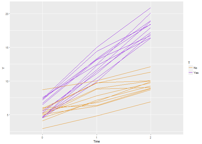
 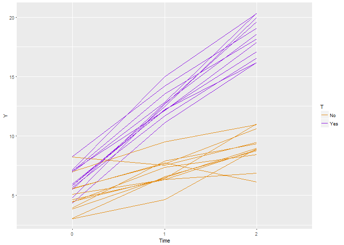 Again, we recover the true parameters. And this time, if we look at the estimated correlation, we see that indeed the outcomes are correlated within each individual. The estimate is 0.71, very close to the the “true” value 0.7.
 SVM
SVM