Sinew: a R Package to create self-populating roxygen2 skeletons

Sinew is a R package that generates a roxygen2 skeletons populated with information scraped from within the function script. The goal of the package is to automate nearly all of the mundane tasks needed to document functions, properly set up the import fields for oxygenation, and make it easier to attain documentation consistency across functions. 

Functionality

  • makeOxygen: Create a skeleton for roxygen2 documentation populated with information scraped from within the package function scripts.
  • makeImport: Create import(s) calls for DESCRIPTION, NAMESPACE, and roxygen2.
  • makeDictionary: Create a R file of all the unique roxygen2 parameter fields in a package R subdirectory.

Installation

#CRAN
install.packages('sinew')

#DEV
devtools::install_github('metrumresearchgroup/sinew')

Example Output

makeOxygen(lm)
#' @title FUNCTION_TITLE
#' @description FUNCTION_DESCRIPTION
#' @param formula PARAM_DESCRIPTION
#' @param data PARAM_DESCRIPTION
#' @param subset PARAM_DESCRIPTION
#' @param weights PARAM_DESCRIPTION
#' @param na.action PARAM_DESCRIPTION
#' @param method PARAM_DESCRIPTION, Default: 'qr'
#' @param model PARAM_DESCRIPTION, Default: TRUE
#' @param x PARAM_DESCRIPTION, Default: FALSE
#' @param y PARAM_DESCRIPTION, Default: FALSE
#' @param qr PARAM_DESCRIPTION, Default: TRUE
#' @param singular.ok PARAM_DESCRIPTION, Default: TRUE
#' @param contrasts PARAM_DESCRIPTION, Default: NULL
#' @param offset PARAM_DESCRIPTION
#' @param ... PARAM_DESCRIPTION
#' @return OUTPUT_DESCRIPTION
#' @importFrom stats model.frame

In more detail…

For new developers, getting a package ready for building and submitting to CRAN is an expletive-filled, head-scratching experience to say the least. Trying to figure out the basics of what goes in depends and what goes in imports is a lost afternoon most of us would like back. Once that is understood, filling in relevant information to each field is a mundane task even for a well polished package developer. The out-of-the-box roxygen2 skeleton supplied by RStudio gives the bare bones road map of what should be part of function documentation:
Continue reading Sinew: a R Package to create self-populating roxygen2 skeletons

slickR

We are happy to bring the slick JavaScript library to R. It is self-described as “the last carousel you’ll ever need”. This carousel is based on putting the elements of the carousel in a div HTML tag. This makes the carousel very versatile in what can be placed inside. Regular objects that are placed in a carousel can be for example: images, plots, tables, gifs, videos, iframes and even htmlwidgets.

  This tool helps review multiple outputs in an efficient manner and saves much needed space in documents and Shiny applications, while creating a user friendly experience. These carousels can be used directly from the R console, from RStudio, in Shiny apps and R Markdown documents.

Installation

CRAN
install.packages('slickR')
Github (dev)
devtools::install_github('metrumresearchgroup/slickR')

Examples

There are many options within the slick carousel, to get started with the basics we will show a few examples in the rest of the post. If you want to try out any of the examples you can go to this site where they are rendered and can be tested out.

library(svglite)
library(lattice)
library(ggplot2)
library(rvest) 
library(reshape2)
library(dplyr)
library(htmlwidgets)
library(slickR)

Images

Some web scraping for the images example….
#NBA Team Logos
nbaTeams=c("ATL","BOS","BKN","CHA","CHI","CLE","DAL","DEN","DET","GSW",
    "HOU","IND","LAC","LAL","MEM","MIA","MIL","MIN","NOP","NYK",
    "OKC","ORL","PHI","PHX","POR","SAC","SAS","TOR","UTA","WAS")
teamImg=sprintf("https://i.cdn.turner.com/nba/nba/.element/img/4.0/global/logos/512x512/bg.white/svg/%s.svg",nbaTeams)

#Player Images
a1=read_html('http://www.espn.com/nba/depth')%>%html_nodes(css = '#my-teams-table a')
a2=a1%>%html_attr('href')
a3=a1%>%html_text()
team_table=read_html('http://www.espn.com/nba/depth')%>%html_table()
team_table=team_table[[1]][-c(1,2),]
playerTable=team_table%>%melt(,id='X1')%>%arrange(X1,variable)
playerName=a2[grepl('[0-9]',a2)]
playerId=do.call('rbind',lapply(strsplit(playerName,'[/]'),function(x) x[c(8,9)]))
playerId=playerId[playerId[,1]!='phi',]
playerTable$img=sprintf('http://a.espncdn.com/combiner/i?img=/i/headshots/nba/players/full/%s.png&w=350&h=254',playerId[,1])

Grouped Images

There are players on each team, so lets group the starting five together and have each dot correspond with a team:
slickR(
  obj = playerTable$img,
  slideId = c('ex2'),
  slickOpts = list(
    initialSlide = 0,
    slidesToShow = 5,
    slidesToScroll = 5,
    focusOnSelect = T,
    dots = T
  ),
  height = 100,width='100%'
)

Replacing the dots

Sometimes the dots won’t be informative enough so we can switch them with an HTML object, such as text or other images. We can pass to the customPaging argument javascript code using the htmlwidgets::JS function.

Replace dots with text

cP1=JS("function(slick,index) {return '<a>'+(index+1)+'</a>';}")

slickR(
  obj = playerTable$img,
  slideId = 'ex3',
  dotObj = teamImg,
  slickOpts = list(
    initialSlide = 0,
    slidesToShow = 5,
    slidesToScroll = 5,
    focusOnSelect = T,
    dots = T,
    customPaging = cP1
  ),
  height=100,width='100%'
)

Replace dots with Images

cP2=JS("function(slick,index) {return '<a><img src= ' + dotObj[index] + '  width=100% height=100%></a>';}")


#Replace dots with Images
s1 <- slickR(
  obj = playerTable$img,
  dotObj = teamImg,
  slickOpts = list(
    initialSlide = 0,
    slidesToShow = 5,
    slidesToScroll = 5,
    focusOnSelect = T,
    dots = T,
    customPaging = cP2
  ),height = 100,width='100%'
)

#Putting it all together in one slickR call
s2 <- htmltools::tags$script(
  sprintf("var dotObj = %s", 
          jsonlite::toJSON(teamImg))
)

htmltools::browsable(htmltools::tagList(s2, s1))

Plots

To place plots directly into slickR we use svglite to convert a plot into svg code using xmlSVG and then convert it into a character object
plotsToSVG=list(
  #Standard Plot
    xmlSVG({plot(1:10)},standalone=TRUE),
  #lattice xyplot
    xmlSVG({print(xyplot(x~x,data.frame(x=1:10),type="l"))},standalone=TRUE),
  #ggplot
    xmlSVG({show(ggplot(iris,aes(x=Sepal.Length,y=Sepal.Width,colour=Species))+
                   geom_point())},standalone=TRUE), 
  #lattice dotplot
    xmlSVG({print(dotplot(variety ~ yield | site , data = barley, groups = year,
                          key = simpleKey(levels(barley$year), space = "right"),
                          xlab = "Barley Yield (bushels/acre) ",
                          aspect=0.5, layout = c(1,6), ylab=NULL))
            },standalone=TRUE) 
)

#make the plot self contained SVG to pass into slickR 
s.in=sapply(plotsToSVG,function(sv){paste0("data:image/svg+xml;utf8,",as.character(sv))})
slickR(s.in,slideId = 'ex4',slickOpts = list(dots=T), height = 200,width = '100%')

Synching Carousels

There are instances when you have many outputs at once and do not want to go through all, so you can combine two carousels one for viewing and one for searching.
slickR(rep(s.in,each=5),slideId = c('ex5up','ex5down'),
       slideIdx = list(1:20,1:20),
       synchSlides = c('ex5up','ex5down'),
       slideType = rep('img',4),
       slickOpts = list(list(slidesToShow=1,slidesToScroll=1),
                        list(dots=F,slidesToScroll=1,slidesToShow=5,
                             centerMode=T,focusOnSelect=T)
                        ),
       height=100,width = '100%'
       )

Iframes

Since the carousel can accept any html element we can place iframes in the carousel. There are times when you may want to put in different DOMs rather than an image in slick. Using slideType you can specify which DOM is used in the slides. For example let’s put the help Rd files from ggplot2 into a slider using the helper function getHelp. (Dont forget to open the output to a browser to view the iframe contents).
geom_filenames=ls("package:ggplot2",pattern = '^geom')

slickR(unlist(lapply(geom_filenames,getHelp,pkg = 'ggplot2')),slideId = 'ex6',slideType = 'iframe',height = '400px',width='100%',slickOpts = list(dots=T,slidesToShow=2,slidesToScroll=2))

htmlwidgets

Finally, we can really leverage R and place self contained htmlwidgets in iframes (like leaflets and plotly) and use them in a carousel. This solves a problem of how to run many htmlwidgets at once outside of Shiny.
library(leaflet)
library(plotly)

l <- leaflet() %>% addTiles()
htmlwidgets::saveWidget(l,'leaflet.html')

p <- iris%>%ggplot(aes(x=Sepal.Length,y=Sepal.Width))+geom_point()
pL= ggplotly(p)
htmlwidgets::saveWidget(pL,'ggplotly.html')

slickR(c(rep(paste0(readLines('leaflet.html'),collapse='\n'),4),
         rep(paste0(readLines('ggplotly.html'),collapse='\n'),4)),
       slideId = c('leaf','plot'),
       slideIdx = list(1:4,5:8),
       slideType = rep('iframe',2),
       slickOpts = list(list(dots=T,slidesToShow=2,slidesToScroll=2),
                        list(dots=T,slidesToShow=2,slidesToScroll=2)),
       height='200px',width='100%')

Jonathan Sidi joined Metrum Research Group in 2016 after working for several years on problems in applied statistics, financial stress testing and economic forecasting in both industrial and academic settings. To learn more about additional open-source software packages developed by Metrum Research Group please visit the Metrum website. Contact: For questions and comments, feel free to email me at: [email protected] or open an issue for bug fixes or enhancements at github.

ggedit 0.2.0 is now on CRAN

Jonathan Sidi, Metrum Research Group

ggedit We are pleased to announce the release of the ggedit package on CRAN. To install the package you can call the standard R command
install.packages('ggedit')
The source version is still tracked on github, which has been reorganized to be easier to navigate. To install the dev version:
devtools::install_github('metrumresearchgroup/ggedit')

What is ggedit?

ggedit is an R package that is used to facilitate ggplot formatting. With ggedit, R users of all experience levels can easily move from creating ggplots to refining aesthetic details, all while maintaining portability for further reproducible research and collaboration. ggedit is run from an R console or as a reactive object in any Shiny application. The user inputs a ggplot object or a list of objects. The application populates Bootstrap modals with all of the elements found in each layer, scale, and theme of the ggplot objects. The user can then edit these elements and interact with the plot as changes occur. During editing, a comparison of the script is logged, which can be directly copied and shared. The application output is a nested list containing the edited layers, scales, and themes in both object and script form, so you can apply the edited objects independent of the original plot using regular ggplot2 grammar. Why does it matter? ggedit promotes efficient collaboration. You can share your plots with team members to make formatting changes, and they can then send any objects they’ve edited back to you for implementation. No more email chains to change a circle to a triangle!

Updates in ggedit 0.2.0:

  • The layer modal (popups) elements have been reorganized for less clutter and easier navigation.
  • The S3 method written to plot and compare themes has been removed from the package, but can still be found on the repo, see plot.theme.

Deploying

  • call from the console: ggedit(p)
  • call from the addin toolbar: highlight script of a plot object on the source editor window of RStudio and run from toolbar.
  • call as part of Shiny: use the Shiny module syntax to call the ggEdit UI elements.
    • server: callModule(ggEdit,'pUI',obj=reactive(p))
    • ui: ggEditUI('pUI')
  • if you have installed the package you can see an example of a Shiny app by executing runApp(system.file('examples/shinyModule.R',package = 'ggedit'))

Outputs

ggedit returns a list containing 8 elements either to the global enviroment or as a reactive output in Shiny.
  • updatedPlots
    • List containing updated ggplot objects
  • updatedLayers
    • For each plot a list of updated layers (ggproto) objects
    • Portable object
  • updatedLayersElements
    • For each plot a list elements and their values in each layer
    • Can be used to update the new values in the original code
  • updatedLayerCalls
    • For each plot a list of scripts that can be run directly from the console to create a layer
  • updatedThemes
    • For each plot a list of updated theme objects
    • Portable object
    • If the user doesn’t edit the theme updatedThemes will not be returned
  • updatedThemeCalls
    • For each plot a list of scripts that can be run directly from the console to create a theme
  • updatedScales
    • For each plot a list of updated scales (ggproto) objects
    • Portable object
  • updatedScaleCalls
    • For each plot a list of scripts that can be run directly from the console to create a scale
 

Short Clip to use ggedit in Shiny


Jonathan Sidi joined Metrum Research Group in 2016 after working for several years on problems in applied statistics, financial stress testing and economic forecasting in both industrial and academic settings. To learn more about additional open-source software packages developed by Metrum Research Group please visit the Metrum website. Contact: For questions and comments, feel free to email me at: [email protected] or open an issue for bug fixes or enhancements at github.

ggedit 0.1.1: Shiny module to interactvely edit ggplots within Shiny applications

ggedit is a package that lets users interactively edit ggplot layer and theme aesthetics. In a previous post we showed you how to use it in a collaborative workflow using standard R scripts. More importantly, we highlighted that ggedit outputs to the user, after editing, updated: gg plots, layers, scales and themes as both self-contained objects and script that you can paste directly in your code.

Installation

devtools::install_github('metrumresearchgroup/ggedit',subdir='ggedit')

version 0.1.1 Updates

  • ggEdit Shiny module: use ggedit as part of any Shiny application.
  • gggsave: generalized ggsave to write multiple outputs of ggplot to a single file and/or multiple files from a single call. Plots can be saved to various graphic devices. 

ggEdit Shiny module

This post will demonstrate a new method to use ggedit, Shiny modules. A Shiny module is a chunk of Shiny code that can be reused many times in the same application, but generic enough so it can be applied in any Shiny app (in simplest terms think of it as a Shiny function). By making ggedit a Shiny module we can now replace any renderPlot() call that inputs a ggplot and outputs in the UI plotOutput(), with an interactive ggedit layout. The analogy between how to use the ggEdit module in comparison to a standard renderPlot call can be seen in the table below.
  Standard Shiny Shiny Module
Server output$id=renderPlot(p) reactiveOutput=callModule(ggEdit,id,reactive(p))
UI plotOutput(id) ggEditUI(id)
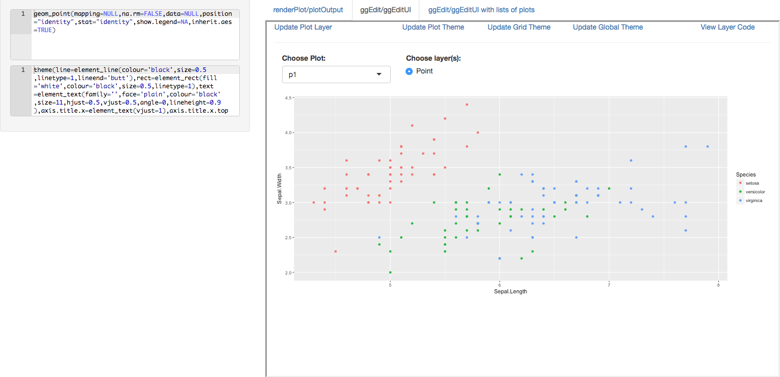
We can see that there are a few differences in the calls. To call a module you need to run a Shiny function callModule, in this case ggEdit. Next, a character id for the elements the module will create in the Shiny environment and finally the arguments that are expected by the module, in this case a reactive object that outputs a ggplot or list of ggplots. This is coupled with ggEditUI, which together create a ggedit environment to edit the plots during a regular Shiny app. In addition to the output UI the user also gets a reactive output that has all the objects that are in the regular ggedit package (plots, layers, scales, themes) both in object and script forms. This has great advantages if you want to let users edit plots while keeping track of what they are changing. A realistic example of this would be clients (be it industry or academia) that are shown a set of default plots, with the appropriate data, and then they are given the opportunity to customize according to their specifications. Once they finish editing, the script is automatically saved to the server, updating the clients portfolio with their preferred aesthetics. No more email chains on changing a blue point to an aqua star! Below is a small example of a static ggplot using renderPlot/plotOutput and how to call the same plot and a list of plots using ggEdit/ggeditUI. We added a small reactive text output so you can see the real-time changes of the aesthetic editing being returned to the server [youtube https://www.youtube.com/watch?v=pJ1kbd_OVwg]

Source Code for example

library(ggedit)
server = function(input, output,session) {
p1=ggplot(iris,aes(x=Sepal.Length,y=Sepal.Width,colour=Species))+geom_point()
p2=ggplot(iris,aes(x=Sepal.Length,y=Sepal.Width,colour=Species))+geom_line()+geom_point()
p3=list(p1=p1,p2=p2)
output$p=renderPlot({p1})

outp1=callModule(ggEdit,'pOut1',obj=reactive(list(p1=p1)))
outp2=callModule(ggEdit,'pOut2',obj=reactive(p3))

output$x1=renderUI({
layerTxt=outp1()$UpdatedLayerCalls$p1[[1]]
aceEditor(outputId = 'layerAce',value=layerTxt,
mode = 'r', theme = 'chrome',
height = '100px', fontSize = 12,wordWrap = T)
})

output$x2=renderUI({
themeTxt=outp1()$UpdatedThemeCalls$p1
aceEditor(outputId = 'themeAce',value=themeTxt,
mode = 'r', theme = 'chrome',
height = '100px', fontSize = 12,wordWrap = T)
})
}

ui=fluidPage(
conditionalPanel("input.tbPanel=='tab2'",
sidebarPanel(uiOutput('x1'),uiOutput('x2'))),
mainPanel(
tabsetPanel(id = 'tbPanel',
tabPanel('renderPlot/plotOutput',value = 'tab1',plotOutput('p')),
tabPanel('ggEdit/ggEditUI',value = 'tab2',ggEditUI('pOut1')),
tabPanel('ggEdit/ggEditUI with lists of plots',value = 'tab3',ggEditUI('pOut2'))
)))
shinyApp(ui, server)

gggedit

ggsave is the device writing function written for the ggplot2 package. A limitation of it is that only one figure can be written at a time. gggsave is a wrapper of ggsave that allows for list of ggplots to be called and then passes arguments to base graphics devices to create multiple outputs automatically, without the need of loops.
library(ggedit) 
#single file output to pdf 
gggsave('Rplots.pdf',plot=pList) 

#multiple file output to pdf 
gggsave('Rplots.pdf',plot=pList,onefil = FALSE) 

#multiple file output to png 
gggsave('Rplots.png',plot=pList)


Jonathan Sidi joined Metrum Research Group in 2016 after working for several years on problems in applied statistics, financial stress testing and economic forecasting in both industrial and academic settings.


To learn more about additional open-source software packages developed by Metrum Research Group please visit the Metrum website.


Contact: For questions and comments, feel free to email me at: [email protected] or open an issue in github.