Interested in publishing a one-time post on R-bloggers.com? Press here to learn how.
By Beth Milhollin, Russell Zaretzki, and Audris Mockus
Coke vs. Pepsi is an age-old rivalry, but I am from Atlanta, so it’s Coke for me. Coca-Cola, to be exact. But I am relatively new to R, so when it comes to data.table vs. tidy, I am open to input from experienced users. A group of researchers at the University of Tennessee recently sent out a survey to R users identified by their commits to repositories, such as GitHub. The results of the full survey can be seen here. The project contributors were identified as “data.table” users or “tidy” users by their inclusion of these R libraries in their projects. Both libraries are an answer to some of the limitations associated with the basic R data frame. In the first installment of this series (found here) we used the survey data to calculate the Net Promoter Score for data.table and tidy.
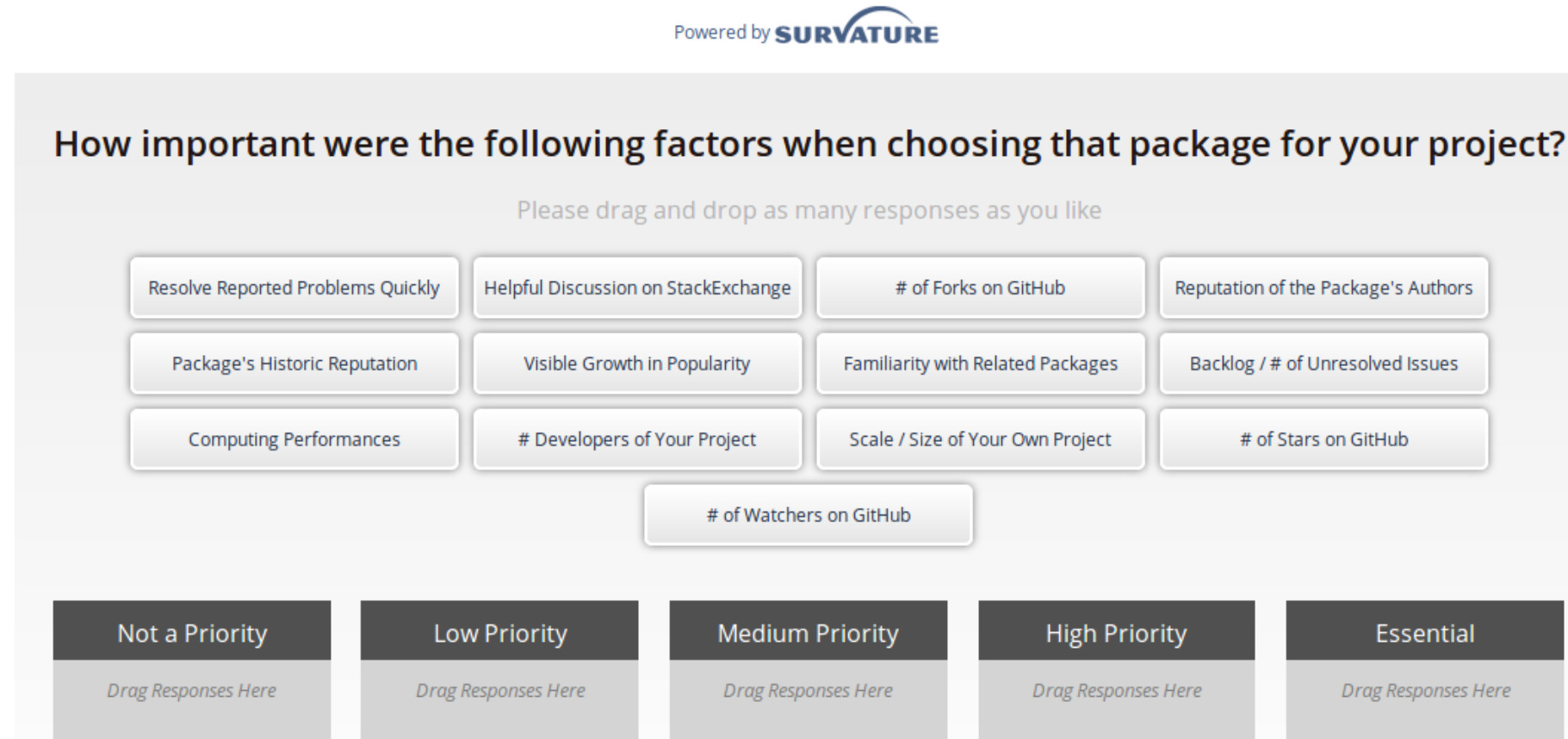
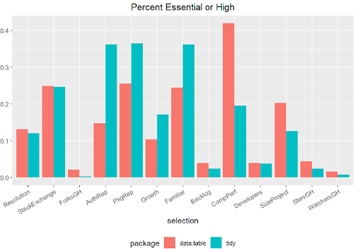
To recap, the Net Promoter Score (NPS) is a measure of consumer enthusiasm for a product or service based on a single survey question – “How likely are you to recommend the brand to your friends or colleagues, using a scale from 0 to 10?” Detractors of the product will respond with a 0-6, while promoters of the product will offer up a 9 or 10. A passive user will answer with a score of 7 or 8. To calculate the NPS, subtract the percentage of detractors from the percentage of promoters. When the percentage of promoters exceeds the percentage of detractors, there is potential to expand market share as the negative chatter is drowned out by the accolades.We were surprised when our survey results indicated data.table had an NPS of 28.6, while tidy’s NPS was double, at 59.4. Why are tidy user’s so much more enthusiastic? What do tidy-lovers “love” about their dataframe enhancement choice? Fortunately, a few of the other survey questions may offer some insights.The survey question shown below asks the respondents how important 13 common factors were when selecting their package. Respondents select a factor-tile, such as “Package’s Historic Reputation”, and drag it to the box that presents the priority that user places on that factor. A user can select/drag as many or as few tiles as they choose. Let’s take a look at what the respondents designated as Essential or High Priority reasons for selecting either data.table or tidy packages. Both user types appear to utilize Stack Exchange as a technical reference, and both keep an eye on how issues are resolved with a package. Tidy users value the reputation of the author and the package, and they appreciate the familiarity they experience when using tidy because of other packages they use. The data.table users are very concerned with computing performance. (Note - The shortened labels below correspond to the order of the tiles above.)
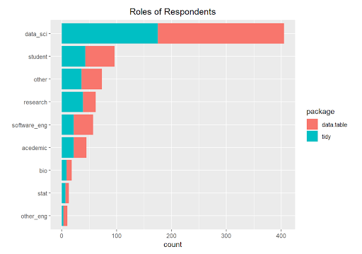
We wondered if data.table users were in roles that required the ability to manipulate very large data sets in memory, taking advantage of data.table’s ability to quickly update columns by reference. Did the role of the respondent predispose their package selection?Nope. Look’s like the preference for data.table or tidy is not related to the role of the user. I do prefer Coca-cola over Pepsi, but maybe I prefer Coke because I was born in the capital of Coke. I am guessing that “exposure” may also be a determining factor when selecting R libraries. In the next installment, we move beyond visualizations, and we will build a logistic model to predict the probability that a user will select data.table or tidy. Dust off your log odds!