The previous
post described how the deeply nested JSON data on fligths were parsed and stored in an R-friendly database structure. However, looking into the data, the information is not yet ready for statistical analysis and visualization and some further processing is necessary before extracting insights and producing nice plots.
In the parsed batch, it is clearly visible the redundant structure of the data with the flight
id repeted for each segment of each flight. This is also confirmed with the following simple check as the rows of the dataframe are more than the unique counts of the elements in the
id column.
dim(data_items)
[1] 397  15

length(unique(data_items$id))
201

# real time changes of data could produce different results
This implies that the information of each segment of each flight has to be aggregated and merged in a dataset as single observations of a statistical analysis between, for example, price and distance. First, a unique primary key for each observation has to be used as reference variable to uniquely identify each element of the dataset.
library(plyr) # sql like functions
library(readr) # parse numbers from strings

data_items <- data.frame(data_items)

# id (primary key)
data <- data.frame(unique(data_items$id))
colnames(data) <- c('id')

# n° of segment
n_segment <- aggregate(data_items['segment.id'], by=data_items['id'], length)
data <- join(data, n_segment, by='id', type='left', match='first') # sql left join
# mileage
mileage <- aggregate(data_items['segment.leg.mileage'], by=data_items['id'], sum)
data <- join(data, mileage, by='id', type='left', match='first') # sql left join
# price
price <- data.frame('id'=data_items$id, 'price'=parse_number(data_items$saleTotal))
data <- join(data, price, by='id', type='left', match='first') # sql left join
# dataframe
colnames(data) <- c('id','segment', 'mileage', 'price')
head(data)
The aggregation of mileage and price using the unique primary key allows to set up a dataframe ready for statistical analysis and data visualization. Current data tells us that there is a maximum of three segments in the connection between FCO and LHR with a minimum price of around EUR 122 and a median around EUR 600.
# descriptive statistics
summary(data)


# histogram price & distance
g1 <- ggplot(data, aes(x=price)) +
  geom_histogram(bins = 50) +
  ylab("Distribution of the Price (EUR)") +
  xlab("Price (EUR)")

g2 <- ggplot(data, aes(x=mileage)) +
  geom_histogram(bins = 50) +
  ylab("Distribution of the Distance") +
  xlab("Distance (miles)")

grid.arrange(g1, g2)
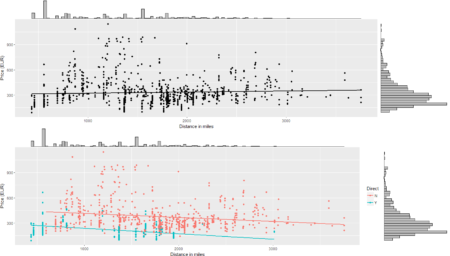
# price - distance relationship
s0 <- ggplot(data = data, aes(x = mileage, y = price)) +
    geom_smooth(method = "lm", se=FALSE, color="black") +
    geom_point() + labs(x = "Distance in miles", y = "Price (EUR)")
s0 <- ggMarginal(s0, type = "histogram", binwidth = 30)
s0
Of course, plenty of other analysis and graphical representations using flights features are possible given the large set of variables available in QPX Express API and the availability of data in real time.

To conclude the 4-step (flight) trip from data acquisition to data analysis, let's recap the most important concepts described in each of the post:
1)
Client-Server connection
2)
POST request in R
3)
Data parsing and structuring
4)
Data analysis and visualization
That's all folks!
#R #rstats #maRche #json #curl #qpxexpress #Rbloggers
This post is also shared in www.r-bloggers.com
 To conclude the 4-step (flight) trip from data acquisition to data analysis, let's recap the most important concepts described in each of the post:
1) Client-Server connection
2) POST request in R
3) Data parsing and structuring
4) Data analysis and visualization
That's all folks!
#R #rstats #maRche #json #curl #qpxexpress #Rbloggers
This post is also shared in www.r-bloggers.com
