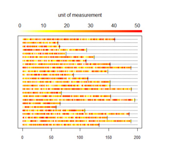
During our research on the effect of prednisone consumption during pregency on health outcomes of the baby (Palmsten K, Rolland M, Hebert MF, et al., Patterns of prednisone use during pregnancy in women with rheumatoid arthritis: Daily and cumulative dose. Pharmacoepidemiol Drug Saf. 2018 Apr;27(4):430-438. https://www.ncbi.nlm.nih.gov/pubmed/29488292) we developed a custom plot to visualize for each patient their daily and cumulative consumption of prednisone during pregenancy. Since the publication these plots have raised some interest so here is the code used to produce them. Data needs to be in the following format: 1 line per patient 1 column for the patient ID (named id) and then 1 column per unit of time (here days) reporting the measure for that day To illustrate the type of data we dealt with I first generate a random dataset containing 25 patients followed for n days (n different for each patient, randomly chosen between 50 and 200) with a daily consumption value randomly selected between 0 and a maximum dose (randomly determined for each patient between 10 and 50 ). Then we compute the cumulated consumption ie sum of all previous days.
# initial parameters for simulating data
n_indiv <- 25
min_days <- 50
max_days <- 200
min_dose <- 10
max_dose <- 50

# list of ids
id_list <- str_c("i", 1:n_indiv)

# intializing empty table
my_data <- as.data.frame(matrix(NA, n_indiv, (max_days+1)))
colnames(my_data) <- c("id", str_c("d", 1:max_days))
my_data$id <- id_list

# daily simulated data
set.seed(113)
for(i in 1:nrow(my_data)){
# n days follow up
n_days <- round(runif(1, min_days, max_days))
# maximum dose
dose <- round(runif(1, min_dose, max_dose))
# random daily value
my_data[i,2:ncol(my_data)] <- c(runif(n_days, 0, max_dose), rep(NA,(max_days-n_days)))
}

# cumulative simulated data
my_cum_data <- my_data
for(i in 3:ncol(my_cum_data)){
my_cum_data[[i]] <- my_cum_data[[i]] + my_cum_data[[i-1]]
}
Our plots use the legend.col function found here: https://aurelienmadouasse.wordpress.com/2012/01/13/legend-for-a-continuous-color-scale-in-r/
Here is the longitudinal heat plot function:
 # Color legend on the top
long_heat_plot <- function(my_data, cutoff, xmax) {
# my_data: longitudinal data with one line per individual, 1st column with id, and then one column per unit of time
# cutoff: cutoff value for color plot, all values above cutoff are same color
# xmax: x axis max value
n_lines <- nrow(my_data)
line_count <- 1
# color scale
COLS <- rev(heat.colors(cutoff))
# plotting area
par(oma=c(1,1,4,1), mar=c(2, 2, 2, 4), xpd=TRUE)
# plot init
plot(1,1,xlim=c(0,xmax), ylim=c(1, n_lines), pch='.', ylab='Individual',xlab='Time unit',yaxt='n', cex.axis = 0.8)
# plot line for each woman one at a time
for (i in 1 : n_lines) {
# get id
id1 <- my_data$id[i]
# get trajectory data maxed at max_val
id_traj <- my_data[my_data$id == id1, 2:ncol(my_data)]
# get last day
END <- max(which(!is.na(id_traj)))
# plot dotted line
x1 <- 1:xmax
y1 <- rep(i,xmax)
lines(x1, y1, lty=3)
for (j in 1 : (ncol(my_data) - 1)) {
# trim traj to max val
val <- min(id_traj[j], cutoff)
# plot traj
points(j, i, col=COLS[val], pch=20, cex=1)
}
# add limit line
points((END+1), i, pch="|", cex=0.9)
}
# add legend
legend.col(col = COLS, lev = 1:cutoff)
mtext(side=3, line = 3, 'unit of measurement')
opar <- par()
text_size <- opar$cex.main
}
Then we generate the corresponding plots:
long_heat_plot(my_data, 50, 200)

long_heat_plot(my_cum_data, 5000, 200)