Imagine a situation where you are asked to predict the tourism revenue for a country, let’s say India. In this case, your output or dependent or response variable will be total revenue earned (in USD) in a given year. But, what about independent or predictor variables?
You have been provided with two sets of predictor variables and you have to choose one of the sets to predict your output. The first set consists of three variables:
- X1 = Total number of tourists visiting the country
- X2 = Government spending on tourism marketing
- X3 = a*X1 + b*X2 + c, where a, b and c are some constants
The second set also consists of three variables:
- X1 = Total number of tourists visiting the country
- X2 = Government spending on tourism marketing
- X3 = Average currency exchange rate
Which of the two sets do you think provides us more information in predicting our output?
I am sure, you will agree with me that the second set provides us more information in predicting the output because the second set has three variables which are different from each other and each of the variables provides different information (we can infer this intuitively at this moment). Moreover, none of the three variables is directly derived from the other variables in the system. Alternatively, we can also say that none of the variables is a linear combination of other variables in the system.
In the first set of variables, only two variables provide us relevant information; while, the third variable is nothing but a linear combination of other two variables. If we were to directly develop a model without including this variable, our model would have considered this combination and estimated coefficients accordingly.
Now, this effect in the first set of variables is called multicollinearity. Variables in the first set are strongly correlated to each other (if not all, at least some variables are correlated with other variables). Model developed using the first set of variables may not provide as accurate results as the second one because we are missing out on relevant variables/information in the first set. Therefore, it becomes important to study multicollinearity and the techniques to detect and tackle its effect in regression models.
According to Wikipedia, “Collinearity is a linear association between two explanatory variables. Two variables are perfectly collinear if there is an exact linear relationship between them. For example, X1 and X2 are perfectly collinear if there exist parameters λ0 and λ1 such that, for all observations i, we have
X2i = λ0 + λ1 * X1i
Multicollinearity refers to a situation in which two or more explanatory variables in a multiple regression model are highly linearly related.”
We saw an example of exactly what the Wikipedia definition is describing.
Perfect multicollinearity occurs when one independent variable is an exact linear combination of other variables. For example, you already have X and Y as independent variables and you add another variable, Z = a*X + b*Y, to the set of independent variables. Now, this new variable, Z, does not add any significant or different value than provided by X or Y. The model can adjust itself to set the parameters that this combination is taken care of while determining the coefficients.
Multicollinearity may arise from several factors. Inclusion or incorrect use of dummy variables in the system may lead to multicollinearity. The other reason could be the usage of derived variables, i.e., one variable is computed from other variables in the system. This is similar to the example we took at the beginning of the article. The other reason could be taking variables which are similar in nature or which provide similar information or the variables which have very high correlation among each other.
Multicollinearity may not possess problem at an overall level, but it strongly impacts the individual variables and their predictive power. You may not be able to identify which are statistically significant variables in your model. Moreover, you will be working with a set of variables which provide you similar output or variables which are redundant with respect to other variables.
- It becomes difficult to identify statistically significant variables. Since your model will become very sensitive to the sample you choose to run the model, different samples may show different statistically significant variables.
- Because of multicollinearity, regression coefficients cannot be estimated precisely because the standard errors tend to be very high. Value and even sign of regression coefficients may change when different samples are chosen from the data.
- Model becomes very sensitive to addition or deletion of any independent variable. If you add a variable which is orthogonal to the existing variable, your variable may throw completely different results. Deletion of a variable may also significantly impact the overall results.
- Confidence intervals tend to become wider because of which we may not be able to reject the NULL hypothesis. The NULL hypothesis states that the true population coefficient is zero.
Now, moving on to how to detect the presence of multicollinearity in the system.
There are multiple ways to detect the presence of multicollinearity among the independent or explanatory variables.
- The first and most rudimentary way is to create a pair-wise correlation plot among different variables. In most of the cases, variables will have some bit of correlation among each other, but high correlation coefficient may be a point of concern for us. It may indicate the presence of multicollinearity among variables.
- Large variations in regression coefficients on addition or deletion of new explanatory or independent variables can indicate the presence of multicollinearity. The other thing could be significant change in the regression coefficients from sample to sample. With different samples, different statistically significant variables may come out.
- The other method can be to use tolerance or variance inflation factor (VIF).
VIF = 1 / Tolerance
VIF = 1/ (1 – R square)
VIF of over 10 indicates that the variables have high correlation among each other. Usually, VIF value of less than 4 is considered good for a model.
- The model may have very high R-square value but most of the coefficients are not statistically significant. This kind of a scenario may reflect multicollinearity in the system.
- Farrar-Glauber test is one of the statistical test used to detect multicollinearity. This comprises of three further tests. The first, Chi-square test, examines whether multicollinearity is present in the system. The second test, F-test, determines which regressors or explanatory variables are collinear. The third test, t-test, determines the type or pattern of multicollinearity.
We will now use some of these techniques and try their implementation in R.
We will use CPS_85_Wages data which consists of a random sample of 534 persons from the CPS (Current Population Survey). The data provides information on wages and other characteristics of the workers. (Link – http://lib.stat.cmu.edu/datasets/CPS_85_Wages). You can go through the data details on the link provided.
In this data, we will predict wages from other variables in the data.
| > data1 = read.csv(file.choose(), header = T)> head(data1) Education South Sex Experience Union Wage Age Race Occupation Sector Marr1 8 0 1 21 0 5.10 35 2 6 1 12 9 0 1 42 0 4.95 57 3 6 1 13 12 0 0 1 0 6.67 19 3 6 1 04 12 0 0 4 0 4.00 22 3 6 0 05 12 0 0 17 0 7.50 35 3 6 0 16 13 0 0 9 1 13.07 28 3 6 0 0> str(data1)’data.frame’: 534 obs. of 11 variables: $ Education : int 8 9 12 12 12 13 10 12 16 12 … $ South : int 0 0 0 0 0 0 1 0 0 0 … $ Sex : int 1 1 0 0 0 0 0 0 0 0 … $ Experience: int 21 42 1 4 17 9 27 9 11 9 … $ Union : int 0 0 0 0 0 1 0 0 0 0 … $ Wage : num 5.1 4.95 6.67 4 7.5 … $ Age : int 35 57 19 22 35 28 43 27 33 27 … $ Race : int 2 3 3 3 3 3 3 3 3 3 … $ Occupation: int 6 6 6 6 6 6 6 6 6 6 … $ Sector : int 1 1 1 0 0 0 0 0 1 0 … $ Marr : int 1 1 0 0 1 0 0 0 1 0 … |
The above results show the sample view of data and the variables present in the data. Now, let’s fit the linear regression model and analyze the results.
| > fit_model1 = lm(log(data1$Wage) ~., data = data1)> summary(fit_model1) Call:lm(formula = log(data1$Wage) ~ ., data = data1) Residuals: Min 1Q Median 3Q Max -2.16246 -0.29163 -0.00469 0.29981 1.98248 Coefficients: Estimate Std. Error t value Pr(>|t|) (Intercept) 1.078596 0.687514 1.569 0.117291 Education 0.179366 0.110756 1.619 0.105949 South -0.102360 0.042823 -2.390 0.017187 * Sex -0.221997 0.039907 -5.563 4.24e-08 ***Experience 0.095822 0.110799 0.865 0.387531 Union 0.200483 0.052475 3.821 0.000149 ***Age -0.085444 0.110730 -0.772 0.440671 Race 0.050406 0.028531 1.767 0.077865 . Occupation -0.007417 0.013109 -0.566 0.571761 Sector 0.091458 0.038736 2.361 0.018589 * Marr 0.076611 0.041931 1.827 0.068259 . —Signif. codes: 0 ‘***’ 0.001 ‘**’ 0.01 ‘*’ 0.05 ‘.’ 0.1 ‘ ’ 1 Residual standard error: 0.4398 on 523 degrees of freedomMultiple R-squared: 0.3185, Adjusted R-squared: 0.3054 F-statistic: 24.44 on 10 and 523 DF, p-value: < 2.2e-16 |
The linear regression results show that the model is statistically significant as the F-statistic has high value and p-value for model is less than 0.05. However, on closer examination we observe that four variables – Education, Experience, Age and Occupation are not statistically significant; while, two variables Race and Marr (martial status) are significant at 10% level. Now, let’s plot the model diagnostics to validate the assumptions of the model.
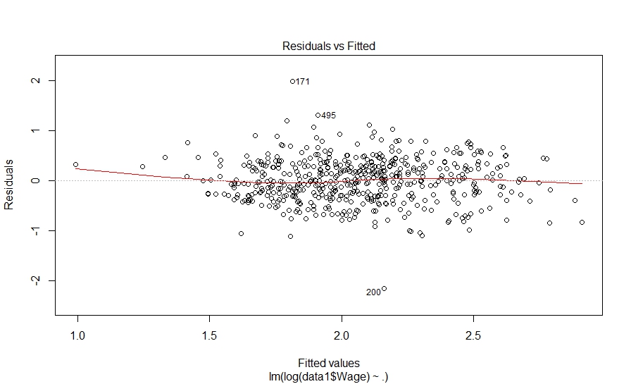
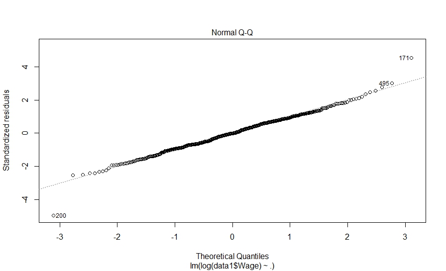
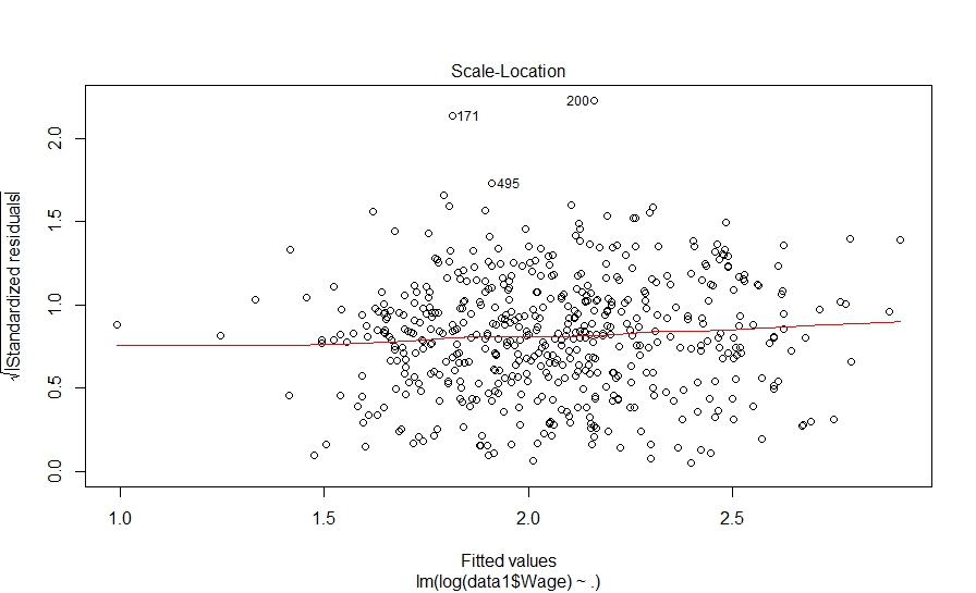
> plot(fit_model1) Hit <Return> to see next plot: |
Hit to see next plot:
Hit to see next plot:
Hit to see next plot:
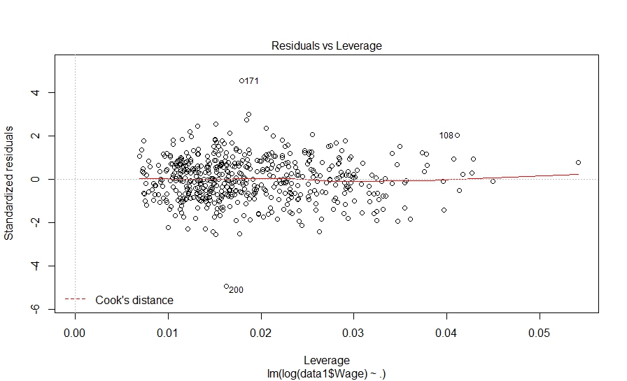
The diagnostic plots also look fine. Let’s investigate further and look at pair-wise correlation among variables.
| library(corrplot) > cor1 = cor(data1) > corrplot.mixed(cor1, lower.col = “black”, number.cex = .7) |
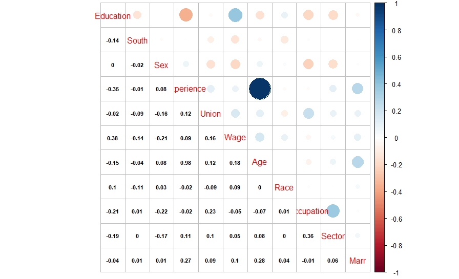
The above correlation plot shows that there is high correlation between experience and age variables. This might be resulting in multicollinearity in the model.
Now, let’s move a step further and try Farrar-Glauber test to further investigate this. The ‘mctest’ package in R provides the Farrar-Glauber test in R.
| install.packages(‘mctest’)library(mctest) |
We will first use omcdiag function in mctest package. According to the package description, omcdiag (Overall Multicollinearity Diagnostics Measures) computes different overall measures of multicollinearity diagnostics for matrix of regressors.
| > omcdiag(data1[,c(1:5,7:11)],data1$Wage) Call:omcdiag(x = data1[, c(1:5, 7:11)], y = data1$Wage) Overall Multicollinearity Diagnostics MC Results detectionDeterminant |X’X|: 0.0001 1Farrar Chi-Square: 4833.5751 1Red Indicator: 0.1983 0Sum of Lambda Inverse: 10068.8439 1Theil’s Method: 1.2263 1Condition Number: 739.7337 1 1 –> COLLINEARITY is detected by the test 0 –> COLLINEARITY is not detected by the test |
The above output shows that multicollinearity is present in the model. Now, let’s go a step further and check for F-test in in Farrar-Glauber test.
| > imcdiag(data1[,c(1:5,7:11)],data1$Wage) Call:imcdiag(x = data1[, c(1:5, 7:11)], y = data1$Wage) All Individual Multicollinearity Diagnostics Result VIF TOL Wi Fi Leamer CVIF KleinEducation 231.1956 0.0043 13402.4982 15106.5849 0.0658 236.4725 1South 1.0468 0.9553 2.7264 3.0731 0.9774 1.0707 0Sex 1.0916 0.9161 5.3351 6.0135 0.9571 1.1165 0Experience 5184.0939 0.0002 301771.2445 340140.5368 0.0139 5302.4188 1Union 1.1209 0.8922 7.0368 7.9315 0.9445 1.1464 0Age 4645.6650 0.0002 270422.7164 304806.1391 0.0147 4751.7005 1Race 1.0371 0.9642 2.1622 2.4372 0.9819 1.0608 0Occupation 1.2982 0.7703 17.3637 19.5715 0.8777 1.3279 0Sector 1.1987 0.8343 11.5670 13.0378 0.9134 1.2260 0Marr 1.0961 0.9123 5.5969 6.3085 0.9551 1.1211 0 1 –> COLLINEARITY is detected by the test 0 –> COLLINEARITY is not detected by the test Education , South , Experience , Age , Race , Occupation , Sector , Marr , coefficient(s) are non-significant may be due to multicollinearity R-square of y on all x: 0.2805 * use method argument to check which regressors may be the reason of collinearity=================================== |
The above output shows that Education, Experience and Age have multicollinearity. Also, the VIF value is very high for these variables. Finally, let’s move to examine the pattern of multicollinearity and conduct t-test for correlation coefficients.
| > pcor(data1[,c(1:5,7:11)],method = “pearson”)$estimate Education South Sex Experience Union Age Race OccupationEducation 1.000000000 -0.031750193 0.051510483 -0.99756187 -0.007479144 0.99726160 0.017230877 0.029436911South -0.031750193 1.000000000 -0.030152499 -0.02231360 -0.097548621 0.02152507 -0.111197596 0.008430595Sex 0.051510483 -0.030152499 1.000000000 0.05497703 -0.120087577 -0.05369785 0.020017315 -0.142750864Experience -0.997561873 -0.022313605 0.054977034 1.00000000 -0.010244447 0.99987574 0.010888486 0.042058560Union -0.007479144 -0.097548621 -0.120087577 -0.01024445 1.000000000 0.01223890 -0.107706183 0.212996388Age 0.997261601 0.021525073 -0.053697851 0.99987574 0.012238897 1.00000000 -0.010803310 -0.044140293Race 0.017230877 -0.111197596 0.020017315 0.01088849 -0.107706183 -0.01080331 1.000000000 0.057539374Occupation 0.029436911 0.008430595 -0.142750864 0.04205856 0.212996388 -0.04414029 0.057539374 1.000000000Sector -0.021253493 -0.021518760 -0.112146760 -0.01326166 -0.013531482 0.01456575 0.006412099 0.314746868Marr -0.040302967 0.030418218 0.004163264 -0.04097664 0.068918496 0.04509033 0.055645964 -0.018580965 Sector MarrEducation -0.021253493 -0.040302967South -0.021518760 0.030418218Sex -0.112146760 0.004163264Experience -0.013261665 -0.040976643Union -0.013531482 0.068918496Age 0.014565751 0.045090327Race 0.006412099 0.055645964Occupation 0.314746868 -0.018580965Sector 1.000000000 0.036495494Marr 0.036495494 1.000000000 $p.value Education South Sex Experience Union Age Race Occupation SectorEducation 0.0000000 0.46745162 0.238259049 0.0000000 8.641246e-01 0.0000000 0.69337880 5.005235e-01 6.267278e-01South 0.4674516 0.00000000 0.490162786 0.6096300 2.526916e-02 0.6223281 0.01070652 8.470400e-01 6.224302e-01Sex 0.2382590 0.49016279 0.000000000 0.2080904 5.822656e-03 0.2188841 0.64692038 1.027137e-03 1.005138e-02Experience 0.0000000 0.60962999 0.208090393 0.0000000 8.146741e-01 0.0000000 0.80325456 3.356824e-01 7.615531e-01Union 0.8641246 0.02526916 0.005822656 0.8146741 0.000000e+00 0.7794483 0.01345383 8.220095e-07 7.568528e-01Age 0.0000000 0.62232811 0.218884070 0.0000000 7.794483e-01 0.0000000 0.80476248 3.122902e-01 7.389200e-01Race 0.6933788 0.01070652 0.646920379 0.8032546 1.345383e-02 0.8047625 0.00000000 1.876376e-01 8.833600e-01Occupation 0.5005235 0.84704000 0.001027137 0.3356824 8.220095e-07 0.3122902 0.18763758 0.000000e+00 1.467261e-13Sector 0.6267278 0.62243025 0.010051378 0.7615531 7.568528e-01 0.7389200 0.88336002 1.467261e-13 0.000000e+00Marr 0.3562616 0.48634504 0.924111163 0.3482728 1.143954e-01 0.3019796 0.20260170 6.707116e-01 4.035489e-01 MarrEducation 0.3562616South 0.4863450Sex 0.9241112Experience 0.3482728Union 0.1143954Age 0.3019796Race 0.2026017Occupation 0.6707116Sector 0.4035489Marr 0.0000000 $statistic Education South Sex Experience Union Age Race Occupation SectorEducation 0.0000000 -0.7271618 1.18069629 -327.2105031 -0.1712102 308.6803174 0.3944914 0.6741338 -0.4866246South -0.7271618 0.0000000 -0.69053623 -0.5109090 -2.2436907 0.4928456 -2.5613138 0.1929920 -0.4927010Sex 1.1806963 -0.6905362 0.00000000 1.2603880 -2.7689685 -1.2309760 0.4583091 -3.3015287 -2.5834540Experience -327.2105031 -0.5109090 1.26038801 0.0000000 -0.2345184 1451.9092015 0.2492636 0.9636171 -0.3036001Union -0.1712102 -2.2436907 -2.76896848 -0.2345184 0.0000000 0.2801822 -2.4799336 4.9902208 -0.3097781Age 308.6803174 0.4928456 -1.23097601 1451.9092015 0.2801822 0.0000000 -0.2473135 -1.0114033 0.3334607Race 0.3944914 -2.5613138 0.45830912 0.2492636 -2.4799336 -0.2473135 0.0000000 1.3193223 0.1467827Occupation 0.6741338 0.1929920 -3.30152873 0.9636171 4.9902208 -1.0114033 1.3193223 0.0000000 7.5906763Sector -0.4866246 -0.4927010 -2.58345399 -0.3036001 -0.3097781 0.3334607 0.1467827 7.5906763 0.0000000Marr -0.9233273 0.6966272 0.09530228 -0.9387867 1.5813765 1.0332156 1.2757711 -0.4254112 0.8359769 MarrEducation -0.92332727South 0.69662719Sex 0.09530228Experience -0.93878671Union 1.58137652Age 1.03321563Race 1.27577106Occupation -0.42541117Sector 0.83597695Marr 0.00000000 $n[1] 534 $gp[1] 8 $method[1] “pearson” |
As we saw earlier in the correlation plot, partial correlation between age-experience, age-education and education-experience is statistically significant. There are other pairs also which are statistically significant. Thus, Farrar-Glauber test helps us in identifying the variables which are causing multicollinearity in the model.
There are multiple ways to overcome the problem of multicollinearity. You may use ridge regression or principal component regression or partial least squares regression. The alternate way could be to drop off variables which are resulting in multicollinearity. You may drop of variables which have VIF more than 10. In our case, since age and experience are highly correlated, you may drop one of these variables and build the model again. Try building the model again by removing experience or age and check if you are getting better results. Share your experiences in the comments section below.
Author Bio:
This article was contributed by Perceptive Analytics. Jyothirmayee Thondamallu, Chaitanya Sagar and Saneesh Veetil contributed to this article.
Perceptive Analytics is a marketing analytics company and it also provides Tableau Consulting, data analytics, business intelligence and reporting services to e-commerce, retail, healthcare and pharmaceutical industries. Our client roster includes Fortune 500 and NYSE listed companies in the USA and India.
 And here is what we did in our study:


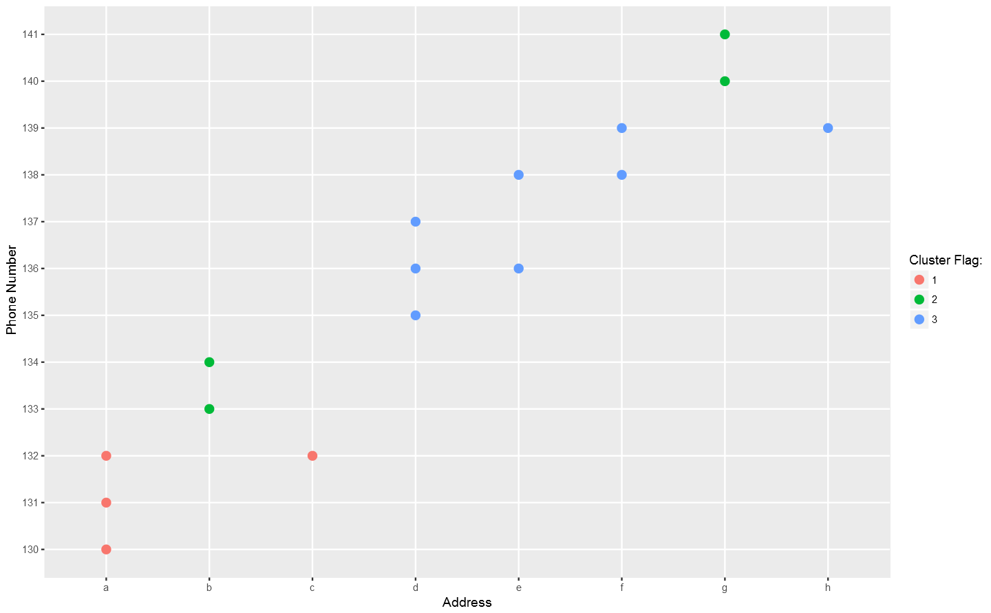
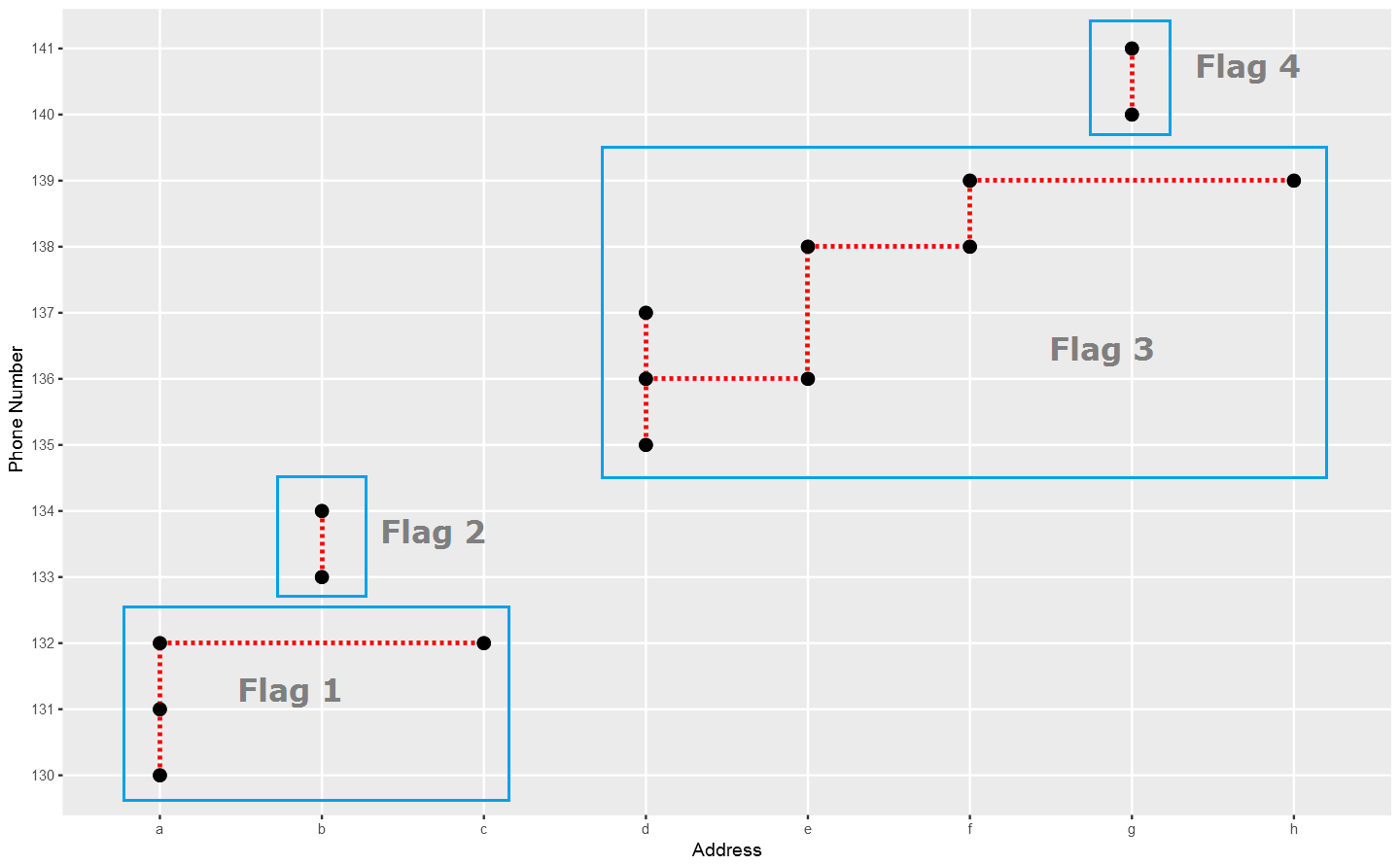 In the above plot, each point stand for a "identity" who has a address which you can tell according to horizontal axis , and a phone number which you can see in vertical axis. The red dotted line present the "connections" betweent identities, which actually means the same address or phone number. So the wanted result is the blue rectangels to circle out different flags which reprent really different persons.
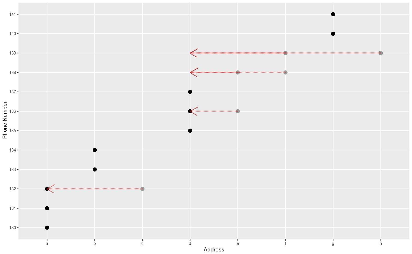
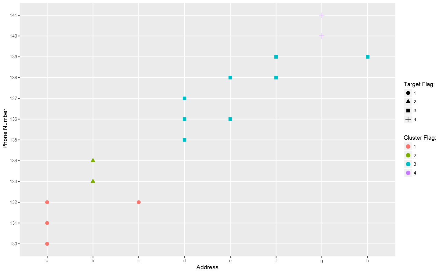 Not bad so far.